|
| Group |
Round |
C/R |
Comment |
Date |
Image |
| 93 |
May 24 |
Reply |
None taken Mark! |
May 27th |
| 93 |
May 24 |
Reply |
Thank you Paul! |
May 26th |
| 93 |
May 24 |
Reply |
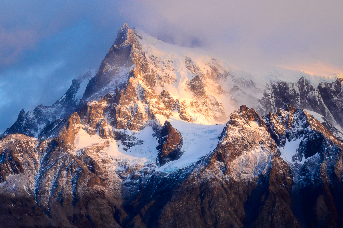
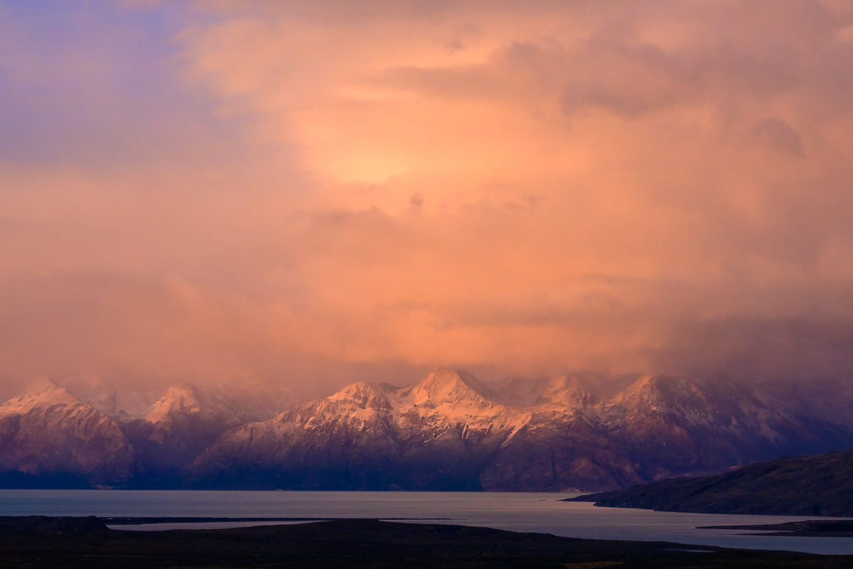
You might be right about the side being a bit too hot Mark, I'll try again and see what I think about it.
As for the pinks and blues, I really try to process it as I remember the image and hope that it looks realistic. In the past, I have certainly over processed images and strive to make sure things look natural. |
May 26th |
| 93 |
May 24 |
Reply |
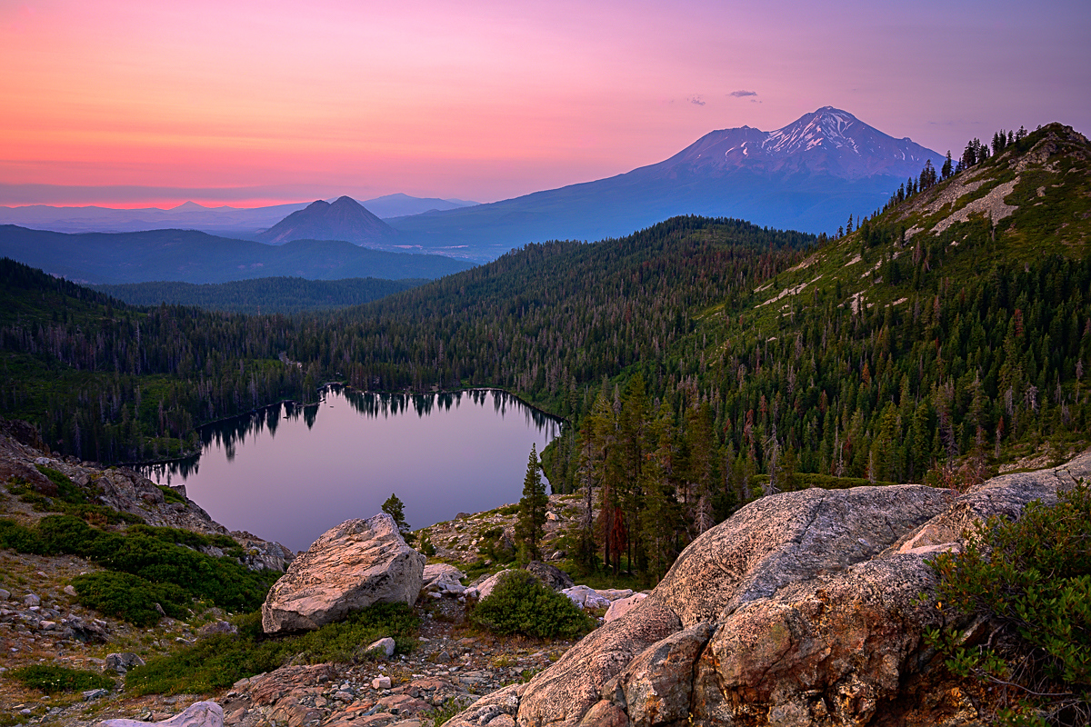
Thanks Neil, I agree, a bit more above the peak might help a bit here. |
May 26th |
| 93 |
May 24 |
Reply |
Don't mind the edit at all Ed! It's nice seeing how someone else might frame an image. |
May 26th |
| 93 |
May 24 |
Reply |
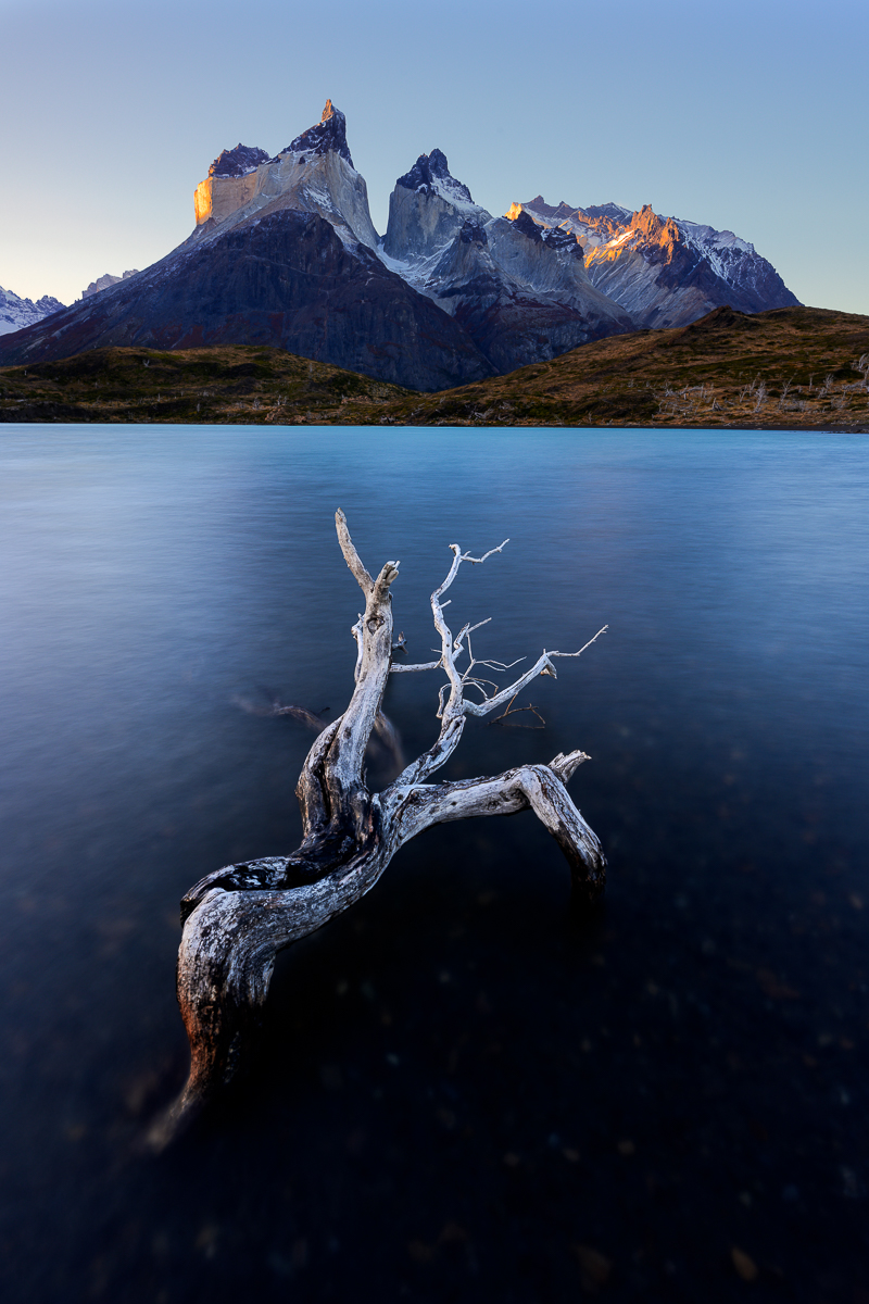
Thanks for the feedback George. I had darkened it a bit, but perhaps I need to do it a bit more, especially that whiter part on the left. |
May 26th |
| 93 |
May 24 |
Reply |
Thank you Darcy! |
May 26th |
| 93 |
May 24 |
Comment |
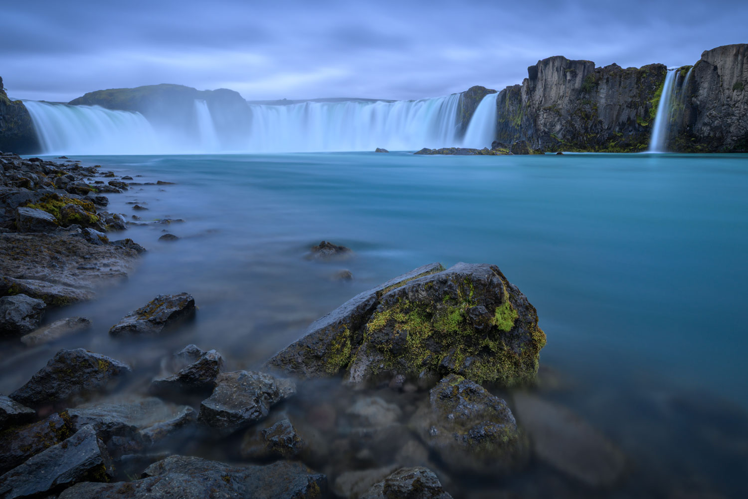
Neil, I agree that the sky is a bit too much compared to the buildings, at least in the way it is processed. That said, I think it could work if you wanted that type of sky impact if you were to also adjust the buildings themselves.
As for the composition, while it traditionally might be considered unbalanced with the buildings on the left and blank space on the right, I like it! I think capturing it with little water and more sky works! |
May 26th |
| 93 |
May 24 |
Comment |
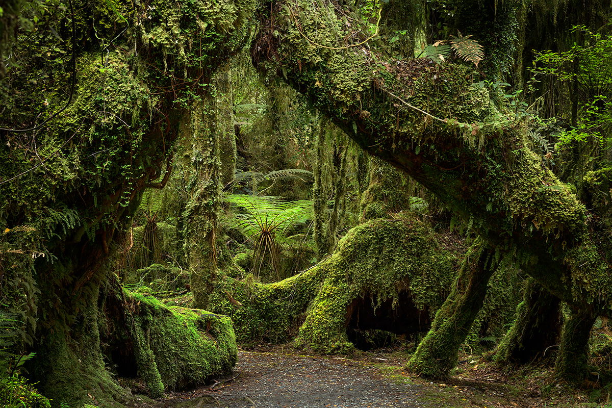
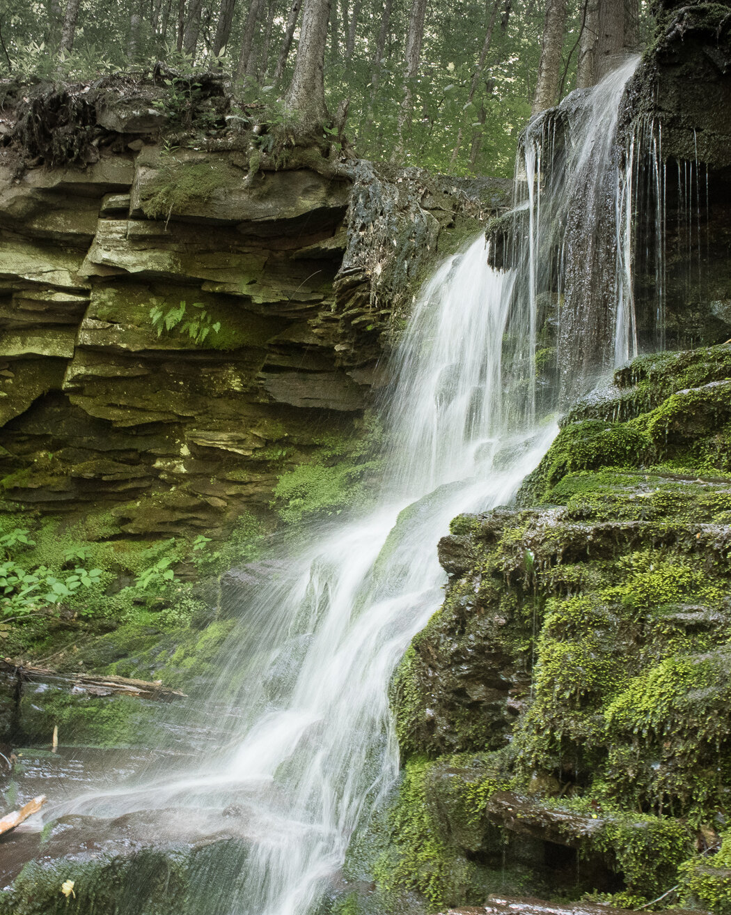
Hi Ed, I agree with some of the other comments, it feels a bit soft and focus stacking might be a great option to try, especially given there is not much wind in there.
I really like what you did with the color processing. Obviously Raw files are a negative and can be interpreted, but you did a good job spotlighting all the colors. |
May 26th |
| 93 |
May 24 |
Comment |
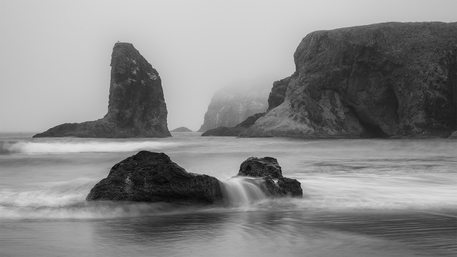
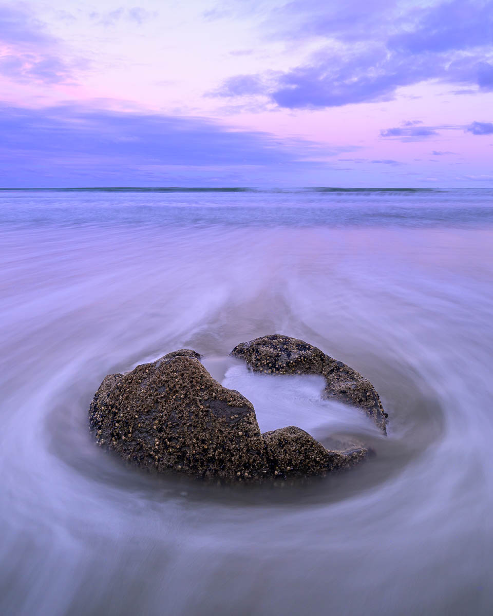
I really like this image Paul, nice job on the B&W processing of it. I like the tonal range of this from the brighter center to the black edges. I agree with George in regards to the bottom leaf, I think cropping this to a 1x1 would help with that and make it even stronger than it is. Nice job! |
May 26th |
| 93 |
May 24 |
Comment |
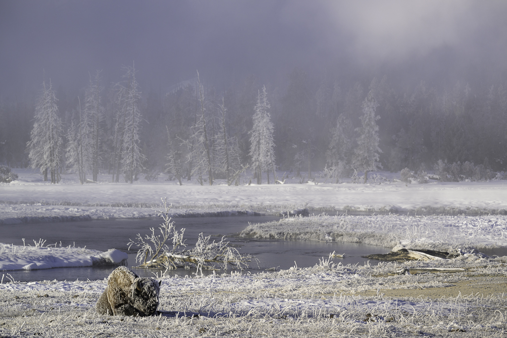
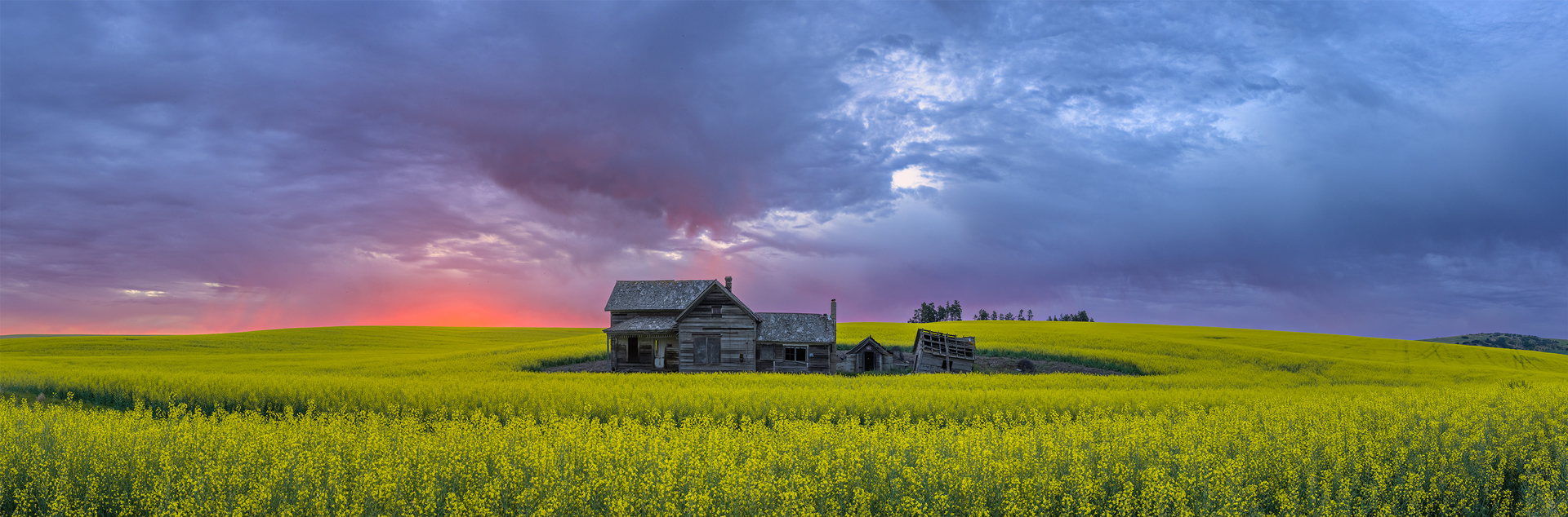
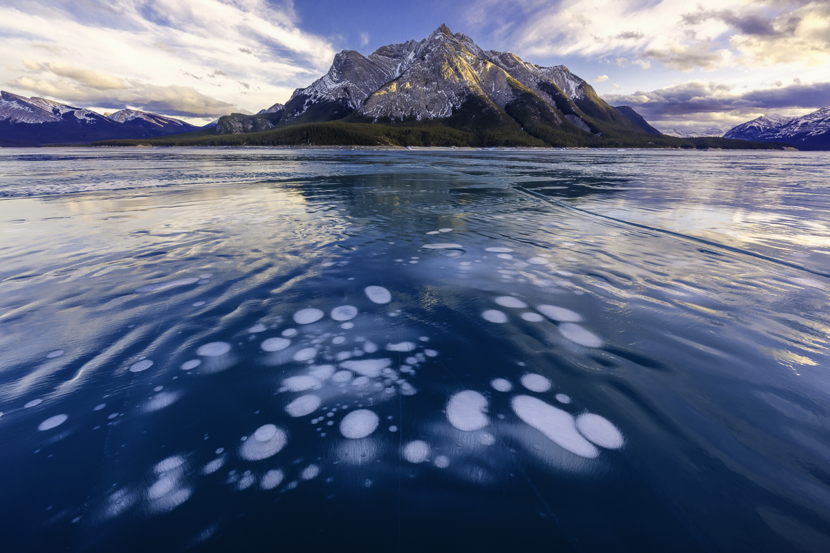
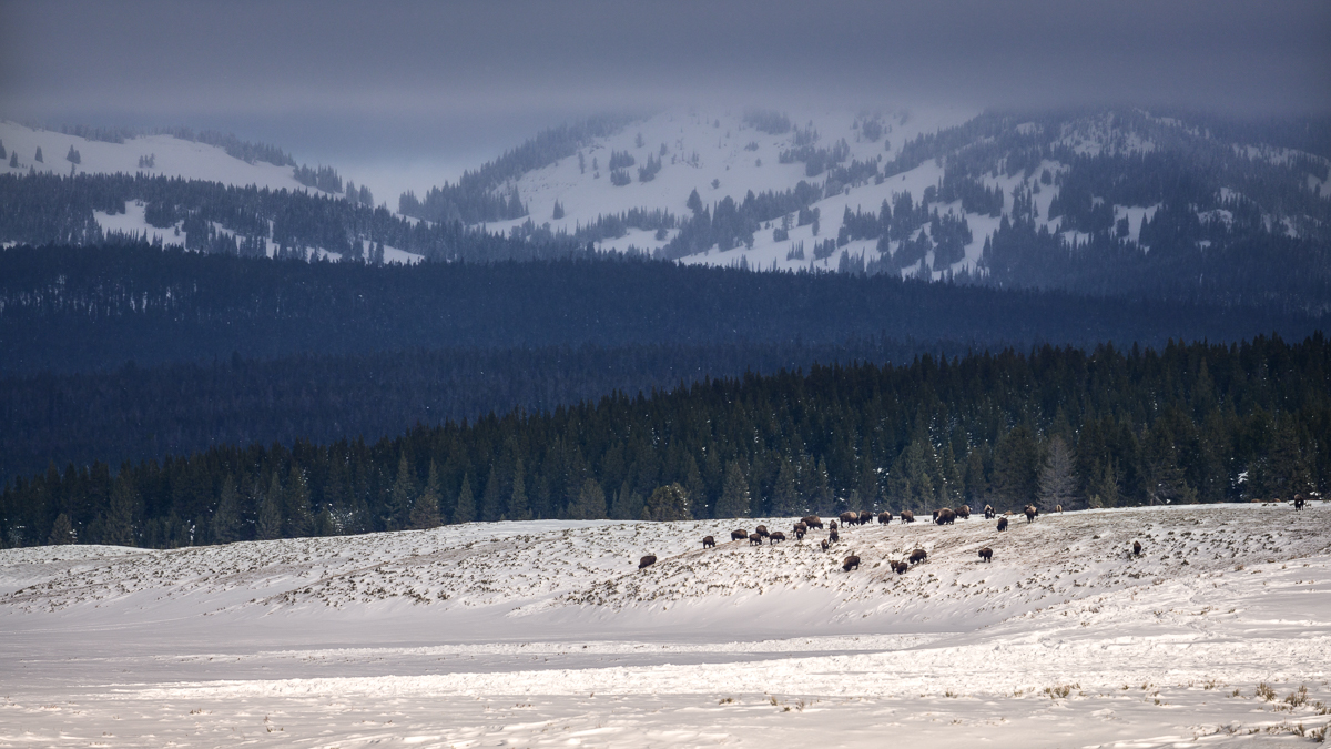
Processing glaciers is...a challenge IMO! I think you've done a great job here Darcy! I really like Marks change to the vertical aspect, it feels more intimate and brings me into the frame a bit more. Nice job. |
May 26th |
| 93 |
May 24 |
Comment |
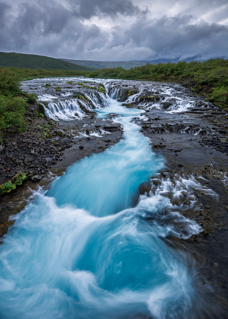
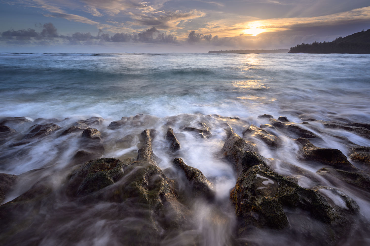
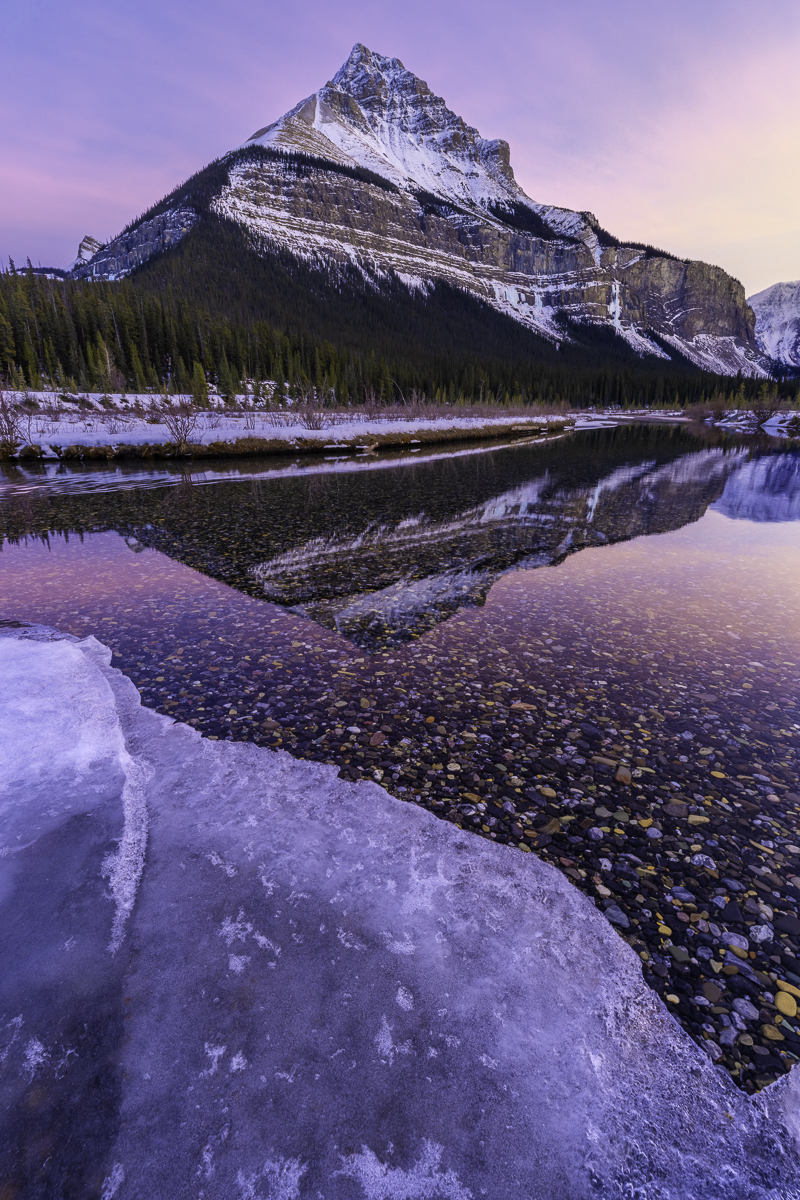
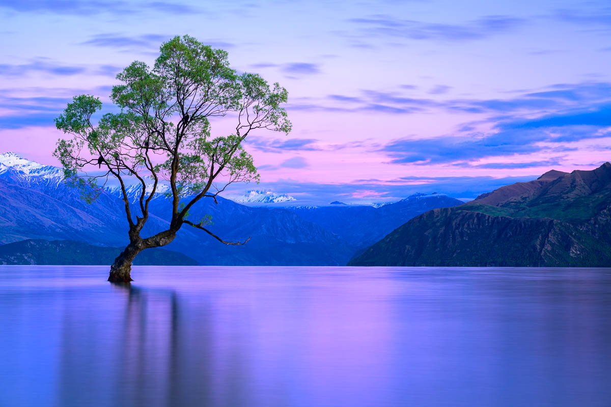
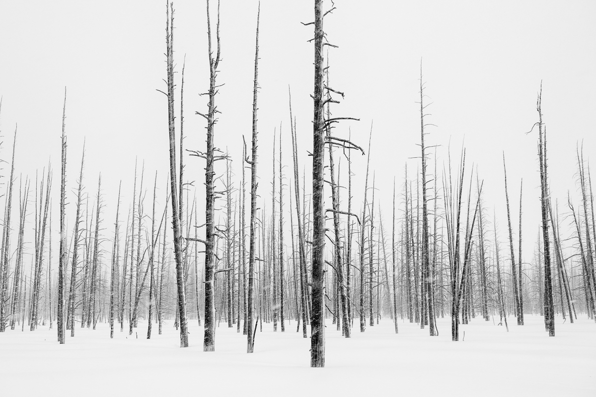
Love the leading lines and how you framed this shot. I like the sunburst, but feel the top one is a bit too bright. I agree with Mark, to my eye, the left bank is a tad too bright (but not by much).
I like the subtle colors of this image. I was thinking B&W might work as well, but like the yellows and blues.
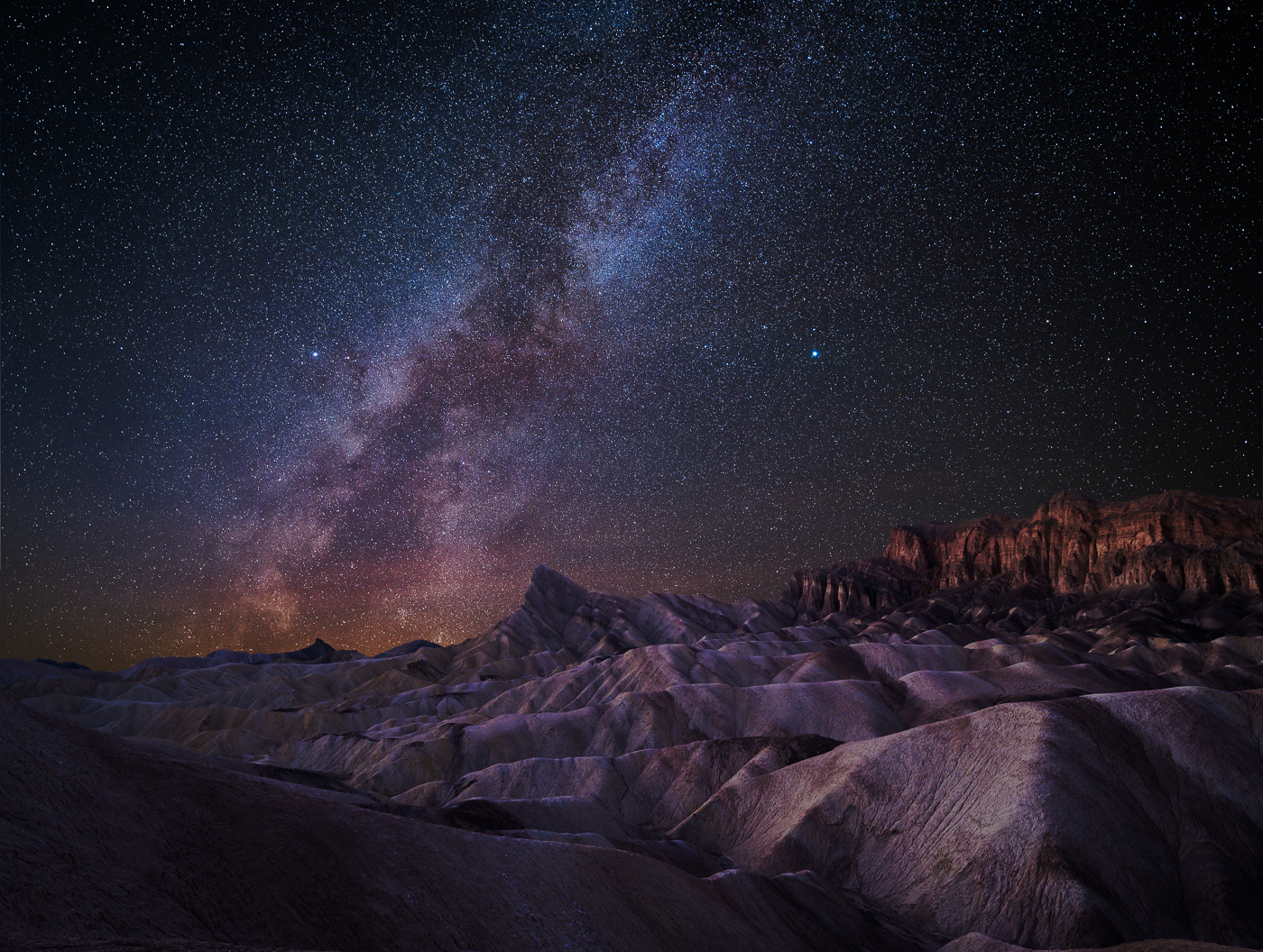
Question about the reflection and the star in the reflection itself, was this taken at the same time? How did you do this? |
May 26th |
5 comments - 7 replies for Group 93
|
5 comments - 7 replies Total
|