|
| Group |
Round |
C/R |
Comment |
Date |
Image |
| 93 |
Apr 24 |
Reply |
Thanks Neil! |
Apr 22nd |
| 93 |
Apr 24 |
Comment |
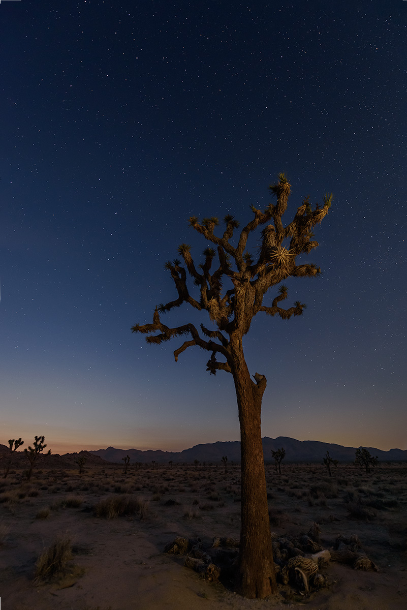
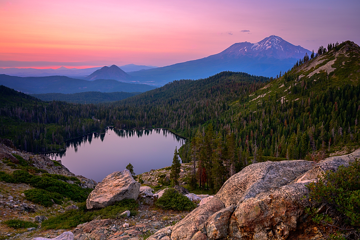
I really like the depth of this, from the foreground to the trees in the back, there are many layers!
Was this taken in mid day sun, or close to it? I feels as it there's a bit of haze to it. As we all know, anyone can process an image in any way. I took a crack at it to help highlight the layers that I like a bit more. Let me know your thoughts!
|
Apr 10th |
 |
| 93 |
Apr 24 |
Reply |
I think there's more that can be done, but wanted to do a quick way to address for you. |
Apr 10th |
| 93 |
Apr 24 |
Reply |
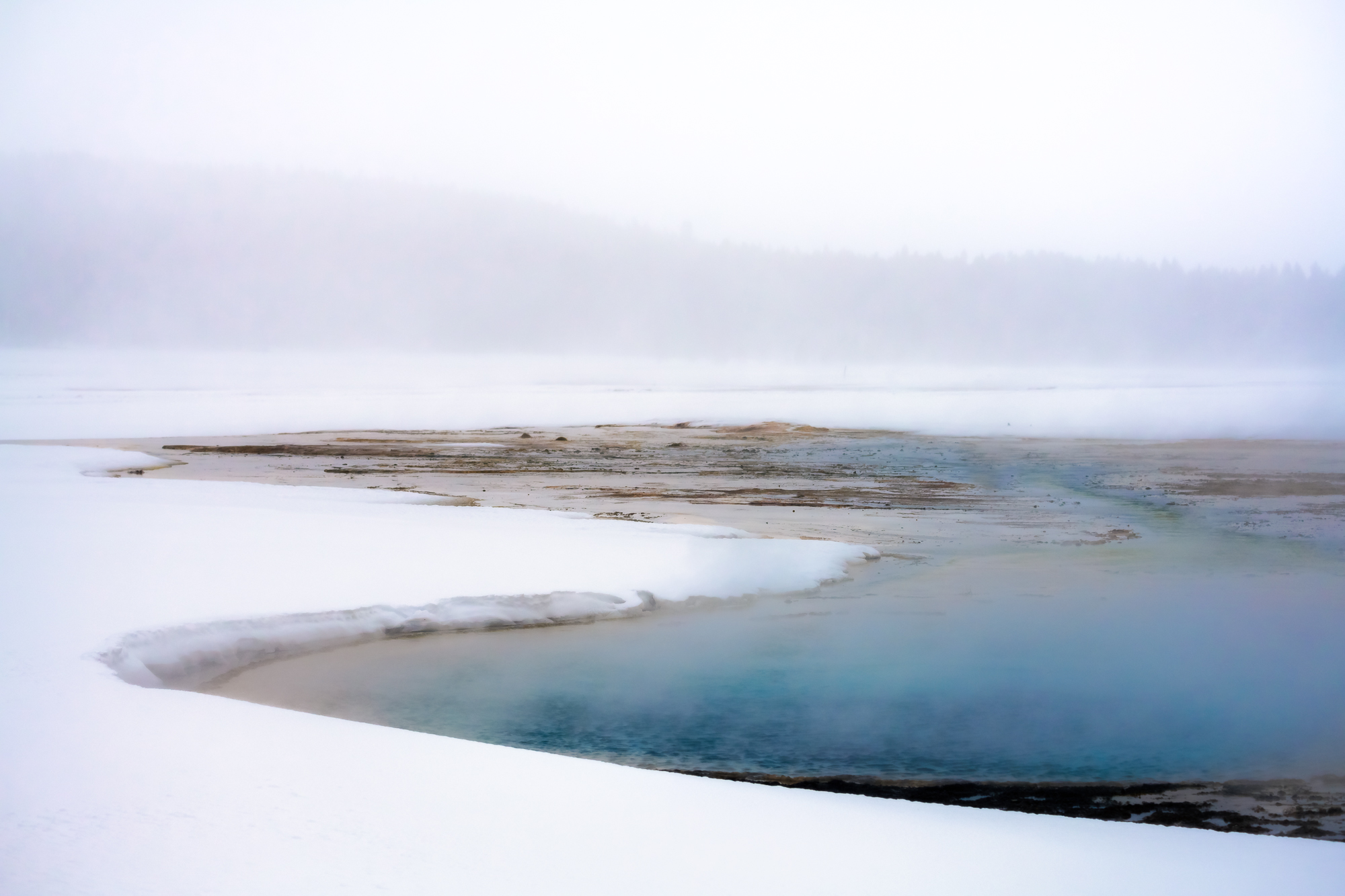
Hi Paul, I did a quick edit in Lightroom with radial filters. This isn't the cleanest way to do it, but the easiest way. I put one radial around the woman and increased the exposure a tiny bit. I then did a radial around the bright part of it and decreased highlights. I didn't think it was knocked down enough, so duplicated it and felt it worked. Let me know your thoughts!
|
Apr 10th |
 |
| 93 |
Apr 24 |
Comment |
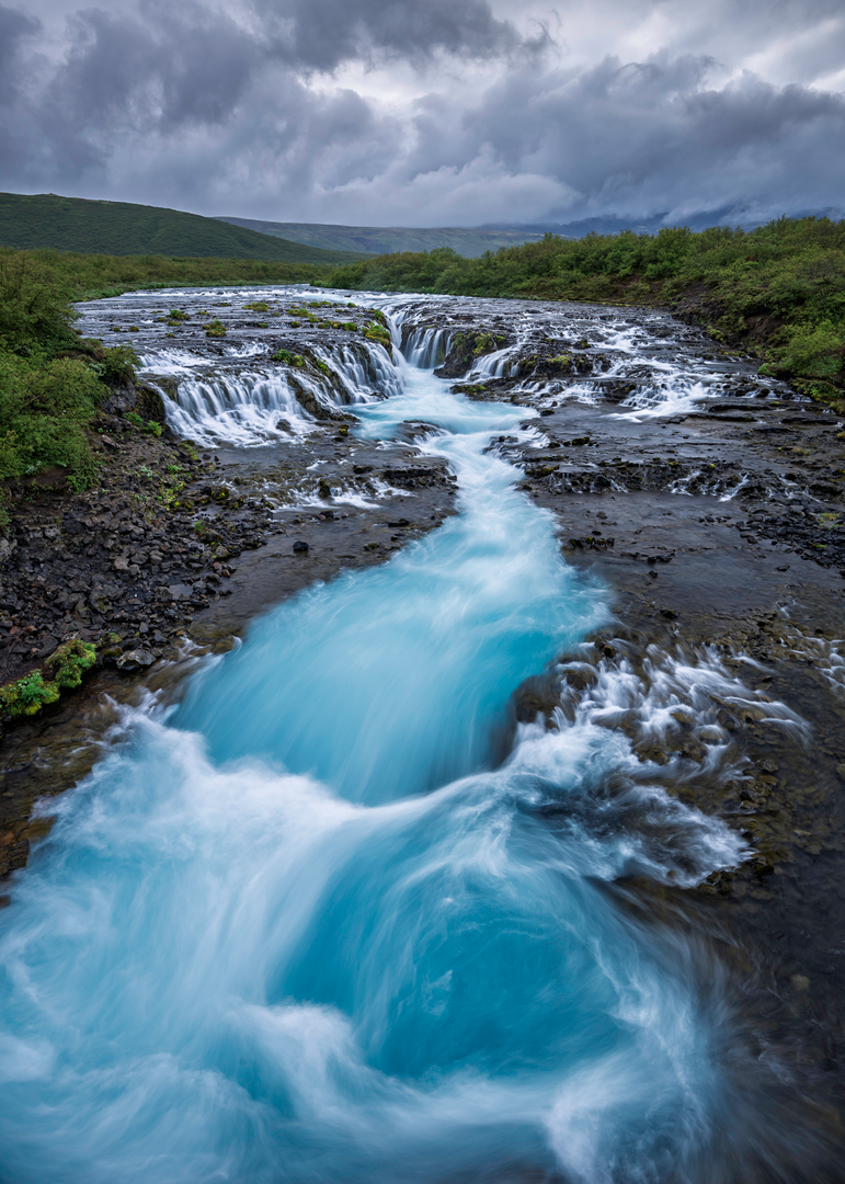
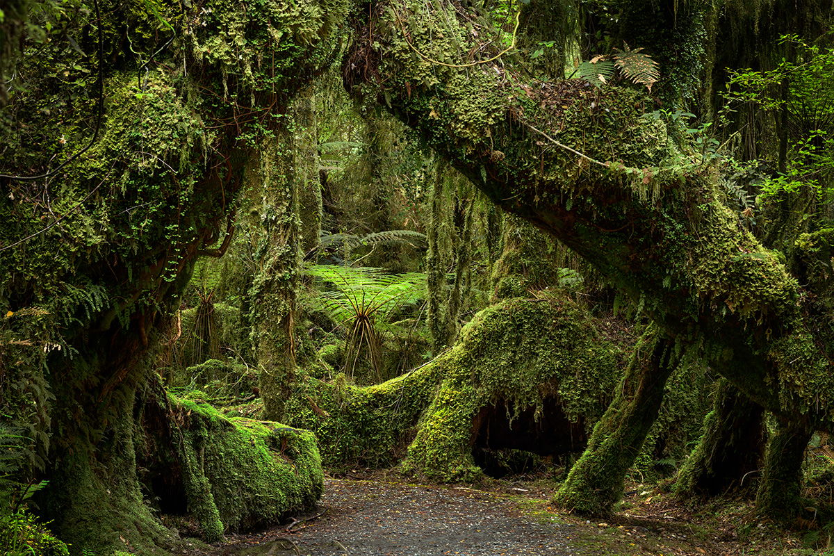
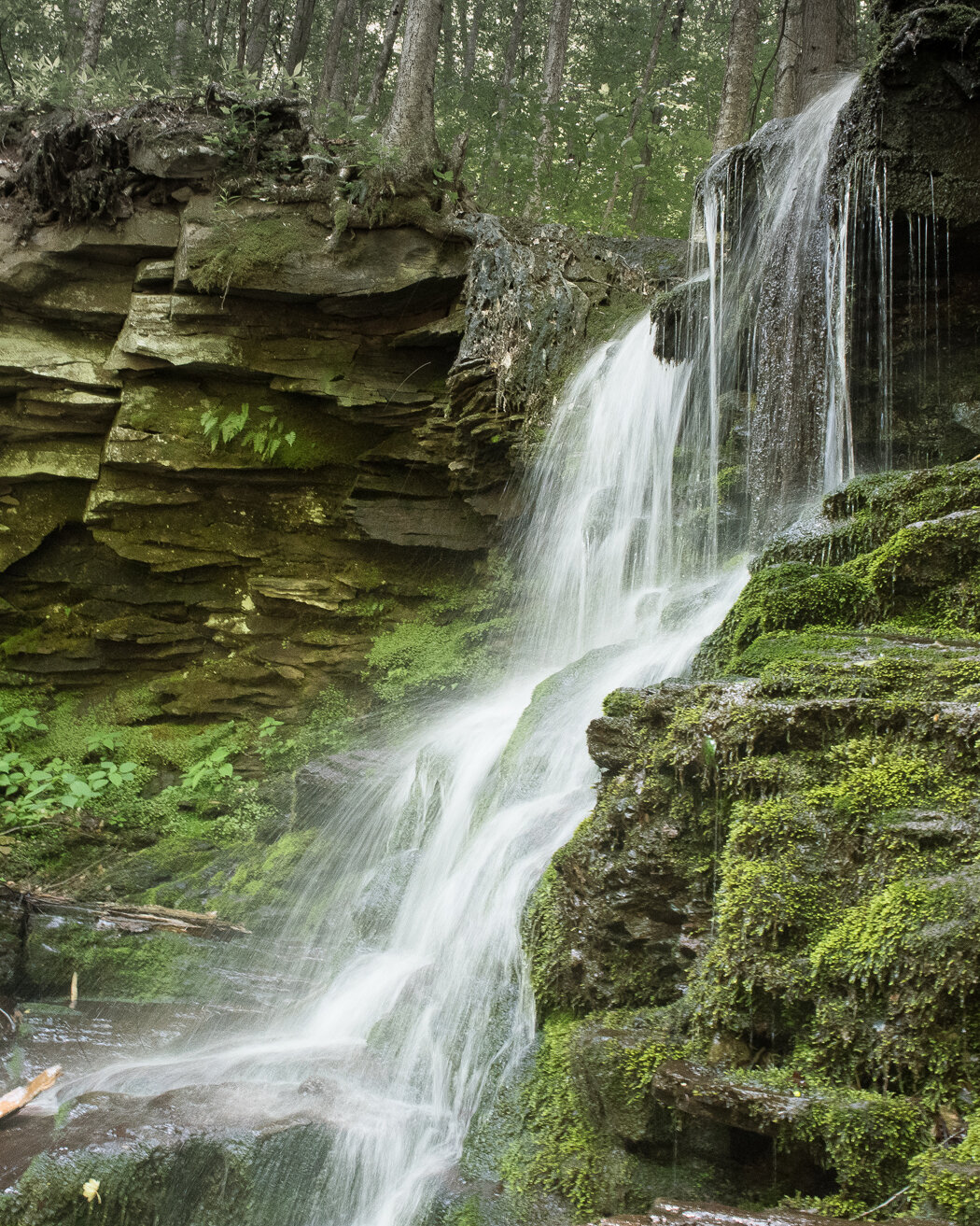
Ed, nice shot, I agree that the greens are great here. I like the composition, the fern hanging over on the left over the water.
Great use of your shutter speed to get the movement of the water. I'm assuming there wasn't any wind given the ferns are not moving?
One thing, to me, the water looks a bit too green, maybe move it to PhotoShop and do color adjustment with a mask to make it a bit bluer? |
Apr 9th |
| 93 |
Apr 24 |
Comment |
You know I'm always impressed with street photography!
I like how you've framed this with the path coming from the bottom left to the middle. The woman riding the bike toward you and the people sitting in the cafe's are great.
Not sure what the color image looks like, but I do like the B&W.
Onto the processing, I think that street in the back is a bit too bright and my eye keeps going towards it. I'd like to see that darkened a bit and maybe masking the woman on the bike and making her the focal point. |
Apr 9th |
| 93 |
Apr 24 |
Comment |
Mark,
This abstract is amazing. The way you framed this and captured the different textures in this image is great. As George said, the S-Curve makes it with the satiny type top left and the crunchier (for lack of a better word) on the bottom. I like what you did with the color as well. At first, I thought I wanted to see more blue as in the original, but the more I look at it, I like how you processed it. |
Apr 9th |
| 93 |
Apr 24 |
Reply |
Thanks Darcy, agree, they're a bit bright, oops! |
Apr 9th |
| 93 |
Apr 24 |
Comment |
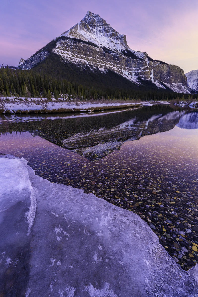
Darcy,
Why do you think you overexposed the mid-ground? Your original looks well exposed to me.
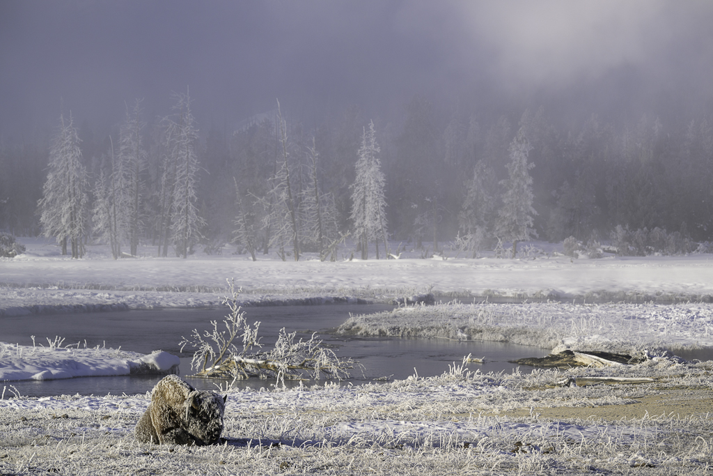
Now to your processing, I really like what you did with the colors of the flowers, I also like the depth and the layers you captured here.
Nice shot, those clouds are great! |
Apr 9th |
| 93 |
Apr 24 |
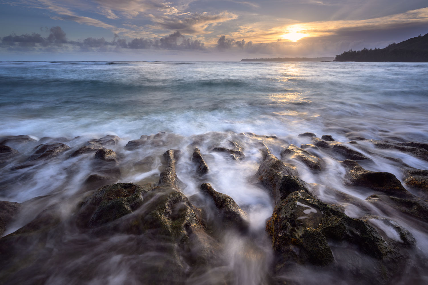
Comment |
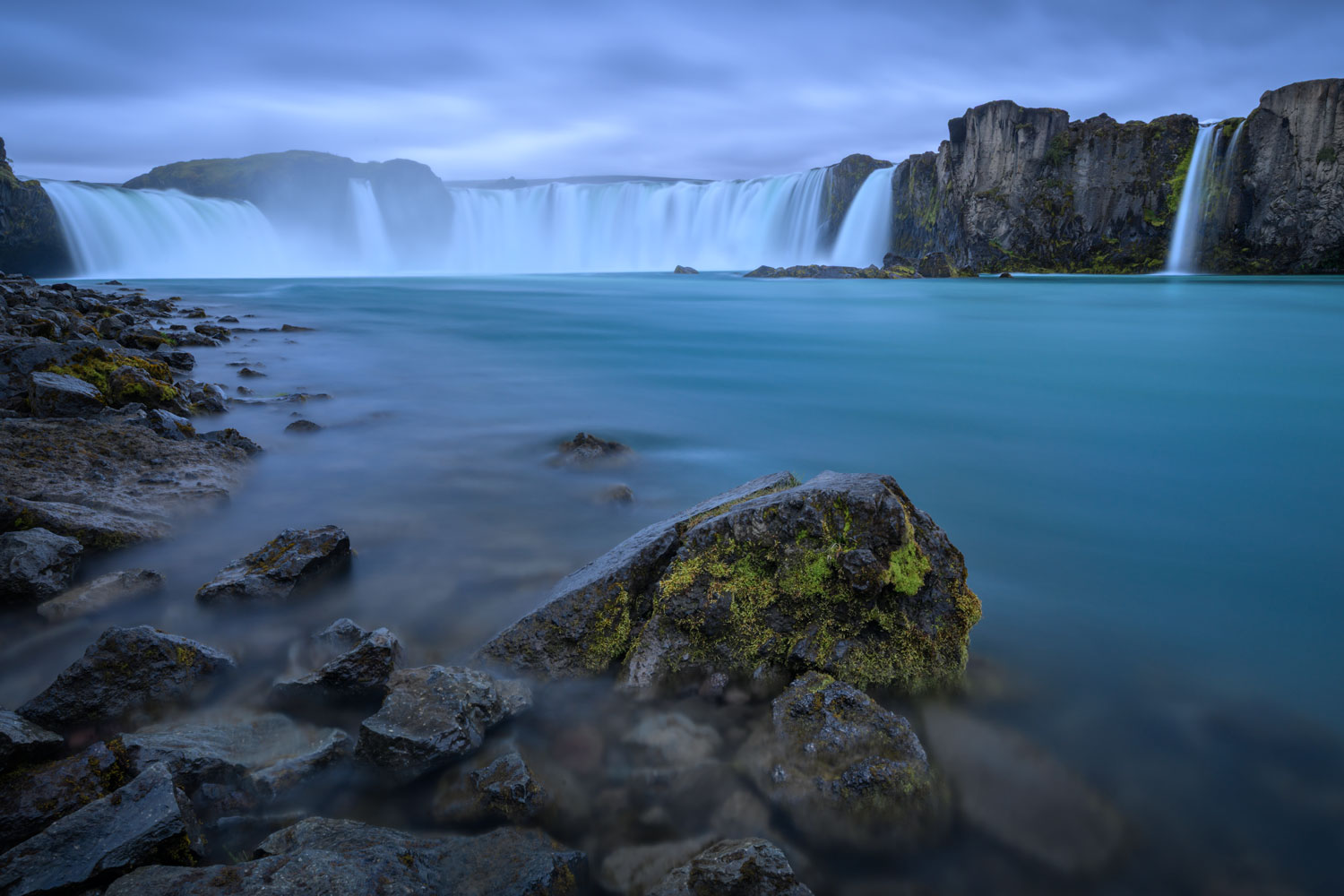
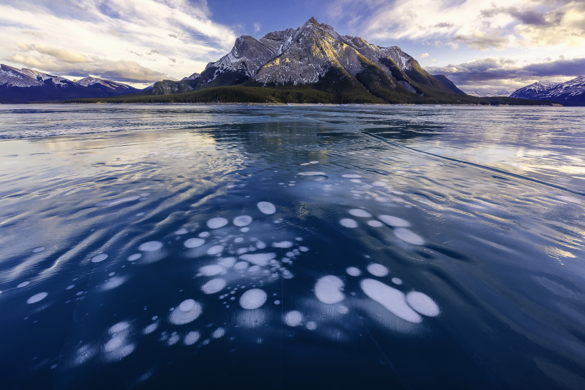
Welcome again George!
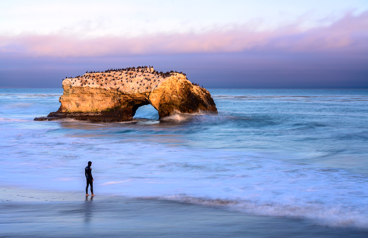
Love the composition with the rock on the right balancing with the rock on the left in the background. Great use of shutter speed (had no idea you could use an ND on a drone!).
I like how you worked the sky and how you brought out the blue in the water. That said, I think the sky is a bit too bright and my eye keeps going there as opposed to looking at the other great parts of it.
I like how while the foreground is moving but is also sharp and colder, while the background is "softer" and warmer.
Looking forward to seeing other images from you!
|
Apr 9th |
| 93 |
Apr 24 |
Reply |
Ask away Paul, I don't mind at all :D |
Apr 9th |
| 93 |
Apr 24 |
Reply |
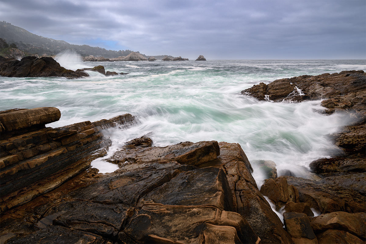
Welcome George!
Great feedback and I noticed the same thing about the clouds, when I looked at this yesterday -- they are blown out! (I had a few edits and think I sent the wrong one in, but oh well!). They shouldn't be blown out as it was a HDR, so there's plenty of range there, just a bad edit on my part.
As for your type of feedback, we're pretty open here and welcome it, no need to withdraw :D
|
Apr 2nd |
6 comments - 6 replies for Group 93
|
6 comments - 6 replies Total
|