|
| Group |
Round |
C/R |
Comment |
Date |
Image |
| 93 |
Sep 23 |
Reply |
Well done Darcy! You did a great job bringing out the colors from the raw file! |
Sep 30th |
| 93 |
Sep 23 |
Reply |
Thank you Jeffrey! Agree after looking at it again, I need to work on the shadow a tiny bit before I print it. |
Sep 30th |
| 93 |
Sep 23 |
Reply |
Thank you Mark and thanks for the editing suggestions as well. Love the feedback and suggestions on how to improve it.
I was very lucky and did indeed have some great opportunities there. |
Sep 30th |
| 93 |
Sep 23 |
Comment |
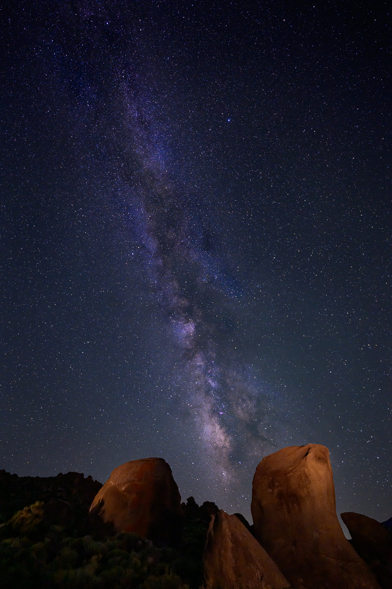
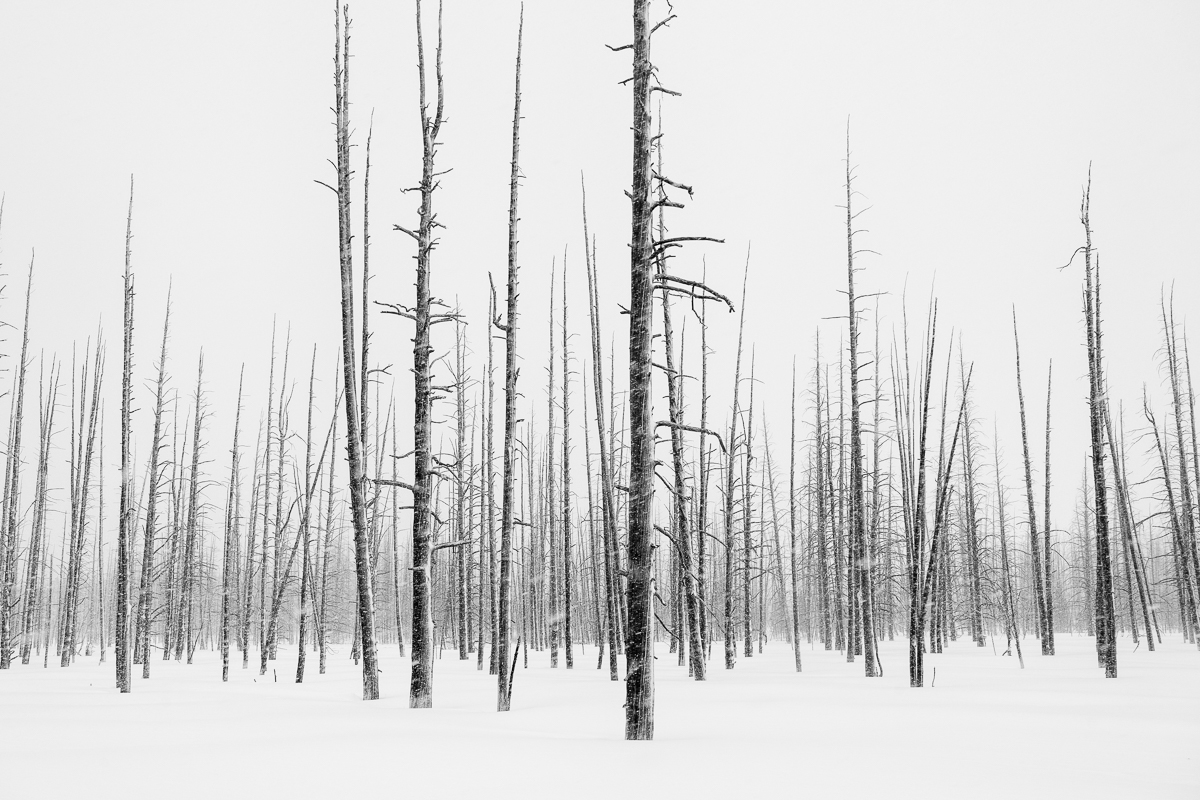
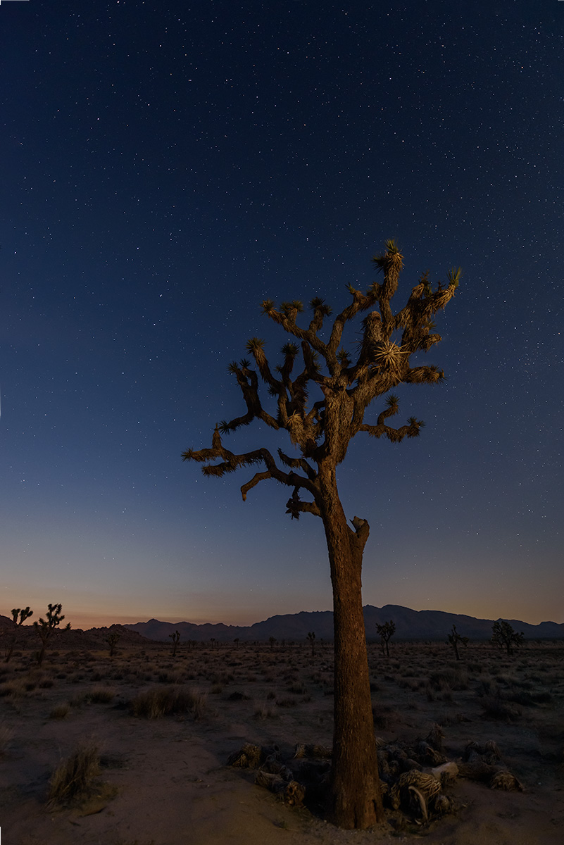
Neil, Nice job capturing the depth and sheer number of Joshua Trees. It is an amazing place to shoot. I like how you framed the "splitting trees" for lack of a better description.
I keep going back and forth on how sharp this is. Sometimes I think it might be over-sharpened a bit, and other times, it feels like an image that had might have had harsh sunlight that caused shadows on the details in the trees and the ground cover to pop a bit more. Either way, I like it, it keeps me going back to look at the details further. |
Sep 30th |
| 93 |
Sep 23 |
Comment |
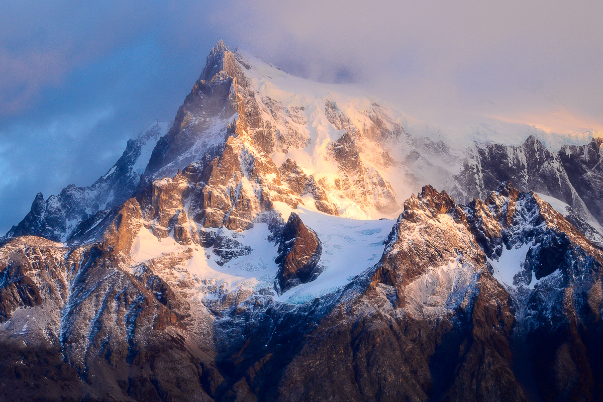
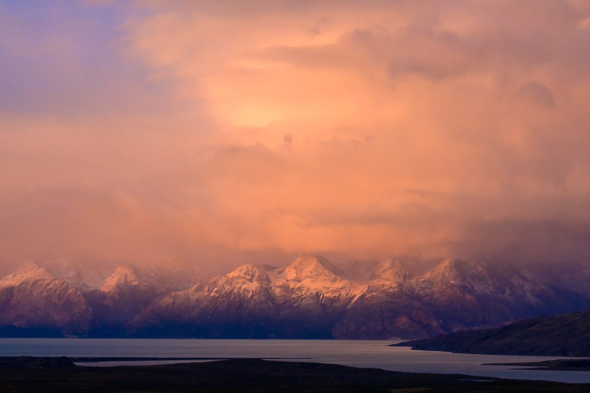
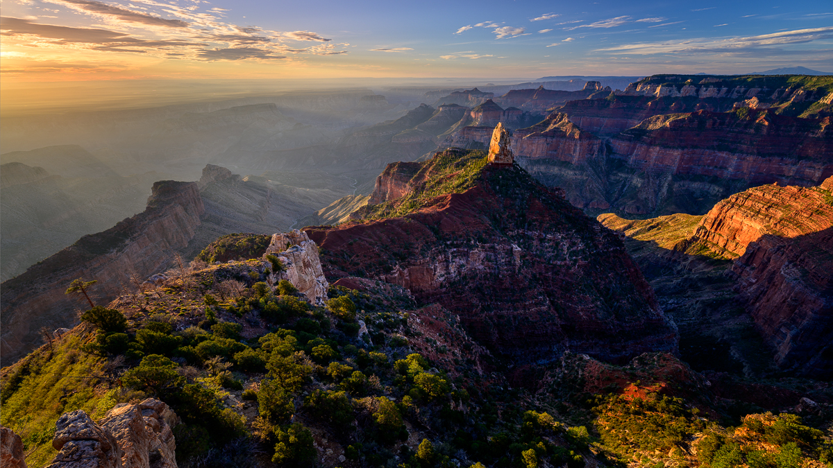
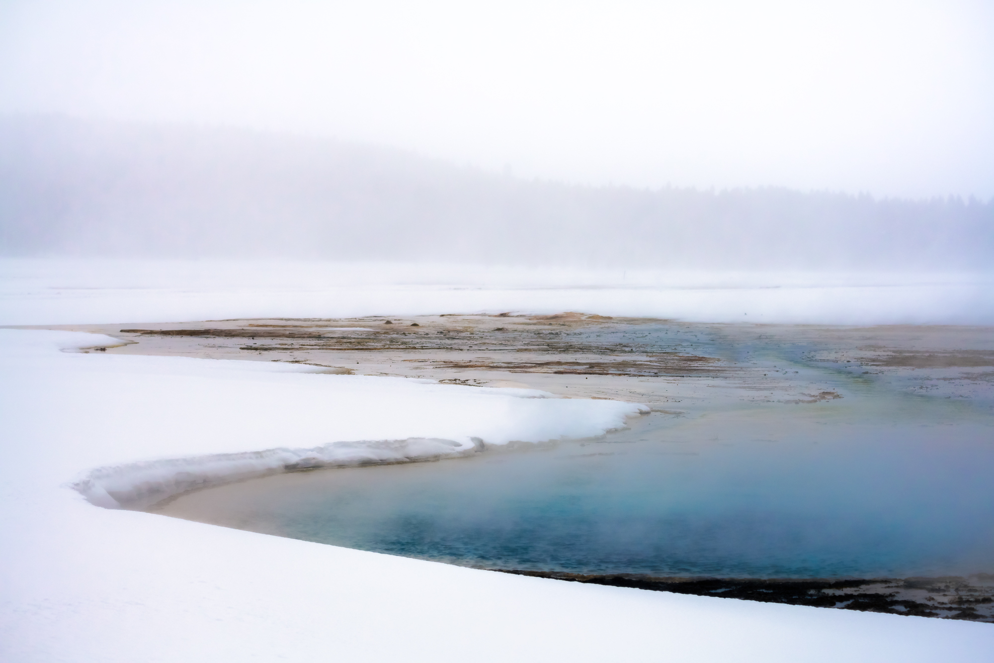
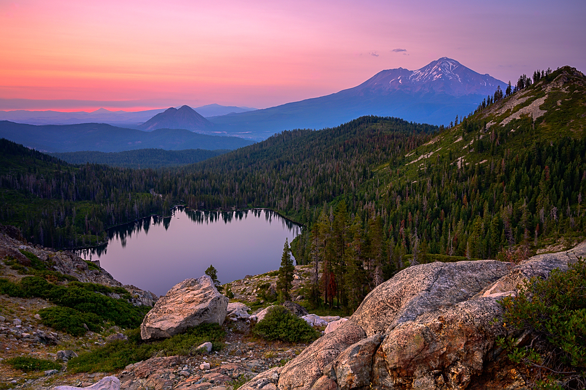
Cannot believe you hiked to this on your own! Good for you! On the processing front, you have done a great job of capturing multiple ranges here. The mists help to show the depth of the mountain peaks. I like the ridge line coming in from the right side and moving into the frame and wrapping back to the middle and the darker parts of the rock. Nice job!
As for failing to summit, I'd say you succeeded overall! To do what you did alone was amazing and seeing that there might be something dangerous is not a failure in my book. :D |
Sep 30th |
| 93 |
Sep 23 |
Reply |
Hi Paul, didn't see your question until now! I don't know if it would work, but what I meant was if you use Lightroom, after you convert, move to the B&W module and play with the blue, that would darken the sky a bit and make it pop a bit more. this is a very quick example for you to look at and I didn't edit anything there then did this as an example for you. The left is just a B&W conversion, the right is B&W conversion and then I went to the B&W module and adjusted the blue. There are may different ways you can do this, this is just one. Hope that makes sense! |
Sep 23rd |
 |
| 93 |
Sep 23 |
Reply |
Thank you Paul :) |
Sep 21st |
| 93 |
Sep 23 |
Reply |
Thanks Ed! Good catch on the middle reflection, will work on that again!
|
Sep 21st |
| 93 |
Sep 23 |
Comment |
Hi Ed, Nice placement of the sun and how lucky for the people and dog!
Hope you don't mind, but I took a crack and did some quick edits as it felt a bit flat to me. I boosted the clarity and dehaze a bit, increased the shadows and whites, and decreased the highlights a tad. Finally, I increased the vibrance a bit and decreased the saturation. As you'll see, I also cropped it to 16x9 as I thought it made it a bit more balanced. |
Sep 16th |
 |
| 93 |
Sep 23 |
Comment |
Paul, I agree! Changing some images to B&W certainly make them stronger and seems like this one works! I like the stoppage of motion mid horse trot. I'm assuming you had a high shutter speed. I also like the cow in front of the cowboy looking toward you as well.
I think it may make it stronger if you were either crop out the cowboy on the right or just darken his had a bit as I keep seeing it. The clouds are great and I think if you add a bit more contrast by darkening the blues a bit it would balance it a bit more and really pop. |
Sep 16th |
| 93 |
Sep 23 |
Comment |
Hi Darcy, I like your composition and how the vine leads you into the frame and to the sky. Looking at the original, it feels like it might be a bit overexposed and the whites are clipped a bit, how did you get the color in the sky?
Given you were handheld and the time of day, your settings make sense. I think your DOF might have worked, however I think focusing on the front of the vine might have made it a bit stronger of an image. |
Sep 16th |
| 93 |
Sep 23 |
Reply |
Forgot to say, great job with the DOF as well! |
Sep 16th |
| 93 |
Sep 23 |
Comment |
I like the angle you took his shot and how the box on the left leads you up the step to the carriage, then over to the hotel itself. I like both the color and the B&W. One thing that I think could help the B&W is if you were to darken the sky a bit as well as the ground on the right. I did a quick edit in LR where I adjusted both the calibration and B&W to darkens the sky. I also darkened the sand a bit as well. To my eye, this helps to bring the focus more to the carriage and the hotel and provide a bit more pop to the image. |
Sep 16th |
 |
6 comments - 7 replies for Group 93
|
6 comments - 7 replies Total
|