|
| Group |
Round |
C/R |
Comment |
Date |
Image |
| 93 |
Jun 22 |
Reply |
Hi Mark,
I first looked at the image and saw the blue tone, then looked at the original and noted how I preferred the original a bit more. If people provide the original, I like to see their final vision, then look at the original knowing that almost every RAW files needs the basic adjustments at a minimum. Can't wait to see what you post in July! |
Jun 27th |
| 93 |
Jun 22 |
Reply |
Thanks Neil! |
Jun 27th |
| 93 |
Jun 22 |
Reply |
Thanks! |
Jun 20th |
| 93 |
Jun 22 |
Reply |
Thank you Kelly! I did set up in different locations and cut out the foreground in some, but settled on this one to edit as it frames it a bit. |
Jun 19th |
| 93 |
Jun 22 |
Comment |
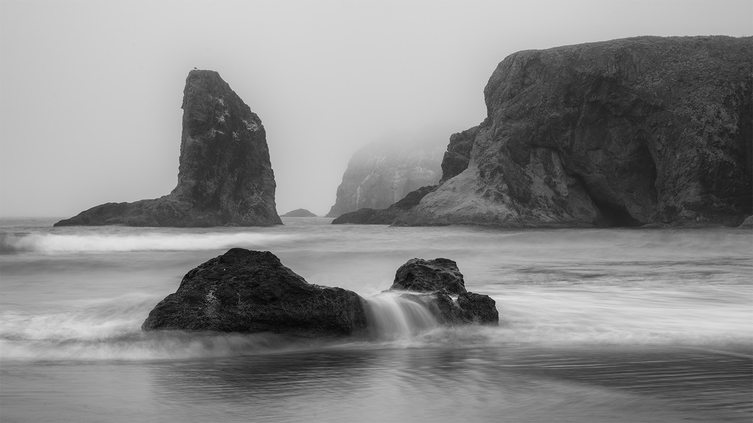
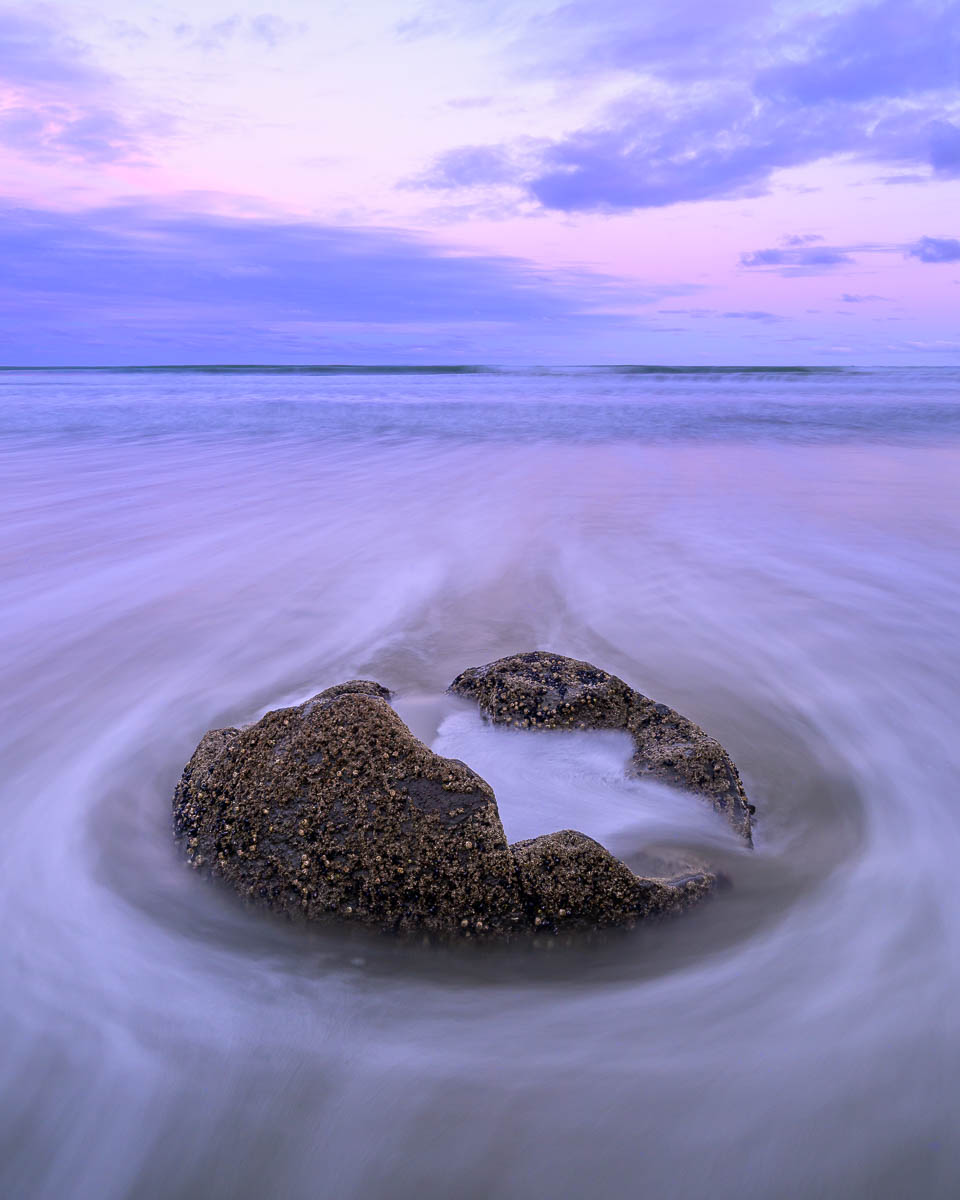
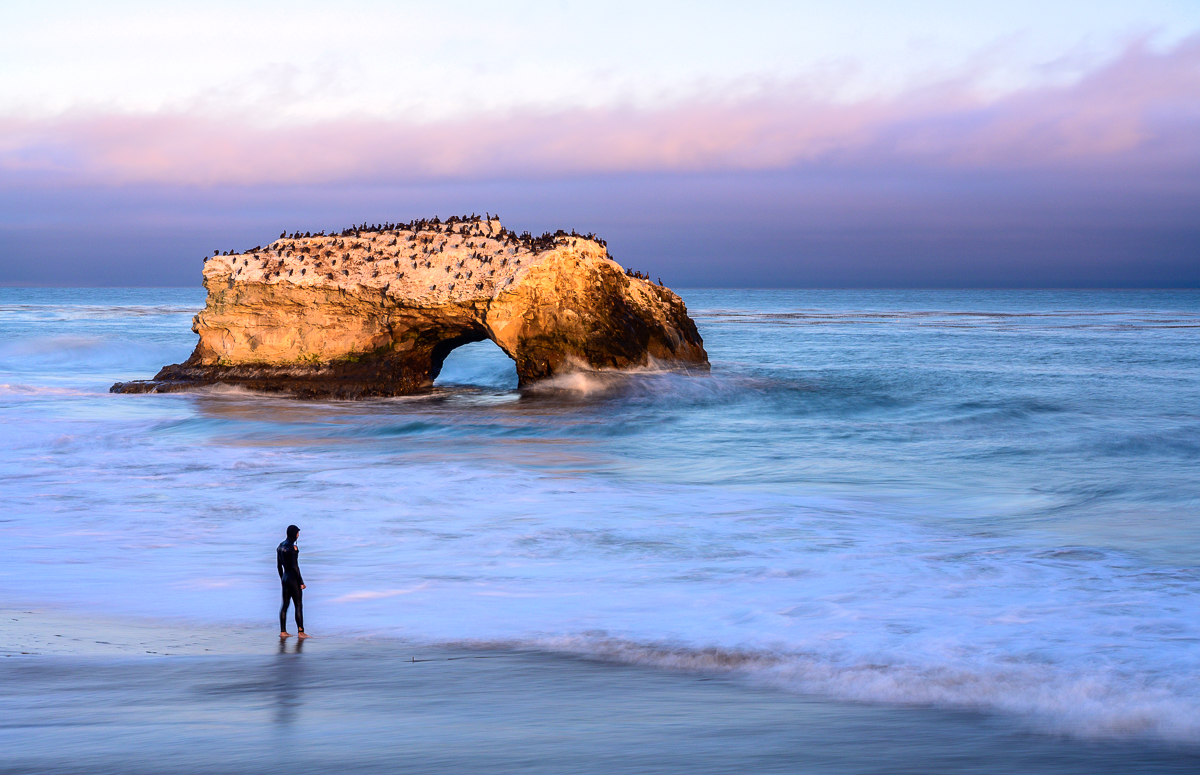
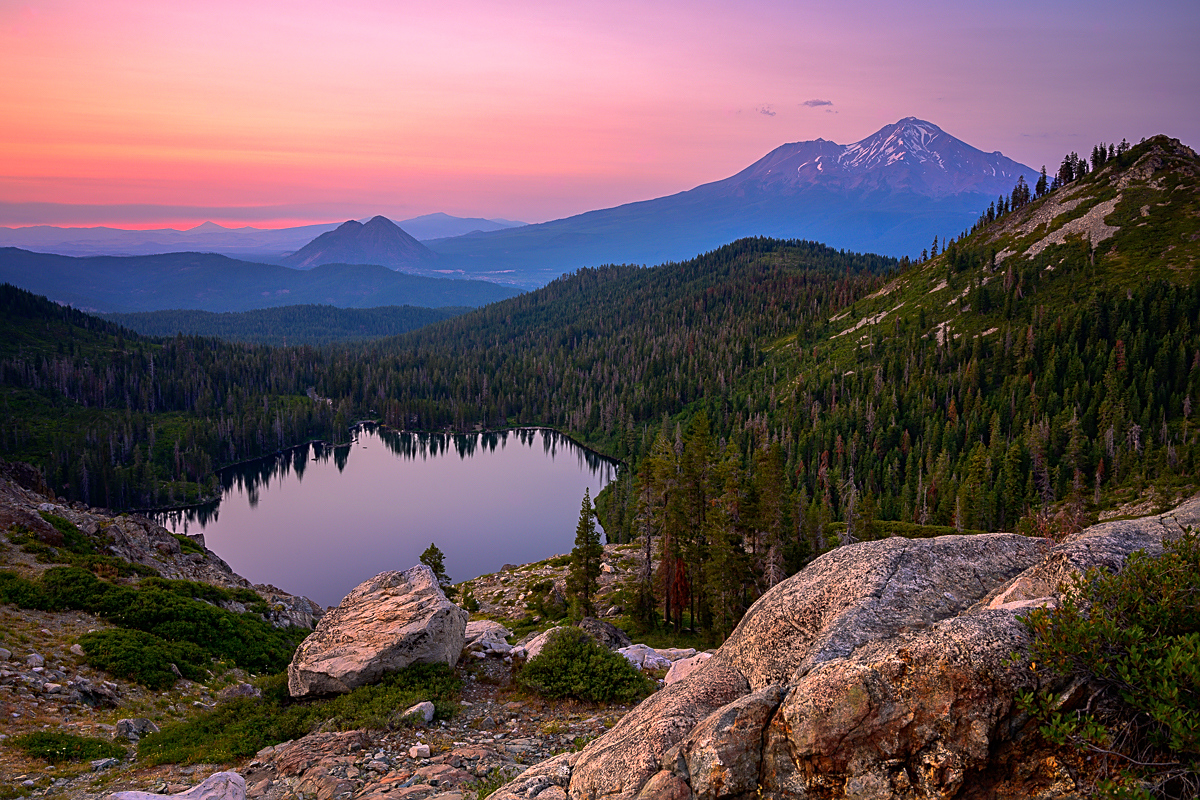
What a view! I kept coming back to this picture thinking about the coast, people and ocean. For me, I think there are two separate pictures here, one of the people looking for keepsakes in the sand the other of the ocean and sea stacks. I think it would have been different if they were looking out at the ocean taking it all in, as you were. Instead, they had their own agenda, looking for treasures. In my mind, if you separated the two that's way, you have two stronger images. |
Jun 14th |
| 93 |
Jun 22 |
Reply |
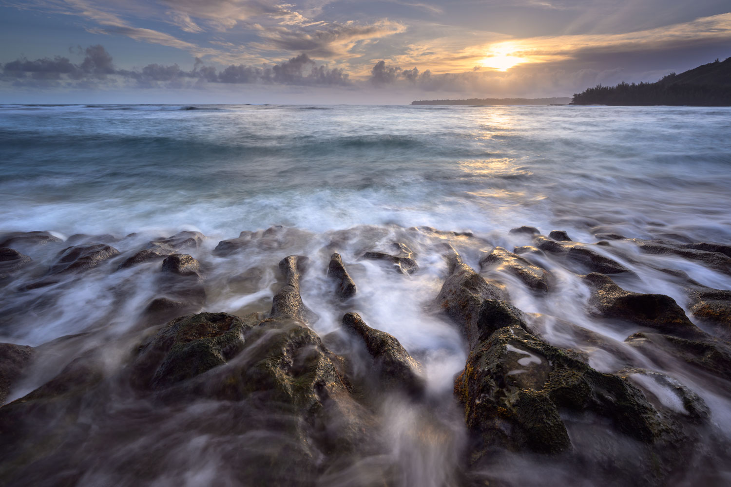
Thanks Ed! Appreciate the kind words. I did have to work for this one, it's a bit of a drive away from my house and a friend and I headed out to shoot the coast one day. We were really lucky that the waves were absolutely insane that day. The clouds earlier in the day were nonexistent, but we got a few for these shots. I'd love to live closer to a beach then my local grocery store - good for you! |
Jun 13th |
| 93 |
Jun 22 |
Reply |
Thanks Darcy! What is PID color? I honestly don't mind the contrail and hadn't thought much about it until Mark mentioned it! I may head back to PS and edit it out to see what it looks like without it. |
Jun 13th |
| 93 |
Jun 22 |
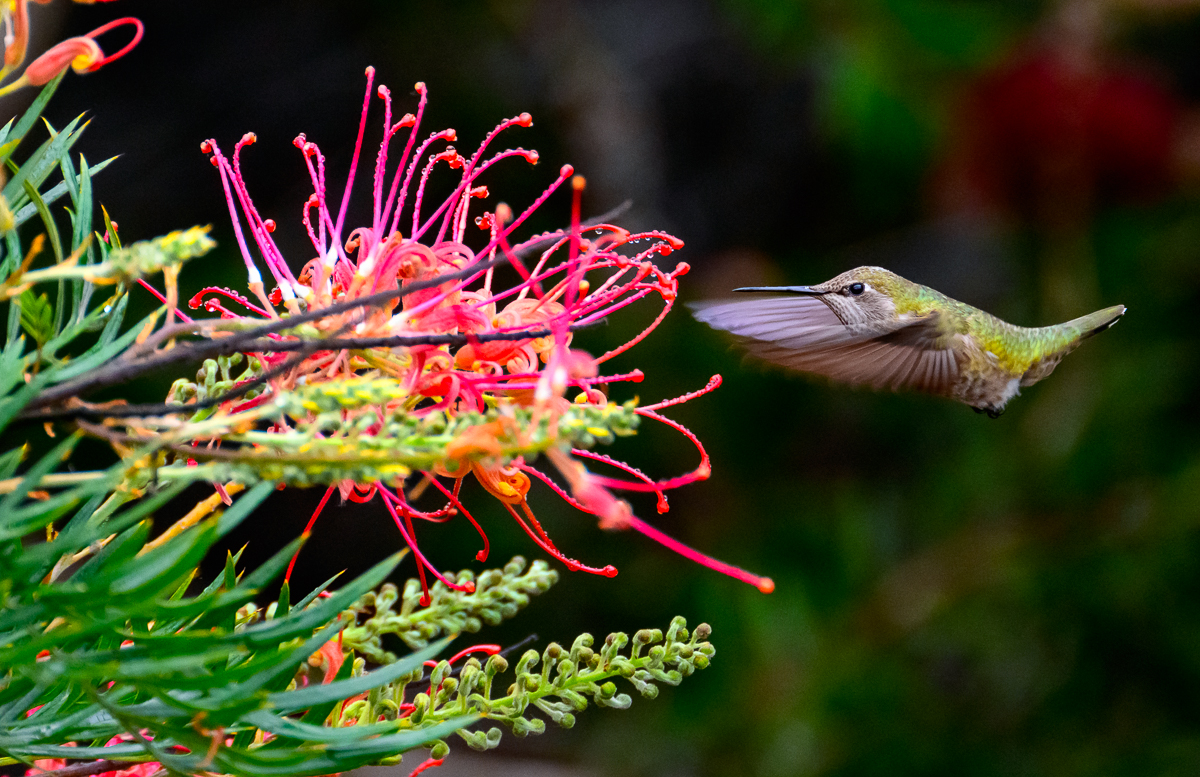
Comment |
Really cool shot! I like how the foreground leaf is out of focus and brings you back to the main subject. It is indeed well camouflaged. The one thing that pulls my eye away is the bud/plant on the top right and stays there for a bit. I feel it's just a tad too bright. Perhaps experiment with a radial filter to help keep the eye moving around more.
How did you ever see this little guy! |
Jun 11th |
| 93 |
Jun 22 |
Comment |
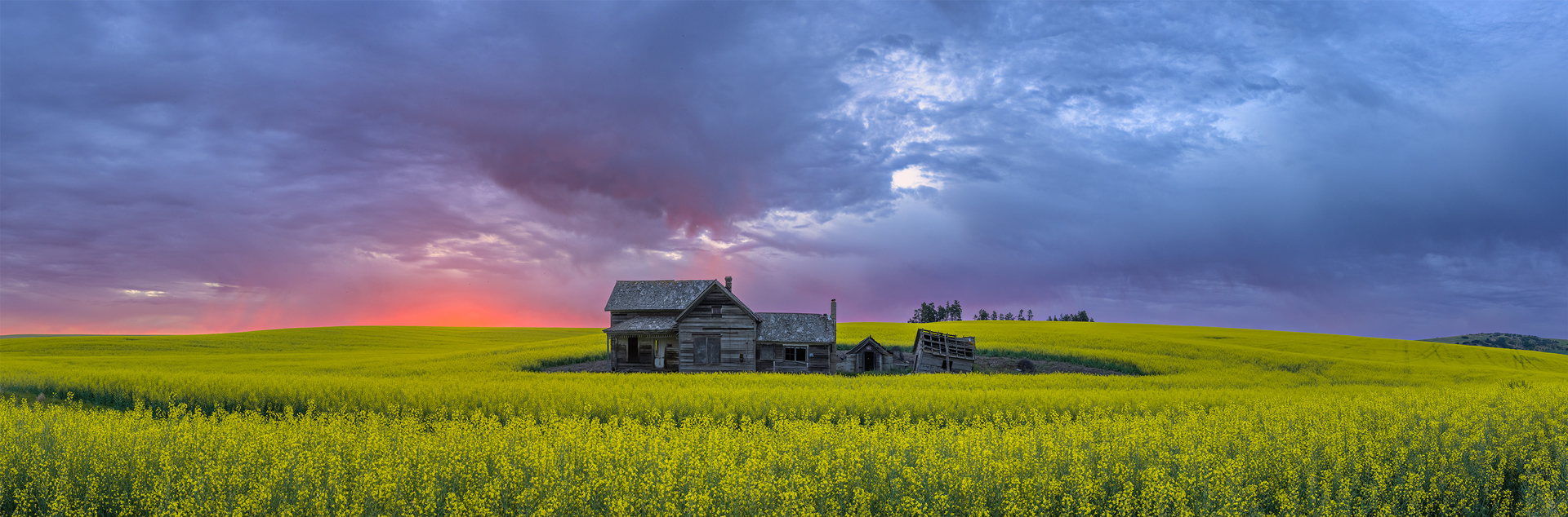
Paul, I can see why you like capturing these old barns so much. I agree, it's is amazing to think that people lived in this. As for the image itself, it's pretty great! I live your processing in it into B&W. Your tonal range is spot on, highlighting the sky, barn and foreground.
Very minor items, you might think of cloning out the dark bush on the right side edge if you print this. It's not a big distraction, but I see it there as my eye wanders. Also, I'd consider going to a 16x9 format and crop a tiny bit of the foreground out, I think by doing this, the viewer would focus on the barn and the awesome clouds more. I like all the items in the foreground, but to me, the clouds and the barn are the highlights! |
Jun 8th |
| 93 |
Jun 22 |
Comment |
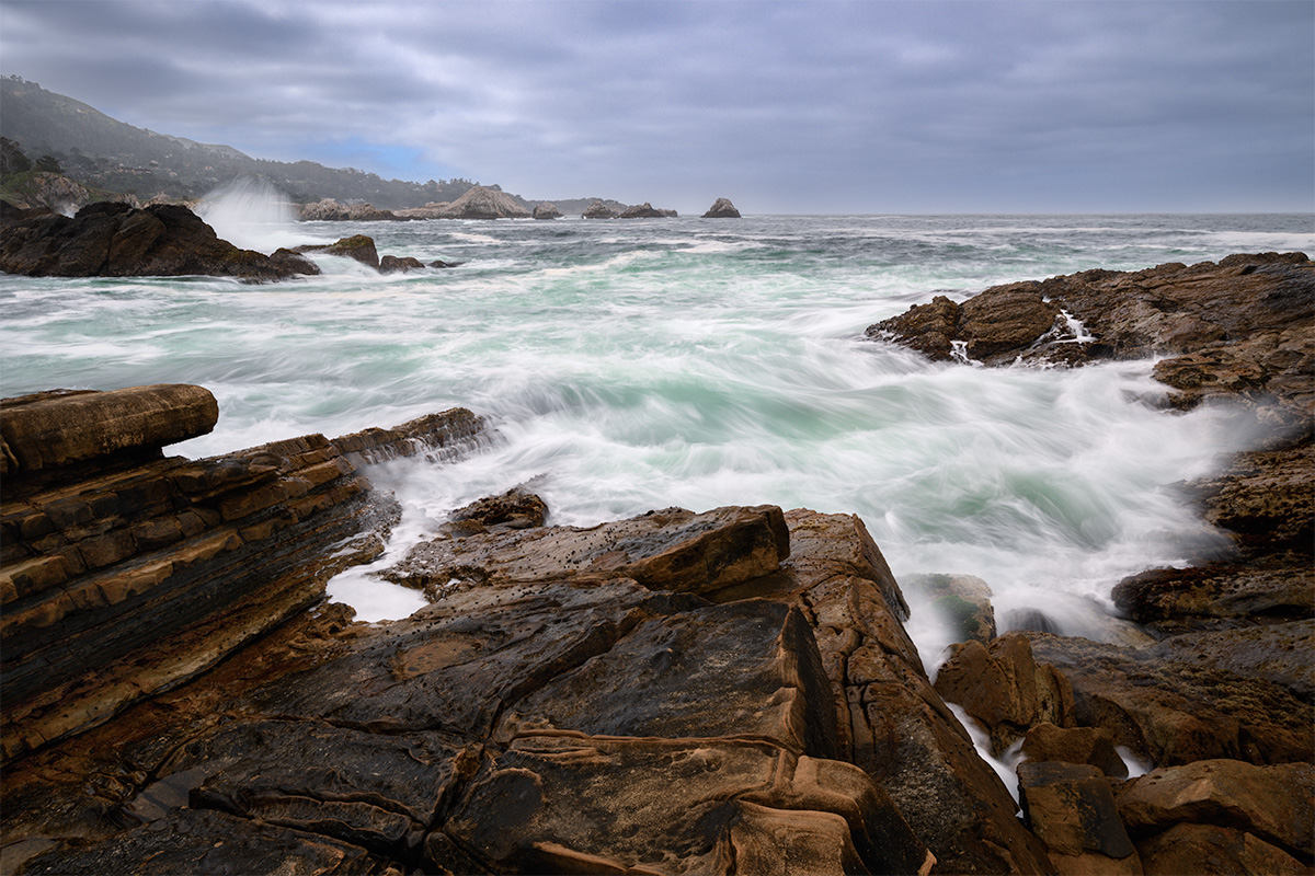
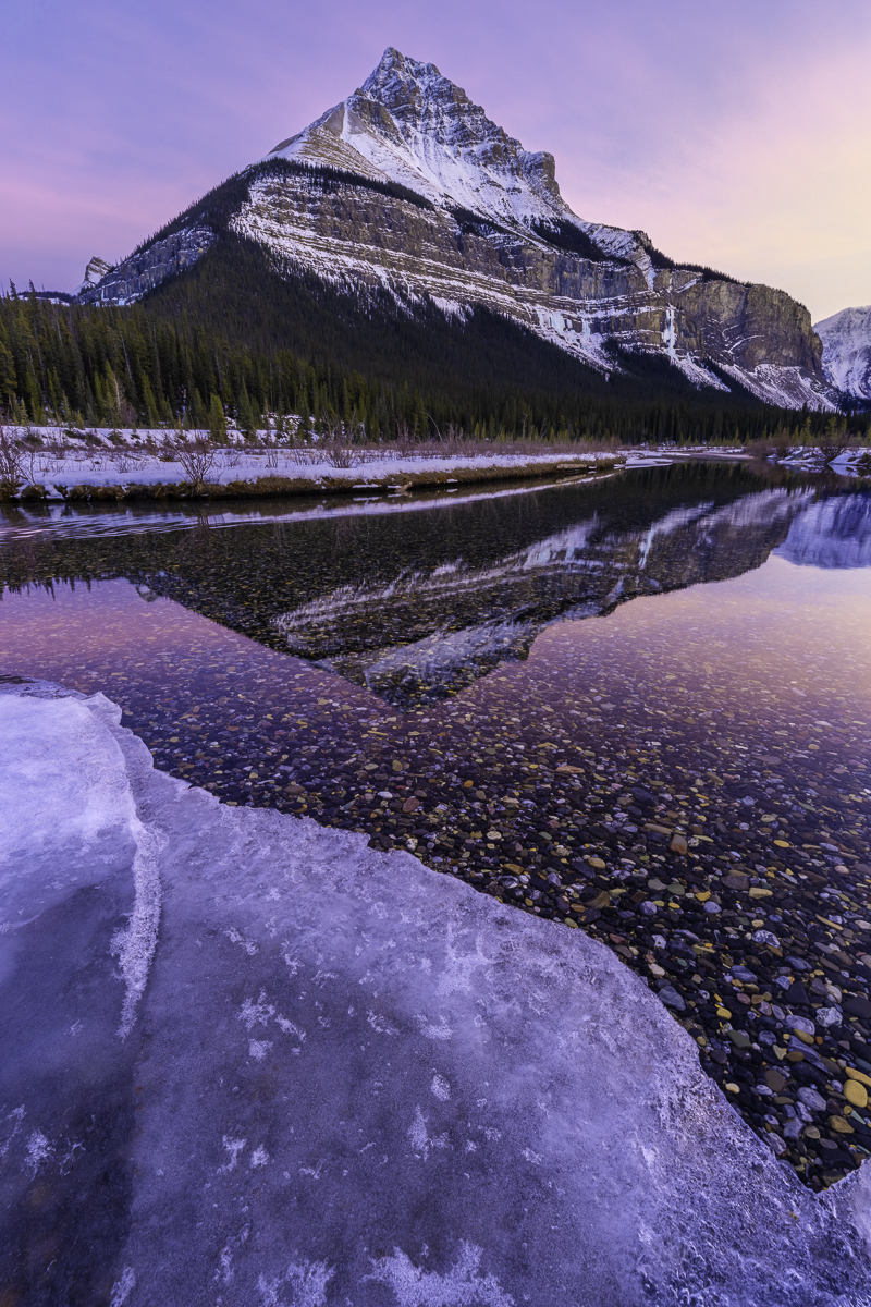
Mark, great decision asking your friend to walk up there as it definitely would have been a different shot if you hadn't, certainly not as strong. I like your composition with the large wall on the right and the overall framing has me looking all throughout the image. Nice job on the processing front, I like the how you increased the contrast with your adjustments, and the walls look great.
If there is one tiny thing (and I don't know if I would have thought this without seeing the original) is that the white in the lower third of the frame seems a tad to blue to me. |
Jun 8th |
| 93 |
Jun 22 |
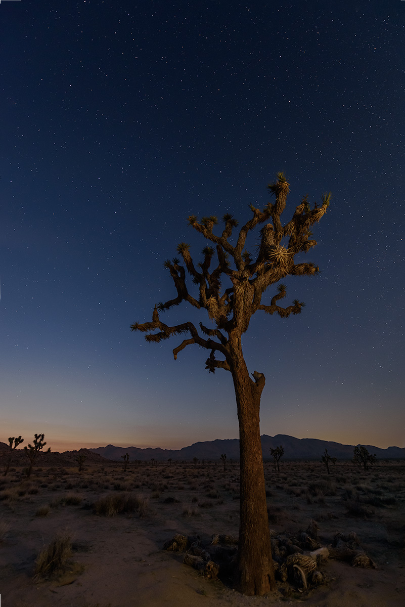
Comment |
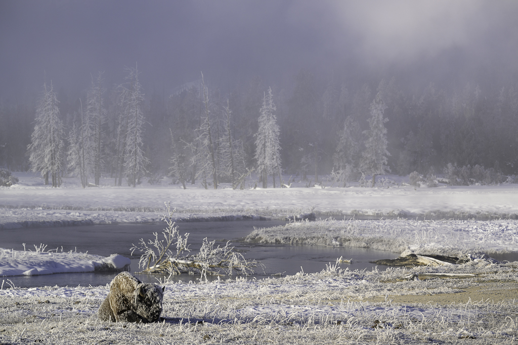
Hi Darcy, nice capture. Growing up in a cold environment, this is something you'd never see - camping chair in the snow! I like how you framed the tree to the left with the chair having room "looking" to the right. The slope going up from the left with the small angle at the trunk leads to the tree, then the chair. I too agree with you decision to clean up the snow a bit. Show is hard to process and thing you did a good job there whitening it just enough. I also like the color adjustment to the chair.
I agree with the crop Mark made, it feels like a stronger image by cutting off some of the top of the tree. I also think that the white vignette was a bit too strong, I kept looking at that instead of the subject, especially around the top of the frame. On the bottom, it looked like fog, so it wasn't as distracting to my eye.
|
Jun 8th |
| 93 |
Jun 22 |
Reply |
Wow - stumped you Mark! Thank you. I have to say, I probably have 100 shots from this day trying to get the "right" capture. I've considered blending three images that I like different parts of each, but haven't tackled that yet due to my PS learning curve. I've processed 2-3 images from this day multiple times and kept coming back to it to see what I could highlight in a positive way and this is the result! |
Jun 8th |
| 93 |
Jun 22 |
Reply |
Thanks Paul, it was a pretty epic day, so hard not to get some great shots! |
Jun 8th |
| 93 |
Jun 22 |
Comment |
Kelly, I can see why you stopped and took a picture of this, I would have as well!
I like how you focused on the foreground flowers and assuming since you shot at f/5.6 you wanted a shallow depth of field. I like the adjustments you did with the flowers colors, however I liked the clouds on the original a bit more. Given the shallow depth of field, I'm not sure you needed the Orton effect, but understand what you were going for here. One tiny composition suggestion I see the tree coming out of the post in the middle and if you shifted a bit one side or the other, it would eliminate that. |
Jun 1st |
6 comments - 8 replies for Group 93
|
6 comments - 8 replies Total
|