|
| Group |
Round |
C/R |
Comment |
Date |
Image |
| 93 |
Feb 22 |
Reply |
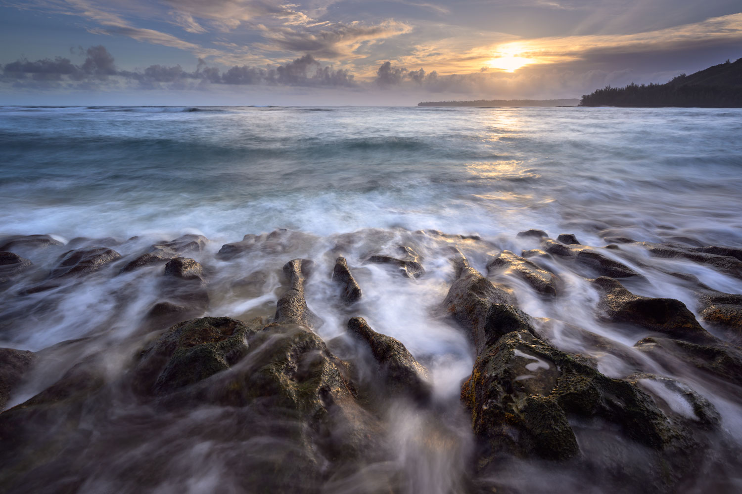
Thanks Darcy. Looking at this on my monitor right now, I can see how it is a bit too harsh in the foreground. Perhaps I warmed it up a bit too much. |
Feb 16th |
| 93 |
Feb 22 |
Reply |
Thanks Paul! |
Feb 16th |
| 93 |
Feb 22 |
Reply |
I am as well! Trying to get better at processing whenever I can and everyone's feedback helps to think of things a different way! |
Feb 16th |
| 93 |
Feb 22 |
Reply |
I am as well! Trying to get better at processing whenever I can and everyone's feedback helps to think of things a different way! |
Feb 16th |
| 93 |
Feb 22 |
Reply |
Thanks Ed, appreciate the feedback! |
Feb 12th |
| 93 |
Feb 22 |
Reply |
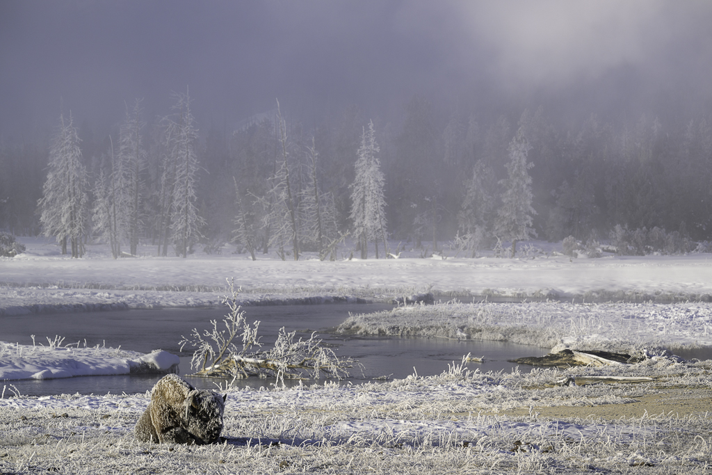
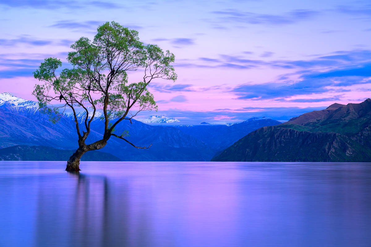
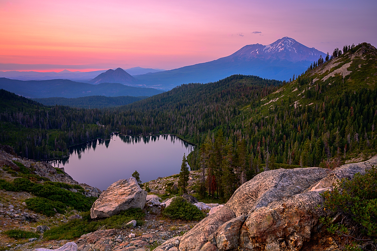
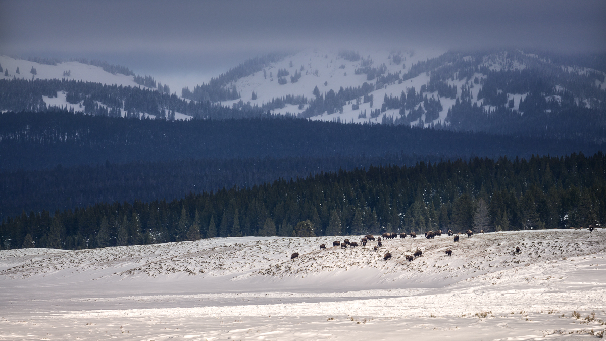
Thanks Mark. I too wish the bison were a bit closer, but alas, they were far away! I like the cropping into a square, I hadn't thought about that and appreciate that suggestion. I warmed the snow as that's how it was, but can see it either way. I went back and forth a lot on many of the components, including the snow. Thanks! |
Feb 12th |
| 93 |
Feb 22 |
Comment |
Ed, I too like your framing and the panoramic view. I like the edits Mark did on it to make the houses "pop", it helps to highlight the wonderful colors. I like the soft lighting on it, highlighting the mountains in the back. Given this where you live, have you considered setting it up and doing a long exposure with an ND filter? I know you said it was windy that day, but might be great to see the reflections in the water via a long exposure, or perhaps on a very calm day. Don't know if it would work, but that's the fun of photography! |
Feb 12th |
| 93 |
Feb 22 |
Comment |
Paul, I really like this image. The B&W tones are quite strong across the image. The one thing I keep looking at and would like to see is the fence to the right. I don't know what was there, but I keep thinking about if you were to shift the barn a bit to the left and capture more fence on the right, it would minimize some of the "clustered" fences on the left. I also think it would help highlight the great clouds you had on the right. This is obviously an "if" scenario, but what I'm thinking about as I look at it. One minor thing that I think you can adjust now is the fence post in the middle, my eye keeps going back to it as it's so bright, I think by burning it in a small amount would be be helpful (to me at least)! |
Feb 12th |
| 93 |
Feb 22 |
Comment |
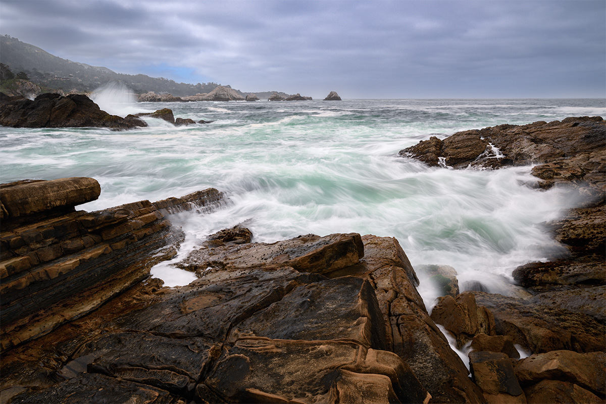
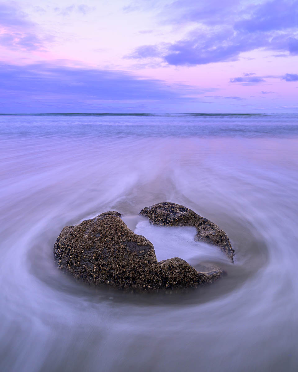
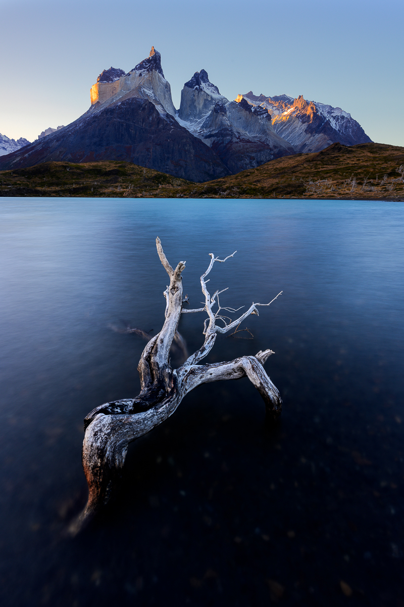
Mark, I really like what you've done with your post processing. The reflection is interesting and I kept looking at it trying to figure out what it was. The warmth of the reflection vs. the cold of the sand is really nice.
In regards to your crop, I actually prefer the full frame. My eye stops at the reflection, where with the full frame, I look around that entire image. I also think by keeping it in, it balances out the left side of the image.
One think that I'd like to see is just a bit more space on the second rock on the right, I like the lines there that start circling, but the just stop at the edge of the frame.
All that said, I can see why you like this image, the first time I looked at it was was trying to figure it out and I liked that.
|
Feb 12th |
| 93 |
Feb 22 |
Comment |
Hi Darcy, agree with Mark on a lot of his points. aside from looking at this from different angles as Mark suggested, I was also going to suggest cropping the top -- it just makes it stronger. I personally like the lines you have in the road and gravel at the bottom of the frame.
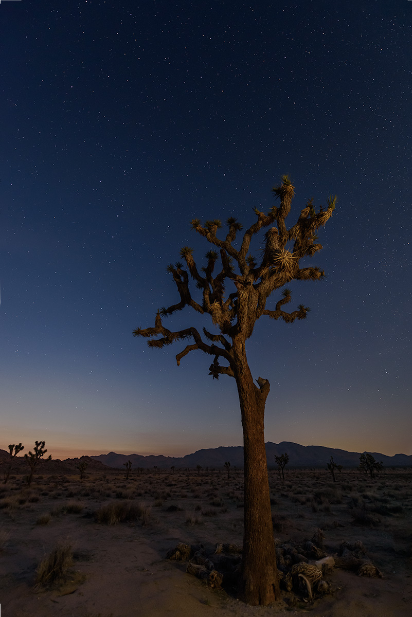
I was also a bit distracted by the guard rail "red", and by toning it down, I don't lookout it as much. Your edits are good, but think bumping up the contrast just a bit on the cactus makes it much stronger. I think I'd also do a gradient filter on both the top and bottom to darken each just a tad and perhaps a radial filter as well darkening the edges to focus on the cactus. |
Feb 12th |
| 93 |
Feb 22 |
Comment |
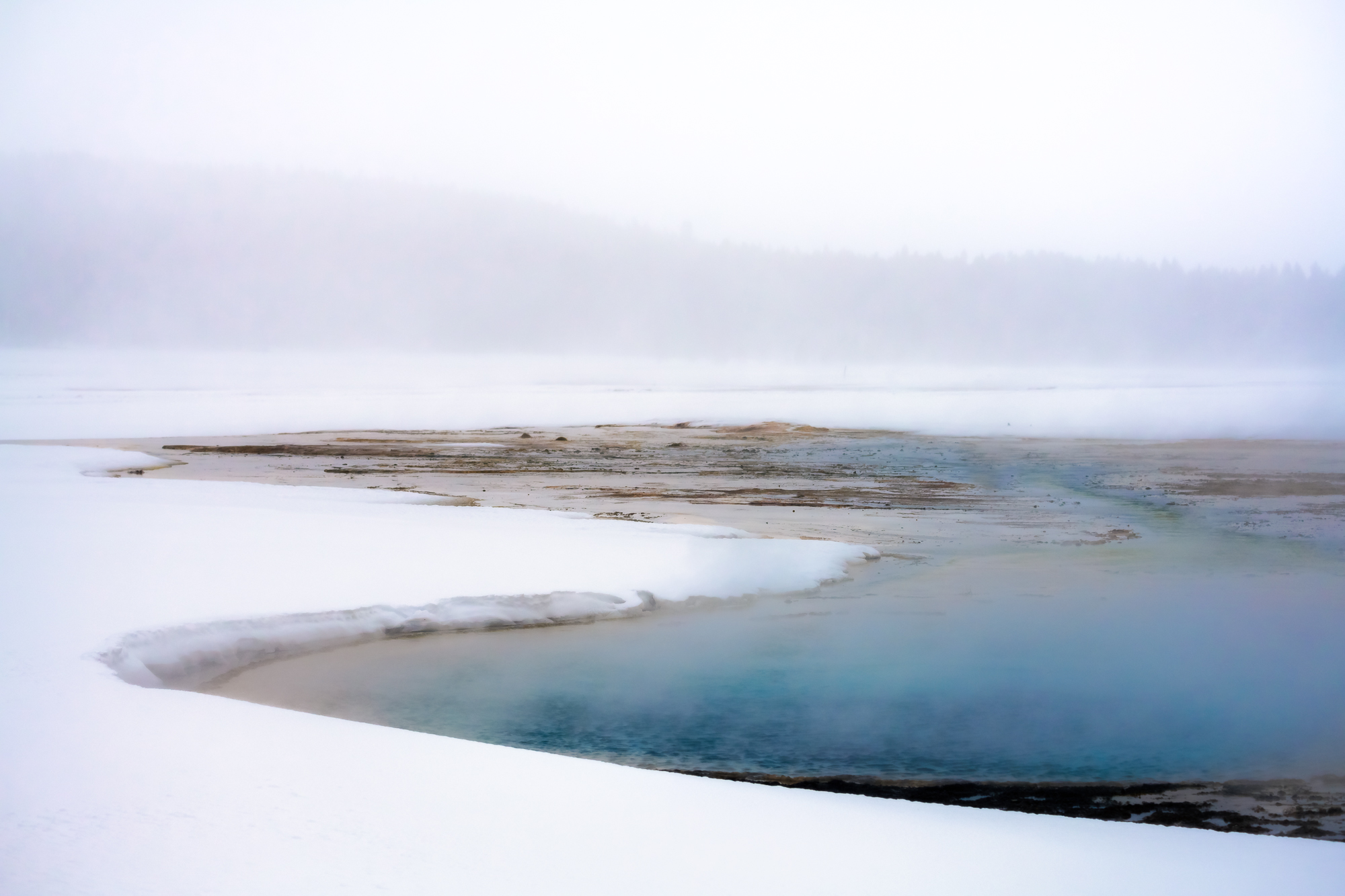
I too like the edits you've made to the green. Personally, I prefer the clouds in your original as it's a bit moody, that said, it is personal preference! I like how you lightened the tips of the foreground shrubs. Like Ed, it doesn't bother me that yet entire pond isn't there. I like the reflections you have in the pond quite a bit too. Nice image! |
Feb 12th |
5 comments - 6 replies for Group 93
|
5 comments - 6 replies Total
|