|
| Group |
Round |
C/R |
Comment |
Date |
Image |
| 43 |
Mar 26 |
Reply |
Thanks, Lane. It wasn't intentional to have the complementary shapes, but it sure worked out well! |
Mar 29th |
| 43 |
Mar 26 |
Reply |
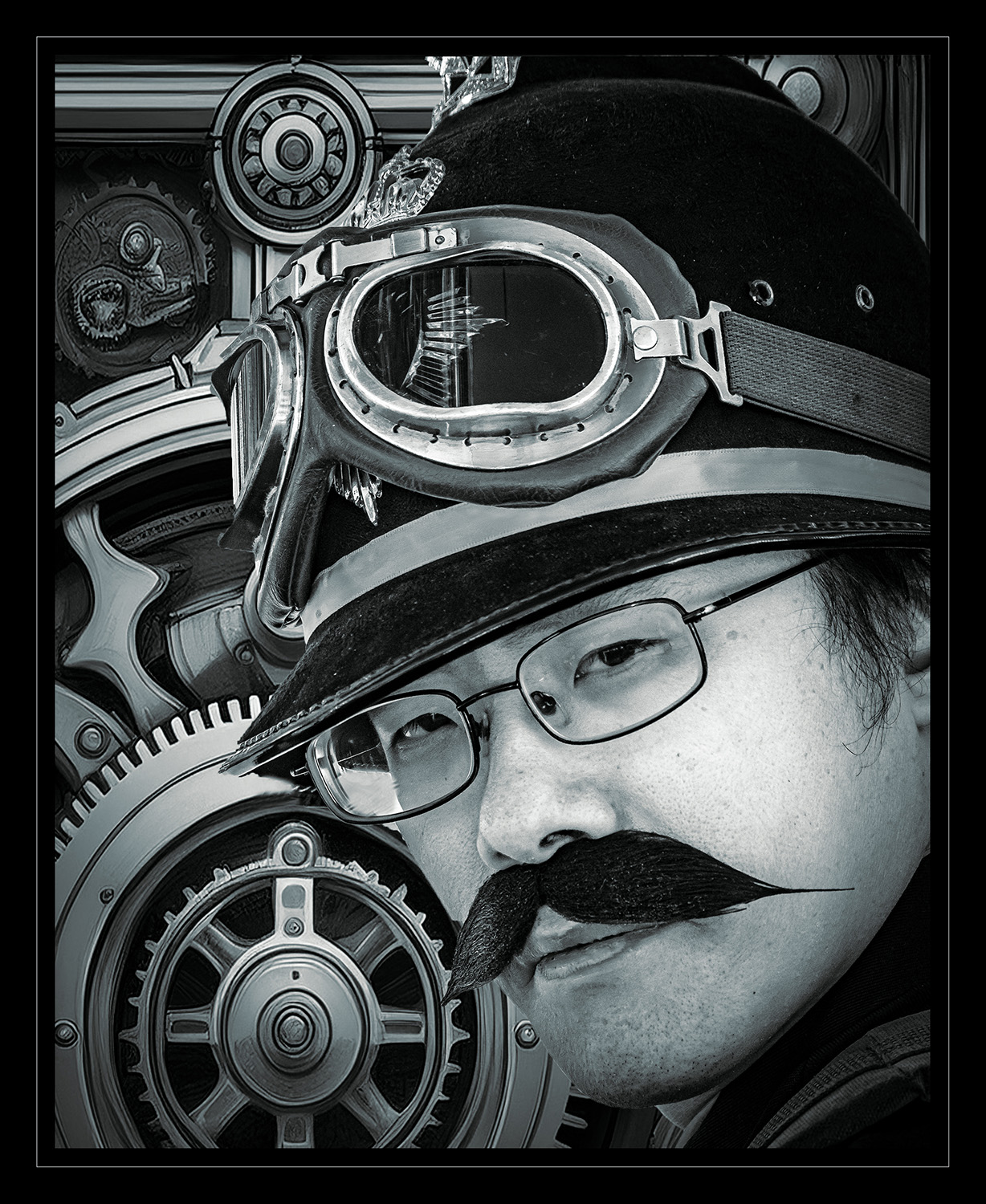
Thanks, Mark. I was pleased with how it came to be. I did use layers to put these elements together. I had the image of the person open, opened another tab in photoshop to generate the AI background, then cut out the shape of the model's face and helmet, and dragged him onto the background. Then I made the global tone adjustments so it matched as closely as I could get it.
Steampunk is kind of weird, but fun! |
Mar 29th |
| 43 |
Mar 26 |
Reply |
You're 100% right, Harley. There is a lot of chaos in this image. Part of it is the feel of the steampunk culture, the other part is my inexperience with putting subjects over a manufactured background. It would be worth the time to work on getting everything to match up in the lighting of the elements. |
Mar 29th |
| 43 |
Mar 26 |
Reply |
Thanks, Max! That was his moustache. Only the background is artificial. He put a lot of thought and effort into his outfit. He was working hard at selling it, too. He was a good sport and posed for a bunch of us. |
Mar 29th |
| 43 |
Mar 26 |
Reply |
Thanks, Bruce. We sure had a good time at the event. I'll admit, I really don't "get" steampunk, but the people are having a good time doing it and that usually translates well into photography. They do love having their pictures taken! |
Mar 29th |
| 43 |
Mar 26 |
Comment |
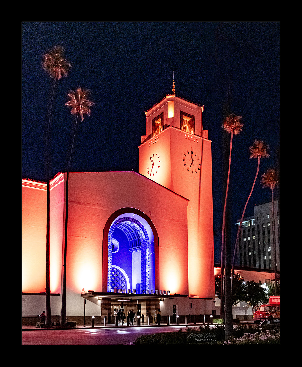
This is a really interesting piece, Bruce. It almost looks like a diorama. The elements of the diner's interior and the scenery outside are dream-like but you can see that the people inside are real. I love the choice you made in dealing with a tough lighting situation by taking it into the ethereal. You nailed the retro feel with the colors. In the right category, I think this should be a hit with your club! |
Mar 29th |
| 43 |
Mar 26 |
Comment |
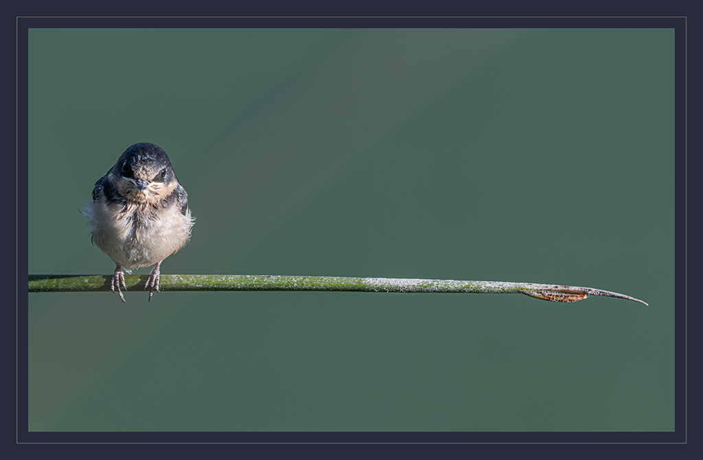
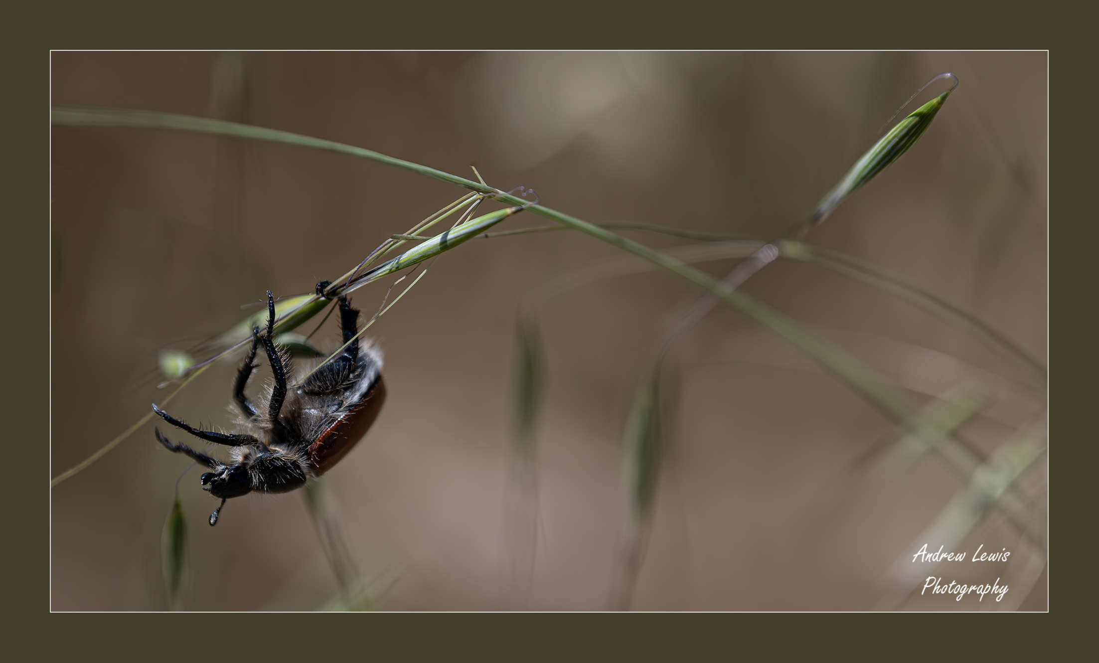
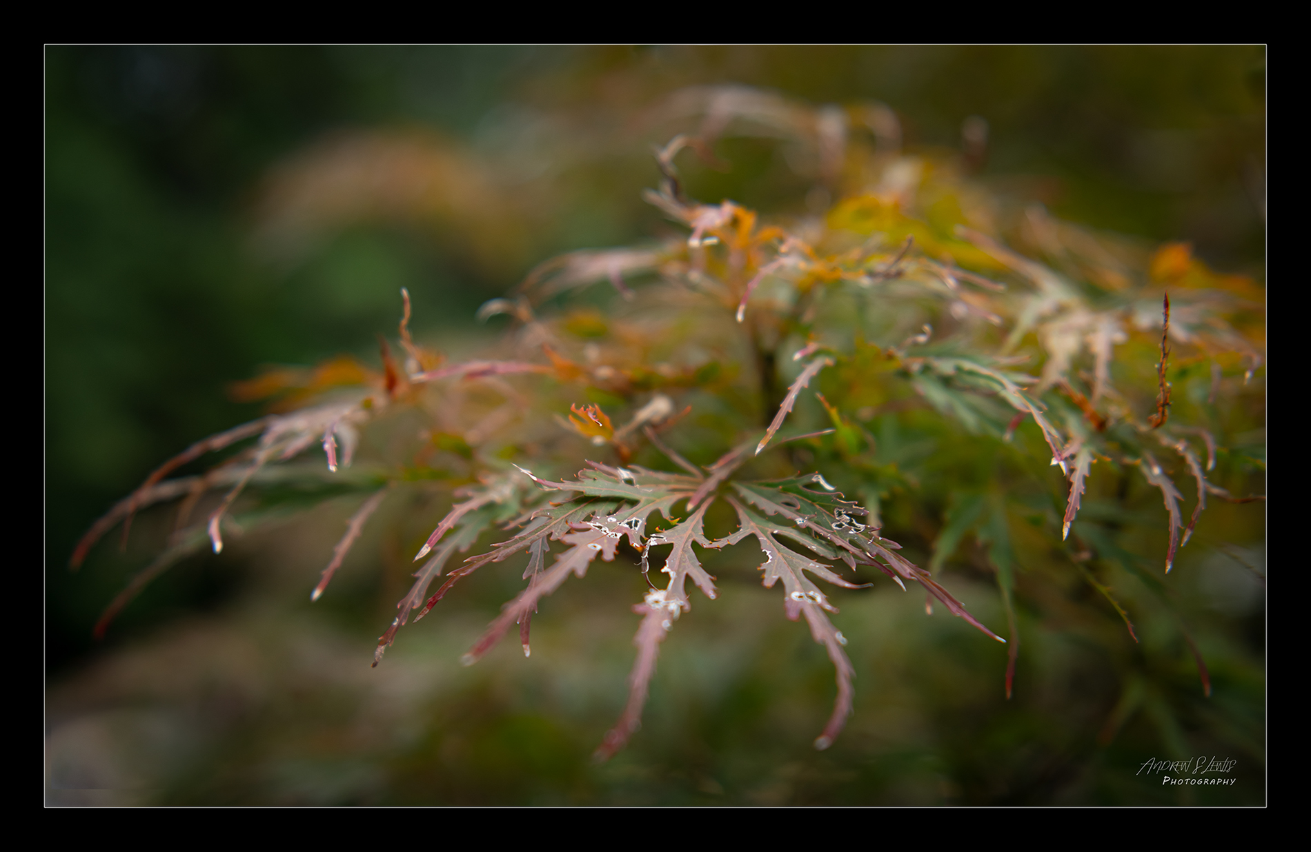
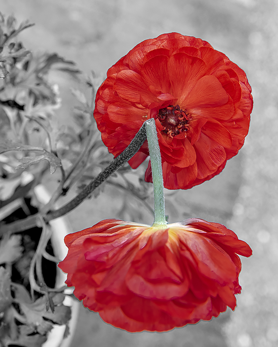
Nice macro shot, Harley. You did a great job at capturing the details in the flower while handling the exposure well. The detail in the shadows is well represented and the edge lighting from behind frames the stem and blooms well. I like how you reversed the image. It's funny how just a simple thing like this makes a difference in how the image hits, but I like how this worked out. The colors work really well together and make this a very pleasing image. |
Mar 29th |
| 43 |
Mar 26 |
Comment |
I hope you're feeling better, Mark. I'm sorry to hear you were under the weather.
This image has a lot going for it. That's a gorgeous blue in the glass and it works well with the color of the items inside. The lighting was really well handled. I love the shadows created by blinds and you did a great job capturing the texture of the surface of the table. Even the blue coming through the glass and projecting on the table is spot-on. You've got great directionality of light and the shadows define the texture of the items very well! |
Mar 29th |
| 43 |
Mar 26 |
Comment |
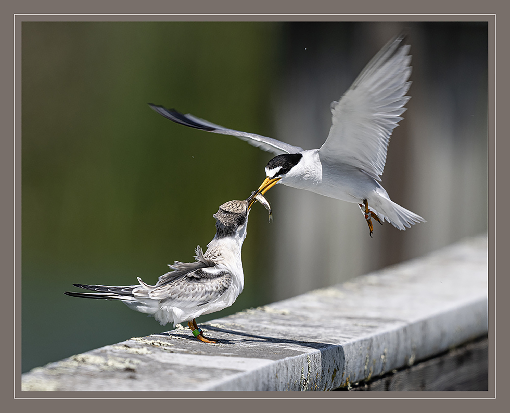
This is a fun image, Lane. You've got a lot of compositional elements working for you. Three birds is a strong component, and the lines of the pattern at the bottom are pleasing as well as acting as leading lines. You've done a great job with the bokeh in the background. It really helps the birds pop in the frame. I'm with the group on bumping the contrast a skosh here. Nice work! |
Mar 29th |
| 43 |
Mar 26 |
Comment |
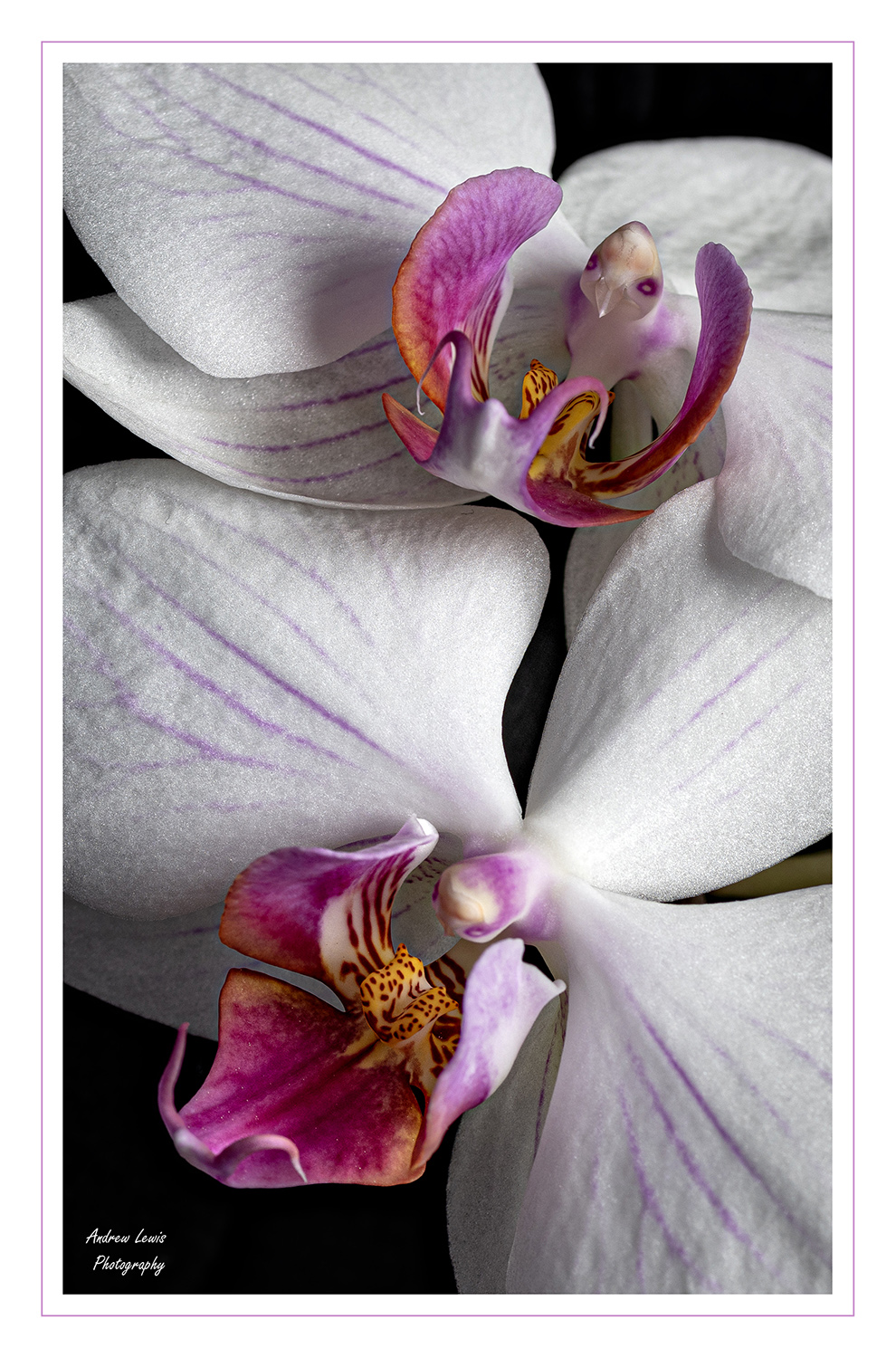
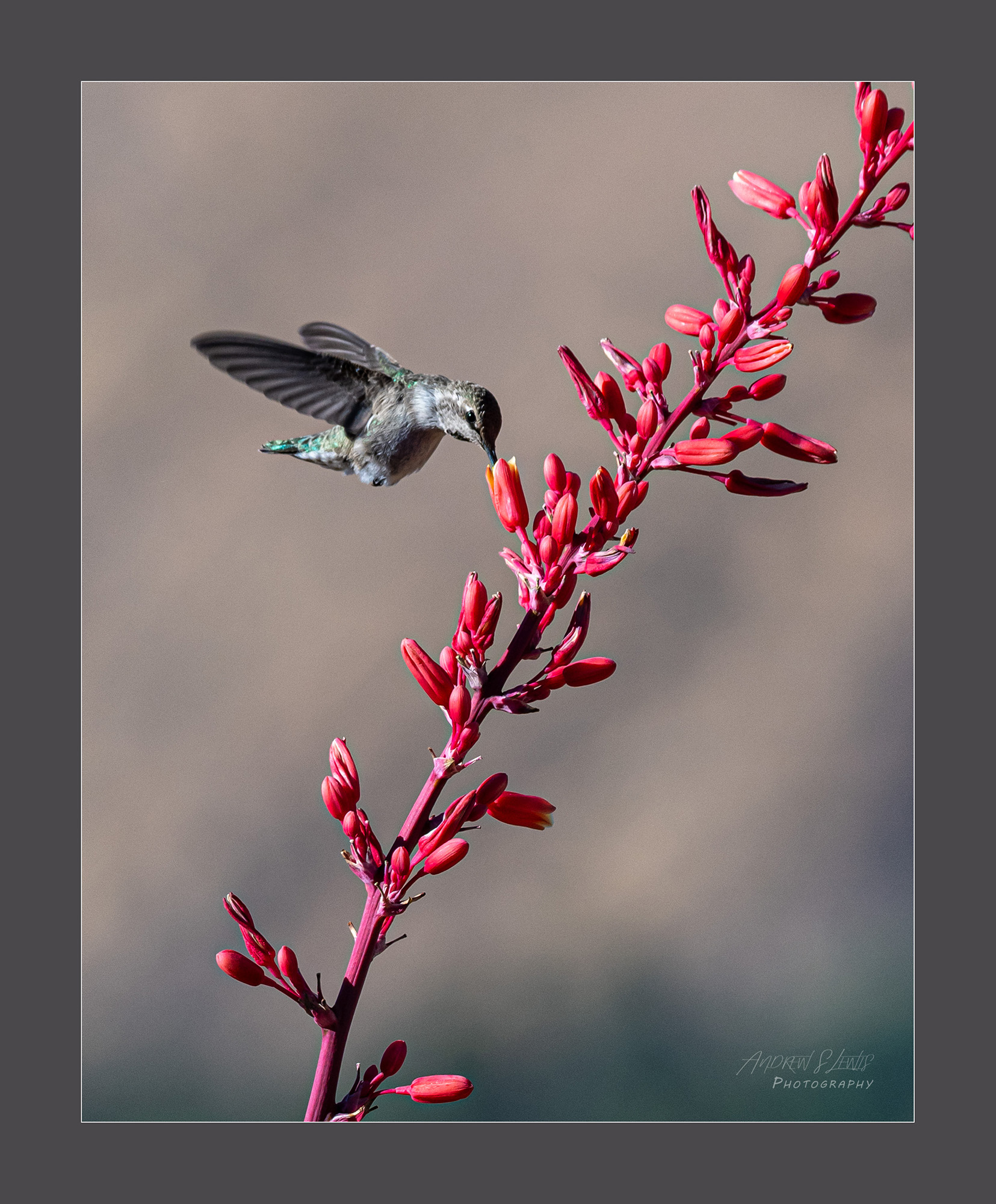
Welcome to the group, Max. It's nice to have you with us. I like your image. I've seen flowers like this. I think the hummingbirds go nuts for them! Nice work on positioning the flower in the frame. Your choice to make it a long, vertical frame was a good one. It really accentuates the shape of the flower and the stems.
The only changes I would suggest would be to bring down the saturation of the image. The haloing was mentioned, I think the image was a little overcooked in post processing. The border could also come down in brightness, as it is competing for attention with the subject. I like how you chose red to tie into the image.
You put a lot of thought into this work and it shows! |
Mar 29th |
5 comments - 5 replies for Group 43
|
5 comments - 5 replies Total
|