|
| Group |
Round |
C/R |
Comment |
Date |
Image |
| 43 |
Jan 26 |
Reply |
I appreciate your insight, Lane. It was a busy day! |
Jan 29th |
| 43 |
Jan 26 |
Reply |
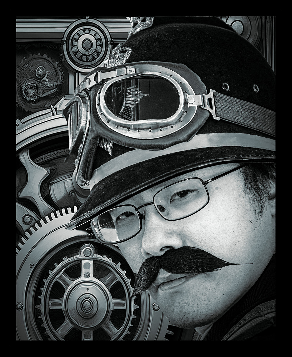
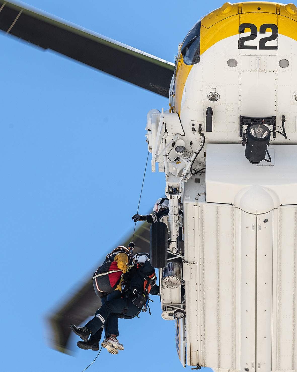
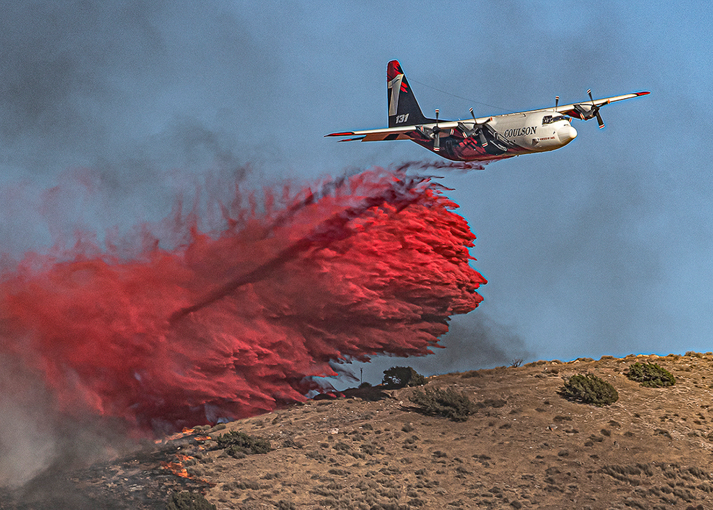
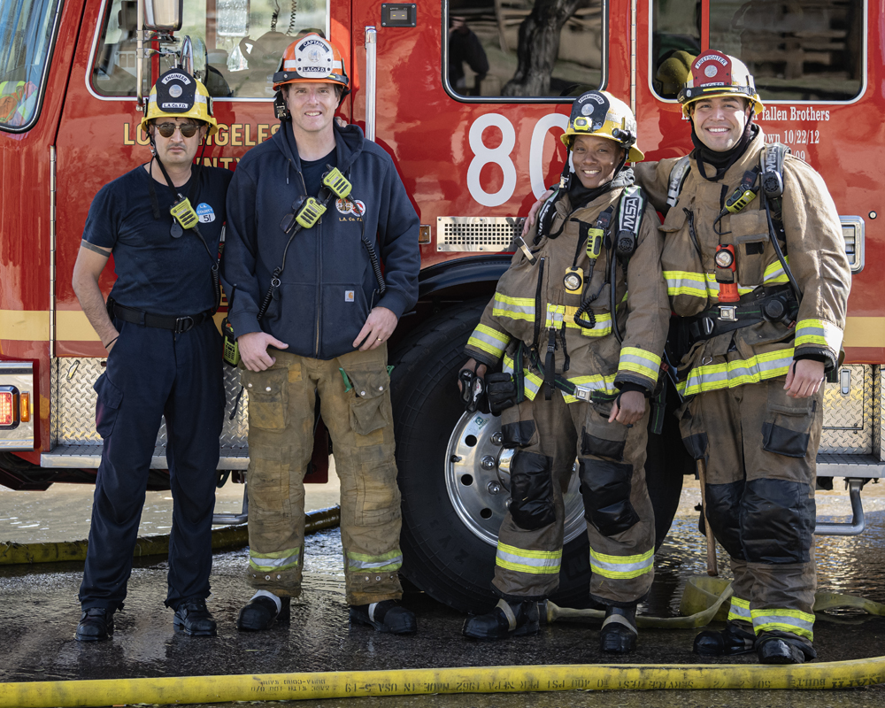
Thanks, Harley. The shapes you're seeing in the background is a chain link fence between the parking area and the railroad tracks. I traded contact information with the captain and have already sent them prints of a group shot they asked me to take in front of the engine, and I sent digital copies of my favorites from the day. The engineer hooked me up with a hoodie. Remember the 70's show, "Emergency!"? Station 51 is a real station now, and the engineer used to work there. I have an LA County Station 51 hoodie.
I agree with you, I'm sure these people are out there. |
Jan 20th |
 |
| 43 |
Jan 26 |
Reply |
Thanks, Bruce. If only our subjects would cooperate and do photo-worthy things when the light is best, right? Maybe next time. :-) |
Jan 20th |
| 43 |
Jan 26 |
Reply |
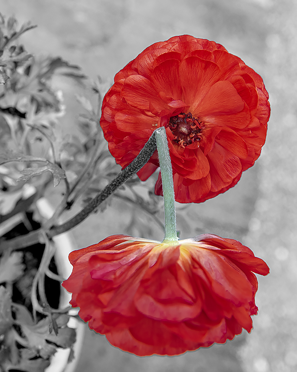
Good catch, Mark. That area is super dark, I like it with the shadows opened up. |
Jan 20th |
| 43 |
Jan 26 |
Reply |
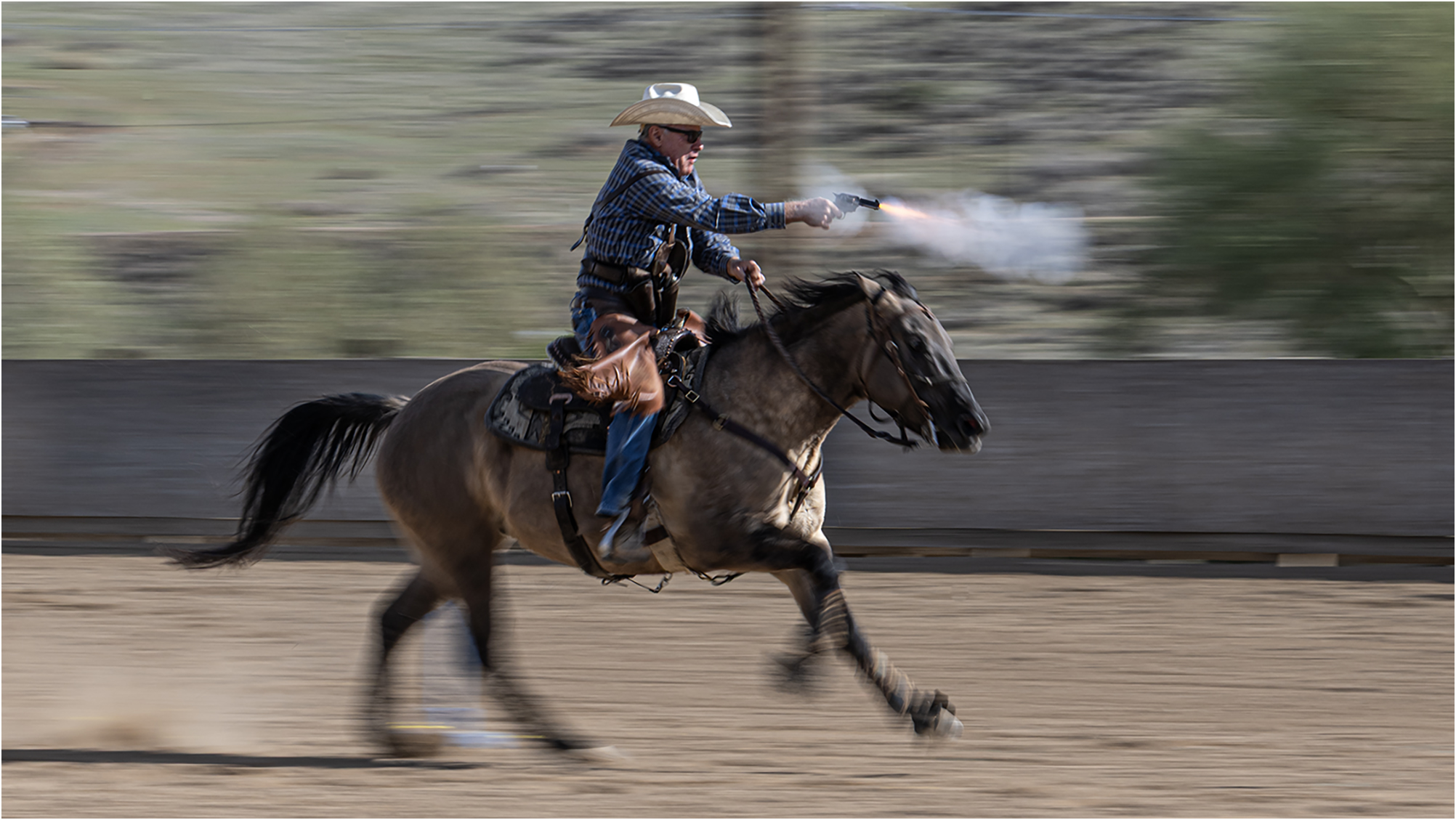
Thanks, Bunny. All the elements lined up for me that day. That's for sure! Oddly enough, I do take requests! I'll find my favorite from the mounted shooting practice and share next month. Stay tuned! |
Jan 20th |
| 43 |
Jan 26 |
Comment |
Ok, I'll get the pun out of the way early. This one came in out of left field, Harvey. This image shows so much creativity and imagination. I was not expecting the combination of the baseball and music. Your explanation was perfect. I like how you have the players facing into the center of the frame. It keeps our eyes within your image. The tilt of the music adds a dynamic element to the story and the hand in the center, providing a platform for the players, really adds depth to your piece. I love the idea of using the silhouettes of the players. It's almost as if they're notes in the song.
You really knocked this one out of the park! (Yeah, I had one more) |
Jan 20th |
| 43 |
Jan 26 |
Comment |
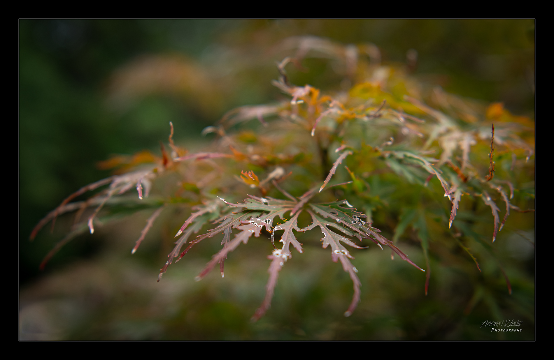
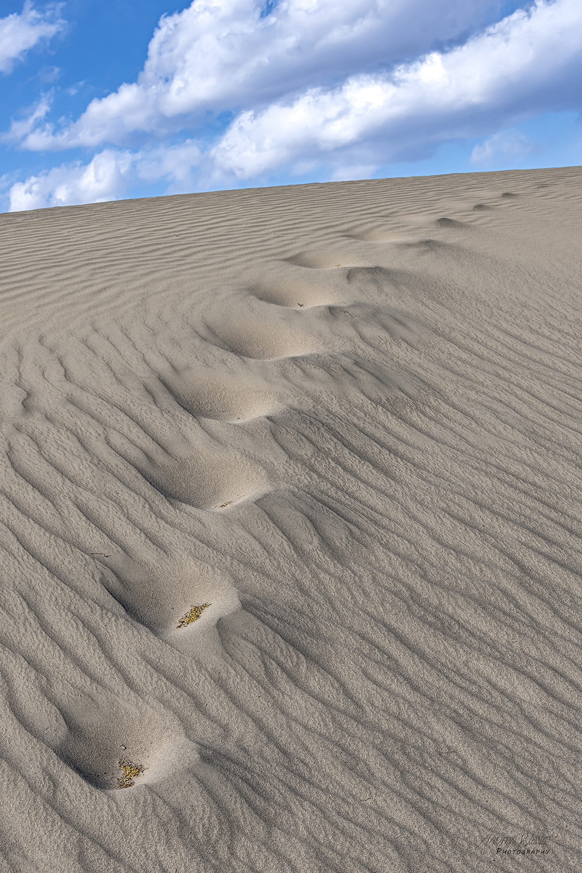
This is really well done, Mark. The image is simple where it needs to be and intricate where it should be. Your presentation is clean and uncomplicated. The focus and exposure really show the detail in the lemon's peel and leaf structure. You nailed the composition as well. You were able to keep the highlights from getting blown out yet you've got good detail in the shadows. Way to go! |
Jan 20th |
| 43 |
Jan 26 |
Comment |
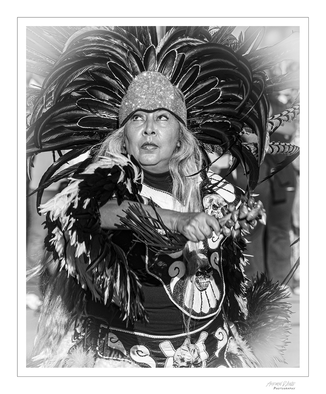
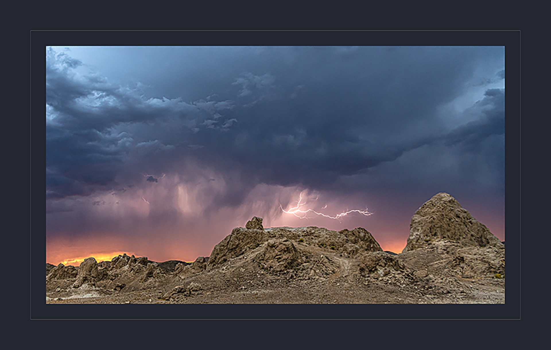
All of your choices paid off here, Bruce. The black and white treatment really sets the mood. Getting low was exactly what you wanted to do to show the power in the figure. It also cut the distracting clutter of the trees, so we focus on the sculpture. You've given the sensation of the gazelle taking flight. This is quite a tribute to this piece of art. |
Jan 3rd |
| 43 |
Jan 26 |
Comment |
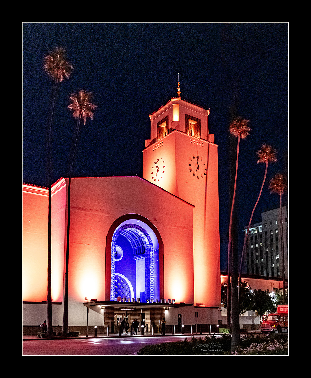
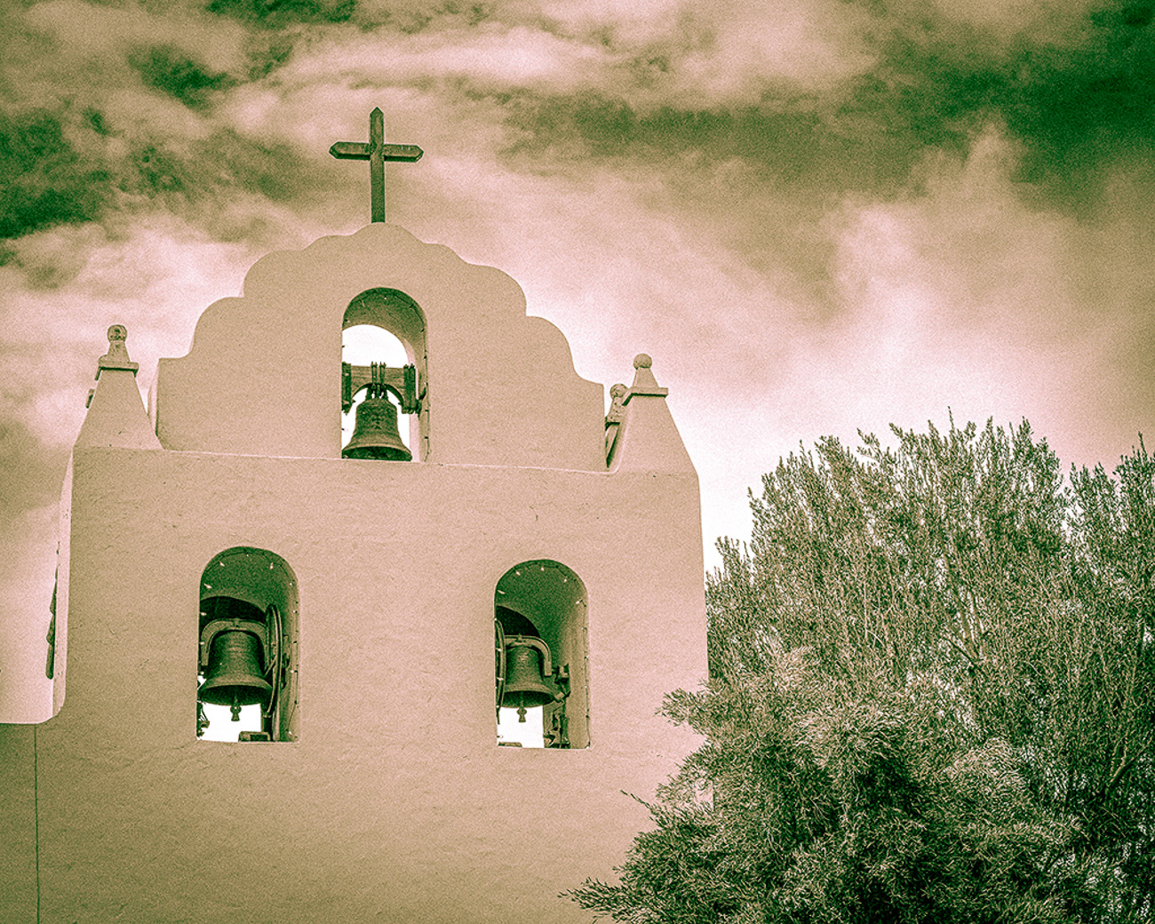
There is so much to like about this image, Bunny. You handled it very well. The exposure is well done. You've got good detail in the shadows and the highlights are not blown out. You've made great use of the textures in the surfaces and the patterns in the architecture tell a wonderful story. Black and white was a great choice for this scene. Very well done! |
Jan 3rd |
4 comments - 5 replies for Group 43
|
4 comments - 5 replies Total
|