|
| Group |
Round |
C/R |
Comment |
Date |
Image |
| 43 |
Dec 23 |
Reply |
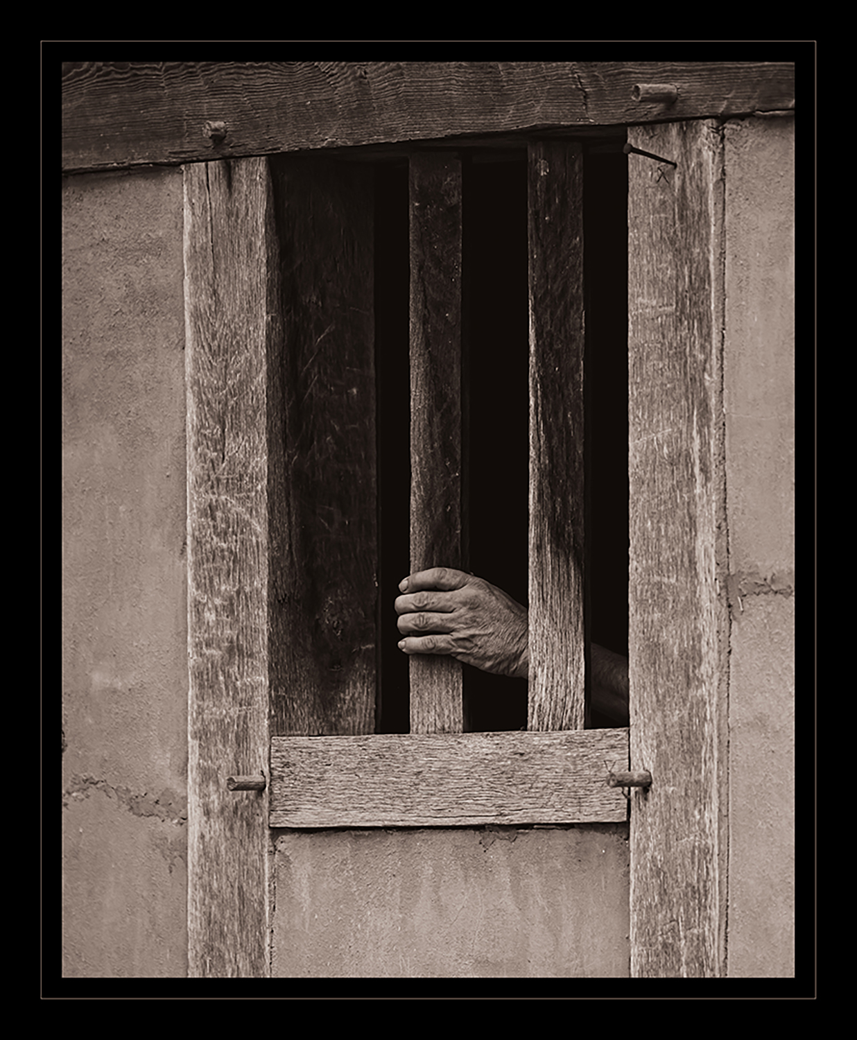
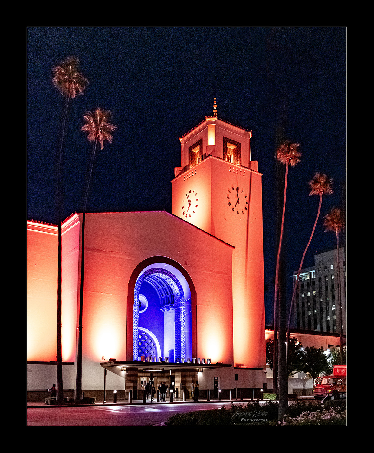
Thanks, Bruce. I have a hunch someone knew what they were doing when they chose the lighting scheme for the exterior of the station. I'm guessing part of my brain recognized the scene and told me to shoot it. The noise almost adds a filmish feel to the frame, adding to the nostalgic element. |
Dec 24th |
| 43 |
Dec 23 |
Reply |
Thank you, Leo. The light and dark contrast does add a bit of a challenge. The original image had considerable noise, but camera raw was able to take care of most of it. I appreciate your observations. |
Dec 24th |
| 43 |
Dec 23 |
Reply |
Wow, Harley! I really had to glance back and forth at the images side by side to catch what you did. Your changes are subtle, but now I can't unsee them. I really like the aspect changes you made. I appreciate your angle and input. |
Dec 24th |
| 43 |
Dec 23 |
Reply |
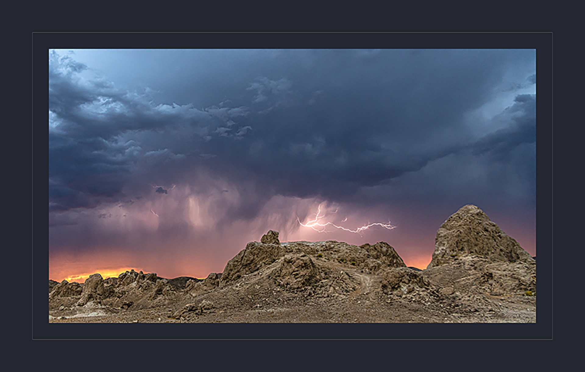
Thanks, Bruce. I think you're right. I'm going to need to stack the images if I want the moon AND another element. It's too much to ask to get both pieces of the puzzle to fit together in one frame. |
Dec 24th |
| 43 |
Dec 23 |
Comment |
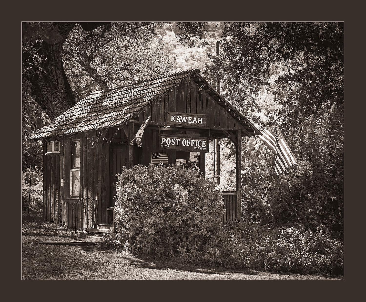
I love the vintage feel of this image, Bruce. Maybe it's the combination of the black and white with the structure of the domes, but this harkens back to the pictures taken of the World's Fair. The tones and detail are exactly what we'd expect from Tri-X. There's just the right amount of grain, and the tones are rich. I like the leading element of the steps bringing my eye into the center of the frame. The domes contain the tree, which is the focal point of the image. The scene is well balanced and tells a wonderful story. Keep playing with film. It's worth it. To answer your question, I last shot a roll of film for a class assignment, about a year and a half ago. Yet another reason to take photography classes. I have the equipment and chemistry to develop film and a scanner. I may need to shoot a roll or two. Thanks for the inspiration. |
Dec 24th |
| 43 |
Dec 23 |
Comment |
You nailed this one, Harley. I love the vibrance of the colors, the image is tack-sharp throughout the screen, and it's well composed. The temple is placed perfectly in the frame and wonderful saturation in the colors. I really like how the colors of the trees and water surround the temple. It's kind of an interesting juxtaposition. Nice work! |
Dec 24th |
| 43 |
Dec 23 |
Comment |
Oh wow, Mark. Before I even read your description, I was thinking "This is just fun". You nailed it. There are images that will hang in a gallery with people standing quietly, contemplating what the artist was doing, and there are images that will be emotional favorites, and evoke joy. You yourself said the two Bobs love it. I suspect they're not the only ones. I love the band playing in the background, the expressions on the Bobs' faces. The image is sharp and really well composed. The divers are perfectly placed, and the musicians in the background complete the frame. I'd be tempted to try to open up the shadows a touch, but that's the only minor change I'd try. Great job! |
Dec 8th |
| 43 |
Dec 23 |
Comment |
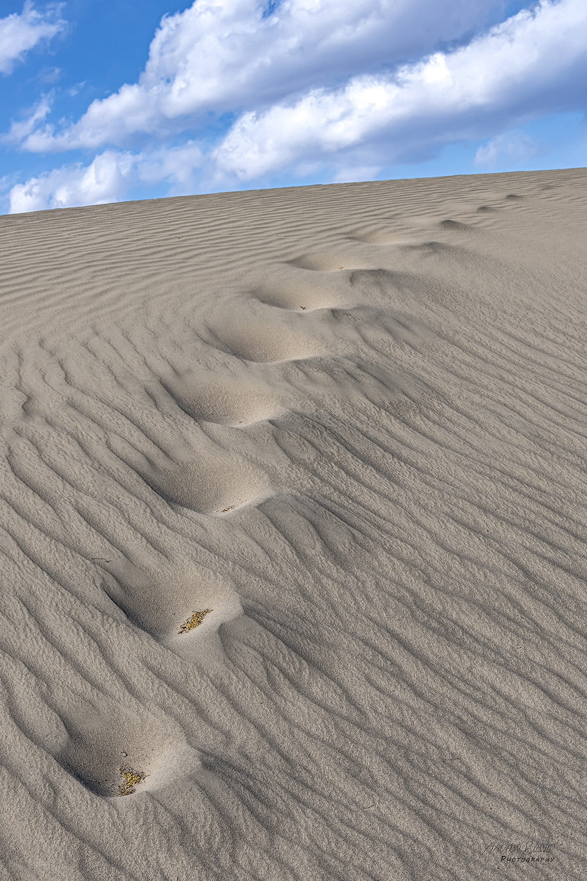
This is very well captured and presented, Lane. I love the texture of the wispy tops of the plants, and the parallel waves in the bottom of the frame. The focus is sharp, but the overall image still has an artistic soft feel to it. I think you nailed the exposure; there's no area that's excessively dark or bright, but you've got great detail in both the shadows and highlights. This work has an abstract feel without being overprocessed. |
Dec 8th |
| 43 |
Dec 23 |
Comment |
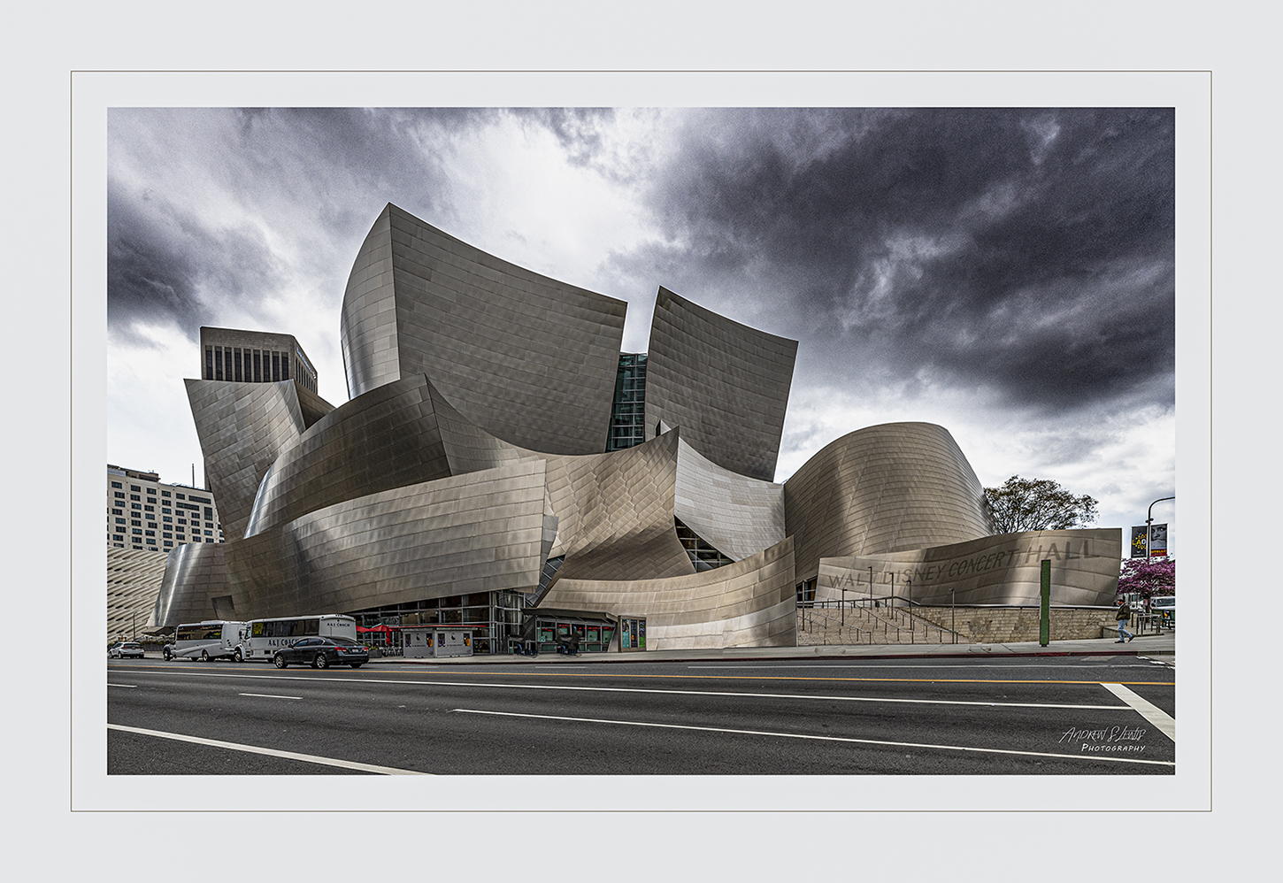
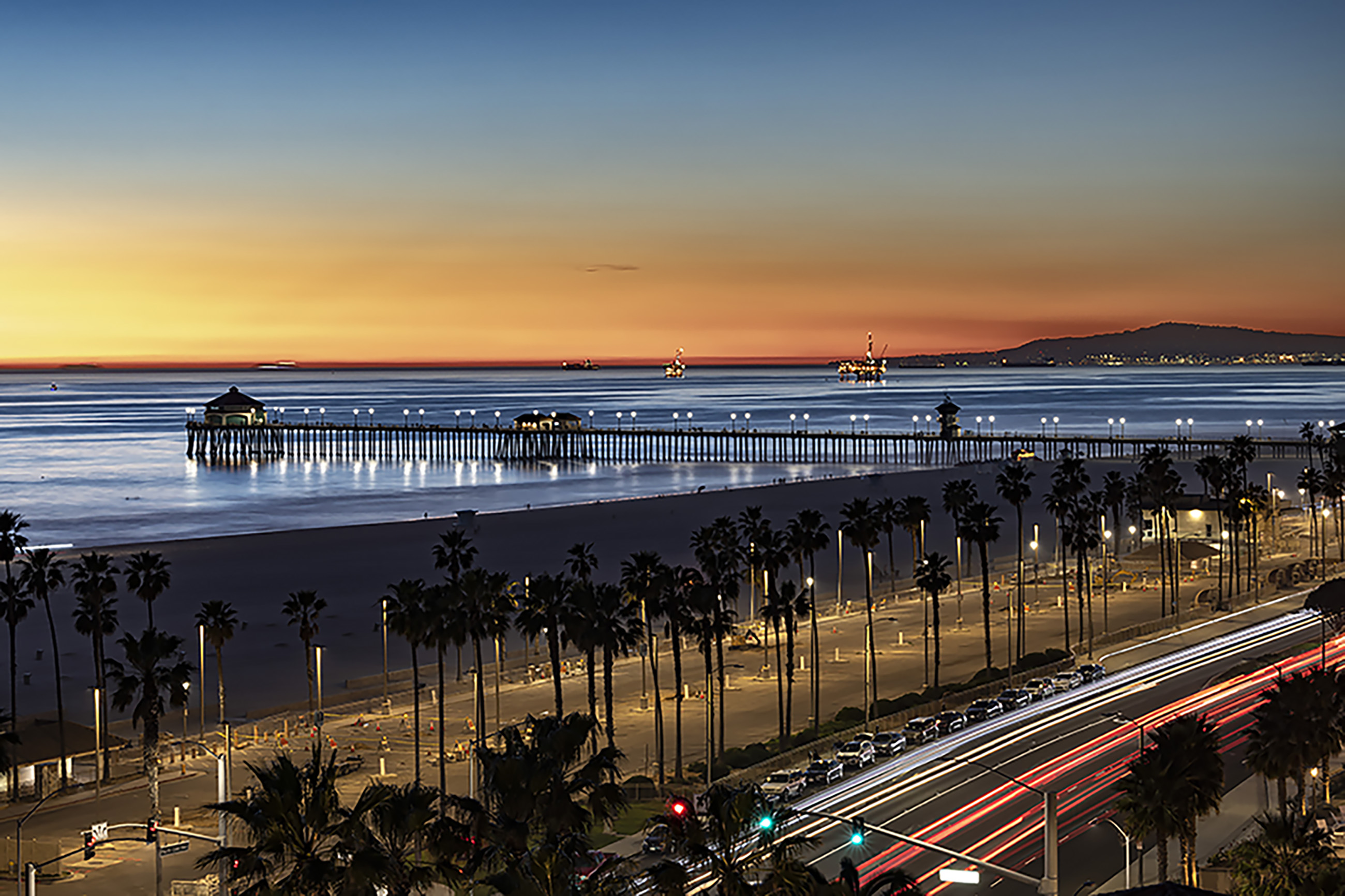
I really like this image, Leo. You've captured the scene very well. We have a strong sense of place. The blurred lights serve to frame the building and keep our interest inside the frame. The mixture of the moving and parked cars really adds to the image. I also like the geometric patterns of the building with the crosshatched area in the street. Great juxtaposition. I also really like the way the reds and yellows are subdued and work so well together. The only thing I would do differently is to open up the highlights of the image to give it a little more "pop". |
Dec 8th |
5 comments - 4 replies for Group 43
|
5 comments - 4 replies Total
|