|
| Group |
Round |
C/R |
Comment |
Date |
Image |
| 43 |
Jun 23 |
Reply |
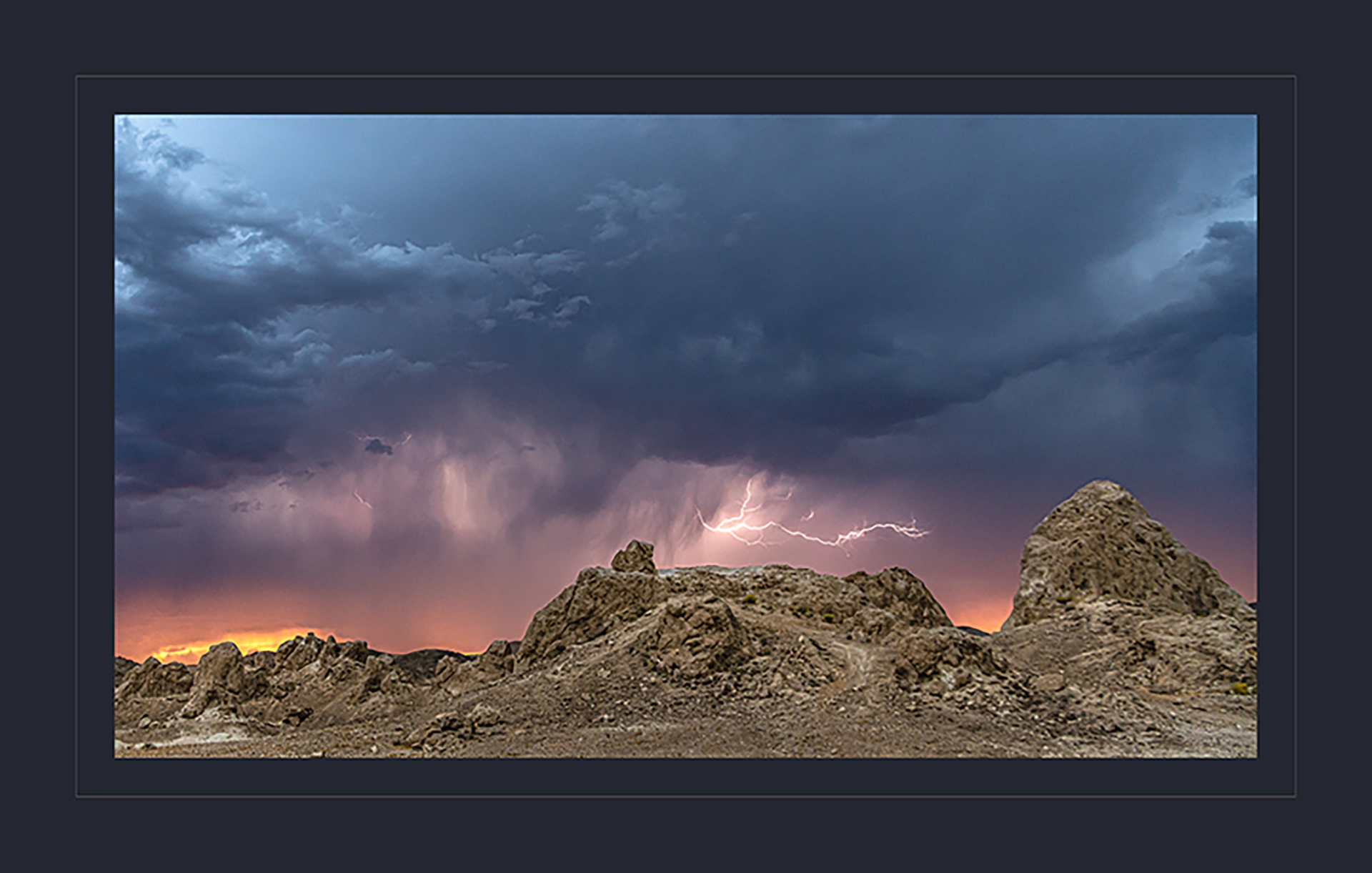
Good thoughts, Harley. Thanks. I always struggle on where to crop when I have such a great scene in front of me. I wasn't as close as this looks. The pinnacle was a few hundred feet in front of me, and the storm was passing in the distance. That lightning bolt was well over a mile away. I'm a big chicken when it comes to storms, fires, lions, bears, etc....That's what made this scene so great. I was far enough away to get the shot safely. I was able to crop down to make it look closer. I appreciate your ideas! |
Jun 28th |
| 43 |
Jun 23 |
Reply |
He done good, didnt he? :-) |
Jun 28th |
| 43 |
Jun 23 |
Reply |
Good eye, Bruce. I was torn on where to crop the sky. I wanted to keep the attention on the lightning bolt, but really liked the texture of the clouds. I like your crop also. There's a fair amount of negative space that we could get rid of. I appreciate your idea! |
Jun 28th |
| 43 |
Jun 23 |
Reply |
Thank you so much, Leo. |
Jun 28th |
| 43 |
Jun 23 |
Reply |
Thank you, Linda. Your changes sure give the scene a different feel! That landscape is so otherworldly. You really enhanced that aspect! I really like your sky too. |
Jun 28th |
| 43 |
Jun 23 |
Reply |
Thanks, Mark. We had a really good time. I'll play with the crop and see what else I can come up with. There are certainly a lot of options! |
Jun 28th |
| 43 |
Jun 23 |
Comment |
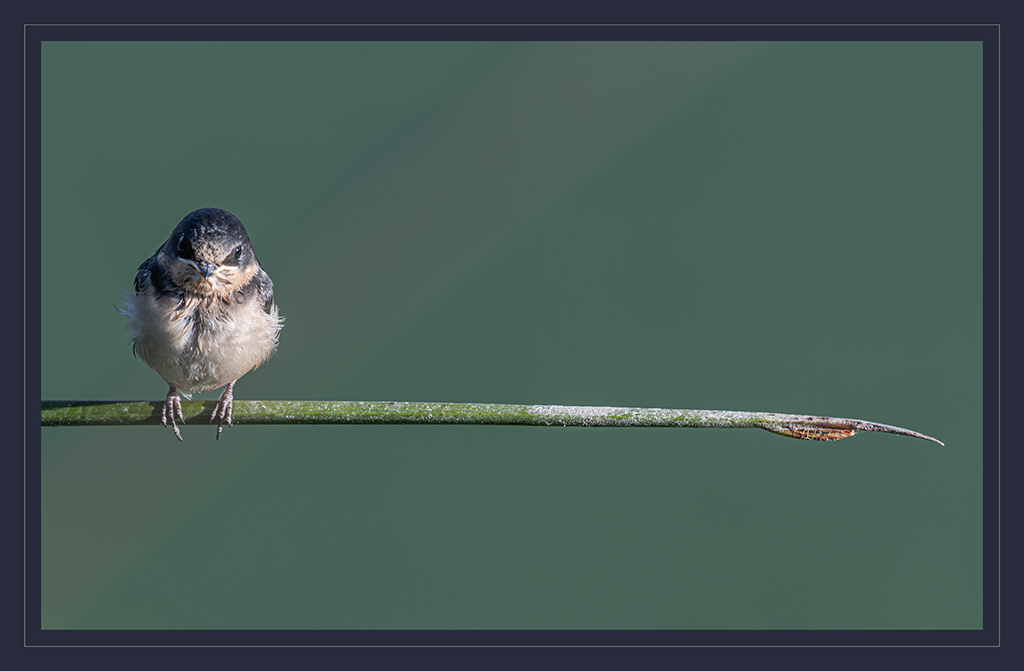
This is a striking image, Bruce. The eye just jumps out at me. The colors are vibrant, and the detail in the feathers is excellent. I also like how there's a spot of sunlight behind the bird, making the body stand out against the background. Your depth of field is perfect. Just enough to give a good sense of place, but blurry enough to not compete with our friend as the subject. You nailed it! |
Jun 14th |
| 43 |
Jun 23 |
Comment |
I really admire what you've done here, Harley. The detail in the finished product is remarkable. I like how the black of the new background contrasts against the bird. This was very artfully done! |
Jun 14th |
| 43 |
Jun 23 |
Comment |
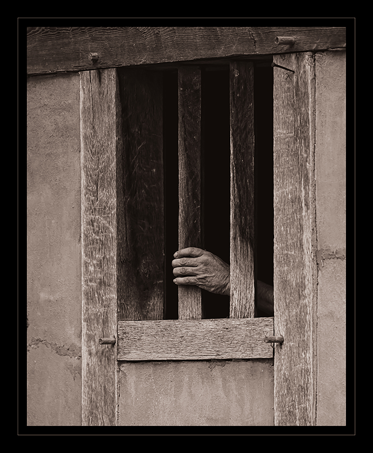
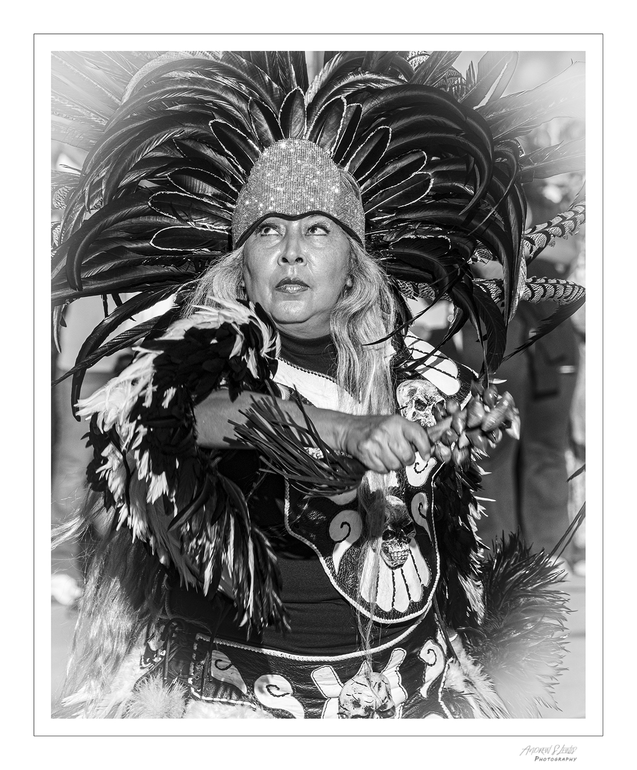
This is a moving image, Mark. Knowing the story you gave us, I think the cans need to be there. Maybe I want to be a photojournalist when I grow up, but I think every element you have here is crucial. The angle of the subject adds a compositional element that gives the sleeping person an energy. I don't think that's easy to do, but you pulled it off. The tone of the dog's coat goes well with the person's skin tone, and the green of the grass is very complementary, The grey of the blanket seems to balance the scene. Nice work, my friend. |
Jun 10th |
| 43 |
Jun 23 |
Comment |
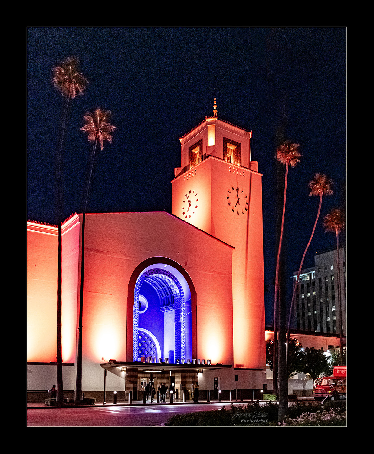
I found myself getting lost in this image, Lane. I can see why this scene caught your eye. Thank you for the explanation, alsio. Knowing what I'm looking at really enriches the scene. I love the red and green tones throughout the image. The arch through the opening in the wall gives a great frame within a frame. I've always kind of liked that viewpoint. If I was going to make any adjustments, I'd bring down the overall brightness of the image, and maybe bump the saturation a little. You've got good, rich shadow elements, but the highlights are a little bit hot. Thanks for sharing the image and the story. Great image! |
Jun 10th |
| 43 |
Jun 23 |
Comment |
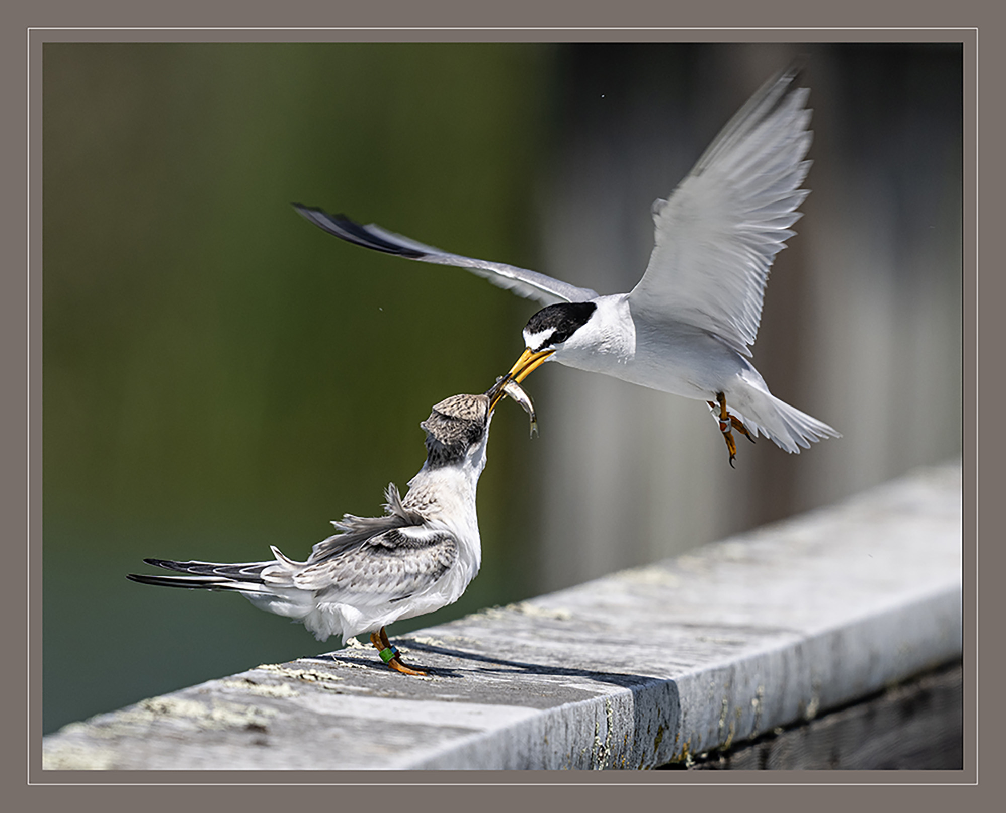
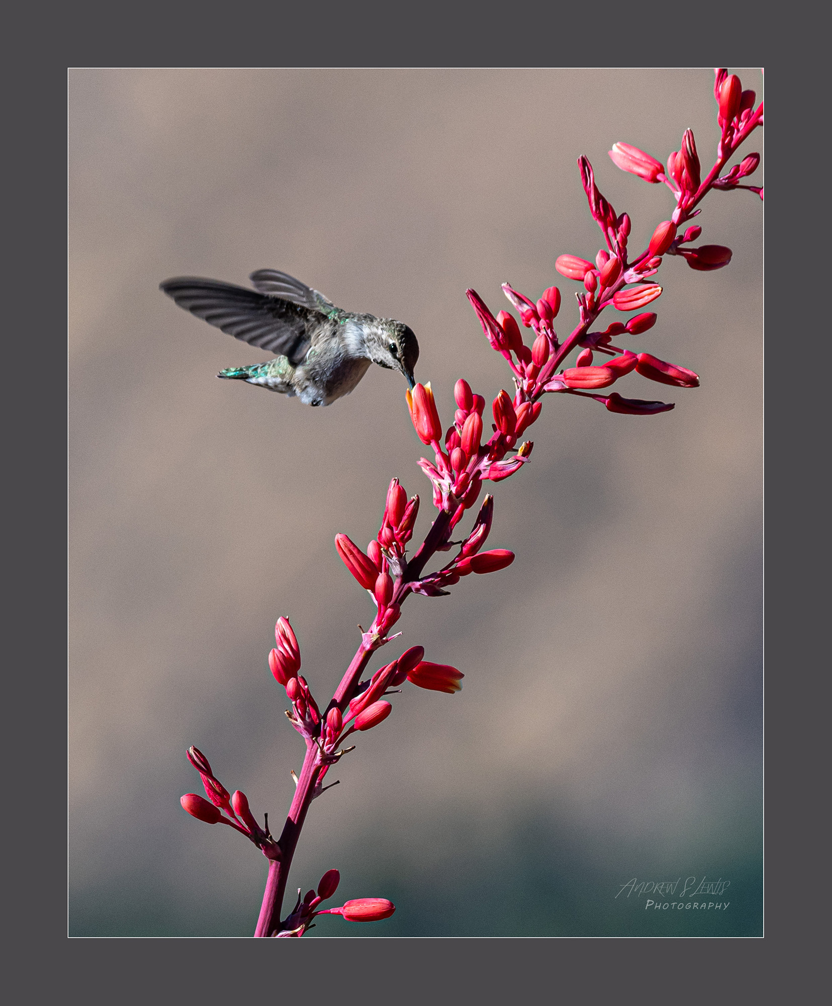
I really like this image, Linda. The placement of our friend in the frame is perfect. You really nailed blurring the wings, but keeping the face sharp. I also like how there's just enough of a reflection below, but not too much. I think too much at the bottom of the frame would have affected the overall composition of the image. It's just the right amount of crop. The brown on the bird and subdued blues of water really work well together. Very, very nice! |
Jun 10th |
| 43 |
Jun 23 |
Comment |
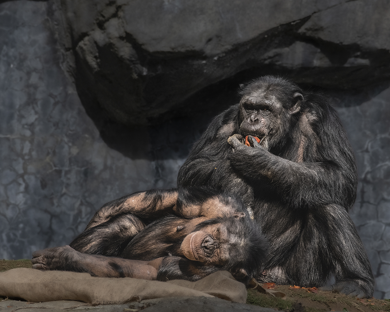
Very well done, Leo. I love how we can see the eyes of both subjects. The facial expressions are a story in themselves. Your exposure is perfect. The details and color saturation on the animals are perfect. I agree with Linda that the background could be brought down a little, but I like the crop you chose. The logs are strong leading lines, bringing our eyes perfectly into the scene. The pole on camera left is a nice complementary vertical element to the mother. It balances the frame nicely. Thank you for sharing your image. |
Jun 10th |
6 comments - 6 replies for Group 43
|
6 comments - 6 replies Total
|