|
| Group |
Round |
C/R |
Comment |
Date |
Image |
| 43 |
Apr 23 |
Reply |
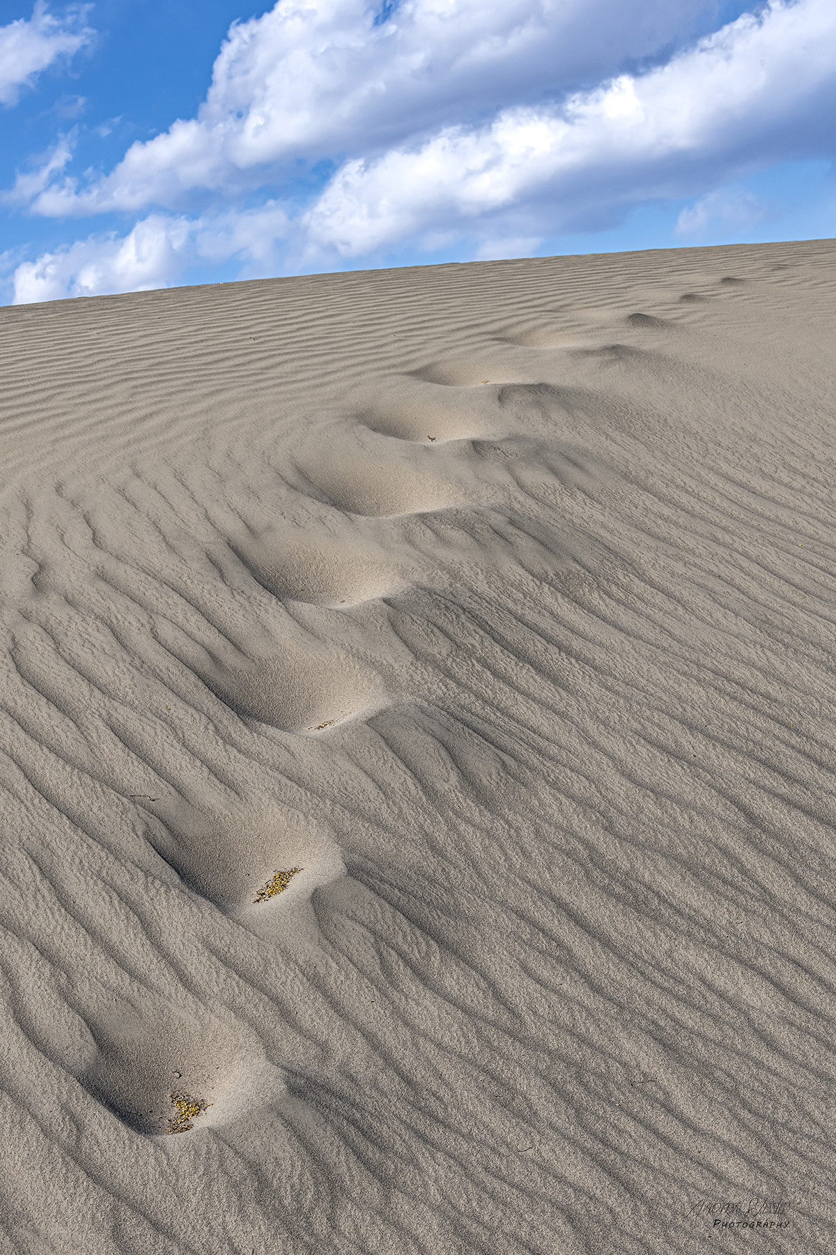
I appreciate your thoghts, Bruce. I'm always torn on horizons in an image. Sometimes my internal dialogue is "I was there, the horizon was tilted!", but then I have to remember that the viewer wasn't there, and the image has to stand on its own. I agree that this image is stonger with the slant, as the footprints are climbing. Your observations strengthen my ideas on this image. Thank you for your input. |
Apr 30th |
| 43 |
Apr 23 |
Reply |
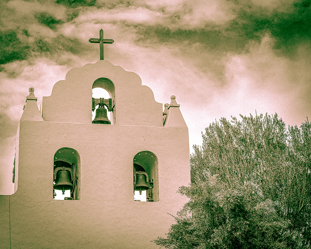
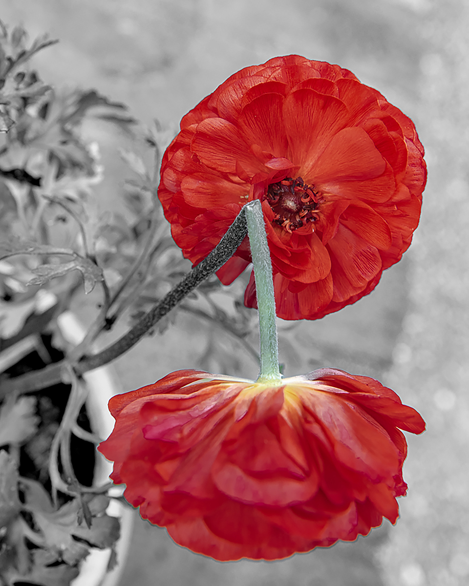
I thank you for your observations, Mark. I think I was fortunate to have the petals there. I don't think I've ever seen them there before. I'll work on the exposure in the clouds. I think you're right about the clouds. I'll be interested to see what changes I can make. Thanks for your input! |
Apr 30th |
| 43 |
Apr 23 |
Reply |
I appreciate your observations, Leo. |
Apr 30th |
| 43 |
Apr 23 |
Reply |
Thank you for your thoughts, Linda. It sounds like you picked up on all of the elements of the image that caught my eye to begin with. Death Valley is certainly something else. If you're ever in the neighborhood, give me a shout. I'd take you around! |
Apr 30th |
| 43 |
Apr 23 |
Comment |
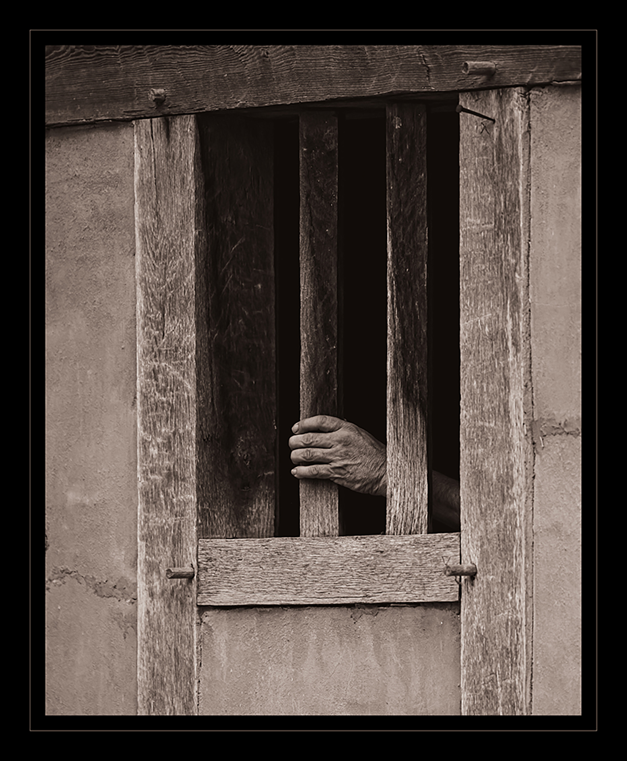
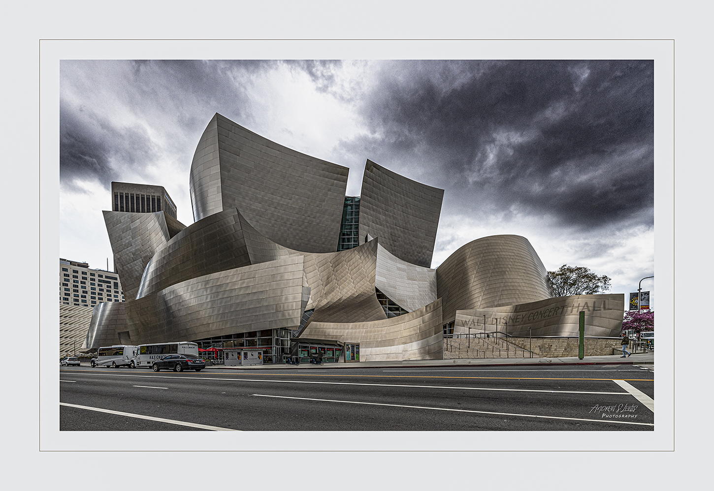
I really like this image, Bruce. I can see why you chose it for your class. The black and white treatment was the right choice for this scene. It has strong tonal ranges, and the texture really pops. I agree with what's been said about bringing the highlights down a touch. I'd also address the window in the upper right corner. I think a vignette around the images, toning down the background, would help the overall image. The grouping of three is obviously a winner, but the arrangement of the varying heights is a very strong compositional element. It's framed well, the crop really helps the image, and the vertical lines of the railing and the horizontal lines of the buildings and the urns work very well together. Nice work! |
Apr 30th |
| 43 |
Apr 23 |
Comment |
Mark, there is so much to love about this image. It really tells a story. The strange thing is, we don't know anything about the story and I don't think we need to know. The colors involved really work together. The textures of the metal against the grain in the wood are striking. I also really like the vertical conversion. The elongation of the hook add a compositional element that is very strong. If I hadn't seen the original format, the stretched image stands on its own as a wonderful image. A black and white version would probably work well, too. There is plenty of texture to make a strong monochrome presentation, but the color image is terrific. Nice job!! |
Apr 30th |
| 43 |
Apr 23 |
Comment |
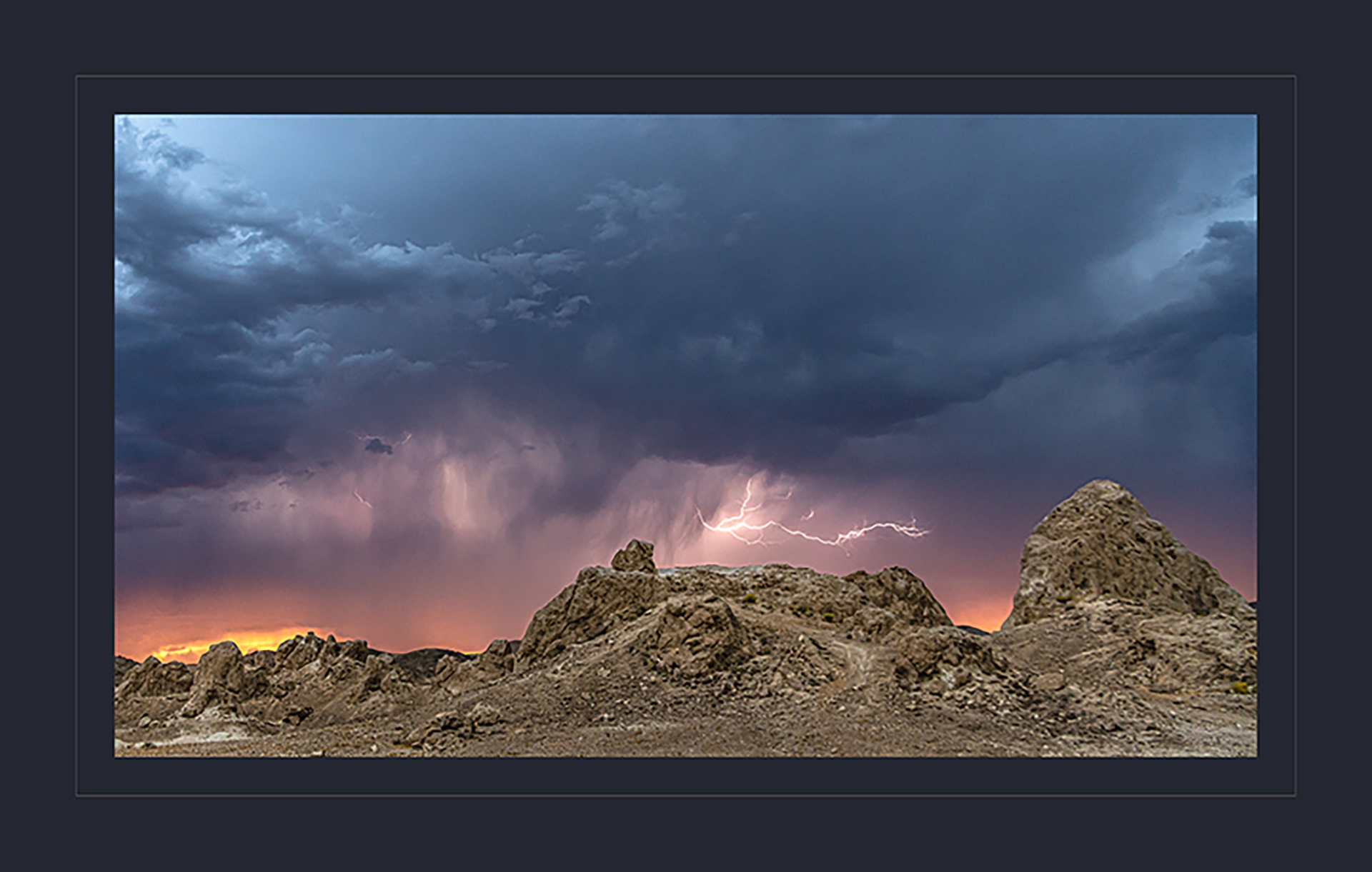
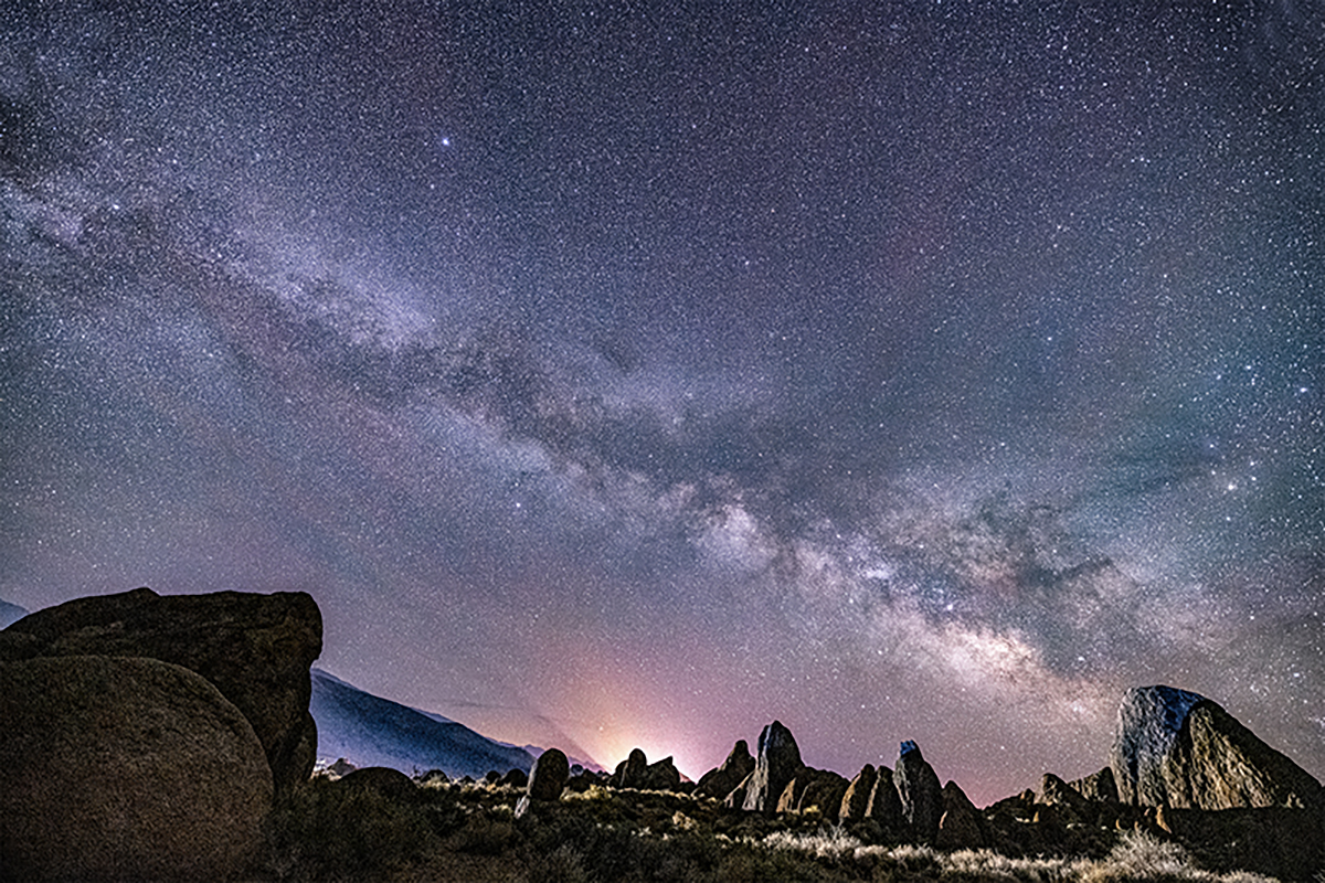
This is a remarkable scene, Lane. I'm wondering if there aren't two different images here, especially after reading our descrpition here. I love the rocks in the foreground, and the mition of the cars' lights. The rising sun, brightening sky, and texture of the clouds and distant mountains are also striking. I think you could get away with cropping the sky out of the image, and just presenting the rocks, mountains, and cars on the road. The brightness of the sky is distracting and takes away from what it seems is the actual subject. Then, I'd wait a few minutes, for the sun to come up, then shoot the scene as a magnificent sunrise. Once the sun is hitting the distant ranges in the images and just kissing the rocks in the foreground, you'd have 2 winning images from one outing. Certainly worth setting an alarm for. Nice job! |
Apr 30th |
| 43 |
Apr 23 |
Comment |
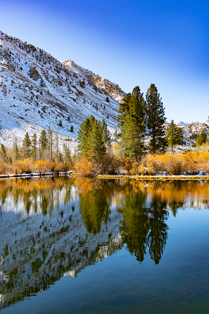
Linda, this image is stunning. Ideally, 2PM would not be the time to take a landscape image. I think you've got some really great lighting and shadow, despite it being in the middle of the day. Great job. Living in the desert myself, I'm a sucker for how the color of the rocks can complement a rich sky. I think you've captured that scene very well here. You've got good direction of light, and your exposure is spot on. You've maintained the detail in the shadows, and have a pleasing scene throughout the frame. The only change I'd suggest is to do something with the contrail in the upper left third of the image. The other one, just to the left, isn't as intrusive, but the one coming out at about 11:00 is distracting. Other than that, you've come up with a winner here.
|
Apr 30th |
| 43 |
Apr 23 |
Comment |
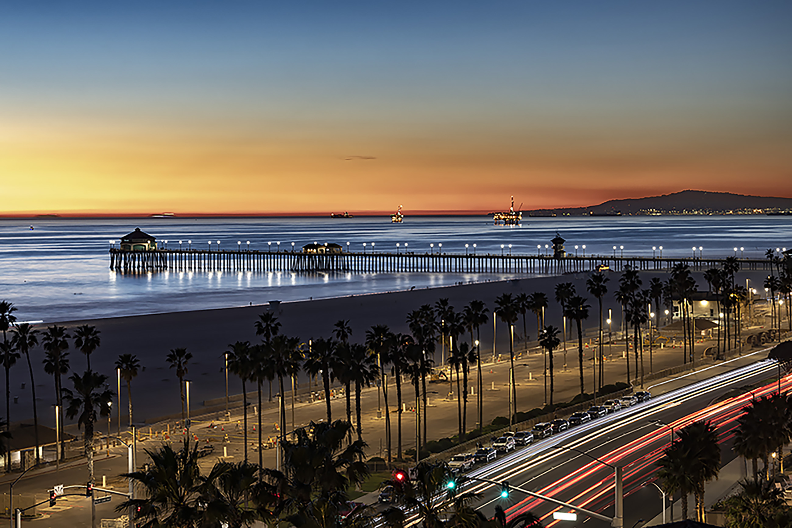
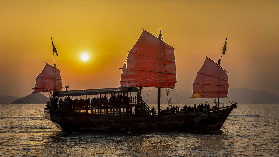
Leo, this image is remarkable. You've captured a wonderful scene. It sounds cliche but, after seeing your image, I want to visit this location. You really did a great job capturing the sun as part of the image, giving a wonderful atmosphere to the scene, but not dominating the frame. I wish the picture had been taken a little earler, when you'd have the city skyline right behind the boat. Unfortunately, trying to have both elements in the frame, it pushes the boat too far to the right. As mentioned, the boat needs more room in front to "go out of the frame". I've made a couple of changes, I humbly submit to you. One is the framing, the other is an adjustment to the boat. I don't think you need any detail in the boat itself. Making it a pure silhouette makes it a stronger image. I also adjusted the sails to make them glow a litle more, and brought up some additional detail in the sky. Thank you for sharing this fantastic scene with us. |
Apr 30th |
 |
5 comments - 4 replies for Group 43
|
5 comments - 4 replies Total
|