|
| Group |
Round |
C/R |
Comment |
Date |
Image |
| 43 |
Aug 22 |
Reply |
Wow, great observation, Lane. I never even saw that beam. Thanks for pointing it out. I was busy, watching what he was doing. I bet I pay better attention to the background next time. Thanks for the praise and help for the next concert! |
Aug 25th |
| 43 |
Aug 22 |
Reply |
Thank you very much, Mark! |
Aug 25th |
| 43 |
Aug 22 |
Reply |
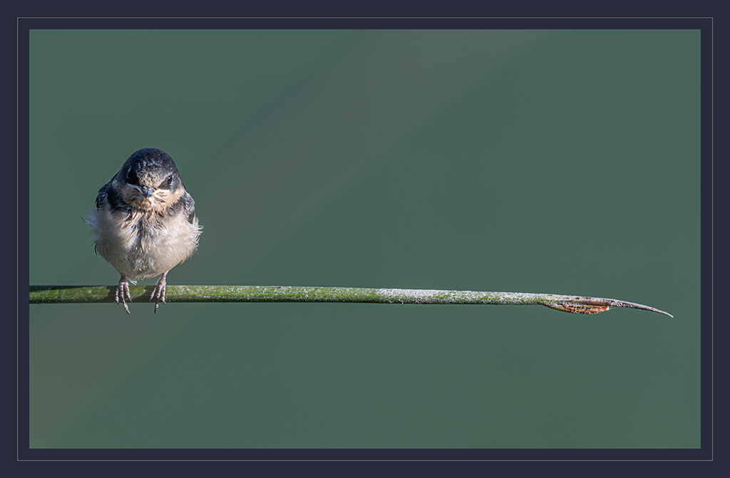
Thank you, Linda. I really like how your edits isolate the musician. It's effective, without being overdone. I appreciate your thoughts and suggestion. |
Aug 25th |
| 43 |
Aug 22 |
Reply |
Thank you so much, Leo! |
Aug 25th |
| 43 |
Aug 22 |
Reply |
Thank you Bruce. I think you're 100% on the mark about toning down the highlights. I appreciate your eye and thoughts. |
Aug 25th |
| 43 |
Aug 22 |
Comment |
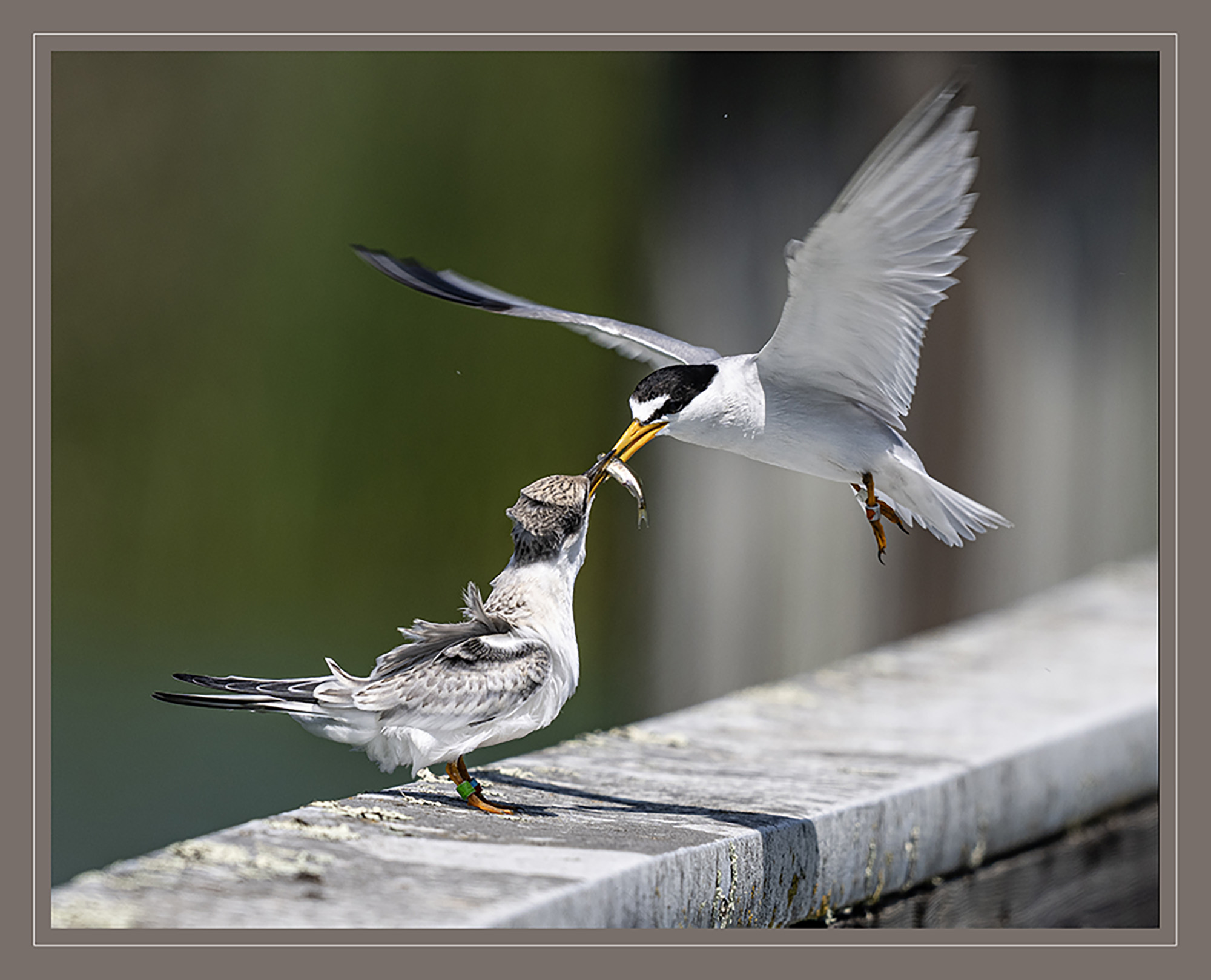
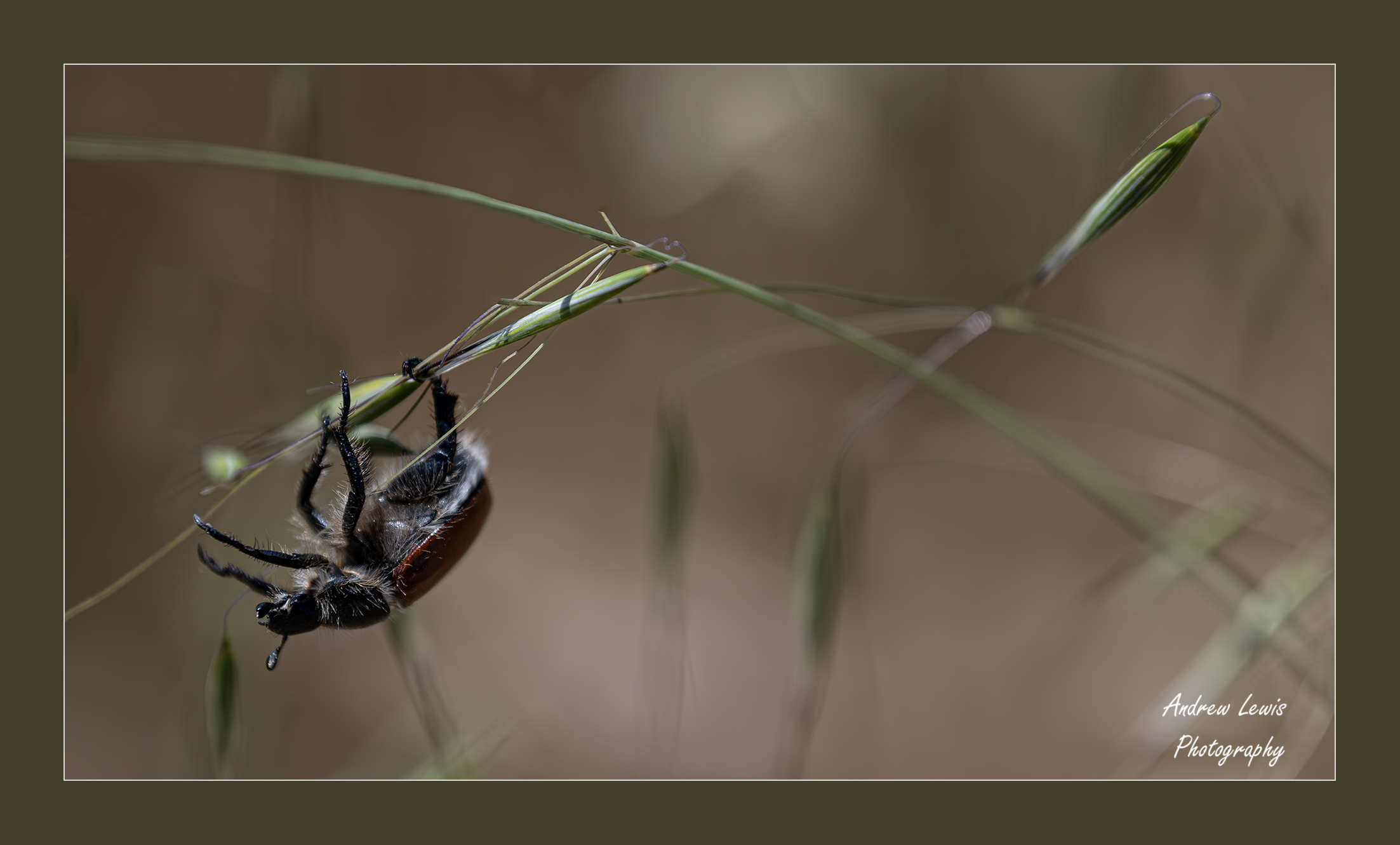
You knocked this our of the park, Bruce. This should be printed on a scroll, and hanging in an Asian palace somewhere. You've exemplified what a high-key image should look like. You've preserved the detail in the birds' feathers and in the nesting materials, and the branches contrast perfectly to the background. The stroke around the edge gives this masterpiece the perfect finishing touch, and I love how you extend the branch over the stroke line and off of the edge. Make room in your trophy case, Bruce. |
Aug 25th |
| 43 |
Aug 22 |
Comment |
What is "Fibonacci sequence"? I'll take "things that make a picture awesome" for 400.
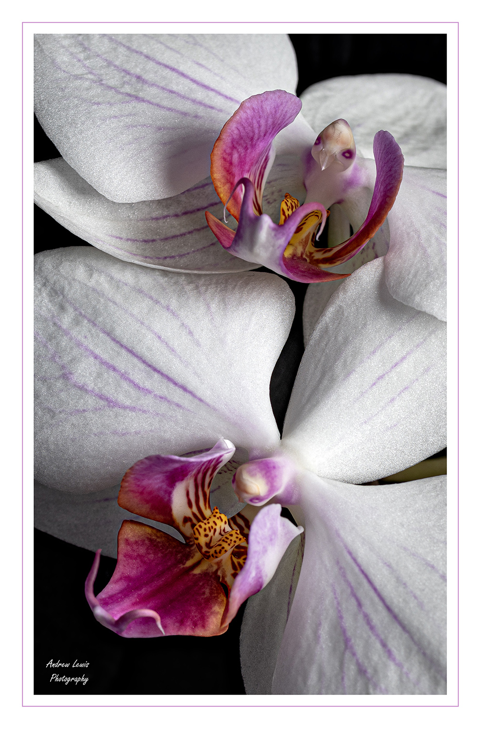
This is a wonderful image. As discussed above, the composition is top-notch. I also love how the light is reflected throughout the nooks and crannies of the shell. You were able to get shape and texture to really pop all over the frame. I'm a huge fan of square images, and this example further exemplifies its proper execution. Well done, Mark. Don't change a thing. |
Aug 25th |
| 43 |
Aug 22 |
Comment |
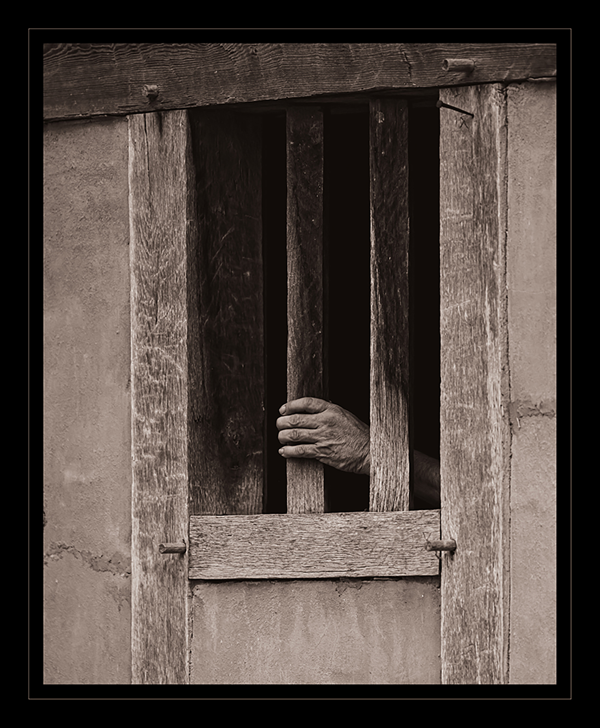
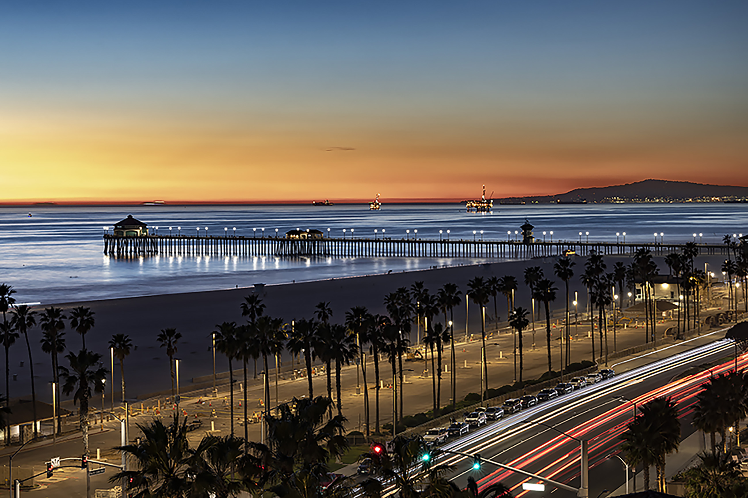
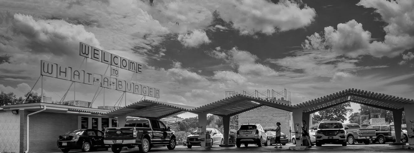
This image is all of the Americana, confined to one panorama. I really like the emotion it evokes. It has the old carhop feeling to it, and the black and white treatment enhances that feeling, but then you look closer and see the cars are modern. That contrast seems to add a dramatic level of interest that makes this story even more endearing. Well captured, Lane. Nice work. My only suggestion would be to crop the right side, to eliminate the partial opening and car, and remove the top part of the sky. The accentuated panorama also lends well to the horizontal lines you already have in the image. |
Aug 25th |
 |
| 43 |
Aug 22 |
Comment |
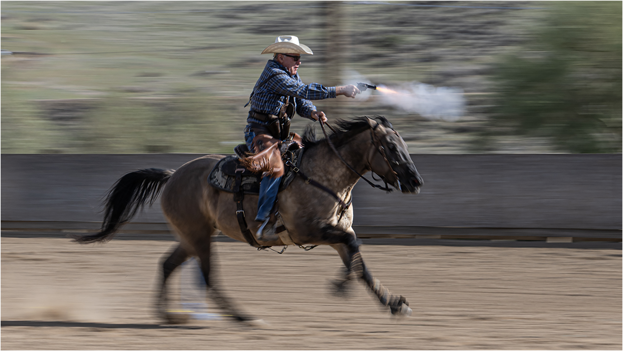
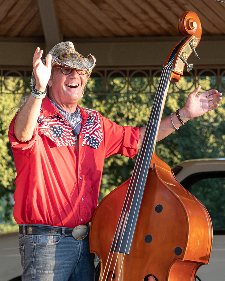
I like what this image is telling us. I was going to suggest you lighten the cowboy and the horse, but after reading your description, I think you got the impact you were trying for. Well done. I was struggling with the compostition on this. There was a piece missing. I tried flipping it horizontally, and that didn't do it. I like what Mark did with his crop. The bushes on the left weren't needed, and the lighter patch of sky was almost distracting. Overall, I really like the message you're conveying with this image. |
Aug 25th |
| 43 |
Aug 22 |
Comment |
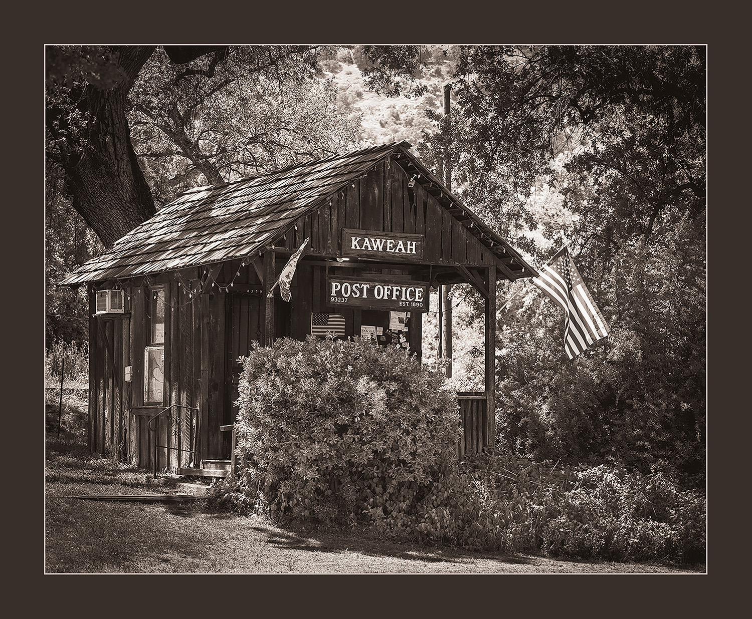
I really like this image. The variety of boats and their arrangement are very pleasing to the eye. I don't know that I would crop at all. The completeness of the opening is a really strong framing element. I would use some content-aware fill and get rid of the handrail in the bottom, the object (light?) in the upper left corner of the image, and also the corner of the boat in the lower right corner of the opening. Once you clean up those distracting elements, I think this would be an even more fantastic image than it is already. Leaving more of the arc in the bottom of the image really enhances the composition. Great job, Leo! |
Aug 25th |
5 comments - 5 replies for Group 43
|
5 comments - 5 replies Total
|