|
| Group |
Round |
C/R |
Comment |
Date |
Image |
| 43 |
Jan 22 |
Reply |
Thank you so much, Linda. I really value everyone's input. Everyone sees things differently, and seeing through someone else's eyes is very helpful.
|
Jan 28th |
| 43 |
Jan 22 |
Reply |
Thank you so much, Linda. I really value everyone's input. Everyone sees things differently, and seeing through someone else's eyes is very helpful.
|
Jan 28th |
| 43 |
Jan 22 |
Reply |
I enjoy the discussion. I'm currently at Imaging USA as a student volunteer, and they gave us the opportunity to sit with professionals for a portfolio review. I sat with three people, and the opinion was split as to whether the prop blades should be blurred or not. It's a valid debate, with great points on both sides. I love how discussions can be generated over the craft. |
Jan 19th |
| 43 |
Jan 22 |
Reply |
Agreed. There's a lot to them, but they're so rewarding. I've been talking to a friend in a local group, and he's going to help me work on them. I'd eventually like to have a setup at home. Stay tuned�� |
Jan 19th |
| 43 |
Jan 22 |
Reply |
I appreciate all of your thoughts and comments. I didn't want to seem like I was ignoring your ideas. I'm really finding this group valuable. |
Jan 16th |
| 43 |
Jan 22 |
Reply |
Thank you for your service, Mark. |
Jan 16th |
| 43 |
Jan 22 |
Reply |
Thank you, Harley. |
Jan 16th |
| 43 |
Jan 22 |
Reply |
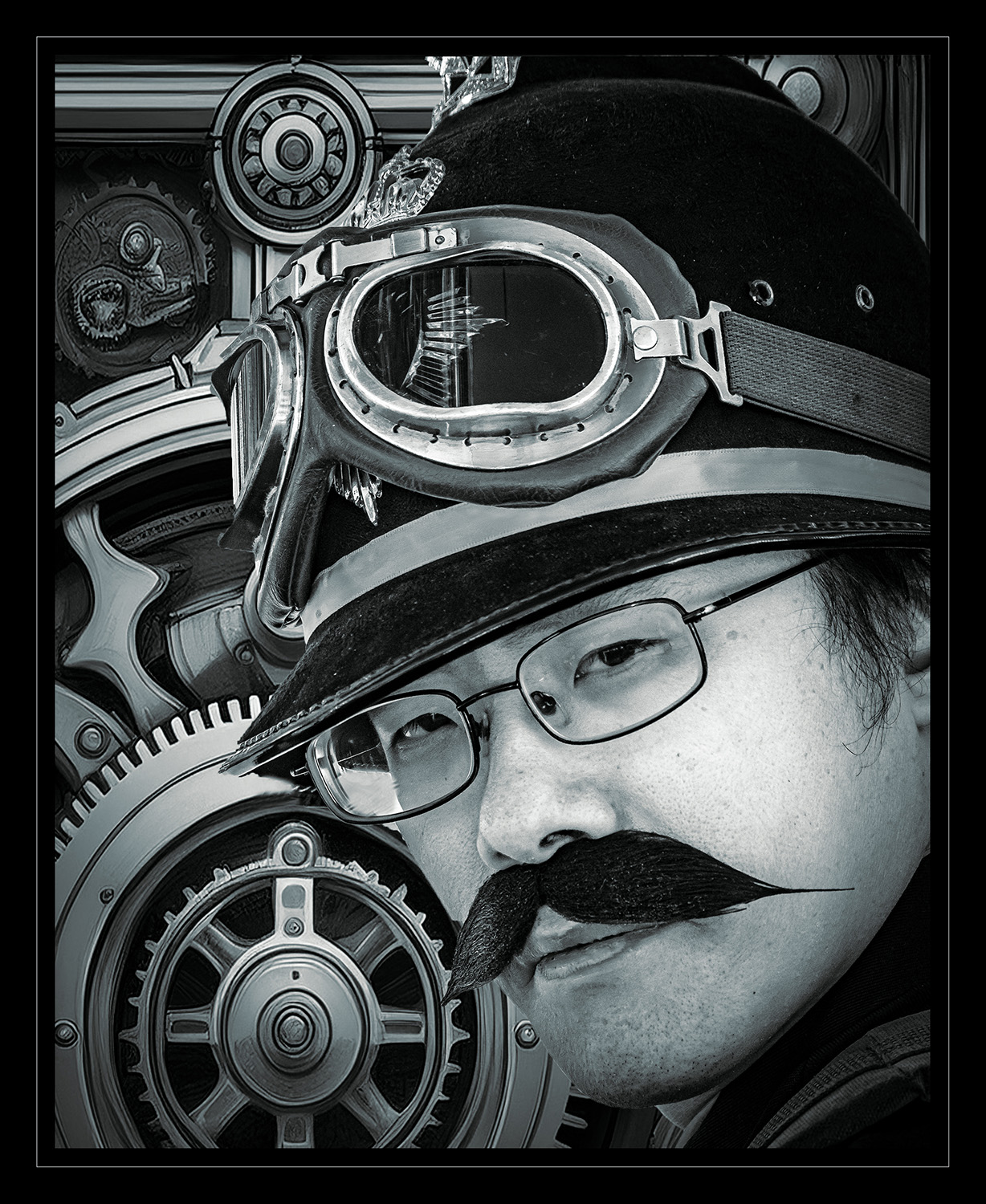
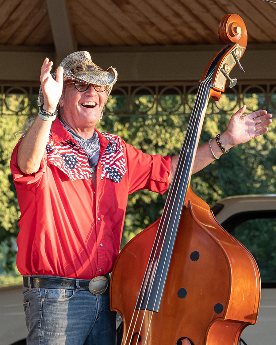
Hi, Harley. I think I like the one where you can see both sides of the face. It's in shadow, but there is enough light on the side of the jaw to give some definition. I made the Karen joke because of the similarity to the haircuts of the "Karens" that are made fun of for complaining. Just an attempt at humor. The image is wonderful. I like both crops, but I think seeing both sides of the face is more pleasing. |
Jan 16th |
| 43 |
Jan 22 |
Comment |
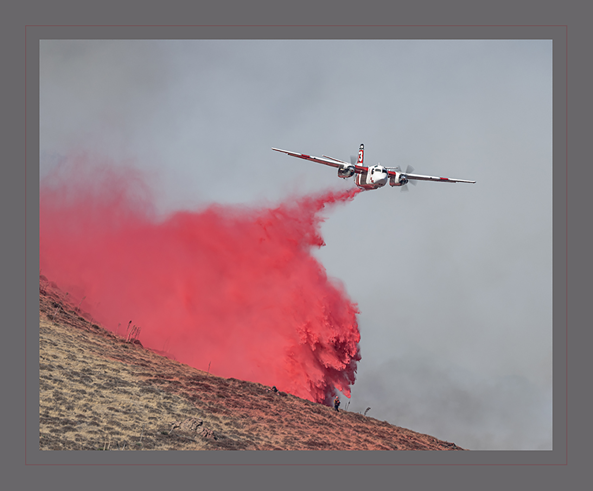
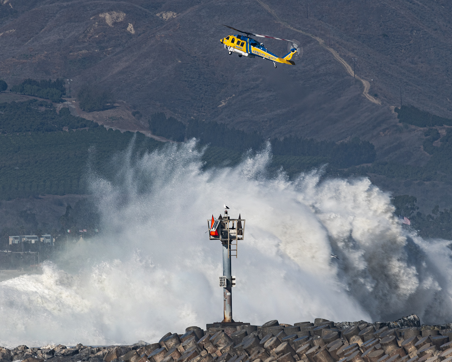
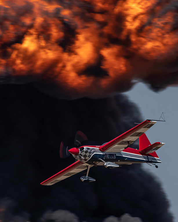
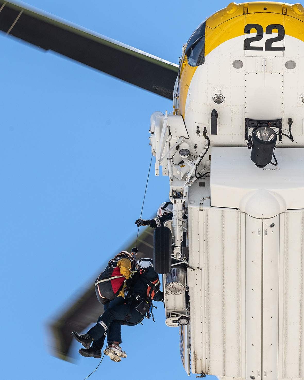
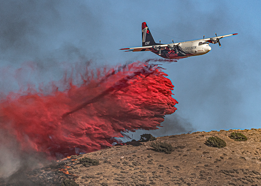
I want to thank everyone for their time and thoughts on this image. The higher shutter speed was more a product of a heavy lens and wanting to maintain sharpness in the image. I also knew this was a smaller fire, and I might be seeing the only retardant drop of the day, which it was. I wanted to make sure I got the shot. Lane and Bruce are right about the blur of the propellor blades adding to the feel of the image. Harley brings up a great point that a slower shutter speed might blur the prop, but the detail in the retardant would be lost.
Mark's point is also well taken, that the star of the show here is the retardant. I wanted to find a crop that would keep adequate detail on the plane but show the scene...the actual flames and the product being dropped.
You are not wrong, Leo. I have had some success with this image in local PJ competitions and am considering using it in state/national competitions. I've also received some swag from the company that owns the plane, and sent them some 8x10s of this, and other helicopters working that day.
Thank you for your input, everyone. I live close enough to an airfield, so I get to practice with blurring, yet keeping sharpness. Full arc! |
Jan 15th |
 |
| 43 |
Jan 22 |
Comment |
I had to look at this one for a while. At first I didn't get it. The original image really helped. I think I agree that the crop selected takes away from the story. In the cropped image, it could be a family or group of friends, crowding into the doorway. Once you pull back and see the variety of people waiting, it really opens up the narrative. This could almost work as an art deco image. The subdued colors really work well together. The variety of textures between the coats and the wall of the building are very well represented. The body language and facial expressions really add to the story. This is an image that takes a while to unfold, but as you look at it, the story grows. Nice job, Mark. |
Jan 15th |
| 43 |
Jan 22 |
Comment |
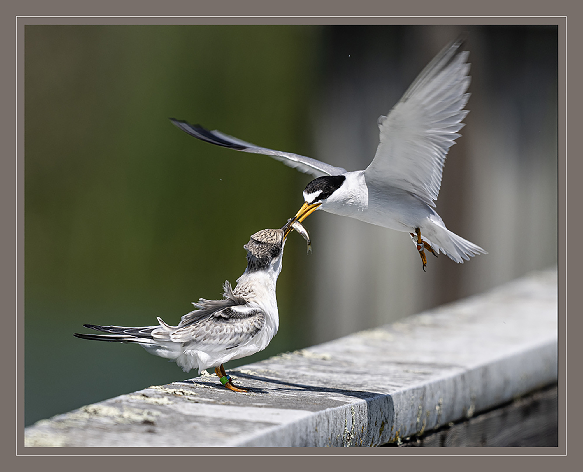
Am I the only one who wonders if this cow's name is Karen, and she is asking to speak with the mooonager? Ok, back to the issue at hand. This image really hit me. I feel like it could be used as a demonstration image for a lighting lecture. The detail in the hair is astounding. The sheen of the highlights just pops. The warm tone of the colors combined with the facial expression really give this a calming effect. The detail and texture on the nose are impressive. I also agree with your choice of the tight crop. The original image is gorgeous, with the fence and pasture, but the story this image tells is great. The only thing I find missing is the eye. If we could see the eye a little more clearly, it might add a lot to the feel. Fantastic work, Harley. |
Jan 15th |
| 43 |
Jan 22 |
Comment |
Nice work, Bruce. I've started paying attention to still life photography and want to start working with some folks in my local clubs to explore the subject. I really like what you've done with this. The emotion it evokes is pure nostalgia and joy. The ever-familiar Kodak yellow against the wood on the tank really works for me. I agree somewhat with the previous discussion that the background is almost too high key. If there was a way to separate the table surface from the background, the sense of dimension that would be added might help the viewers' eyes move through the image. I really enjoyed this work. |
Jan 15th |
| 43 |
Jan 22 |
Comment |
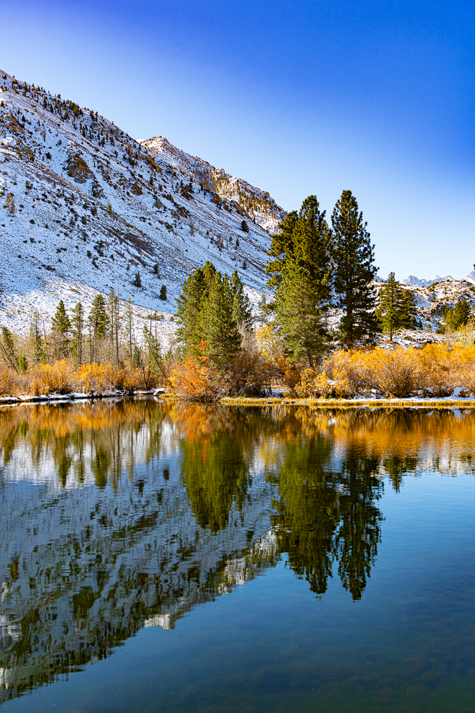
Blurred water, and fall colors. How do you lose? I really like what you've done, Lane. The tones of this image are very warm and pleasing. The texture in the rock really shows up well. I would be interested to see the right side of the image brightened a little. I think the lighter tones of the water would balance well with the rest of the image, and maybe tell more of the story. Other than that, this is a wonderful image. The leaves against the rock are wonderful both in texture and color combinations. Thank you for sharing this one. |
Jan 15th |
| 43 |
Jan 22 |
Comment |
This is a wonderful image, Linda. The color throughout is just striking. You've combined the curving leading lines with the straight geometry of the post (?) in the center. The post brings you into the breathtaking stained glass at the top of the dome, then the stairs curve you back down, only to have your eyes go back up. The combination really keeps your eyes inside of the image. I'm a big fan of existing light, and really like how you handled the exposure all through the image. The only thing I'd be tempted to play with is the lower part of the frame, maybe open up some of the shadows to bring out more of the texture on the metal staircase and the post. Very nicely done. |
Jan 15th |
| 43 |
Jan 22 |
Comment |
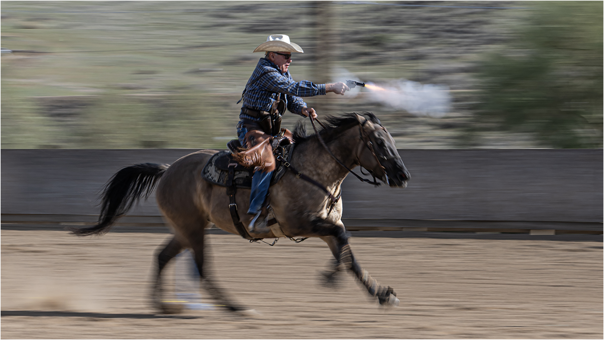
I really like this image. I'm not in the same boat as the rest of my cohorts here, but I tend to see things with photojournalism in mind. I agree the cone is a little distracting, but I like the juxtaposition of the sign in the background. It really gives a twist to the story, and an incredible sense of place. As for the rider and the motorcycle, they're tack sharp, perfectly exposed, and you've caught the height of the action. The composition is solid, the roostertail of dirt actually kind of acts as a leading line, bringing you back to the subject. The colors on the bike and the rider's jersey are perfectly matched with the surroundings. Nice job, Leo. |
Jan 15th |
7 comments - 8 replies for Group 43
|
7 comments - 8 replies Total
|