|
| Group |
Round |
C/R |
Comment |
Date |
Image |
| 95 |
Jun 24 |
Reply |
Thanks Stuart for the suggestions |
Jun 26th |
| 95 |
Jun 24 |
Reply |
Thank you Carol - I think I will print an hang this one! |
Jun 26th |
| 95 |
Jun 24 |
Reply |
Thanks Keith I was lucky |
Jun 26th |
| 95 |
Jun 24 |
Reply |
Thanks Pat |
Jun 26th |
| 95 |
Jun 24 |
Reply |
Thanks - good suggestions for next opportunity |
Jun 26th |
| 95 |
Jun 24 |
Reply |
Thank you Stuart |
Jun 26th |
| 95 |
Jun 24 |
Comment |
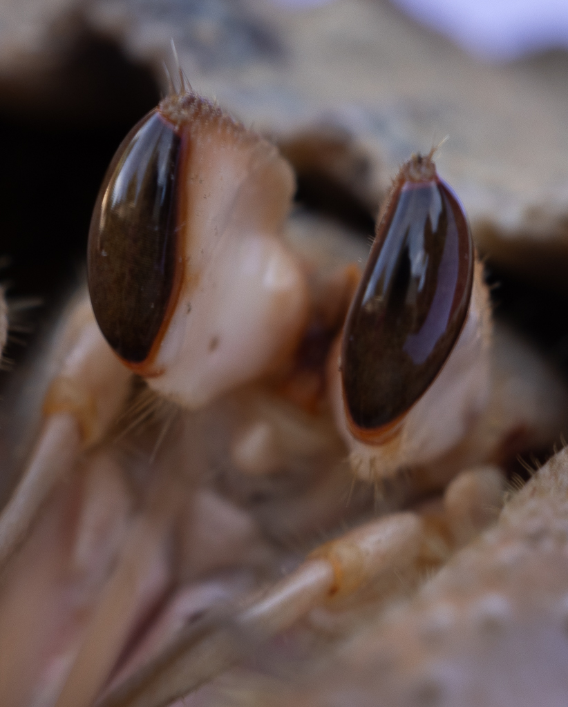
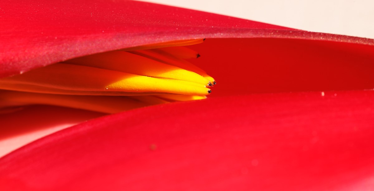
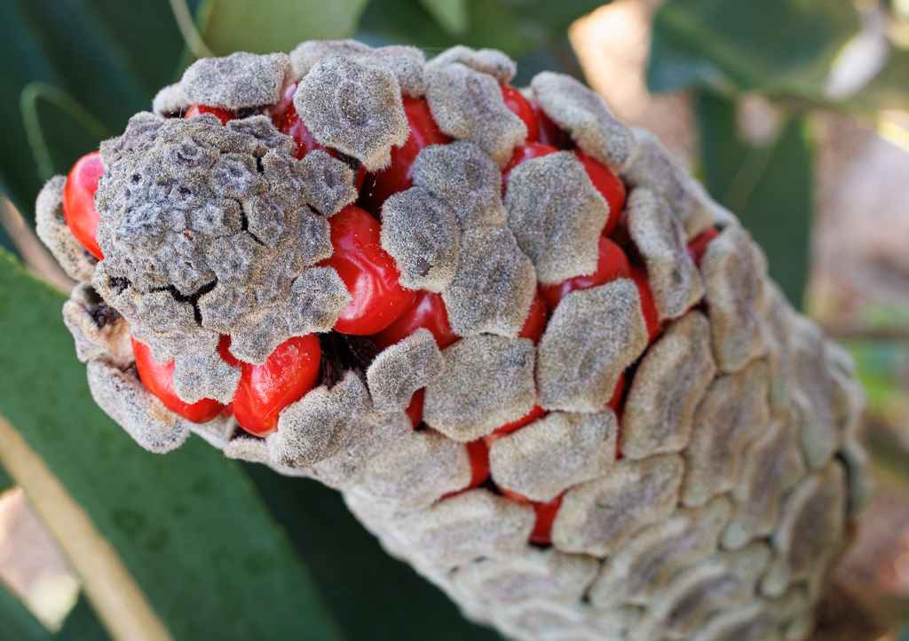
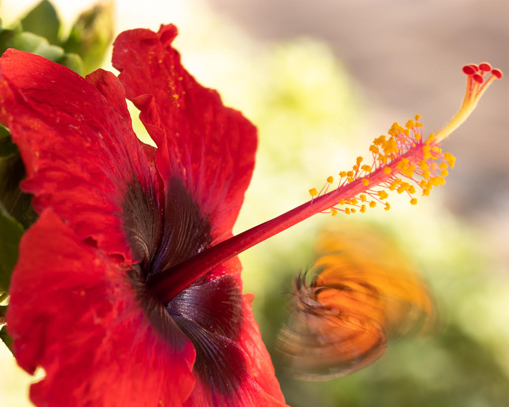
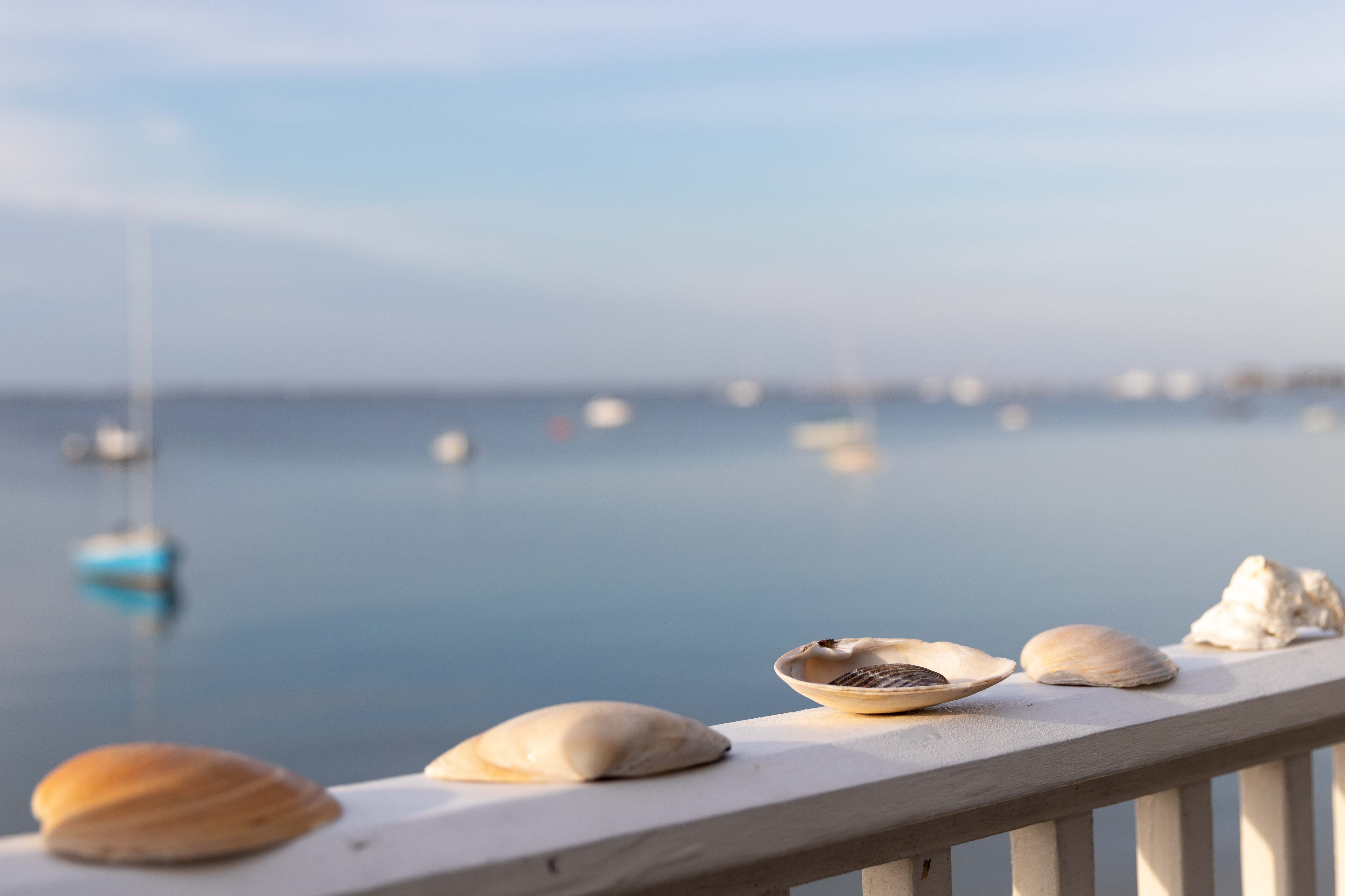
Hi Keith, this flower is quite amazing! I agree with Stuart that you cropped too much on top and with the edits you made, the edges do not seem natural. Maybe you could keep just the first 2 flowers, bring back some of the stem, remove the left flower that is least sharp, and then just sharpen the lower part of the large flower. The red is wonderful.
|
Jun 14th |
| 95 |
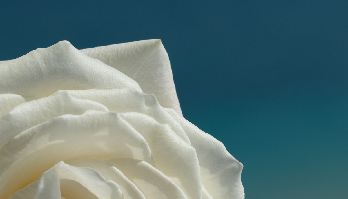
Jun 24 |
Comment |
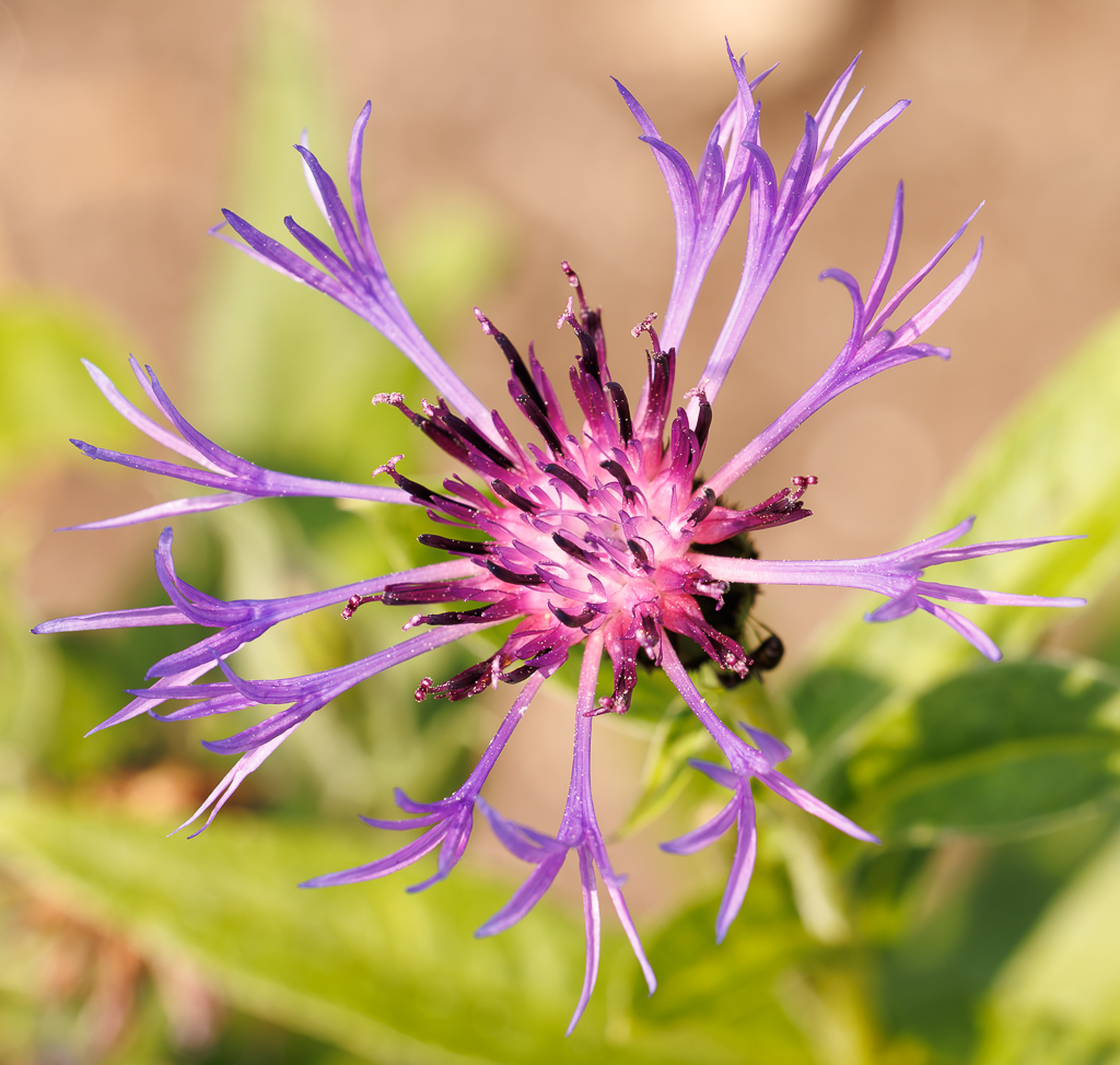
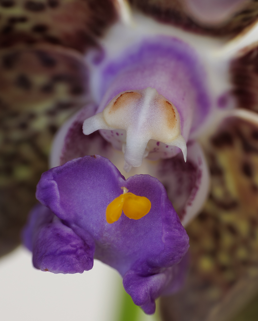
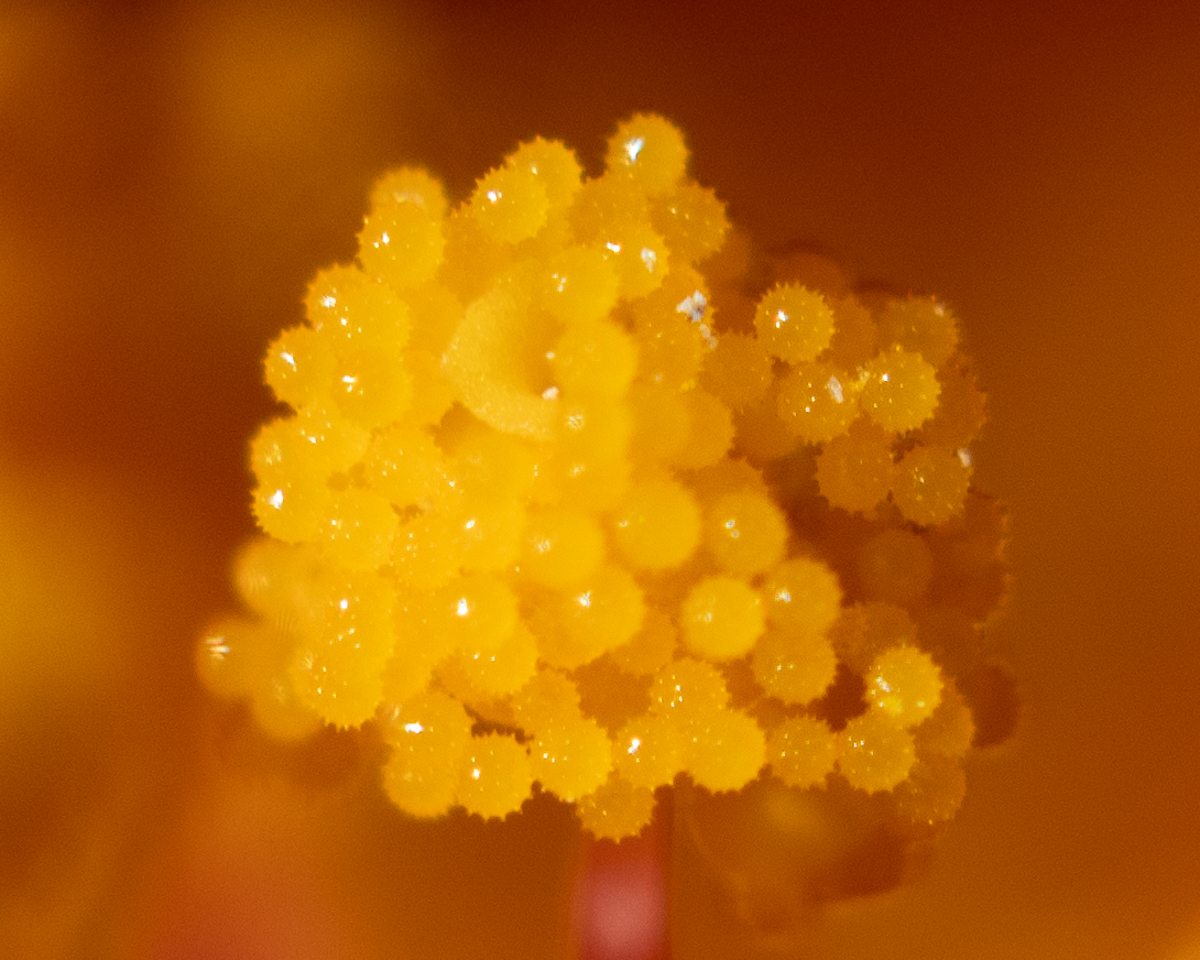
Hi Pat, I really like close ups of flowers because they move towards abstraction, and the focus becomes the colors and the textures. Your image is very appealing to me. I do think it is more yellow/red than pink - at least in my screen. I like the soft areas, but maybe more sharpness in the foreground section would enhance the image. |
Jun 14th |
| 95 |
Jun 24 |
Comment |
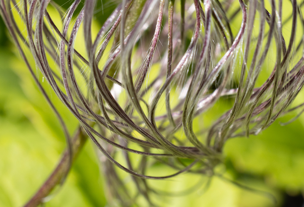
Hi Stuart, what a beautiful weed. I love the color combination. And one can see so clearly the details of the stem. I agree with Margaret that it would be nice to have the flowers tilted a bit more towards the viewer. When I see the sharpness of your photos I think that I really do need to learn more about focus stacking. |
Jun 14th |
| 95 |
Jun 24 |
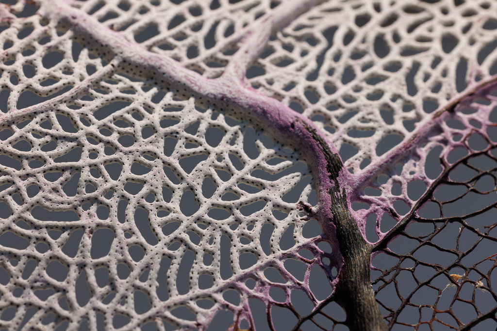
Comment |
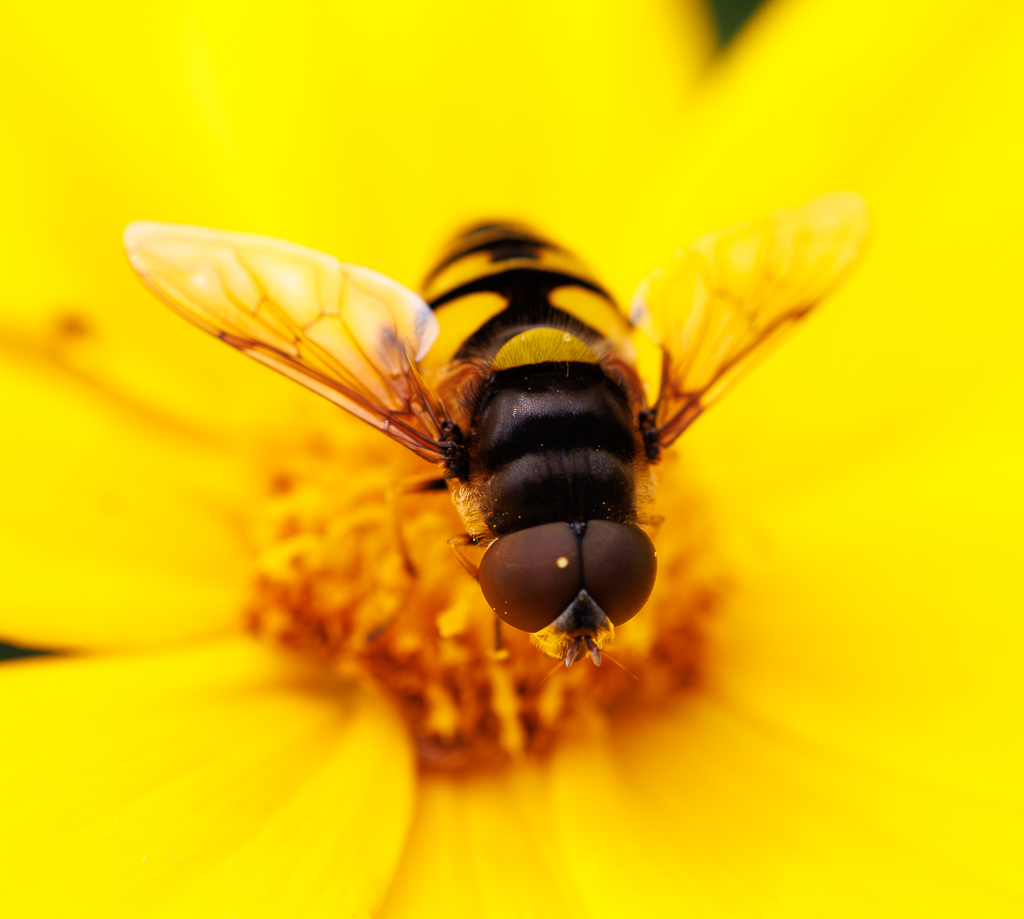
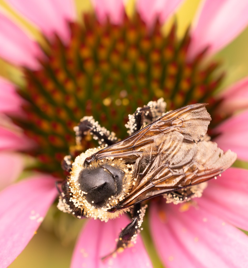
Hi Margaret, wow the details are incredible. I also like very much the soft pink background that matches the wings. Maybe you can crop even more to increase the focus on the fly itself. I am also still trying to figure out the focus stacking potential of the R5�� |
Jun 14th |
4 comments - 6 replies for Group 95
|
| 96 |
Jun 24 |
Reply |
Thanks Robert, I paid for Nik but have never used it.. so thanks for the suggestion! |
Jun 26th |
| 96 |
Jun 24 |
Reply |
Thank you Haru, I m heading to Provincetown next week and will try your suggestions |
Jun 26th |
| 96 |
Jun 24 |
Comment |
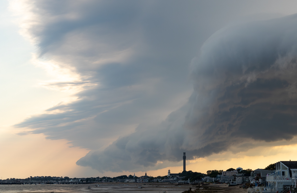
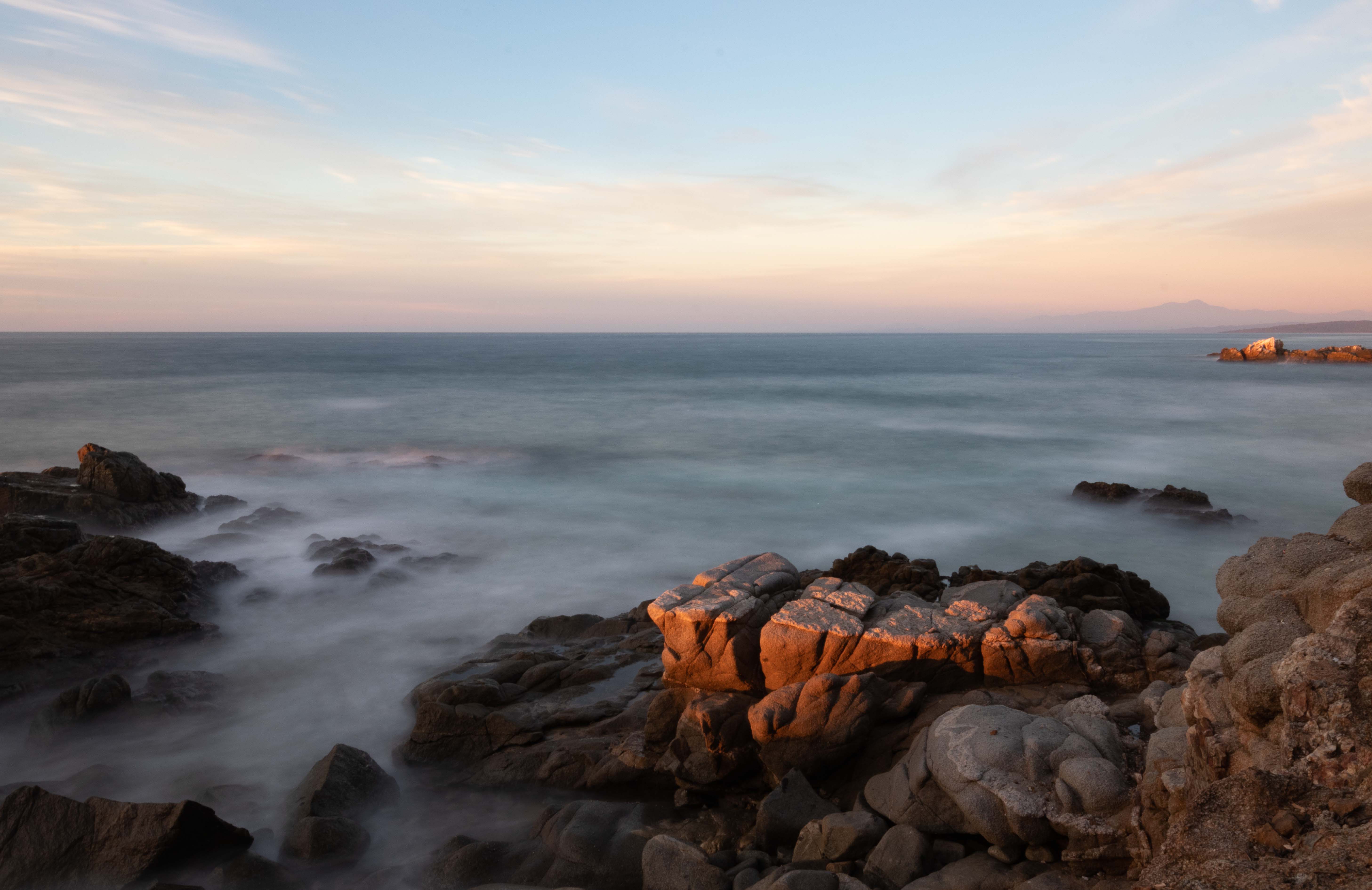
Hi Robert, it is a pity you could not get the composition you wanted. The place is spectacular and with a lot of potential. Still what you have is quite magnificent. The leading line of the salt works for me, and I like your editing that makes it brighter. In terms of the composition, maybe you could crop the foreground to bring more balance. I also think the with the edits the sky is a bit too washed out - although you are right that the clouds were too busy, and the pink of the mountains does not look natural to me. Overall the scenery is spectacular so I think you have material to make it a great image. |
Jun 14th |
| 96 |
Jun 24 |
Comment |
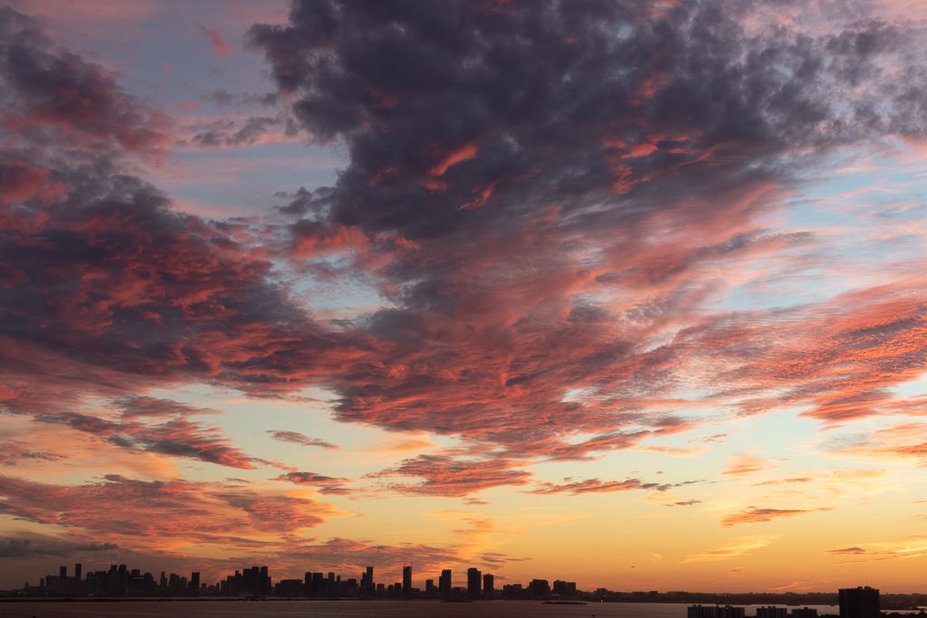
Hi Howard, I am also drawn by reflections on water at night - but it is indeed hard to shoot. Your reflection of the buildings are great. Maybe you could work on the detail of the tops of the buildings and the dark trees to adjust the exposure. |
Jun 14th |
| 96 |
Jun 24 |
Comment |
Hi Haru, I really like your image - as Viren says it is almost surreal. I actually like the space on top as it gives me the sense of the fog descending. I wonder why you decided to use vertical image - maybe with horizontal you would have shown more of the forest. And the two trees would be seen fully. It is a simple but beautiful image. |
Jun 14th |
| 96 |
Jun 24 |
Comment |
Thanks Viren |
Jun 14th |
4 comments - 2 replies for Group 96
|
8 comments - 8 replies Total
|