|
| Group |
Round |
C/R |
Comment |
Date |
Image |
| 95 |
May 24 |
Comment |
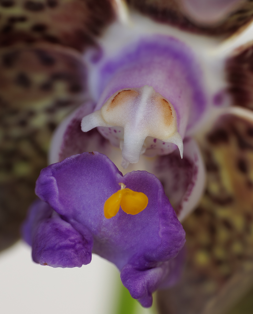
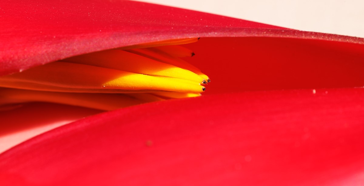
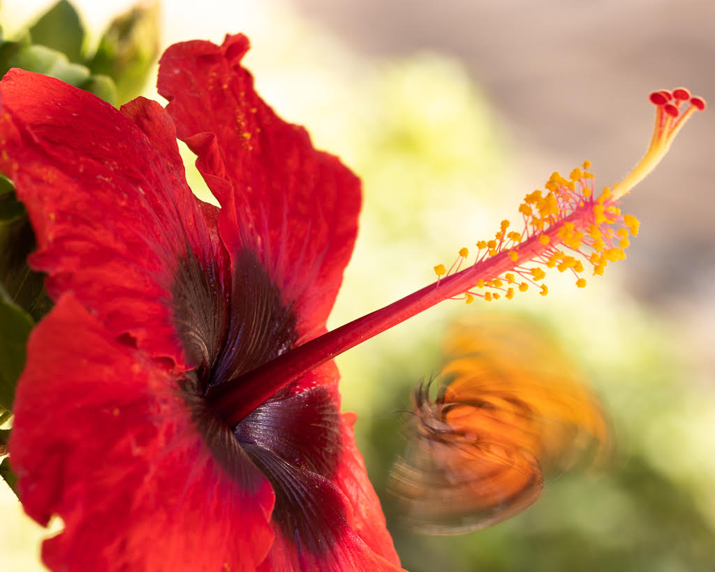
Hi Keith, the petals are very beautiful, look almost translucent and you can see clearly the details. I agree with comments on blurring further the background. The front petal lack of sharpness does not bother me - it looks to me as if it is opening up to better show the inside of the flower. |
May 18th |
| 95 |
May 24 |
Comment |
Stuart, I really liked your April image - but this one opens up nicely the full beauty of the flower with the branch. I like it even better with the darkening of the petals. The blur in the background works really well. |
May 18th |
| 95 |
May 24 |
Reply |
Thanks Carol, I will look at her images. |
May 18th |
| 95 |
May 24 |
Comment |
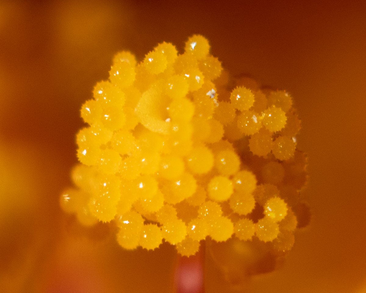
Hi Margaret, the image and the colors are stunning. The black background works really well. I agree that not all areas have to be super sharp. Also, this image has the potential to be an abstract one if you cropped closer. At first I thought of fireworks in the night sky... |
May 18th |
| 95 |
May 24 |
Comment |
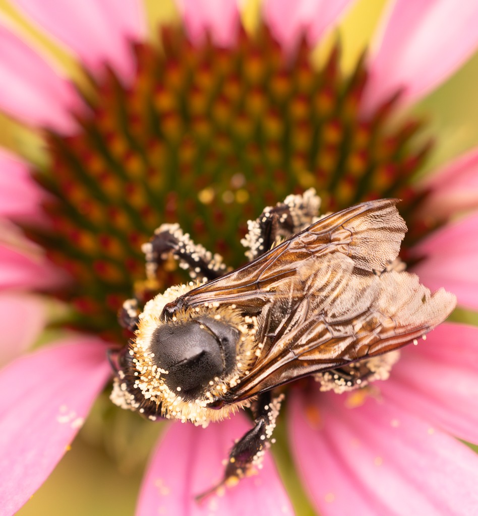
Carol, what a wonderful image. The butterfly looks so delicate and light, almost translucent. I like the sharpness in the foreground and the blur in the rest of the wings and petals. The color combination and the composition are also spot on. |
May 17th |
4 comments - 1 reply for Group 95
|
| 96 |
May 24 |
Comment |
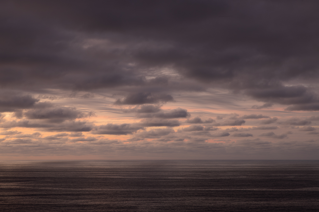
Hi Robert, very interesting image - at first I thought of the Moon or a surreal spot... The B&W works very well and enhances the image. The clouds and the dark sky are wonderful. I do agree with Haru that adding brightness to the dishes will make it easier to focus the eye towards them. |
May 18th |
| 96 |
May 24 |
Comment |
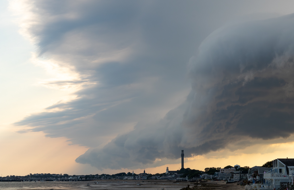
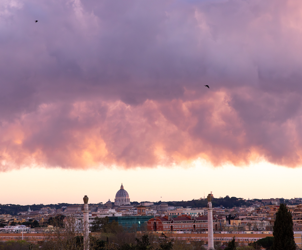
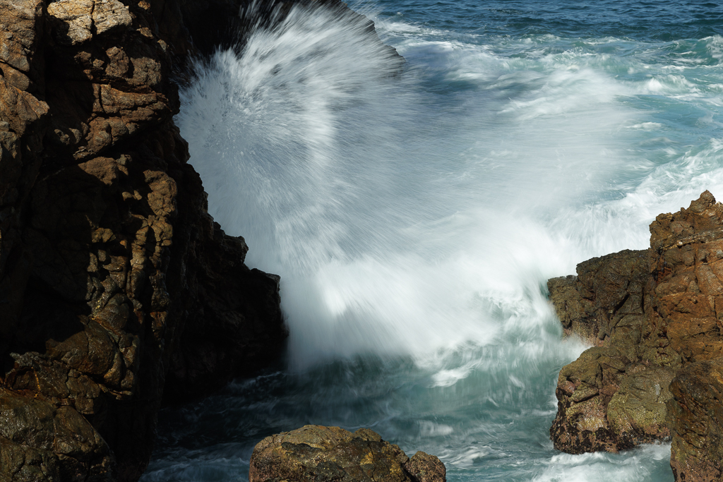
Hi Howard, it is a powerful image of the fury of nature. Very dramatic, you were lucky to catch the moment. I feel the blue sky on the left side looks a bit artificial - did you edit in some way the color? Also, I would like to see more of the sand in the foreground; or else the other option is to crop all the sand off - now I find it a bit distracting. |
May 18th |
| 96 |
May 24 |
Comment |
Bruce, I like the combination of colors and with a less bright sky it would work even better. I do feel the composition is a bit too busy on the sides, and distracts from the ranch and the impressive rocks in the background. Maybe you could crop so that the eyes go more directly towards the ranch. |
May 18th |
| 96 |
May 24 |
Comment |
Hi Haru, I looked at your image quite a long time and I felt mesmerized. I can totally see your title. The black and white I think works well. Maybe you could bring out some more of the details on the lower left side which is now very dark. |
May 18th |
| 96 |
May 24 |
Reply |
Thanks Haru |
May 18th |
| 96 |
May 24 |
Comment |
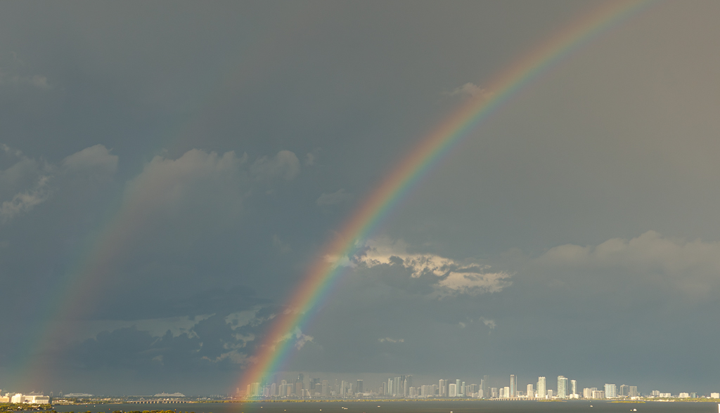
Hi Robert, it is a beautiful image and to me it fits the "amazing beauty of nature" image category. I really like the shapes and the colors and it is clear it was just a passing moment that you were lucky enough to catch. I do not think the arch is on the way - I like the composition. However, I would crop some of the left side so that the focus would be squarely on the center which has the most pink and the beautiful mountains. |
May 16th |
| 96 |
May 24 |
Reply |
Thank you Bruce. |
May 16th |
5 comments - 2 replies for Group 96
|
9 comments - 3 replies Total
|