|
| Group |
Round |
C/R |
Comment |
Date |
Image |
| 95 |
Apr 24 |
Comment |
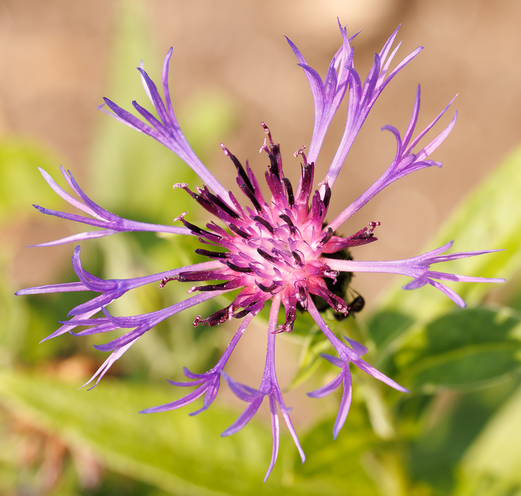
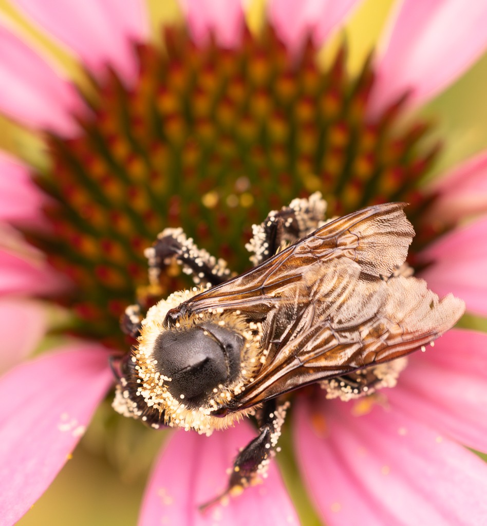
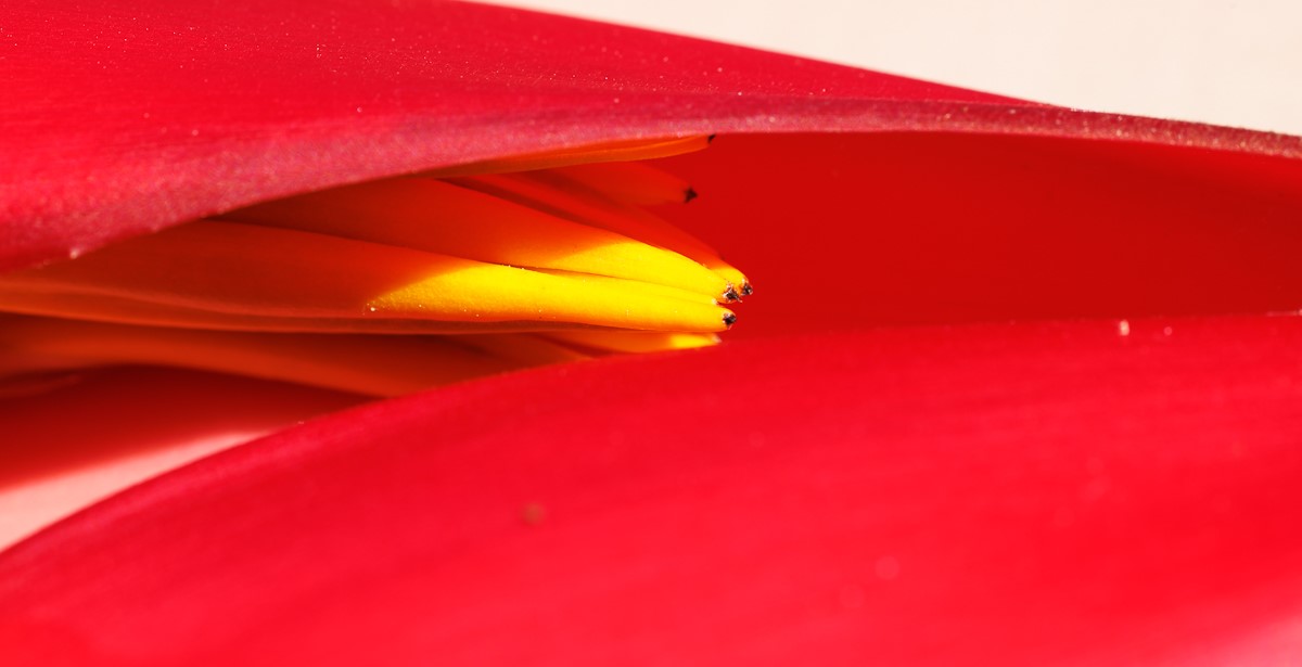
I really like this image Keith. The flower is stunning. The color is gorgeous, I see what you mean with the possible over saturation. But maybe because it is pink it looks good to me. The center is the most interesting part so makes sense to look there for greater sharpness. Great photo. |
Apr 20th |
| 95 |
Apr 24 |
Comment |
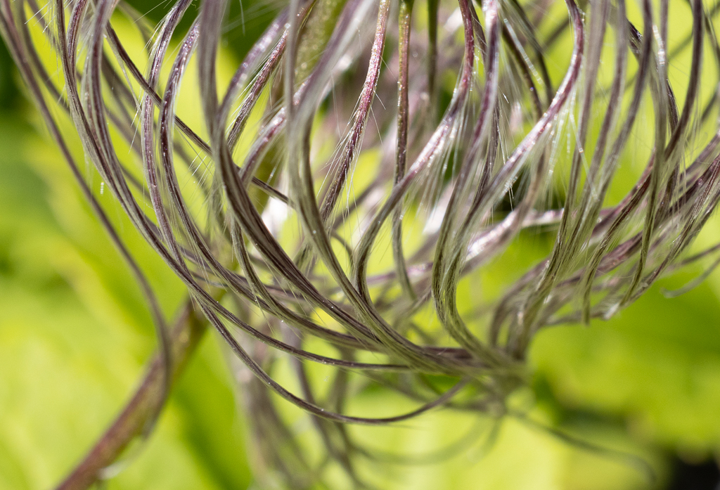
Hi Pat, I also like the result. Great composition, the bud seems to be floating and reaching out. I also find the colors and textures very pleasing. The stacking makes a difference I have to start using it more. |
Apr 17th |
| 95 |
Apr 24 |
Comment |
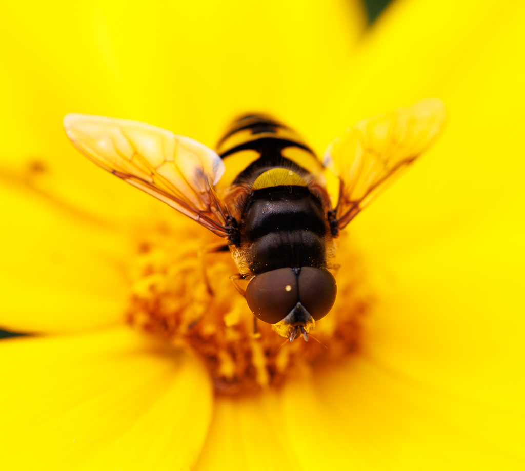
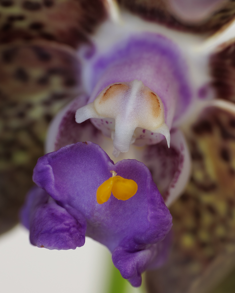
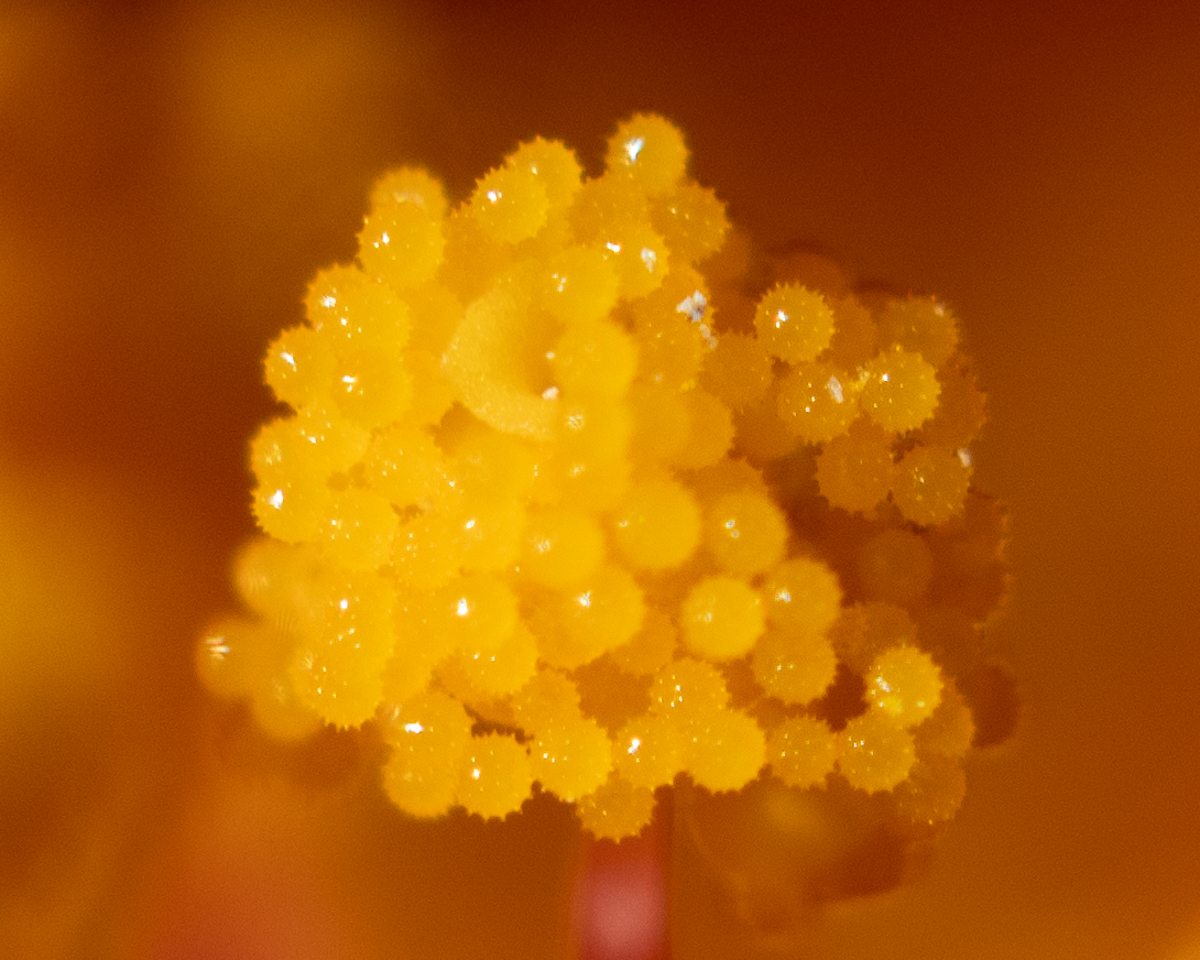
Hi Margaret, wow what an interesting image. Everything came so sharp. You are very creative and have opened my mind to possibilities! I love the colors and the composition. I agree with Stuart that the most beautiful part of the image is the tendril on the yellow of the sunflower. Ps could you give us details on camera and settings, and did you use a tripod. thanks. |
Apr 17th |
| 95 |
Apr 24 |
Comment |
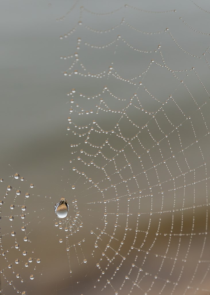
Hi Stuart, I love the colors, and learnt a lot about lighting and use of reflector and diffuser - thanks! My preferred version is the one with the mask and blur, the colors of the flower I think are enhanced. |
Apr 17th |
| 95 |
Apr 24 |
Reply |
Thank you and welcome to the group! |
Apr 17th |
| 95 |
Apr 24 |
Reply |
Thanks Keith |
Apr 17th |
| 95 |
Apr 24 |
Reply |
Thank you Stuart - very helpful. |
Apr 17th |
4 comments - 3 replies for Group 95
|
| 96 |
Apr 24 |
Comment |
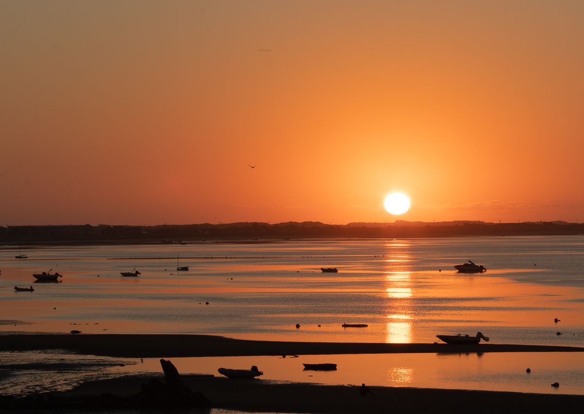
Hi Robert, I really like this image. The composition, the color, everything. The dunes feel alive. I get a sense of movement upward so I like your title. I like it as is with the breadth of view, not sure it needs cropping. I spend summers in cape cod and I know how mesmerizing dunes are, and how difficult to photograph, especially with wind. |
Apr 17th |
| 96 |
Apr 24 |
Comment |
Hi Viren, I like the black and white on this image. I also like the composition with the leading lines towards the top. I agree that the elevator would be more of a focus of attention if it were higher up. One thing that has been helpful to me in this group is to say a few words about what you would like to convey emotionally and visually with the image beyond the factual image. |
Apr 17th |
| 96 |
Apr 24 |
Comment |
Hi Howard, the image is very appealing and I like the color combination of the red within the natural environment. Also the falling water is pleasing to the eye and adds dynamism to the shot. I agree with all of Robert's comments - I think his suggestions make your image even stronger. |
Apr 15th |
| 96 |
Apr 24 |
Reply |
Thanks Robert I see your point. I appreciate the suggestions. |
Apr 15th |
| 96 |
Apr 24 |
Reply |
Thank you, encouraging comments |
Apr 15th |
3 comments - 2 replies for Group 96
|
7 comments - 5 replies Total
|