|
| Group |
Round |
C/R |
Comment |
Date |
Image |
| 95 |
Feb 24 |
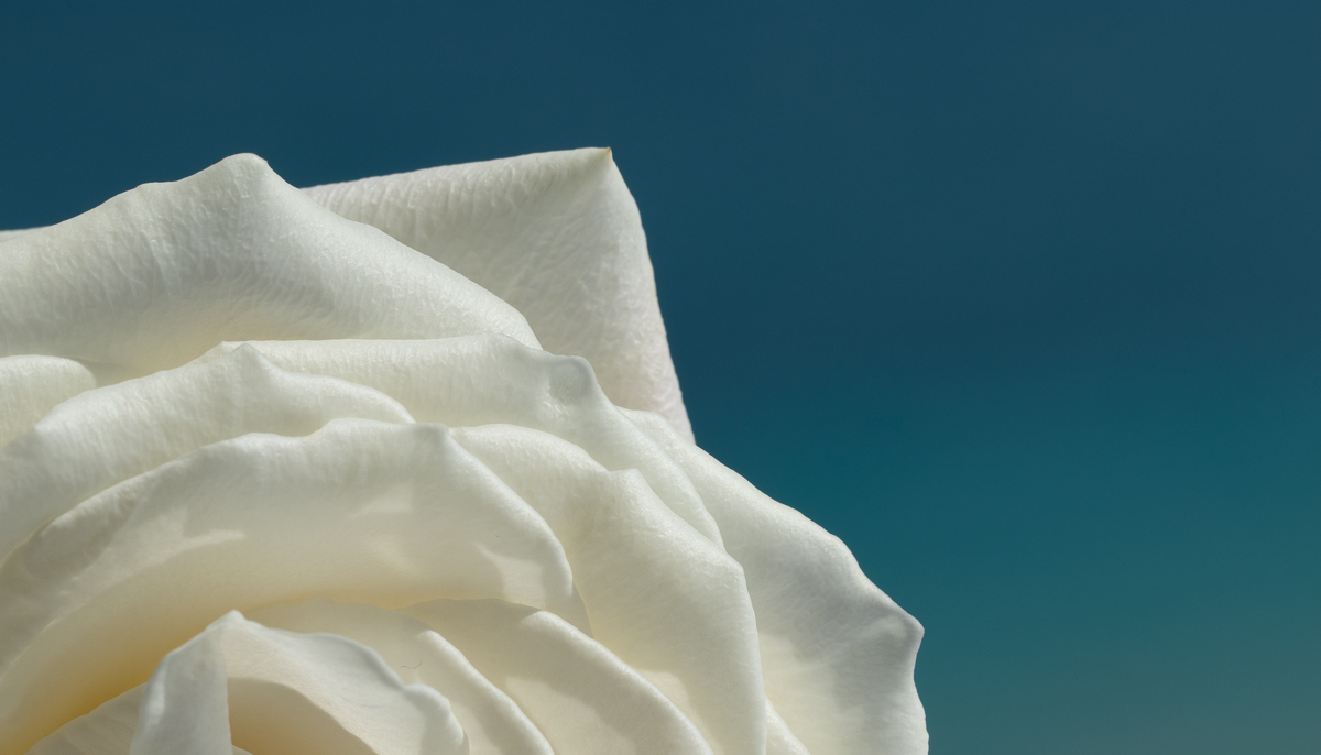
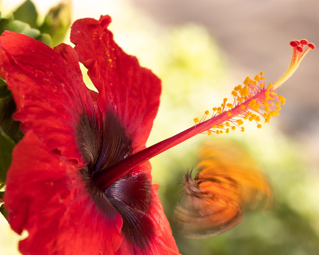
Comment |
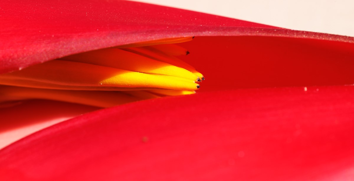
Nice image Keith - I like the very crisp hairs and the bright yellow and green. I am impressed you took it handheld. I agree that the leaf on top and the green background top left distract the eye and could be removed. I also agree with Stuart that would be worth trying rotating flower vertically. |
Feb 21st |
| 95 |
Feb 24 |
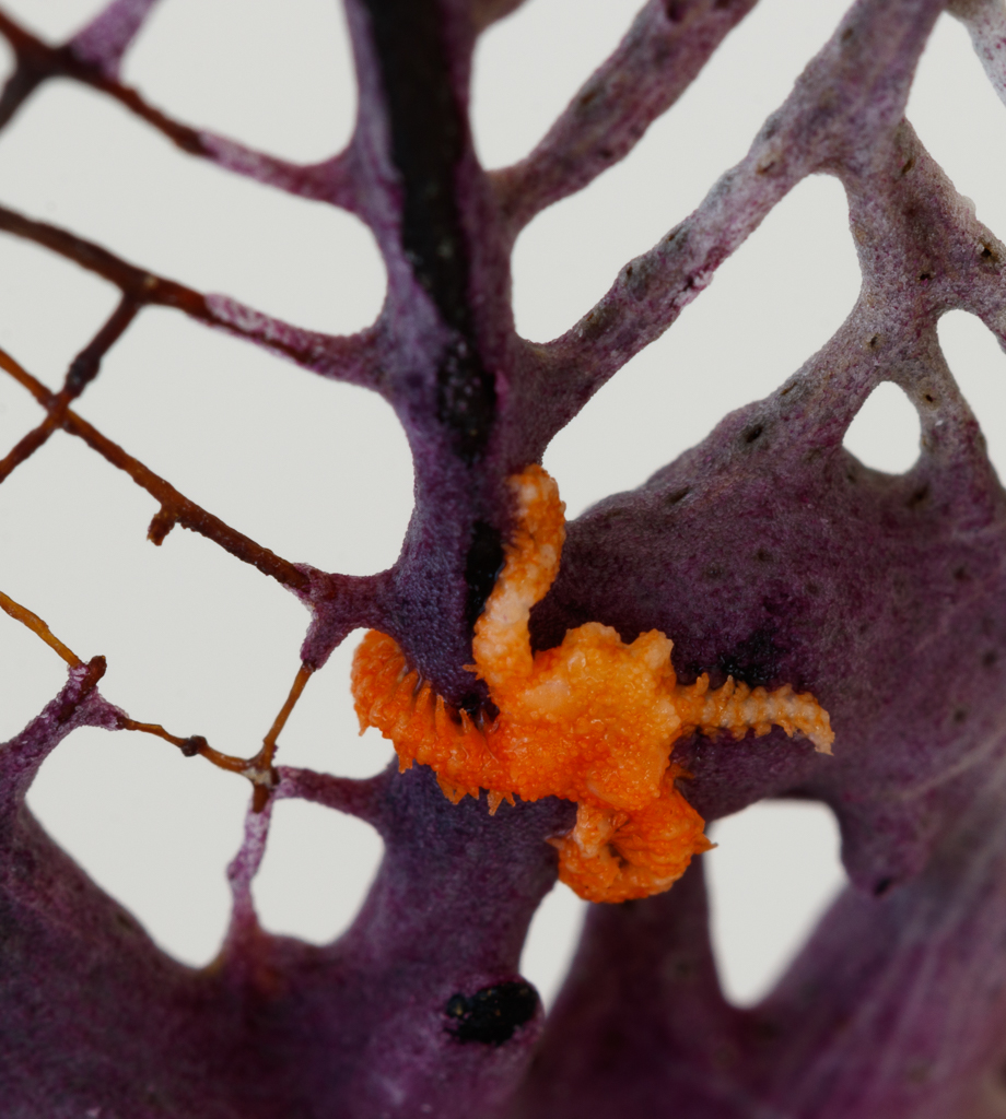
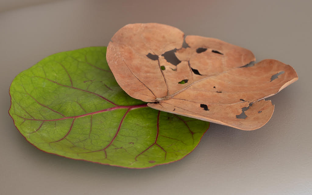
Comment |
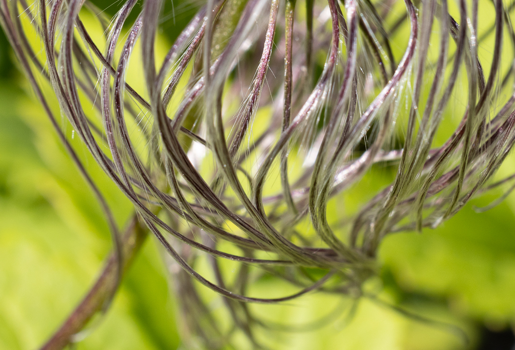
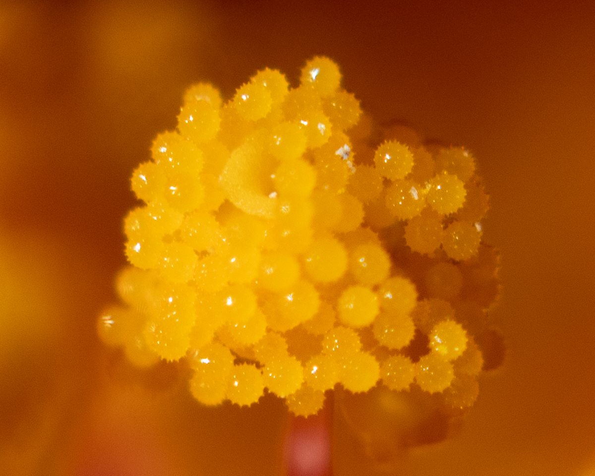
Hi Stuart, Wow so interesting - you keep opening new worlds to us! I really like the texture and the color combination. I would have never guessed how you got to this image. Thank you for sharing. |
Feb 21st |
| 95 |
Feb 24 |
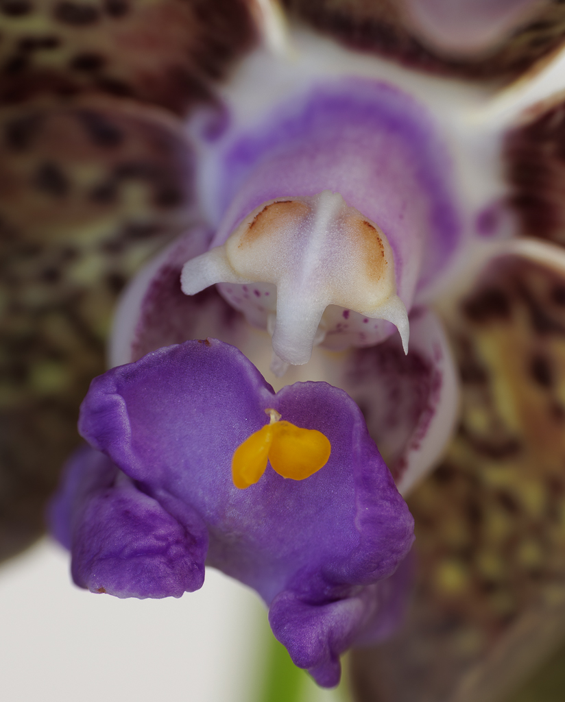
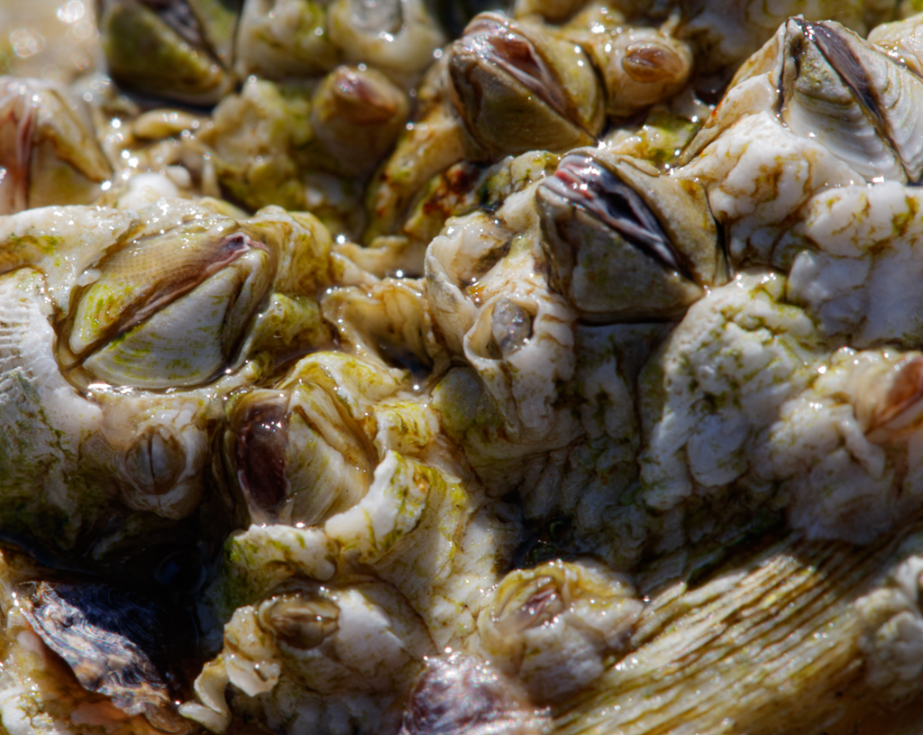
Comment |
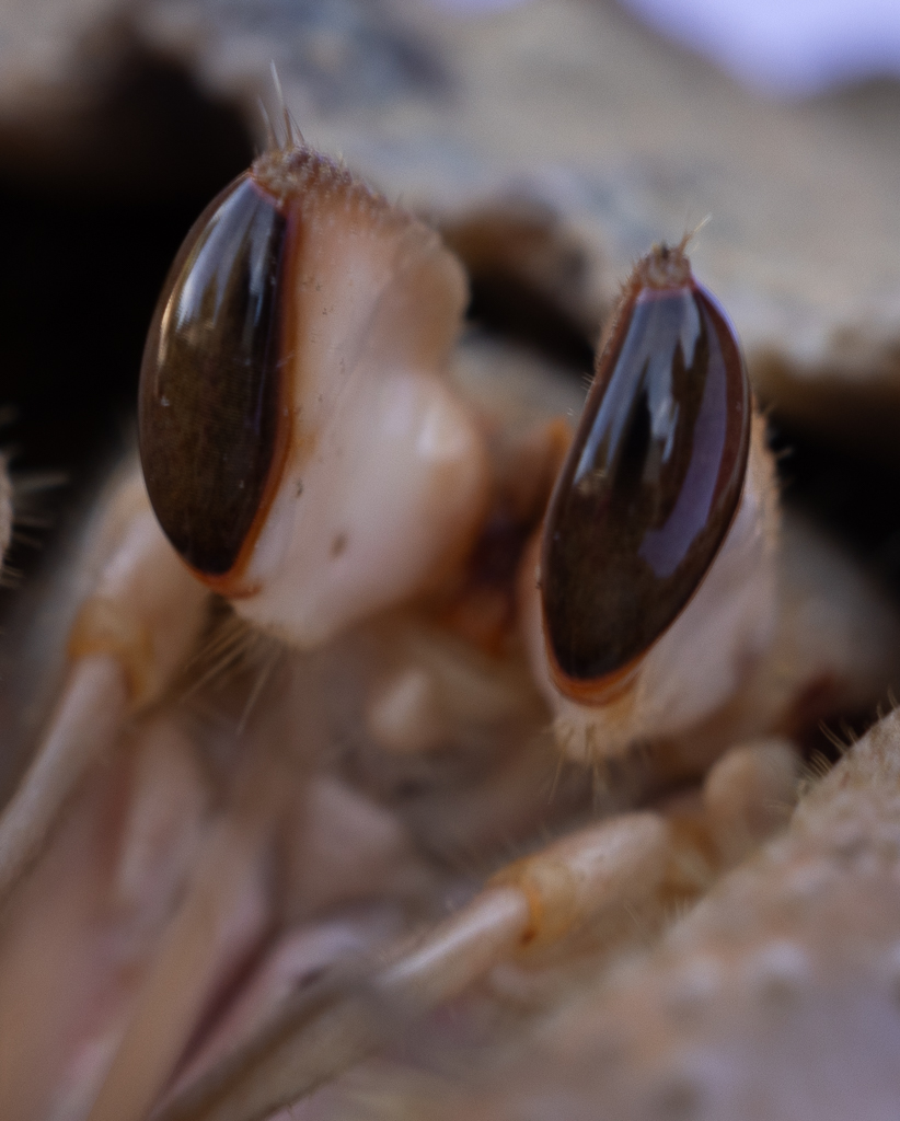
Hi Pat, very nice result - how many images did you use in the stacking? It is amazing how it helps with sharpness. I like very much the 3D composition and the color combination is really pleasing to the eye. |
Feb 20th |
| 95 |
Feb 24 |
Reply |
Thanks Pat. Maybe I need to crop further and leave just the polyps more in focus. I find it really hard to achieve sharp images all around when I try larger magnifications. And I definitely need to practice focus stacking.. |
Feb 20th |
| 95 |
Feb 24 |
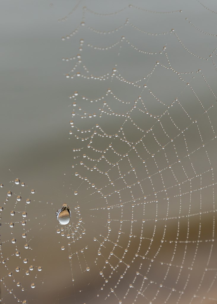
Comment |
Hi Carol, what a nice and creative image. I like the composition, the color combination, and the texture. You did create a very pleasing abstract image. I have never worked with water and oil but you are an inspiration! And I agree that even if it is not razor sharp is it very pleasing to the eyes. |
Feb 20th |
| 95 |
Feb 24 |
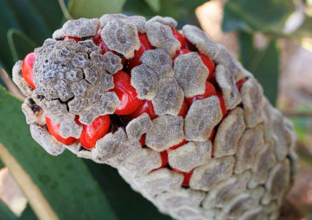
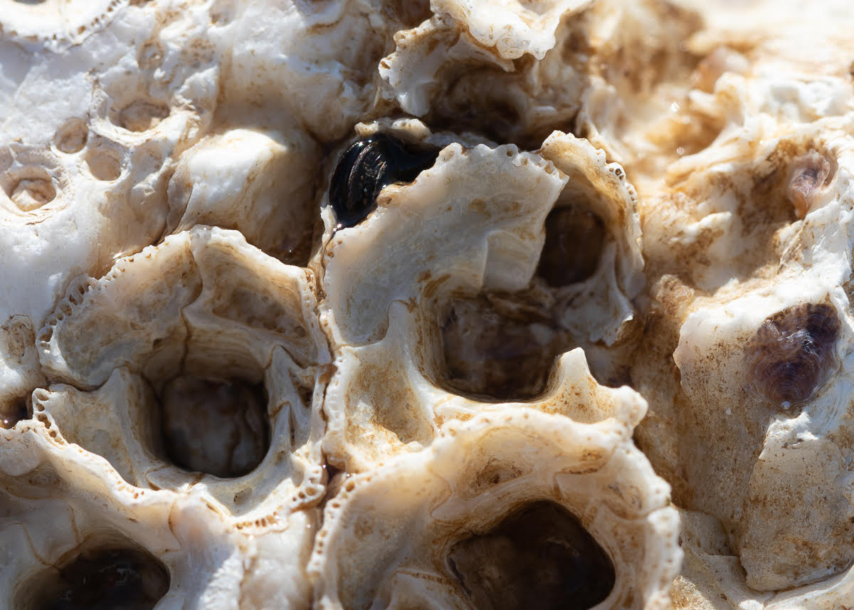
Comment |
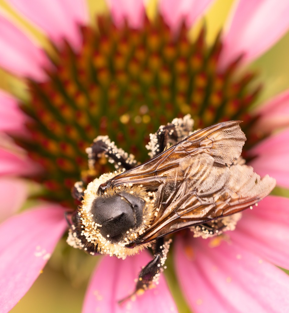
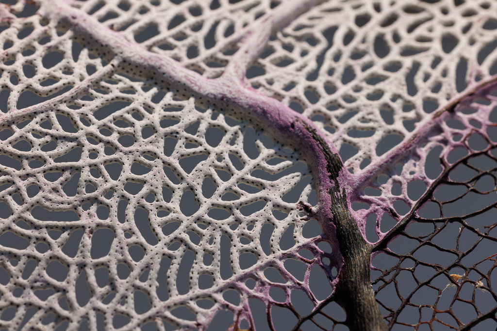
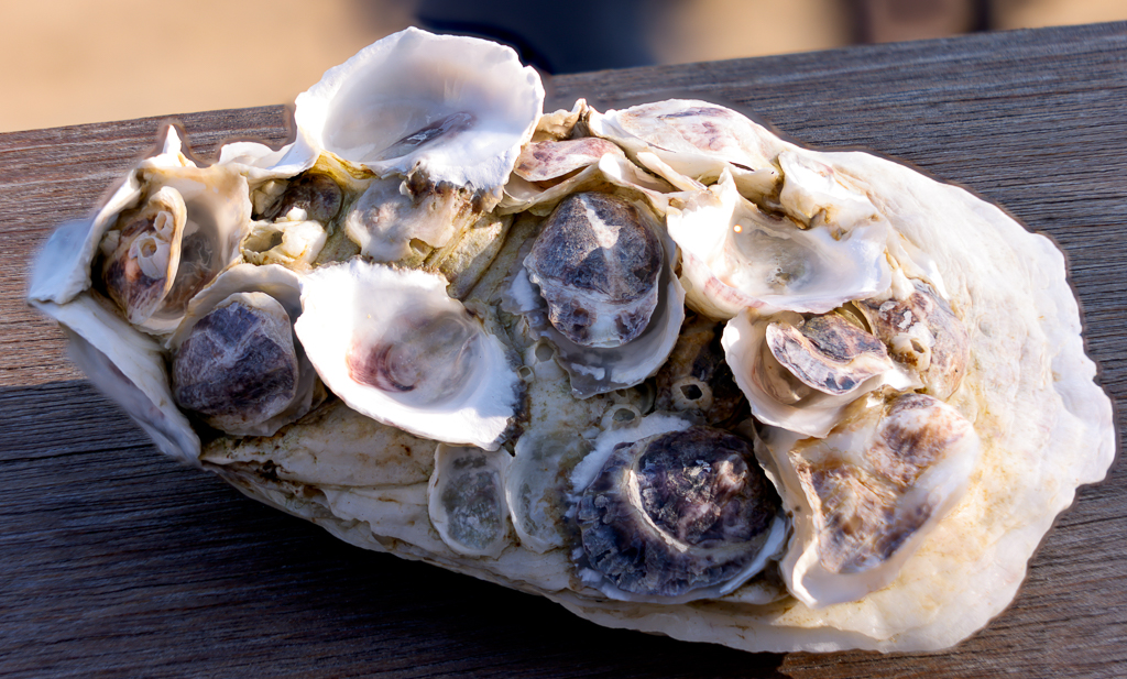
Hi Stuart, thanks, this is detail of last month's sea fan.
|
Feb 9th |
 |
5 comments - 1 reply for Group 95
|
| 96 |
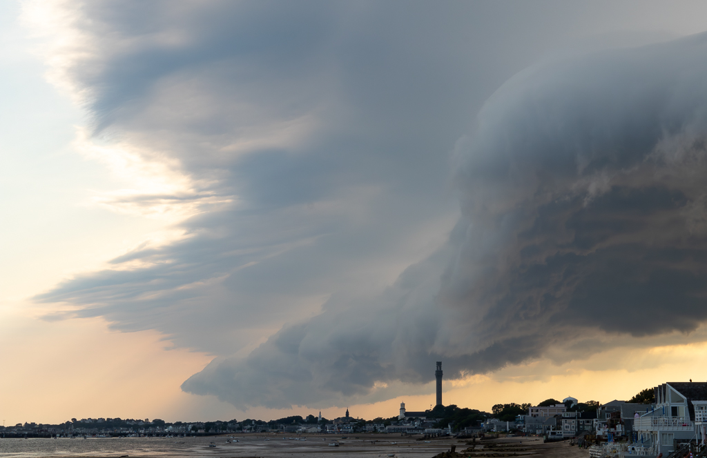
Feb 24 |
Comment |
Hi Viren, I really like the way the colors come out in this photo - particularly the blues and the pink. And also the reflection in the water. I also like the way the arrangement of the 4 buildings looks - with 4 different shapes. I agree with others that one improvement would be to crop the left side and focus on the buildings and the light coming from the right side. I like what Don did along those lines. |
Feb 20th |
| 96 |
Feb 24 |
Comment |
Hi Howard, welcome to the group. It is a beautiful image of the sunlit building - I really like the golden hue of the windows. Since the building is the main subject, I agree that to make it even more impressive maybe would be worth cropping some of the left side and the bottom part that is a bit distracting. You did not mention a tripod so I assume you did a very good job by handholding as it looks quite sharp. |
Feb 20th |
| 96 |
Feb 24 |
Comment |
Hi Haru, it is a magnificent image and I love the black and white contrast.
1. to me the center of attention is the sun and its rays threading down to the vegetation
2. the light source is not distracting, to me is like a guiding light for my eyes
3. I like Robert's approach to making it better, more intense, and bringing in more of the vegetation by brightening it.
Overall a beautiful image. |
Feb 20th |
| 96 |
Feb 24 |
Reply |
Hi Robert, , as others mentioned the first version had too many things going on and was hard to focus the eye on the main subject, and the light was a bit off. I personally like this second version much better - although I feel you could have included the top of the peak at the center. Now it feels cut off. I can feel here the path from darker to lighter. I like the color combination of the green of the trees and the white of the snow in the same image.I do feel the sky might need a bit more blue. |
Feb 20th |
| 96 |
Feb 24 |
Reply |
Thank you so much Robert for your thoughtful and thorough
comments. Actually you helped me clarify exactly what I was after.
I also appreciate your analysis of the image and how to improve it.
Your comments are really helpful to me as I have many opportunities
Here for these type of images and now you clarified how
To best make use of these opportunities.
I am very grateful. |
Feb 18th |
| 96 |
Feb 24 |
Comment |
Hi Sharon, Good first photo! You choose well by posting an image that you can reshoot. If you wanted the focus on the big mountain you definitely should use a different aperture - as others have mentioned at least f/8. I use f/11 for landscape shots with focus point farther away. And definitely use a tripod. Also maybe crop the left side a bit. To brighten the colors of the trees on the right you could apply Lightroom's brush feature. Welcome! |
Feb 15th |
| 96 |
Feb 24 |
Reply |
Thank you Sharon |
Feb 15th |
| 96 |
Feb 24 |
Reply |
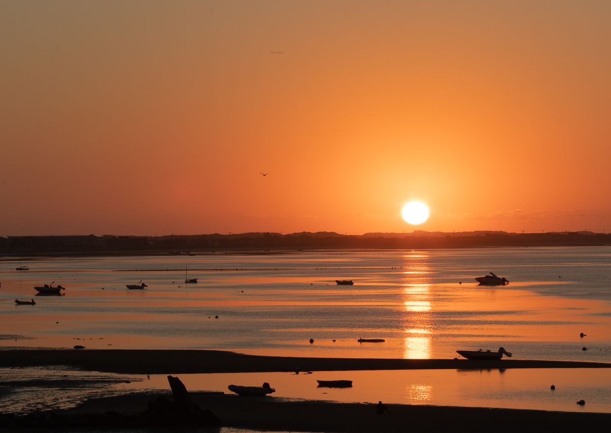
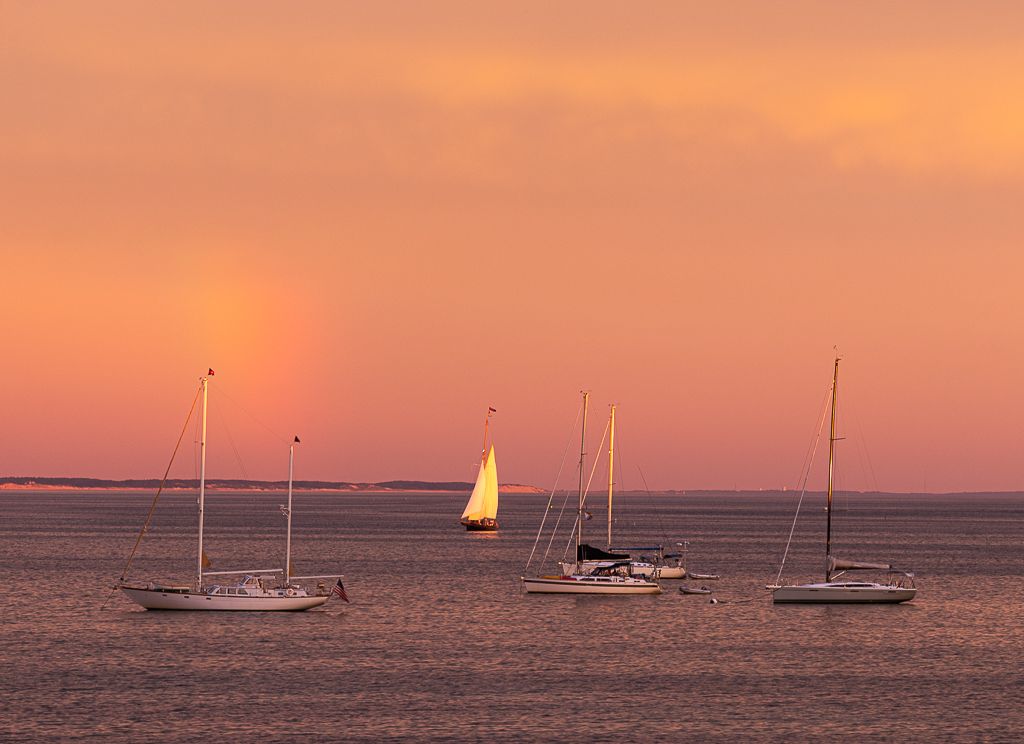
Thanks Haru, hopefully a boat will pass by to pose for one of my sunset images! |
Feb 15th |
| 96 |
Feb 24 |
Reply |
Thanks Howard, yes I understand. The challenge I have is that here there are some amazing sunsets but�� it is very remote and almost no boats pass by�� just whales�� which are hard to photograph! Maybe in the next shots I try to include part of the natural environment. |
Feb 15th |
4 comments - 5 replies for Group 96
|
9 comments - 6 replies Total
|