|
| Group |
Round |
C/R |
Comment |
Date |
Image |
| 95 |
Dec 23 |
Reply |
Hi Stuart, yes for my taste lighter color is indeed better. What was the actual background - did you try blurring that one. |
Dec 18th |
| 95 |
Dec 23 |
Comment |
Hi Fran, I like the color combination and the abstraction of the image. If you had not told me where it came from I would have had my imagination going wild. Agree with others that a tighter cropping might enhance image even more. |
Dec 17th |
| 95 |
Dec 23 |
Comment |
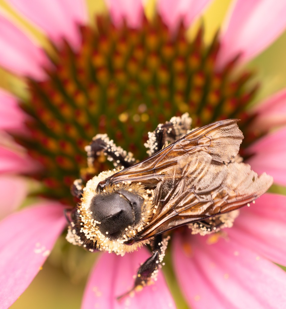
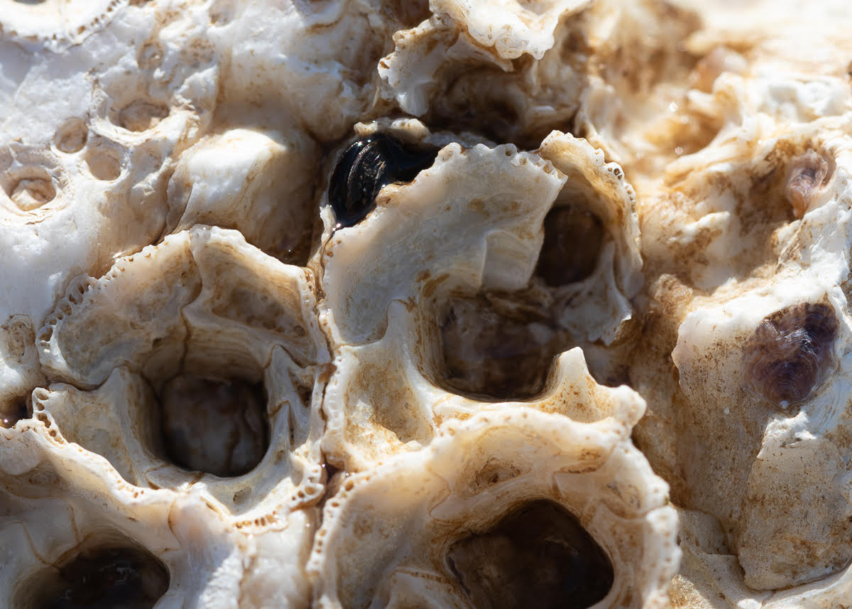
Hi Stuart, The sharpness of the details and the ice are amazing. And I like the transparent ice combined with the bright green and purple. I am fine with the angle. I like the blur in the background, but it felt too dark and superimposed to me. |
Dec 17th |
| 95 |
Dec 23 |
Comment |
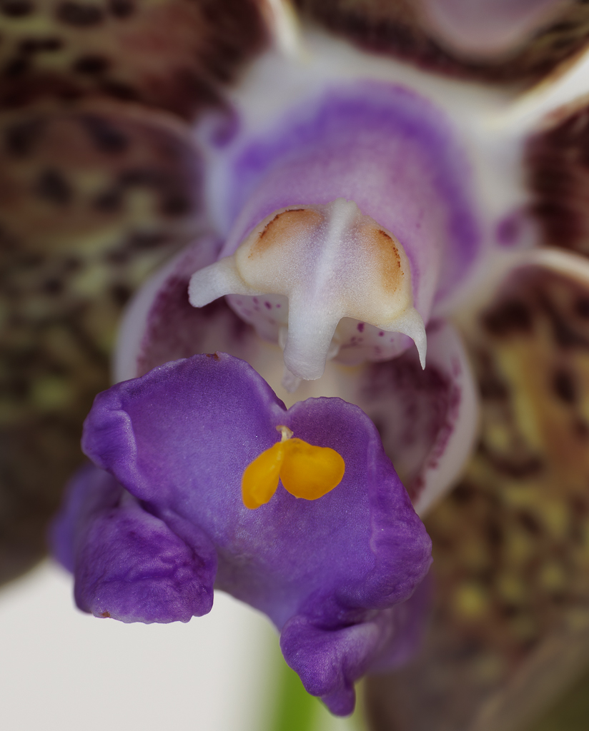
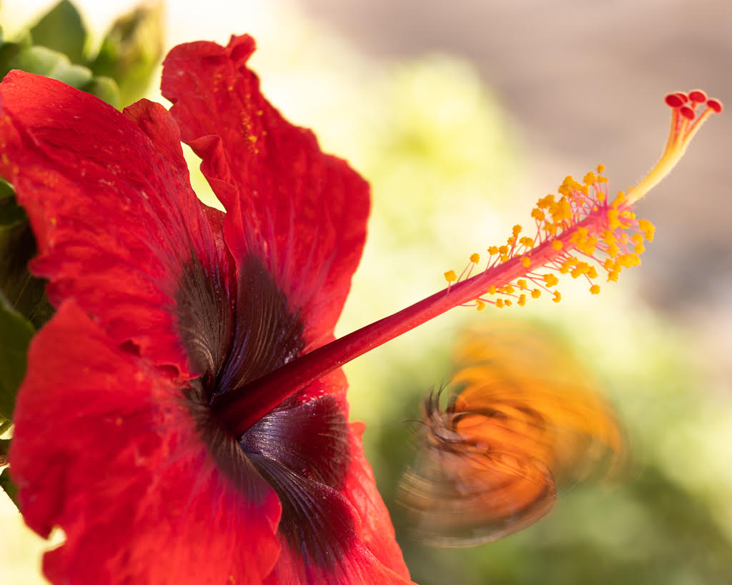
Hi Pat, definitely you feel you want to touch the velvety flower and the purple is beautiful. This is one image that I personally would like to see cropped much closer with much less of the green areas around. And maybe even crop tightly into one of the areas more in focus. |
Dec 17th |
| 95 |
Dec 23 |
Comment |
Hi Keith, great learning opportunity for me too. I am also learning to use focus stacking and it is challenging. I like your crop because I think macro allows us to get closer and closer to abstraction and also appreciate the minimal details. The shades of green and yellow are very nice close up. I agree on the reflection and I appreciate all of Stuart's suggestions which are helpful to me too! |
Dec 17th |
| 95 |
Dec 23 |
Comment |
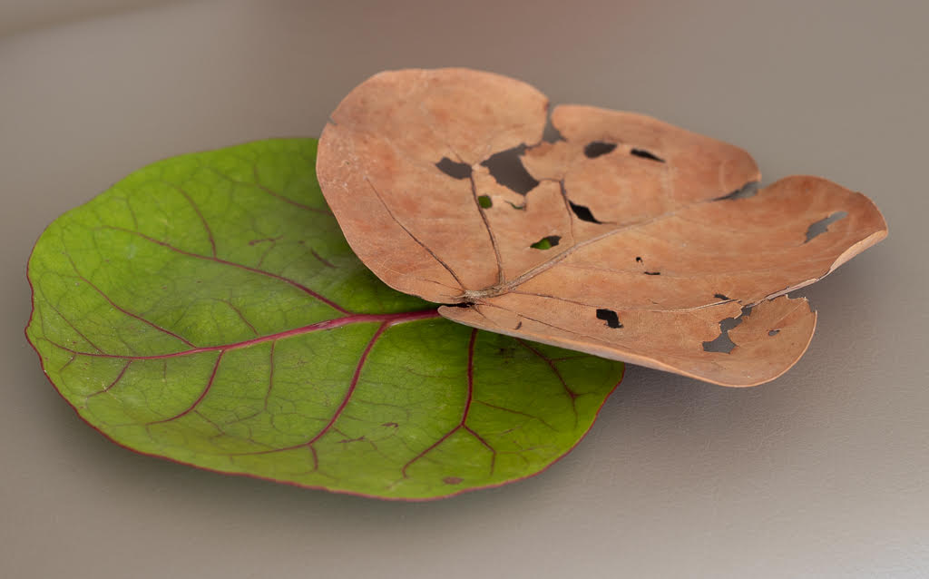
Hi Carol, what a beautiful image, be it by chance or not I really like the effect. If you replicate it, let us know how you did it! I also am not bothered by the yellow, I find it pleasing to my eyes.
And thanks Stuart for the reference. |
Dec 17th |
| 95 |
Dec 23 |
Reply |
Thanks Keith, I will try. |
Dec 17th |
| 95 |
Dec 23 |
Reply |
Thank you Carol for the suggestions to improve it |
Dec 17th |
| 95 |
Dec 23 |
Comment |
Hi Tom, Very nice and sharp. I like Stuart's lightened version. I wonder whether it would be even more impressive if you cropped it closer, without the dark background behind. |
Dec 6th |
| 95 |
Dec 23 |
Comment |
Hi Stuart, Very thankful for your comments and suggestions. Next time I will face the other way - you are absolutely right. And try to get closer. |
Dec 6th |
7 comments - 3 replies for Group 95
|
| 96 |
Dec 23 |
Reply |
Thanks Viren. I'll go back and enhance raw file. |
Dec 18th |
| 96 |
Dec 23 |
Comment |
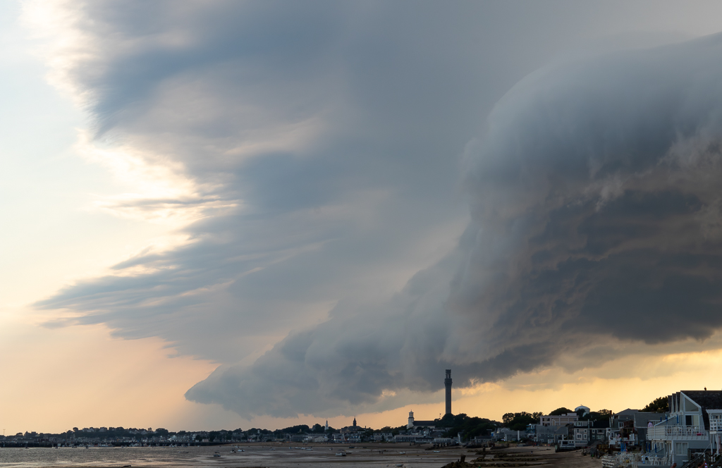
Hi Haru, this is a magnificent image - gives a sense at the same time of peace and of the force of nature. I like your title too. My eyes go from right to left - from the light to the darkness. Then to the mountain peaks. Finally they stop at the trees that are so sharp, delicate, and peaceful. I do not think it is busy at all - I really like the composition and the reflections on the water. In terms of enhancements, maybe just bring out a bit the green of the trees - but it is a comment at the margin - the image is really pleasing to my eyes as is. |
Dec 17th |
| 96 |
Dec 23 |
Comment |
Hi Robert, I really like your image and the title works for me. I can see the contrast. I immediately thought the Beast was the big dark cloud however. The yellow of the flowers looks gorgeous. I have used focus stacking in macro images, never in landscape - but this is an interesting idea and it worked in your photo. I do not see any frame to frame motion. I agree with Haru on cropping the right side as it would give more prominence to the more striking yellow flowers. |
Dec 17th |
| 96 |
Dec 23 |
Comment |
Hi Viren, It is an interesting image and the leading lines do work in making one focus on the monument. However, I agree with Bob that there is some drama missing in terms of the colors and highlighting the monument itself. Maybe you can enhance the green of the trees and the sky. Or maybe crop on the left side and use only the cemetery as leading line ,so you focus on the monument and cemetery only. |
Dec 17th |
| 96 |
Dec 23 |
Comment |
Hi Bob, The colors are very nice. And I love lighthouses too.. I would also crop the left side a bit to hide the roof and also to give more prominence to the right side where the sky is most interesting.
And thank you for your dedication and the extremely useful and detailed comments you always provide. I learned a lot from you. We will miss you. |
Dec 17th |
| 96 |
Dec 23 |
Reply |
Hi Bob, Thanks. Yes I wonder why it looks so noisy, I shot it with a tripod. I will apply the Topaz Denoise to the original RAW image. |
Dec 17th |
| 96 |
Dec 23 |
Reply |
Thanks Haru - will use your suggestion |
Dec 17th |
4 comments - 3 replies for Group 96
|
11 comments - 6 replies Total
|