|
| Group |
Round |
C/R |
Comment |
Date |
Image |
| 95 |
Jul 23 |
Comment |
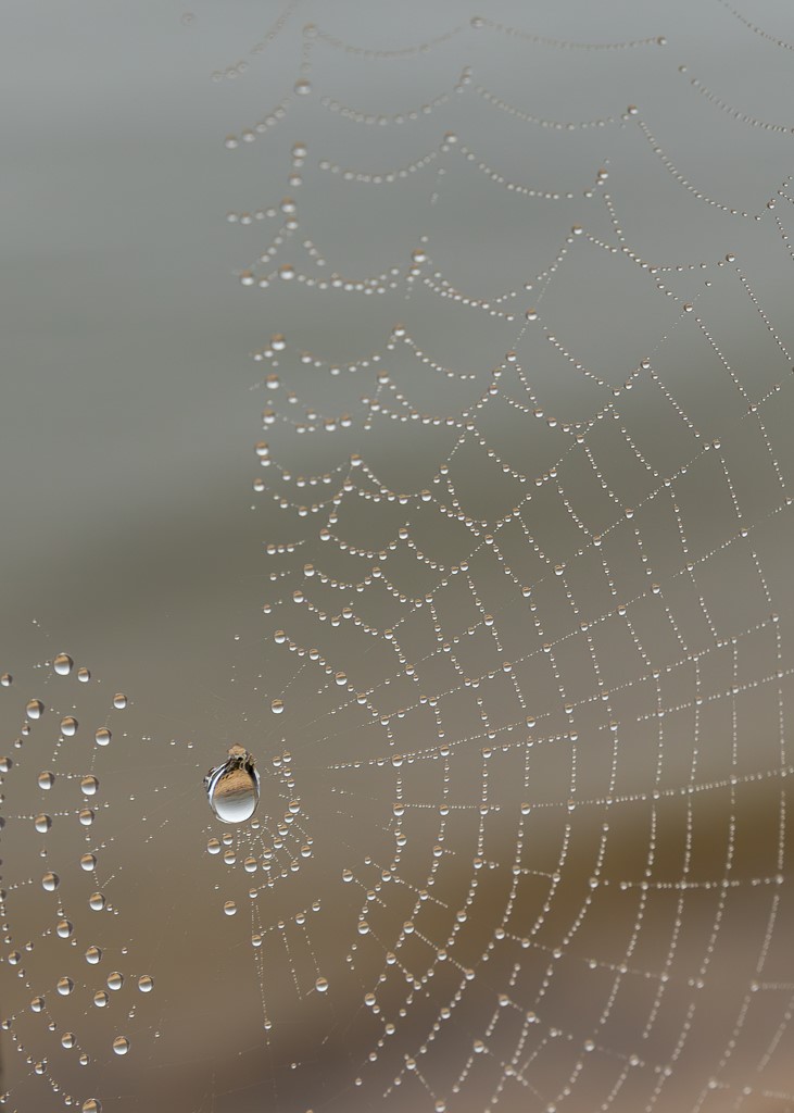
Stuart, I cannot comment on technical details, still learning. But I really like the result in your answer to Tom, sharper and the crop allow the eye to focus more on the colors and shapes. I have a question on the background, I wonder whether it would be better a bit blurred, the blue and the texture distracted my eye. |
Jul 19th |
| 95 |
Jul 23 |
Comment |
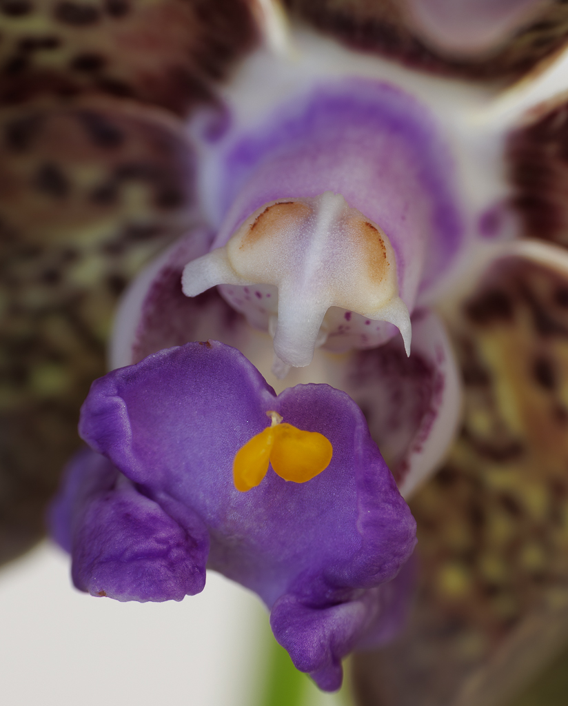
Hi Carol, I am really drawn by your image - the stem is so crisp and the colors beautiful. The Chiaroscuro works for me - I had never heard of it applied to photography. Thanks to you and Stuart for the learning. |
Jul 19th |
| 95 |
Jul 23 |
Comment |
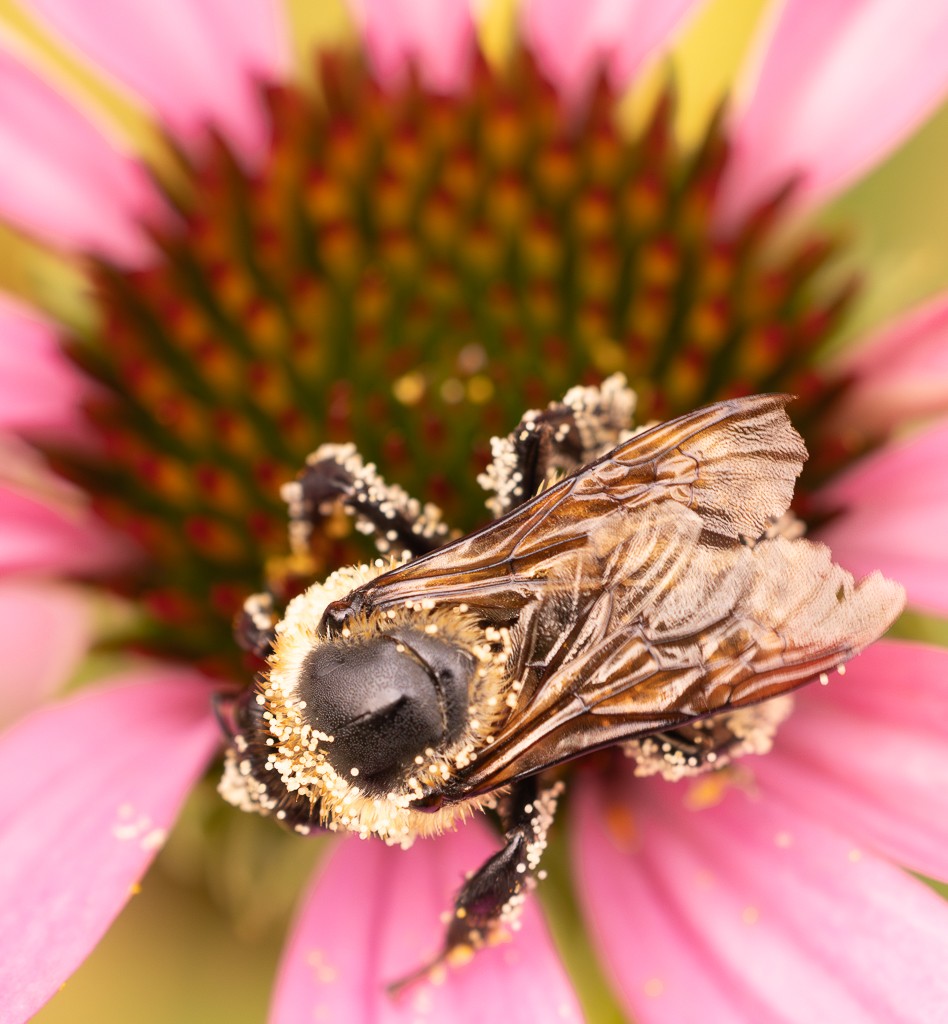
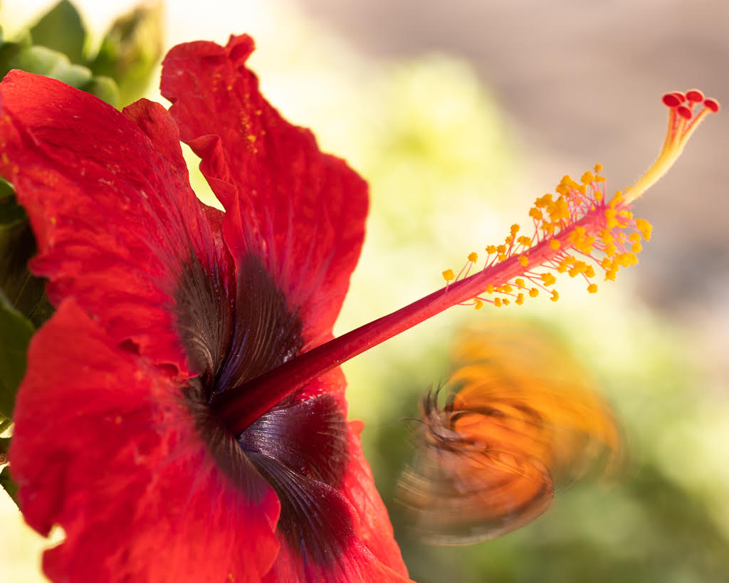
Great image - I love the color combination and the clarity of the drops. I felt I could almost touch the morning dew drops.. You had a very good result even if handheld. I agree with Stuart that it was challenging to get a crisper shot of the upper close petal. |
Jul 19th |
| 95 |
Jul 23 |
Reply |
Thank you Pat, will do. |
Jul 18th |
| 95 |
Jul 23 |
Reply |
Thank you Pat, will do. |
Jul 17th |
| 95 |
Jul 23 |
Reply |
Thank you Pat, will do. |
Jul 17th |
| 95 |
Jul 23 |
Comment |
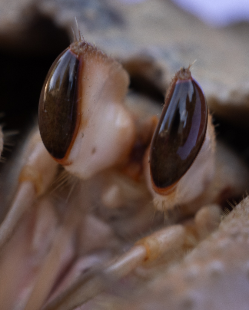
Keith, I think it is a great capture given the little time you had - and an even better learning opportunity for next time! Also for me... I think I would go with the option of greater depth of field and get more in focus. |
Jul 14th |
| 95 |
Jul 23 |
Comment |
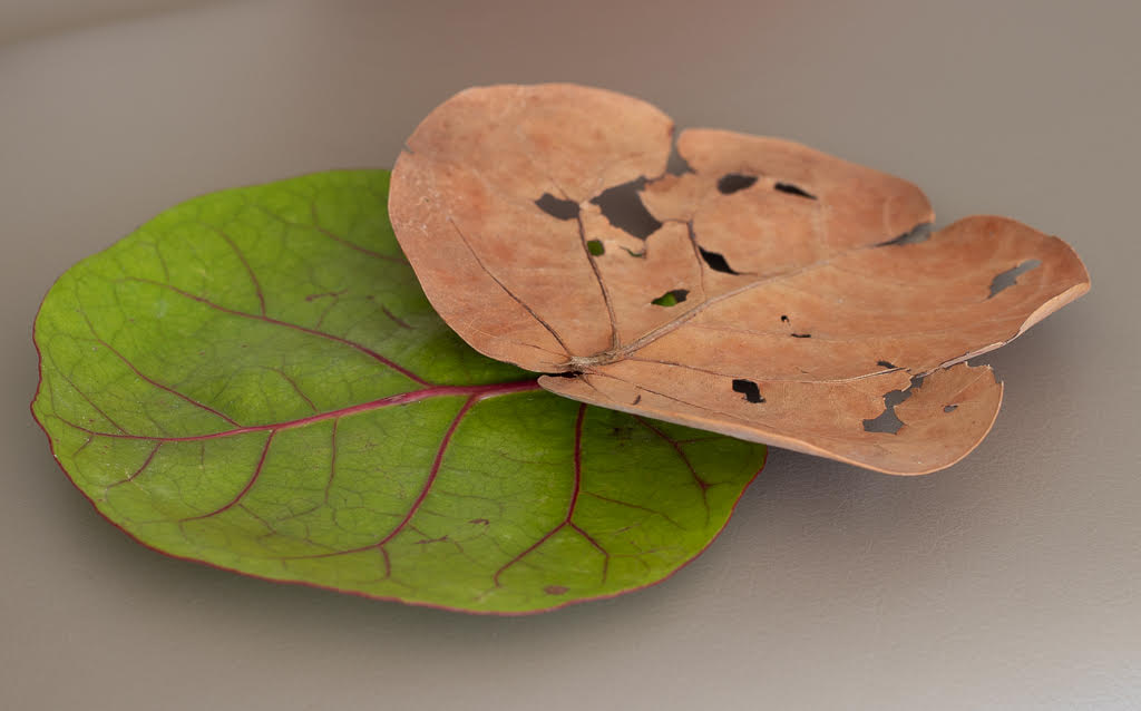
Tom, I really like your image. The colors are great and I like the abstraction you get by getting closer. It really conveys a sense of movement towards the center. |
Jul 14th |
| 95 |
Jul 23 |
Comment |
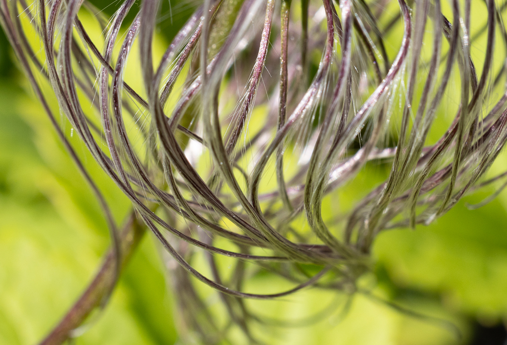
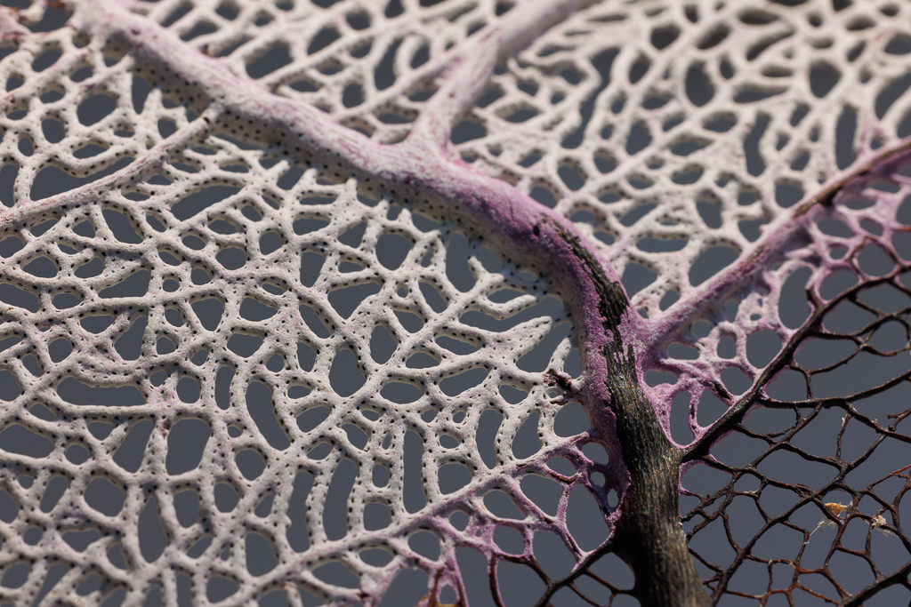
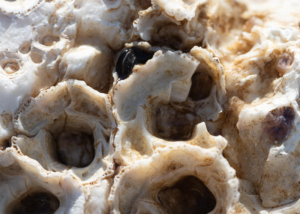
Very interesting! Amazing what you can see of everyday things with a macro lens - really opens new horizons. Worth shooting it again to try to get more of the edges in focus. |
Jul 14th |
| 95 |
Jul 23 |
Reply |
Thank you Tom!!! great learning opportunity. I will use this again. |
Jul 14th |
| 95 |
Jul 23 |
Reply |
Thank you Carol, I will try out your suggestions. |
Jul 14th |
| 95 |
Jul 23 |
Reply |
Thank you Stuart, great suggestions |
Jul 14th |
6 comments - 6 replies for Group 95
|
| 96 |
Jul 23 |
Reply |
Thanks Robert - I took quite e few pictures so I will check if I have other perspectives that better show what I was trying to convey. |
Jul 19th |
| 96 |
Jul 23 |
Comment |
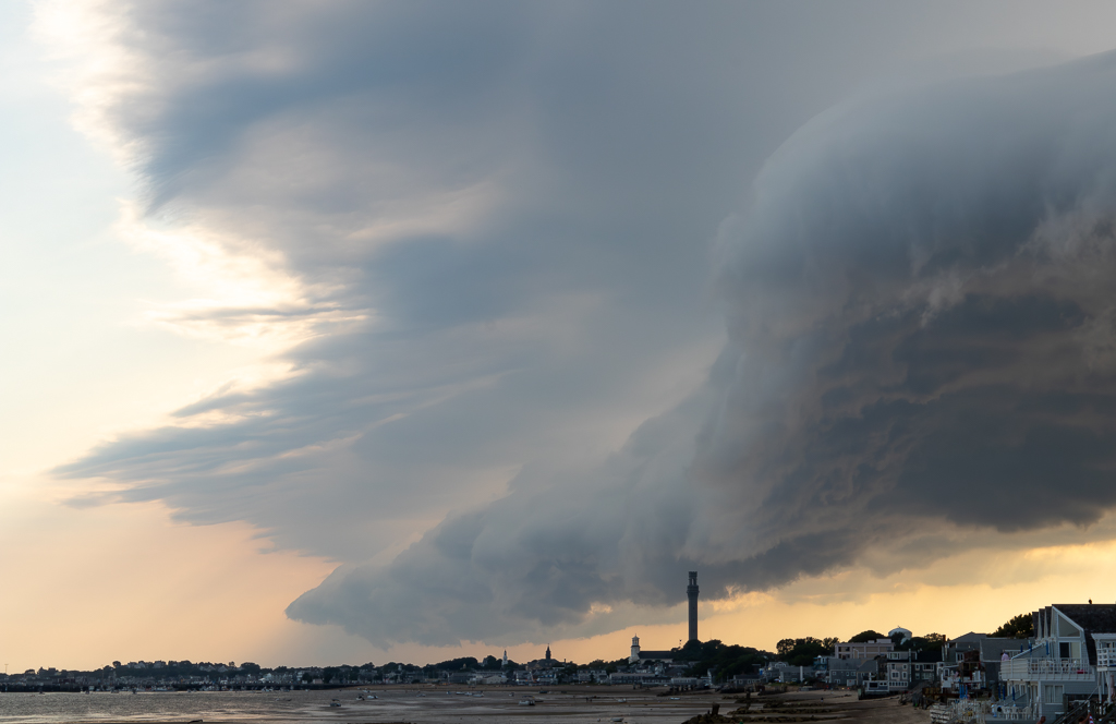
Hi Ye, looking at this image I thought of contrasts... between the creativity of nature with different shapes of trees and clouds, and the uniformity of the human constructions. And the contrast of bright blue and green, with the grey of the buildings. In my case I was fine with a lack of a focal point as my eyes went to the overall scene. I agree would have been nice to see a more clear reflection of the buildings in the water, and maybe crop a bit the sky. |
Jul 14th |
| 96 |
Jul 23 |
Comment |
Hi Bob, I also love lighthouses - so great idea. I might get inspired to use some of my own! Thanks for opening up this discussion on AI - it is very interesting and I learn a lot from you and those that commented. I also learn from the conversations on sky replacement - I see how having the right sky can really enhance an image, although I am still struggling with replacing the ones I have taken. I think your new sky fits well in this case, but is a bit too intense to my eye. Thanks again for pushing me to learn more about new ways of enhancing images. |
Jul 14th |
| 96 |
Jul 23 |
Comment |
Hi Viren, beautiful capture and the B&W works very well. Nothing to add to others' great comments. It is interesting what you say on contrast - I am learning B&W and it is a big challenge for me getting it right. |
Jul 14th |
| 96 |
Jul 23 |
Comment |
Hi Dan, I really like your processing - you rendered the old farmhouse quite interesting. I agree with Bob's crop. And thanks for sharing the possibilities of using NIK. |
Jul 14th |
| 96 |
Jul 23 |
Comment |
Hi Robert, this is an interesting shot - looking at it at first made me think of a Pictorialist image. I agree that the light is beautiful and I like the subtle approach to colors. |
Jul 14th |
| 96 |
Jul 23 |
Comment |
Hi Haru, this image gives me a sense of mystery, of exploring uncharted territory. In my case, my eye is caught by the whole, not necessarily one specific center of attention. I really am drawn by the orange flowers and the bright green of the tree on the right. As Dan says - each person will react differently. I do like what Bob did with the right frame as it intensifies the colors but looses a bit of the overall mystery feeling.
|
Jul 14th |
| 96 |
Jul 23 |
Reply |
Thanks Haru, I will see if I can improve this by having less sky and more of the sea and white town. |
Jul 14th |
| 96 |
Jul 23 |
Reply |
Thank Dan for your comments. Yep - it is extremely hard to convey in an image all that you see and feel. I had a sense that this would not work.... as there are too many things going on and the main one can escape the viewer. |
Jul 14th |
| 96 |
Jul 23 |
Reply |
Thank you Bob, will do. |
Jul 14th |
6 comments - 4 replies for Group 96
|
12 comments - 10 replies Total
|