|
| Group |
Round |
C/R |
Comment |
Date |
Image |
| 95 |
Jun 23 |
Comment |
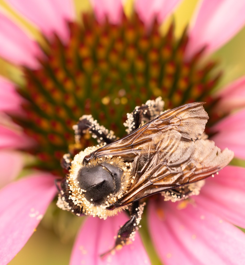
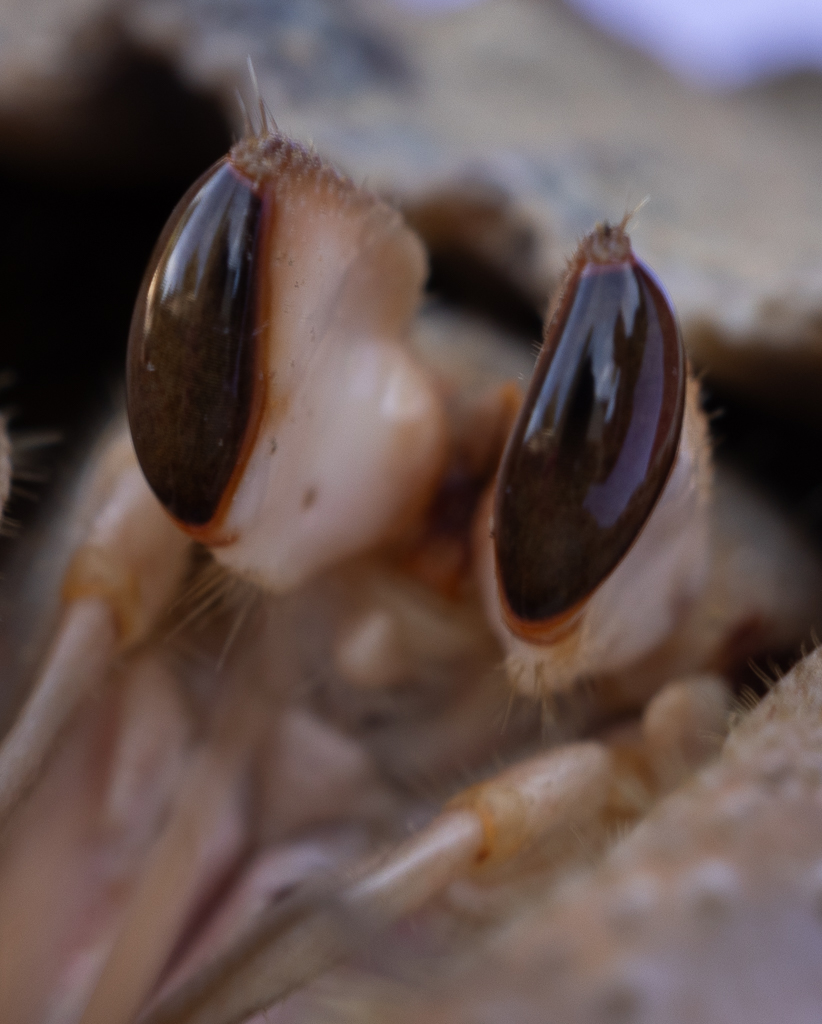
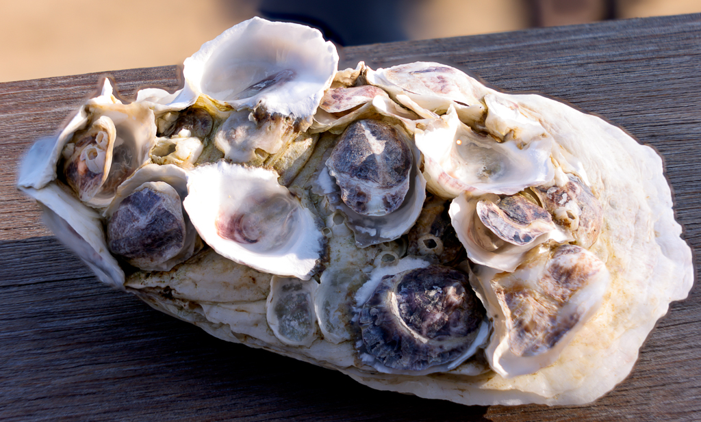
Hi Carol, I have never tried focus stacking but seeing your result clearly is one option for achieving greater sharpness. As Fran says it is quite interesting to see the big eye up front looking at you. The colors are beautiful so I personally would not go B&W. Maybe I would try to make the right part sharper if that is possible with the images you shot for the focus stacking. Thanks for sharing. |
Jun 16th |
| 95 |
Jun 23 |
Reply |
Thank you Fran, now with new canon macro lens I can get closer than with the one I used here. |
Jun 16th |
| 95 |
Jun 23 |
Reply |
Thank you Carol for the encouraging words and for the tips on DOF - seems I need to move towards f8/f11 more consistently with macro images. |
Jun 14th |
| 95 |
Jun 23 |
Comment |
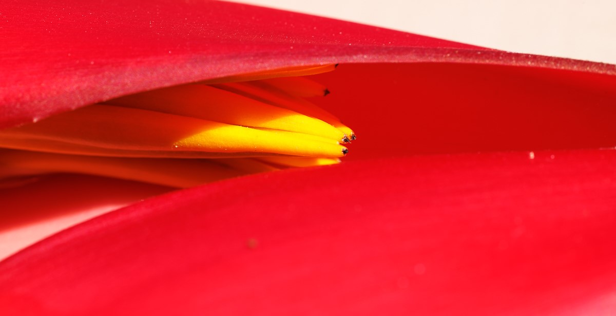
Hi Fran, very nice image and nice sharpness. I wonder whether you could crop it closer, as your title suggests that the focus is on the inside of the Lily, while now the eye focuses more broadly. The one grass blade seen through the petal is a bit distracting to me, but might be just a personal preference. |
Jun 13th |
| 95 |
Jun 23 |
Reply |
Hi Stuart, yes I think the trade-off is that one must buy the lenses made specifically for the R5 to get the full frame advantage. They and expensive�� I Did get the macro one so we'll see if worth it soon! |
Jun 11th |
| 95 |
Jun 23 |
Comment |
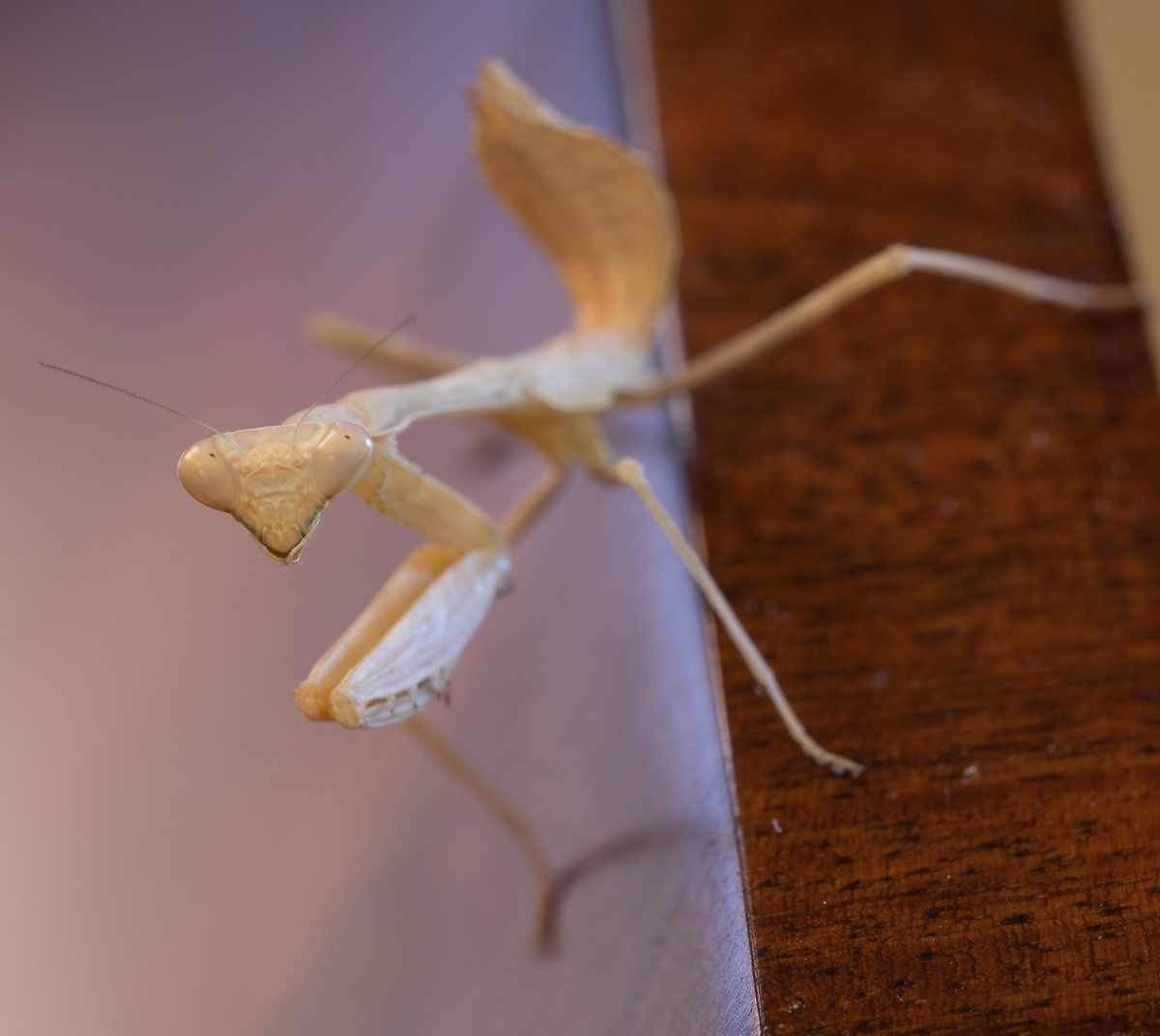
Hi Keith, the colors are beautiful and I am amazed you got it so crisp handheld - there was no wind I guess. I agree with Stuart that on a second look the blurred petals are distracting. I actually liked the fact that it seemed as if was floating - but from your exchange I infer that flower shots in general do show the stem. |
Jun 10th |
| 95 |
Jun 23 |
Comment |
Hi Tom, you also have me wondering, does seem concrete, or a rock wall maybe. And I would be also curious about the details of the macro lens and how much control your phone gives you.. I have an iPhone 13 but I am always shy of showing any pictures taken with it - apart from snapshots. So thanks for trying this out. |
Jun 10th |
| 95 |
Jun 23 |
Comment |
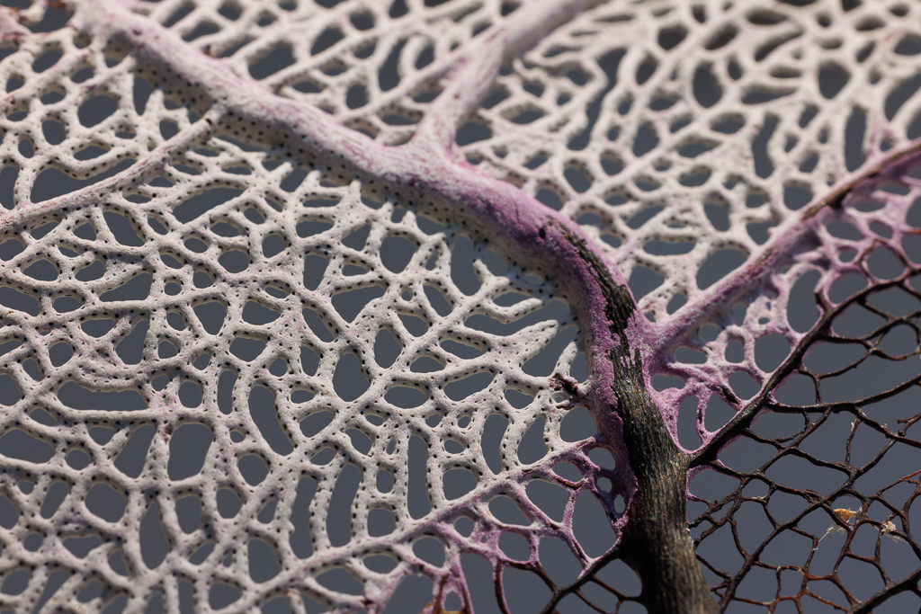
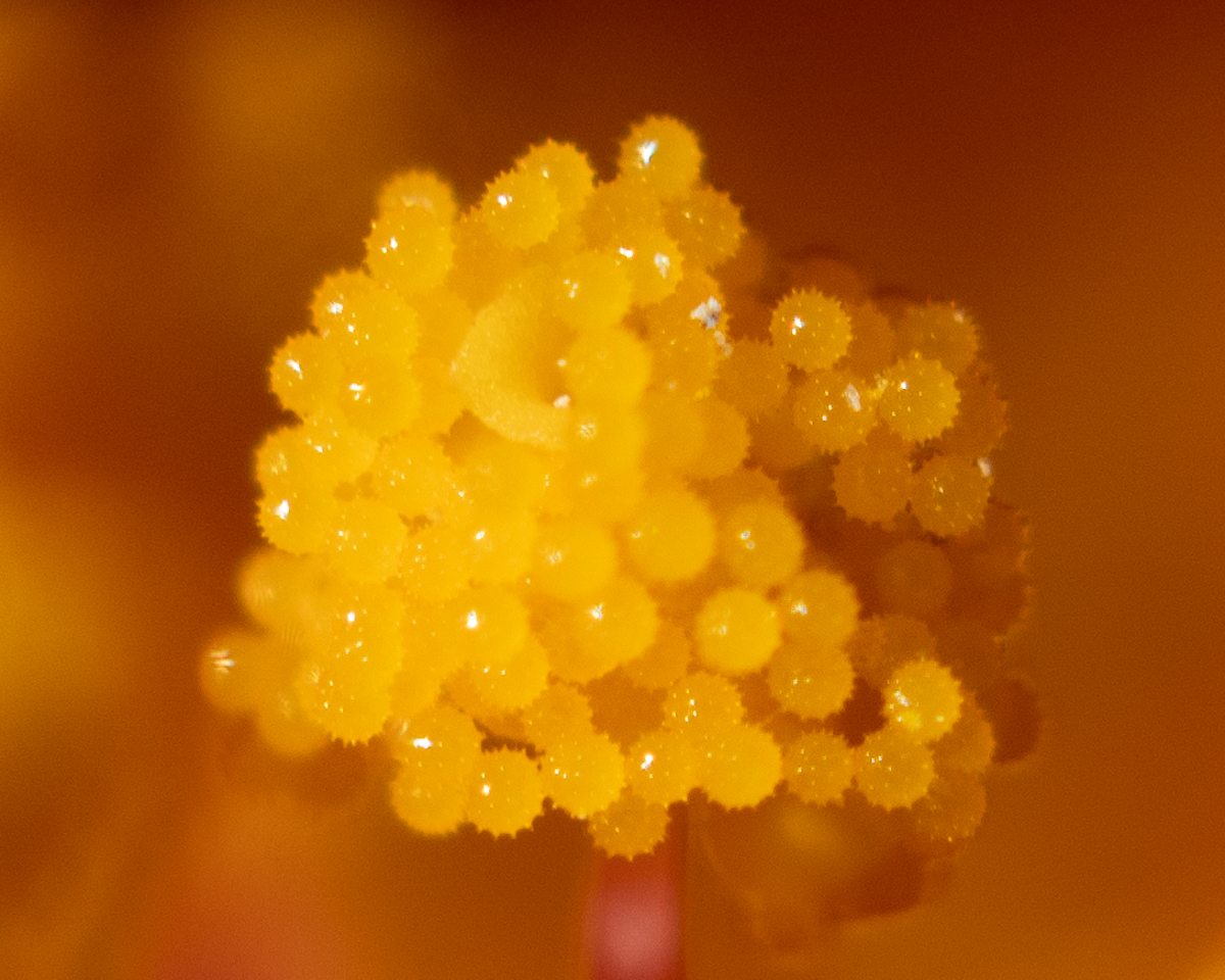
Wow Stuart I see what you mean here with focus stacking images! it is so so crisp, looks alive. Made me think of a piece made of Murano glass. I love the colors and the texture. Lots to learn�� |
Jun 10th |
| 95 |
Jun 23 |
Reply |
Thanks Keith. |
Jun 10th |
| 95 |
Jun 23 |
Reply |
Thanks Stuart, I bought the macro lens for the R5, eager to test it�� Also, good feedback on specular highlights, I have never used that feature but will try it now. |
Jun 10th |
| 95 |
Jun 23 |
Reply |
Very very grateful Stuart, this is a very useful set of tips. Thank you for spending the time to write them, I will certainly make good use of them. the R5 has focus stacking and I will also try it. |
Jun 10th |
5 comments - 6 replies for Group 95
|
| 96 |
Jun 23 |
Reply |
Thank you Robert for your feedback and suggestion |
Jun 24th |
| 96 |
Jun 23 |
Reply |
Thank you Dan I appreciate your words and tips |
Jun 24th |
| 96 |
Jun 23 |
Comment |
Hi Ye, Very nice image and combination of colors. I agree that given that there are many objects in the composition one does not necessarily focus on the twilight at first. First feeling I had was curiosity to identify all the components of the image, and then stepped back to the beauty of the overall image. It is busy, but it works, as Dan says. The sky does not look as crisp as the rest - I wonder whether your enhancements made it less sharp, although the colors are very nice. |
Jun 13th |
| 96 |
Jun 23 |
Comment |
Hi Dan, what an amazing image. I must go there! When I first saw the image I could not figure out what it was - looks like an abstract landscape. It has been added to my USA travel list.... I really like that you just presented a section, your unordinary approach is very effective visually. I am in awe, wonderful work. |
Jun 13th |
| 96 |
Jun 23 |
Comment |
Hi Bob, beautiful image and composition. With the sepia toning you managed to convey a very peaceful and timeless image. And the birds fits perfectly in the spirit of the image. Excellent first attempt - maybe only the sky is bit flat to my eyes - and you can't crop it because the tree on the left is so tall. |
Jun 13th |
| 96 |
Jun 23 |
Reply |
Thanks Bob for the clarification! :) |
Jun 11th |
| 96 |
Jun 23 |
Comment |
Hi Haru, I love the blue! I like better the cropped version. I think overall the cropped version is more mysterious. I like better the reflections and also the way the composition of the branches turns out. The parallelism of the left and right branches works very well to my eye. While in the larger photo there is another large branch on the right side that does not fit as well. There is not much I can contribute on improving it - great job. |
Jun 10th |
| 96 |
Jun 23 |
Comment |
Hi Bob, Great material you have to photograph. I also like very much the original image - the colors, I feel, are such integral part of the specific place that leaving them out looses something. On the B&W, maybe more contrast among the grays could make it more dramatic. Also, the mountain peaks seem a bit blurry in my screen. |
Jun 10th |
| 96 |
Jun 23 |
Reply |
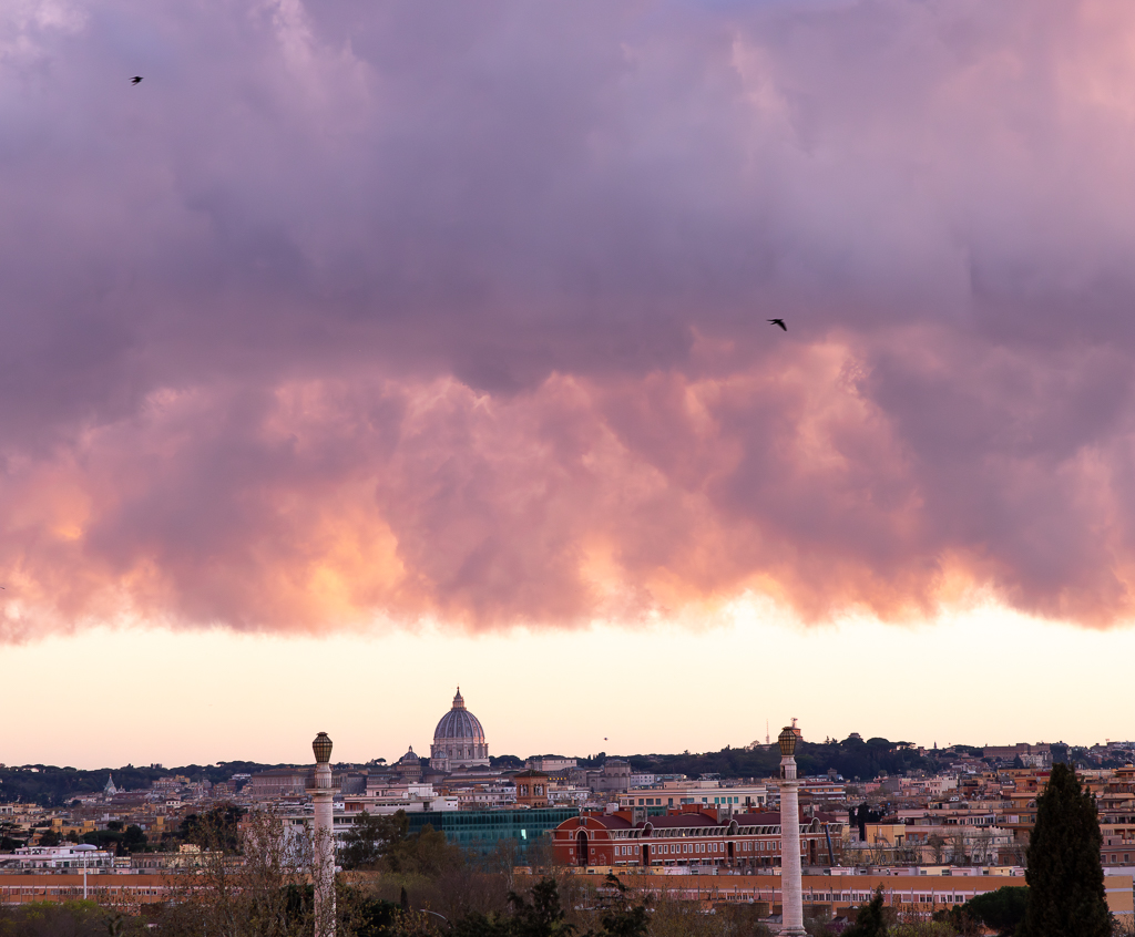
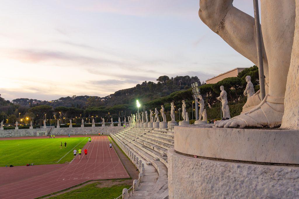
Thanks Bob for your comments. I now realize what you mean by a Travel vs. Scape image. I guess I thought this was a Cityscape - albeit with ancient buildings! And you are right - I should have spent some time working on the sky. I saw the 2023 version of Lightroom has additional masking options that I will use on this image and in the future. |
Jun 10th |
5 comments - 4 replies for Group 96
|
10 comments - 10 replies Total
|