|
| Group |
Round |
C/R |
Comment |
Date |
Image |
| 95 |
Jan 23 |
Comment |
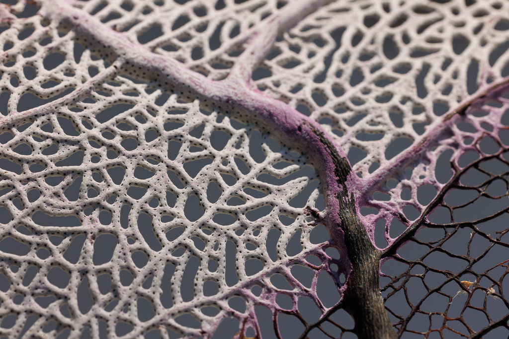
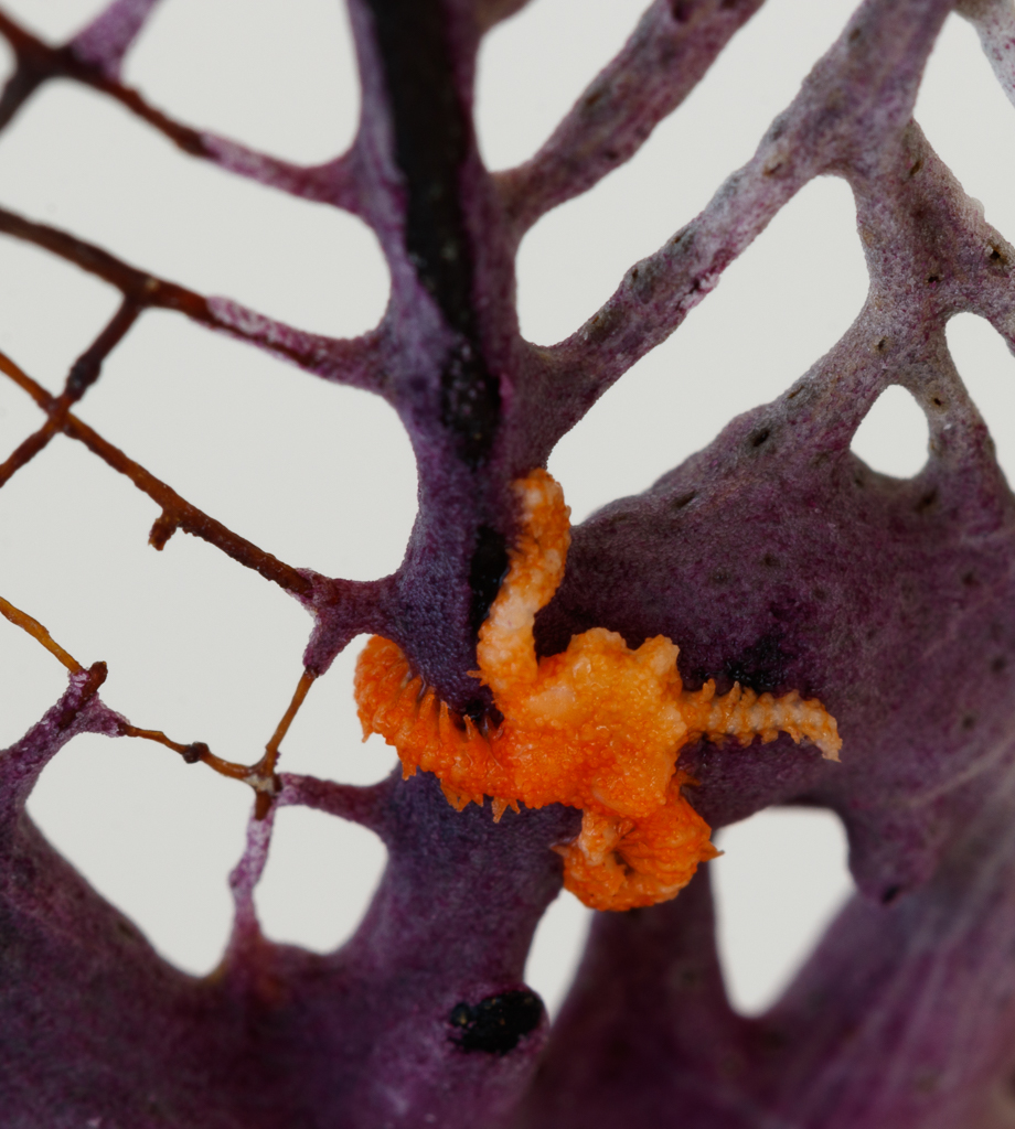
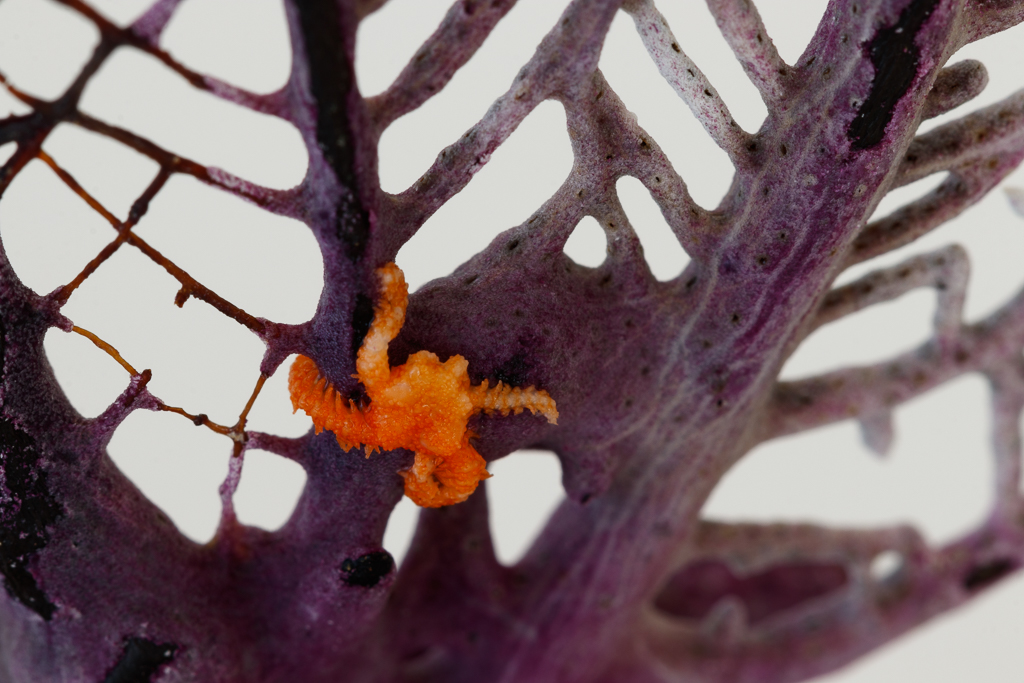
Ps, the orange creature was pretty slimy, so I wonder whether that also did not help with sharpness. |
Jan 22nd |
| 95 |
Jan 23 |
Reply |
Hi, thanks for advice. Hopefully with new camera I can get better sharpness of small creatures. Also - thanks for comments on sea fan, I guess I do not need to look only for very small subjects. |
Jan 22nd |
| 95 |
Jan 23 |
Reply |
Thank you Fran, it's a learning curve�� |
Jan 22nd |
| 95 |
Jan 23 |
Comment |
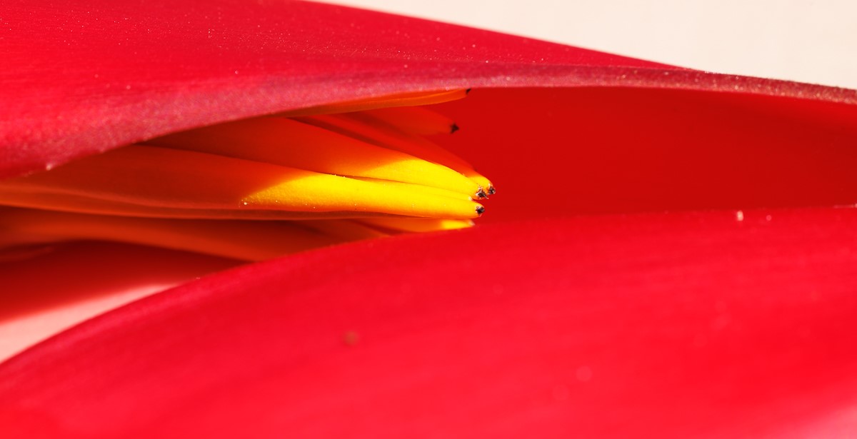
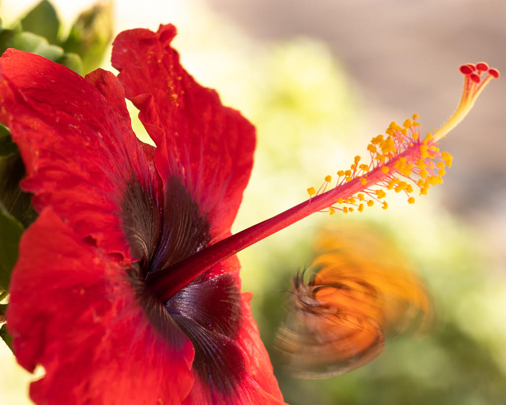
Hi Carol, your images of flowers are very beautiful and inspiring! Your post-processing is amazing, how you created the blurred background around the main flower. The texture of the petals of the main flower is so well defined and crisp, and the red you attained is gorgeous. I also noticed the softness at the edges of the petals of the main flower - but I felt it was fine if your main focus was the inside part of the flower. |
Jan 16th |
| 95 |
Jan 23 |
Comment |
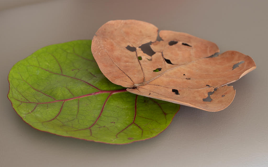
Hi Fran, This image has a lot of potential for several macro photos I think. You have several subjects you could zoom into - the detailed texture of lichen itself, or of the twig. As others mentioned, I agree that now there is so much background, and it is so sharp, that is hard to focus the eyes on the specific subject of the capture. |
Jan 16th |
| 95 |
Jan 23 |
Comment |
Hi Pat, I like this image very much - the color combination is very soothing. And as mentioned , it shows the beauty all around us when we look close enough. I tend to agree with Stuart's suggestion on cropping - although it is also great as is. Your "mundane life art" topic made me smile - a reminder to me to observe more... |
Jan 14th |
| 95 |
Jan 23 |
Comment |
Hi Stuart, I am very impressed by the sharpness of the image, and the texture of the frost is very realistic. The light is beautiful. And thanks for the lesson... the stacking really makes a difference, and even hand holding only! |
Jan 12th |
| 95 |
Jan 23 |
Comment |
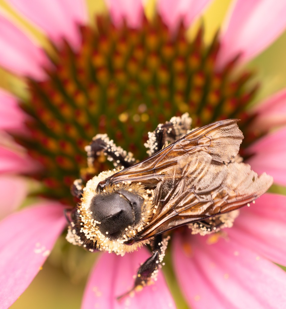
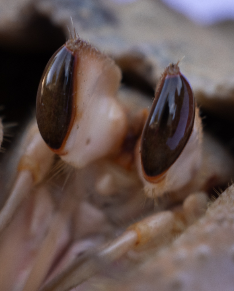
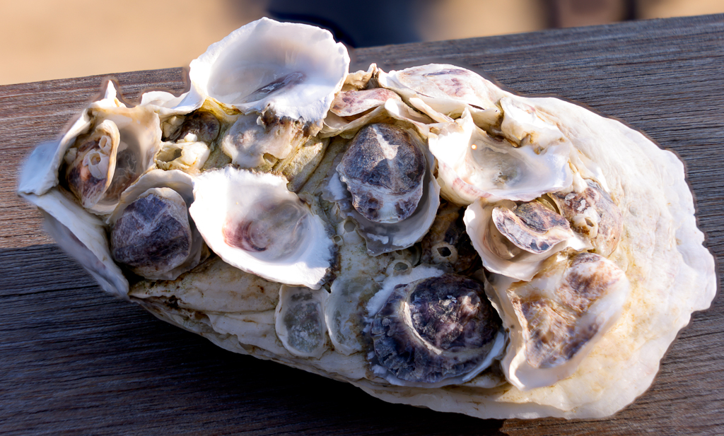
Hi Stuart and Carol, Thanks and apologies. I should have been clearer... what I called the original was the photo of the sea fan when I saw the orange critter. The macro image without cropping was a close up, which I attach here. The point is that it is too soft... The good news is that I just got 2 new cameras the Canon 90D and the full frame mirrorless Canon R5 and both can do focus stacking. So hopefully my future macro photos will be more crisp when I do close ups!
|
Jan 12th |
 |
6 comments - 2 replies for Group 95
|
| 96 |
Jan 23 |
Reply |
Thank you Kate, hopefully the posts will last a long time! |
Jan 21st |
| 96 |
Jan 23 |
Reply |
Thank you Robert very useful comments for the future. And I do like the black and white version a lot! |
Jan 21st |
| 96 |
Jan 23 |
Reply |
Thank you Bob, encouraging comments. Now I feel I can keep the image.. |
Jan 21st |
| 96 |
Jan 23 |
Reply |
Hi Bob I like this version. |
Jan 20th |
| 96 |
Jan 23 |
Comment |
thank you Dan for the advice! |
Jan 16th |
| 96 |
Jan 23 |
Comment |
Hi Robert, I really like your image - to me the approach of combining the 2 images really works. Seems rainbows are a theme this month, and I would keep it. I also like very much the crispness of the pink flowers and the contrast with the fog on the background. As others commented the picture is calming and also gives a sense of hope. Thanks for sharing this, I can totally understand you'd want a larger print. |
Jan 14th |
| 96 |
Jan 23 |
Comment |
PS. By chance do you have a version with the full trees and not cropped at the top? |
Jan 14th |
| 96 |
Jan 23 |
Comment |
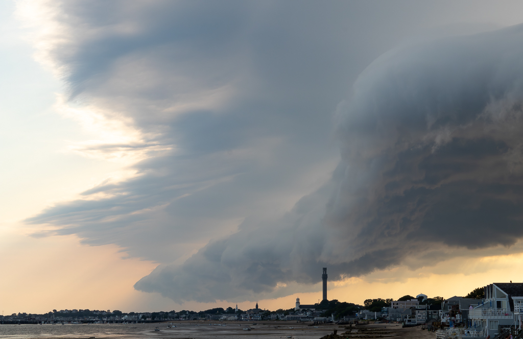
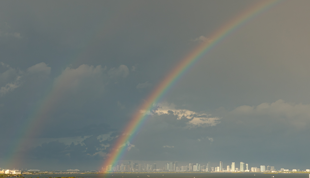
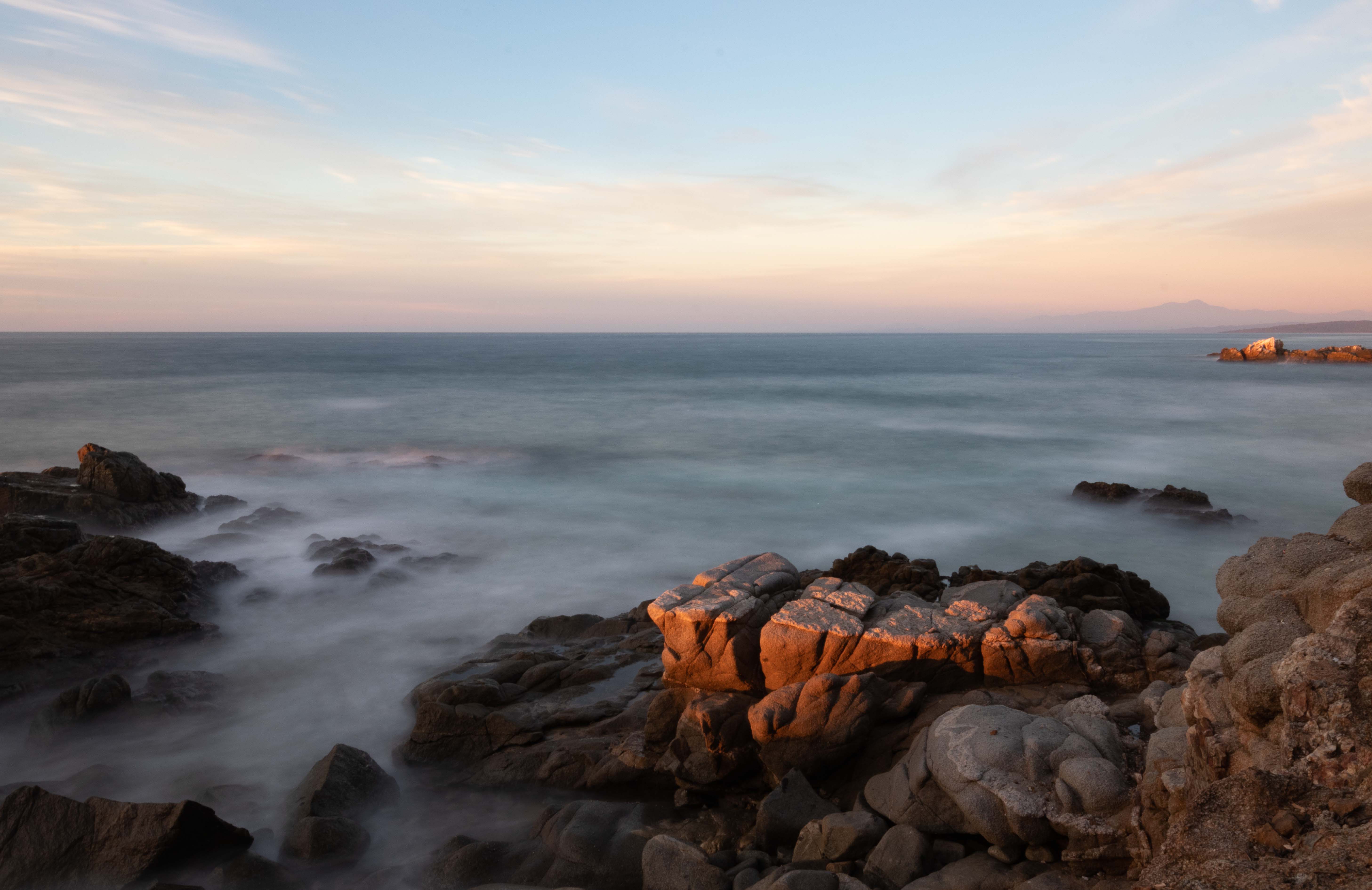
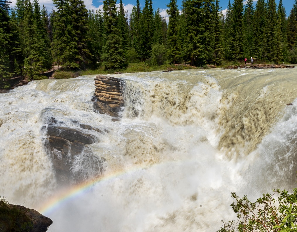
Hi Bob, I hope you are feeling better. You were so lucky to catch a rainbow on the waterfalls! The image has potential - since the focus is the water and the rainbow maybe you could crop the right side - keep the 2 people for perspective but not the full group. Also maybe crop the foreground to take away distractions. The water seems a bit soft, I feel that either you make it a bit sharper or maybe you could slow it down a bit and it would give a more mysterious feeling.
This is the cropping I was thinking
|
Jan 14th |
 |
| 96 |
Jan 23 |
Comment |
Hi Dan, What a beautiful image! I really like the composition and the colors. The color enhancements work very well in this case. It does look almost like a painting or digital art! I agree with Haru on cropping out the top right leaf that is cut off. - my eyes tend to go there. (PS I just bought the Canon R5 and I am excited by the possibilities of a full frame!). |
Jan 14th |
| 96 |
Jan 23 |
Comment |
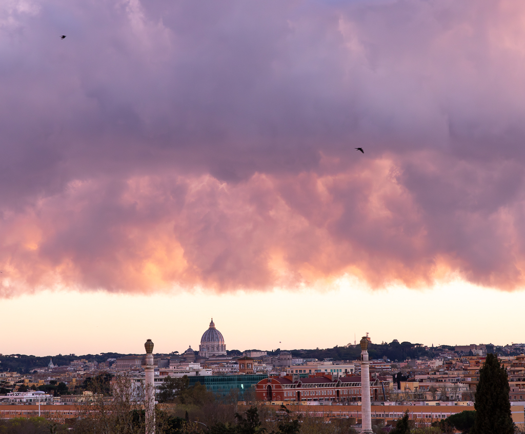
Hi Kate, It is so challenging to convey to others the emotions and vision of a landscape that you know well and "speaks" to you very strongly! In this case, from your comments seems that the clouds are what you want us to focus on. So maybe a bit less foreground and more of the sky/clouds could help us direct our gaze and you could darken a bit the clouds to give more of a sense of the impeding storm. |
Jan 14th |
| 96 |
Jan 23 |
Comment |
Hi Haru,
I am drawn to this image and the title speaks to me. I also like the combination of fall colors. On your questions:
Does this composition work for you? I wish you had shown all the branches to the left and the top. And crop the area below after the reflection of the leaves. The idea overall works for me and I like very much the reflection in the water.
Help me to understand your eye travel. My eye goes first to the colorful leaves on the top right then to the reflection in the water and then to the branches, fog on the left side.
Is the left side too bright and distracts your eye? I like it
Any idea to make this better WITHOUT cropping? as mentioned before if you had another photo with the whole branch to the left and top. |
Jan 14th |
7 comments - 4 replies for Group 96
|
13 comments - 6 replies Total
|