|
| Group |
Round |
C/R |
Comment |
Date |
Image |
| 95 |
Sep 22 |
Comment |
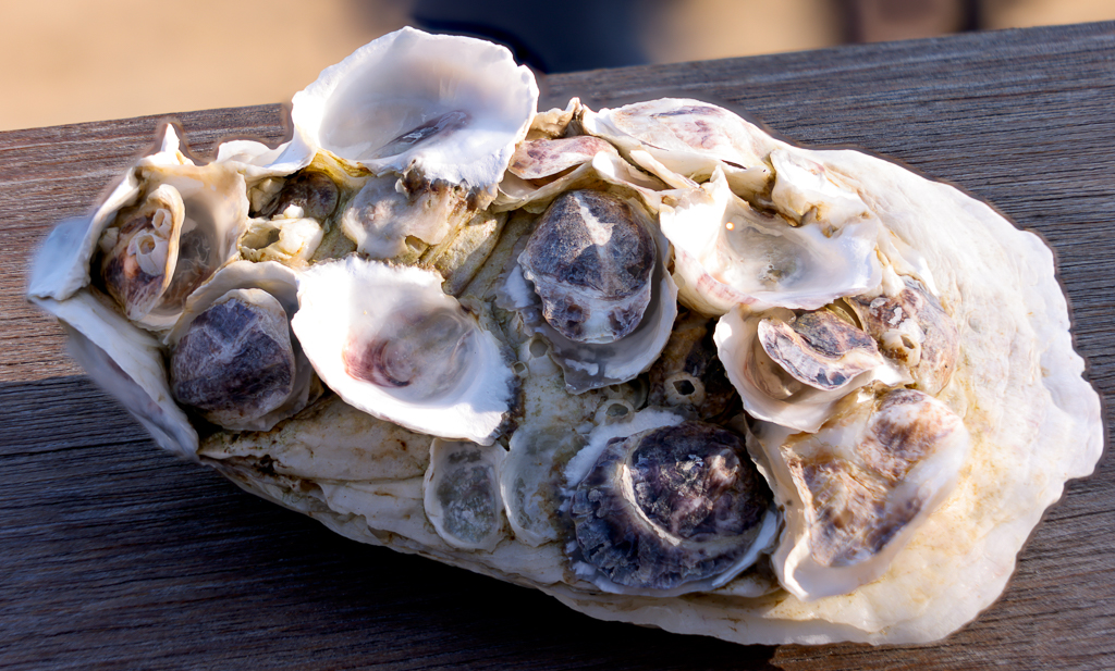
Carol, great shot just handheld! Very nice job - I really enjoyed this image. I do like Tom's suggestion of removing the upper part of metal so it makes it feel as if she is flying. I would also prefer to have upper part of bust crisp as the head. I find red reflection in the lower part a bit distracting. Definitely worth perfecting this image. |
Sep 17th |
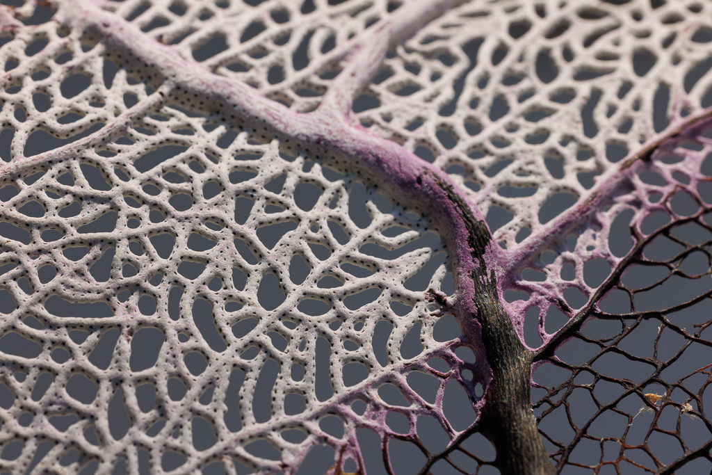
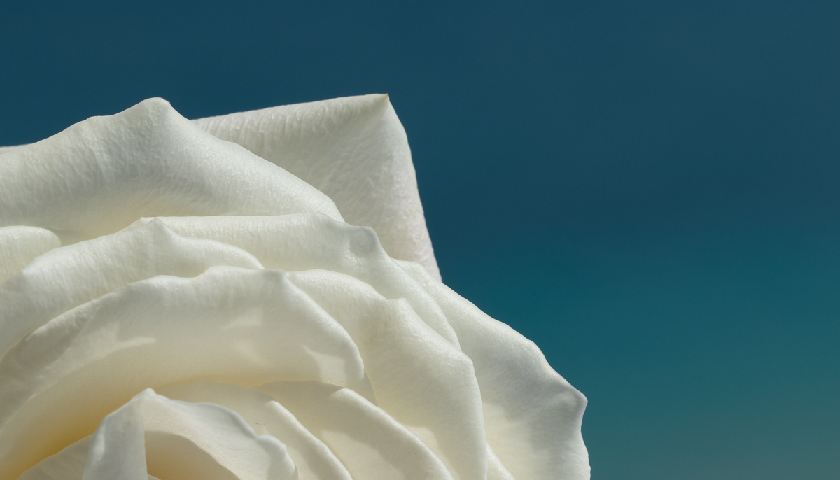
| 95 |
Sep 22 |
Comment |
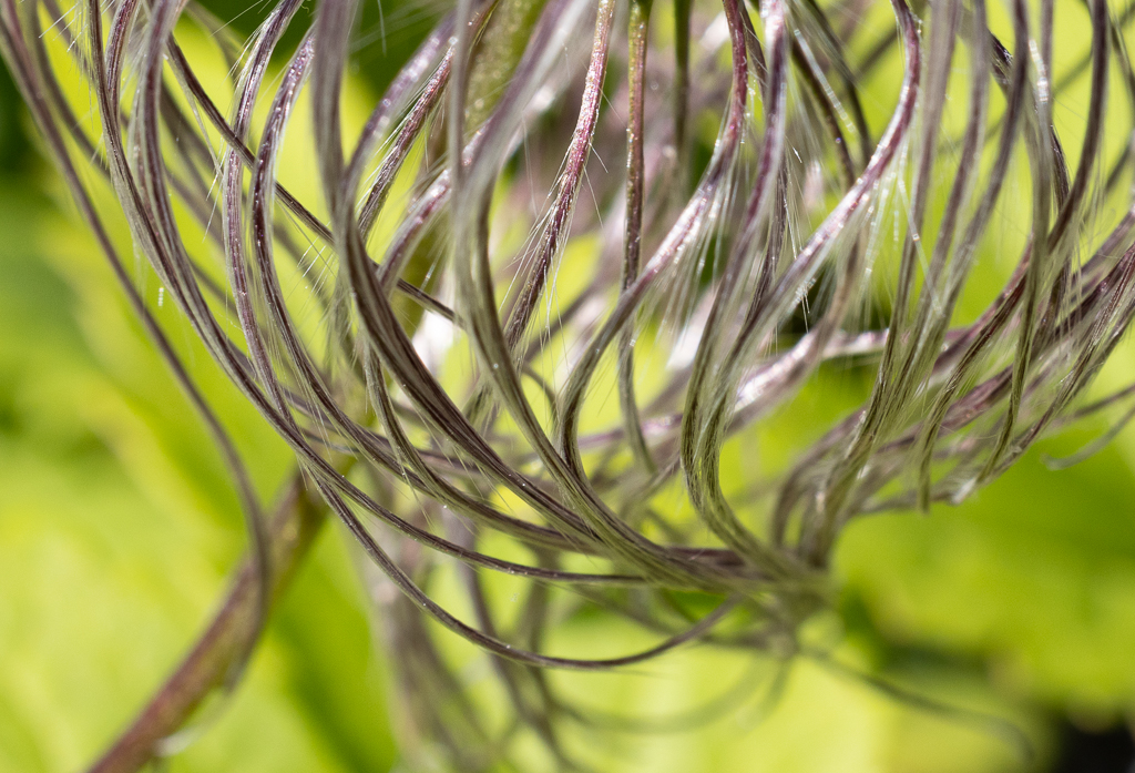
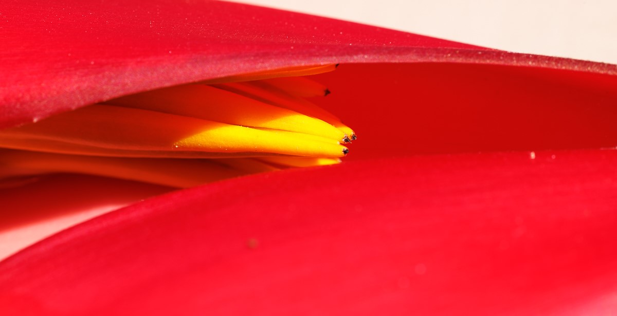
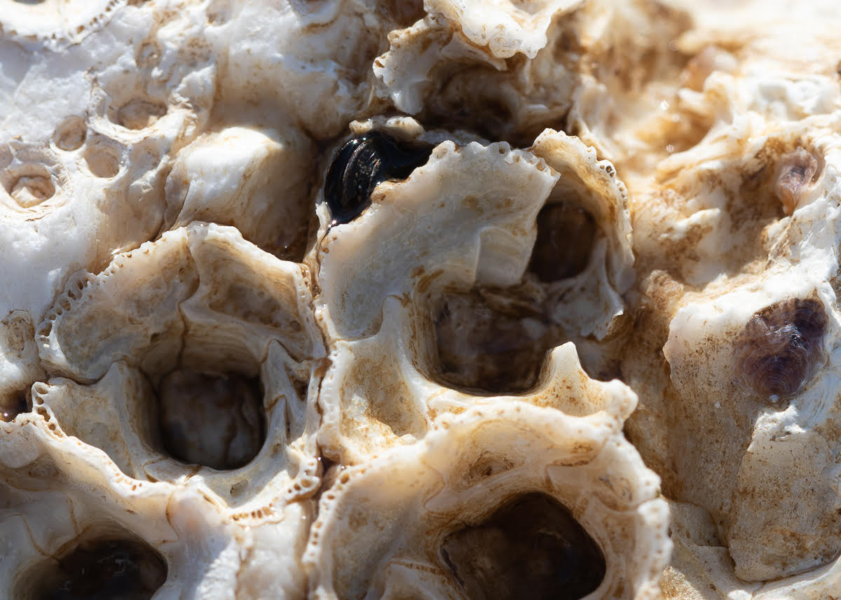
Hi Tom, I am very drawn by this beautiful abstract image - I love when macro photography makes you see the unseen and also makes you wonder what the image is about. Without your explanation it would be a mysterious natural texture. Thank you for sharing it. |
Sep 17th |
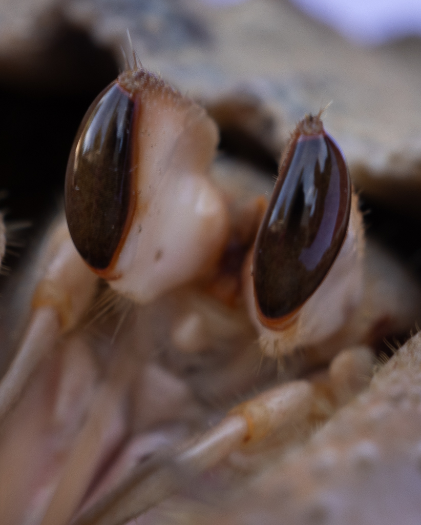
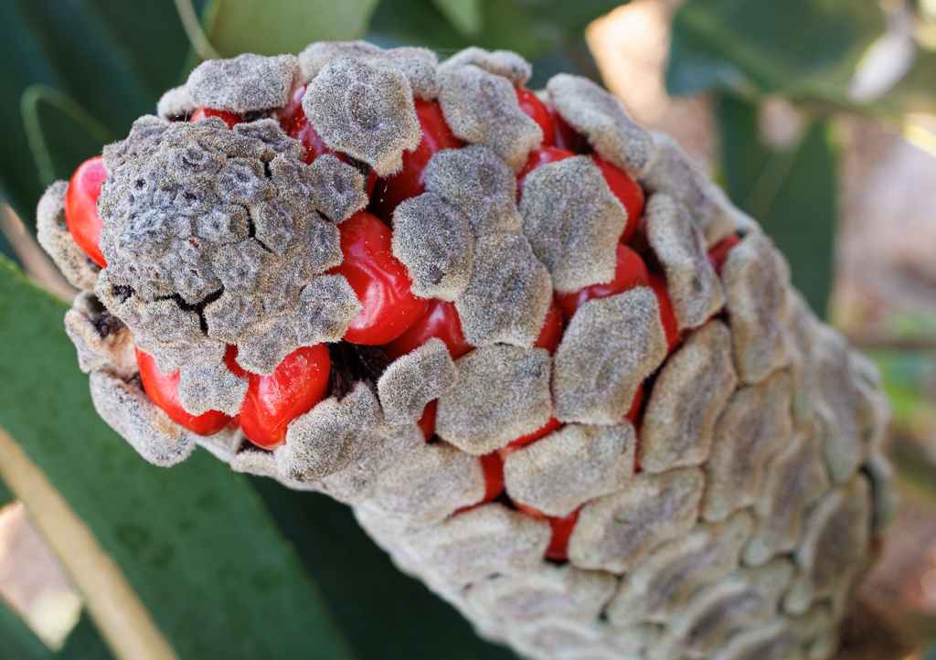
| 95 |
Sep 22 |
Comment |
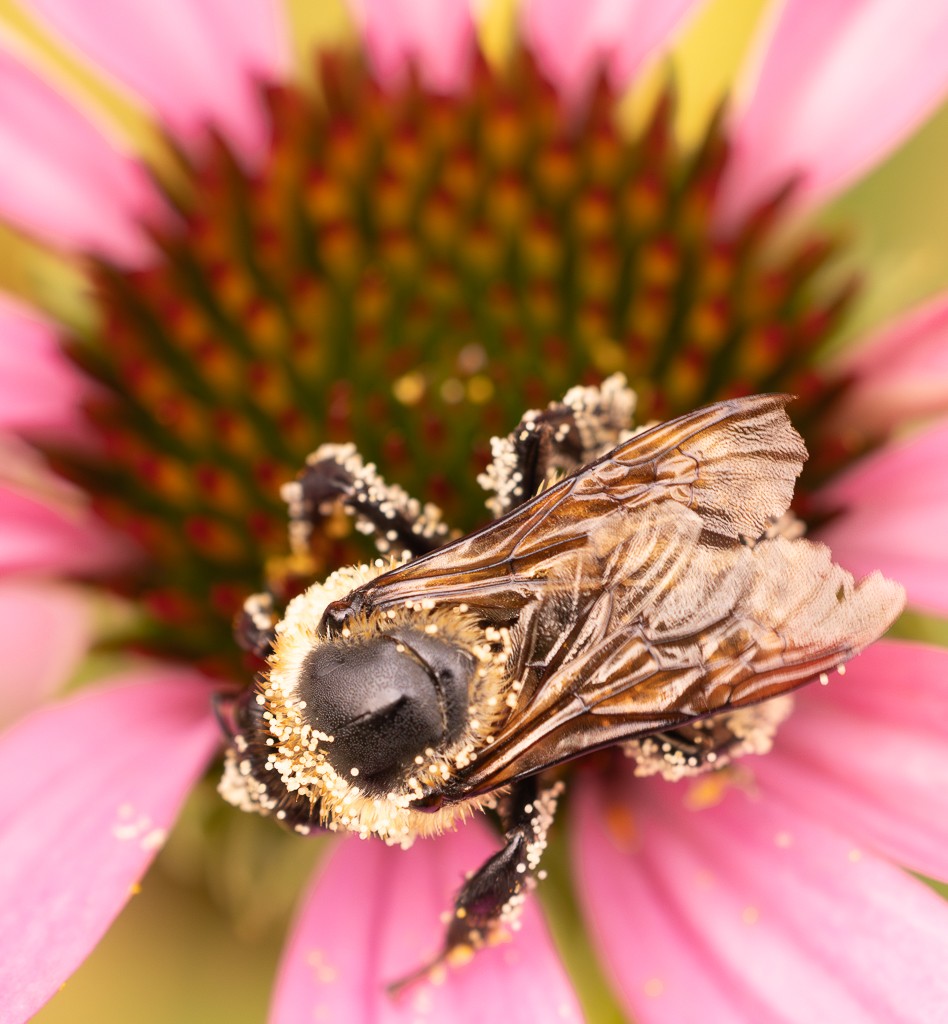
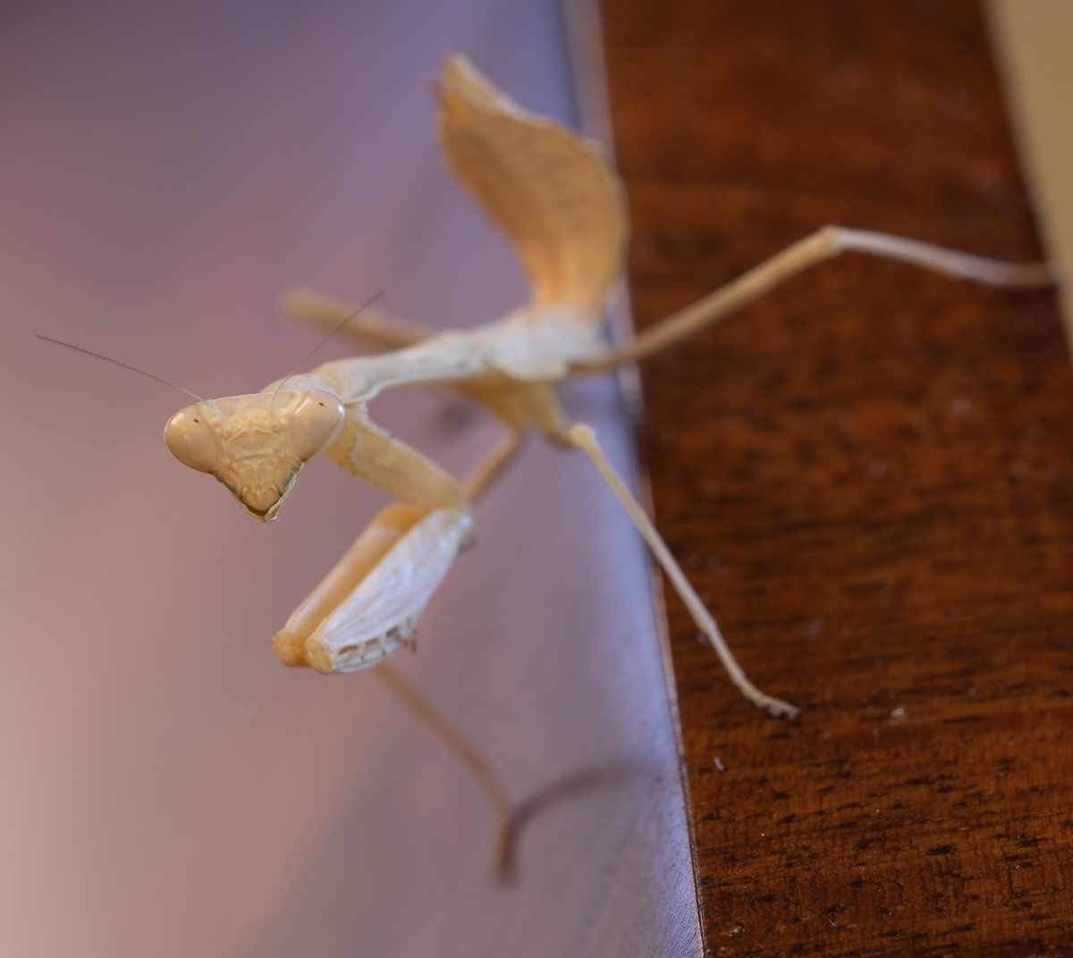
Hi Pat, as others mentioned I know from experience that bugs are hard to photograph. It is a good attempt. Maybe you could have gone closer to the head and gotten more detail of that specific part. Also, in a way having the second half a bit out of focus gives a sensation of movement - gives me the impression that it is slowly crawling towards me and makes me feel like if I wait long enough it will all come out and be in focus. |
Sep 17th |
| 95 |
Sep 22 |
Reply |
Thank you Carol, I will try to continue this series. |
Sep 17th |
| 95 |
Sep 22 |
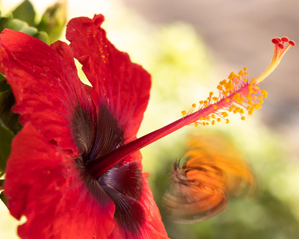
Comment |
Thank you Tom means a lot to me! They were about 5 inches each more or less. Thanks for advice on f flexibility. |
Sep 16th |
| 95 |
Sep 22 |
Comment |
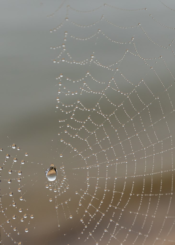
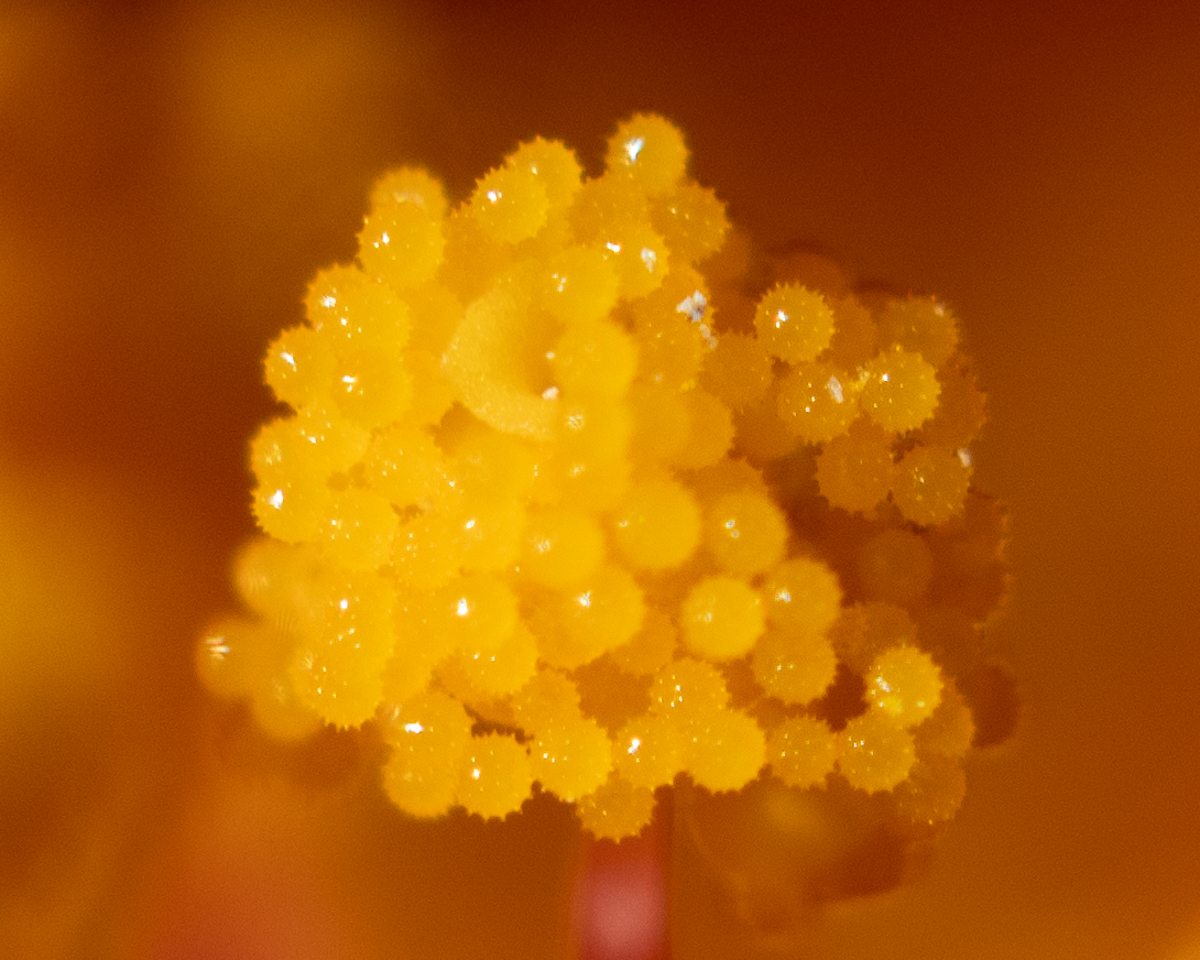
Hi Stuart, wonderful image, I love the color and the water drops are so crisp. I also appreciate your description of how you got to this result. I wonder if focusing only on the flower without including the buds would make it even more stunning. And thank you for the macro lights info. |
Sep 15th |
| 95 |
Sep 22 |
Comment |
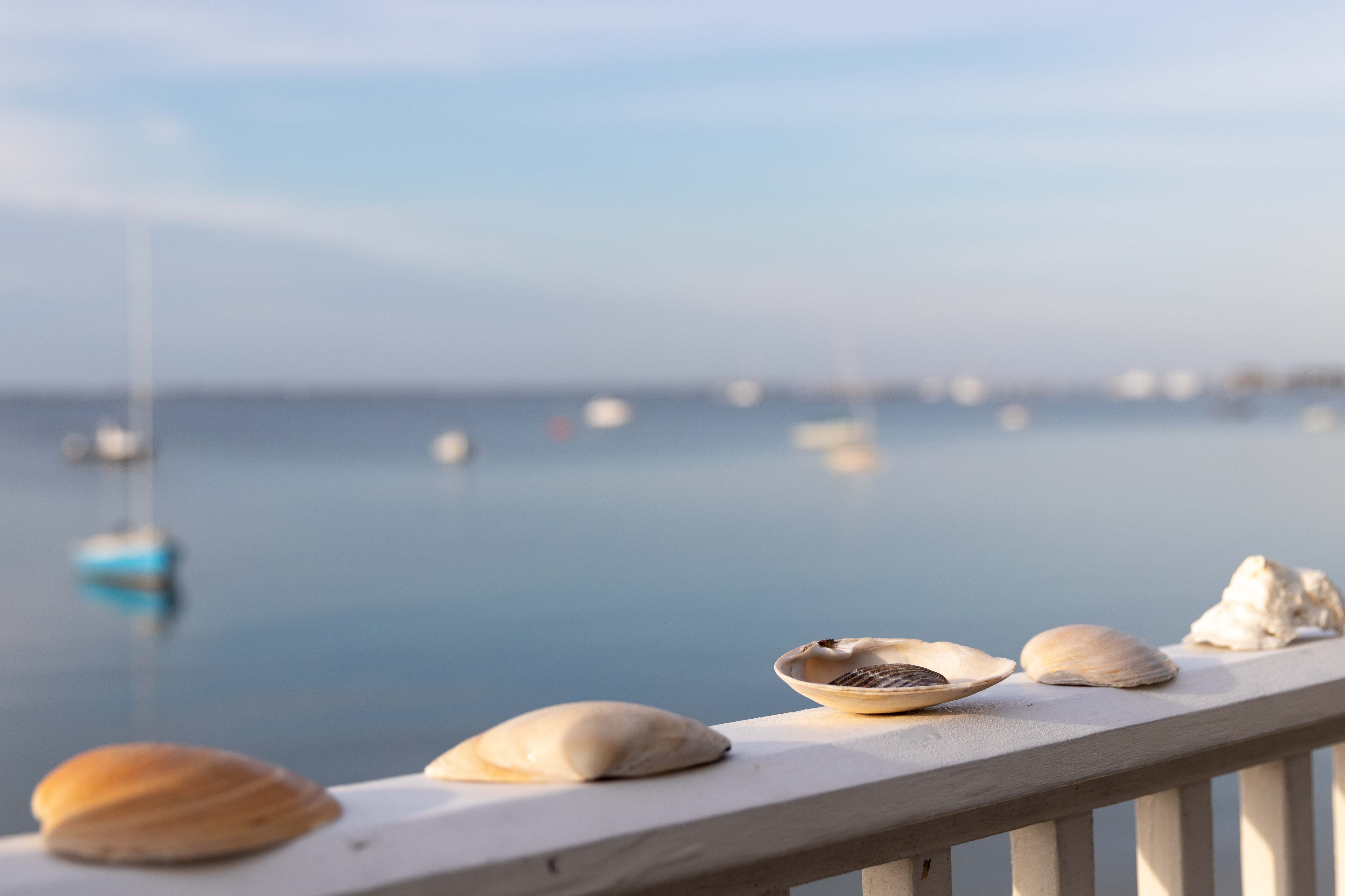
Hi Keith, I feel you are almost there and I like the burgundy background you choose. You inspired me to try stacking with some stones I collected in Cape Cod. An option would also be to make it more abstract and focus on a sub-section of the stone - like the internal concentric image. |
Sep 15th |
| 95 |
Sep 22 |
Reply |
Thank you! |
Sep 15th |
| 95 |
Sep 22 |
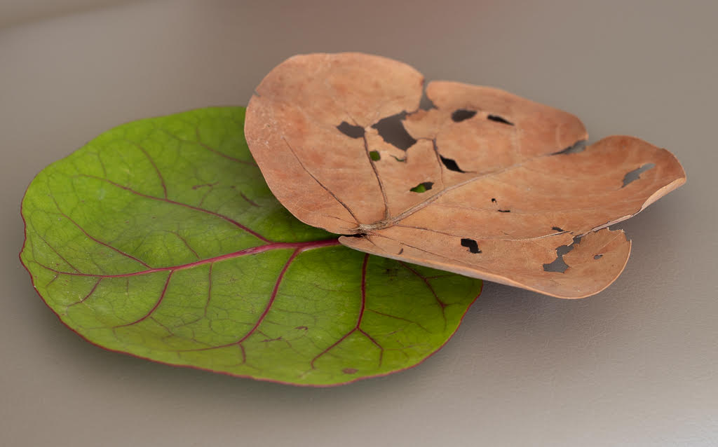
Reply |
Thank you Stuart, I thought a lot about the background color and as you guessed I went for a bland one (my beige leather sofa actually!), I tried with white and was too bright. I did struggle with the focus, I tried different depth of field but I could not manage to have both leaves both all in focus. Thanks for the encouraging words. |
Sep 12th |
6 comments - 3 replies for Group 95
|
| 96 |
Sep 22 |
Reply |
Thank you Robert - great to have creative options for the future. |
Sep 29th |
| 96 |
Sep 22 |
Reply |
Thank you Bob! |
Sep 29th |
| 96 |
Sep 22 |
Comment |
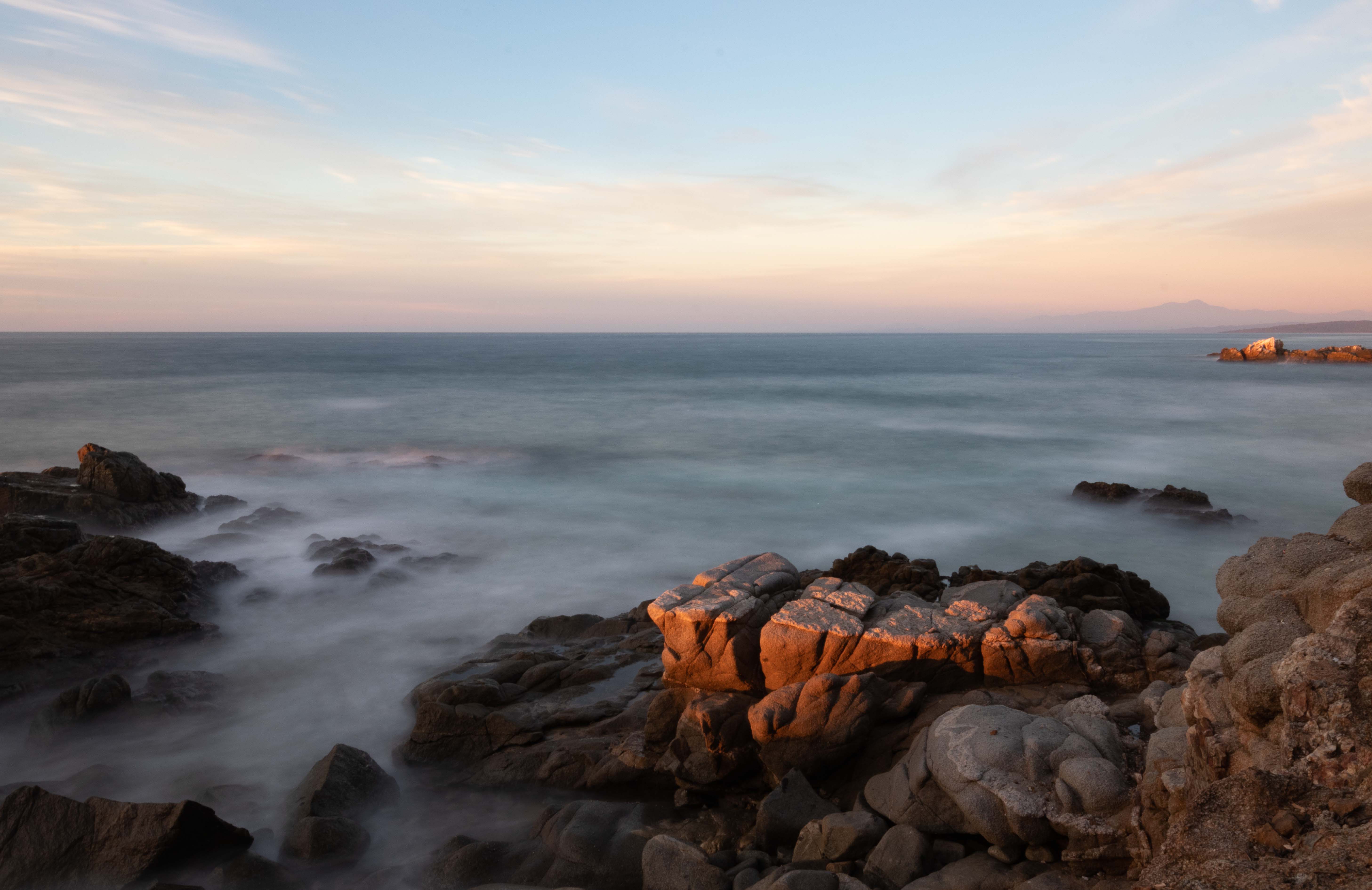
Hi Haru, this is a beautiful and ethereal, calming image. The fog works very well in deepening the mood. I like both versions, but I am particularly drawn to the B&W one. I agree on cropping the left side a bit or cloning some more of the bushes on that side far side. I can appreciate the usefulness of pano seeing this image of yours - inspires me to try it more often. |
Sep 17th |
| 96 |
Sep 22 |
Comment |
Cheryl, I am very impressed by your attempt. I like the softness of the sky combined with the clear lines of the buildings, and definitely the B&W works very well. I do not have much to add to all the useful and instructive comments you already got. looking forward to seeing more of your images. |
Sep 17th |
| 96 |
Sep 22 |
Reply |
Thank you Haru, I always learn from your perspective. You have given the image a very mysterious angle, thanks for opening my eyes to different options. |
Sep 17th |
| 96 |
Sep 22 |
Reply |
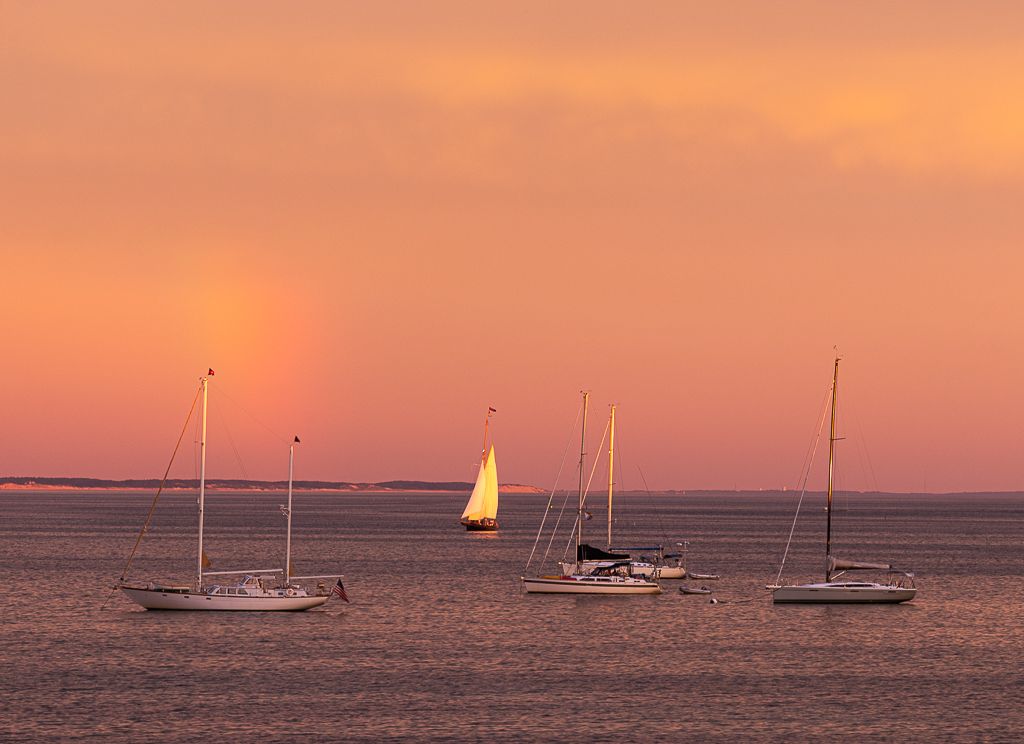
Thank you Cheryl, I like what you did - it is clearer that the sunlit sailboat is the focus of the image |
Sep 17th |
| 96 |
Sep 22 |
Comment |
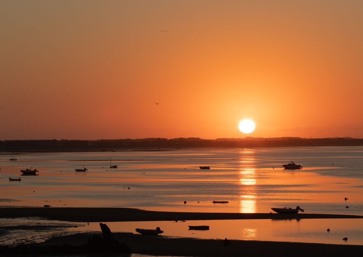
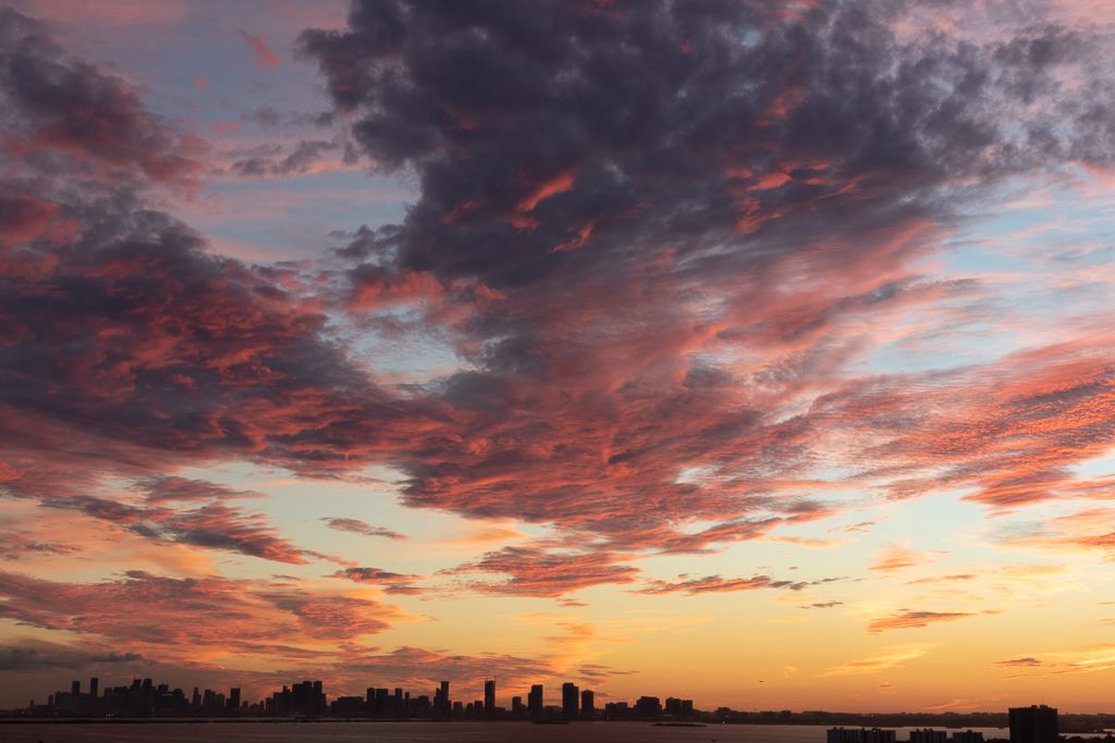
Hi Robert, I add myself to the collective WOWs! What a shot. I do agree that the highlights are the mountain and the clouds - so I like Cheryl's crop. The colors do seem a bit too saturated to my eyes. Would be interesting to see original colors. An amazing image. |
Sep 15th |
| 96 |
Sep 22 |
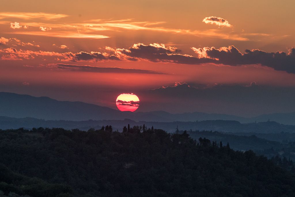
Comment |
Hi Dan, the image does speak to me as consistent with your vision. I also think the B&W enhances the message. In terms of composition I was going to suggest what Bob did - that way the focus is the curve, I really like his modification. |
Sep 15th |
| 96 |
Sep 22 |
Comment |
Hi Bob, Nice image and I think you did achieve a particular viewpoint beyond just a snapshot. However, since your focus is the Museum of Glass, maybe you could crop the post with green decoration on the left side, it distracted me from the glass building. |
Sep 15th |
| 96 |
Sep 22 |
Reply |
Hi Bob, thank you! Great improvement. Very useful. I will work on this version. |
Sep 15th |
| 96 |
Sep 22 |
Reply |
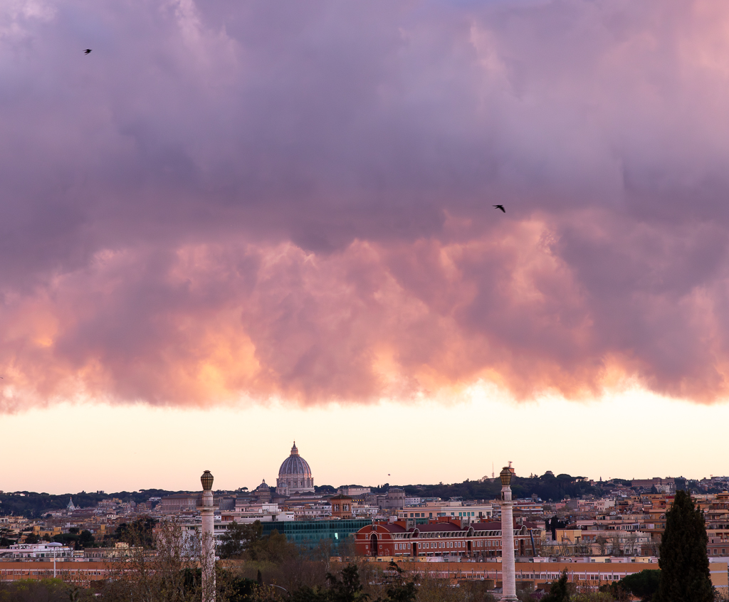
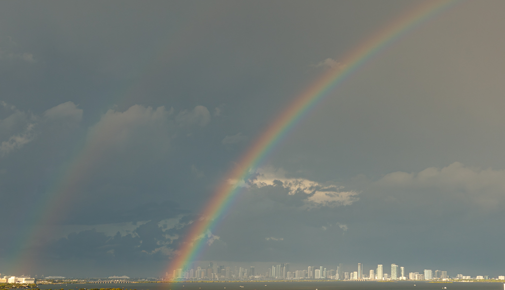
Thank you Dan, I see your point - thank you. I guess the rainbow faded away by the time I got the camera set up�� |
Sep 15th |
5 comments - 6 replies for Group 96
|
11 comments - 9 replies Total
|