|
| Group |
Round |
C/R |
Comment |
Date |
Image |
| 95 |
Aug 22 |
Comment |
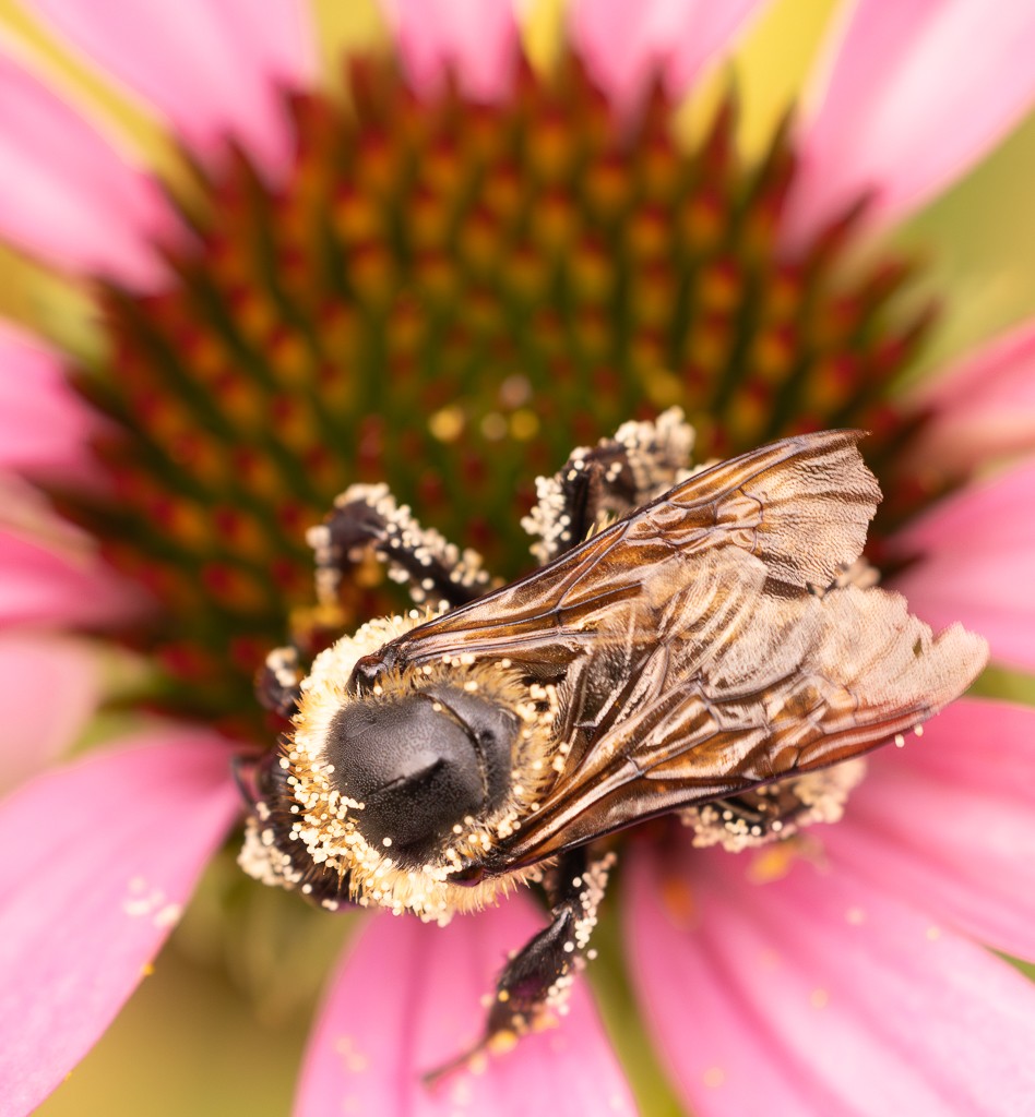
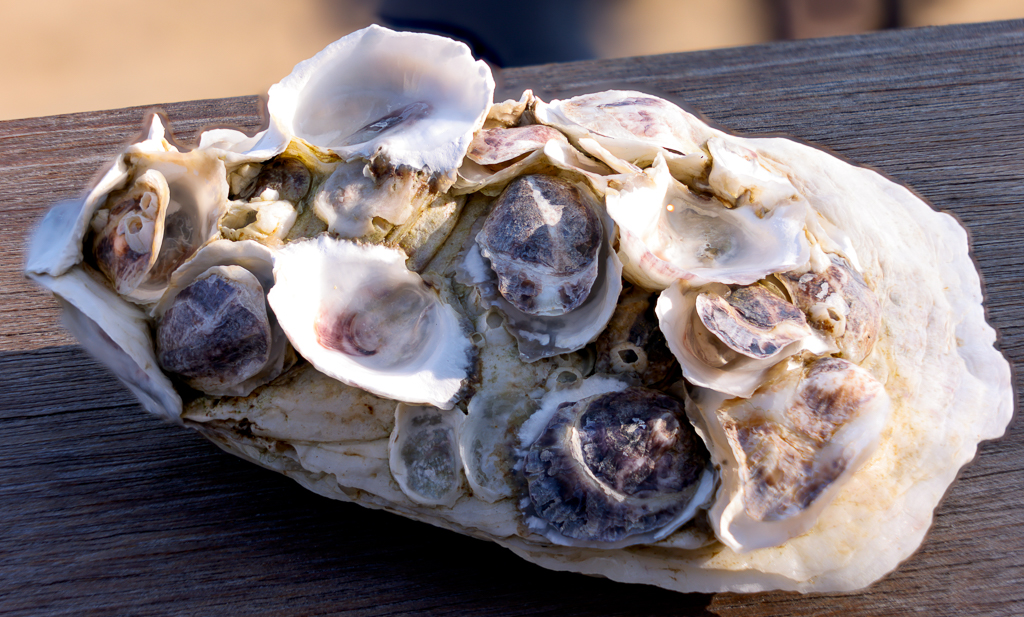
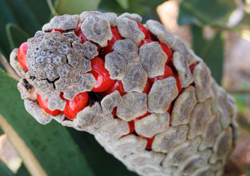
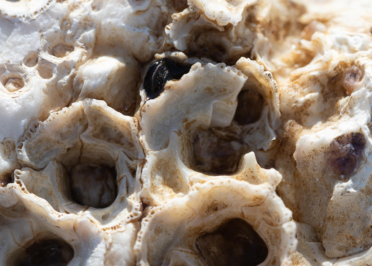
Hi Pat, it is a beautiful rock and I like the idea of making a "portrait" of it. Maybe, as others suggest, a different, tighter cropping would bring that out more fully. I like the balance of the colors. |
Aug 22nd |
| 95 |
Aug 22 |
Comment |
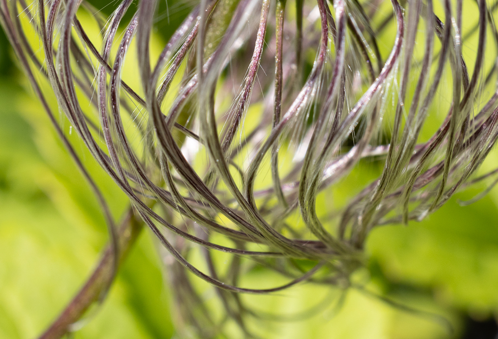
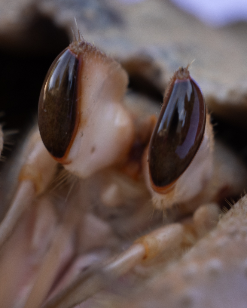
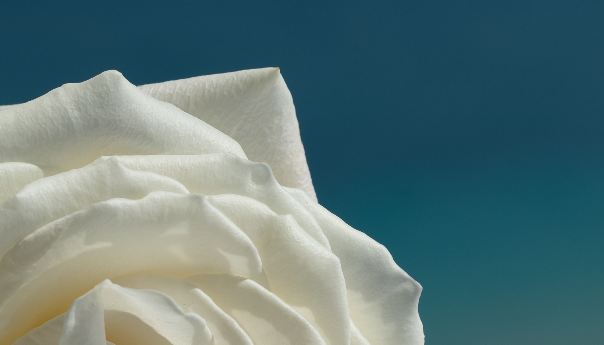
Hello Stuart, what an interesting and beautiful image. It has a lot of detail and richness. The hairs along the edges are so crisp. One feels you could go closer and show even more detail. I like very much the balance of the colors. My only wish would be to see the full set of stems (?) on the right side. |
Aug 22nd |
| 95 |
Aug 22 |
Comment |
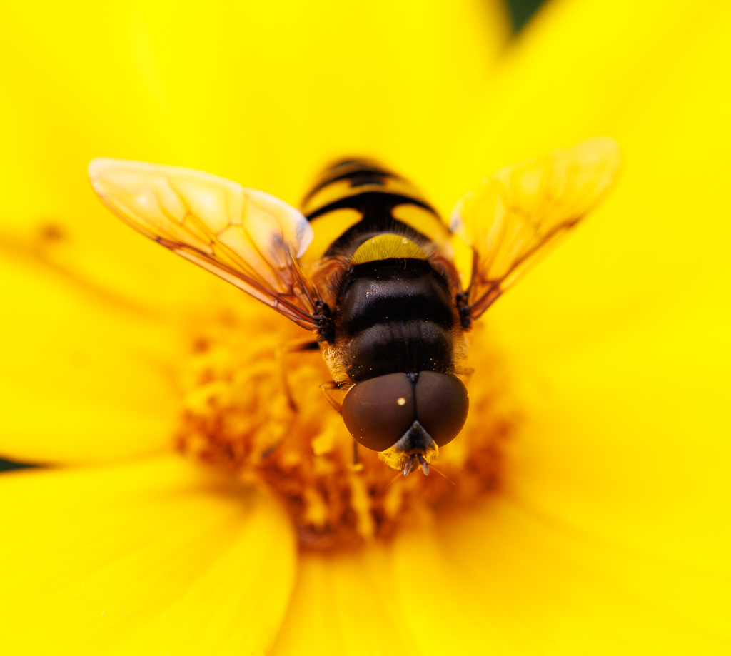
Hello Fran, I love this image. I really like the sharpness of the focus point of the image and the rest being softer. I am curious about your lens - the lens velvet 85 - I had not heard of it but with it you did a great job at creating the dreamy effect. Thank you for helping me discover a new tool... |
Aug 22nd |
| 95 |
Aug 22 |
Comment |
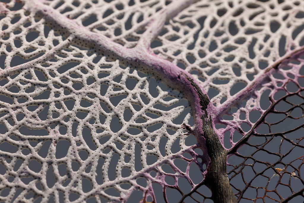
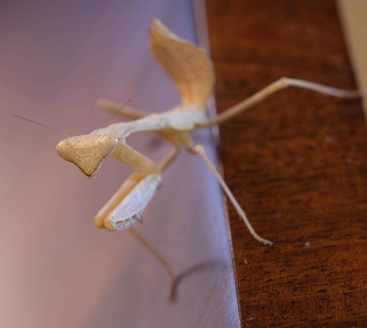
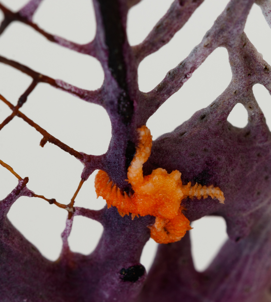
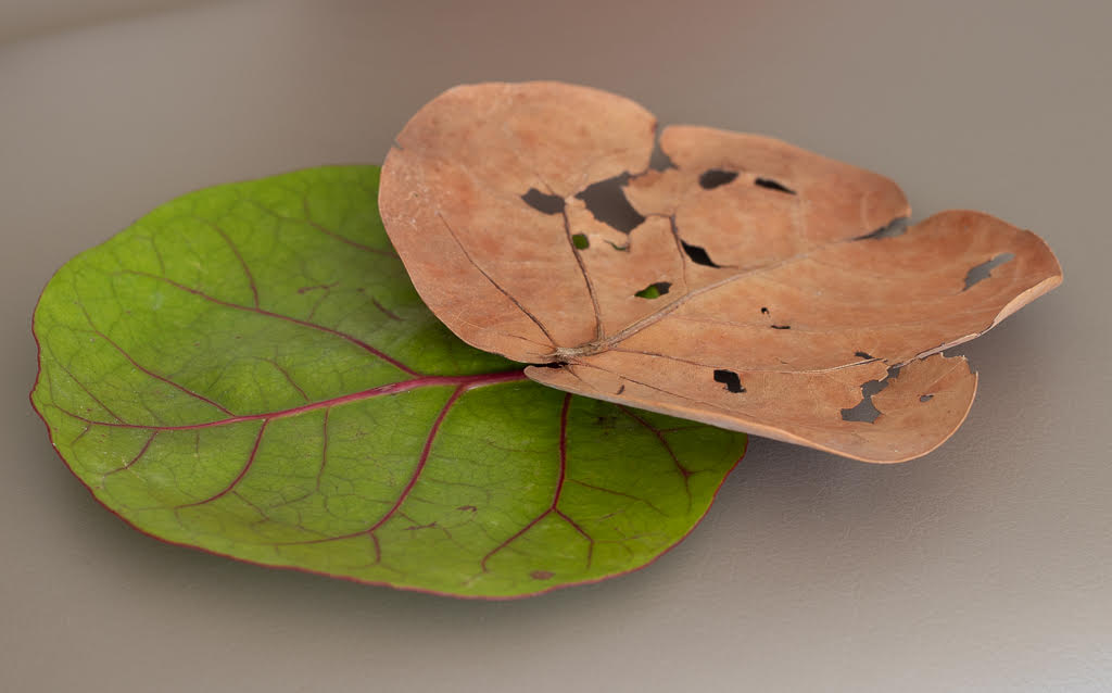
Tom, beautiful image - and I can totally relate to the family tree metaphor. I love the details, once again it is amazing when we take the time to go into the details of nature. I wonder whether you could go even closer and have the leaf take over the whole space. |
Aug 22nd |
| 95 |
Aug 22 |
Comment |
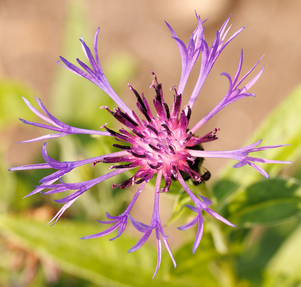
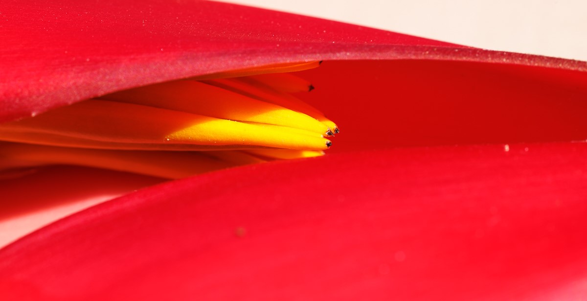
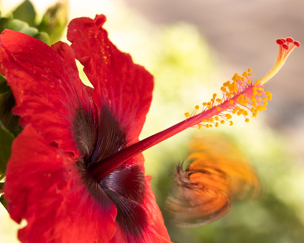
Hi Carol, Gorgeous image. And yes the title speaks to me - the softness come through and also the movement - so the slowly also speaks to me. It feels like the flower keeps opening up as you are looking at it. Wow. I also like the yellow tone very much. Lots to learn from you! |
Aug 15th |
| 95 |
Aug 22 |
Comment |
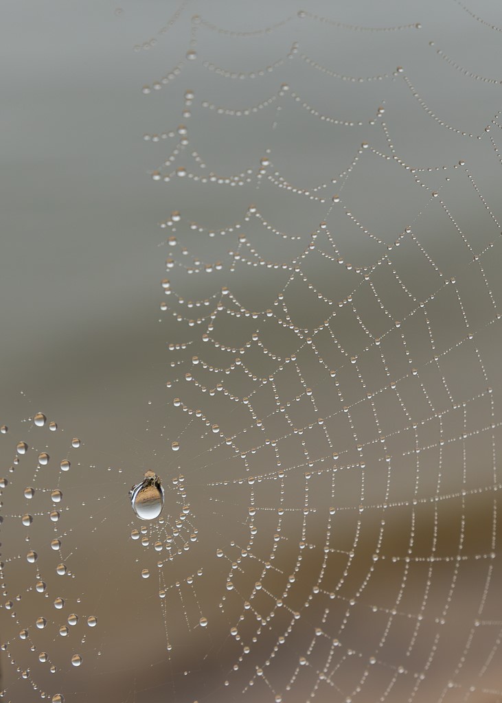
Keith, your image opens the door for a lot of more images and experimentation. I also immediately felt that the green background is distracting and takes away from the focus on the curves of the stone. Indeed you could try retaking it with f10. Also, you might try focusing on just a portion of the stone/curves and making it more abstract. I am learning quite a lot on stacking from the comments and answers on your efforts! |
Aug 15th |
| 95 |
Aug 22 |
Reply |
Thank you Pat, I am a novice in macro photography and all your comments are very useful. I see it is important to focus on 1 thing and not have distractions. Also any suggestions on how to widen/improve focus are very useful. I see the point of increasing ISO to have more flexibility. |
Aug 15th |
| 95 |
Aug 22 |
Reply |
Thank you Bev for suggestions |
Aug 15th |
| 95 |
Aug 22 |
Reply |
Thank you Keith - your feedback is consistent with others... I will focus on one thing next time. |
Aug 15th |
| 95 |
Aug 22 |
Reply |
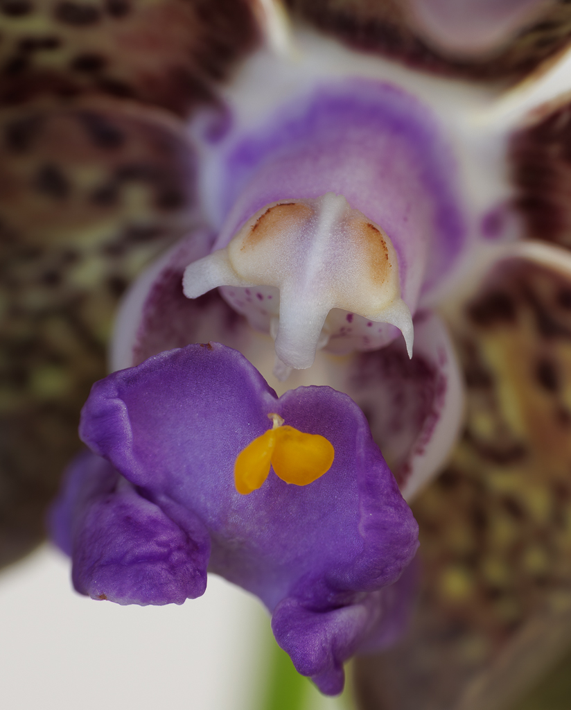
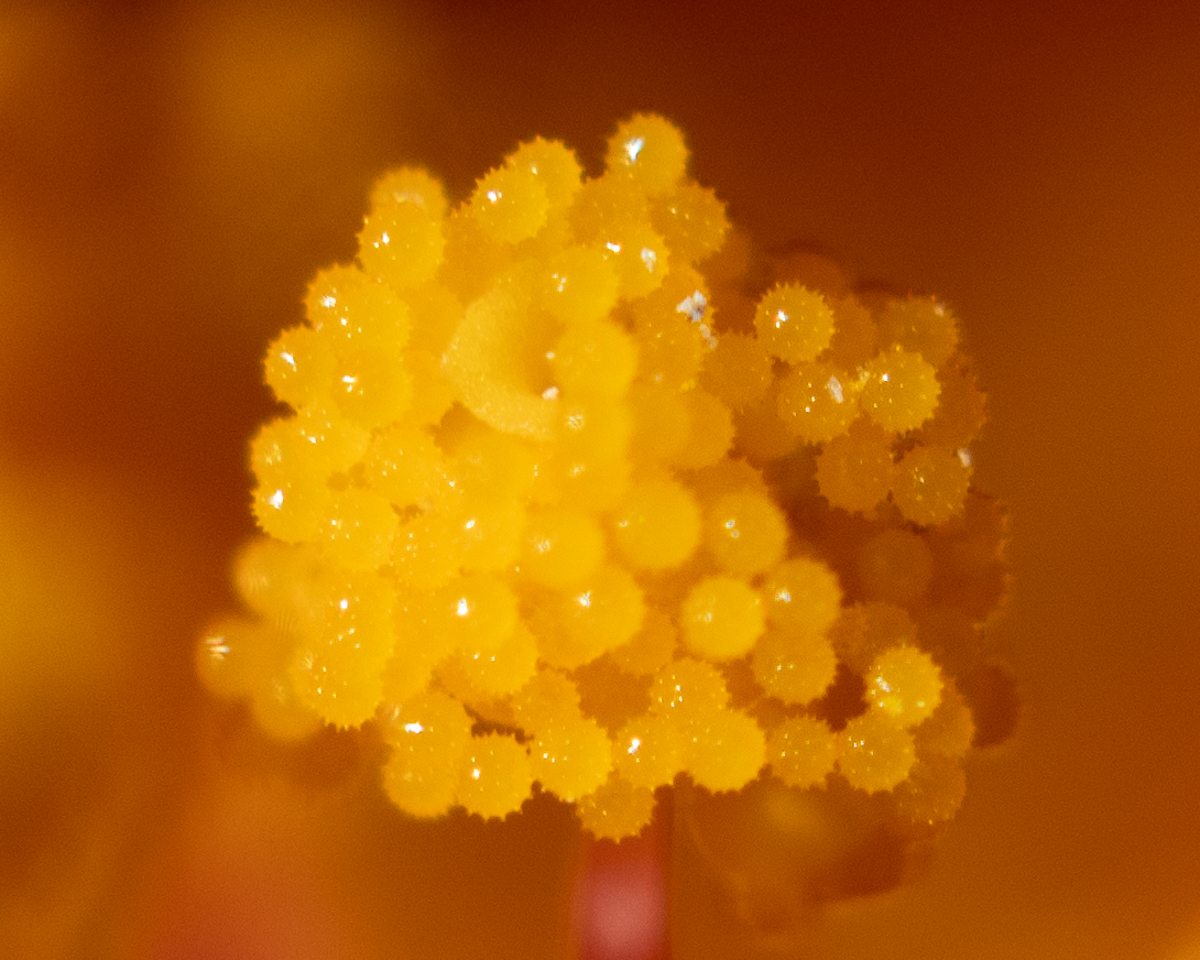
Thank you Carol. Great suggestions. This was the first shoot I did with my new 100 mm macro lens and I had a lot of trouble focusing. I realize that that is one of the main challenges of macro photography. I have never tried focus stacking and I see now how it can help in macro photography. I also did some shots specifically of the stigma and the anther. Might use them in the following months to hear your your opinion. |
Aug 15th |
| 95 |
Aug 22 |
Reply |
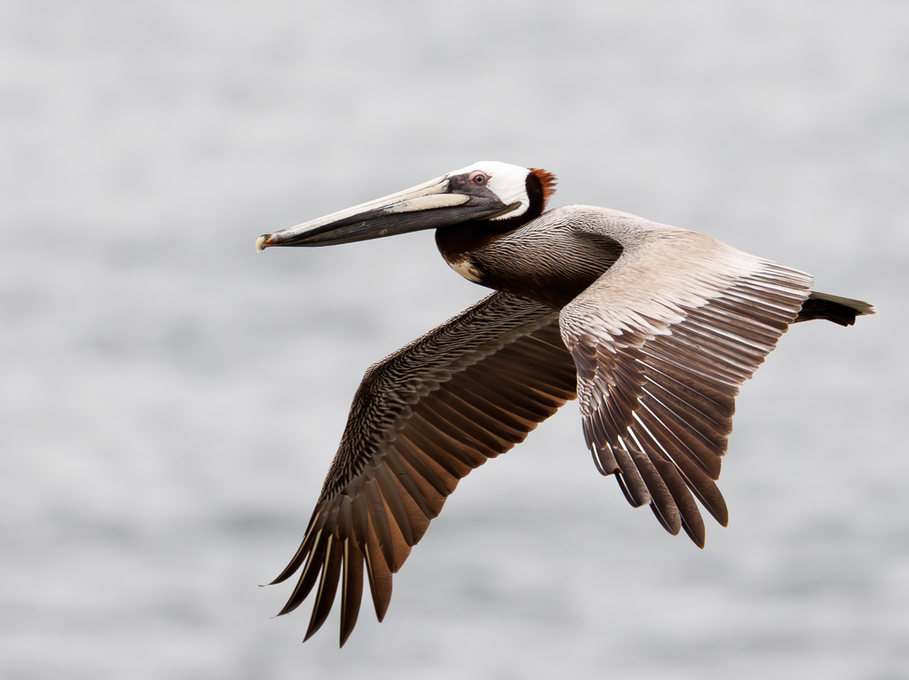
Thanks Stuart - I see the point on the yellow being distracting. On the blurred butterfly.. see general comment below. |
Aug 15th |
| 95 |
Aug 22 |
Comment |
Hi to all. Apologies for not being more active this month - I caught Covid 5 days ago and have not been 100%. Will respond to specifics but a general point that comes up in all comments.
In that same session I have several photos of just the hibiscus and also with the monarch on the flower. I had picked this composition on purpose - with the abstraction of the blurred butterfly .... I guess it did not resonate!
|
Aug 15th |
 |
7 comments - 5 replies for Group 95
|
| 96 |
Aug 22 |
Reply |
Thank you Robert - yes I am lucky to have such view point. Thank you for your suggestions to improve the image. I will pull together all the comments and see if I can come up with an image to hang on the wall! |
Aug 22nd |
| 96 |
Aug 22 |
Reply |
Yes- I get it. Thank you again |
Aug 22nd |
| 96 |
Aug 22 |
Reply |
Thank you Cheryl, I really really appreciate your detailed comments and the explanations on the changes! And also I now understand more clearly the need for a foreground. |
Aug 22nd |
| 96 |
Aug 22 |
Comment |
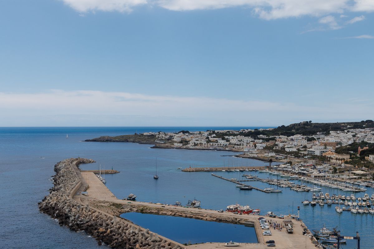
Hi Robert, the place is gorgeous. And I wish there was a way to convey in your image the difficulty of getting there and shooting this image! Or a way to bring out some detail that brings this picture to life with some of your experience of the place that you so well describe above. It is the challenge we all have. As others mentioned the original has softer tones, also the snow looks whiter. I would stick with it as much as possible. Although the right side might be a bit too dark. |
Aug 11th |
| 96 |
Aug 22 |
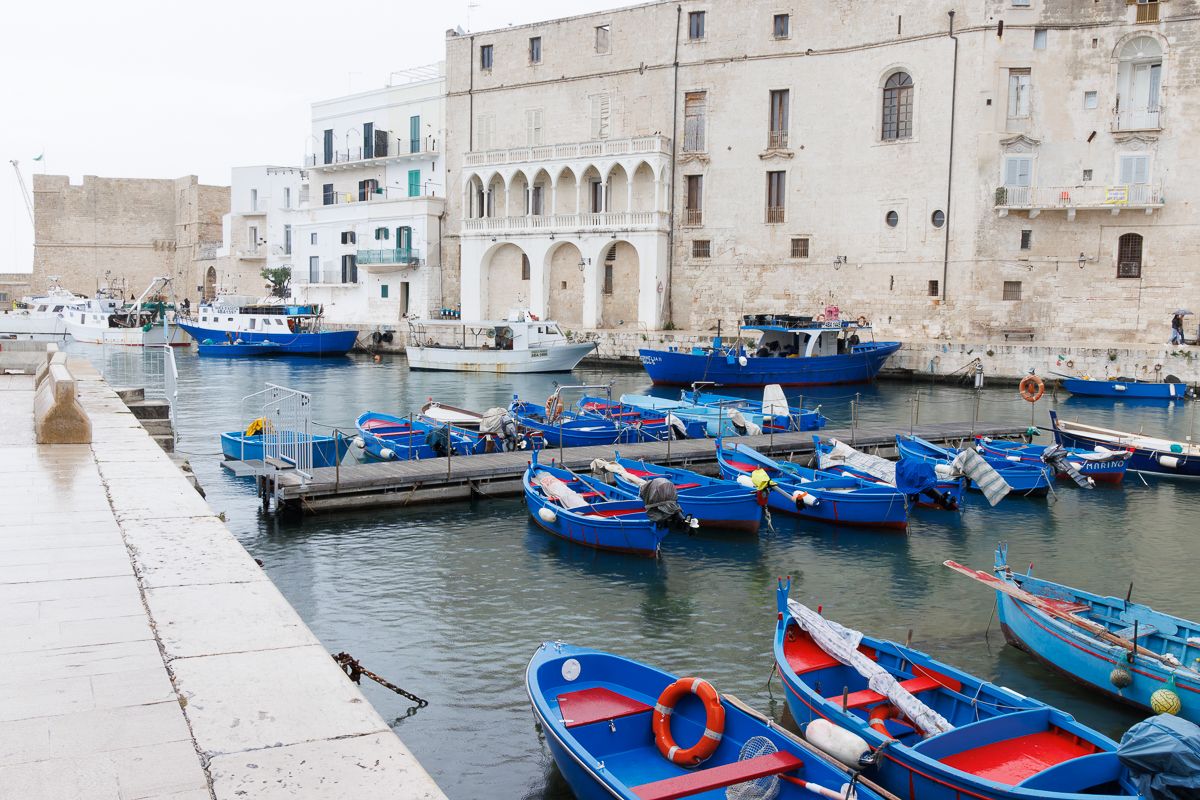
Comment |
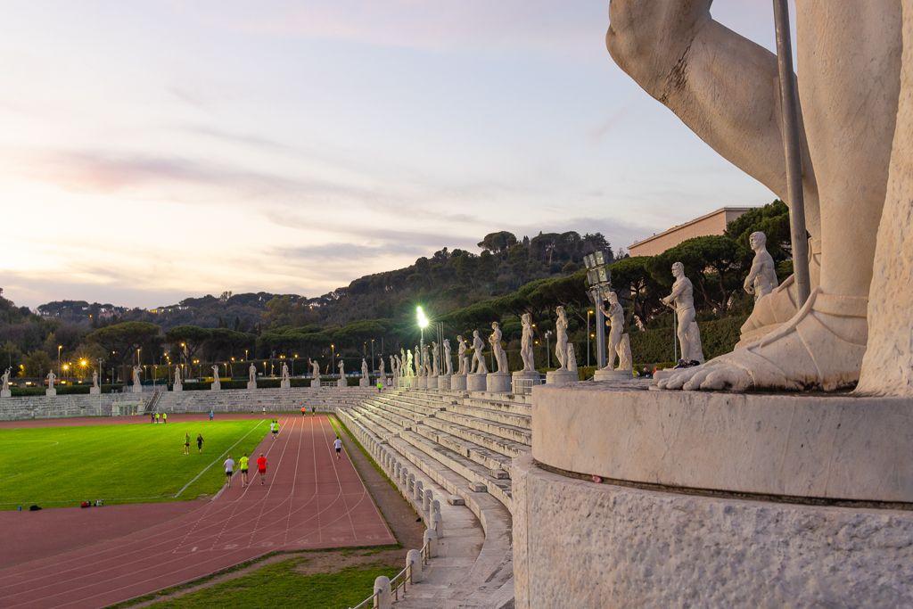
Hi Bob, I really like the old pagoda and its colors and the weathered roof. I think you should make that the focus of your image. The orange color seems a bit too saturated. Maybe crop the left side - the whole bush, and then if possible as Haru said include the whole statue (?) on the right side. |
Aug 5th |
| 96 |
Aug 22 |
Comment |
Hi Cheryl, The greens in this image are so amazing. I also like very much the reflection. It is definitely "peaceful" - one can imagine sitting there for hours. I like the saturation as shown. In terms of improvement I would also crop a bit the left side to be able to focus more on the waterfall. This image really makes me want to go visit this garden! |
Aug 5th |
| 96 |
Aug 22 |
Comment |
Hi Haru - I like the most the image you posted at the end of the dialogue with Dan. I also felt the top left portion of original image was not really needed to convey the zen emotion - and the piece of tree trunk was not that pleasing to my eye. I definitely prefer the color version - the different tones of green are gorgeous. To improve it maybe I would have added a bit more of the stream in the image to the left of the horsetails. |
Aug 5th |
| 96 |
Aug 22 |
Comment |
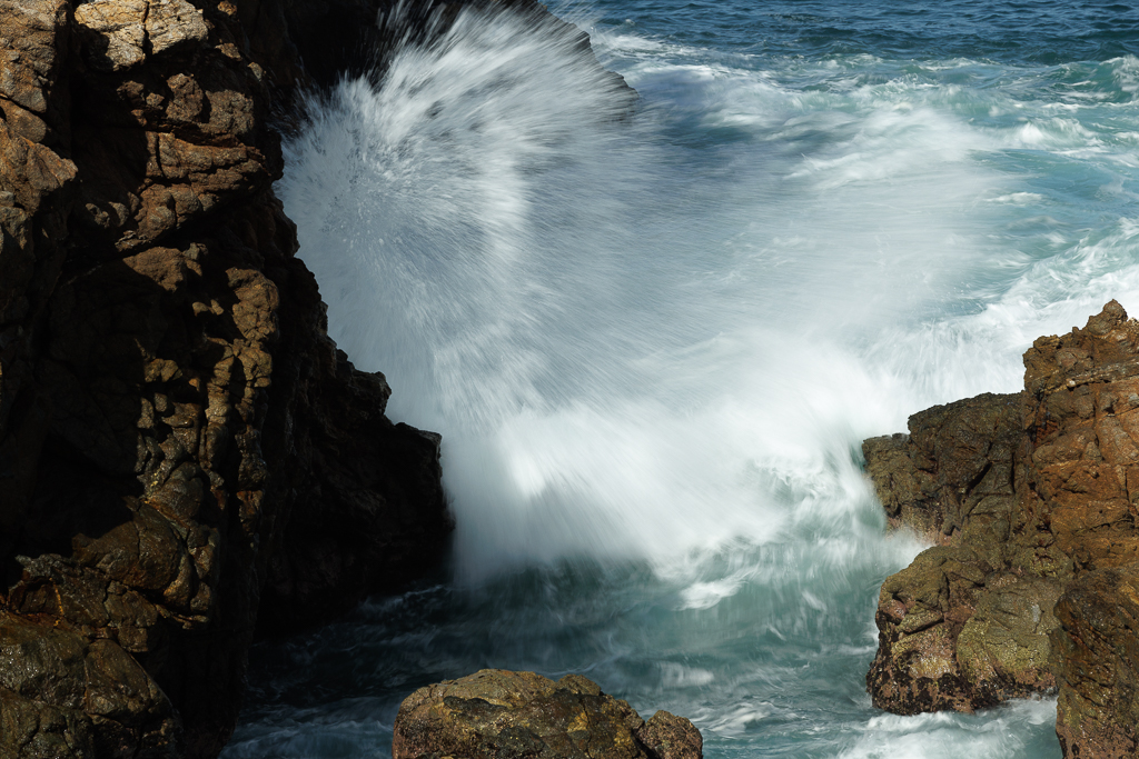
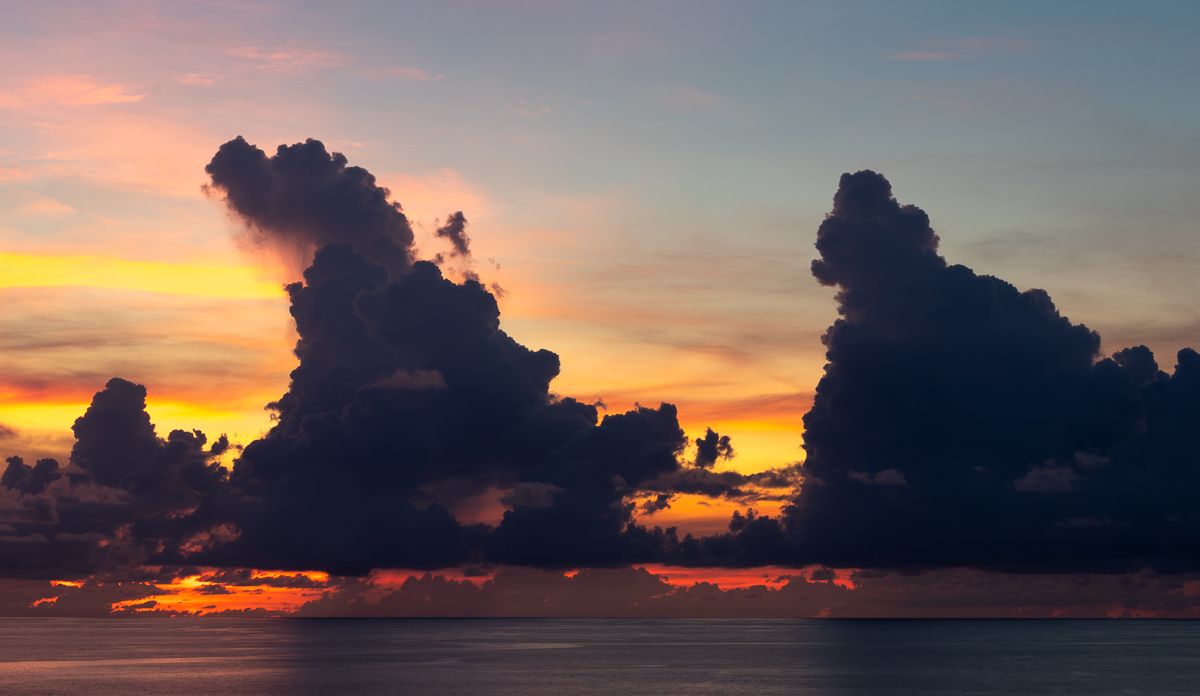
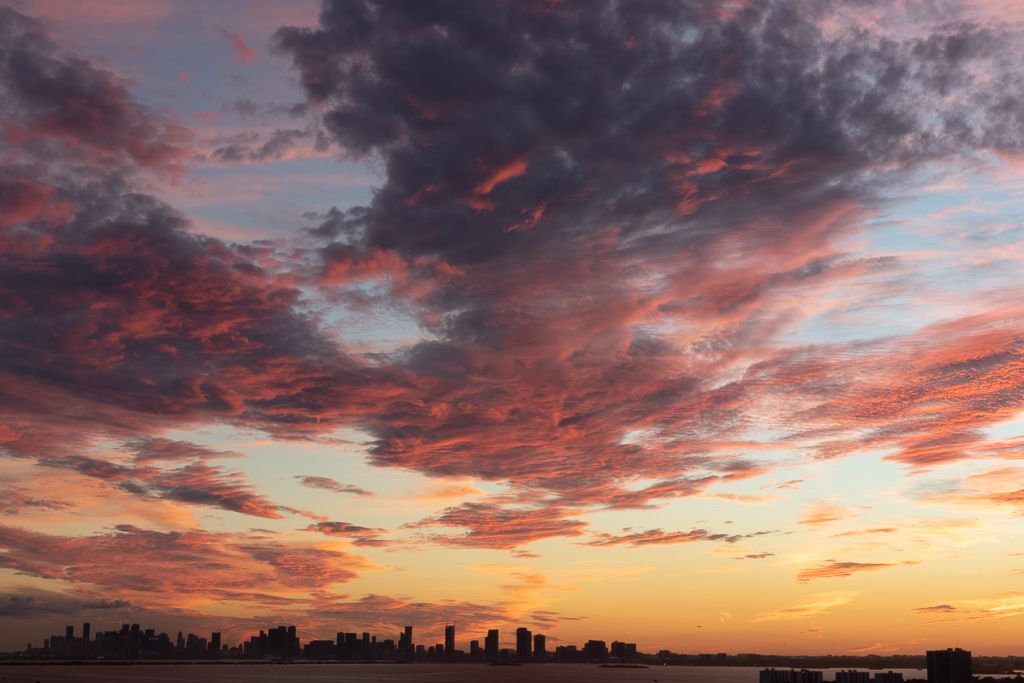
Hi Dan,
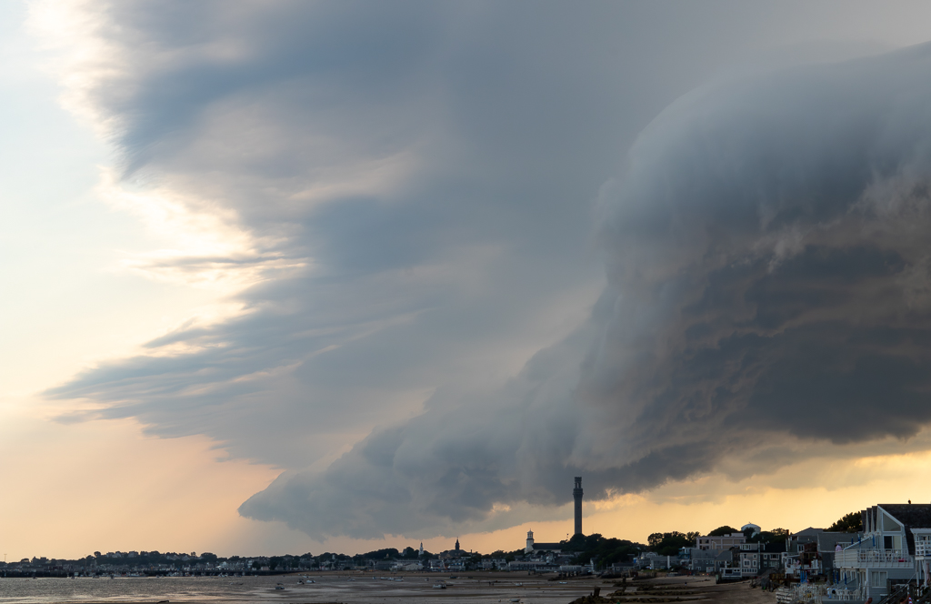
I love your image. I like the parallelism of the clouds shooting up and the sand shooting down. And the brown of the rocks complements the whole composition. I can totally understand how you enjoyed the experience in itself. I would also keep the landscape mode - but I would crop the right hand side darker part of the sky. |
Aug 5th |
| 96 |
Aug 22 |
Reply |
Thank you Haru - wow nice advice on bringing out the contrast and making the image more forceful. I really like your color version. The B&W is interesting and I see your point - although I would want to keep the colors. |
Aug 4th |
| 96 |
Aug 22 |
Reply |
|
Aug 4th |
 |
| 96 |
Aug 22 |
Reply |
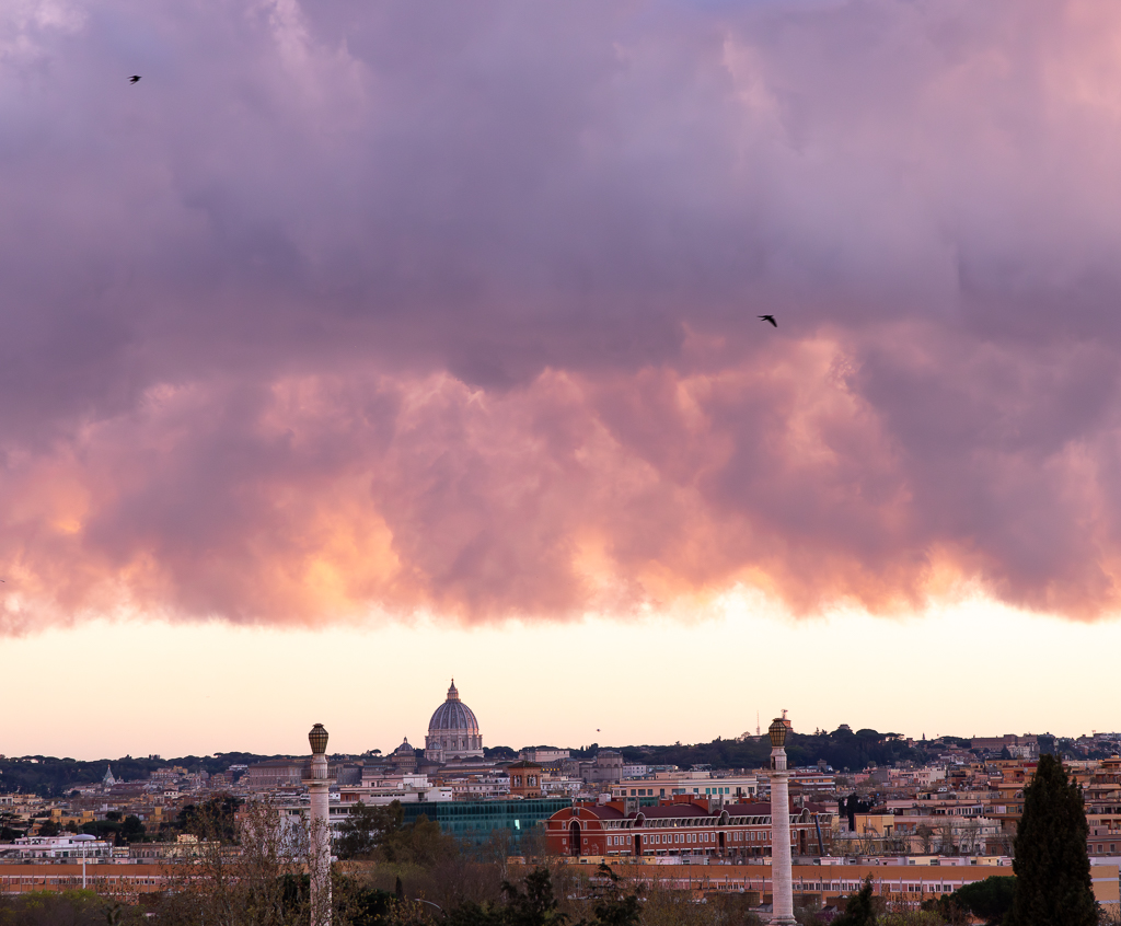
Hi Dan,
Thank you! I am not sure I'll get another storm with this shape and colors any time soon.. This is the original - I will try what you suggest - I have never done it. The iPhone version got more skyline but not as great crispness and colors.
|
Aug 4th |
 |
5 comments - 6 replies for Group 96
|
12 comments - 11 replies Total
|