|
| Group |
Round |
C/R |
Comment |
Date |
Image |
| 96 |
Mar 22 |
Comment |
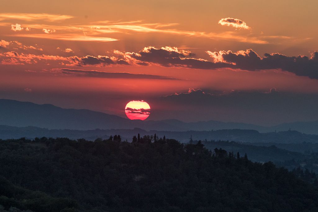
Hi Cheryl, apologies again for late comments. I learn so much from your panoramas and the technical details to improve them. I will not repeat others' comments. I think your 3/15 version is definitely an improvement and makes the image very dramatic. Definitely the B&W version is the one that highlights the dramatic scenery better. Indeed the challenge is to have enough contrast to make the image memorable. I think this version really works. I can appreciate better the light on the mountains, and the reflection on the water. And also the dramatic clouds. Thank you for a wonderful image and many lessons to be learnt. |
Mar 31st |
| 96 |
Mar 22 |
Comment |
Hi Bob, apologies to you too for late comments. Hard to add much - I have never been in that area and I also looked it up. Such a dramatic landscape, and I admire your creativity in presenting it. I will not repeat others' comments on the color red and wishing for more texture. The revised image you posted on 3/13 is a more artistic image, with more appealing color combination of the mountains and the sky. And the green in the foreground also blends better with the clouds. I always learn new techniques from your creative images - thank you! |
Mar 31st |
| 96 |
Mar 22 |
Comment |
Hi Dan, I also think the second image in response to Robert is more pleasing to my eye. It has less foreground and the sky is more appealing to me. Although you loose some of the orange in the sky. In terms of emotional response, I can relate to the sense of calm, and awe at the natural beauty of the frozen water - but not the pain or euphoria from this image. Thanks for this image - the branch makes all the difference in making this beautiful sunset a more powerful image. I love sunsets and I am always struggling to make them interesting and not just a snapshot. |
Mar 31st |
| 96 |
Mar 22 |
Comment |
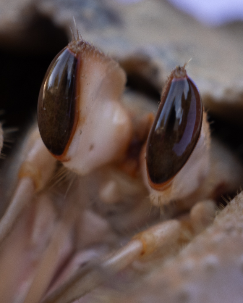
Hello Robert, sorry for late comments - crazy month for me. I was mesmerized by your image and the "Hidden Power" title is very appropriate. The image is scary and beautiful at once. I also agree you should do a series. I agree with bringing in more light and you did a good job with sharpening given how difficult must have been to shoot this image. |
Mar 31st |
| 96 |
Mar 22 |
Comment |
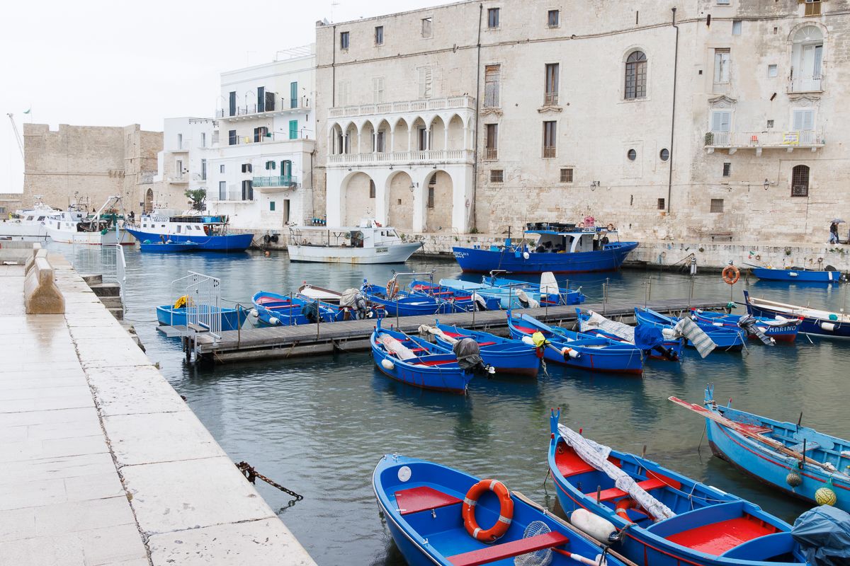
Hello Brian, Knowing your goal helps to appreciate the street scene and the historical monuments. I travel quite a bit and I am always struggling on how to reconcile capturing a Moment to remember and recording an image that also meets some technical standards. Also hard for me to know when to include people or not. I agree with others on overexposure of buildings that can be corrected. I do think that by cropping the left side a bit, you can take out the street signal and the red shirt that is a bit distracting from the architecture of the buildings. Looking forward to seeing more of your Moments. |
Mar 28th |
| 96 |
Mar 22 |
Comment |
Hello Haru, First of all I agree with Brian that this is a scene of great natural beauty. How lucky for you to be able to experience it. on your questions this is my take:
1. On Composition I like to see the whole environment, although I would crop the sky on the top left and the 2 trees on the left side.
2. I like the version with direct light - it is more dramatic and the colors are more striking.
3. BW not as dramatic to my eyes.
4. On post production I agree with Cheryl's comments.
Beautiful place and picture. Thanks.
|
Mar 27th |
| 96 |
Mar 22 |
Reply |
Brian, thank you. I guess being from the Italian mediterranean that is exactly what I was being drawn too. |
Mar 27th |
| 96 |
Mar 22 |
Reply |
Thank you! Yes, I will keep trying! All your comments are useful. |
Mar 27th |
| 96 |
Mar 22 |
Reply |
Thanks Bob - the combination of all your comments is very insightful. Lots of approaches to try to attempt to better convey what I wanted to express. |
Mar 27th |
| 96 |
Mar 22 |
Reply |
Thanks for the comments - very useful. I appreciate the comments on composition and also on not overutilizing the tripod! |
Mar 27th |
| 96 |
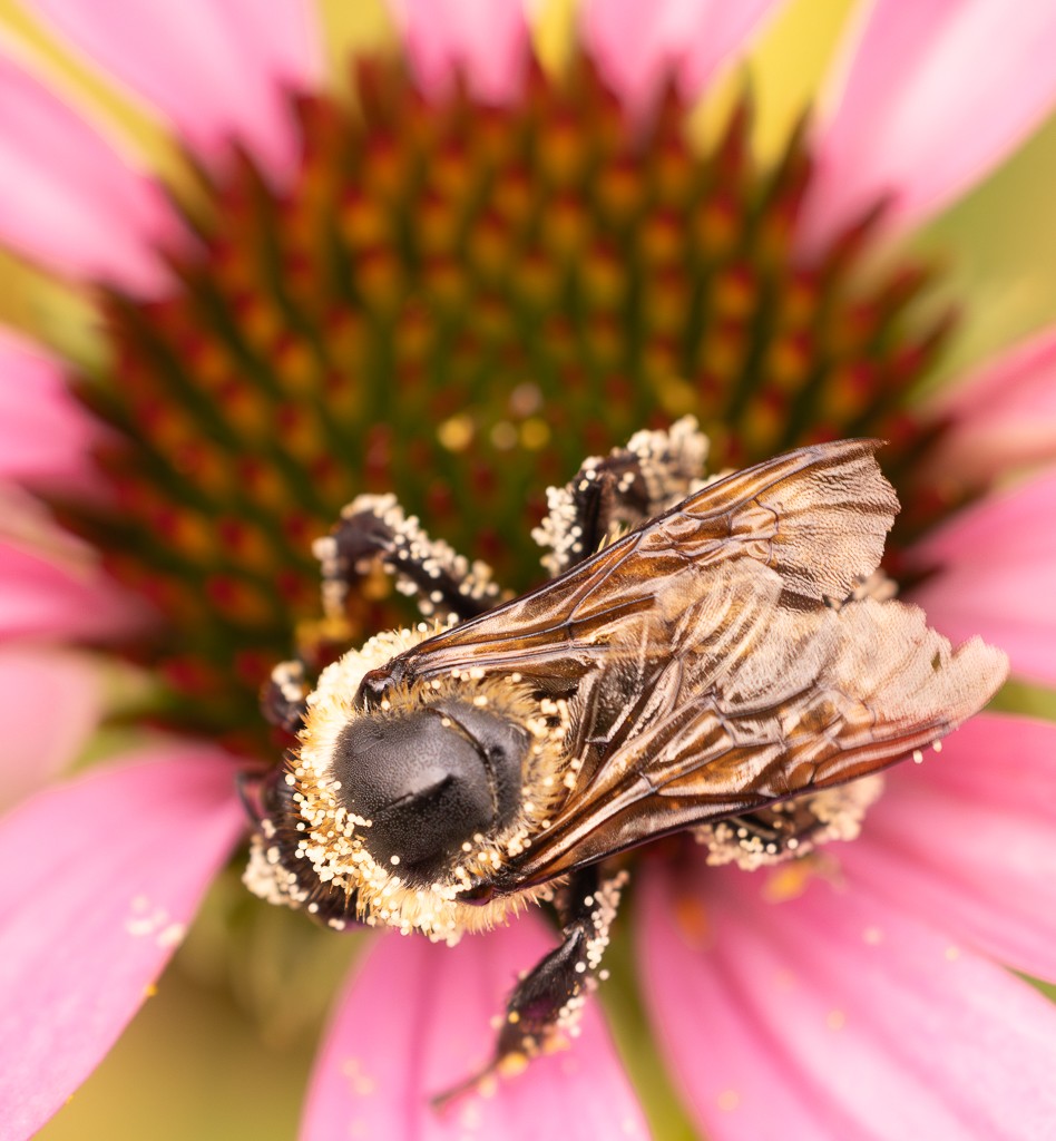
Mar 22 |
Comment |
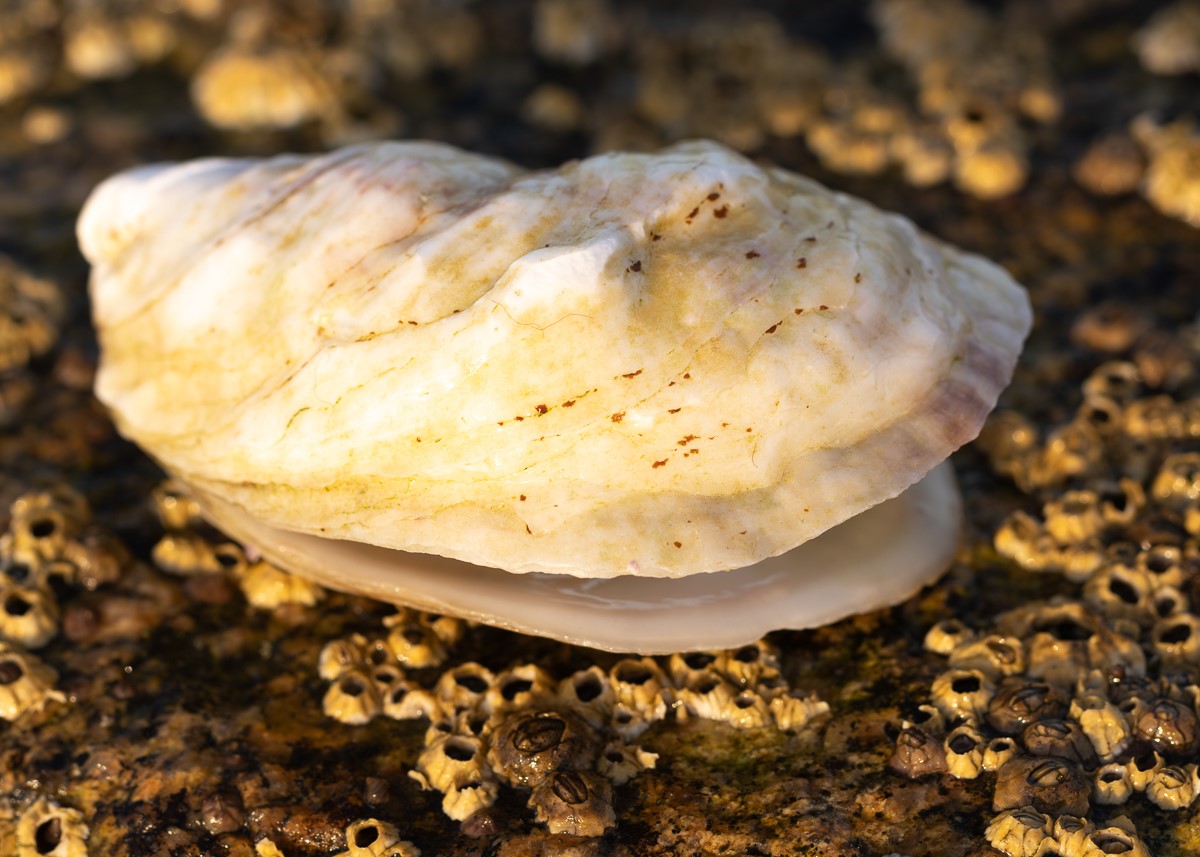
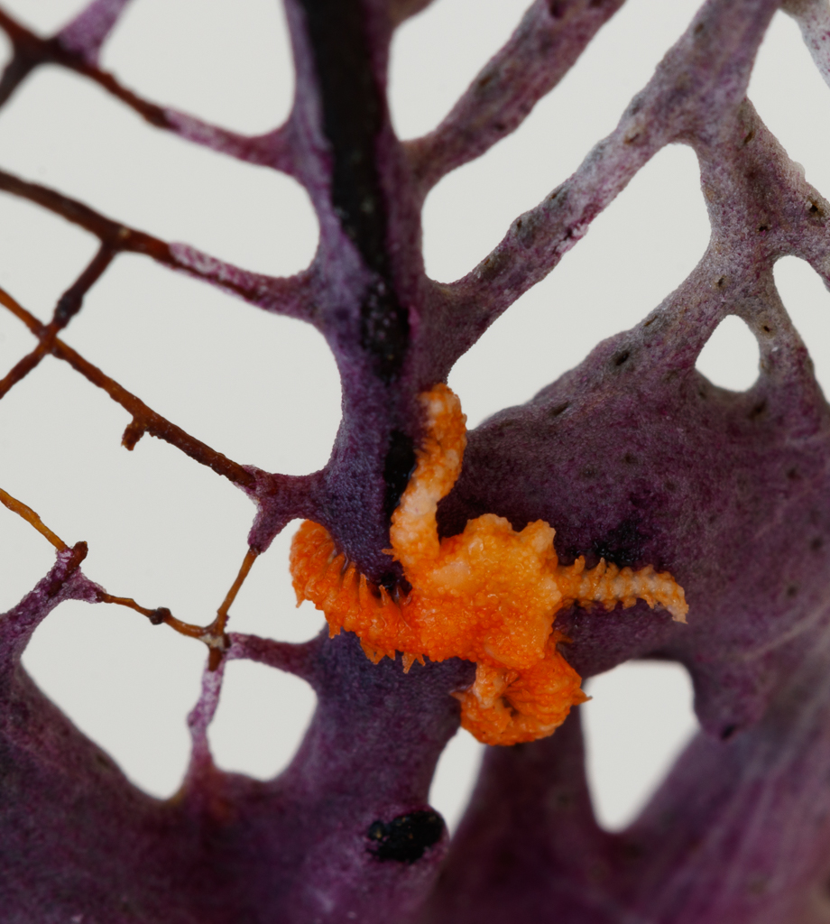
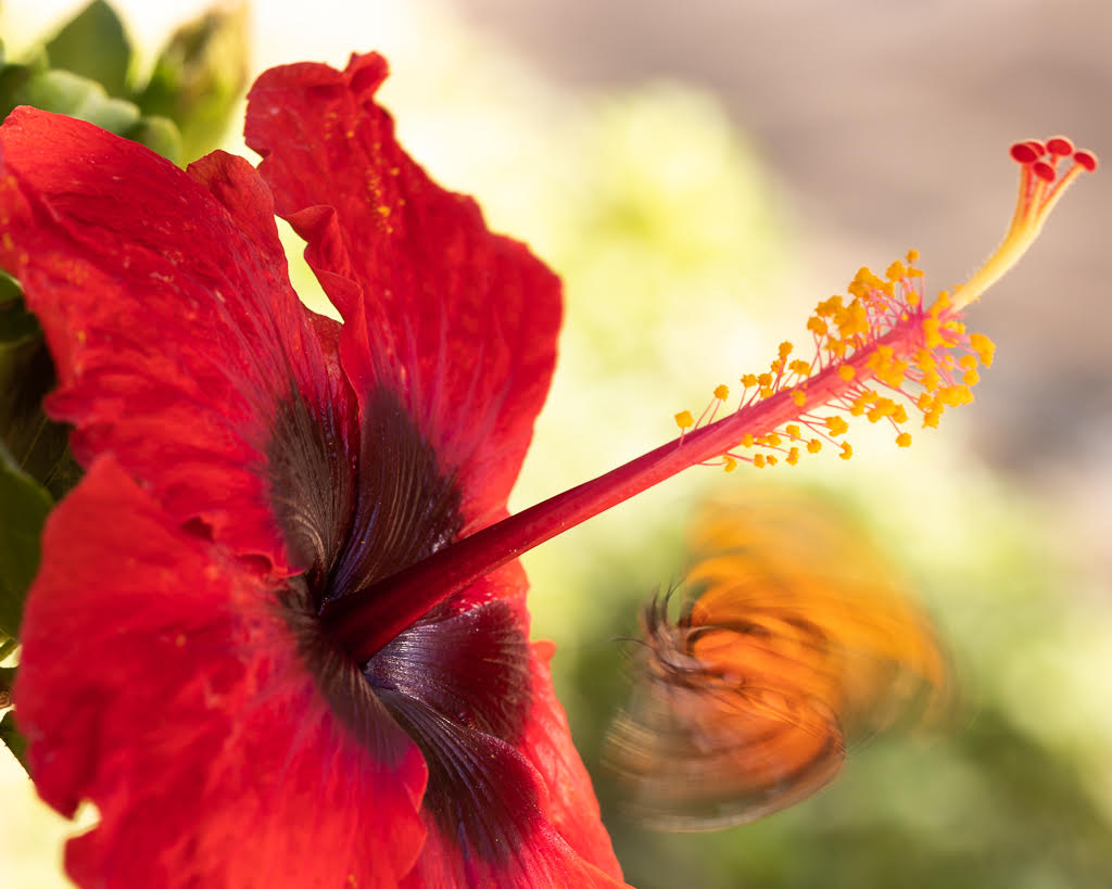
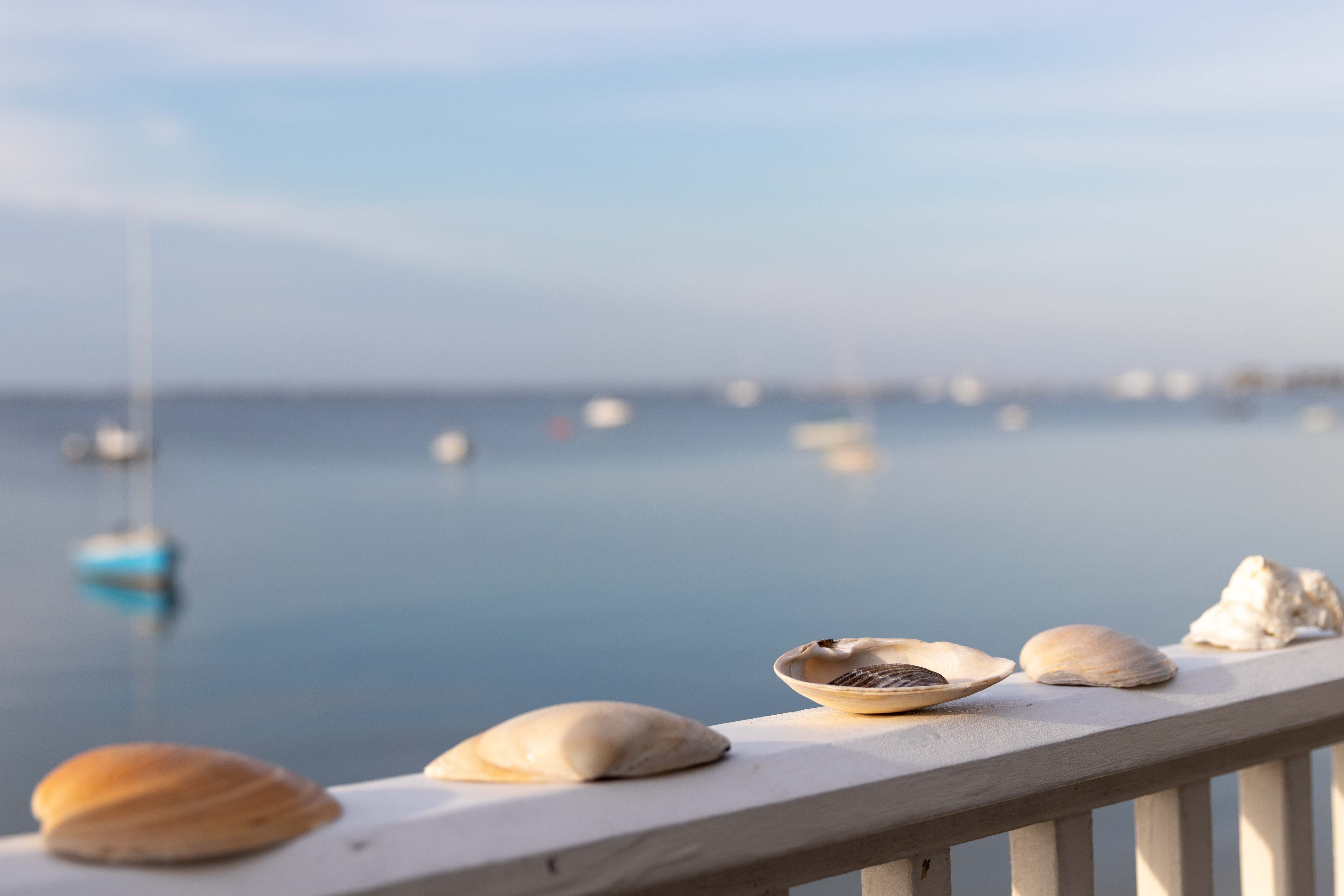
Hi Bob, thanks for your comments. What I had intended was to only focus on the center shell, I blurred the rest of purpose. I wanted to give the background around it but in a suffused way - I guess for you it did not work. I think the message for me is to focus on the main message and I tend to want to include too many things! I will send comments to others the weekend. |
Mar 10th |
7 comments - 4 replies for Group 96
|
7 comments - 4 replies Total
|