|
| Group |
Round |
C/R |
Comment |
Date |
Image |
| 9 |
Nov 21 |
Reply |
I agree with this comment and realize that is the problem I have been trying to identify. Is there any crop that would help define a resting point? Or a reshoot? |
Nov 27th |
| 9 |
Nov 21 |
Reply |
thanks! I will give it a try |
Nov 17th |
| 9 |
Nov 21 |
Comment |
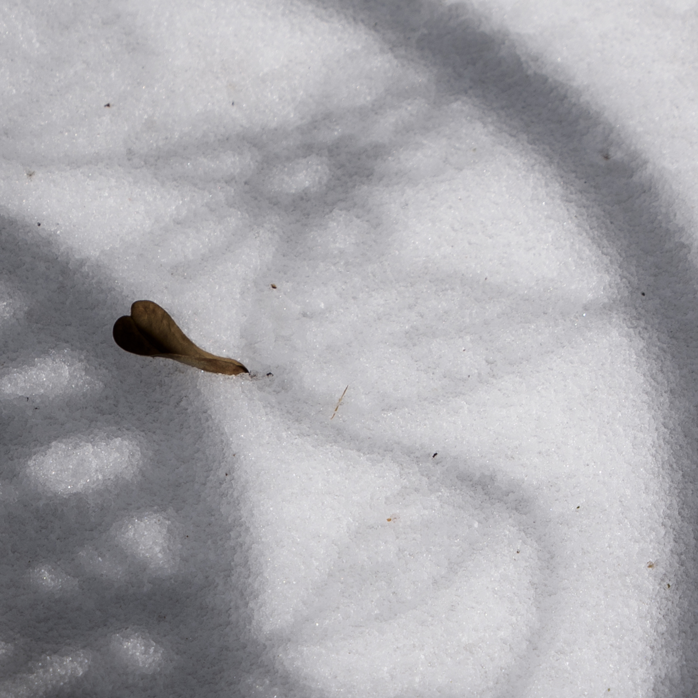
Looks like a lovely day at the pond. The ed edges of the submerged leaves are particularly nice. Red is a tough color and might benefit from a slight desaturation. |
Nov 14th |
| 9 |
Nov 21 |
Comment |
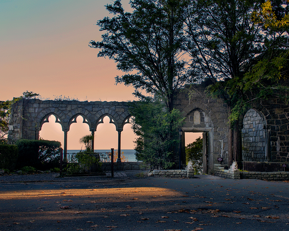
I like the composition with repetition of the towers. Perhaps some contrast and vibrancy enhancements would counteract the grey day. And there is a bit of a halo around the building edges. |
Nov 14th |
| 9 |
Nov 21 |
Comment |
The shadows really capture my attention. Good choice to remove the background clutter. Color of the head is wonderful
|
Nov 14th |
| 9 |
Nov 21 |
Comment |
I am intrigued by the hint of light on the fingers. Is there any way to bring more of that effect to other areas of the statue? As a silhouette, it works well. |
Nov 14th |
| 9 |
Nov 21 |
Comment |
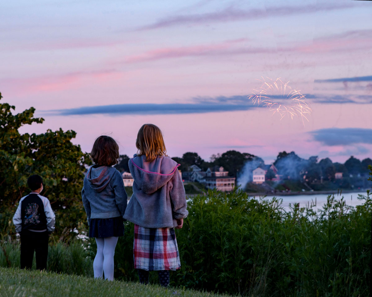
locating people at either side brings the photo and story to life. |
Nov 14th |
| 9 |
Nov 21 |
Comment |
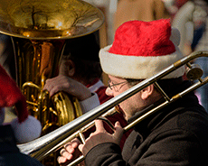
Great concept. Fade to white creates a nice perception of light. |
Nov 14th |
6 comments - 2 replies for Group 9
|
6 comments - 2 replies Total
|