|
| Group |
Round |
C/R |
Comment |
Date |
Image |
| 95 |
Jul 22 |
Reply |
Hi Stuart,
Thanks for making the change.. I think the orange makes the blue stands out more (although I am not an orange colour person). My personal preference is the one without the shadow. In any case, the crystal is amazingly beautiful. |
Jul 16th |
| 95 |
Jul 22 |
Reply |
Oh Yes.. It's a lot more comfortable to the eyes. Nice change.
By the way, from the colour chart, blue's complimentary colour is orange.. Maybe light orange background could compliment the overall look as well.. Just a thought.. Not important. |
Jul 13th |
| 95 |
Jul 22 |
Comment |
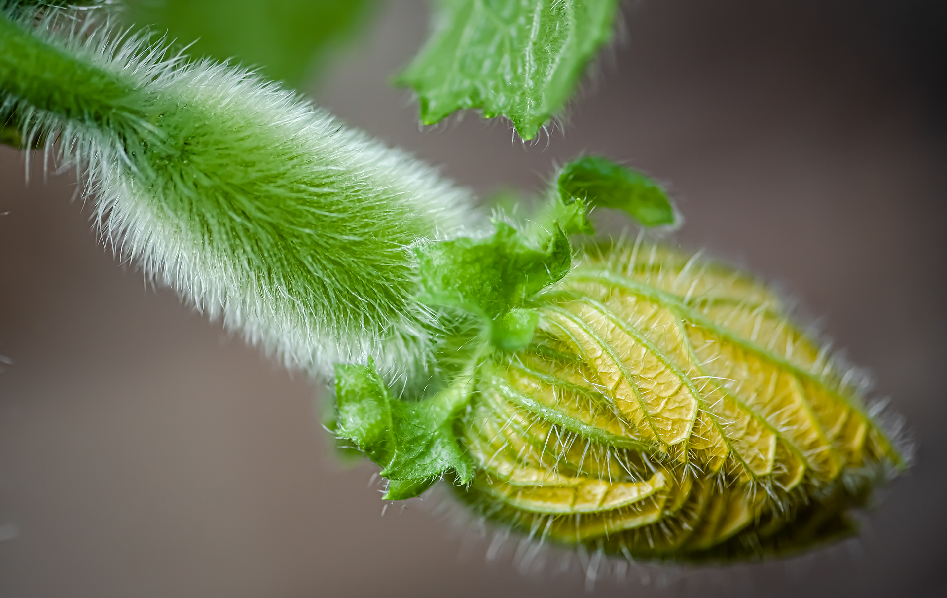
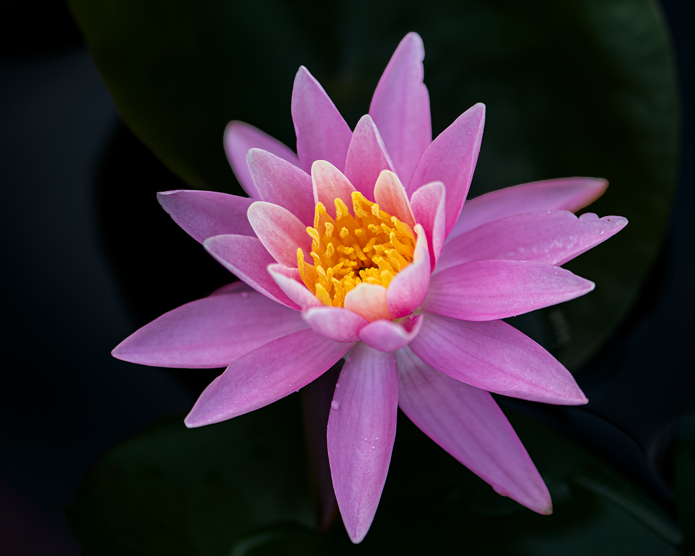
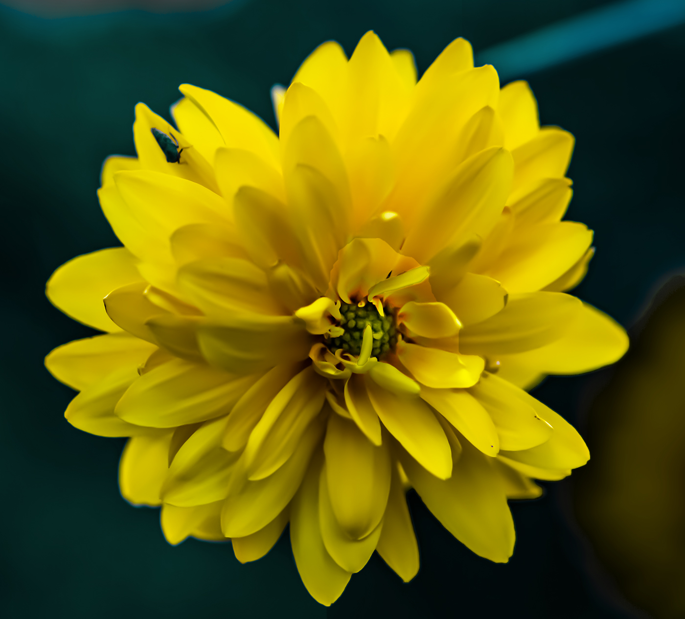
Hi Carol, the soft lighting with front and back contrast amazes me.. Very artistic. Love the way you use high speed shutter producing the dark background. It's a difficult shot as the flow stem is so flimsy..
Btw, just wondering.. so you did not need to lower the clarity and/or contrast to help make the subject softer? |
Jul 12th |
| 95 |
Jul 22 |
Comment |
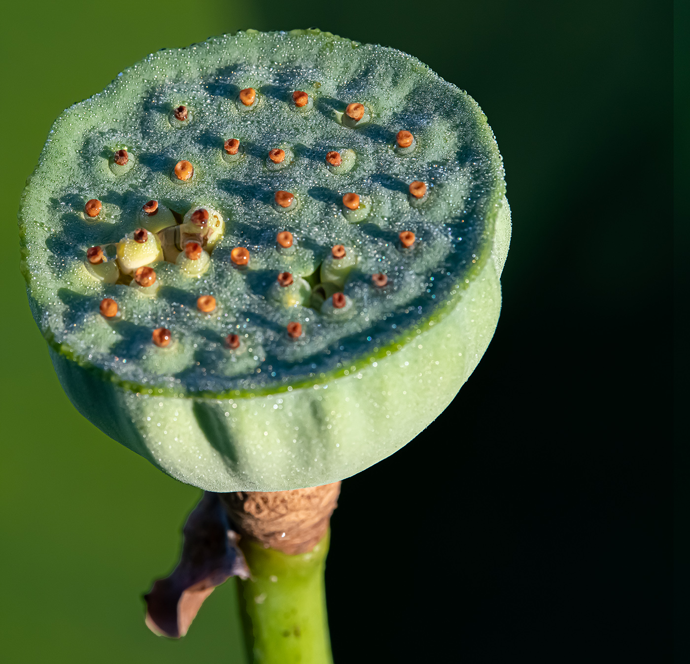
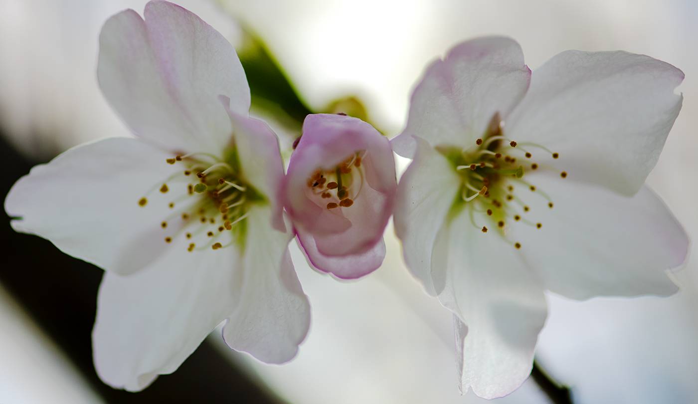
Great shot, Tom. I like the well-balanced soft lighting.. with main light from the top left. The stem positioning is perfect. Thanks for sharing with us. |
Jul 12th |
| 95 |
Jul 22 |
Comment |
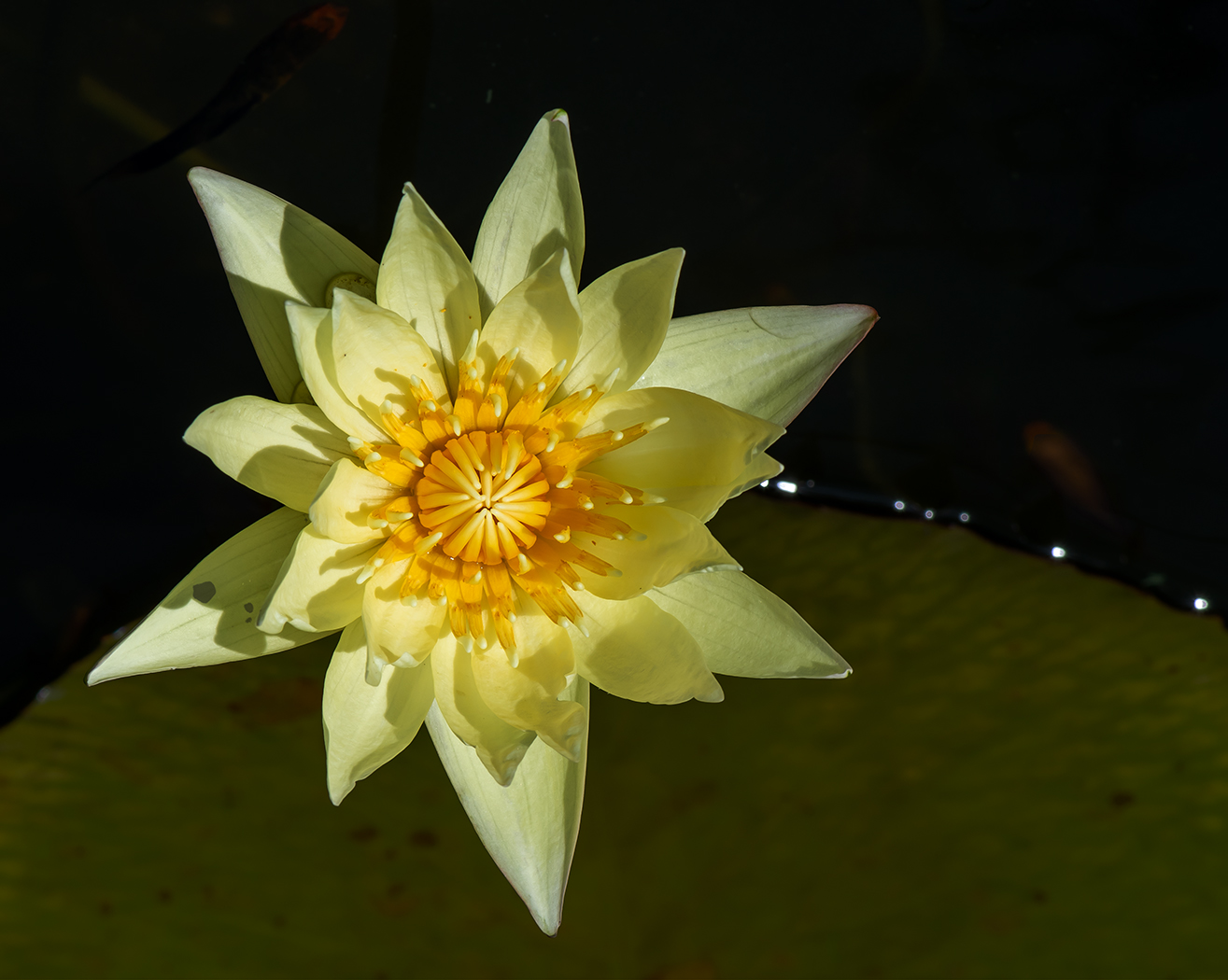
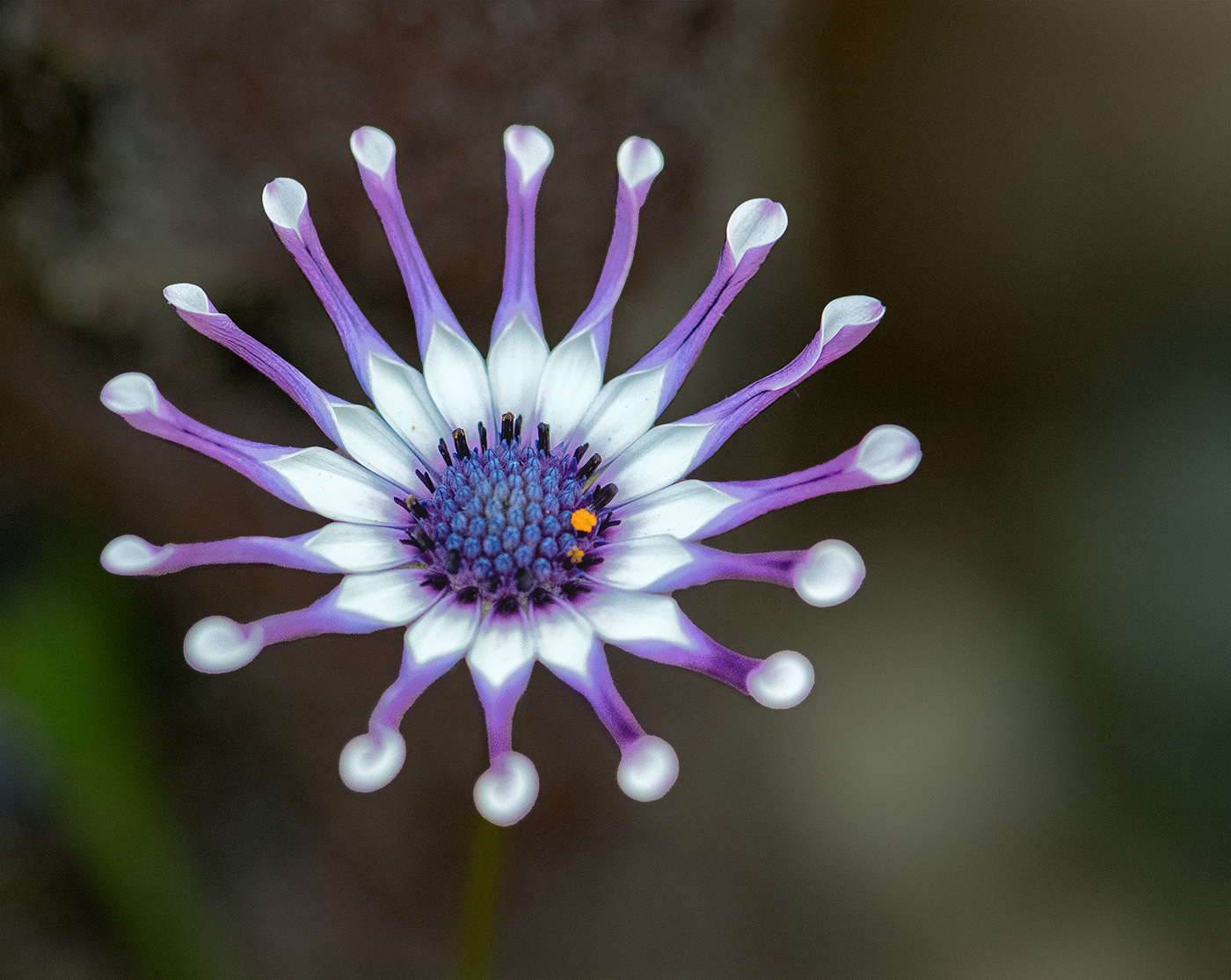
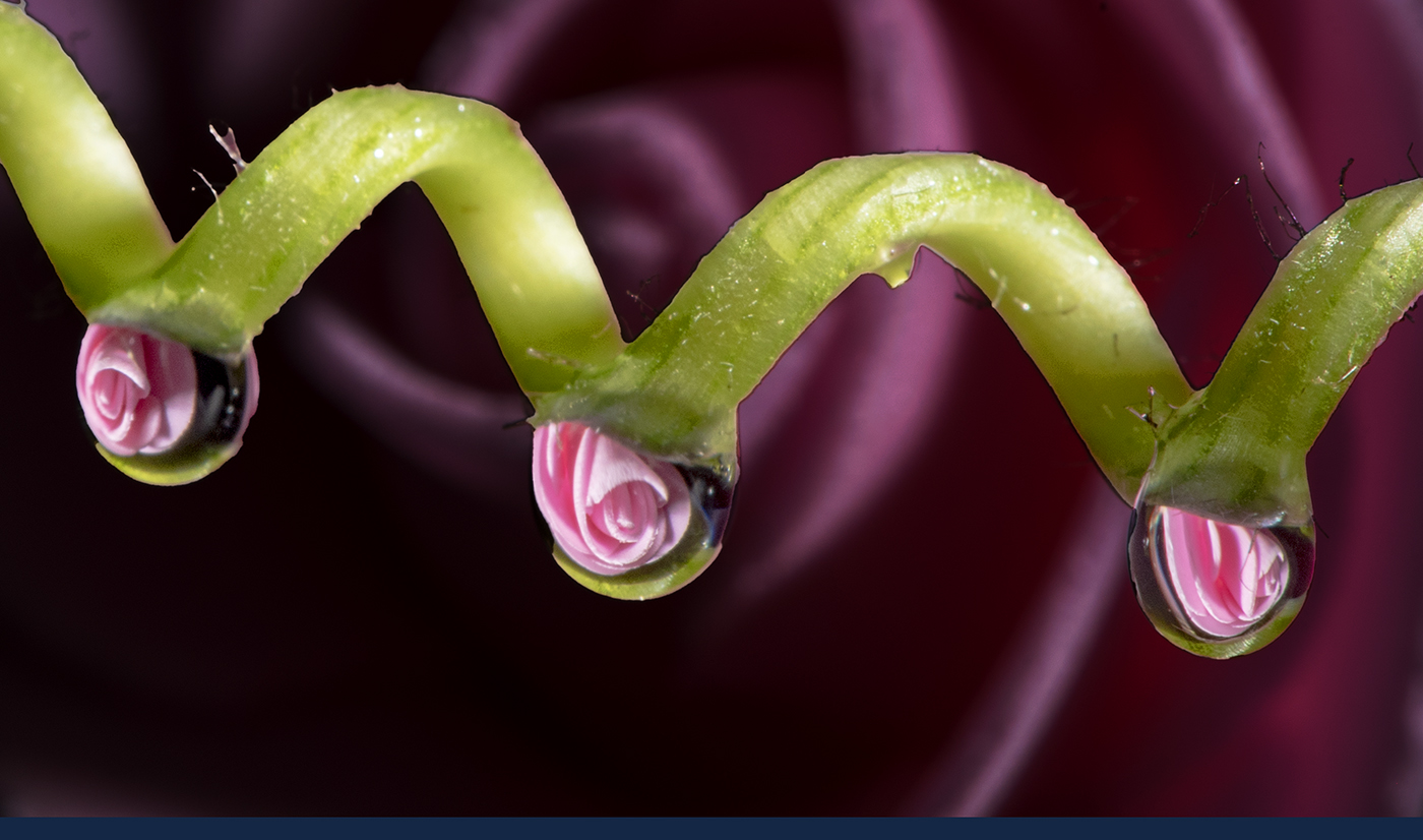
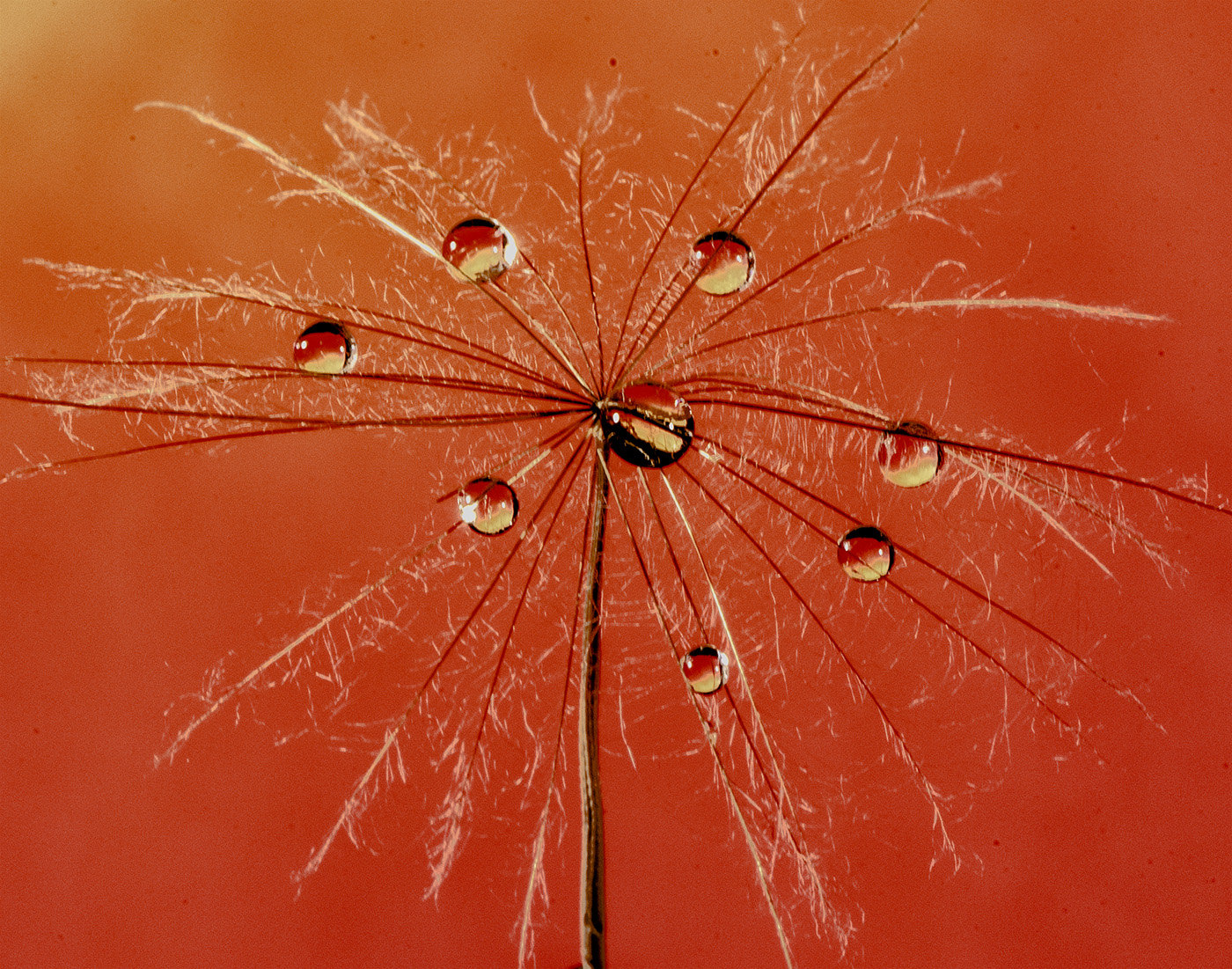
Pat, love the colour and texture.. I don't mind the blur background.. Just wondering how it would look like if cropping into landscape view..?
Oh.. I see the original picture in camera original format, with nice red diagonal.
Haha.. I'll look into shooting rocks or stones instead of flowers for next month. |
Jul 12th |
| 95 |
Jul 22 |
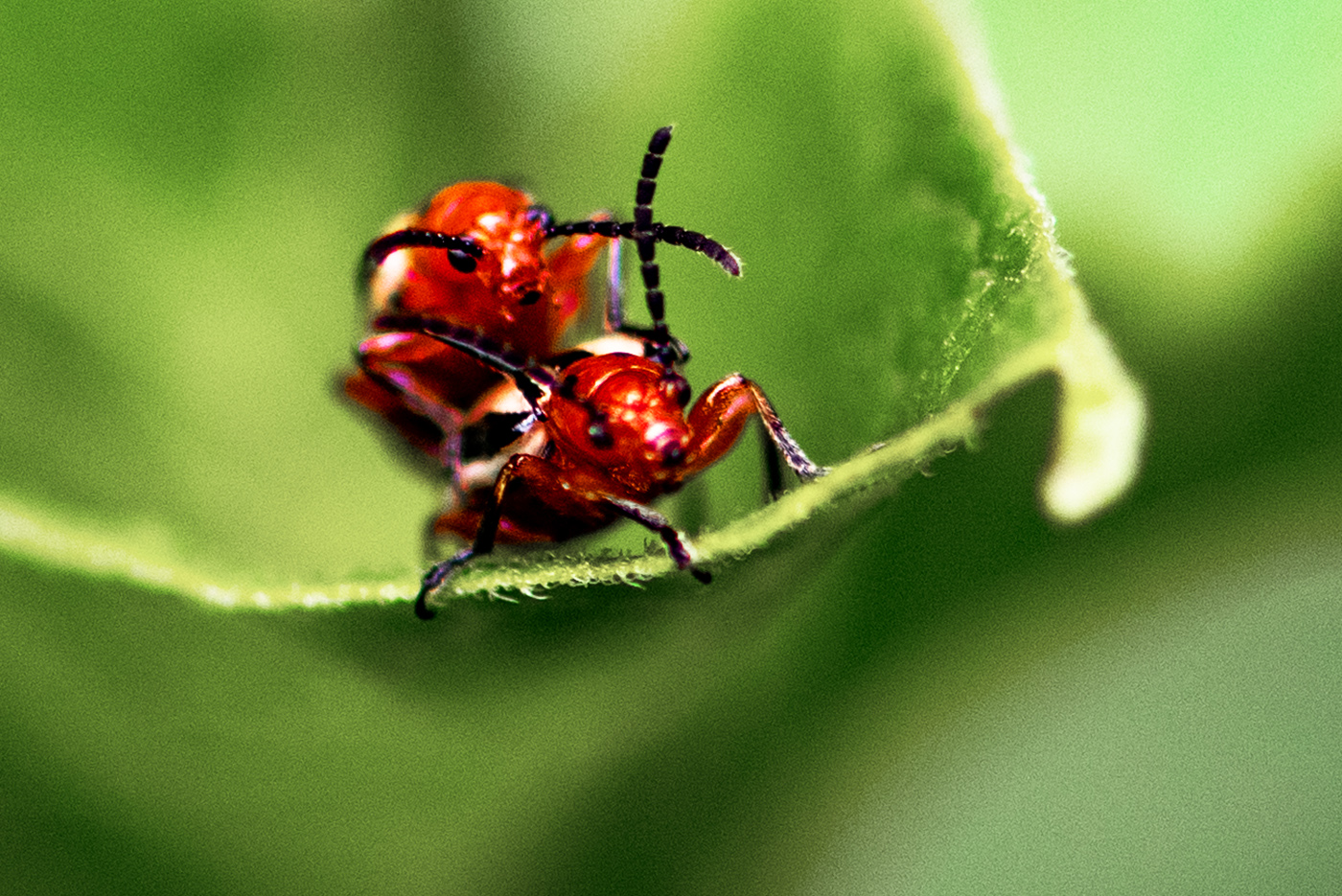
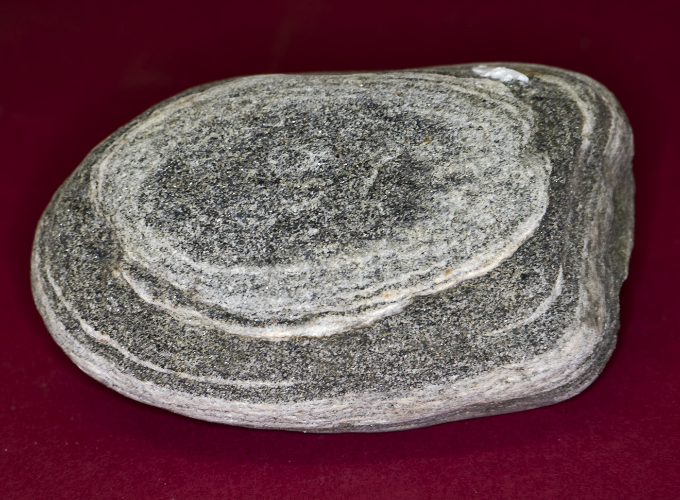
Comment |
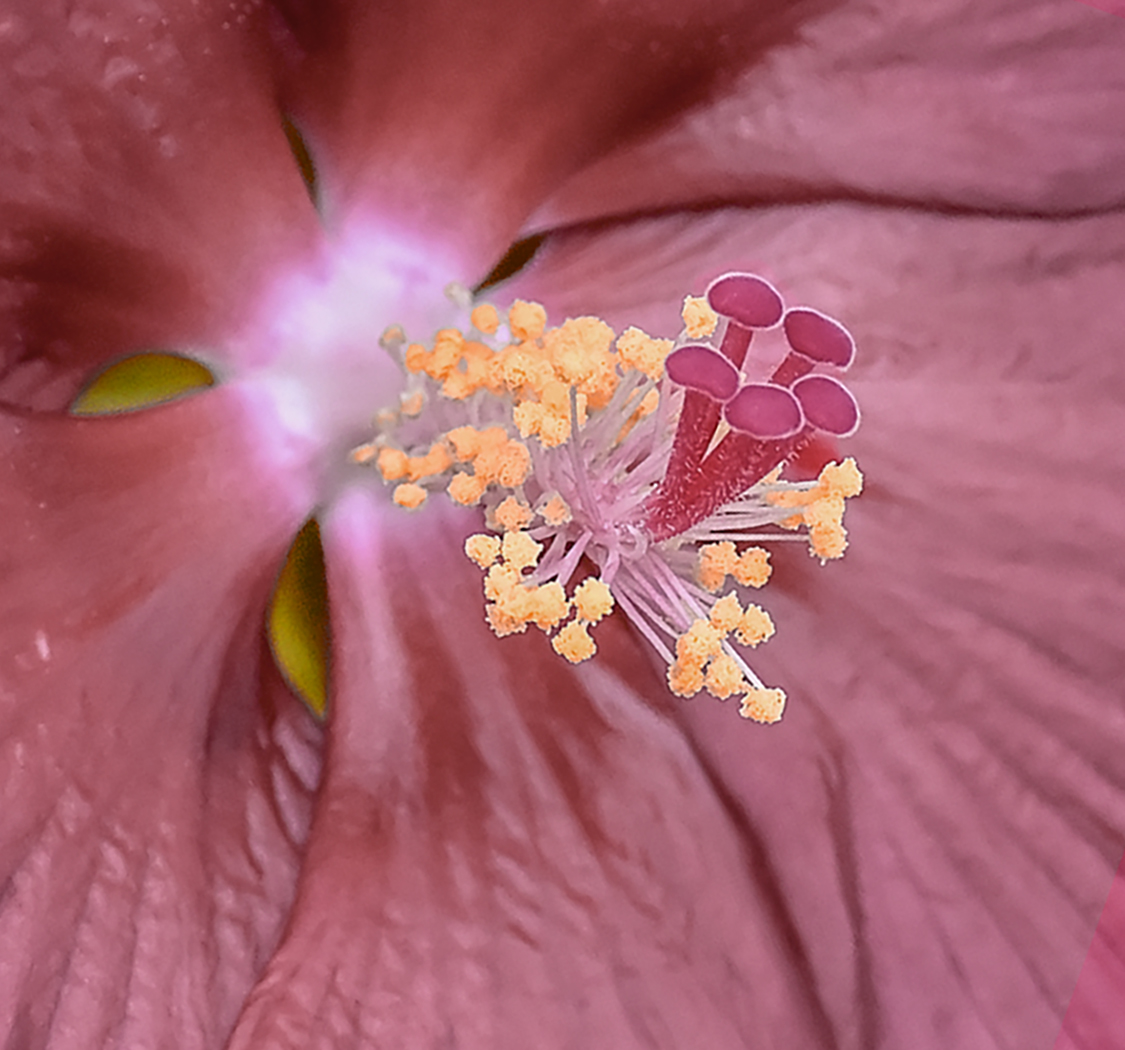
It's good idea to take macro images of rocks or crystal, like this cooper sulphate. The stacked outcome produces very even focus on the whole subject.. Very nice. My only different view is that the hard shadow does distract me from the prime subject. As Pat suggested, lighter shadow may help the viewer's focusing area. Just my reaction when enjoying the image.
Thanks for the idea.. I may try similar shots my own later. |
Jul 12th |
4 comments - 2 replies for Group 95
|
4 comments - 2 replies Total
|