|
| Group |
Round |
C/R |
Comment |
Date |
Image |
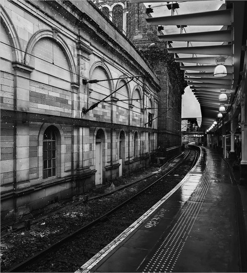
| 33 |
May 25 |
Comment |
Lovely sae. The clouds in the sky the colour on the building and graves. All is nice. Lovely image |
May 17th |
| 33 |
May 25 |
Comment |
Hi Carl. Love the image and the mono conversion the man there is perfect and you feel scared for him.. in a landscape competition I wonder if the image would do well as the focus is on the person and not the landscape. But I would gladly accept such an image if it is offered to me |
May 17th |
| 33 |
May 25 |
Comment |
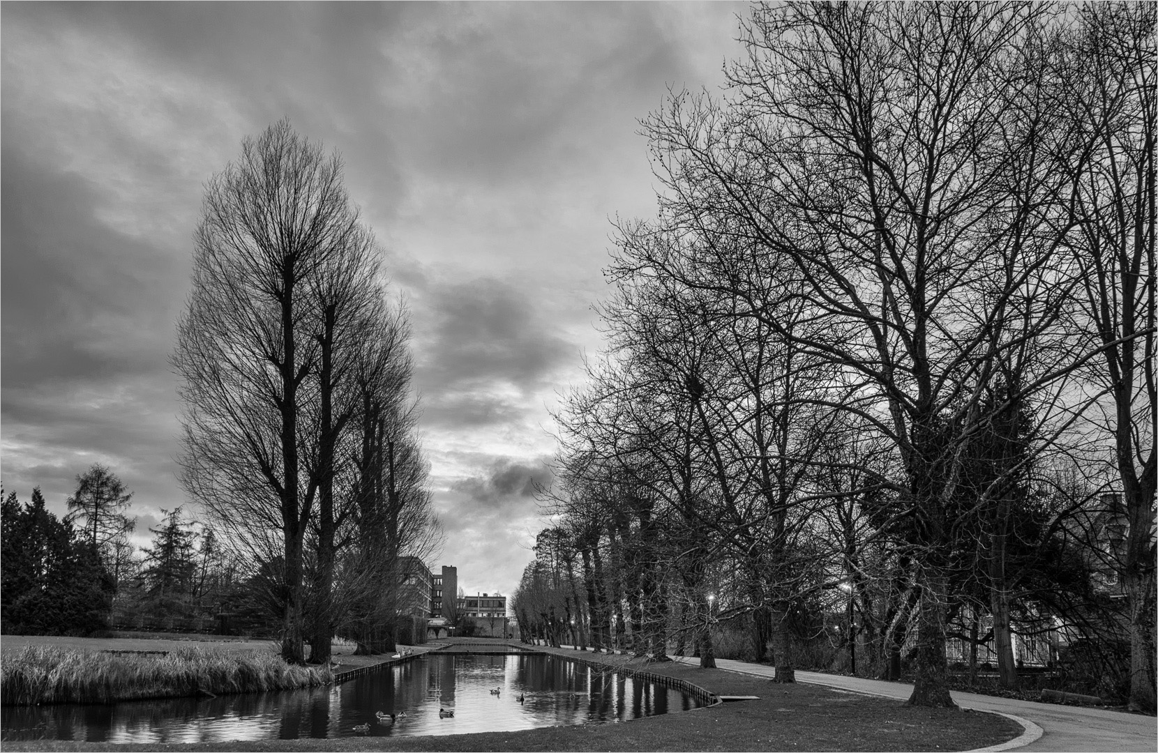
Well composed image. The lines and shapes an colours realy pull you into the image. Well done |
May 17th |
| 33 |
May 25 |
Comment |
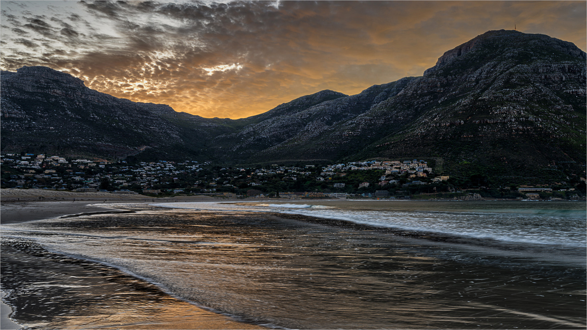
I love everything about this image. The storm that's coming almost make the city look vulnerable. Love it |
May 17th |
| 33 |
May 25 |
Comment |
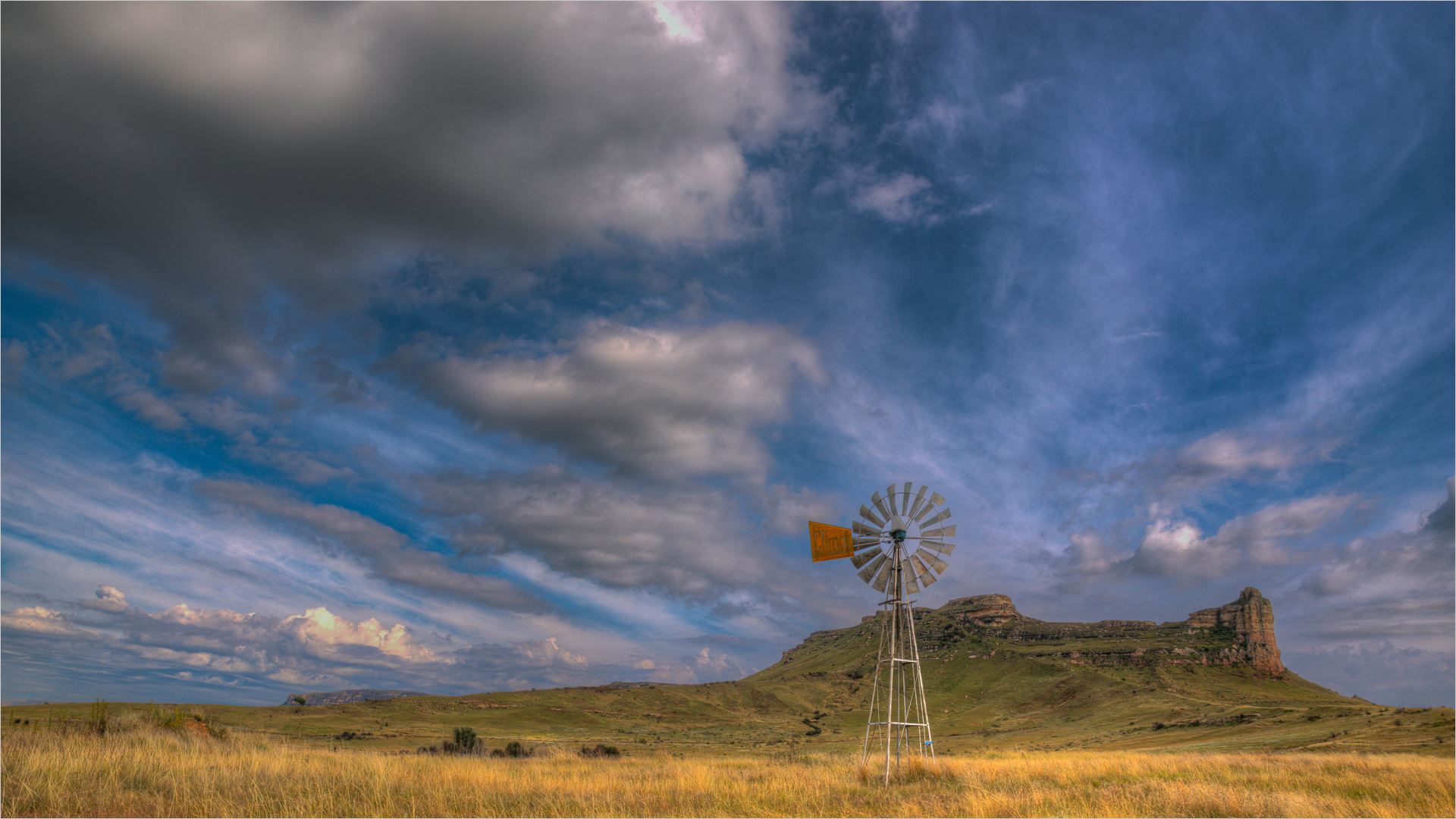
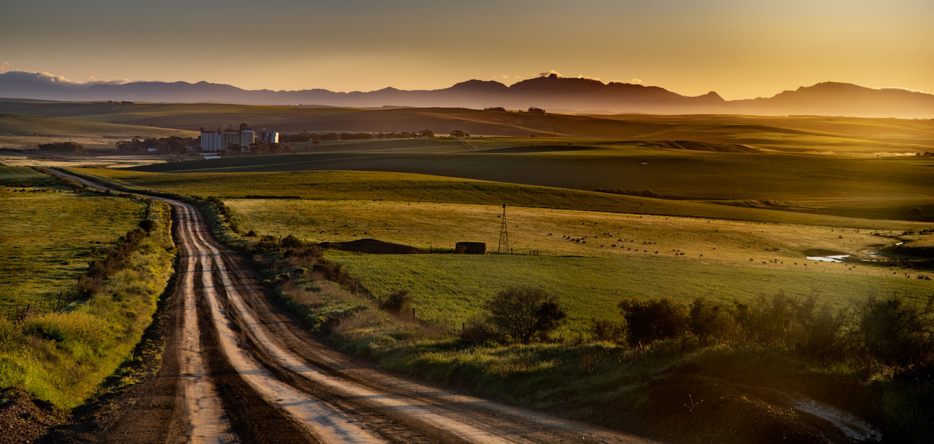
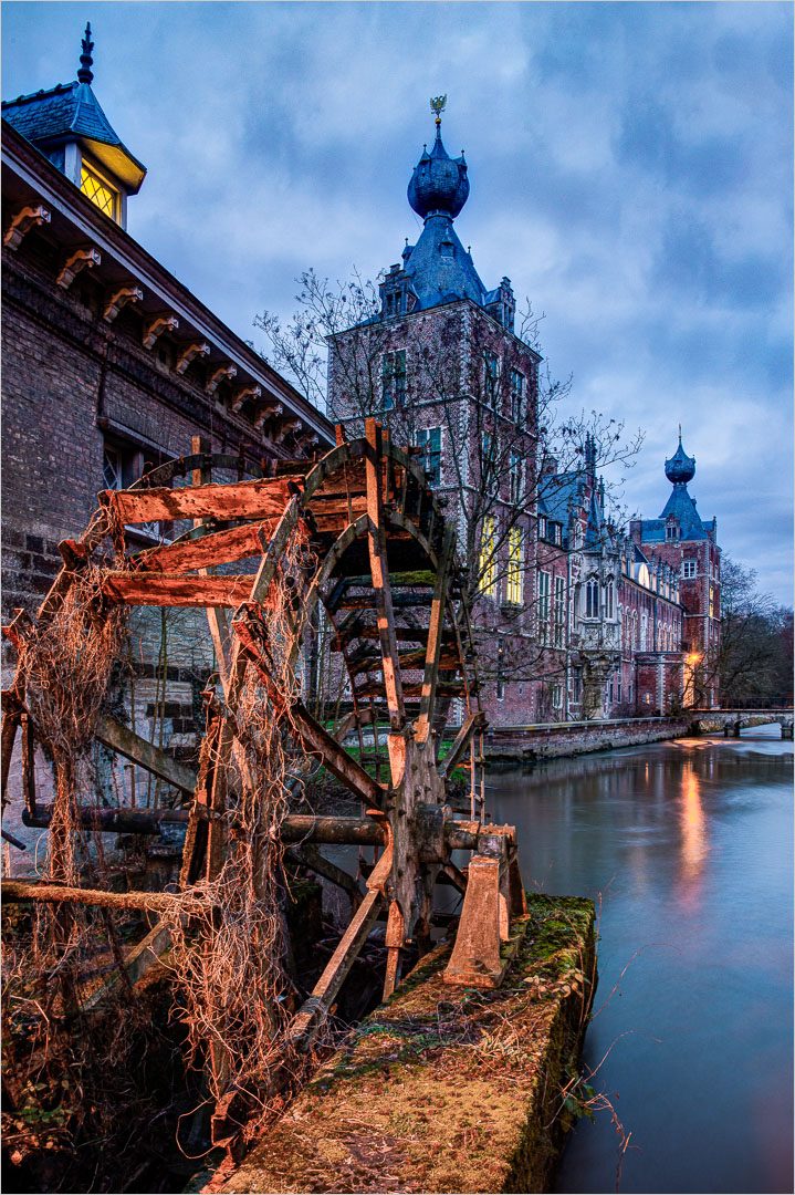
Marilyn, it is a nice scene with a lot of depth. I agree a slightly tighter crop an a bit more punch using contrast and saturation would help. The reason for these suggestions are that your centre of interest, the windmill, disappears a bit into the landscap. So the aim would be to highlight some of the features of the landscape to bring the centre of interest out |
May 17th |
6 comments - 0 replies for Group 33
|
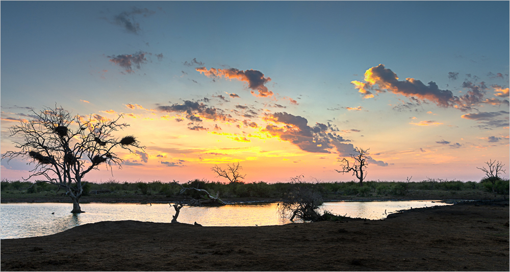
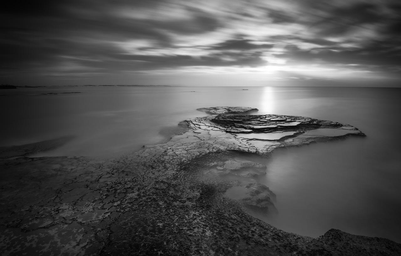
| 93 |
May 25 |
Comment |
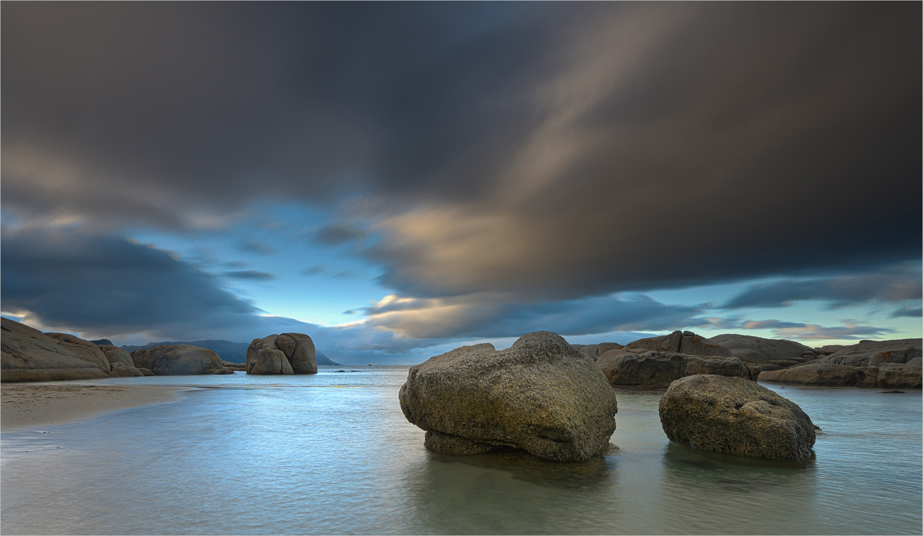
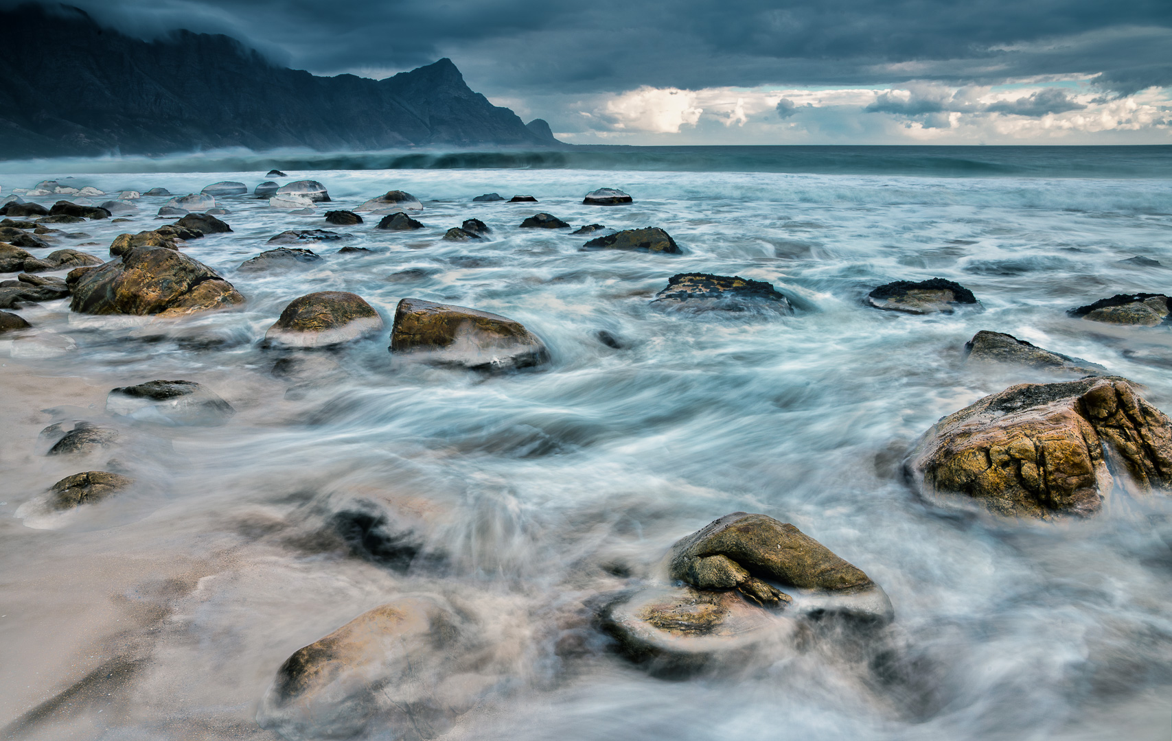
Nice interaction between the two birds. The image is a bit grey for my liking as a mono. As a Landscape I think it needs more of the expanse, which would probably not work due to the light you have
|
May 18th |
| 93 |
May 25 |
Comment |
The image is quote moody with the bit of flat lighting. I think it can work in colour but mono as well. I do thing you need some contrast. Especially mid tone contrast (try dehaze in Lightroom). I say this as the light you had did not give you the contrast needed to make the image pop
|
May 18th |
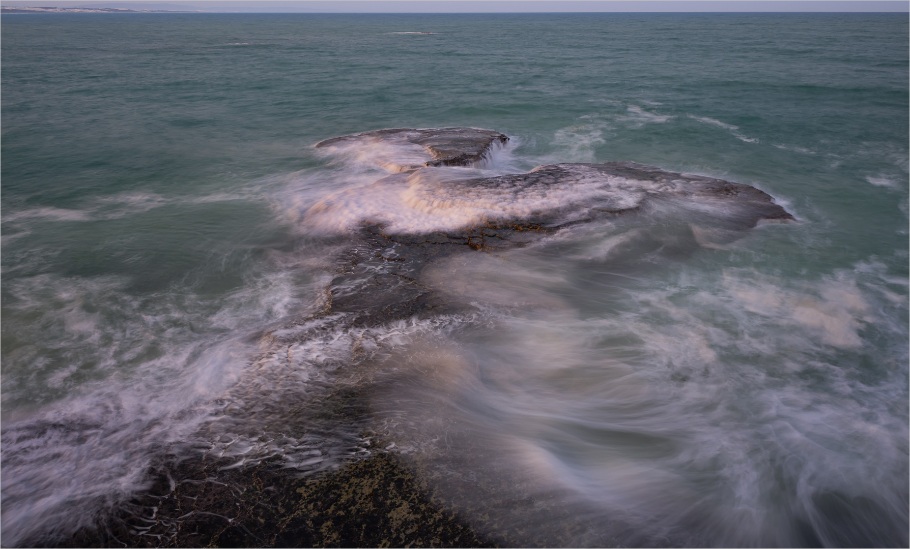
| 93 |
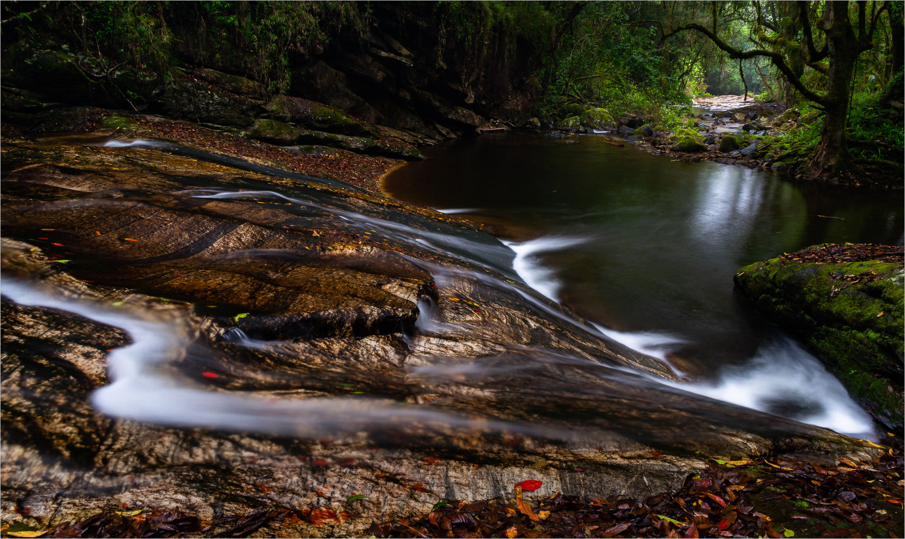
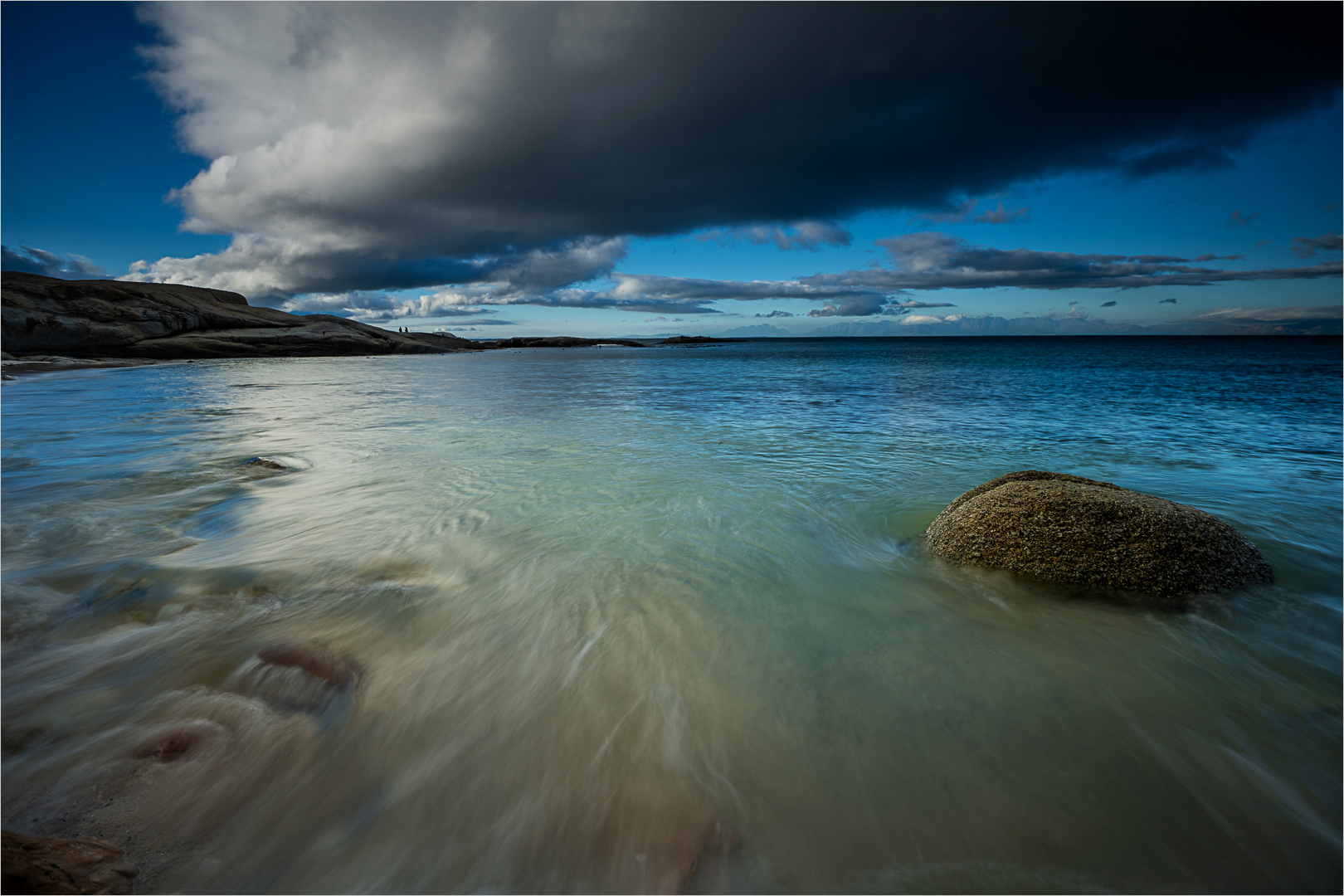
May 25 |
Comment |
Very interesting image. Love the leading line. Solving the in-ballance with left side would do wonder for the image. I would suggest lifting the shadows on the bottom left triangle, That should solve the problem and let the rest of the image shine. |
May 18th |
| 93 |
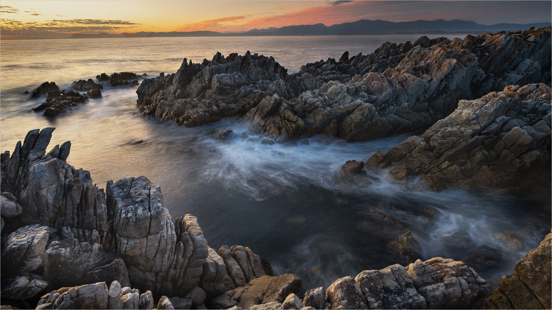
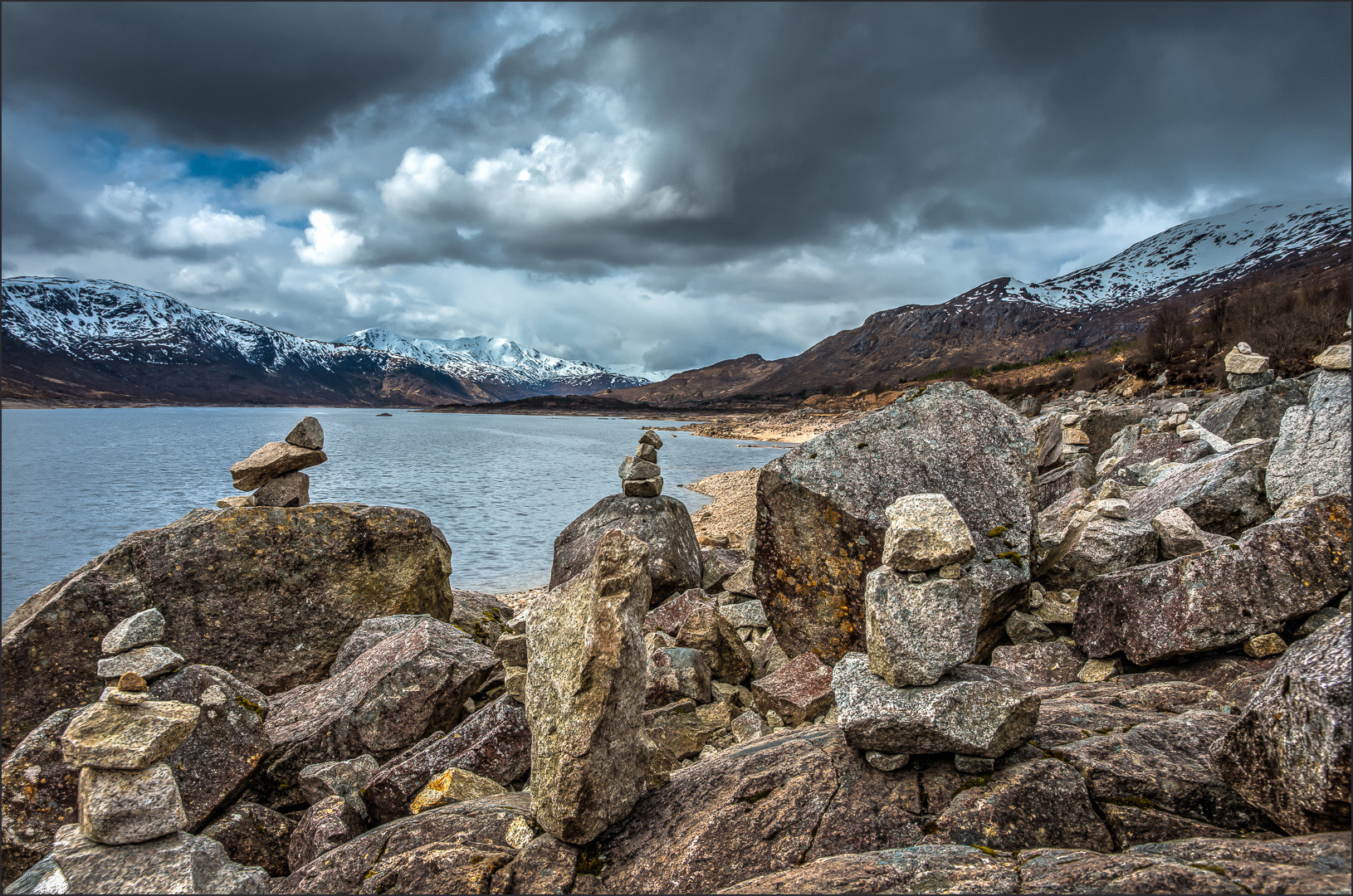
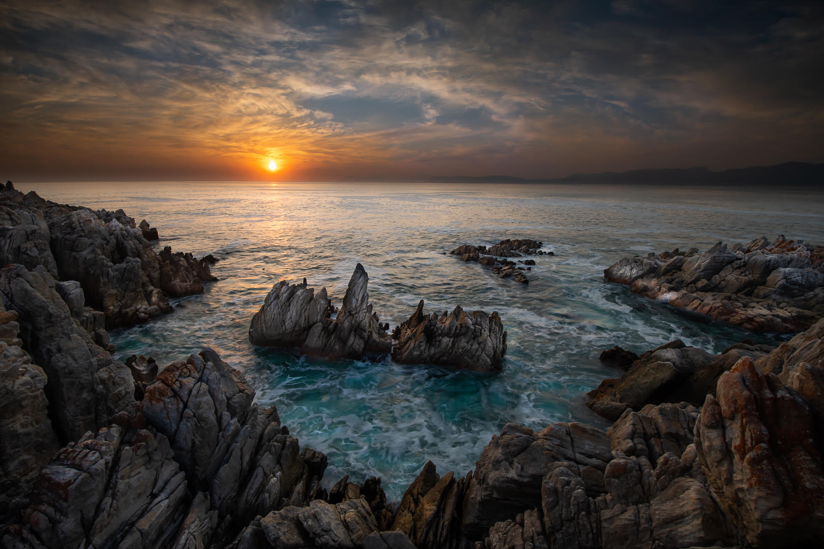
May 25 |
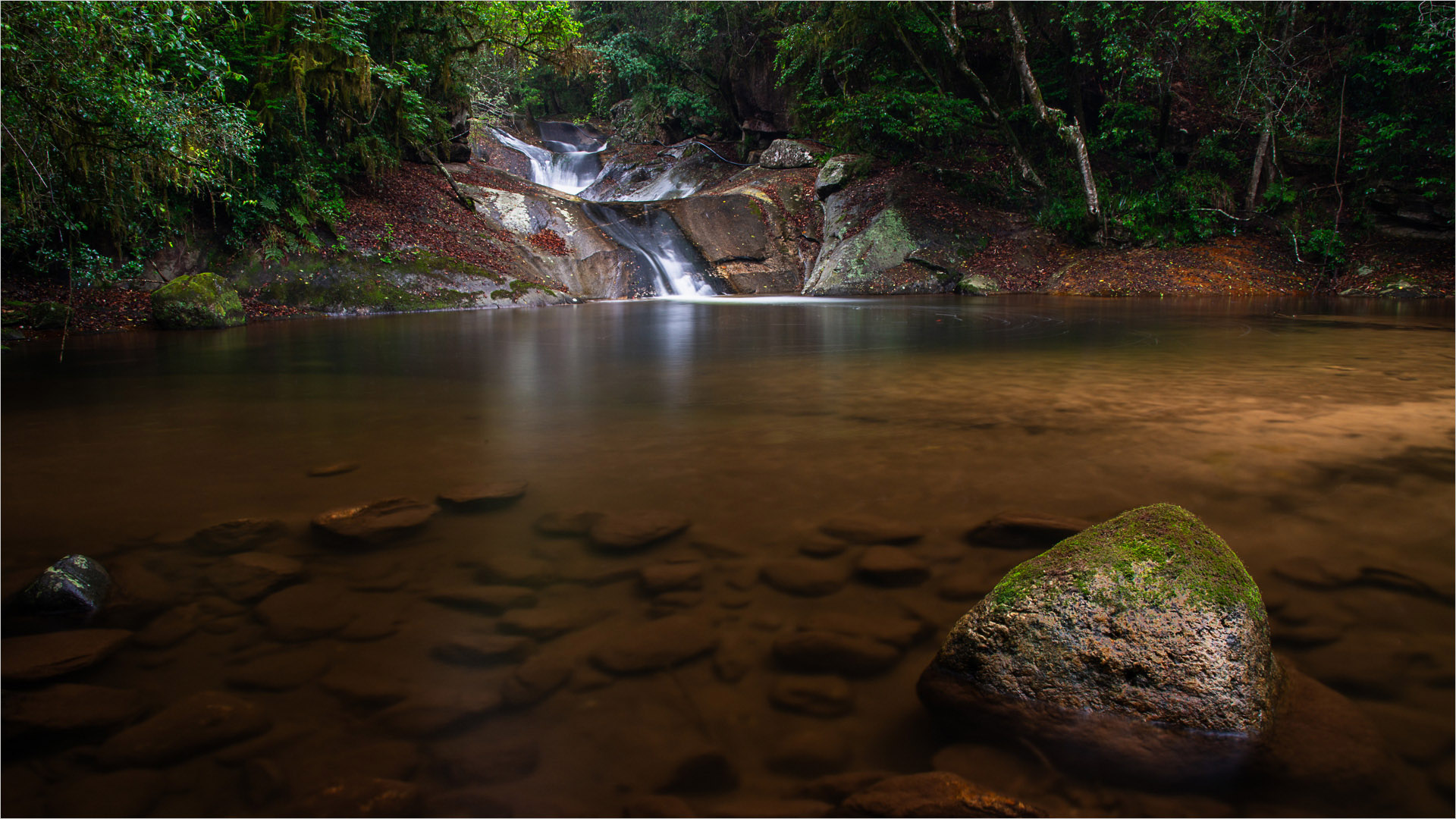
Comment |
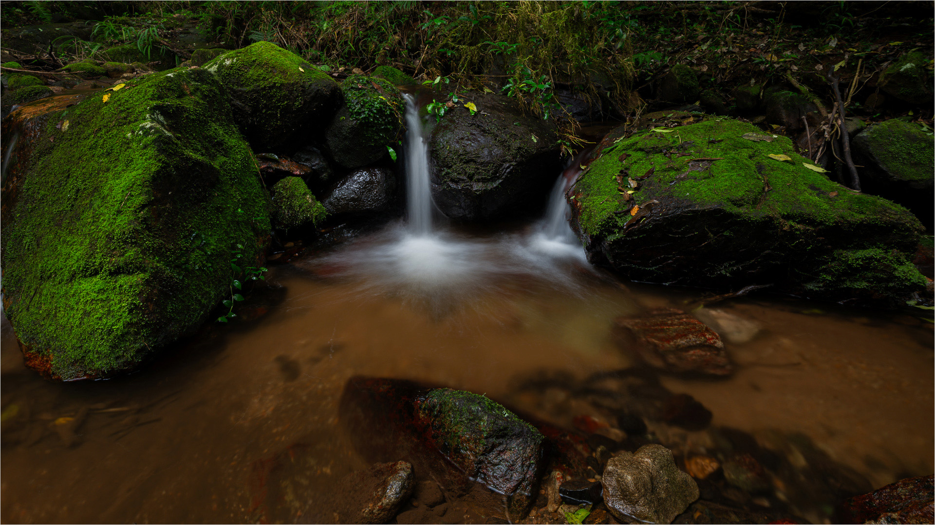
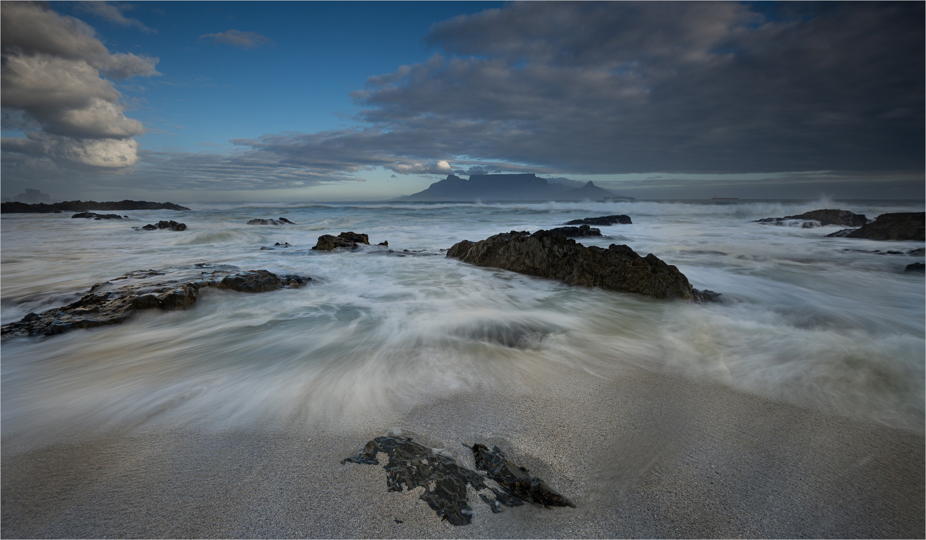
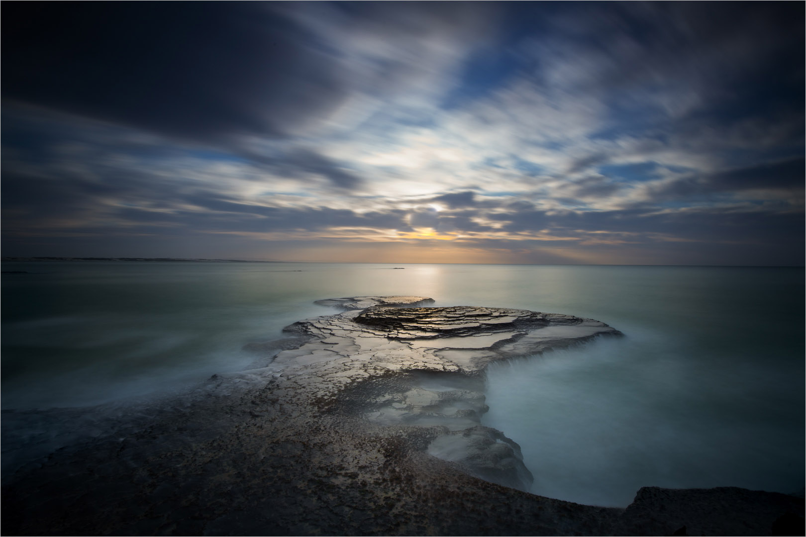
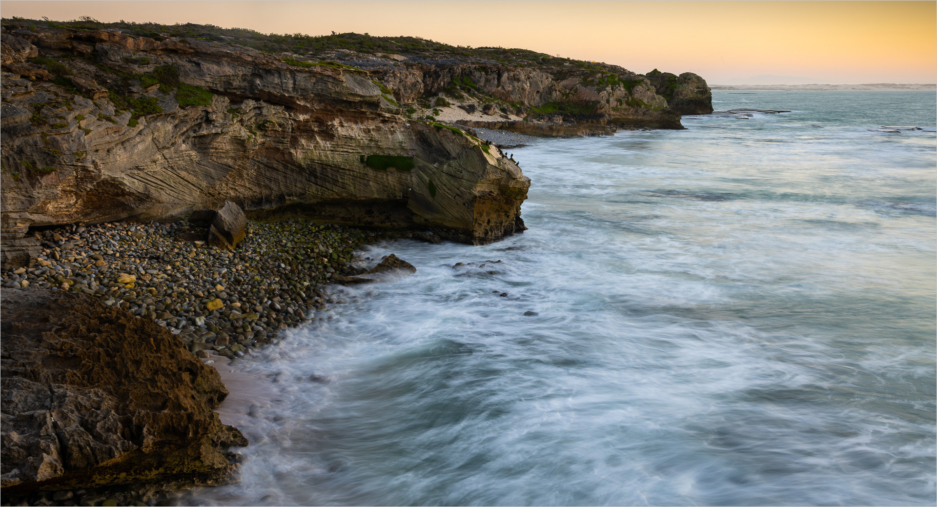
This is my kind of landscape. Love the lines in the water and the colour in the landscape and sky. Lovely lovely. Great technique lovely image
|
May 18th |
| 93 |
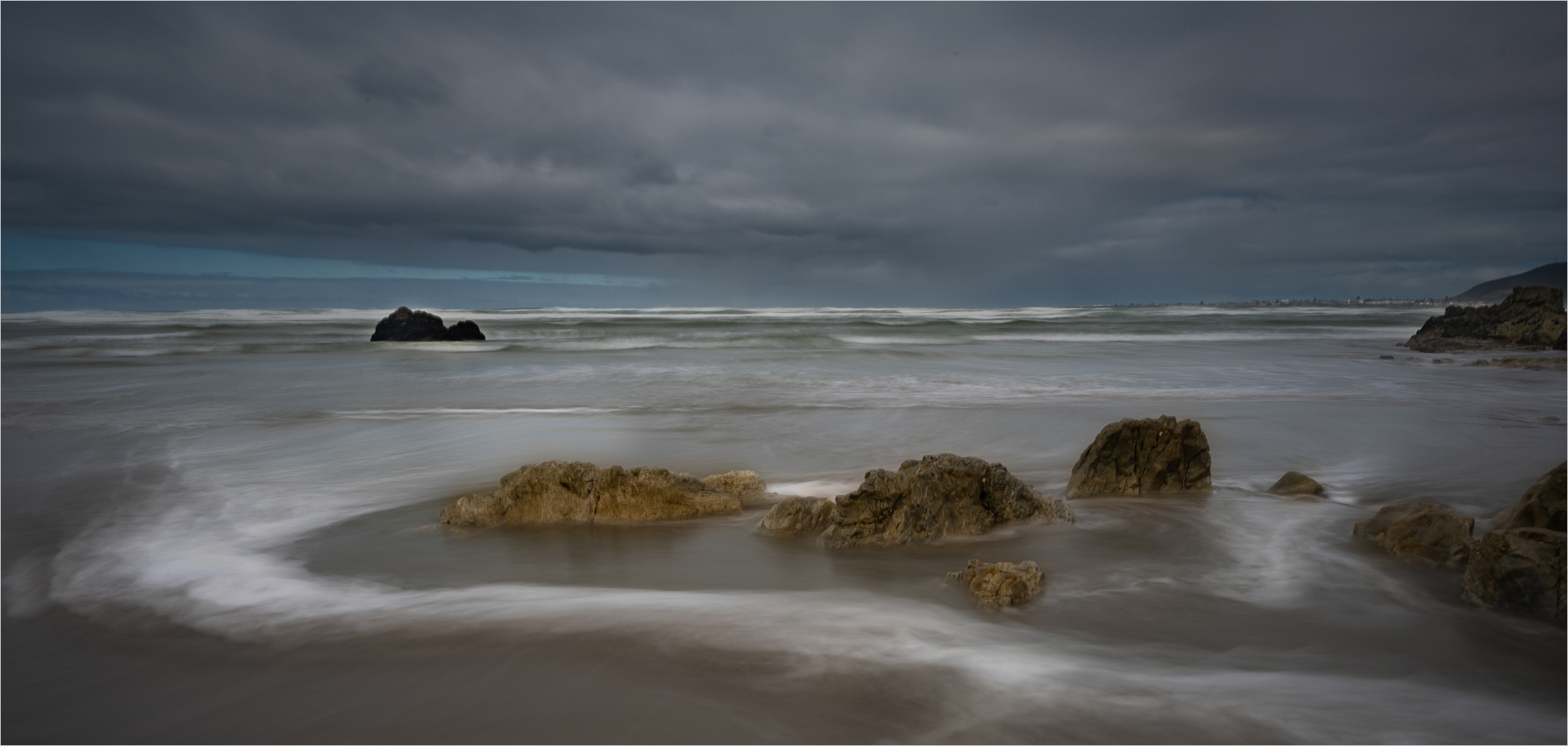
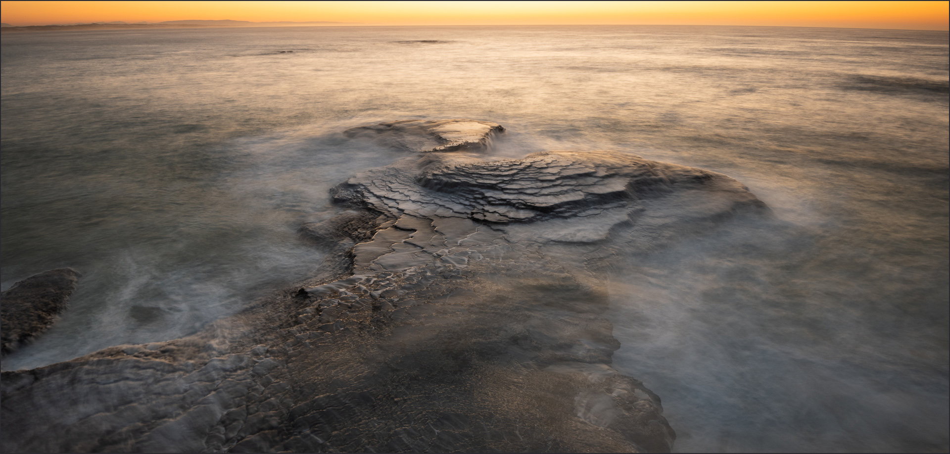
May 25 |
Comment |
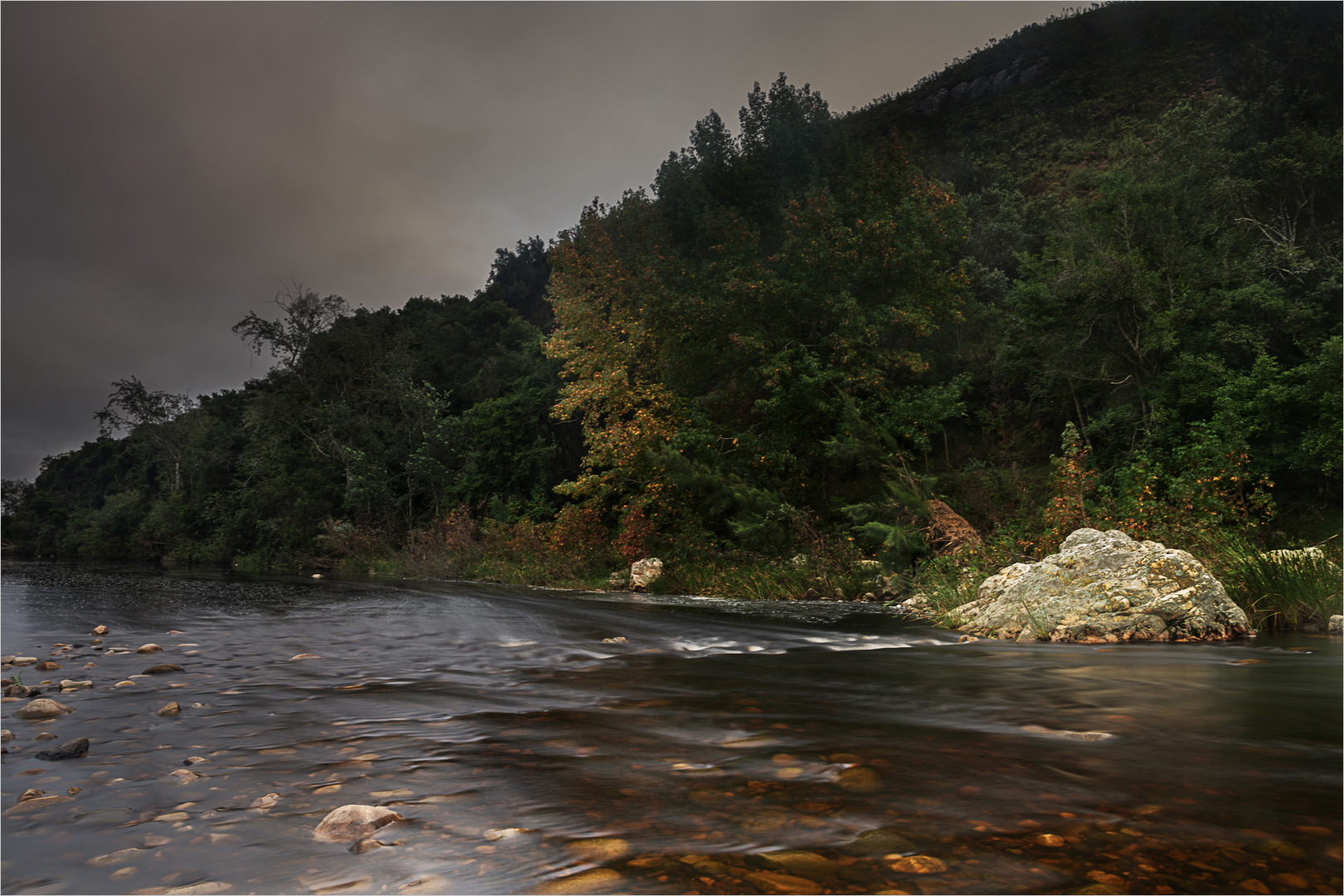
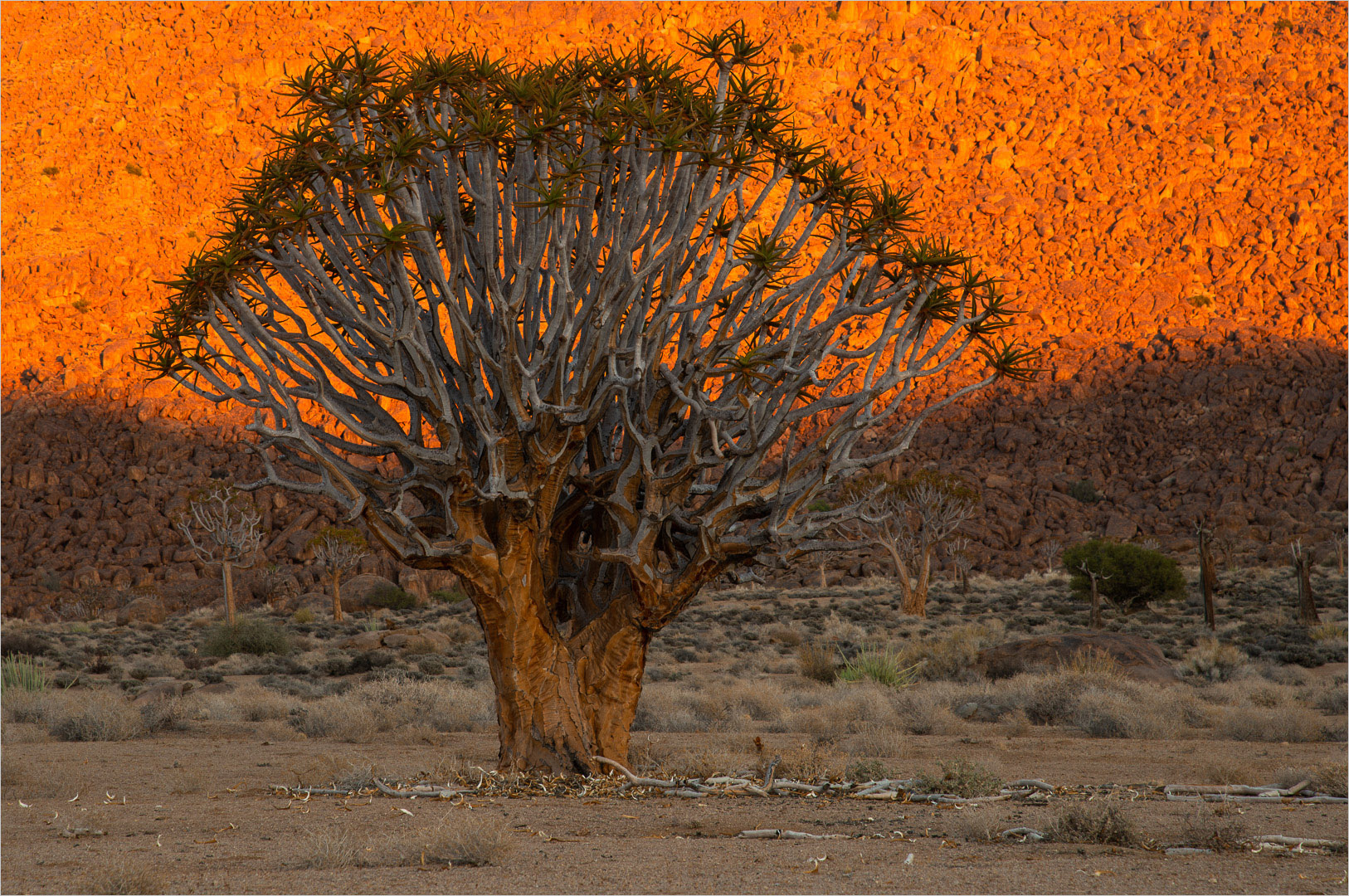
It is a good image of contrasts, I love the offset between the shinning city at the back and the textured (almost) "ugly" foreground. Lovely image
|
May 18th |
5 comments - 0 replies for Group 93
|
11 comments - 0 replies Total
|