|
| Group |
Round |
C/R |
Comment |
Date |
Image |
| 26 |
May 22 |
Reply |
Interesting, I will have to experiment with mine (Canon R5) to see if it has a similar issue. Yes, I did realize the green was in the background, just mentioning that it drew my eye away a bit. Again, though, great shot! |
May 22nd |
| 26 |
May 22 |
Comment |
As others have said, not shot, and agree with everyone about the crop. I suggest an overall crop though--not just the bottom but a bit overall to balance that. Or perhaps you could just take the green tone out of that blurred foliage at the bottom over the stone so that it does not stand out--it might blend in with the rock. I played a bit; I desaturated that area and added a bit (probably too much) sharpening to that area so it looked a bit more natural--I also cropped slightly but only from the top and left to remove a bit more of the open area. |
May 21st |
 |
| 26 |
May 22 |
Comment |
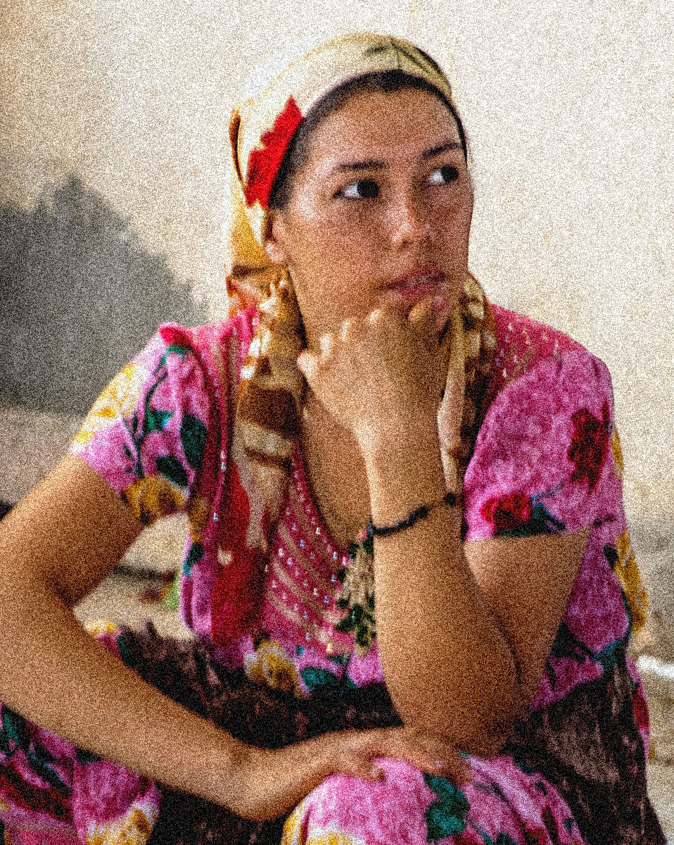
Three different images, 3 entirely different subjects! The 2 originals show more environment--more of a story. But, your final image is a great portrait on its own with a very different message. Of course there is the sharpness issue as others have said (and I am sure that is at least one thing you meant about the image having problems). Certainly using Topaz or similar software can be helpful, but another approach might be to embrace that softness. Make it look like it was intentional...maybe add fog, or a pattern of some sort. I played briefly and added a fair amount of monochromatic noise in my sample image. I did it on your final image, but of course it could be done on any of them. Might even play with varying alterations on the originals, such that the main subject (the woman in the final iamge) gets a different treatment than the environment. |
May 21st |
 |
| 26 |
May 22 |
Comment |
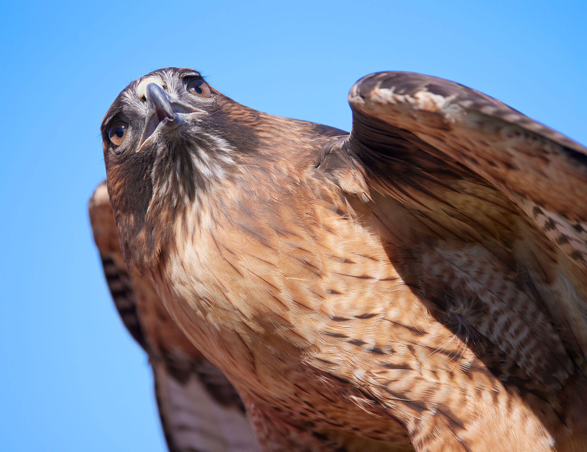
Agree with all--beautiful formal portrait but not with the classic "looking directly at the viewer" stance. The eyes are still a good visual focal point even though the eyeballs are not in view. I agree, the color works well and is important in this image. |
May 21st |
| 26 |
May 22 |
Comment |
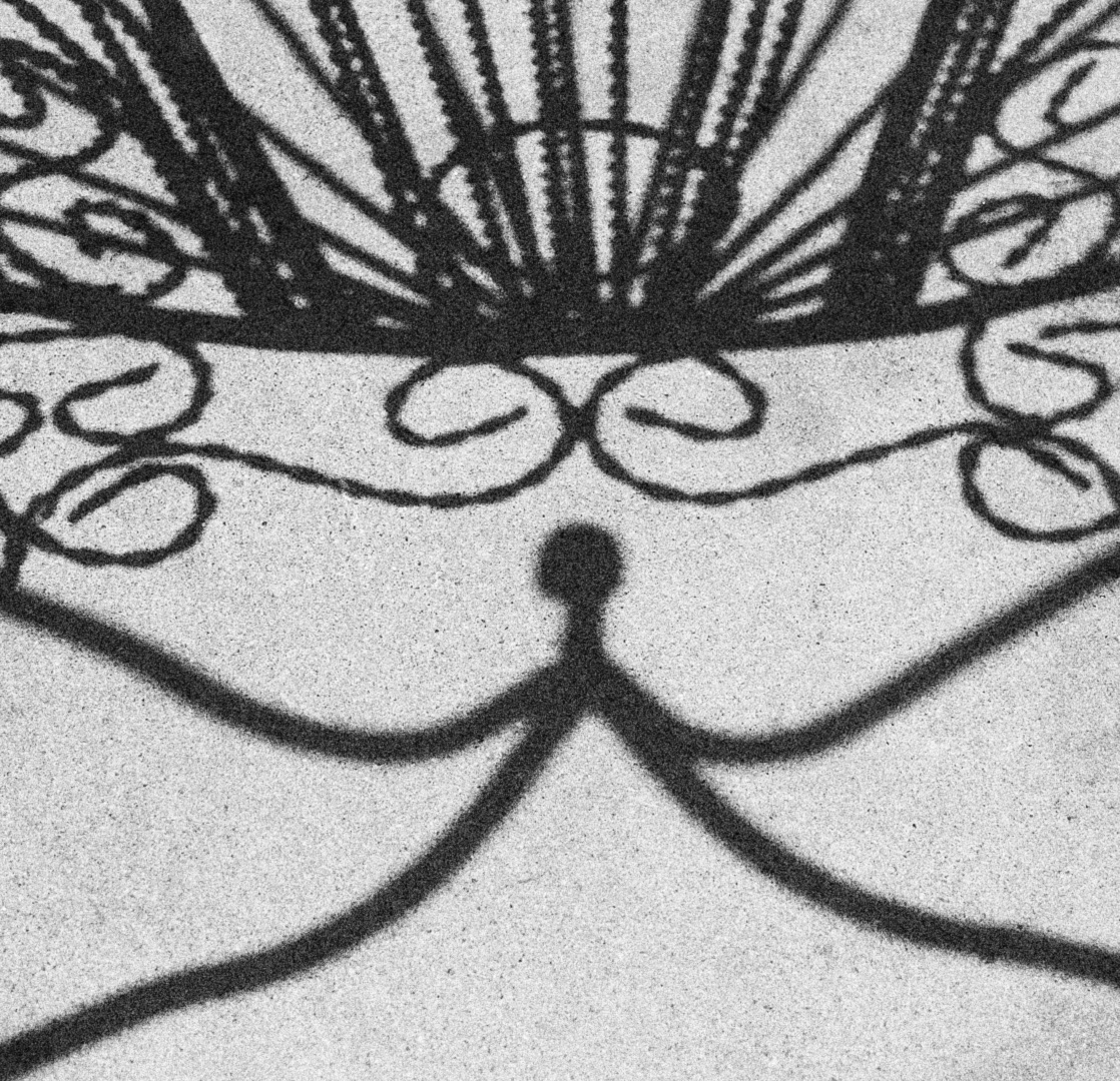
I really like the path and, in this case, that it is centered. The business does bother me a bit, although it does work as this is basically the point of this image! I am not sure if there is a way to improve that while maintaining the intended feel. Maybe slightly less contrasty? I also suggest trying to crop a bit from either side--I think that would put even more emphasis on the straight path and might help by taking the more solid dark areas out while maintaining all the interesting shapes of the branches and shadows. |
May 21st |
| 26 |
May 22 |
Comment |
B&W is perfect for this image, even if there was a lot of color in the original. I like fog; it gives a calm atmosphere to images that is not commonly seen. I agree, in this case the subject going away works extremely well. I do agree with Anges--the bush to the right is a bit distracting. Maybe even clone out some of the branches that are "on their own" to the left and cropping a bit. Possibly the remaining part could be "fogged out" a bit too, although you would have to be careful about making it look too artificial. |
May 21st |
| 26 |
May 22 |
Comment |
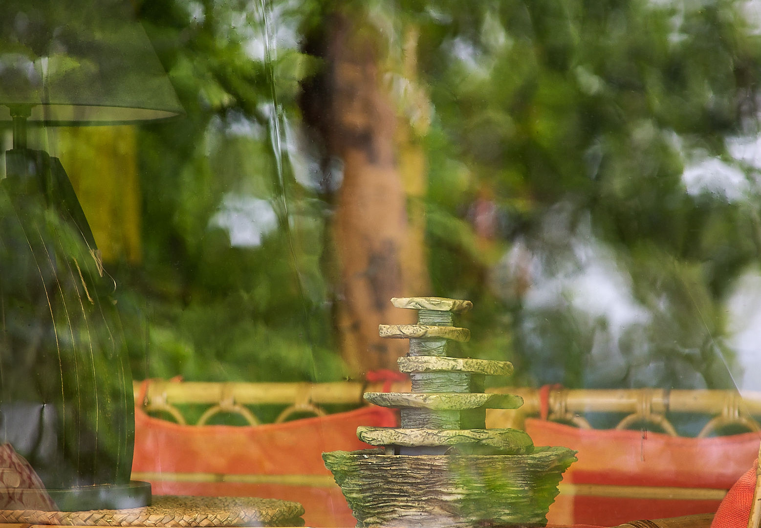
Wonderful colors and composition, and I agree about the "waves," Bob. I like that you did not center the flower as is common for these close shots. Focus stacking worked very well--I have to play with that more (I have used it a but not a lot). Clearly it is very useful for this sort of shot. I wonder why using the camera's focus stacking function resulted in wrong exposures?
My only suggestion for improvement is that green spot to the right--it drew my eye away from the main focus a bit. It does not ruin the image by any stretch, but I think just changing its color to something that blends more with the rest of the image would not draw attention away from where you want the viewer to go. There is none of that green anywhere in the subject. I don't suggest matching the colors, as that would probably look unnatural, but something that is just less contrasting. I got a similar comment on one of my flower images in another group (not PSA) :-). |
May 21st |
6 comments - 1 reply for Group 26
|
6 comments - 1 reply Total
|