|
| Group |
Round |
C/R |
Comment |
Date |
Image |
| 26 |
Jan 22 |
Comment |
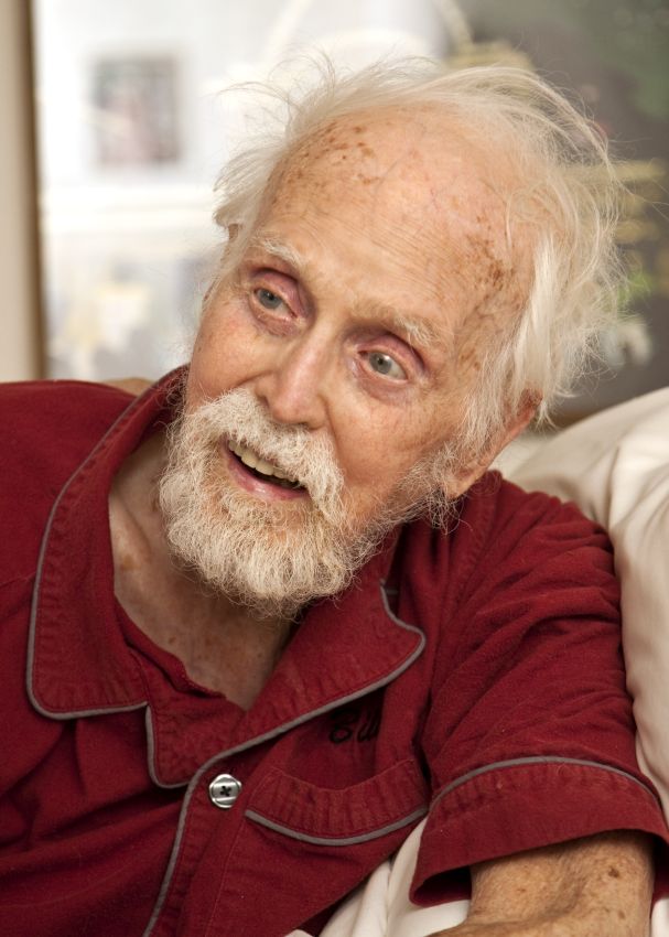
Thank you all for your good comments. I find them interesting, as in my mind it tells pretty much the opposite--although one could easily interpret the image many ways. Of course it was a friend, so I knew the situation. This man's daughter is also a social worker that worked in hospice for many years, so I have learned from her experience. He is shutting down, but the expression is not dispair but calmness and comfort. He is not in pain nor despair. The photo I included here was taken a few minutes later--you can see a bit of a smile, so the photo has a different feel. He was very out of it--as it was late in the process he was responsive, but not especially so. This shows, I think, how difficult it can be to interpret pictures like this. The people that know this man and this day will understand the true meaning, but for the general viewer the true meaning cannot be certain. |
Jan 29th |
 |
| 26 |
Jan 22 |
Reply |
Yep, sometimes it is just not possible to get a different angle, better or otherwise! Maybe you need a tall monopod to hold up :-).
Somewhere I was recently reading about drone photography--the comment was that the typical high-altitude overhead view, although very interesting and can be very effective, gets old fast. The point was made to use a drone for a slightly different angle of view--that is, just a few feet or 10s of feet (feel free to convert to the better metric system) higher, or of course from a point where you can't get (such as off the edge of a cliff). That makes me think a drone would be interesting to try. |
Jan 15th |
| 26 |
Jan 22 |
Reply |
I see your point but keep going back and forth. |
Jan 15th |
| 26 |
Jan 22 |
Reply |
Thanks--I think I do agree, some blur and/or some toning out of the background would be better. |
Jan 14th |
| 26 |
Jan 22 |
Reply |
Right, it was not meant as fine art! I think it was not actually despair (as much as it looks like it could be), but rather "the end." Not as a bad thing, but just that he was near the end of his journey and is transitioning to whatever the next step is. |
Jan 14th |
| 26 |
Jan 22 |
Reply |
Yes, I think B&W would work well too! Thank you for that comment. |
Jan 14th |
| 26 |
Jan 22 |
Reply |
I see your point about the hand/eye. I also like, though, that the eye is not visible. I think they would be 2 entirely different photos! He was pretty out of it at this time--certainly responsive, but slow--like he was shutting down (which he was). |
Jan 14th |
| 26 |
Jan 22 |
Comment |
I agree the rain adds nice impact. I also really like how you framed the steeple in the clouds! I did not realize it was a steeple of a church until I read the other comments--probably my failure, but I wonder what it would have been like if you had included just a tiny bit of the top of the building? It seemed to me like an odd building poking up out of the ground. |
Jan 14th |
| 26 |
Jan 22 |
Comment |
Great bright colors! I agree there are 2 different photos--the crop is a great portrait, the full original is more of a story. Both great. The gray cast in the face, whether real or not, does bother me a bit. It gives a rather "chilling" feeling to an otherwise warm, colorful subject. |
Jan 14th |
| 26 |
Jan 22 |
Comment |
Welcome from me as well! I am probably the next newest member; I have only been here for a few months. I love the color and lighting in this image--really well-done. As others suggest I would take a bit off the top, but I would also try taking a bit off the bottom as well. I do like seeing the overal location--on the bottom I think just above that rock in the foreground. I really like the sky, but a bit too much with this framing. Maybe crop just a bit on top then put more saturation in the blue to bring that color back. Maybe something like this? |
Jan 14th |
 |
| 26 |
Jan 22 |
Reply |
Hmm, I am not sure I like the cropped version as much either! Maybe crop less? I don't really have a problem with the original though in that regard though. |
Jan 13th |
| 26 |
Jan 22 |
Comment |
To me it seems a bit overall busy, although I am not sure how one would fix that. Maybe clone out some, but not all, of the branches? The structure at the bottom bothers me a bit--doesn't add much to me and is a bit distracting. I do like the framing, as well as the muted color of the bridge. |
Jan 13th |
| 26 |
Jan 22 |
Comment |
Nice shot. The "dots" don't really bother me but the points made are good. The tiny white highlight/dot in the extreme lower left caught my eye more than the dark spot.
What bothers me is it look tilted. I don't know that it is--probably just the angle it was taken--but has a sense of the horizon being tilted (yes, I know there is no horizon showing!). Might look at playing with slight rotation and/or perspective control. |
Jan 13th |
| 26 |
Jan 22 |
Comment |
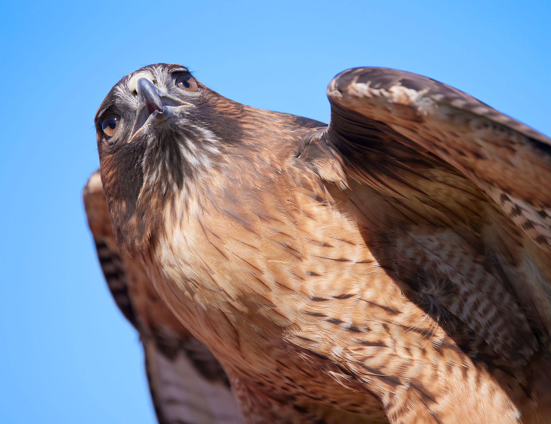
My first reaction, before I read any other comments, was WOW! That is an amazing image. I still think that. I love the lighting, yet to me it still has great detail--of course not in the shadows, but everything is clear that needs to be. Grain/noise doesn't bother me in the least--I think this would be fine if it were noisier. Well done! |
Jan 13th |
7 comments - 7 replies for Group 26
|
7 comments - 7 replies Total
|