|
| Group |
Round |
C/R |
Comment |
Date |
Image |
| 26 |
Dec 21 |
Comment |
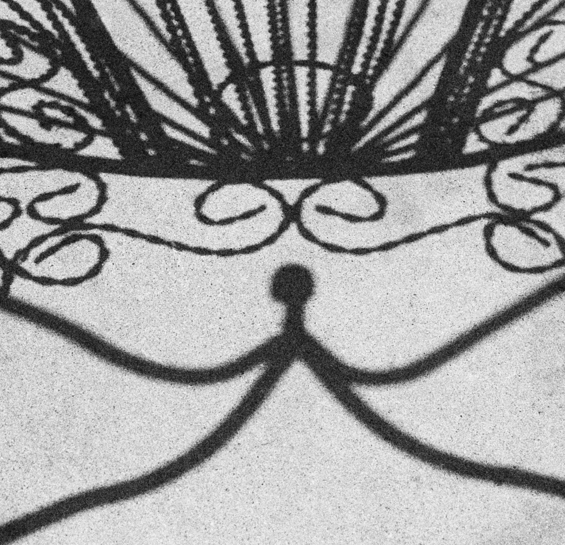
Thank you again for the suggestions...I have aligned it a bit for better symmetry.
Now for the answer...it is actually the shadow of the back of a chair made from heavy steel wire and strap. I had someone hold it in a position to optimize the shadow for this look and symmetry. It is on concrete, but I added a lot of simulated film grain and added contrast and of course made it fully B&W. |
Dec 15th |
 |
| 26 |
Dec 21 |
Reply |
I like this better! The sky still looks real (not excessively enhanced) and I think removing the sandy area and first wave keeps my attention more on the subject rather than being distracted by the foreground.
I don't think you should crop too much on the left--maybe just crop out that large house on the left, which looks so different than the rest. That would still maintain a good composition. |
Dec 11th |
| 26 |
Dec 21 |
Reply |
I generally agree with this. In some ways I would like to see a little taken off the right as well as the top, but as Jose said it would remove a key part of the composition. So, in all likelihood you got it right the first time! I do like the color better as well--the red of the smoke really tells you what it is (not that it isn't apparent from the B&W version) and gives it some separation. |
Dec 11th |
| 26 |
Dec 21 |
Reply |
"Reach" referred to the stick-figure looking part or the subject--reaching up. |
Dec 11th |
| 26 |
Dec 21 |
Comment |
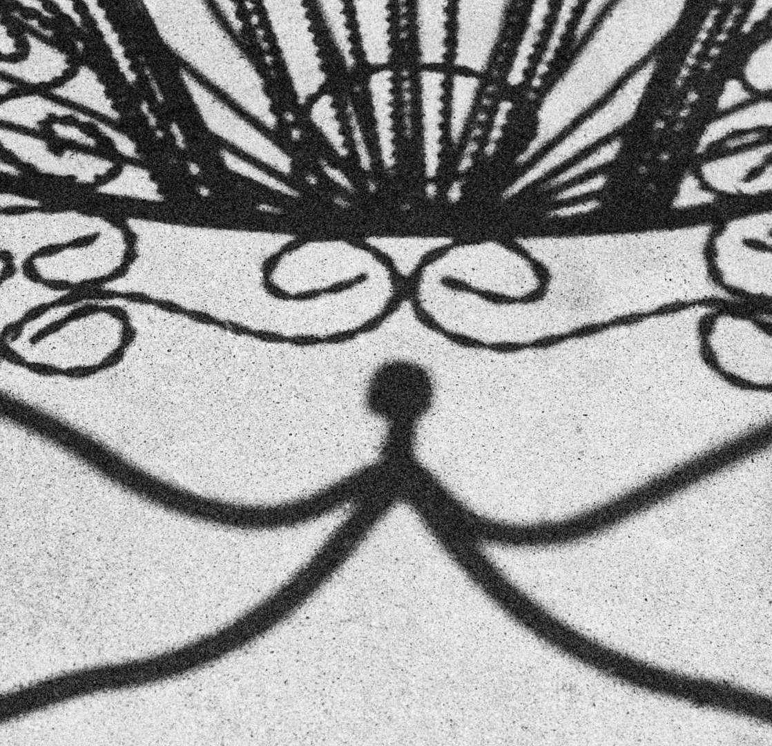
Warping is a great idea. I was aiming for fairly symmetrical, but could not quite achieve it in-camera. I will play with it post-processing it. |
Dec 11th |
| 26 |
Dec 21 |
Comment |
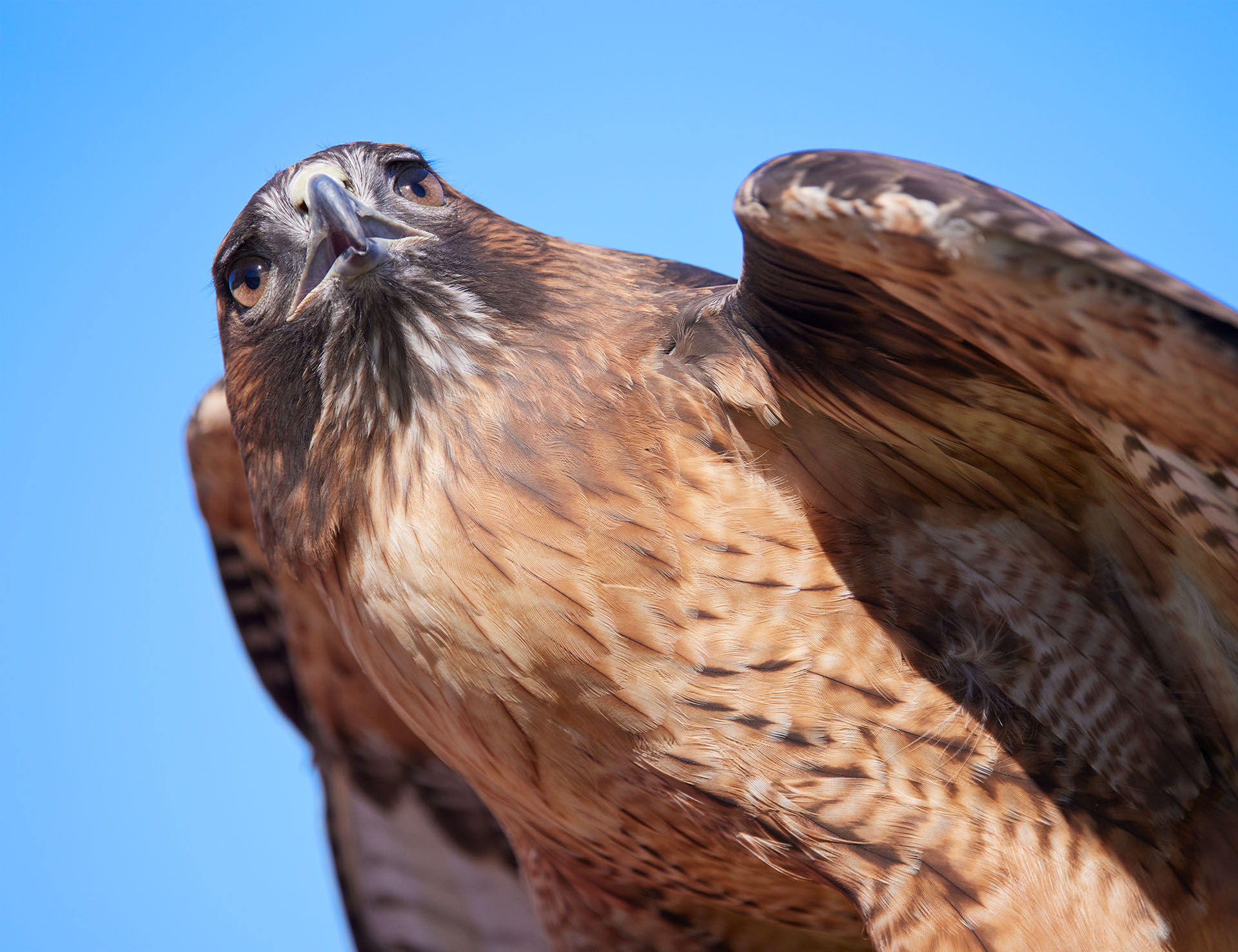
That is an unusual pose! It isn't the typical perch we see in photos, which adds some interest. Really nice detail and blurred background. |
Dec 9th |
| 26 |
Dec 21 |
Comment |
The expressions are great as is the color! Highlight on the hair really works well. Maybe try bringing out the faces just a tiny bit (brighter) but really it works very well as it is. |
Dec 9th |
| 26 |
Dec 21 |
Comment |
I was thinking about cropping a little of the foreground as well--eliminate the sand and maybe that first break. Maybe see if you can burn the surfers a bit, especially the one on the board, to make him stand out a bit more. Bumping up the color a bit would probably be a good idea as well. |
Dec 9th |
| 26 |
Dec 21 |
Comment |
Living in an area prone to wildfires this elicits some real emotion from me! I have had to evacuate a couple times, although thankfully not too recently (and the fire never actually got all that close to my home). It might be nice if you can bring out just a little more detail in the hills--not a lot, just so some detail in the trees/scrub is apparent. The sky is rather boring, but obviously you could not do much about that (aside from sky replacements, which I tend not to do). You might try cropping a little from the right side and maybe the top to reduce that negative sky space, although that might cut out too much of the foreground and smoke. As Bob said, it is simple but compelling. |
Dec 9th |
| 26 |
Dec 21 |
Comment |
I like the motion! There is enough detail/sharpness in the right places (horse's head and body and the rider) to give a clear subject, while motion blur in the right place for the story. I suppose if the rider's face could be a bit sharper that would be nice, but I think as-is it is an excellent image. I also like the tones--muted but still somewhat vibrant colors. |
Dec 9th |
7 comments - 3 replies for Group 26
|
7 comments - 3 replies Total
|