|
| Group |
Round |
C/R |
Comment |
Date |
Image |
| 95 |
Sep 25 |
Reply |
I think we should keep that connection part fuzzy for decency :-)
|
Sep 20th |
| 95 |
Sep 25 |
Comment |
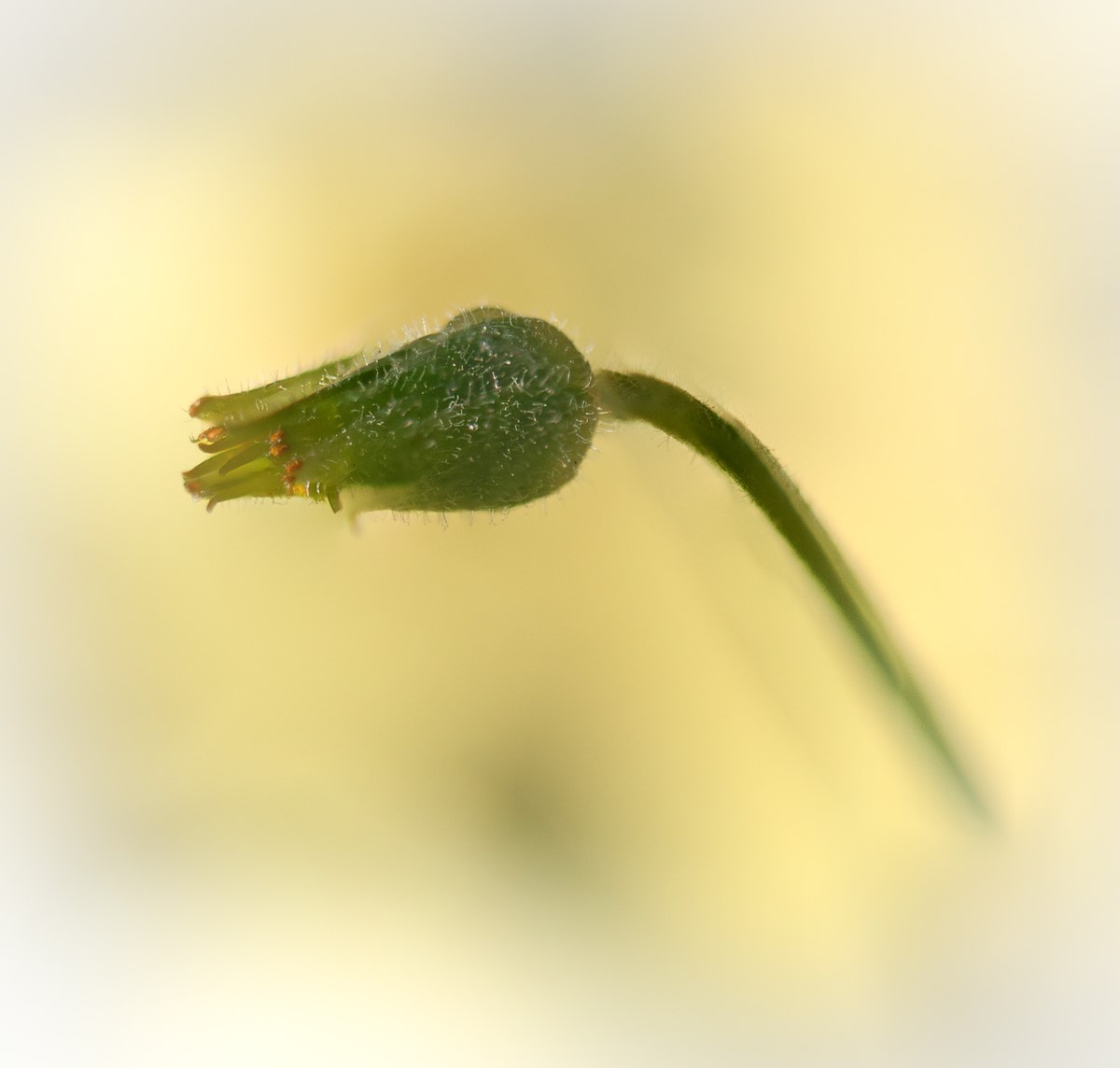
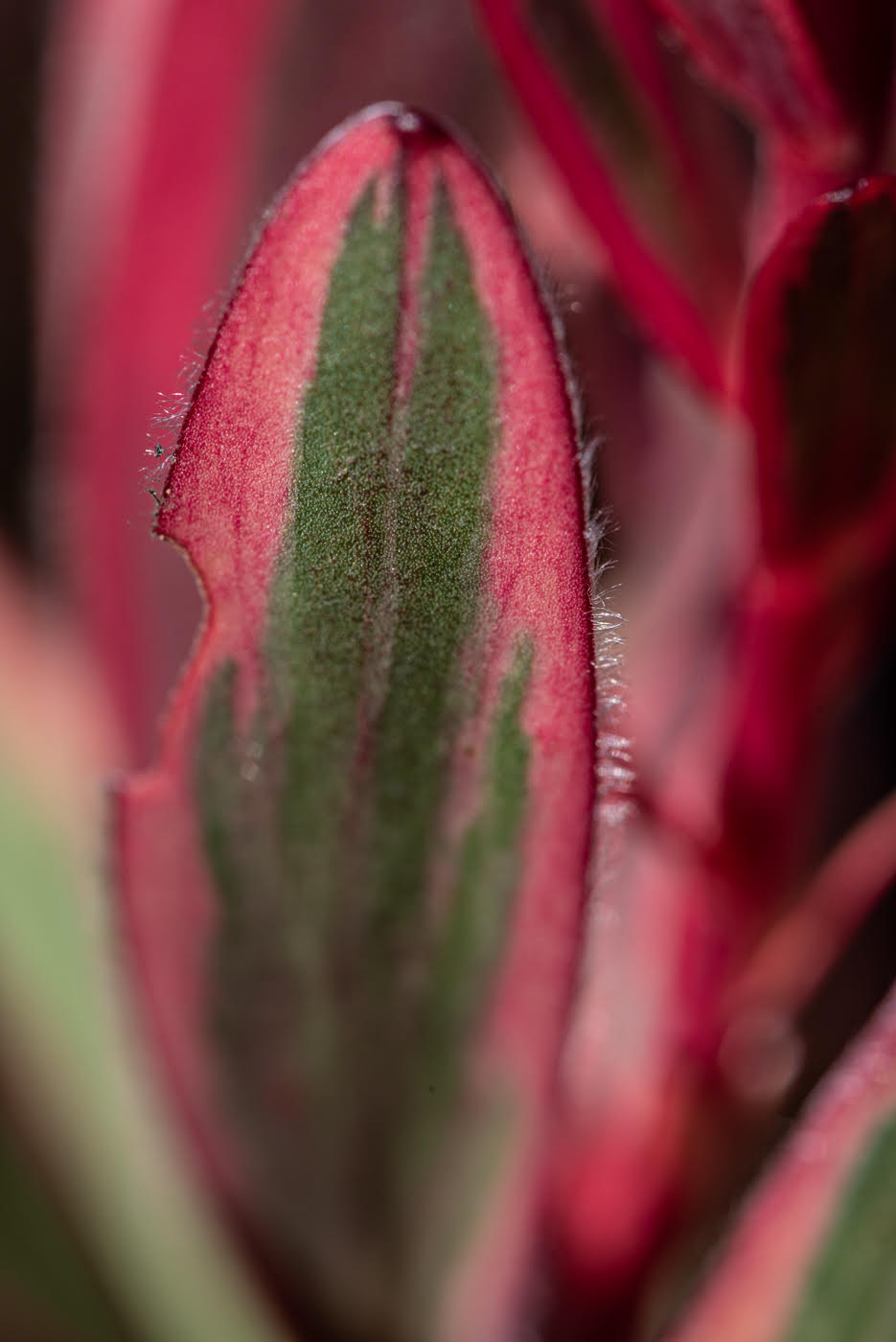
how risqué !!! a great shot. colors are nice red-orange against green. one of the 2 hoppers are in focus - underbelly is soft but does not bother me. nice 3 tiered vertical progression. |
Sep 20th |
| 95 |
Sep 25 |
Comment |
I like it! red leaves are nice against the green grasshopper. I just wish there was another red petal where the black space is on the right. even though I am the queen of dark tones I would decrease some shadows in the center if possible. |
Sep 20th |
| 95 |
Sep 25 |
Comment |
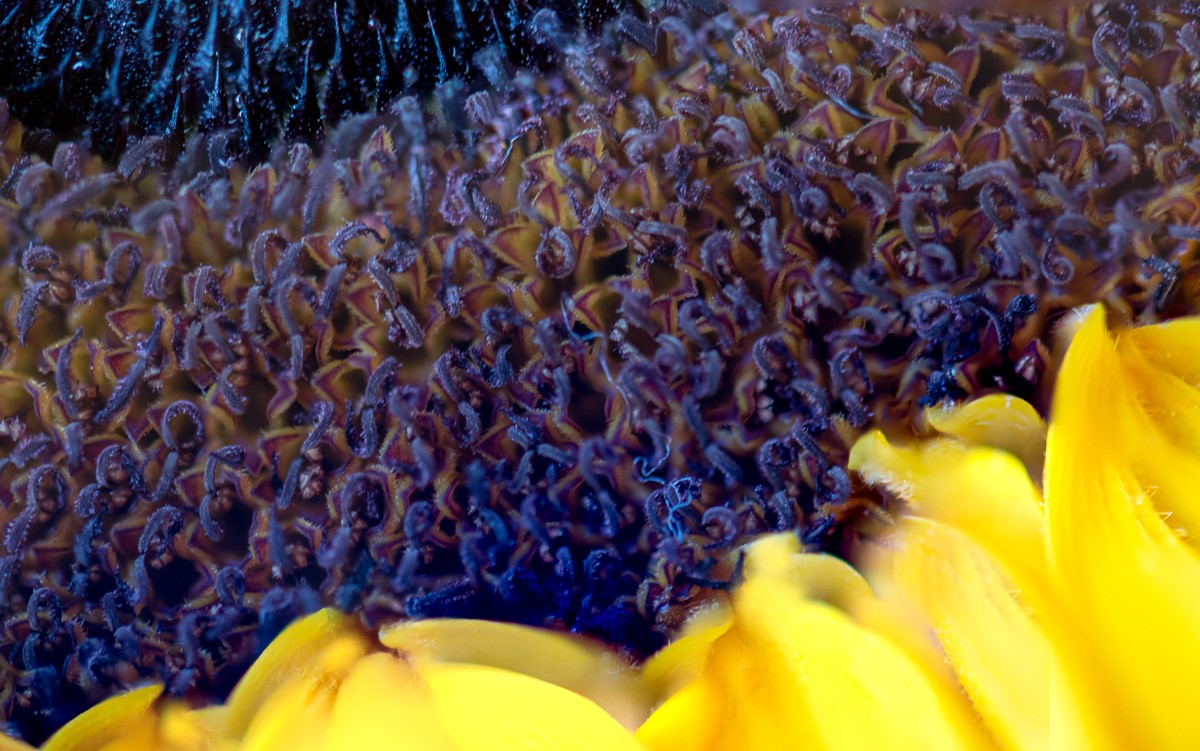
nice sunflower. I go with stuart's comment to pull back the framing a little to give it more room. you background seems nice so I thin we could bear to see a little more of it. I like the green petals below the sunflower so seeing a little more of them might be ok , it would probably change focus on the subject . |
Sep 14th |
| 95 |
Sep 25 |
Comment |
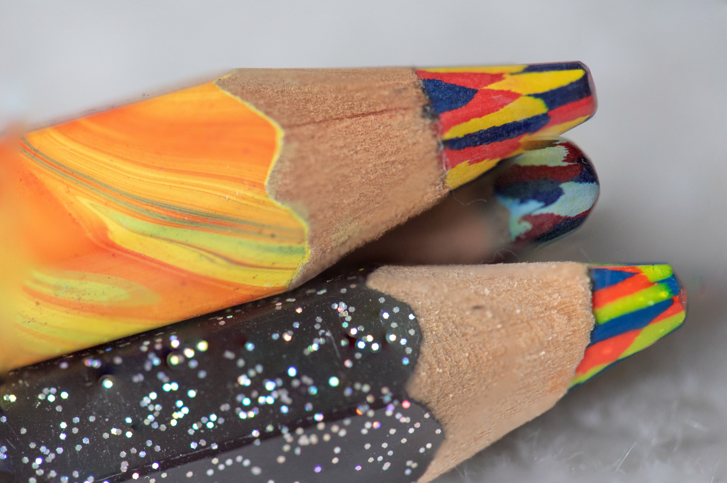
I like making the close up so that it is abstract. nice color transitions. I like the crop after Mike's comment. there might be a few too minor highlights for me , mostly in red and in 2 spot for green. or is it just green/yellow coming thru the red, maybe. it make a great image. |
Sep 14th |
| 95 |
Sep 25 |
Comment |
great perspective like a reverse perspective. I also need the bee to be in focus and I assume stacking would be the best approach because I would want to see the pollen up and down the whole body. the flower and the bee are too bright for me. that bee would never stay still long enough to stack so it is a challenging subject to attack. |
Sep 14th |
| 95 |
Sep 25 |
Comment |
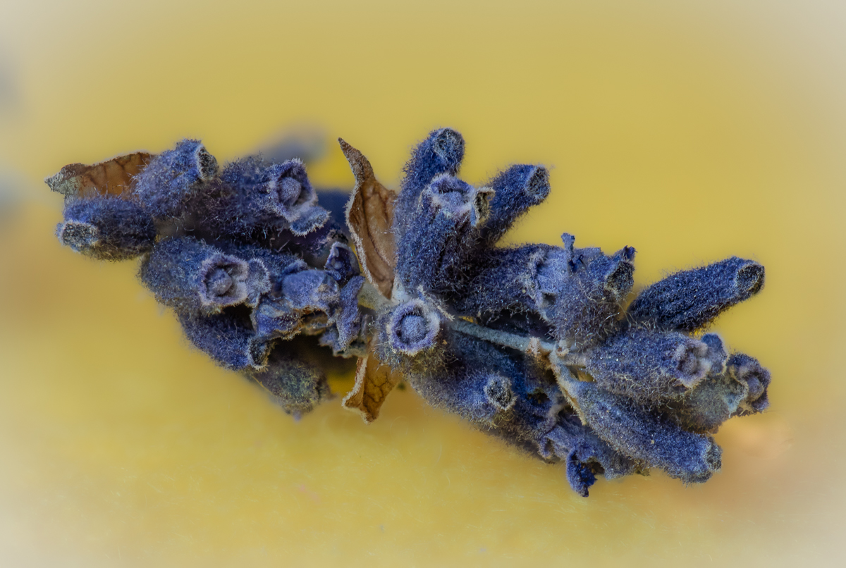
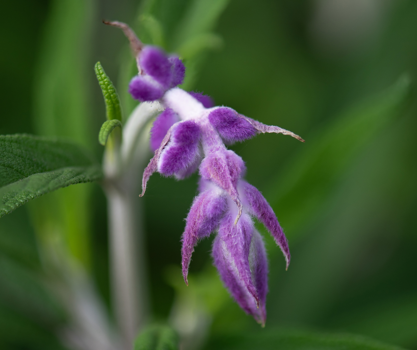
great shot. I like the flower off center. 2 tones of purples are nice. I even like the asymmetry of the petals - bottoms ones are not perfectly arranged and more out of focus which is fine and take you from outside the photo then moves you inward to the focus areas. I like the fly . making it lighter is fine, it did not bother me as much in its darker tones because I lean to the dark side :-) so maybe a shade in-between the two would be just right for me. the background work well in it blurred state. |
Sep 14th |
6 comments - 1 reply for Group 95
|
6 comments - 1 reply Total
|