|
| Group |
Round |
C/R |
Comment |
Date |
Image |
| 95 |
Jun 25 |
Reply |
I was thinking that it is a lot walking around outside with my heavy camera and tripod, keys, phone etc. I have not taken the flash equipment yet. I thought that was a lot for outside. glad you clarified. |
Jun 20th |
| 95 |
Jun 25 |
Reply |
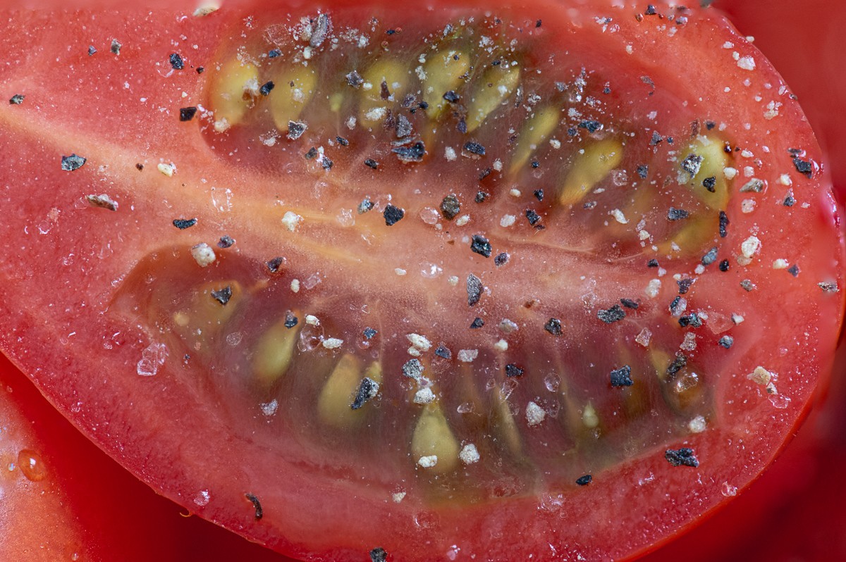
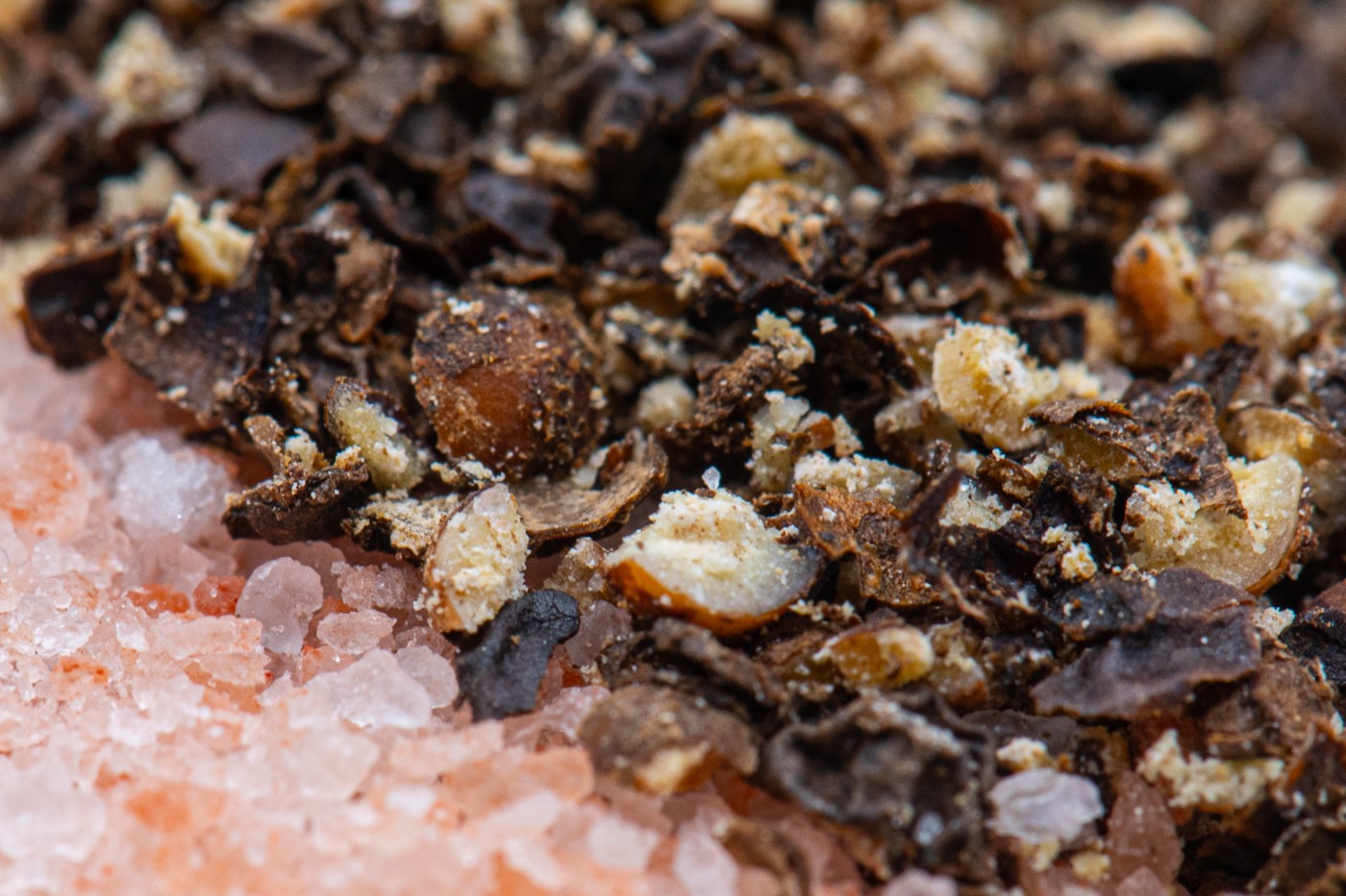
funny, I did a salt and pepper macro in July 2023. I did a series without the salt/pepper and was struggling to like the photos - I put the salt /pepper on and I liked it so much more. I started using the focus rail about 1.5 ago and have struggled with it. my first one did not move properly - the knobs had too much play in them [Newer brand]. I got a more expensive [Nisi] one that should be ok. my issue seems to be that my camera is so heavy that it seems to be too much drag on the mechanisms that move the rail. so things to look out for.... but for more ask Stewart, he has a better handle on the rails. |
Jun 20th |
| 95 |
Jun 25 |
Comment |
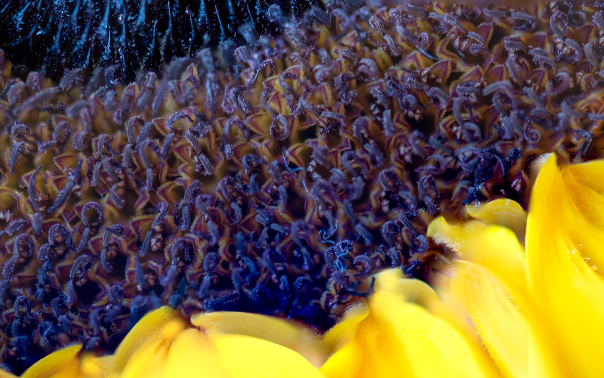
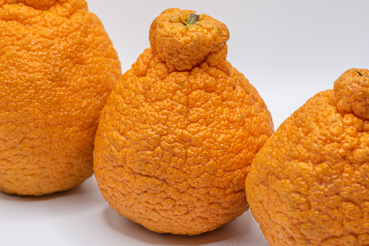
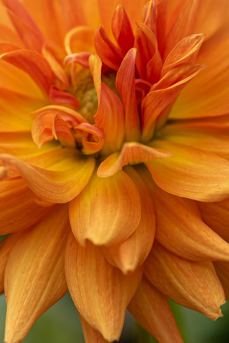
the flower is beautiful. for a macro lens thinking of the background as the story is confusing for me. it would still be ok but I would still want to blur it more... or if you had pivoted around the flower maybe you could have had only nursery plants behind it. I do prefer the background with darkened effect in the background and the flower brighter. I like Cheryls rendition of getting rid of the background. thistles at the top are nice and since they are a focus point it draws the eye thus background is important. |
Jun 20th |
| 95 |
Jun 25 |
Comment |
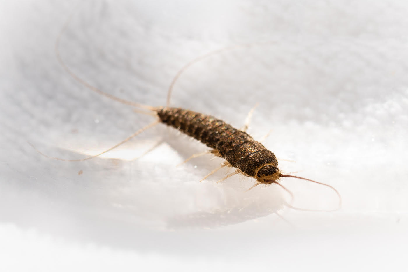
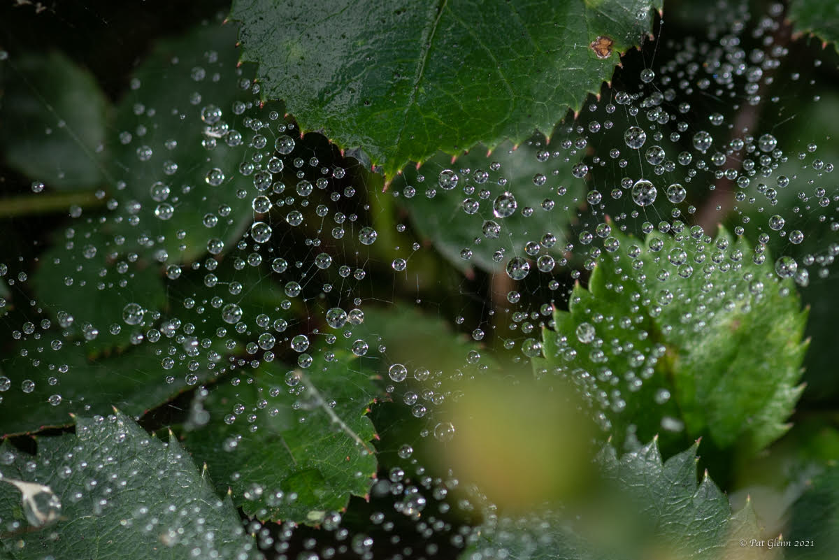
love it... thinking about your technique.... because it is not in my toolbag yet. the threads of the dandelions and the water droplets look impressive!!! threads & droplets against the black background are best. how much to photoshop to do vs the reality that all sides are not perfectly centered with black background ... debatable. I like that the background is real daisies [thus maybe not a perfect black circle behind it] vs dandelions in a studio box. did you try to just brush out the highlights and exposure of the red/orange on the left rather than a more involved approach. it is very pleasing to look at.
|
Jun 20th |
| 95 |
Jun 25 |
Comment |
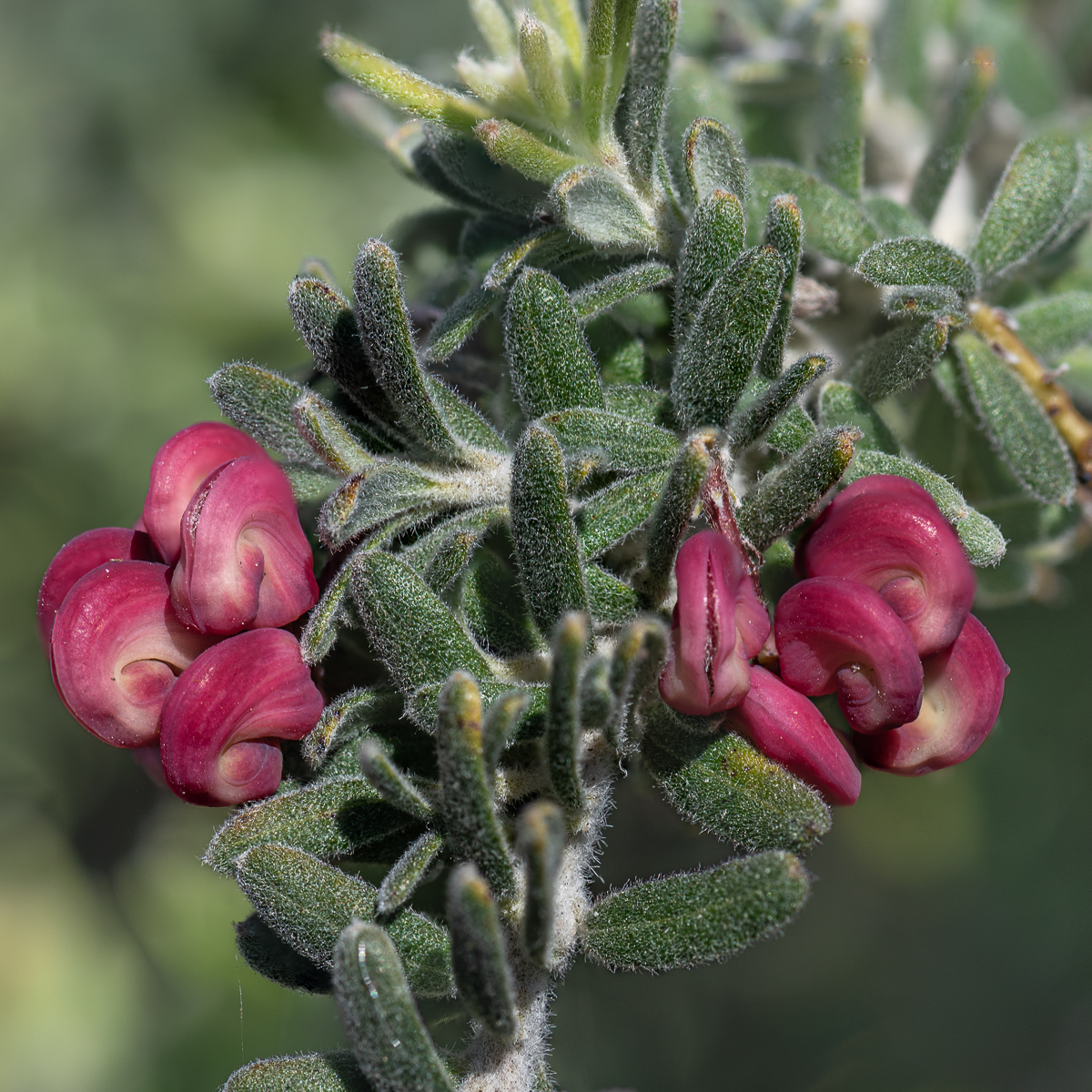
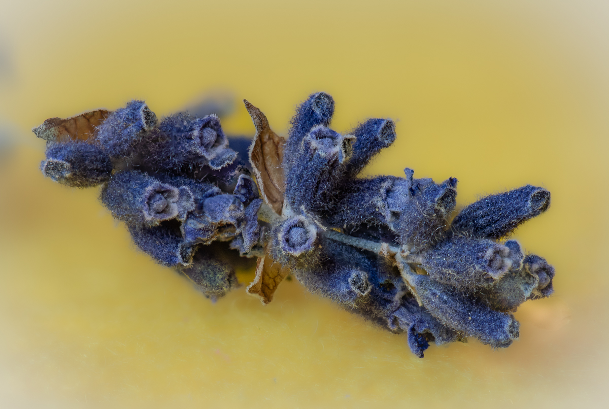
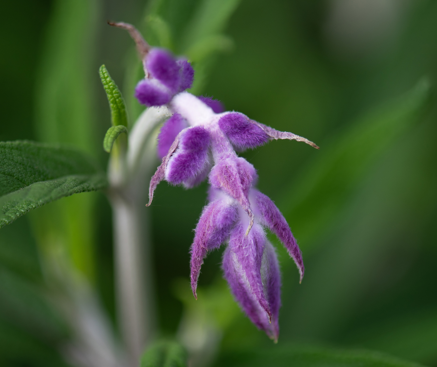
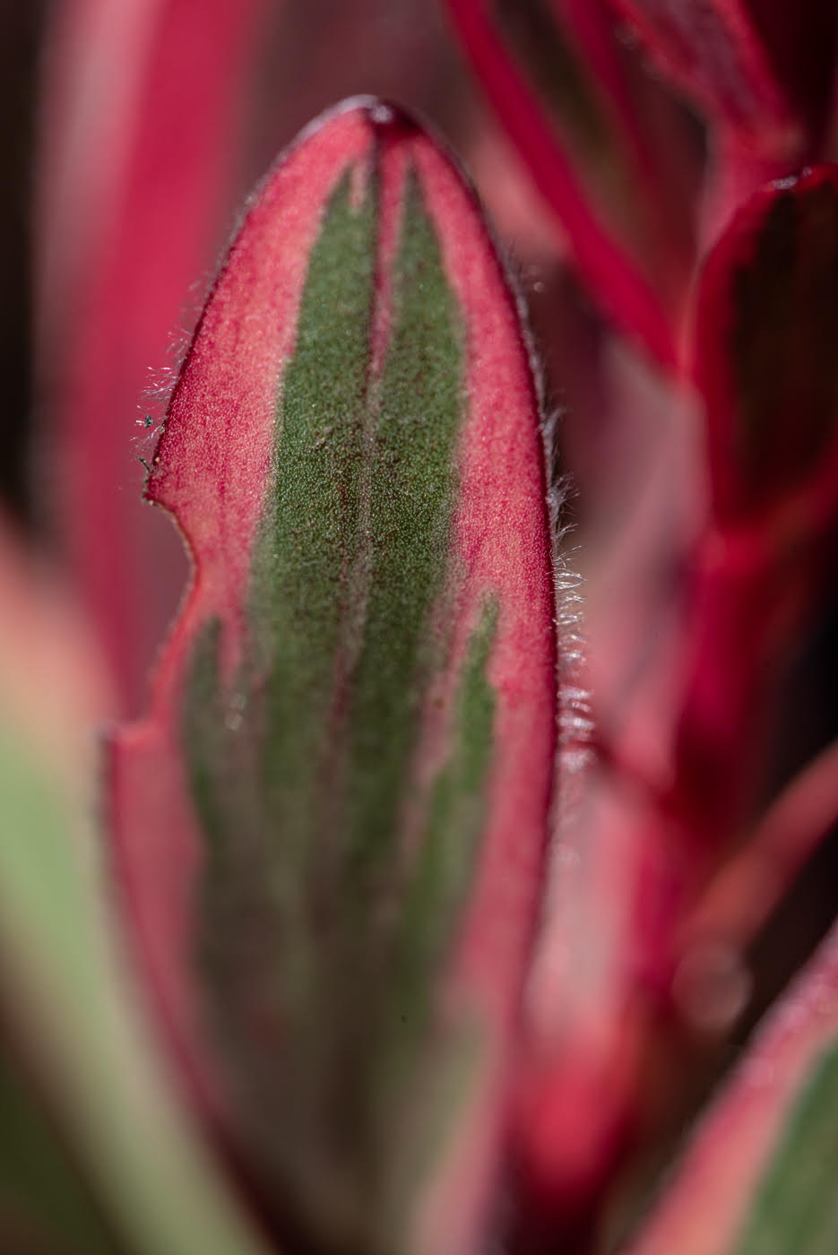
lovely purple petals with complimentary yellow. I wish the white in lower left was not there. it would be nice to see the brown leopard style pattern in that corner. the background out of focus is good. the purple petals dominate since they are in focus but the other part beyond it is prominent also - guess it is good to be out of focus. |
Jun 16th |
| 95 |
Jun 25 |
Comment |
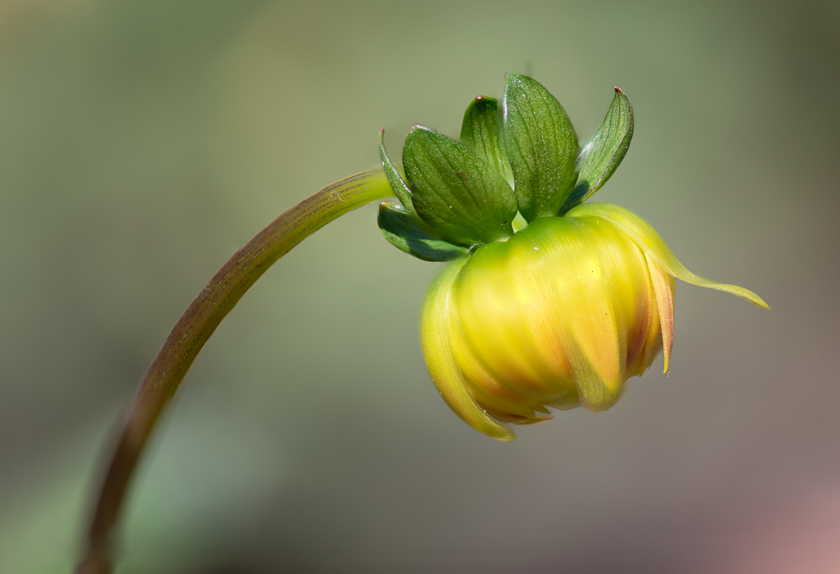
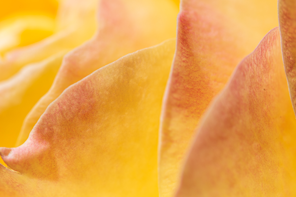
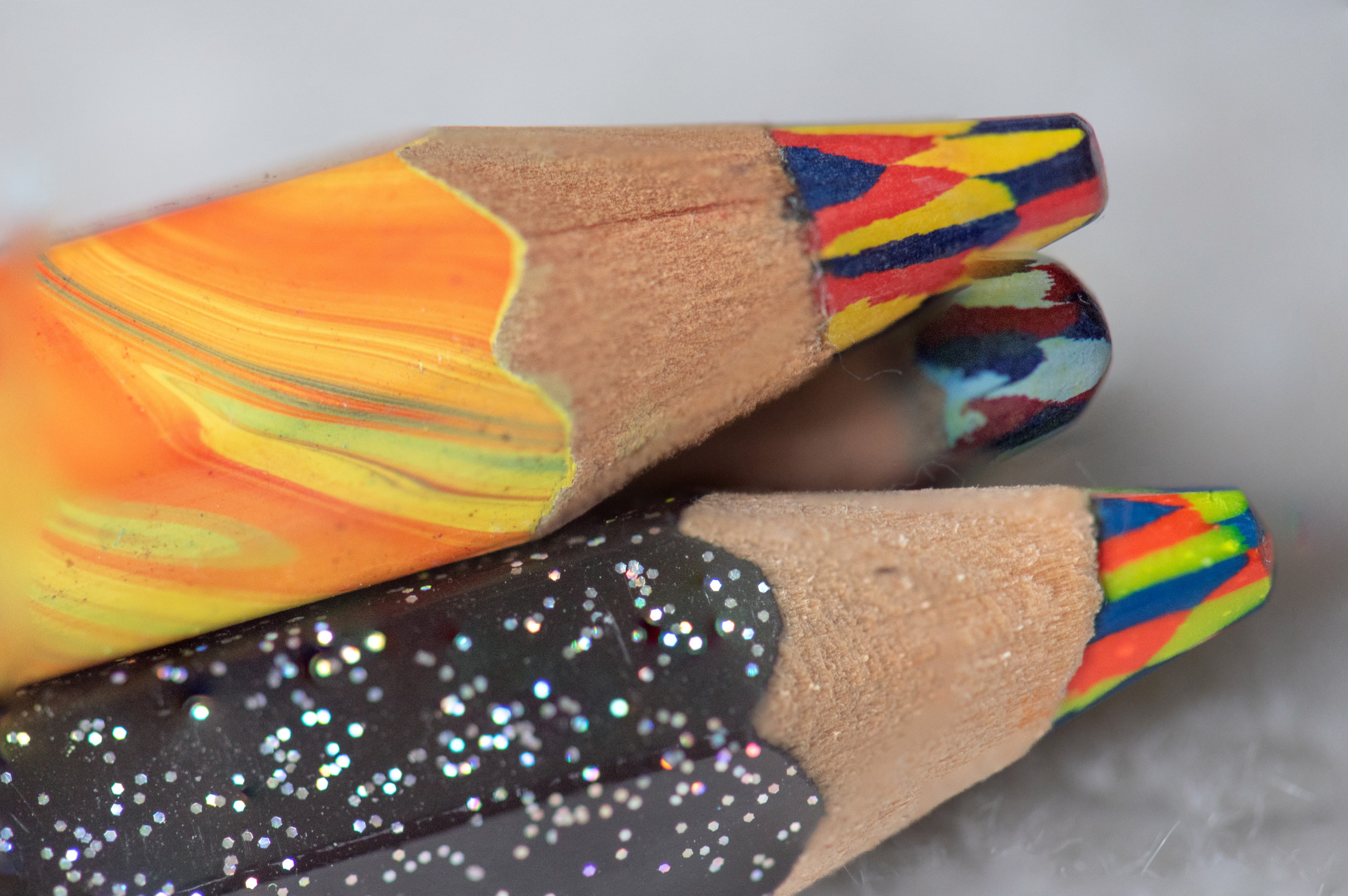
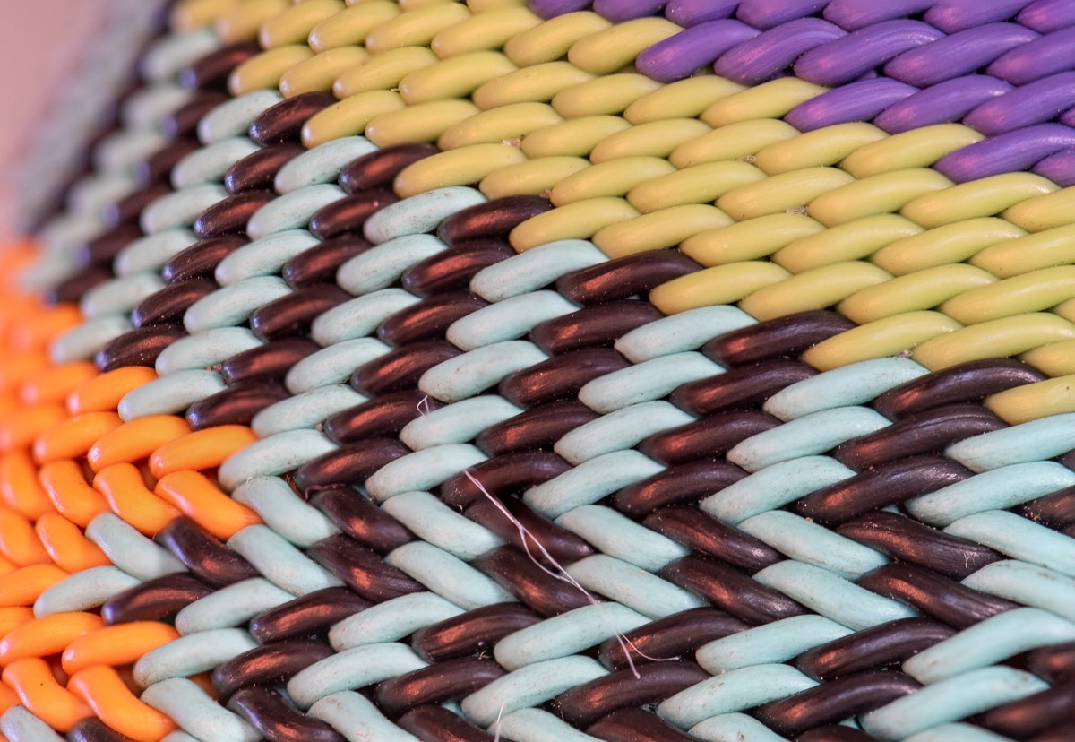
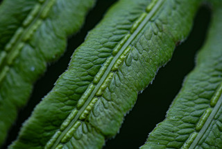
love the folds. colors morphing from top to bottom, dark to light is nice. focus looks good, I can see dimpling of the dark colors the best. nice image. |
Jun 16th |
| 95 |
Jun 25 |
Comment |
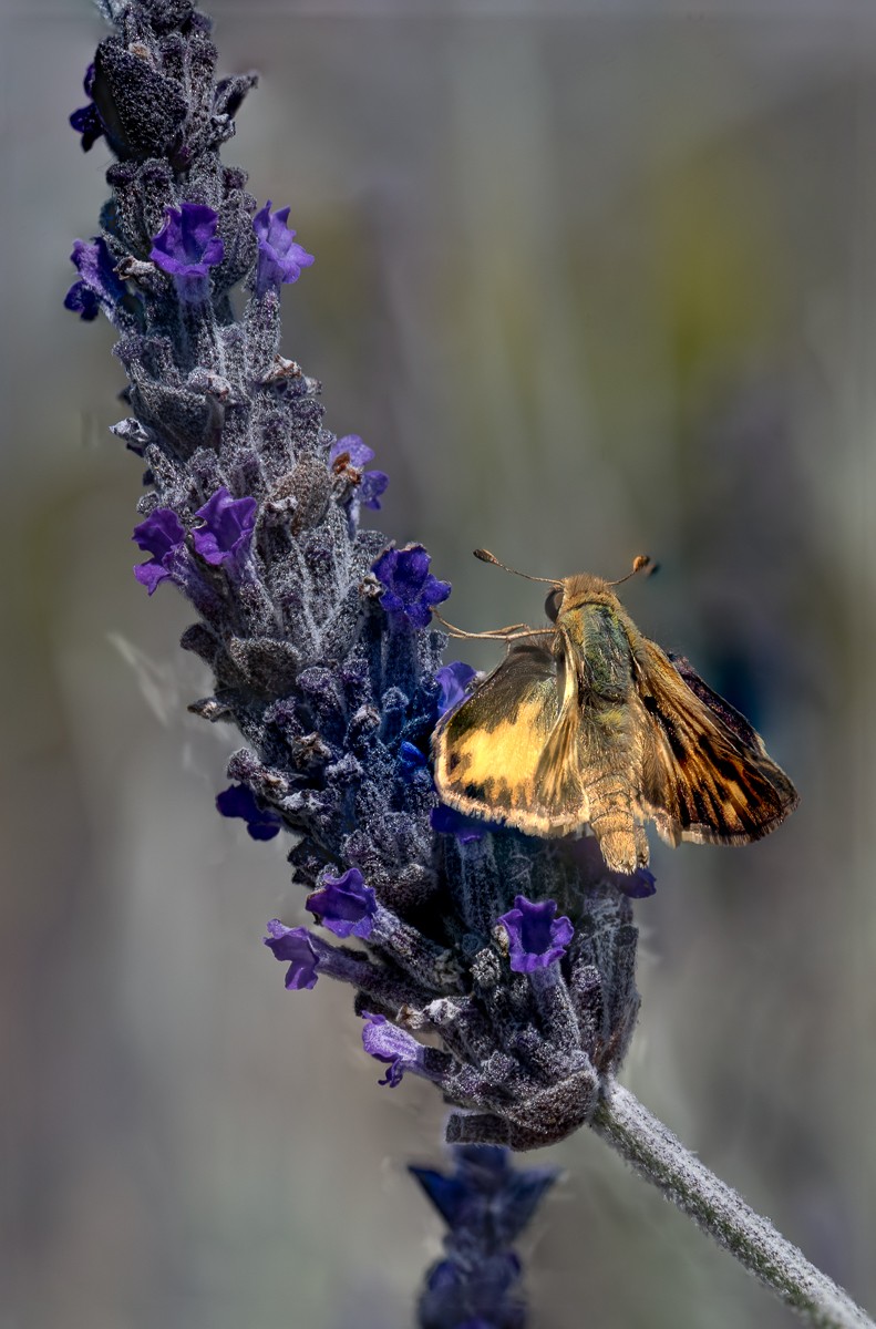
very soft pleasing photo to look at.like sitting in an easy chair :-). the background blur and flower blur is fine with me - lets meditate on the blue dots, head and nearest wing looks pretty good! red/green colors are great. |
Jun 16th |
| 95 |
Jun 25 |
Comment |
striking image was my thought also. clarity and simplicity of B&W. nice geometrical patterns. I see a circular pattern of the thorns, vertical , horizontal. nice imagery. |
Jun 16th |
6 comments - 2 replies for Group 95
|
6 comments - 2 replies Total
|