|
| Group |
Round |
C/R |
Comment |
Date |
Image |
| 95 |
May 25 |
Reply |
very quick exposure increase on eyes and background. seeing some highlights come up on 2 eyes but will stop playing with it now. |
May 18th |
 |
| 95 |
May 25 |
Comment |
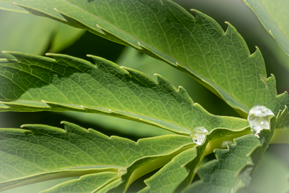
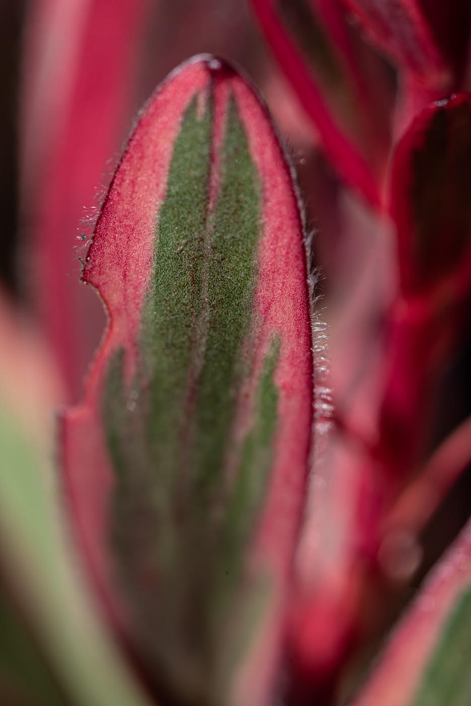
yes, it is ethereal, I think it is stunning. I can relate to hand holding camera and crouching down... gets in the way but sometimes I just want to walk with the camera and not gear! 10,000 iso! softness of the petals is great and being able to seen the green stem is good - give a groundedness. the middle of the white is the focus point and all that is needed for being macro - yellow petal lend to that soothing effect. black on yellow works. sure, the only other thing that could be done is to extend the focus area on the white pods up to the green but that would be different set up , tripod, off knees, stack. agree, get what you can when it is in front of you. green point at top doesn't bother me because I can tell it is part of plant. |
May 18th |
| 95 |
May 25 |
Comment |
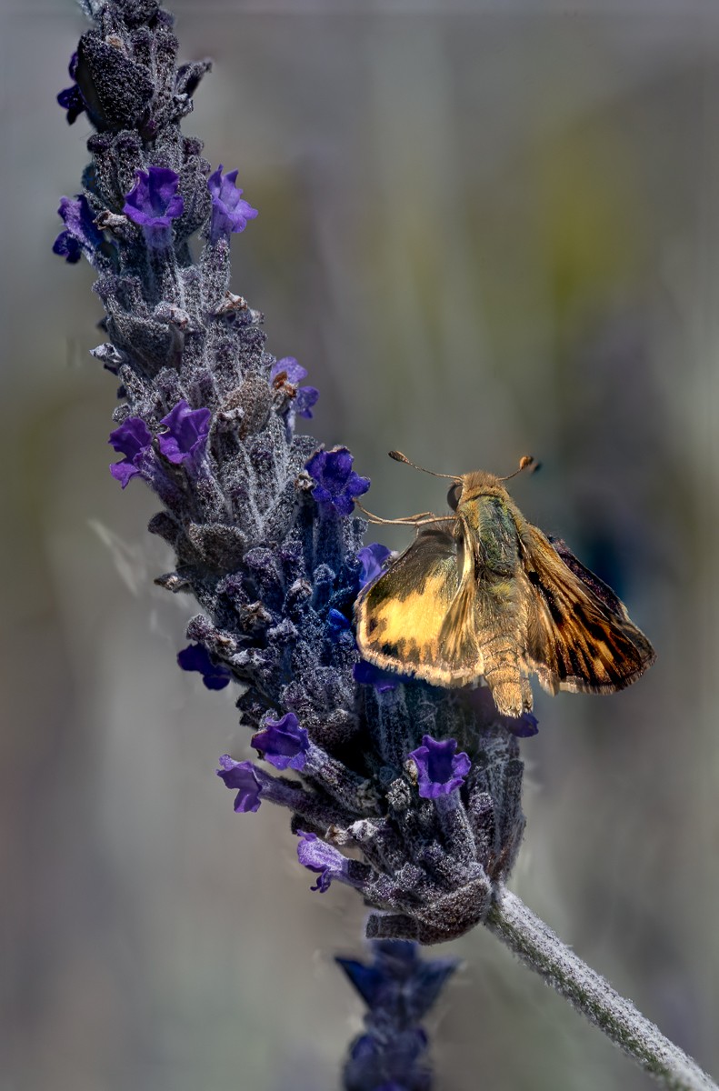
beautiful scene. butterfly is so crisp. outline of the wing is very nicely placed. the body is very nice black/yellow. pink is a bold splash of color but it livens things up. the background is nice - you know it is a natural outdoor setting. agree that I would want to do something about the highlights on the wing - clone/heal. stunning. |
May 18th |
| 95 |
May 25 |
Comment |
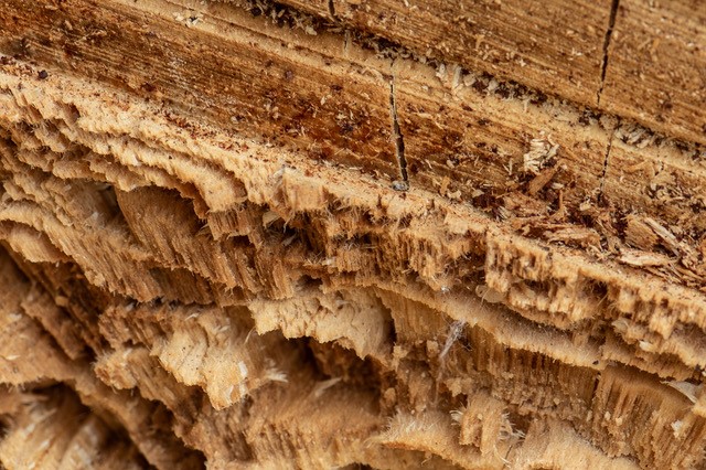
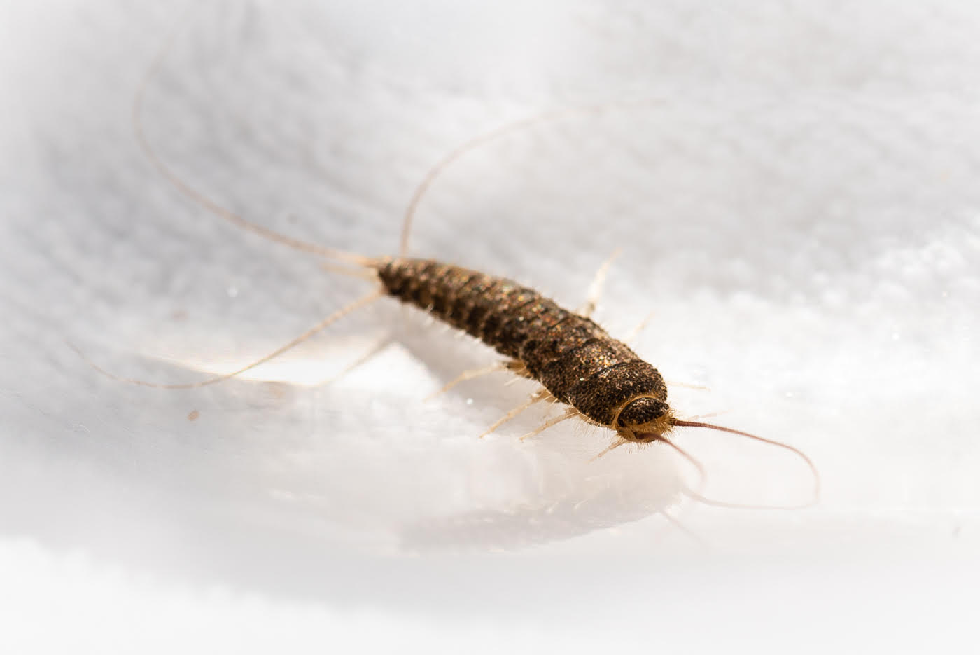
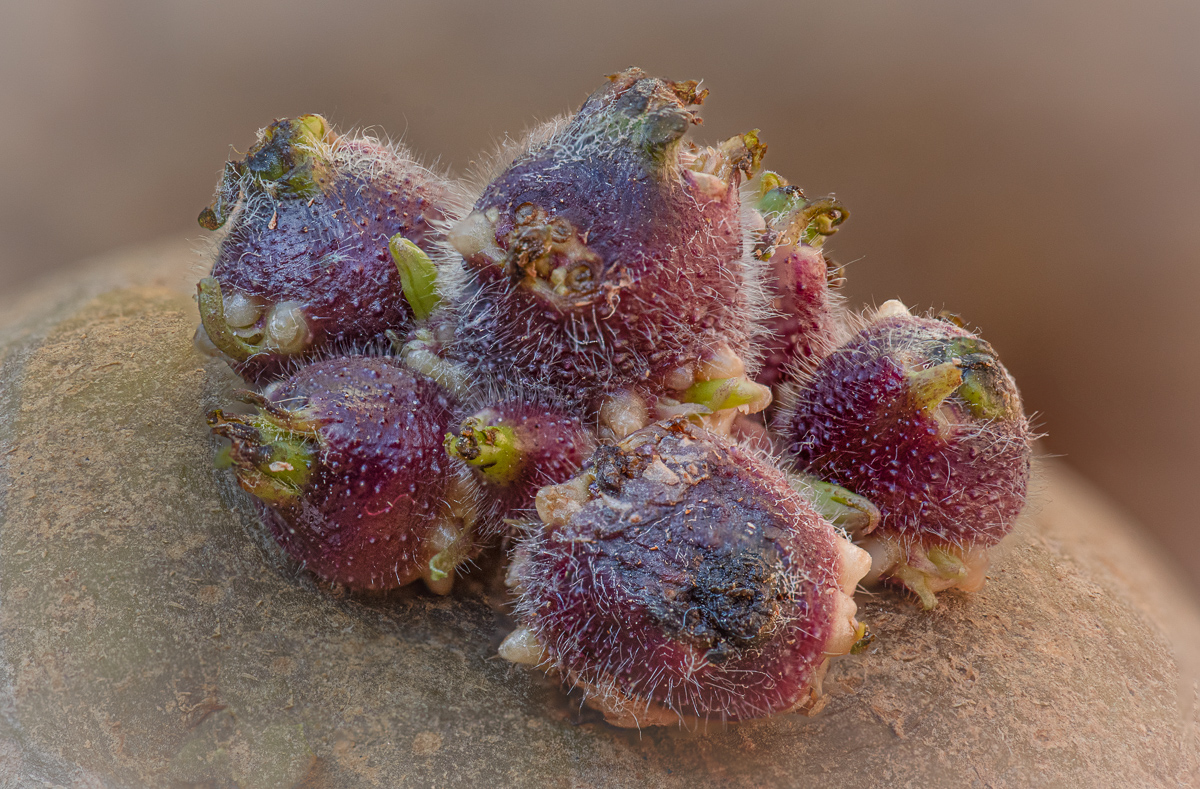
nice ladybug. I agree with less white - what the big background may be doing is helping the bug look smaller. also cropping of some of left would work for me. the macro part I appreciate is the one strip of wood that is in focus . even if all of the lady bug is not in focus.... its "shell" is soft but overall the bug looks good... except for the highlights on the head. even slow moving these bugs are hard to get... especially handheld. |
May 18th |
| 95 |
May 25 |
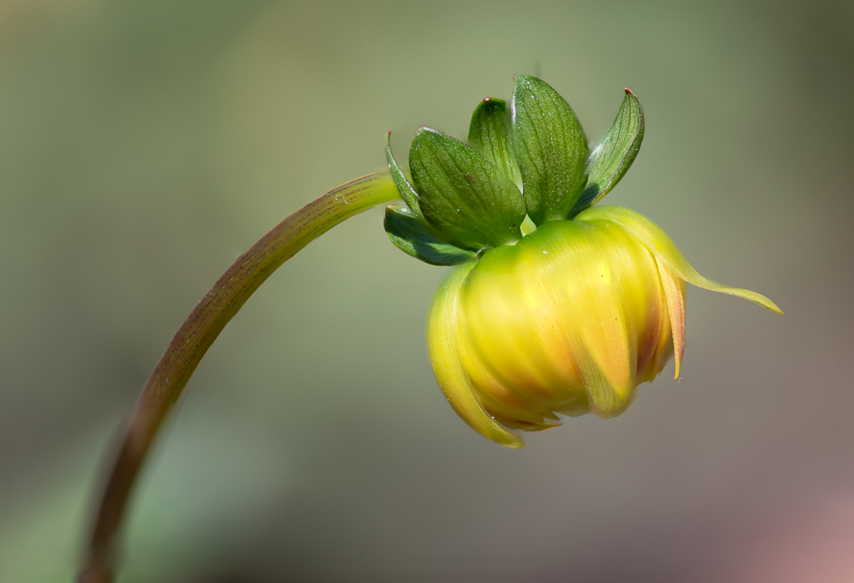
Comment |
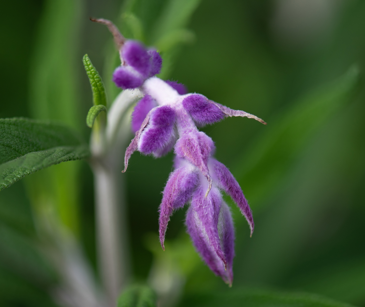
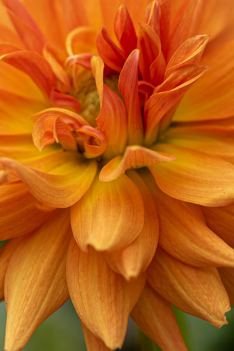
lovely flower - it has lots going on for it. my first thought here is a tighter crop, maybe even a square one - since it is so busy, zooming in on a feature [ and there are multiple areas to chose from] might give a different view. agree that the part at the bottom should not be cut off. |
May 18th |
| 95 |
May 25 |
Comment |
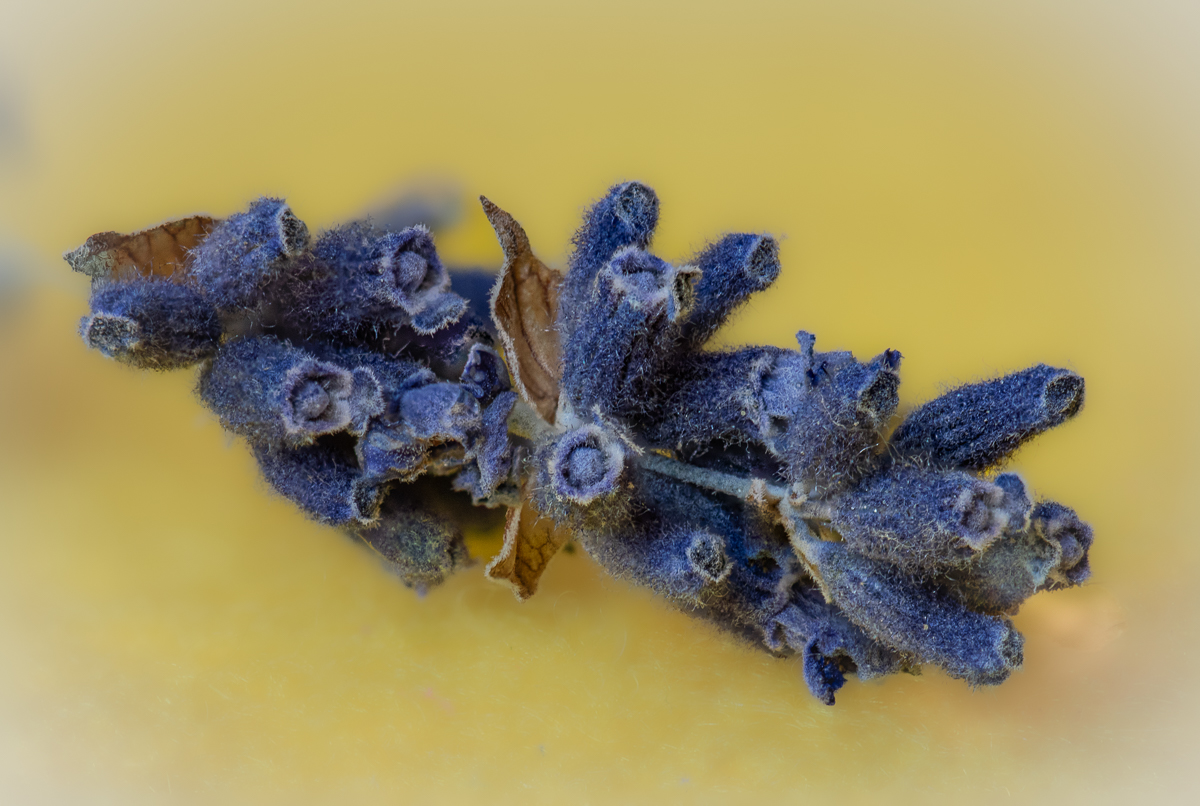
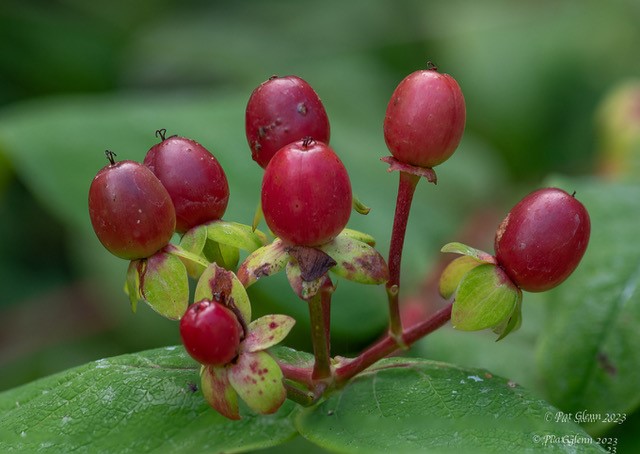
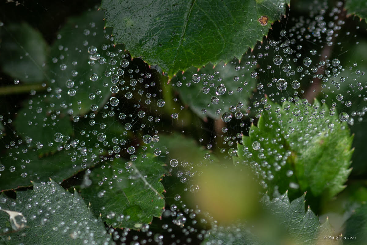
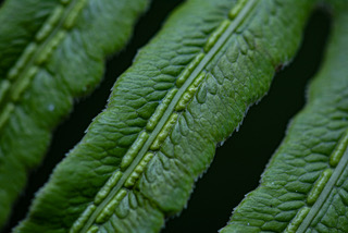
my first thought was horizontal framing. I love the lines of the horizontal "stick/stems" and the texture and spotting is very nice. I am tempted to reach in and pull off the vertical stems on the left - reality is not always picture perfect. the center brown glob seems the most unfocus so the stacking did not seem to catch that as well. white against the brown is a good "catch". |
May 18th |
| 95 |
May 25 |
Comment |
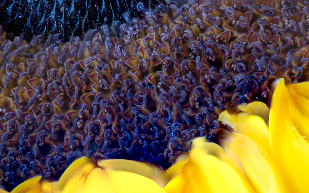
this is gorgeous, love the blue on blue which makes it look so serene - lower f works for that. variations in blue exposure/vigneting is nice. yes that yellow center POPS. leaves are nicely soft , serene effect again. stem is fine soft/blur because it is a macro. UV use is great - Cheryl asked questions that are interesting, I have never tried UV yet. now do the petals actually have some pink in them or is that an effect from UV on some color? [you did not say photoshop anything]. for pleasing to look at I still like the background dark areas - but as I said about my own edit , I can leave to heavy handed with depth of colors because I kind of like the darker tones. when to lighten up I am still working with. |
May 17th |
| 95 |
May 25 |
Reply |
thanks, I am a bit heavy handed on deep colors and need to be pushed to lighten things - there were lightened and this is where I chose to stop - so I need the critique. |
May 17th |
6 comments - 2 replies for Group 95
|
6 comments - 2 replies Total
|