|
| Group |
Round |
C/R |
Comment |
Date |
Image |
| 95 |
Oct 23 |
Comment |
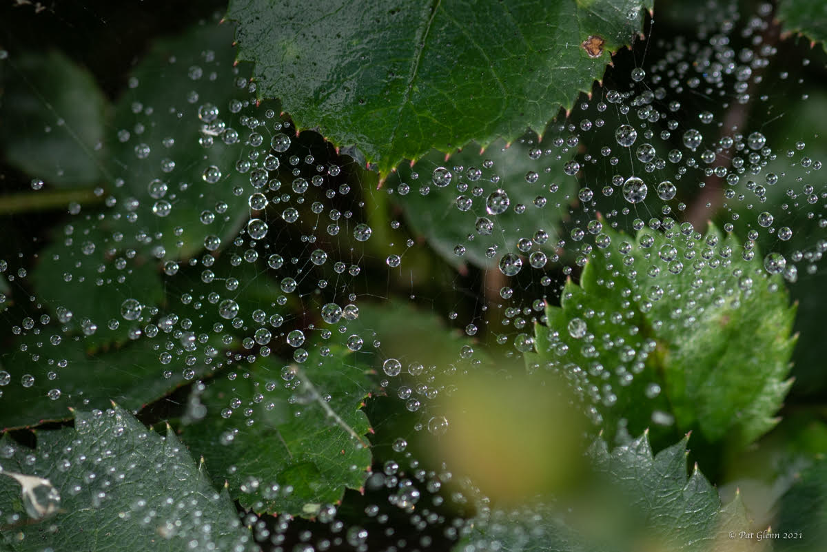
ok that makes sense... might compliment Gloria's impression of looking like a landscape photo. horizontal and vertical fighting each other is an observation I was. not seeing. |
Oct 22nd |
| 95 |
Oct 23 |
Comment |
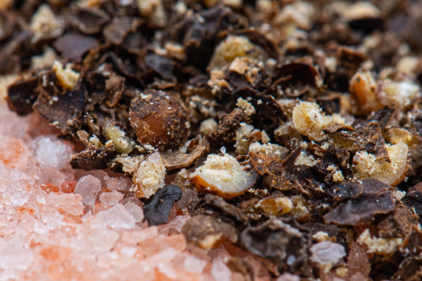
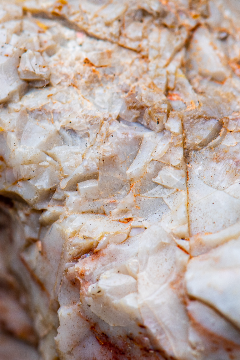
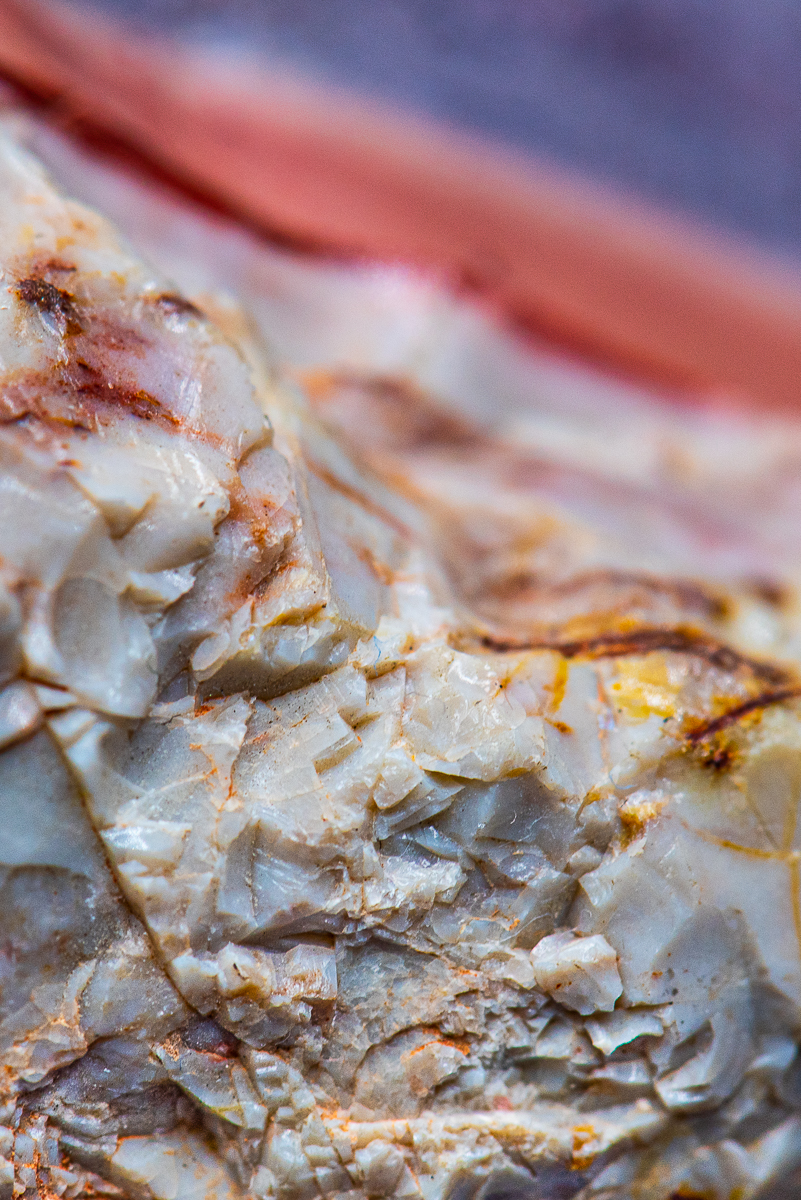
it is a great subject. first it look like has a mouth and eyes and is smiling. I have no problems with he back of the oyster being blurred and the background is blurred which is expected. now one think I keep going to is that if I had time to play with it I want to prop up the mouth so the oyster is not in a flat horizontal line but stays on that diagnol but mouth up in the air a little to feel a downward/verticle line rather than horizontal. then getting the line of focus thru the mouth-eyes.
|
Oct 21st |
| 95 |
Oct 23 |
Reply |
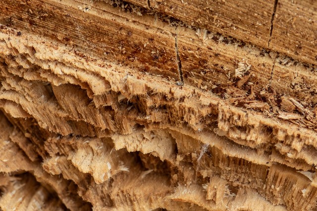
not sure about closer. maybe. I was pretty much on top of it. I was wondering how they took the trees down since there were so many jagged treats, not a clean cut.
|
Oct 21st |
| 95 |
Oct 23 |
Comment |
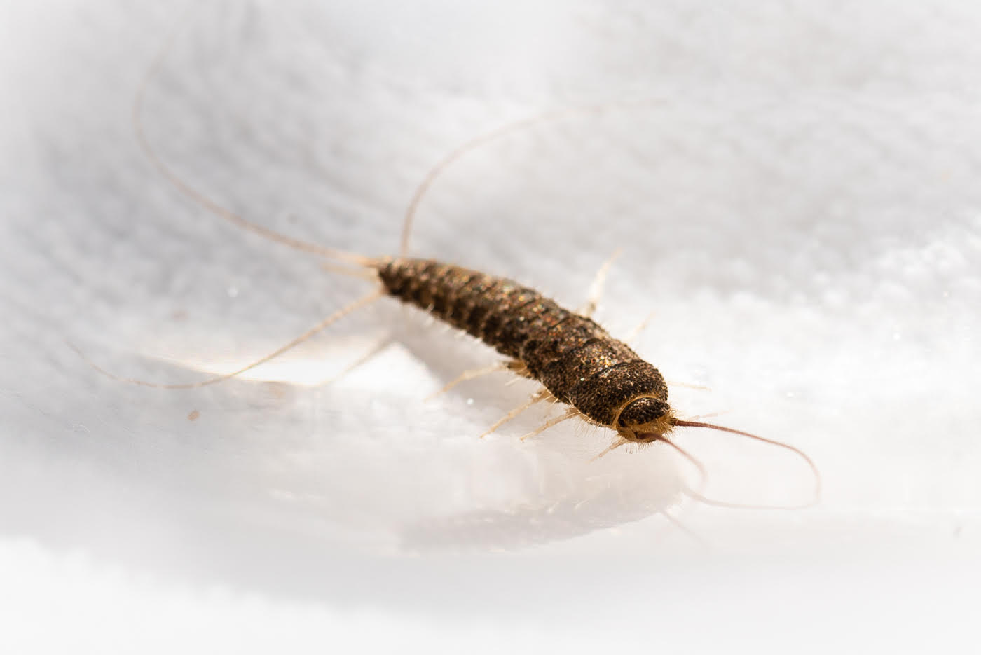
agree with the overly dark tones but that can be tweaked.great photo for the month of Halloween.i see some great hairs on the body. I like a dark photo sometimes.... if face had some work done on it I think being able to see more of the folds would bring out the monster face.
|
Oct 21st |
| 95 |
Oct 23 |
Comment |
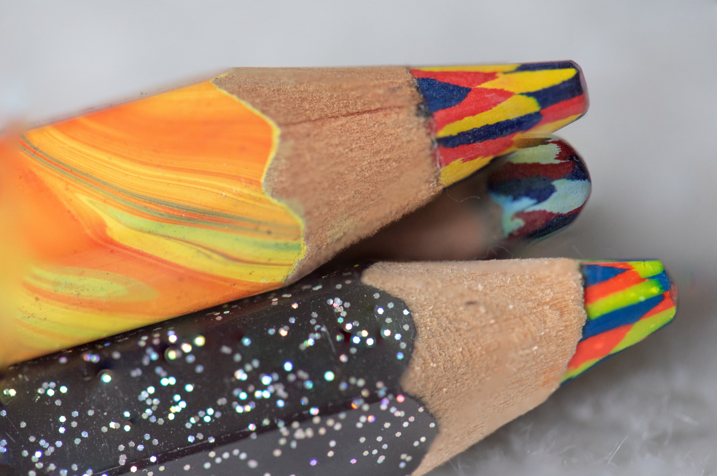
I am impressed with the fact that it is the iPhone. next, this is so appealing to me. first the wood theme, love the diagonal presentation which almost turns the photo into 2 triangles. the actual wood then the insect which looks like wood and the backgrounds is very earthy, wood color.Focus is is spot on like stuart said. the piece of wood and the center of the body are parallel or in line with each other - the legs being out of focus just highlight the narrow band with of focus of a macro setting. it could have been any bug but you have one that looks like wood, has the same tones of the wood. the topped of with the yellow "pearl"!!! |
Oct 21st |
| 95 |
Oct 23 |
Comment |
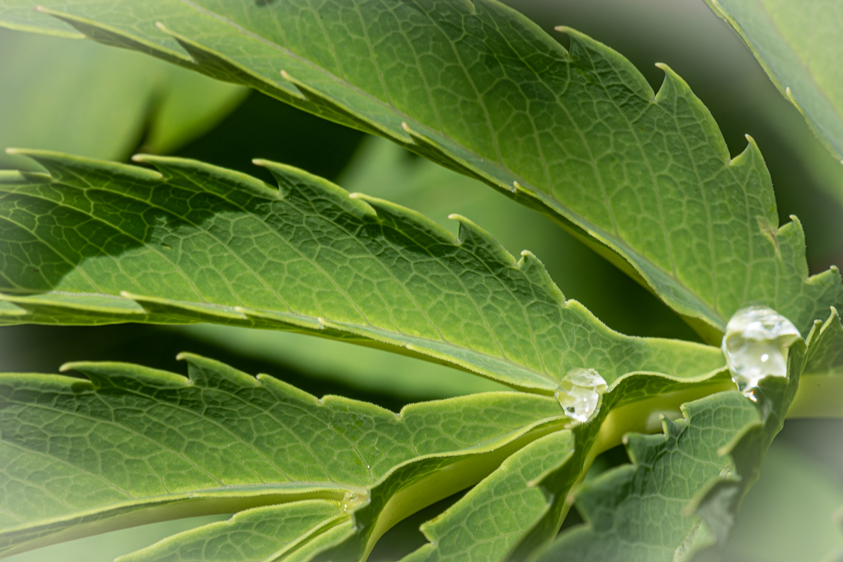
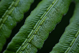
wonderful - sharp edges all around on this holly.. it is very dramatic...shouts out high clarity.... and HANDHELD. even though you stacked... I have practiced a little with multiple handheld to stack and it needs more practice. window reflection I like - it does look like a reflection and the grayness is different - I still like it - gray vs green holly works for me. |
Oct 15th |
| 95 |
Oct 23 |
Comment |
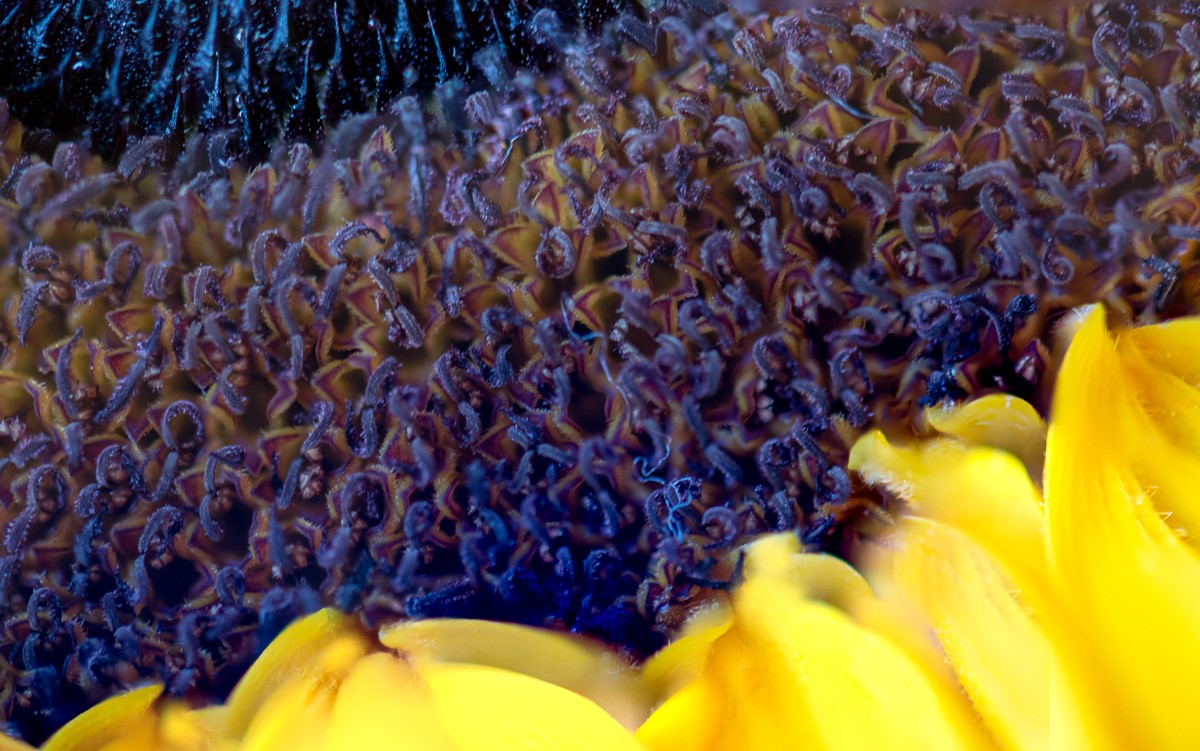
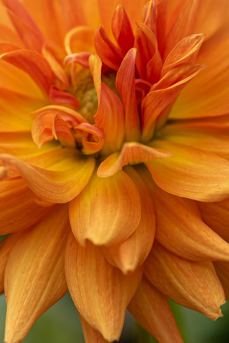
love it. I like asymetrical flower placement, it puts the bee in the center. it really look in focus for the most part. safest macro part to me looks like upper left but even that does not detract. bee and middle seed area capture my attention but then the contrasting yellow is pleasing to the eye. background is nice muted/out focus green with no distractions. |
Oct 15th |
6 comments - 1 reply for Group 95
|
6 comments - 1 reply Total
|