|
| Group |
Round |
C/R |
Comment |
Date |
Image |
| 95 |
Feb 23 |
Comment |
yes Tom I see that crop eyebrow out is much better and that bit of hair. |
Feb 25th |
| 95 |
Feb 23 |
Comment |
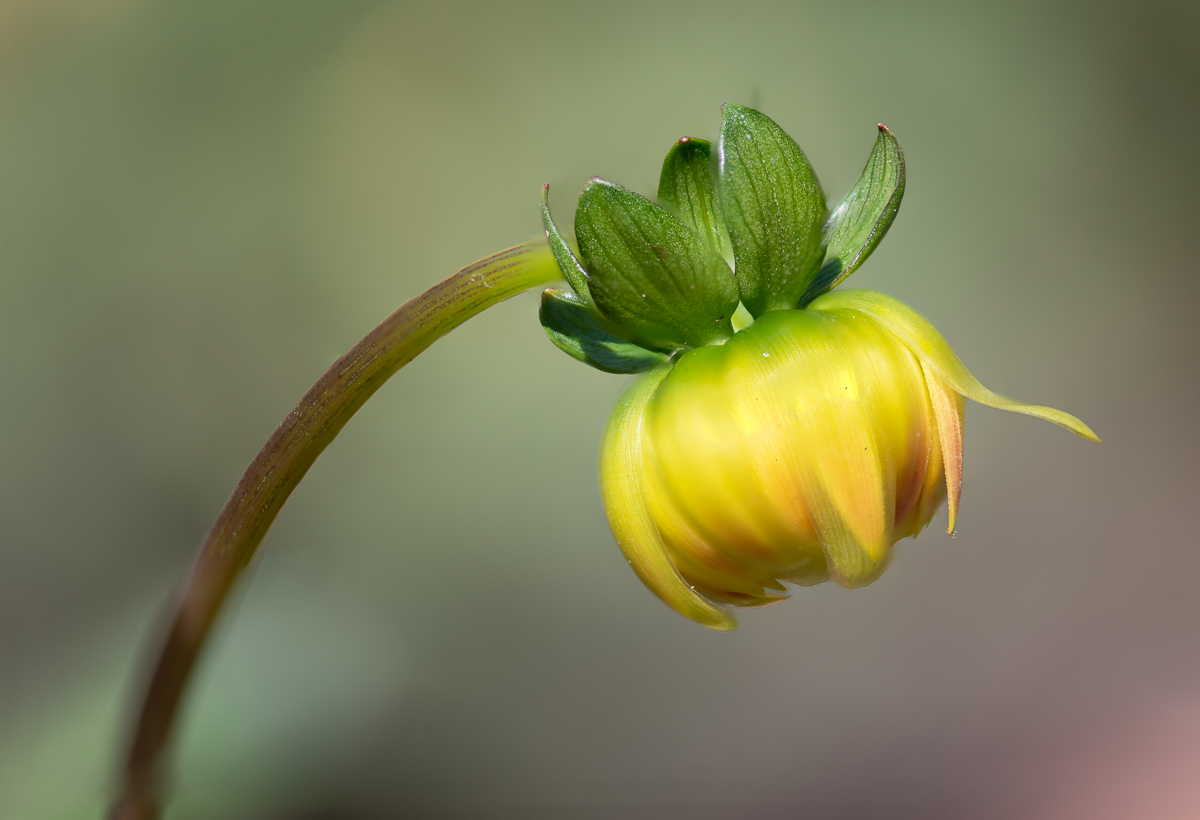
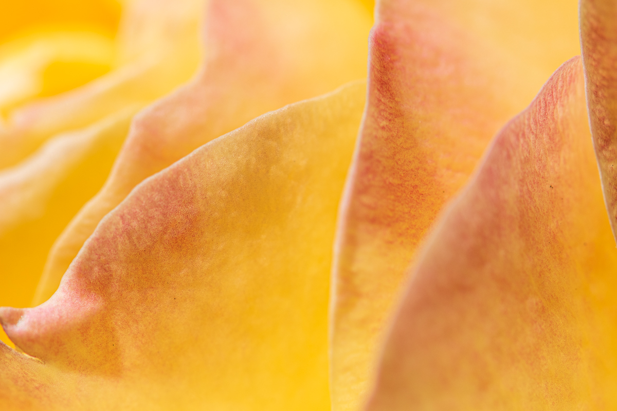
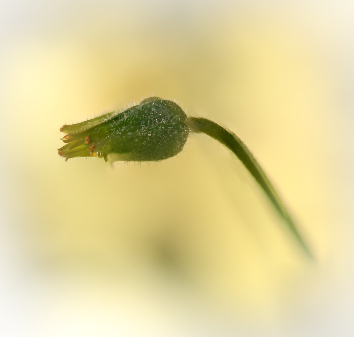
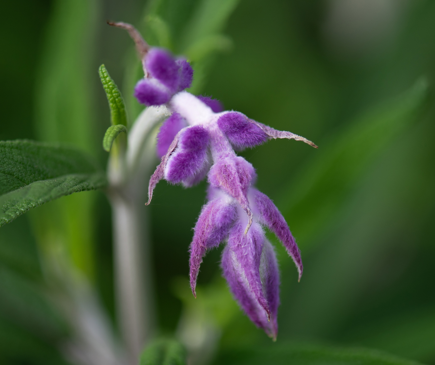
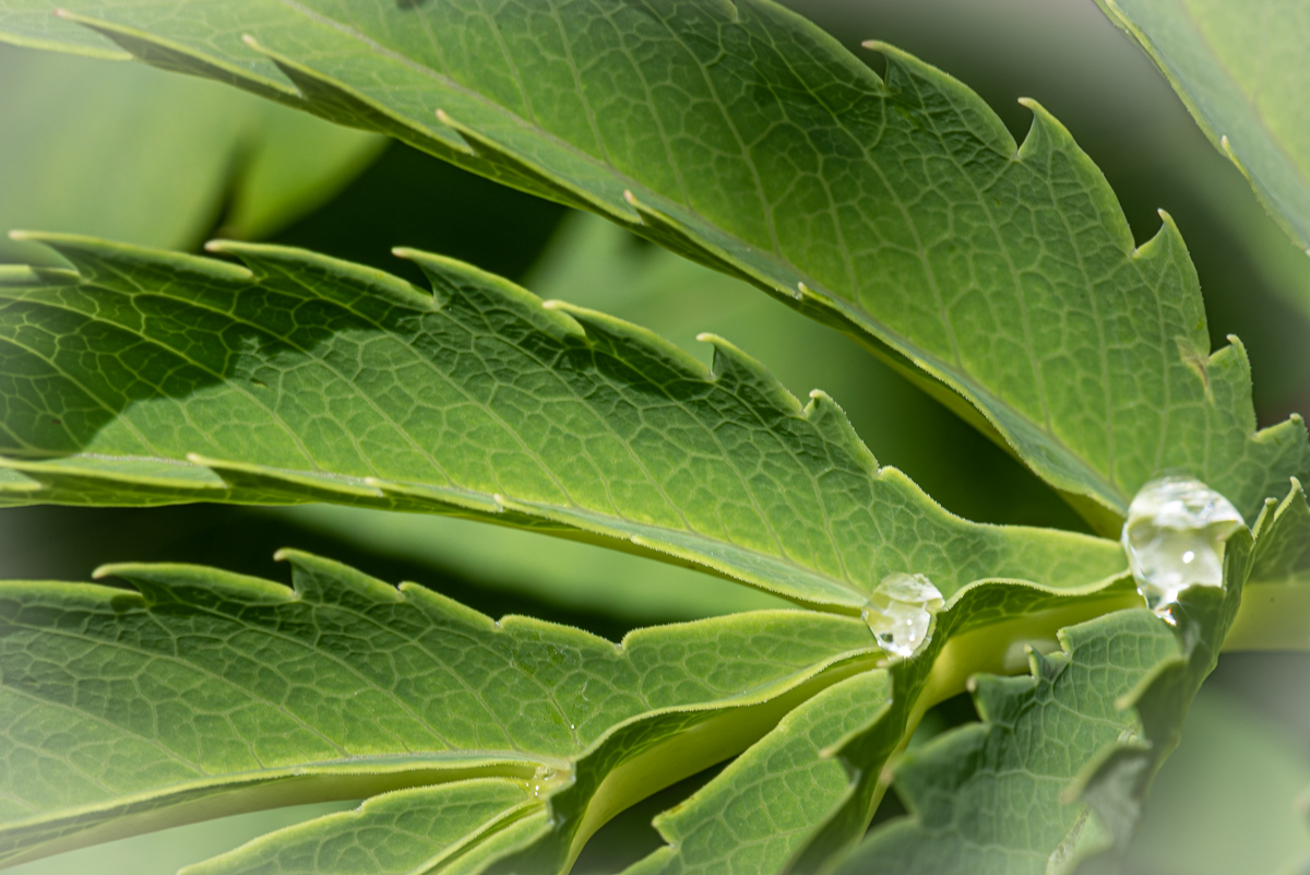
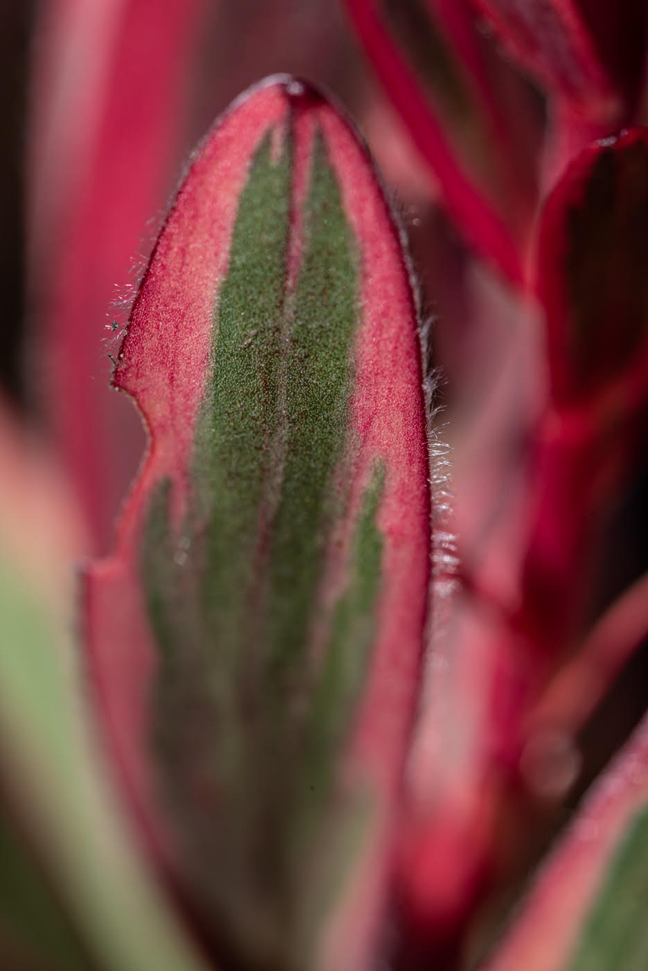
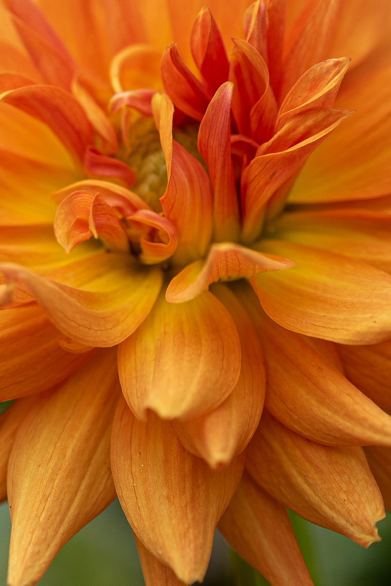
nice looking flower. I actually like the original background where you can see it as green [love pink and green tighter]. I like looking for the out of focus area at the edges - so I would vote for closer on your center and let edges blur. getting in closer might be able to then just have green in background and leave it greener instead of blacker. |
Feb 25th |
| 95 |
Feb 23 |
Comment |
I like the original photo better [yes with cropping]. first the green color is prettier - the submitted one look brown-green in the shadows. the concept of the subject is good- cute little plant - I like seeing it cupped around by that one leaf - but the background light is too unbalanced for me. |
Feb 25th |
| 95 |
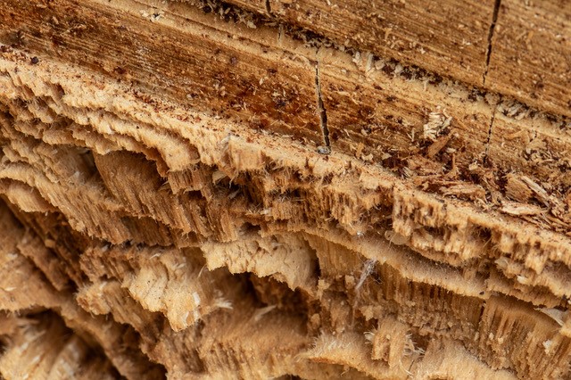
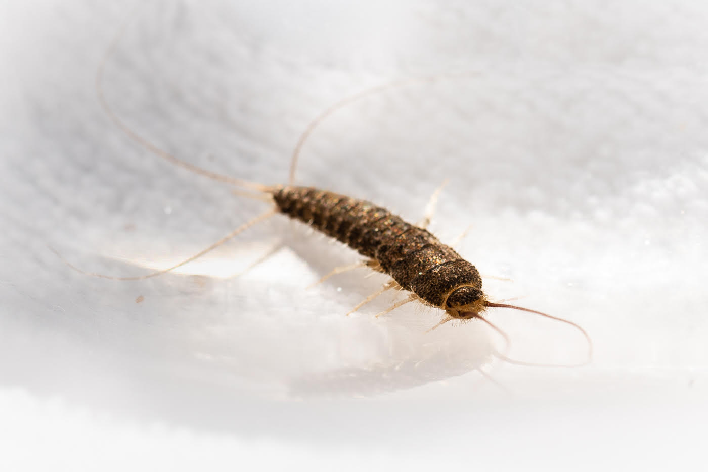
Feb 23 |
Comment |
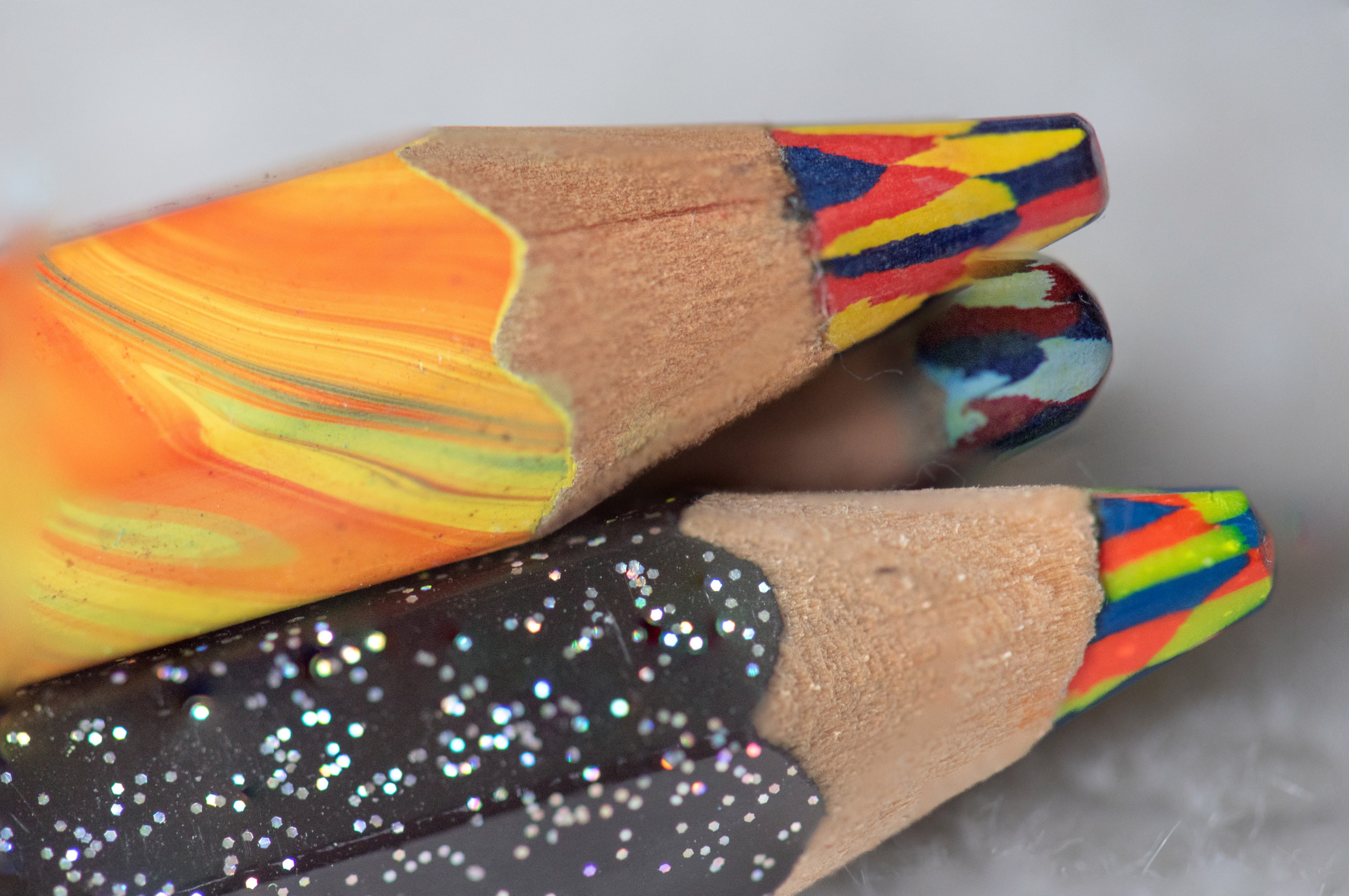
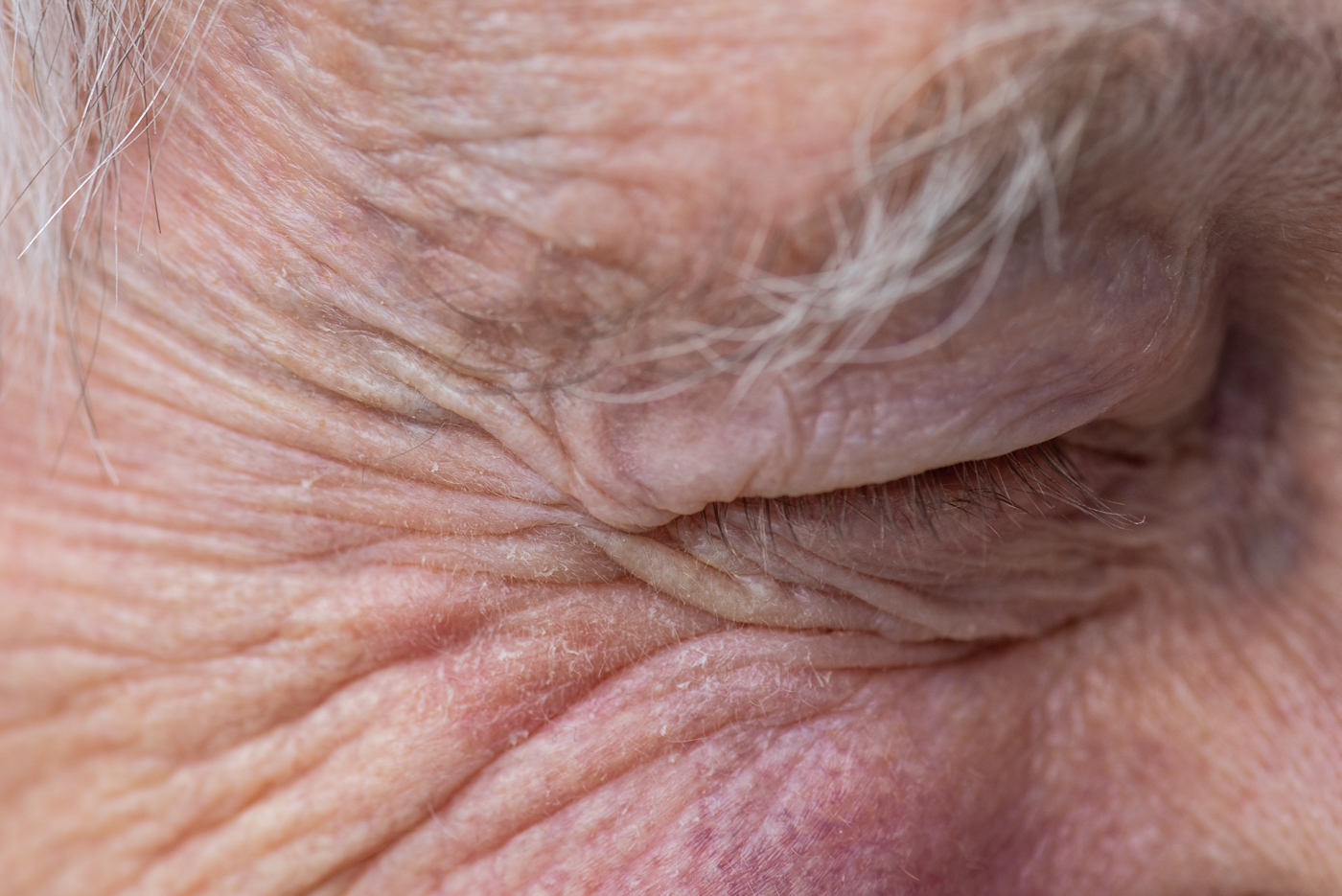
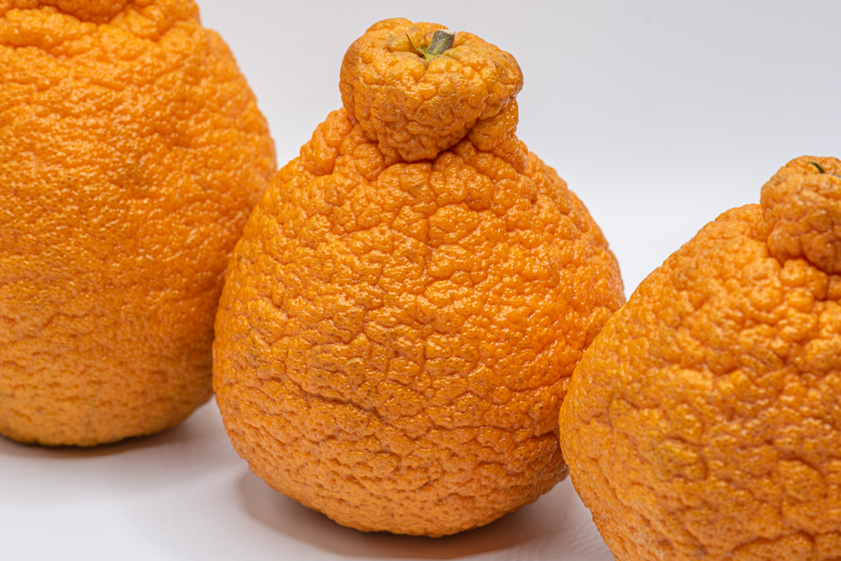
1/125 ,f8. focus point was the wrinkles at the outside/closest to eye - focus is only only a narrow strip as the wrinkles start to fan out - wide part of the fanning is not in focus - again this is 1:1. so eye/brow/lids not meant to be in focus.
I am investigating what a face will look like at 1:1 - I thought the wrinkles was a more interested place to start. I did have a tripod but it was awkward to use - I could not get the proper angles so I gave up on it. also I did not have stools etc and did not want to test my subjects patience anymore.
|
Feb 19th |
| 95 |
Feb 23 |
Comment |
another great ethereal photo Carol. 3 concentric layers. petal have nice soft but defined enough lines to give that whiteness character. vingettes are fine for me. Hey, I did not get the memo that this was FLOWER month. |
Feb 19th |
| 95 |
Feb 23 |
Comment |
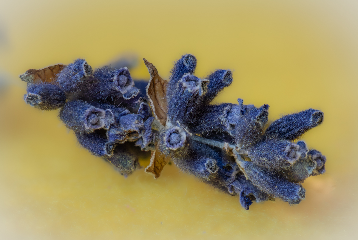
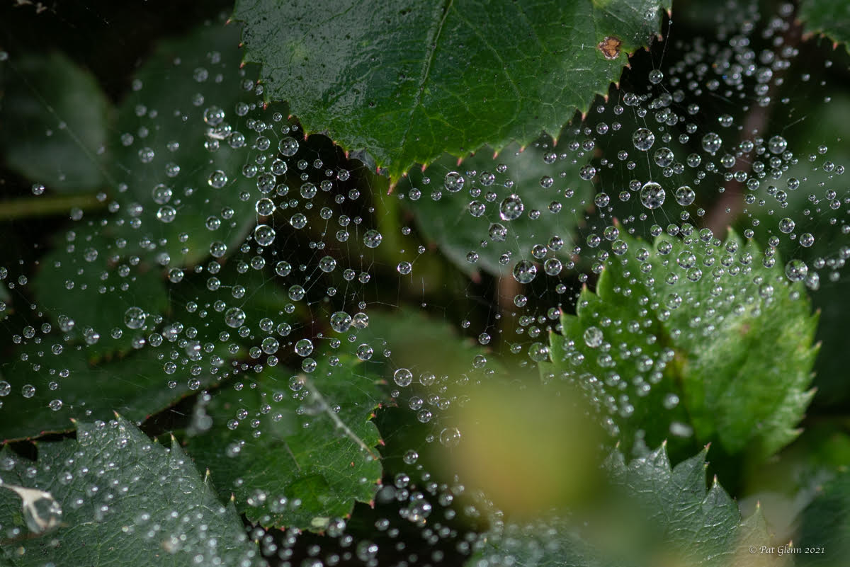
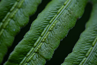
stuart I love frost, its dazzling. I agree that a black background works - solid black would be stunning. single image means no stacking for you, right. the frost looks good - so many look focused enough and have separation between the individual frost. |
Feb 19th |
| 95 |
Feb 23 |
Comment |
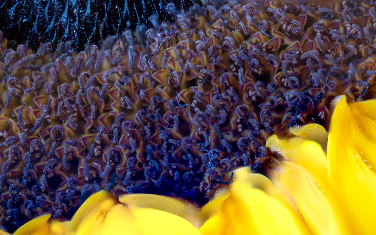
Gloria I like it. I will agree that another version with water drops would be a fantastic idea. personally I love asymmetry so it does not bother me. to counter carol's comment I would suggest a square image crop which would minimize the blue and still let the flower be in the corner. |
Feb 19th |
7 comments - 0 replies for Group 95
|
7 comments - 0 replies Total
|