|
| Group |
Round |
C/R |
Comment |
Date |
Image |
| 95 |
Dec 22 |
Comment |
thanks all. I kind of knew that you would all say about the foreground... and I did it anyway... based on my reality viewpoint... that is really what I was seeing. now complicated by fact that the pressures were aging, less flexible joints.... I was down at street level and it was uncomfotable and hard toes what the camera was getting and holding the camera and trying to stay steady. I was not even sure what I had that had any focus till I got home. i cropped out foreground but it seemed too cleansed for me. the cropped one you did is fine too. I do like the DIAGONAL EFFECT also, that is a good one. I did overhead and down low for different perspectives. I agree it is not perfect but as Carol mentioned it is along the lines of mystery about what the item is that I like in macro. |
Dec 18th |
| 95 |
Dec 22 |
Comment |
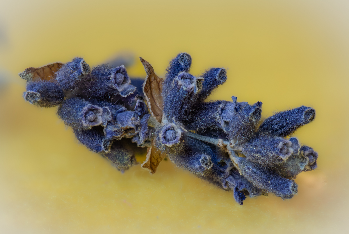
Carol, I love it... fan of the ethereal... another one presented so well & feeling is there. we have talked about backgrounds and I am a fan of learning that and archiving backgrounds - this looks like a good way to present it. I don't see any distracting edges? what I am looking for is use of "object selection" for copy /paste... I have not done enough but some my preliminary ones show my novice try. which techniques are you using? |
Dec 18th |
| 95 |
Dec 22 |
Comment |
Keith, I love it. the colors and texture are great. I feel the macro with the small strip of focus is with majority of frog in it which is amazing and what is soft focus on frog is appropriate to make me feel macro. good fortune to have frog on a solid grey background - good eye to catch it there. |
Dec 18th |
| 95 |
Dec 22 |
Comment |
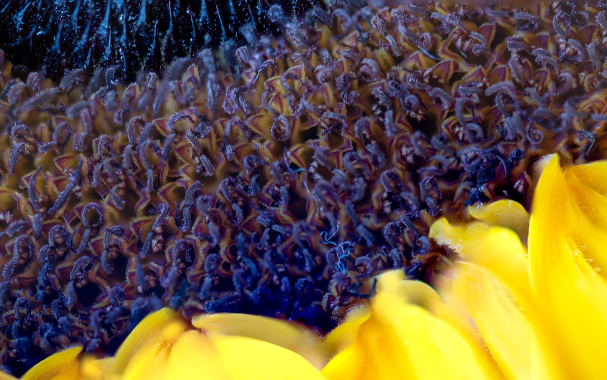
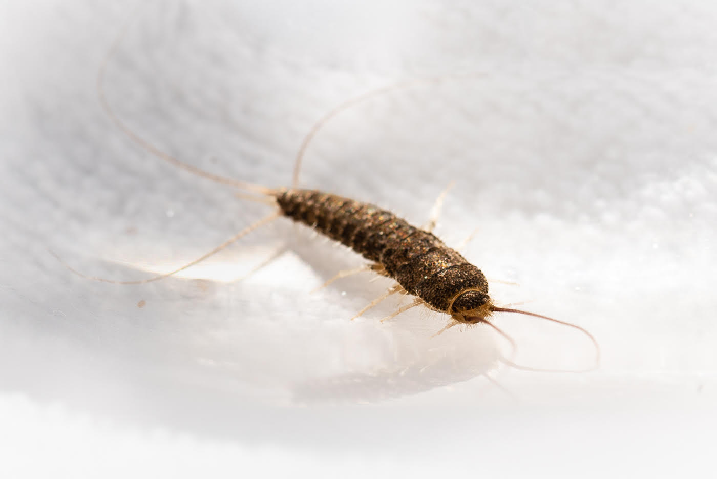
Tom, agree with above... front fine. no wow for me, highlight spots distracting. this is where some of my concepts come from... I sometime shoot something and try to find it macro interesting and I don't find it. I still want to see those images and hear what is said. [other than mine, ha]. I think the bug itself is so monochrome... unlike Stuart fly which has zap of color & design. so the bug is to blame!!! an alternate to make the monochrome bug shine might be if overhead more to see more structure develop... is the back of bug round/oval/long. |
Dec 18th |
| 95 |
Dec 22 |
Reply |
can you take a photo of your set up. I am looking at your rail. anyone who want to share what rail they have in US ordering system [sorry Stuart]. I mentioned I think mine was a lemon. the one I have was nice because it moved vertical and horizontal but too much play in one of the knobs. |
Dec 18th |
| 95 |
Dec 22 |
Comment |
Stuart, stunning. Stuart I looked at fly before I read your summary... NO STACKING! I assumed stacking - abdomen is stunning detail and makes sense that wing and legs have the out focus look [not distracting]. and everyone else has already stated what I saw after the fly.... red too saturated in original. but at my level if outside if I am following a moving subject it is hard to worry at the moment about the supporting cast like the whole flower... agree with comments but it does not bother me. the dark background works fine for me. I like the shot of tail close to highlight back of fly. |
Dec 18th |
5 comments - 1 reply for Group 95
|
5 comments - 1 reply Total
|