|
| Group |
Round |
C/R |
Comment |
Date |
Image |
| 95 |
Feb 22 |
Reply |
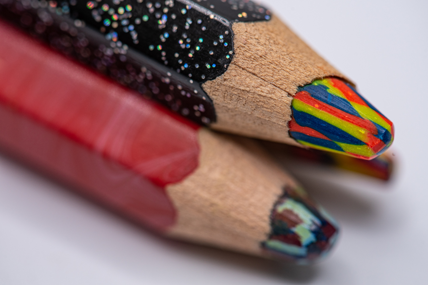
wow, the black background is a great alternative. makes this white and the orange so striking!
|
Feb 19th |
| 95 |
Feb 22 |
Reply |
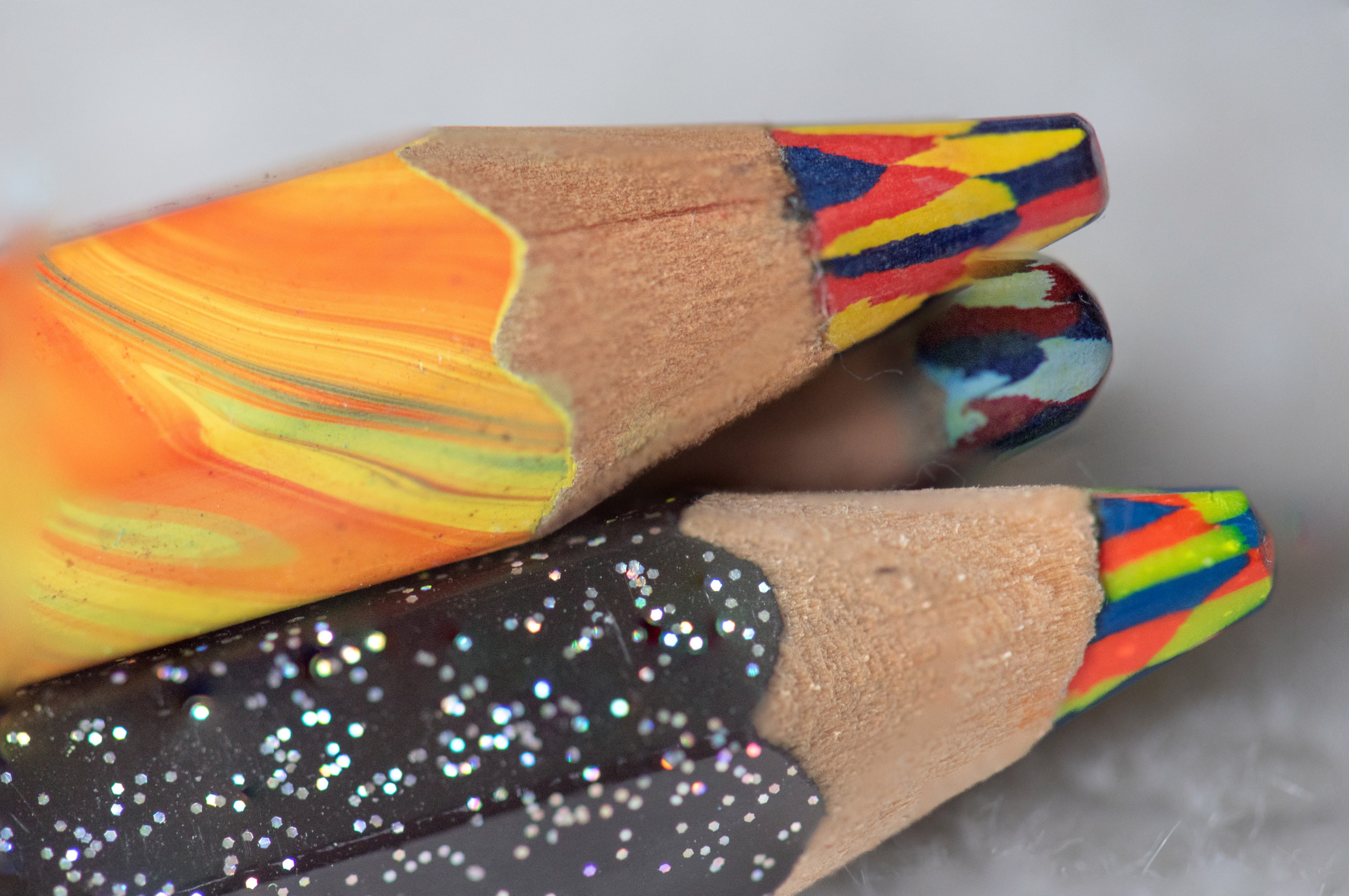
thanks Tom, you guys were great at noticing that third pencil. I actually had not heard about the odd # vs even ... so now all of you have me thinking.
|
Feb 19th |
| 95 |
Feb 22 |
Reply |
Stuart looks like you have a whole room for this equipment. I need something that fits in my pocket but would love a whole room instead. I am looking at these items in near future :-) |
Feb 19th |
| 95 |
Feb 22 |
Reply |
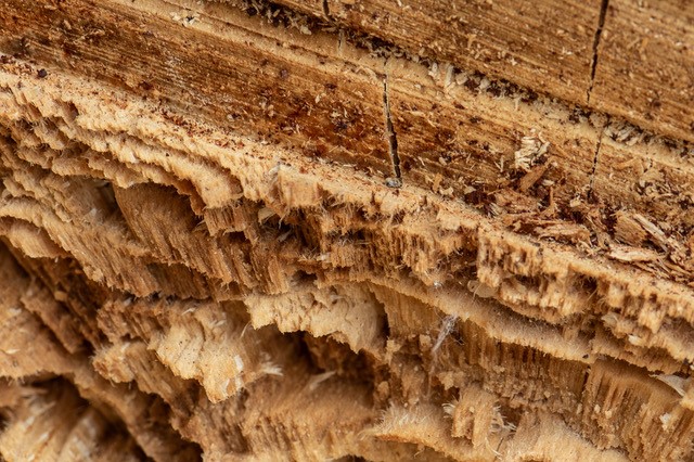
when you say focus stacking you mean the "thing I don't do" . I do want the 'out of focus' - in my quest for what makes an interesting macro without stacking. basically, I wanted the colors of the black pencil in focus - red pencil was meant/assumed to be out focus - red was part of the quest for putting other items in a photo but not having them be the focus point. I did kind of like this photo myself, closer to what my quest is. Now Stuart's comment about the third pencil is interesting but you even think red pencil is unnecessary [you like 1 or 3 pencil?]. 3 pencils are there to make tiers so things are on different focal planes. I need the 3rd pencil to give the black height which puts the red on different plane then black. should 3rd pencil be more/less in photo - I guess I could pull back totally. the best surprised for me was that the wood was in focus which gave great texture - then the focus starts trailing off. |
Feb 13th |
| 95 |
Feb 22 |
Reply |
as always Stuart you have great suggestions. so, we are not talking about stacking .. you are just saying buy the rail to "bracket focus" [making up my own terms]. seeing the amazon ad helps. I am thinking now about the third pencil. I did not put a lot of thought into third pencil while shooting.... just focus of the black and the red. |
Feb 13th |
| 95 |
Feb 22 |
Comment |
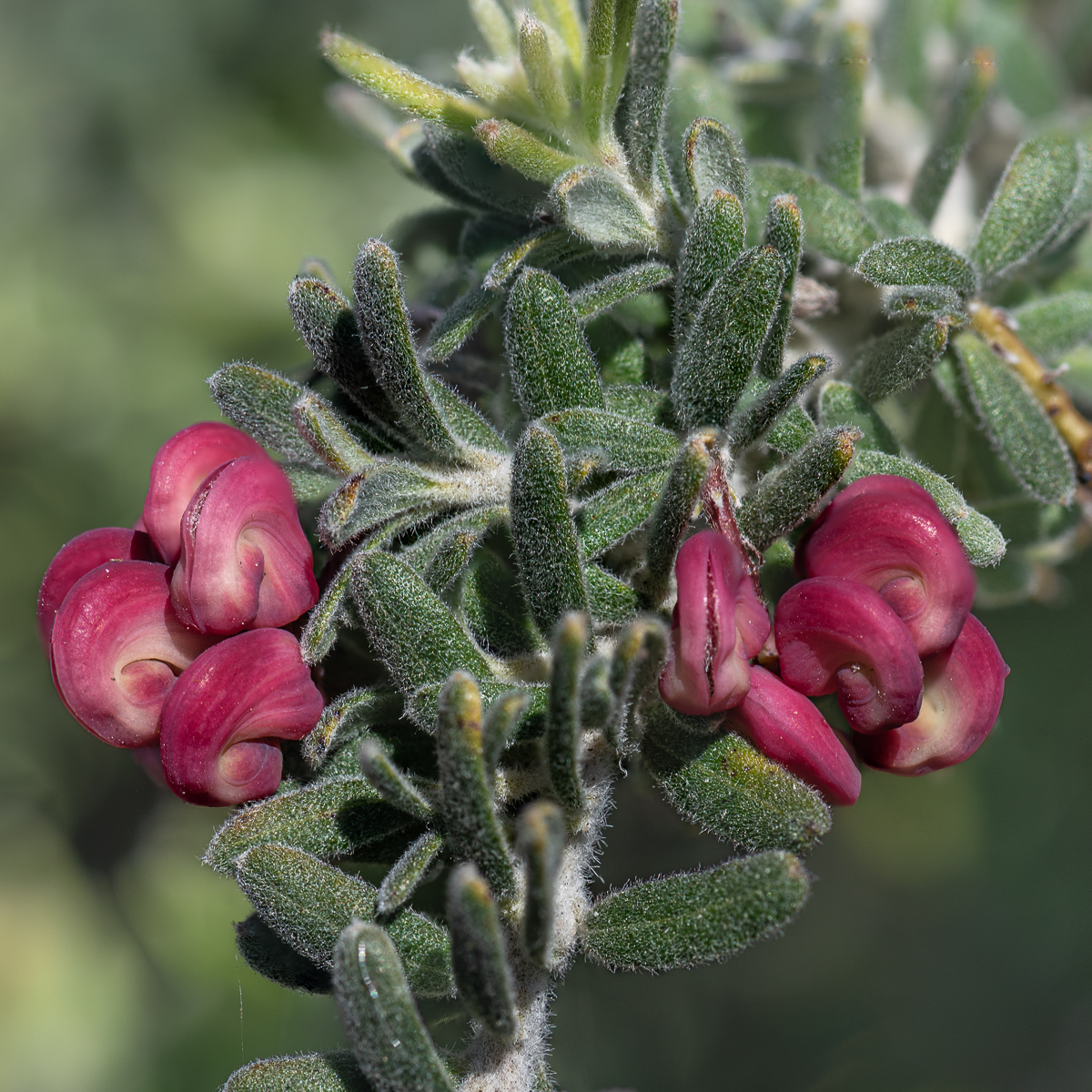
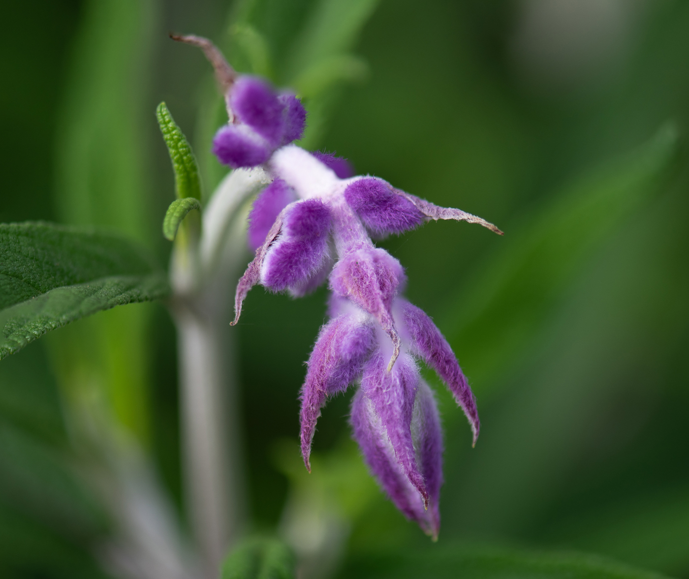
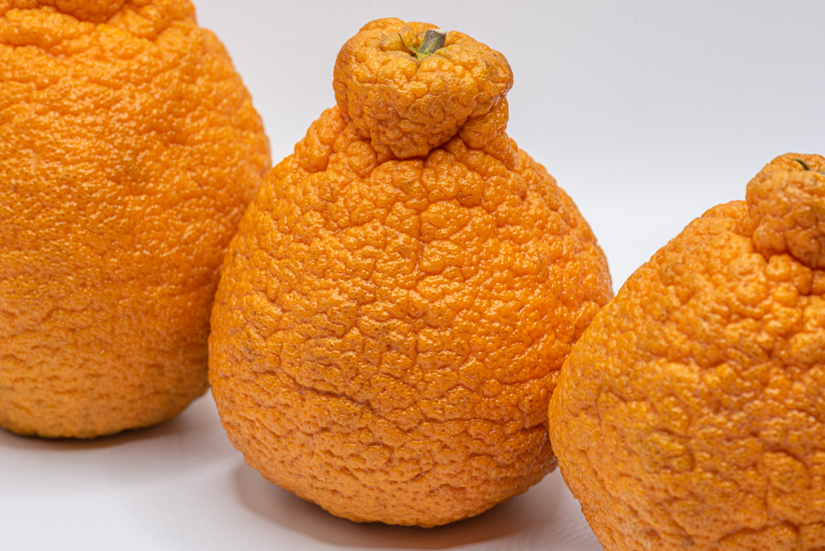
welcome Bernie!!! it is a beautiful composition. I have not seen that type of flower before. the wheel of orange surrounding it is my favorite part. all looks nice and focused. I agree with Carol. I assumed it was not a macro shot - for sure you would have lost the orange parts or the orange could be the macro focus. the white part of the flower may have too many highlights for me, just a touch less highlight. |
Feb 13th |
| 95 |
Feb 22 |
Comment |
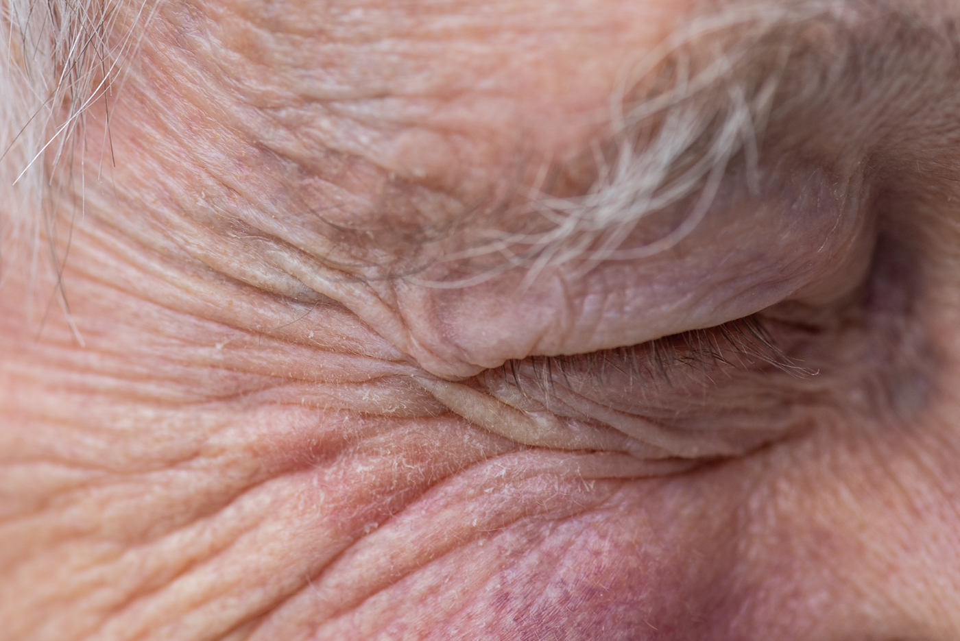
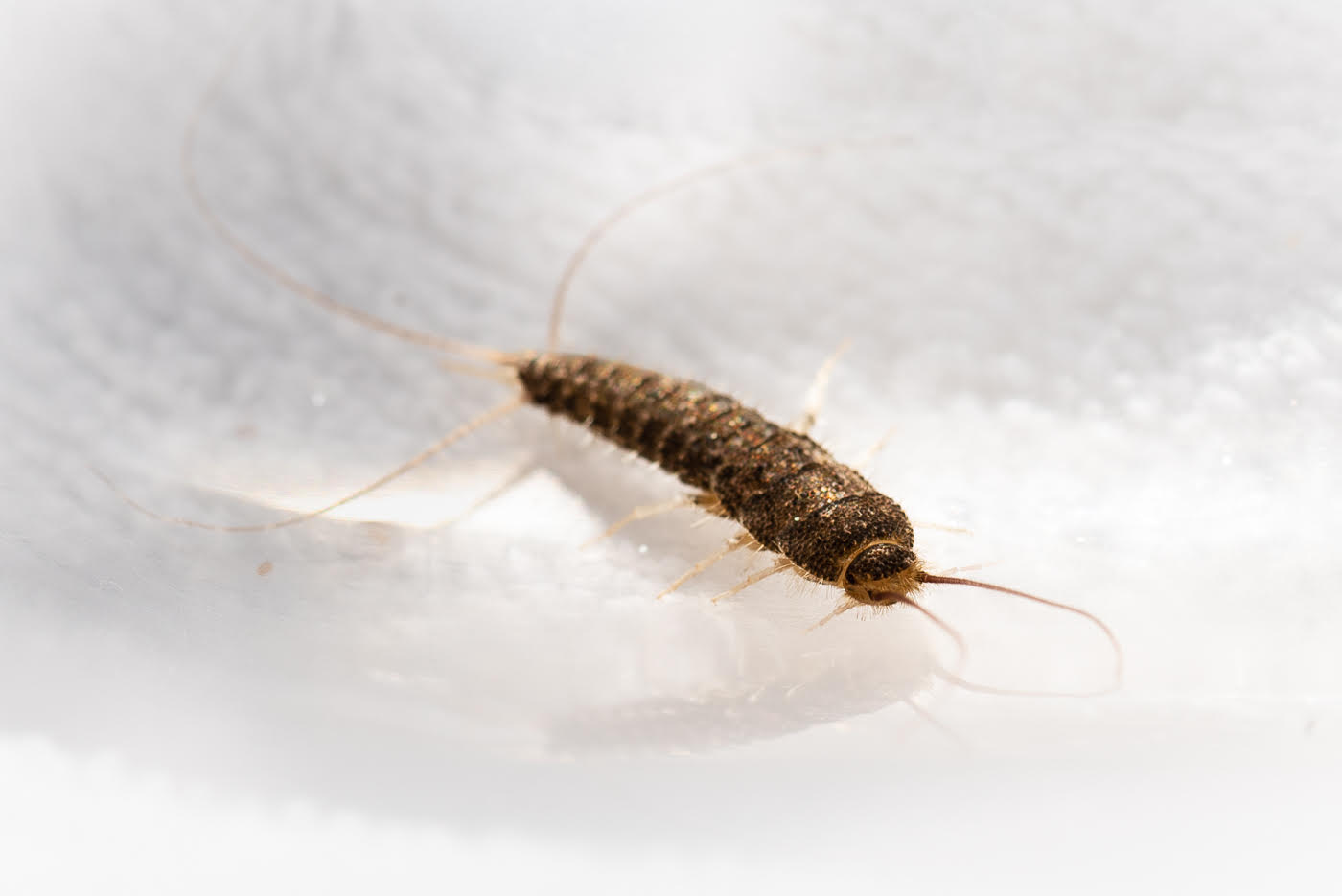
if you did not tell me what it was I probably would not have figured it out. it does looked monstrous. I do like the part of you finding something weird and seeing what you can make of it. I am having a hard time sorting it out myself... thinking the shadows are so dark that I cannot make it out. the top part almost looks like a LIP also beside a cyclops eye. I think I need something else out of the hair clip .... maybe some image in the background. I think it is one of those experiments that you don't know how you will really use it until some projects arises and you say ah ha the hair clip.
|
Feb 13th |
| 95 |
Feb 22 |
Comment |
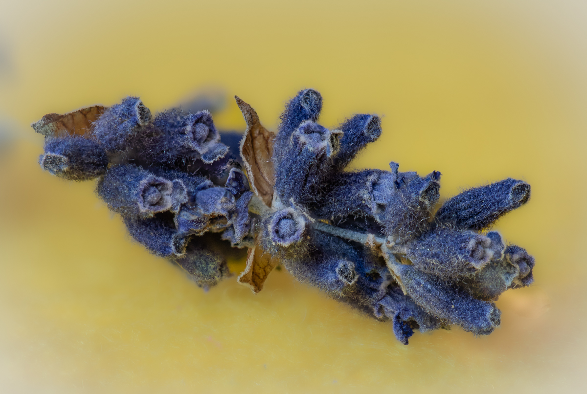
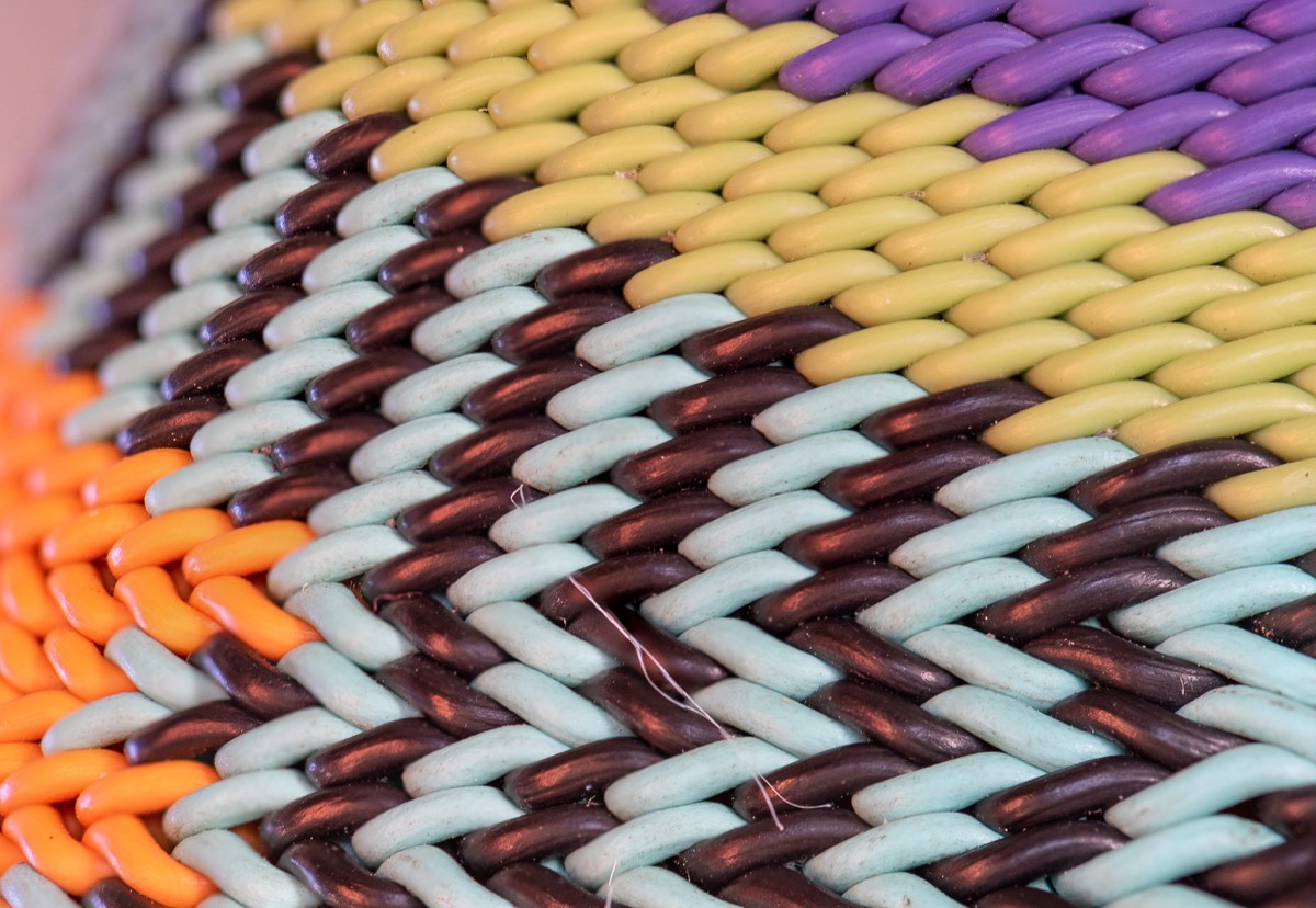
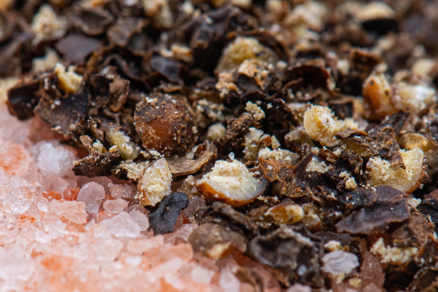
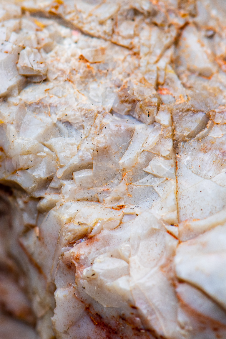
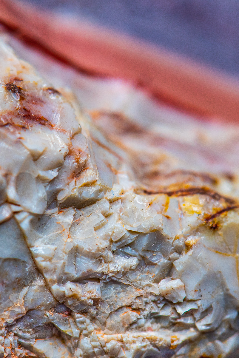
the shell is beautiful to look at, so, yes it was was worth the effort... since you are asking :-). top tiers have nice texture with the ridges showing, my eye goes there firsts then drifts down to the softer lower tier then fades away with the focus fading away. very nice. I like the asymettrical framing off to the side. the white spots should stay. I think of it like salt... plucked out of the ocean... or maybe sand also. ohhh here is a good one... photoshop replace blue background with ocean/waves. |
Feb 13th |
| 95 |
Feb 22 |
Comment |
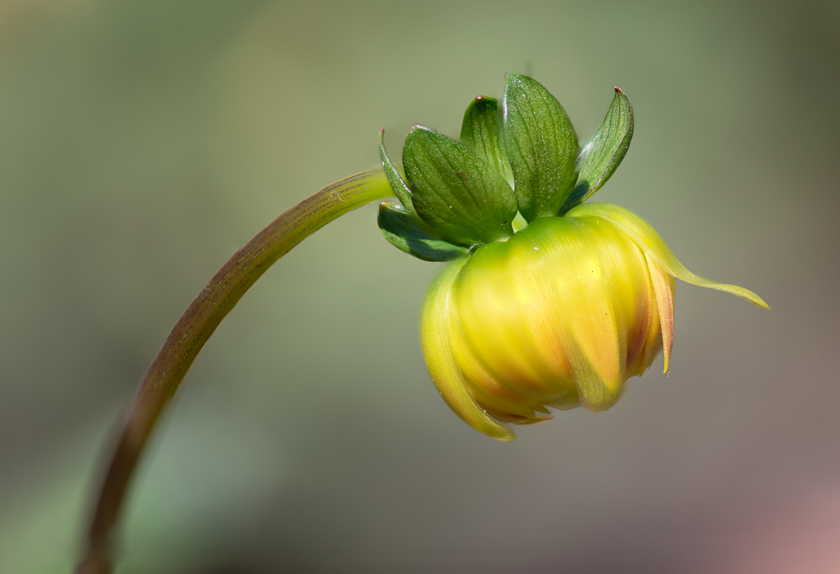
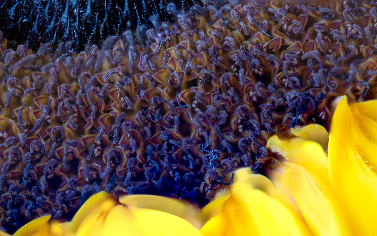
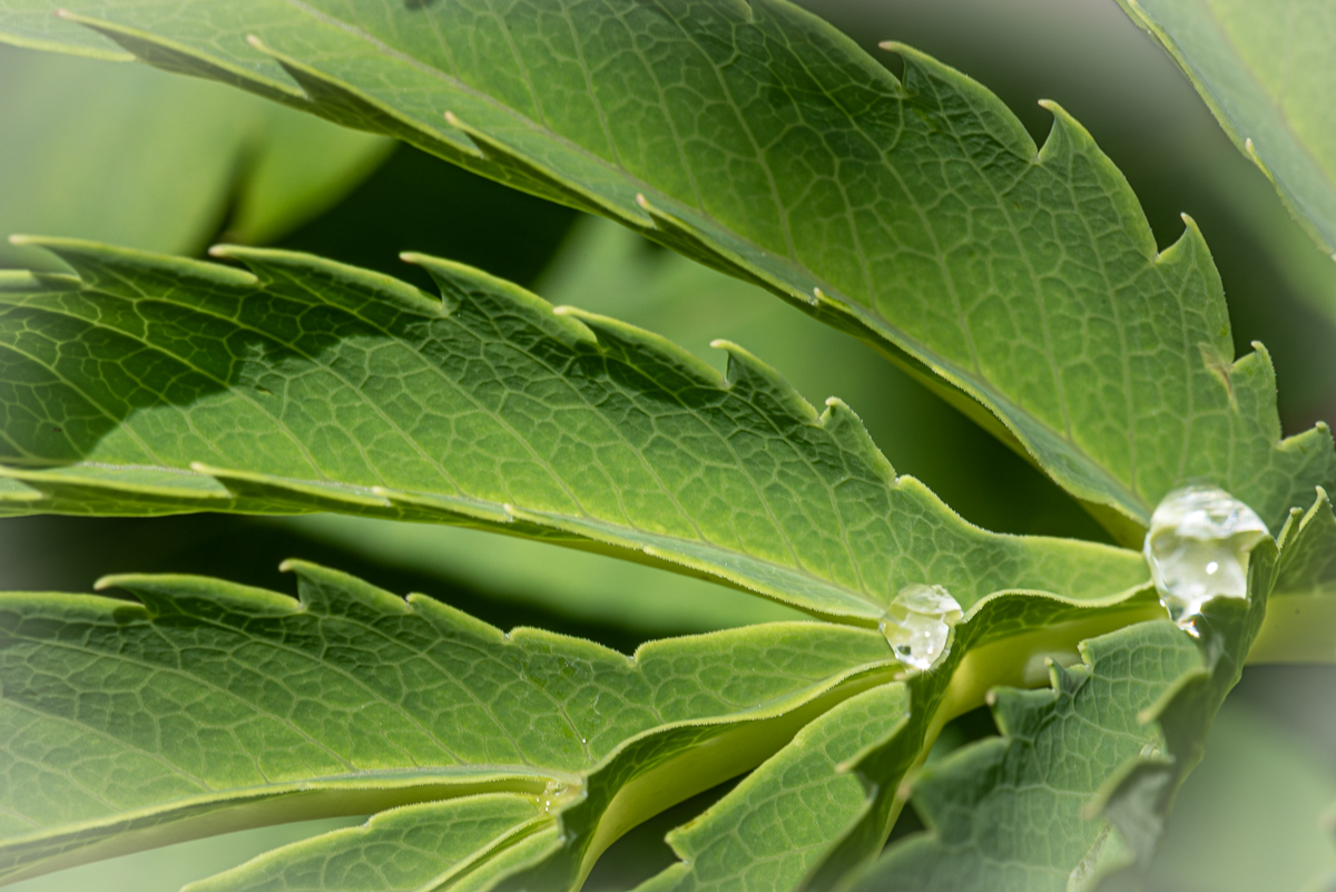
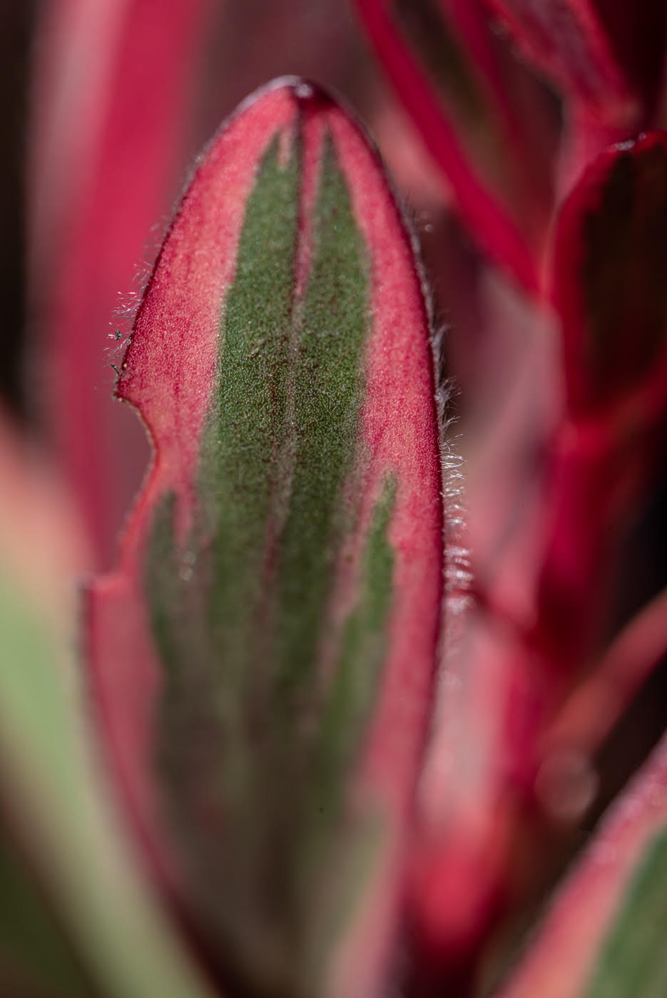
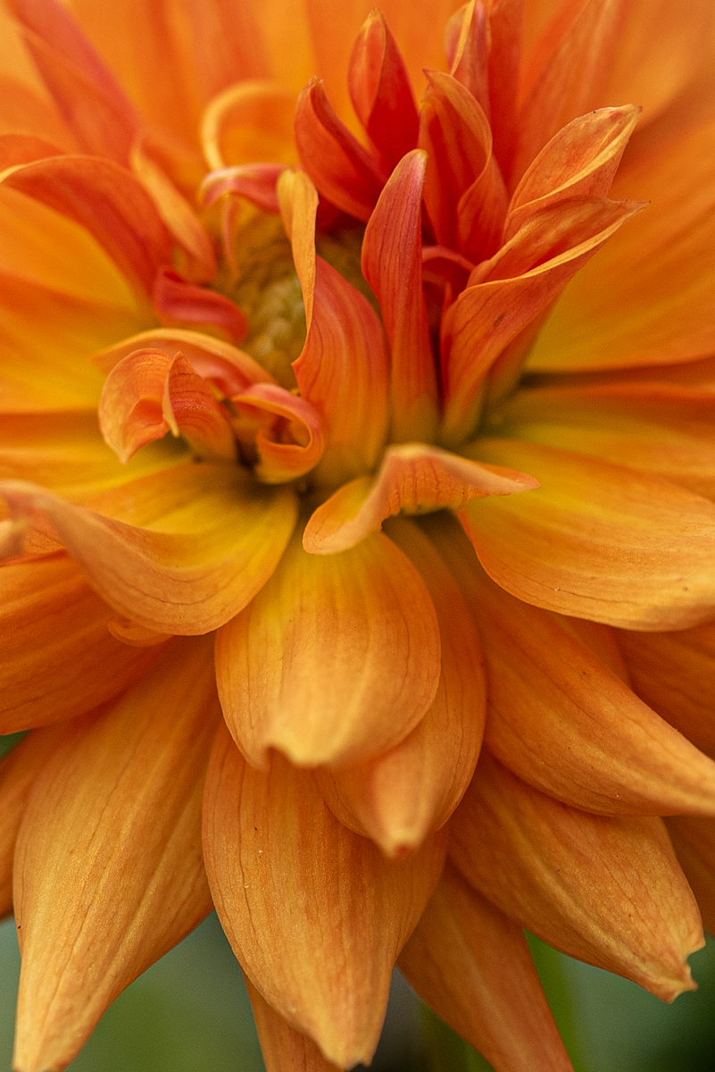
Very pleasing flower to look at. you choose f4 so I feel that I am to fall into the softness of the flower. the orange gives beautiful striping/petal tips - orange is what really make the photo for me. the orange has a few levels of tiering down into the flower... like falling into soft pillow effect. overall very pleasing to look at. |
Feb 13th |
4 comments - 5 replies for Group 95
|
4 comments - 5 replies Total
|