|
| Group |
Round |
C/R |
Comment |
Date |
Image |
| 95 |
Dec 21 |
Comment |
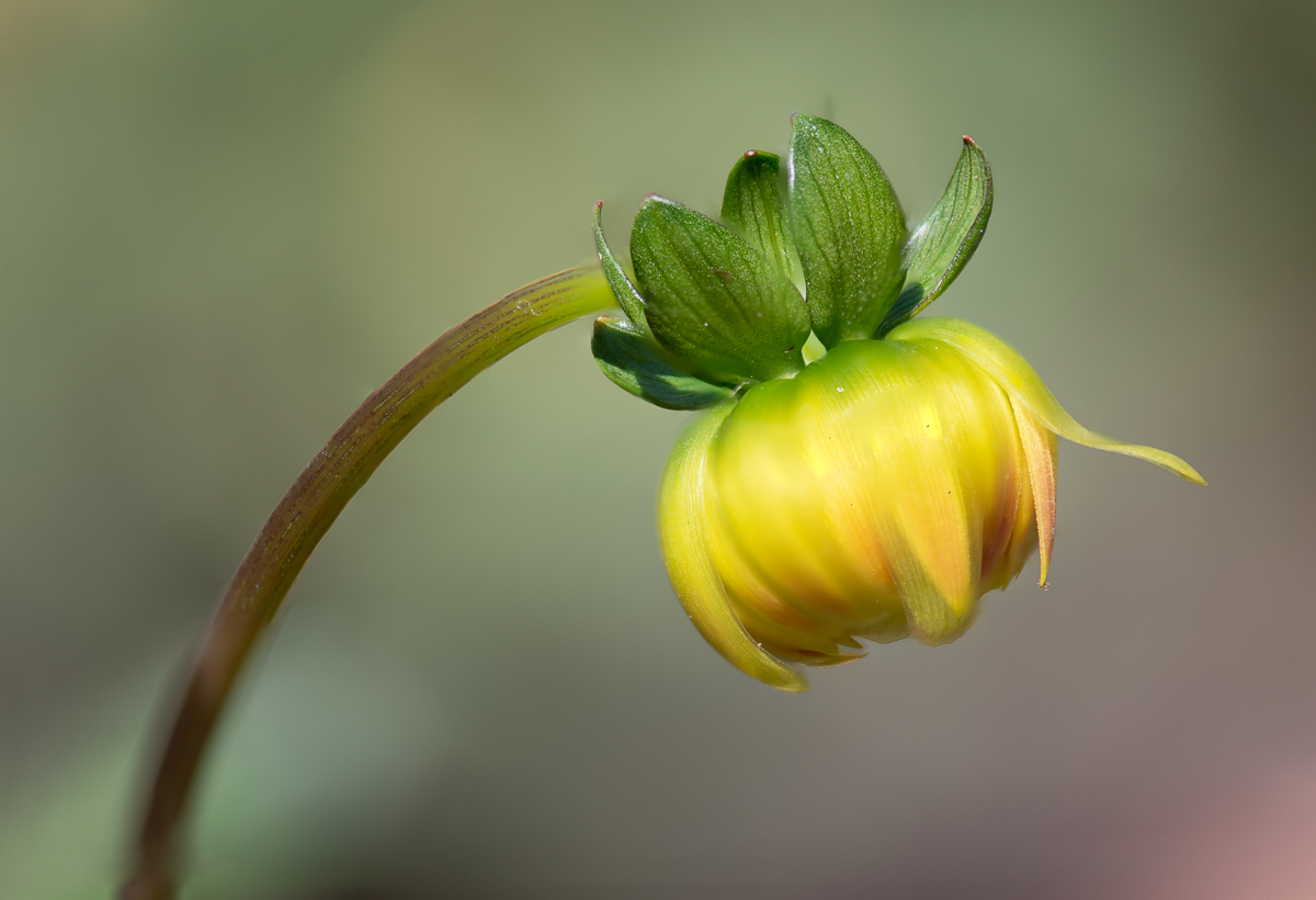
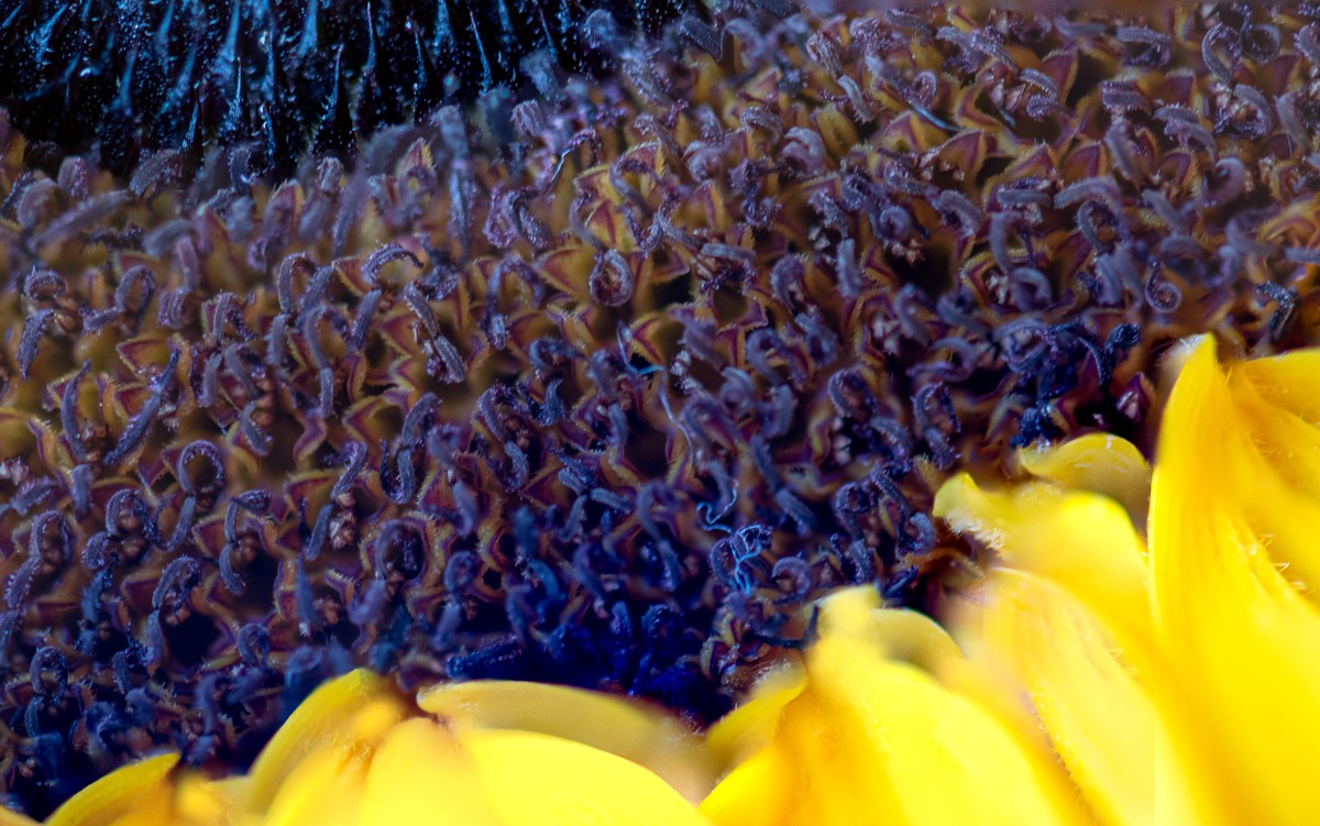
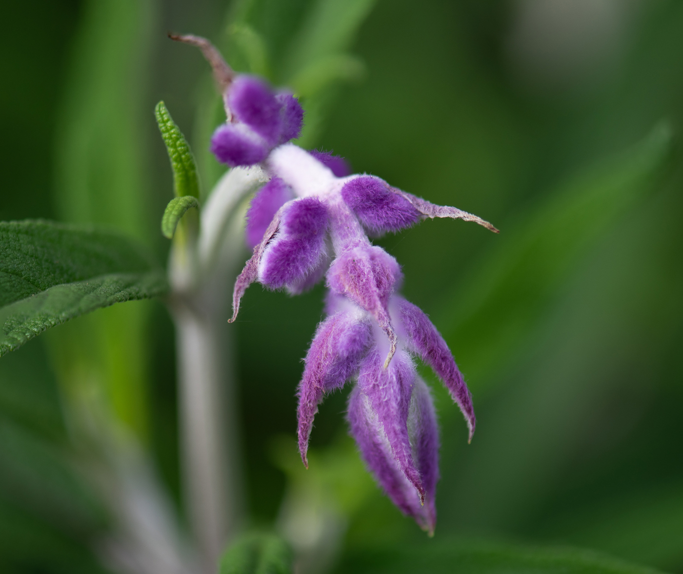
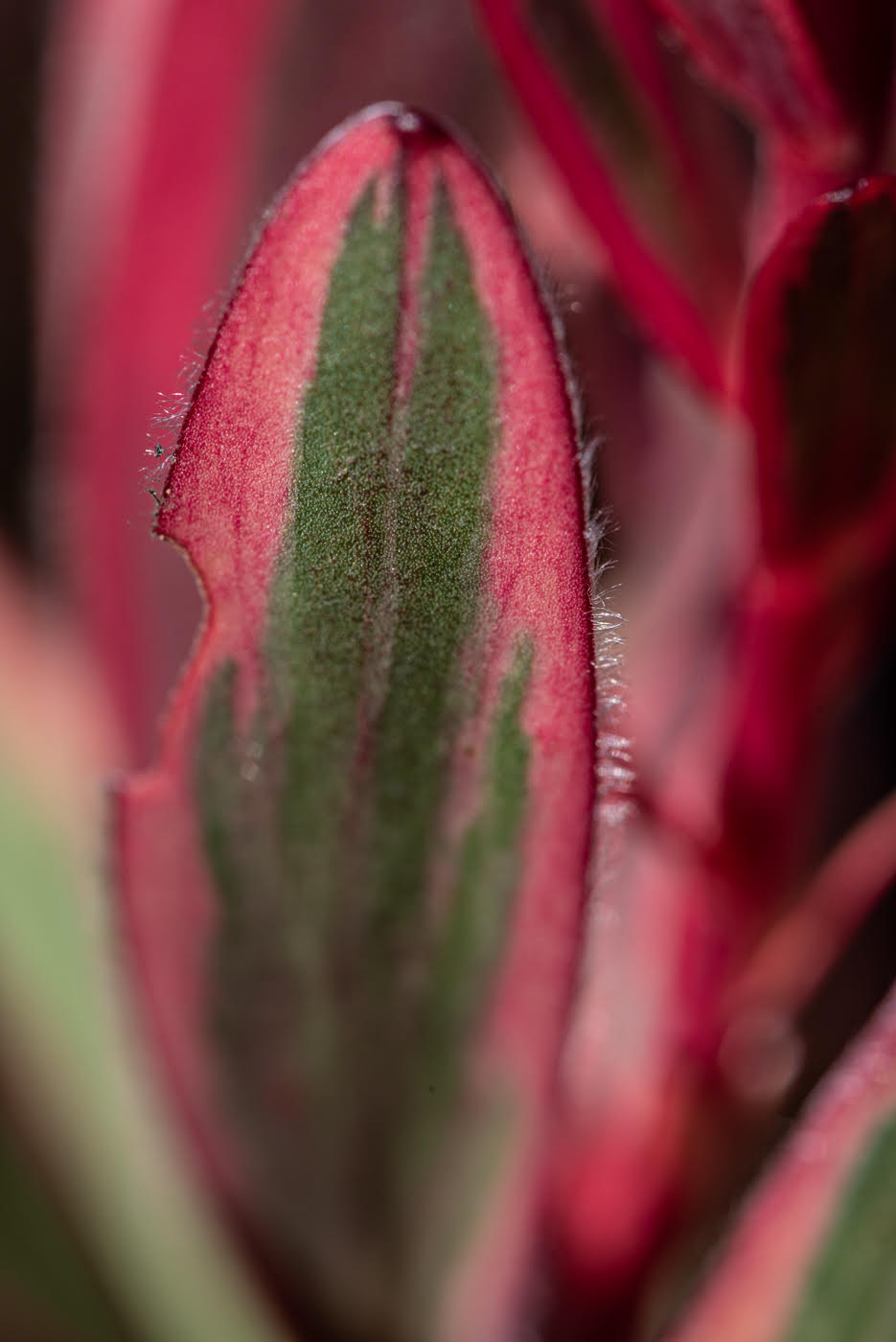
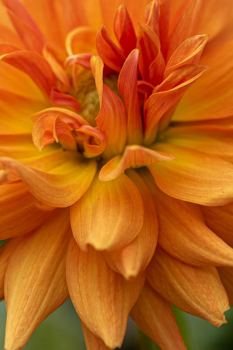
Keith, great flower and positioning of the magnification. I like the asymmetry of the magnified petals. I do feel it is a little bright for me.... I like the deeper red of the original. and maybe if the yellow was not as bright. but I love the cropping and the way the "postal/stamens" [not sure of my plant parts] stand out. original red [unmagnified] has beautiful furrows in the red petals and bringing them out more in the magnified one would be great... less highlights more shadows? |
Dec 20th |
| 95 |
Dec 21 |
Comment |
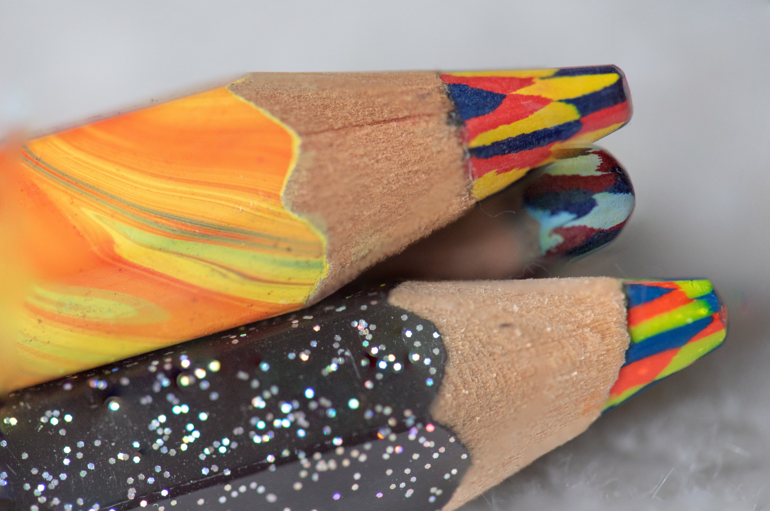
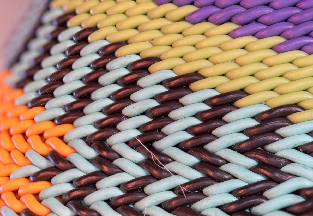
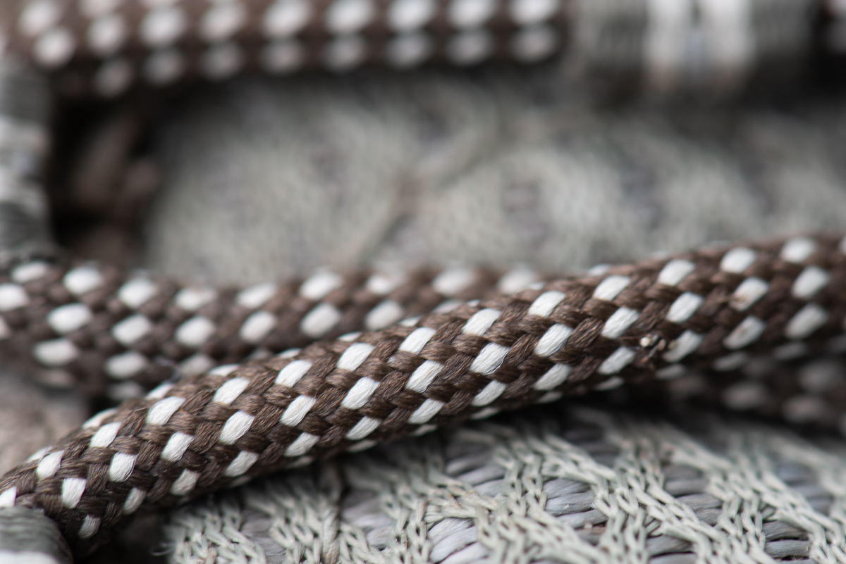
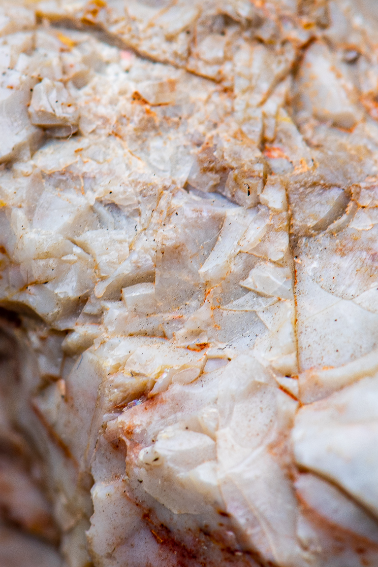
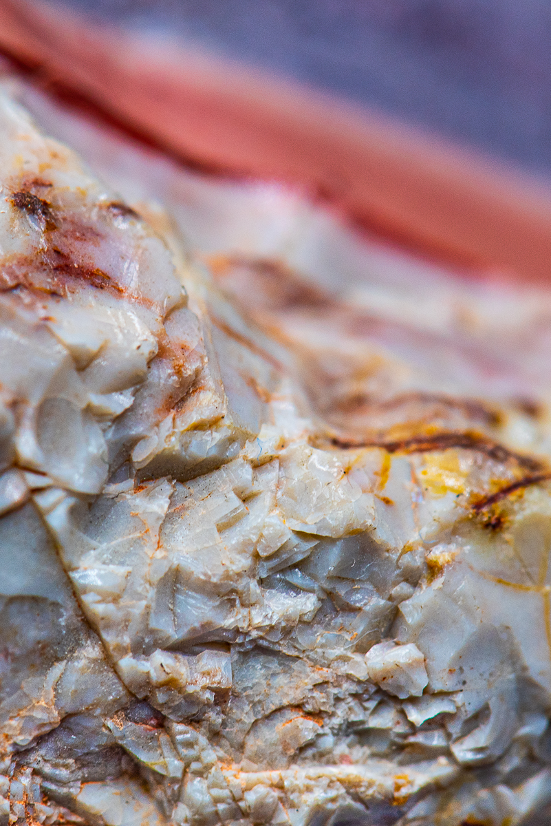
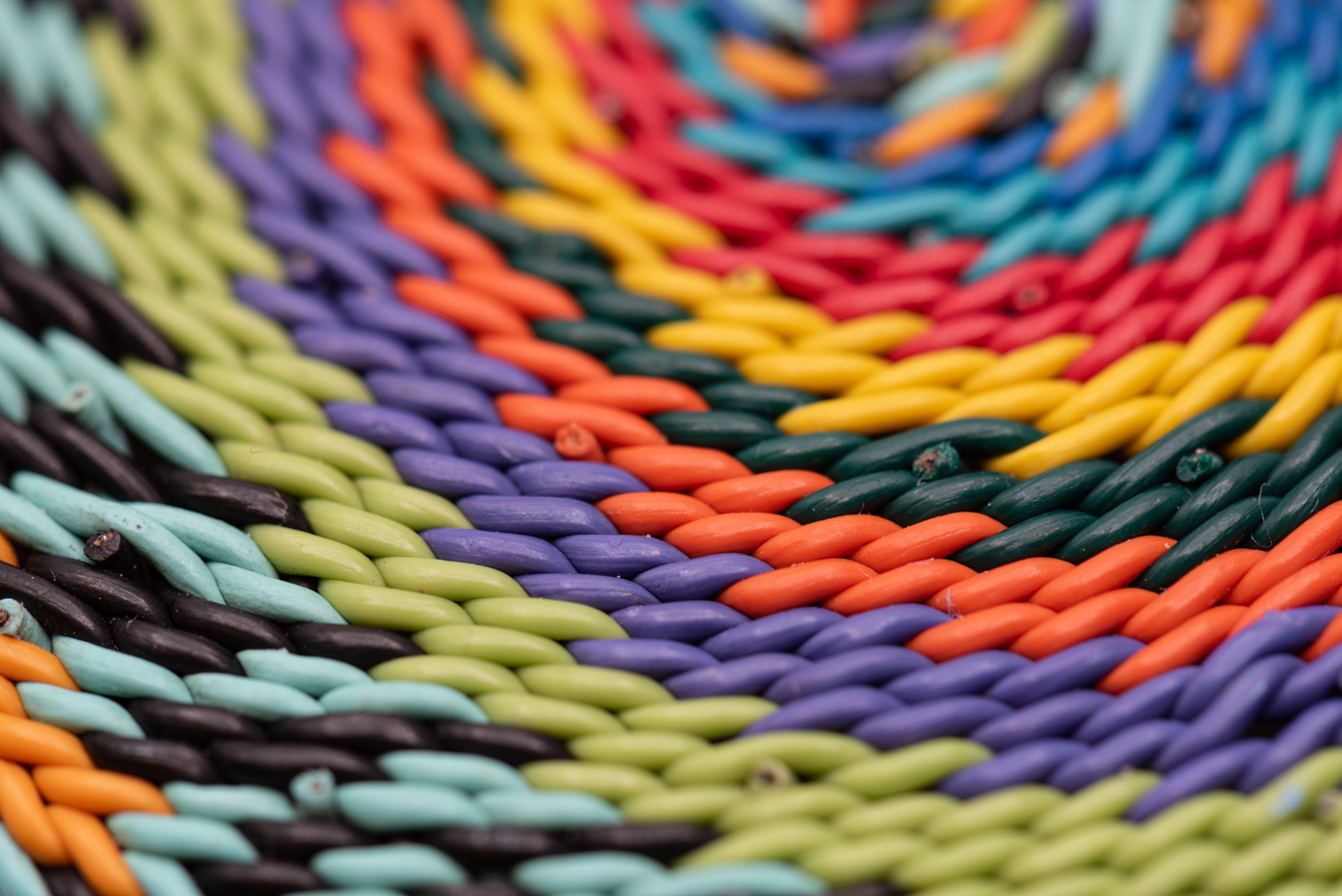
Tom, I see the photo as something I would use for a background - something that gives texture but is diffuse - so it works for that for me [I am collecting a few things like this myself]. I find it hard to find if anything is in focus in the cloth but does it need to be? this works for a background for me whether it is more or less in focus. This looks like a shot overhead of the cloth? what I would want to see is cloth at couple angles to see how the patterns/swirls look. |
Dec 20th |
| 95 |
Dec 21 |
Comment |
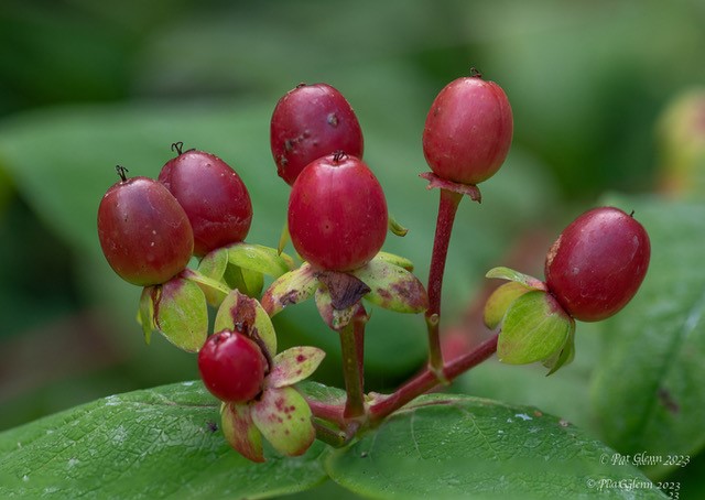
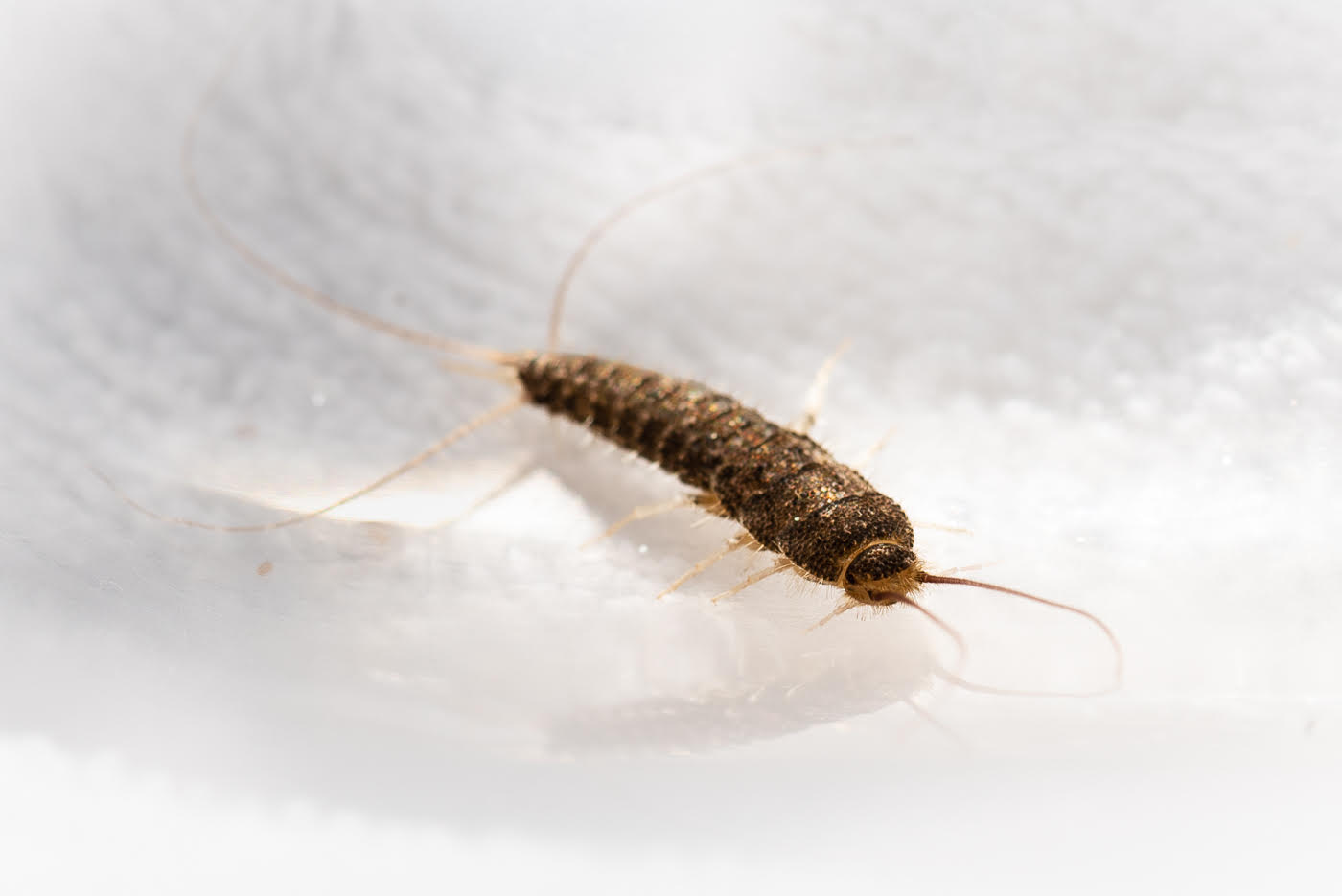
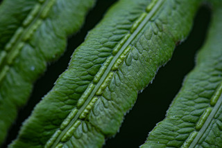
Carol, is that white sand in your backyard? I am seeing the "focus stripe" from the one eye down the length side of the main body... seems like enough focus out of a macro lens. if the highlights where decreased I wonder if more of the frog's back is in focus [just having a hard time telling if it is]. a bit too much which around the frog for me. after chasing some birds and bees in the parks I appreciate how hard it is to get any living things with a macro lens and get focus. |
Dec 20th |
| 95 |
Dec 21 |
Comment |
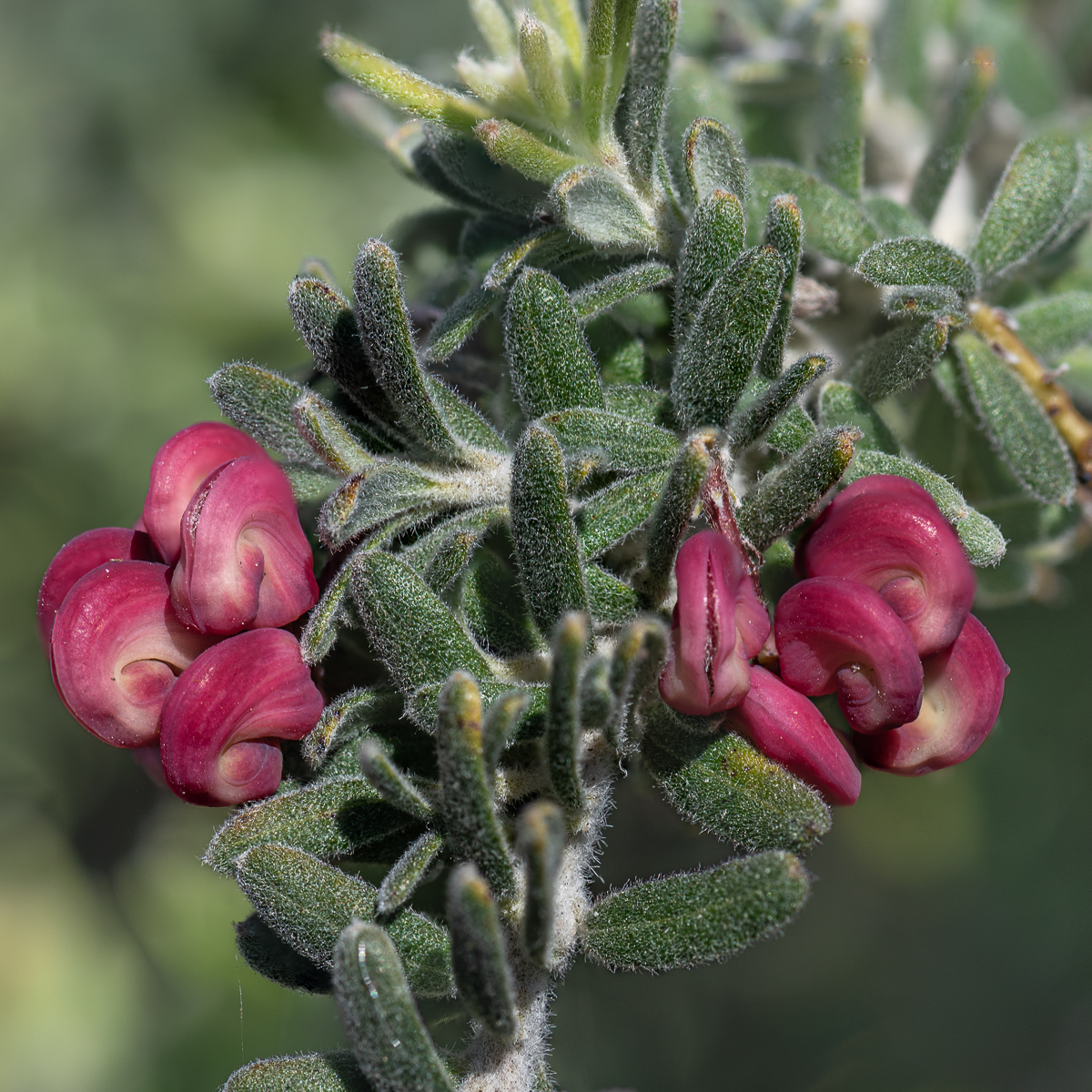
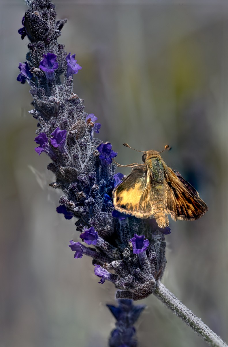
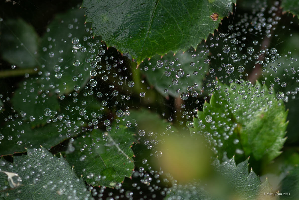
Fran, Lovely!!! so I see the main body/round segment looking in focus and 2 leg segments above body and handful of petals in focus... this seems to be enough for macro. the wings and lower legs look like you captured movement - so all that seems great. the petals obviously are suppose to loose focus as they go to edge of frame.... but give a soft touch to the photo. brown in the insect repeats almost in the brown with the petals...maybe that is wilting petals but colors match. then I love the background is all green & diffuse - so it works for me. is the background in nature or staged indoors?
|
Dec 20th |
| 95 |
Dec 21 |
Comment |
that trio is nice to see. green is pretty also. color inversion means you flip white tips for colors then background became more white. the stacking dramatically changes everything... since I am not there yet with stacking the initial photo is interesting to me as a macro... just a few spikes in focus but that is what you get with macro... still adjusting my eye to that. Nice job Stuart. |
Dec 8th |
| 95 |
Dec 21 |
Comment |
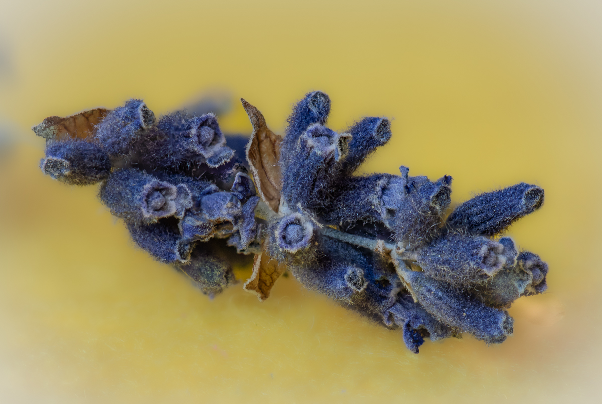
It is striking! all the spikes seem to be focused. it almost looks like a drawing/painting - is that the effect? since it is striking to me I say the color inversion is good - do you have a photo before color inversion? also do you have the original before stacking? |
Dec 6th |
6 comments - 0 replies for Group 95
|
6 comments - 0 replies Total
|