|
| Group |
Round |
C/R |
Comment |
Date |
Image |
| 54 |
Mar 25 |
Reply |
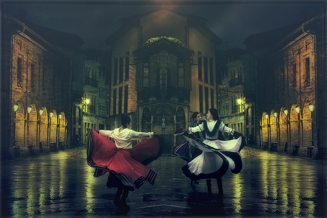
Hi Peggy, thanks for your comment and suggestion. I am glad that you like the image and I agree with you that the border is not very noticeable. |
Mar 24th |
| 54 |
Mar 25 |
Reply |
Hi Matt,
Thank you for your kind comment! I'm glad you like it. I agree with you that areas with more luminosity or contrast act like magnets for our eyes, drawing attention away from the main subject of the scene. I will revise the luminosity in those areas. |
Mar 12th |
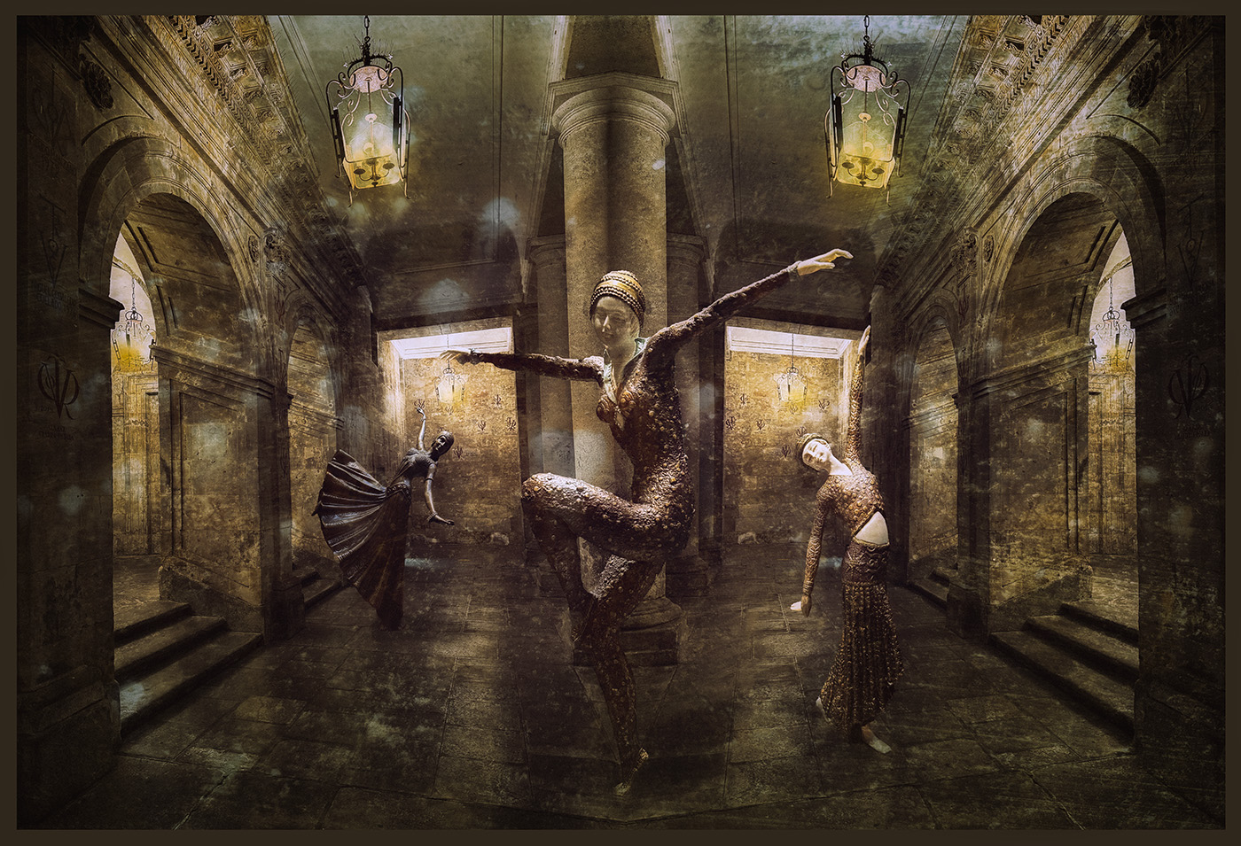
| 54 |
Mar 25 |
Reply |
Hi Kirsti,
Thanks for your comment and suggestion. While I was positioning the dancers, I struggled with their sizes and perspective. I wanted to make them as realistic as possible, but now I agree that making this one a bit bigger would help achieve more consistency. |
Mar 12th |
| 54 |
Mar 25 |
Reply |
Hi Brad,
Thank you for your comment and suggestion. I agree with you that lighting the dancer could improve the overall impact of the image. It looks fine on my monitor, but I think that's because its luminosity is a bit high. |
Mar 12th |
| 54 |
Mar 25 |
Reply |
Hi Alan,
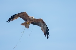
Thank you and your wife for such a nice comment! When I saw these little sculptures in a shop window, they immediately caught my attention. I quickly took some shots because I knew they would make a great subject for a future composite. |
Mar 12th |
| 54 |
Mar 25 |
Comment |
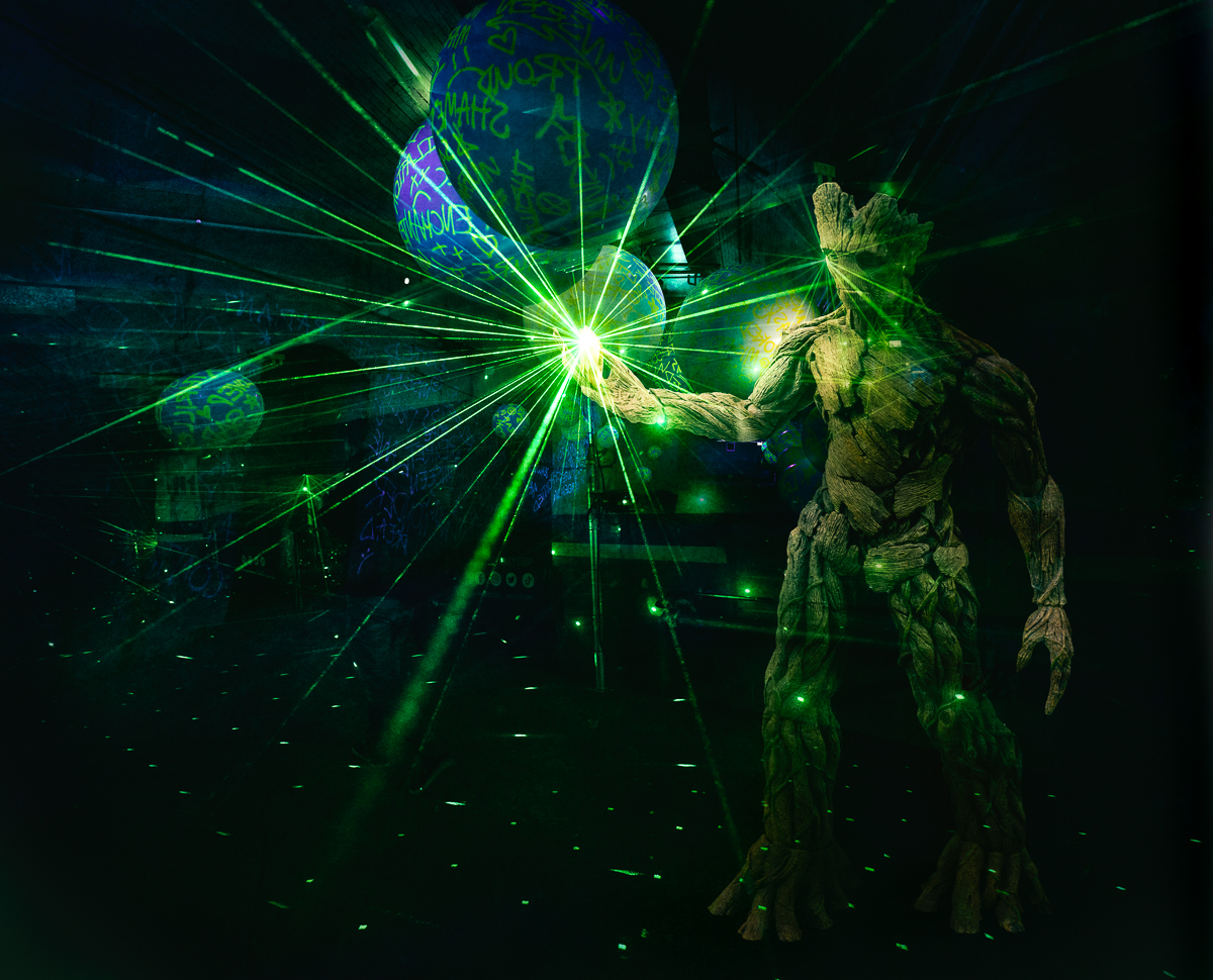
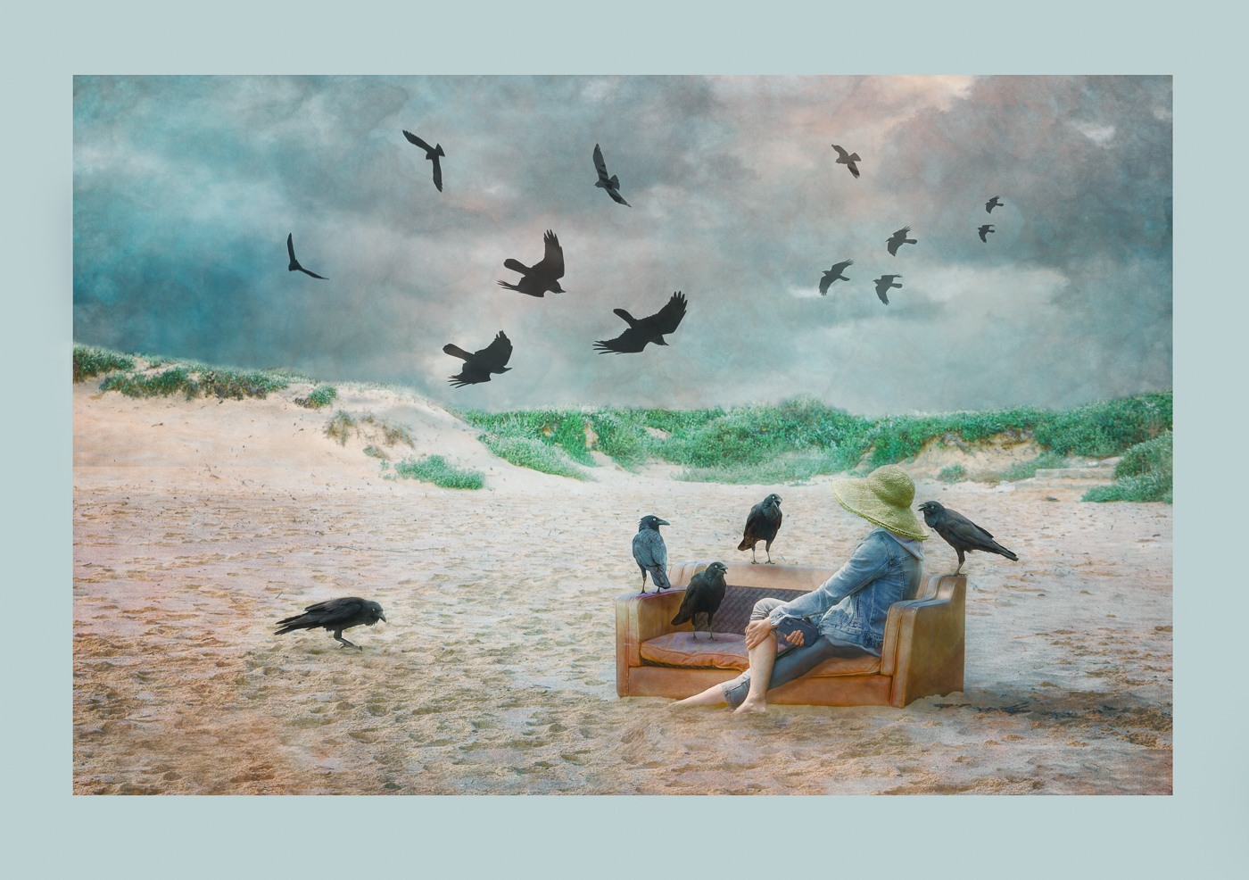
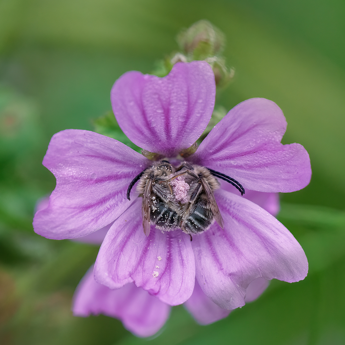
Hi Brad,
I really like your idea of creating this portal in time, placing David in such a different environment from what we're used to seeing. Alan's crop suggestion helps center the attention on the fact that the sculpture is on the tree, though at the same time, it loses some of the surrounding context.
I suggest working a bit on the lighting of David-since he is inside the trunk, the light should reflect the difference in luminosity from the interior to the exterior. To my eye, this gradation is not very noticeable at the moment.
|
Mar 12th |
| 54 |
Mar 25 |
Comment |
Hi Alan,
You are a master at creating these spaces. The gradient ties all the walls together, forming an empty space that can contain everything-like this chess game. I prefer the simplified background, as others have suggested.
The human figure is a very strong visual element in the scene, further emphasized by the red numbers on his clothes. Even his pose creates a visual path of interest, drawing us to observe what is happening. The presence of only one visible hand adds tension and mystery to the story.
I'm not sure about the shadow of the chessboard-it looks too strong compared to the softer light and shadows on the walls. Additionally, the shadow of the feet appears slightly unnatural to me.
|
Mar 12th |
| 54 |
Mar 25 |
Comment |
Hi Matt,
You did a great job with these images, creating a final piece that truly showcases the chaos of the city. I love the vivid colors and the sense of movement and distortion that envelop the entire scene, inviting exploration of what's happening.
There's a clear flow of movement from left to right, drawing me outside the frame, while the dancing buildings frame the scene and lead my eye toward the center. I wonder if shifting the cars more toward the center to create a stronger leading line to the buildings would tighten the composition and strengthen the overall impact. |
Mar 12th |
| 54 |
Mar 25 |
Comment |
Hi Kirsti,
You have created a striking image inspired by Dalí's surreal masterpieces while finding your own path to express creativity in a surrealistic way.
I particularly like your second version without the group of dancers, as Alan pointed out-it creates a stronger visual connection between the Sandman and the bear. I'm not entirely sure about the blue tonality, but as you said, in a surreal world, anything is possible!
|
Mar 6th |
| 54 |
Mar 25 |
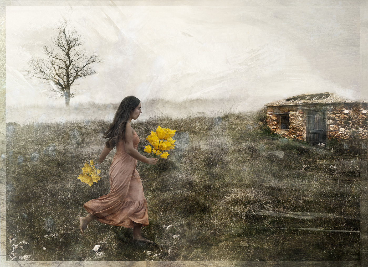
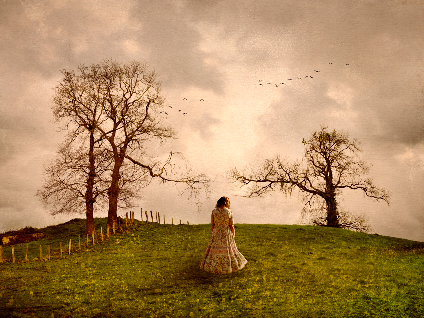
Comment |
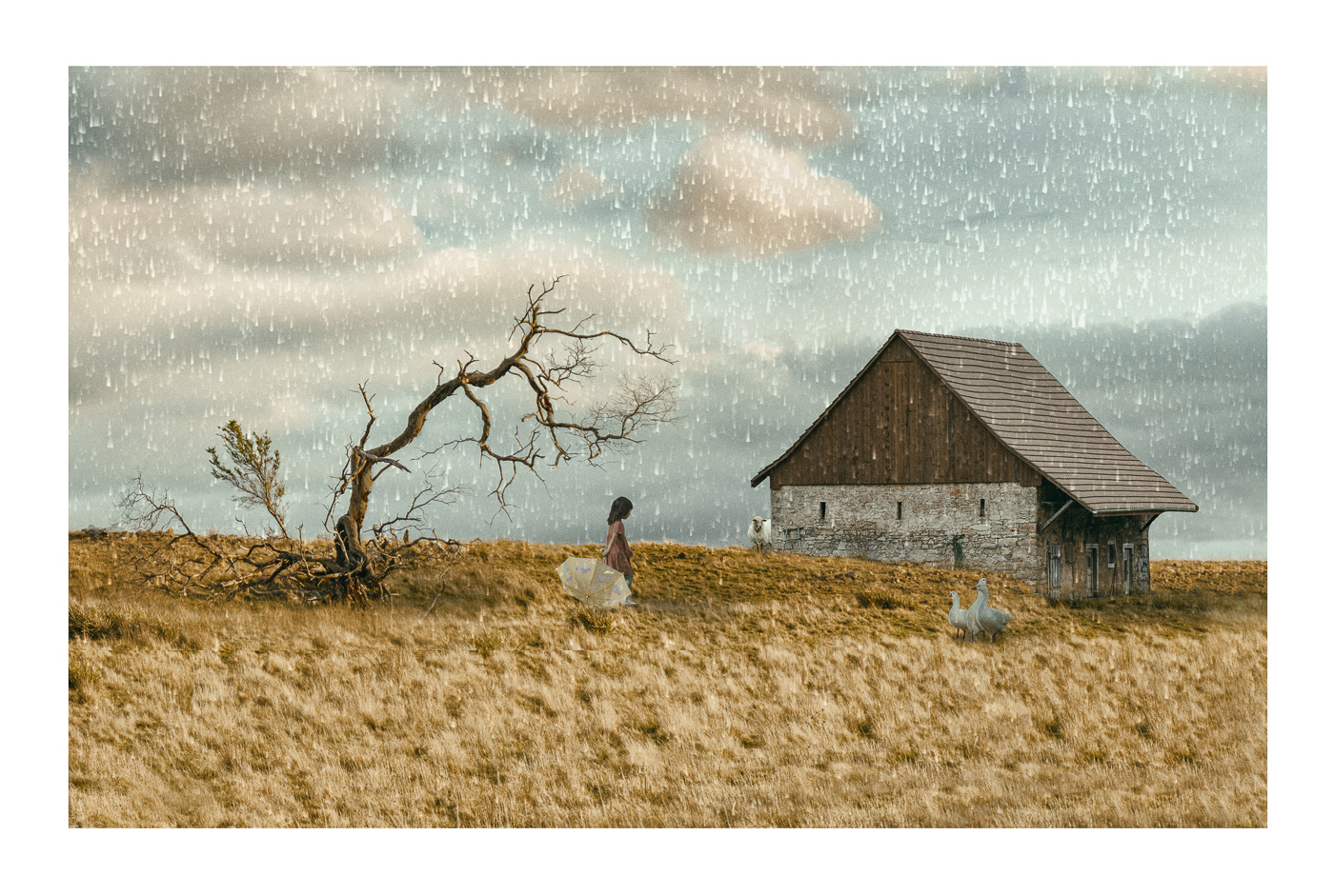
Hi Peggy,
You have taken care of every detail in this creation-the light direction, the shadows, the girl walking toward us, and the colors. Everything works together beautifully to create a wonderful image.
As Kirsti said, you transport us to the grounds of Downton Abbey. Well done!
|
Mar 6th |
5 comments - 5 replies for Group 54
|
| 65 |
Mar 25 |
Reply |
Hi Barbara, thank you for your comment, I really appreciate it |
Mar 24th |
| 65 |
Mar 25 |
Comment |
Hi David,
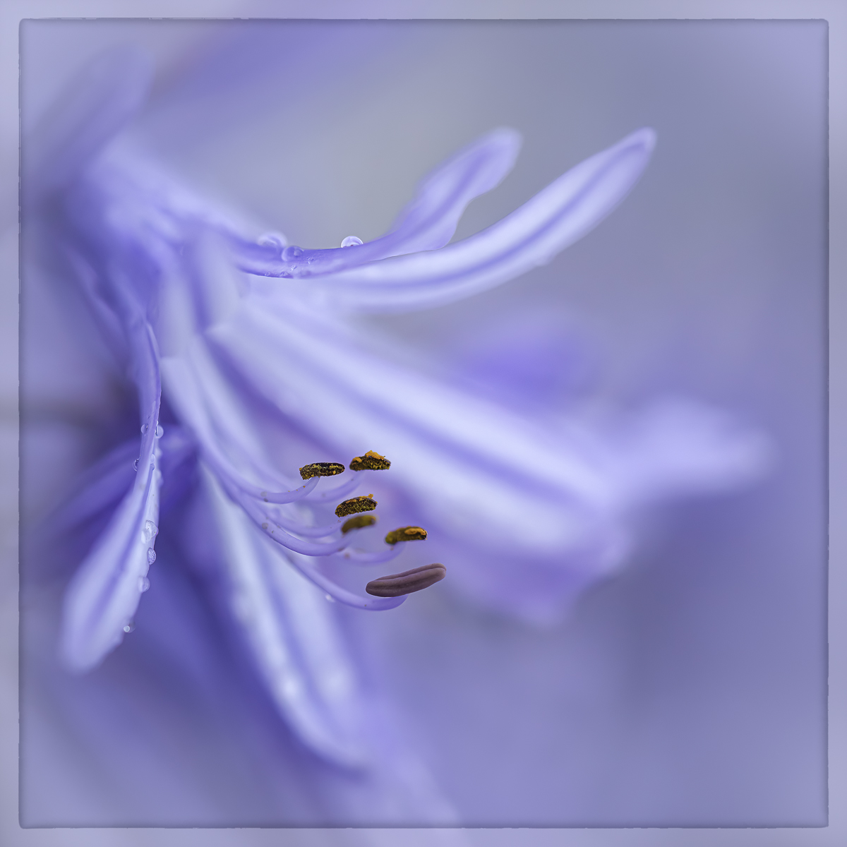
The amount of detail in the stamens of this lily is amazing-I can even count the tiny grains of pollen!
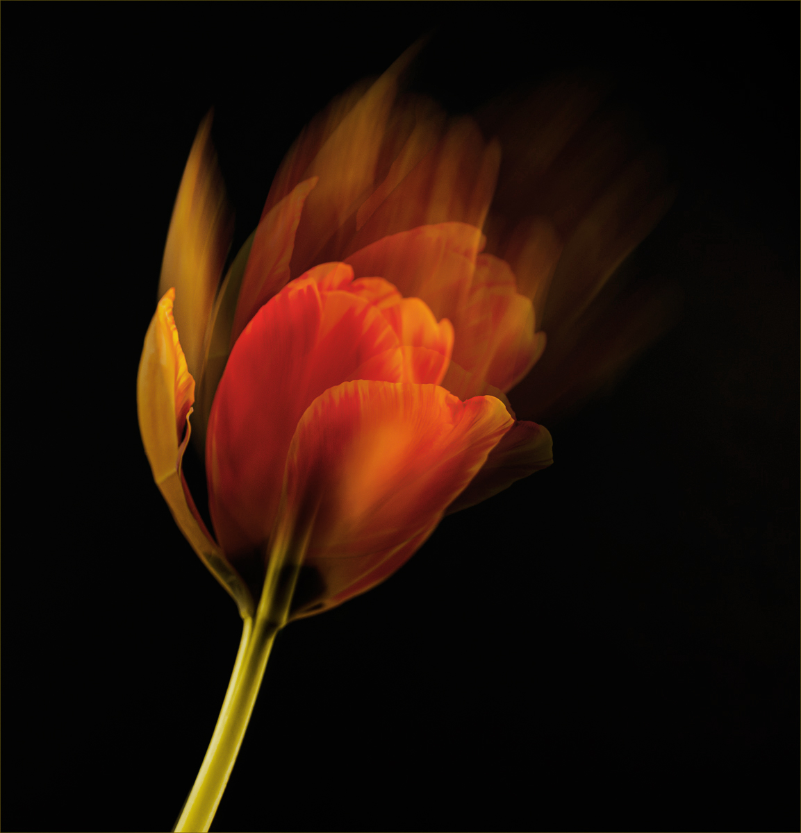
You did a great job capturing this image. I would suggest a different approach to editing. I find that reducing the exposure by three stops introduces a lot of black into the flower's color, which diminishes the visual impact of its beauty and detail.
I brought it into Photoshop, slightly reduced the luminosity of the flower's colour, increased the light around the stamens, and tried a different crop. I hope you don't mind!
|
Mar 6th |
 |
| 65 |
Mar 25 |
Comment |
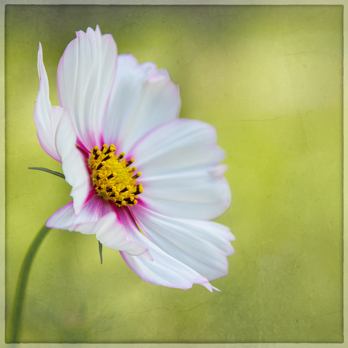
Hi Amy,
I love that this beautiful light caught your attention and that you intentionally created this image to capture the flower. Most of the time, our eyes and brain process information differently from what the camera records, and that is the true challenge of photography.
I took the liberty of bringing it into Photoshop to experiment with a different crop and darkened some areas to emphasize the flower and the golden light. I hope you like it!
|
Mar 6th |
 |
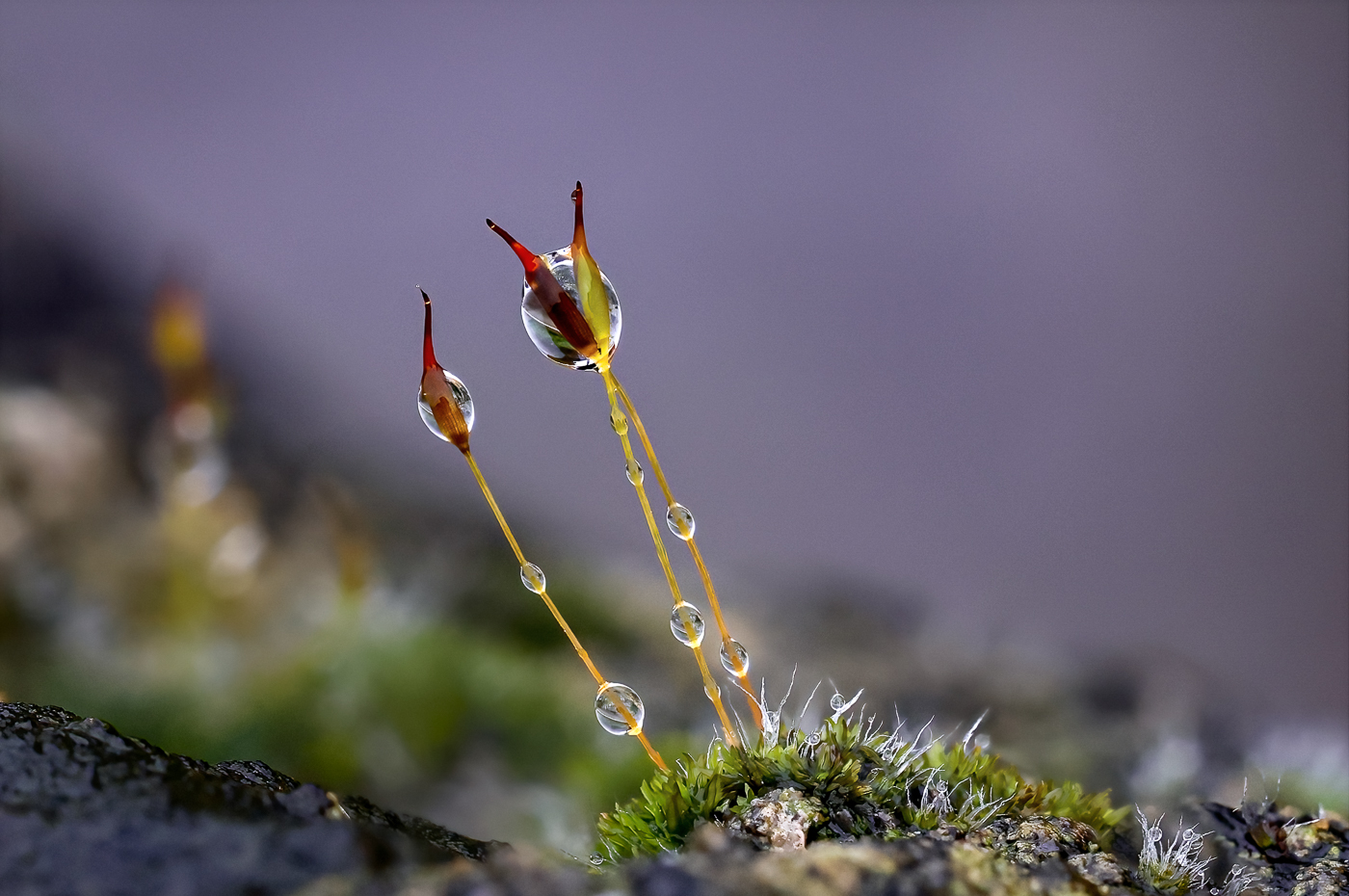
| 65 |
Mar 25 |
Comment |
Hi Dick,
I love this tiny flower growing in such a harsh environment-it's a beautiful example of how nature always finds a way to be resilient, even in the most unfavorable conditions.
While I appreciate the inclusion of the surrounding environment, I find the upper part of the image slightly distracting from the flower. I would suggest creating another version with a square crop to remove some of the upper area or darkening that section to make it less prominent.
|
Mar 6th |
| 65 |
Mar 25 |
Comment |
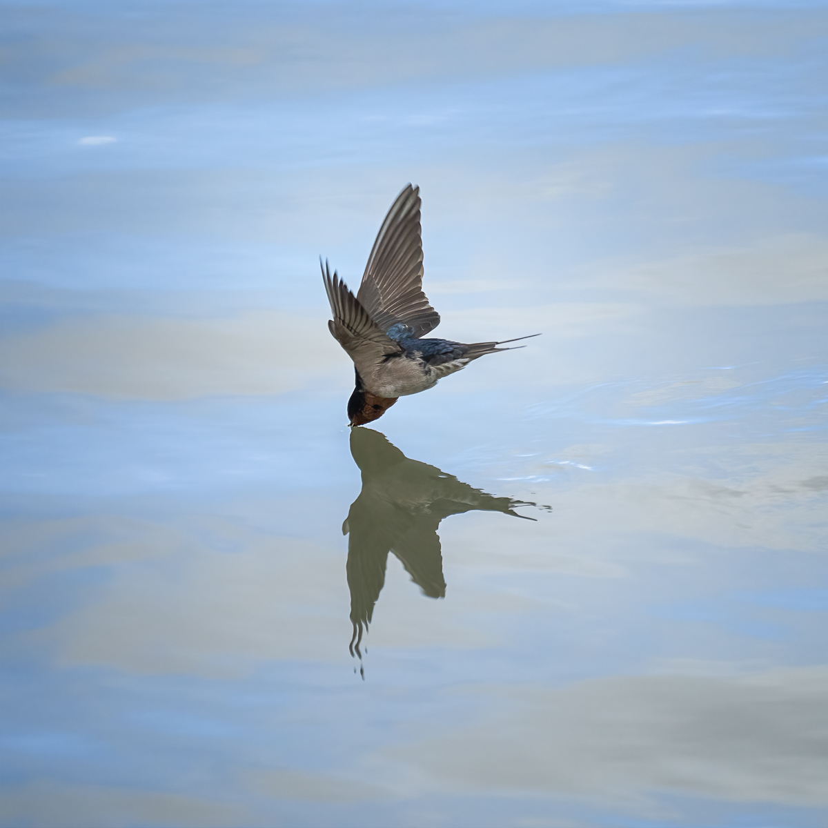
Hi Barbara,
You did a fantastic job creating this image in-camera! The final result beautifully combines stillness and movement, elevating it beyond a straightforward capture. The soft light and vibrant colours complement the image wonderfully.
My only suggestion would be to enhance the vibrancy even further by slightly adjusting the luminosity and colours.
|
Mar 6th |
 |
| 65 |
Mar 25 |
Reply |
Hi Dick,
Thanks for your comment! I really appreciate it.
The wind made it challenging to get the final image, as the camera failed to stack two or three times before I managed to get this one. |
Mar 6th |
| 65 |
Mar 25 |
Reply |
Hi David,
Thanks for your comment! I really appreciate it.
I'm just beginning to explore focus stacking, and I think the camera does a great job considering I shot this handheld, using autofocus, and on a windy day. With spring around the corner, I hope to have many opportunities to capture beautiful subjects.
Next time, I'll plan better, and I think using a tripod and manual focus could improve the results.
|
Mar 6th |
| 65 |
Mar 25 |
Reply |
Hi Amy, thanks for your comment! I'm glad that you like it. |
Mar 6th |
4 comments - 4 replies for Group 65
|
| 72 |
Mar 25 |
Reply |
Hi Bruce,
Thank you for your comment and suggestion. It seems that the upper right side of the image is drawing attention away from the water flow and ice. I might reconsider the crop to better focus on that area. |
Mar 12th |
| 72 |
Mar 25 |
Reply |
Hi Richard,
Thank you for your comment and suggestion. I agree that such a large area of white snow could draw too much attention, so I might crop part of it to reduce the distraction.
When I take long exposures of waterfalls or moving water, I usually prefer a one-second exposure. It creates a silky effect while still retaining some detail and movement. |
Mar 12th |
| 72 |
Mar 25 |
Comment |
Hi Isaac,
I admire this beautiful capture, full of sharp detail and great colour contrast. I always struggle with the lack of detail in dragonfly wings due to the shallow depth of field, even when I try to position the camera parallel to maximise sharpness. Your image, however, showcases excellent detail throughout the wings and tail. |
Mar 12th |
| 72 |
Mar 25 |
Comment |
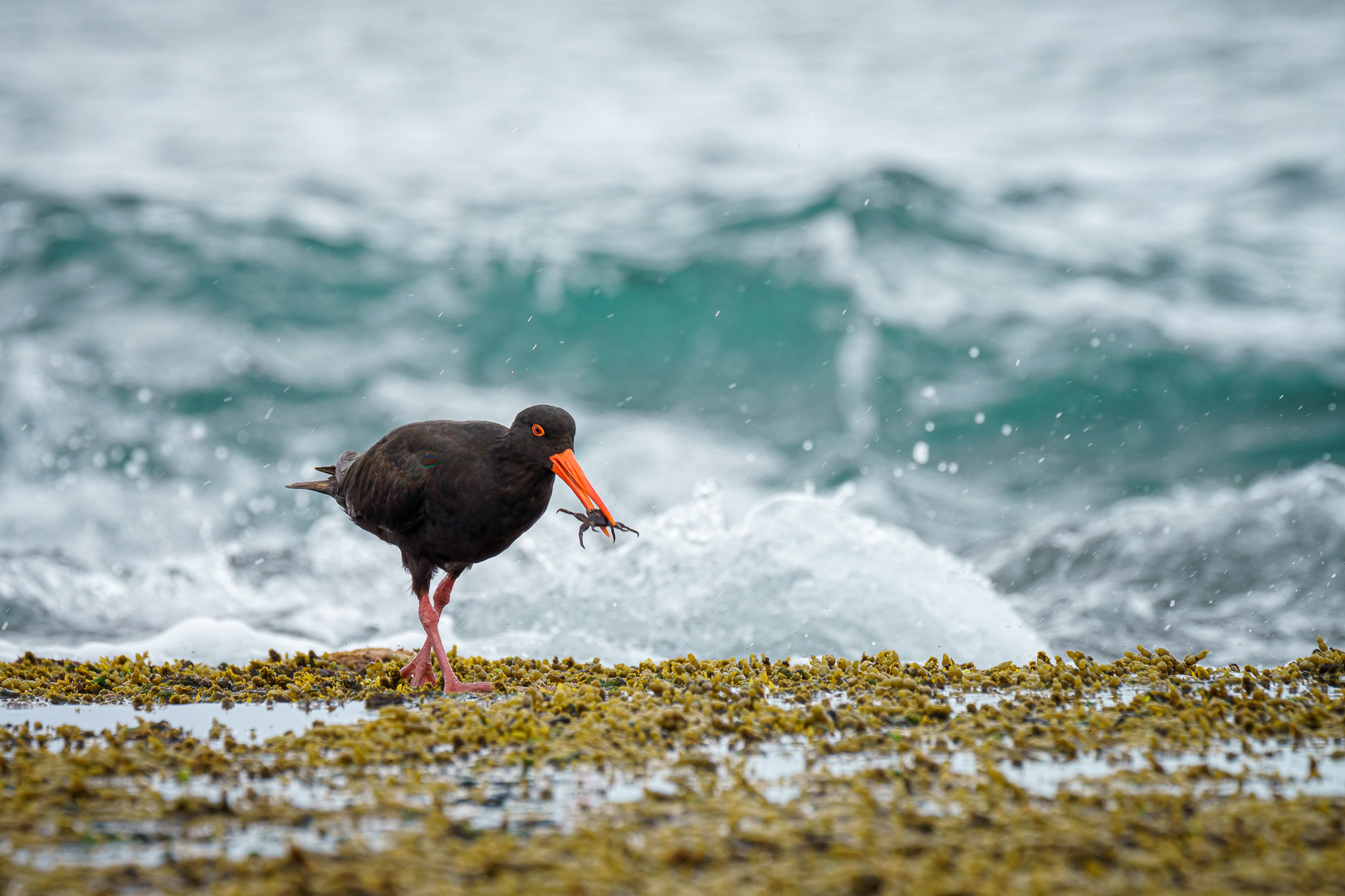
Hi Adrian,
What a fantastic moment of interaction between these two fellows you've captured! As you mentioned, it's not easy in such an action-packed moment to get all the elements right-capturing the fish and both birds clearly while showcasing their interaction.
I agree with Richard's suggestion to create more contrast between the birds and the water, as it will enhance the visual impact and make the moment even more striking for the viewer.
|
Mar 12th |
| 72 |
Mar 25 |
Comment |
Hi Maria,
You have captured a nice interaction between these two birds. I especially like the facial expression of the black-necked stilt as it glances at the ibis's display. The amount of detail is exquisite, allowing us to appreciate the beautiful iridescence of the ibis's feathers.
I agree with Richard's suggestion about cropping tighter, as it removes more of the empty space that competes with the birds' interaction, even if it means sacrificing part of the ibis's wings. |
Mar 12th |
| 72 |
Mar 25 |
Comment |
Hi Richard,
Despite the technical challenge of capturing a high-quality image in low-light conditions, I really like this one because it stands out from the usual images I see. The blue cast is beautiful, and the detail and pose of the egret are very nice, well complemented by the square crop. |
Mar 12th |
4 comments - 2 replies for Group 72
|
13 comments - 11 replies Total
|