|
| Group |
Round |
C/R |
Comment |
Date |
Image |
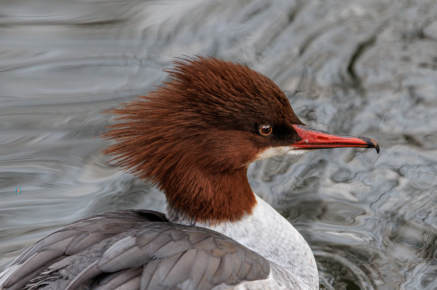
| 46 |
Feb 25 |
Comment |
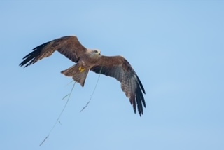
Hi Marilyn, I like the close framing of this raptor. The detail, light, and colours are beautiful throughout the image.
It's a pity the bird didn't turn its head slightly toward you to capture eye contact with the viewer. My only suggestion would be to lighten the eye a bit to make it more prominent. |
Feb 19th |
| 46 |
Feb 25 |
Comment |
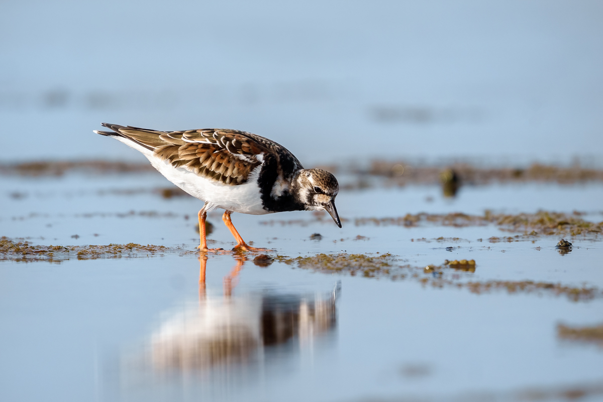
Hi Xiao, this little bird is gorgeous! We don't have it here in Spain. Your crop enhances the bird by isolating it from the distracting branches, making it the main subject of the image. I love the tonalities throughout the image and the way the bird and branches create a diagonal composition.
I also have the same difficulties with my new camera. I think it's just a matter of time until I get familiar with the focus system and the camera's capabilities. |
Feb 19th |
| 46 |
Feb 25 |
Comment |
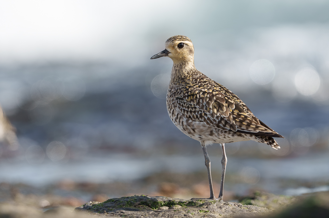
Hi Ted, the perspective you chose has created a very striking image. The detail in the feathers and the sharpness are remarkable, complemented by the beautiful colours of this bird. On my screen, it looks like you have applied some texture to the background. I don't think it's necessary, but that's just my personal taste. |
Feb 19th |
| 46 |
Feb 25 |
Reply |
Hi Tom, I'm glad you like this image! I'm getting familiar with the birds surrounding me here in Spain. They are different from the ones in Australia, both in species and behaviour. |
Feb 19th |
3 comments - 1 reply for Group 46
|
| 54 |
Feb 25 |
Reply |
Hi Brad, thank you very much for your comment and for encouraging me to improve the image. I never take constructive feedback as an offense.
I believe that exposing our images to critique helps us grow in knowledge and creativity. Most of the time, we have a sentimental attachment to our images, which can prevent us from noticing details that could be improved. |
Feb 22nd |
| 54 |
Feb 25 |
Reply |
Hi Peggy, thank you for your comment and suggestion. I agree that the background draws a lot of attention, so blurring it or applying a filter to soften the trees could help to enhance the children more. |
Feb 22nd |
| 54 |
Feb 25 |
Reply |
Hi Bruce, thank you for your detailed comment. I had also considered converting it to monochrome to avoid some of the lighting and colour issues, but in the end, I decided not to do it.
I really like your editing, I think it brings better cohesion between the elements in the image. |
Feb 22nd |
| 54 |
Feb 25 |
Reply |
Hi Kirsti, thank you for your comment and suggestions. I completely agree with you about the egret-I knew I needed to go back and fix the issue, but I was running out of time.
|
Feb 22nd |
| 54 |
Feb 25 |
Reply |
Hi Alan, thank you for your comment-it aligns with my own feelings about the image. I know I haven't achieved the best result when putting everything together.
The past few months have been a bit crazy-moving from Australia to Spain, it was a big change, and my belongings only arrived at the beginning of this month. Now that everything is here, I still need some time to settle in, but I hope to get back to my routines soon and have more time to focus on the details. |
Feb 22nd |
| 54 |
Feb 25 |
Reply |
Hi Matt, thank you for your kind comment. The lighting on the children was not easy to get right, and I'm still not entirely sure if I achieved the best result. |
Feb 22nd |
| 54 |
Feb 25 |
Comment |
Hi Bruce, thank you for your detailed explanation of how you created this stunning image. I really love the tonalities and textures of the sand dunes, which contrast beautifully with the sky. The balloon and the camels complement the scene perfectly, adding to the story, and your editing brings everything together seamlessly. A truly wonderful image! |
Feb 22nd |
| 54 |
Feb 25 |
Comment |
Hi Brad, you have masterfully blended these images to create an appealing landscape that looks very natural.
I agree with Bruce's suggestions about the lack of detail in the dark areas-his editing enhances the image by bringing out more detail in those sections.
I don't think the image needs the black frame, and having it open at the bottom makes it look incomplete. I would suggest creating another version with more space to allow the waterfall's flow a little longer. |
Feb 22nd |
| 54 |
Feb 25 |
Comment |
Hi Alan, this is a very striking image-it conveys both a strong visual impact and an emotional response. Your technical skills in creating these dice are fantastic, and as you said, they have found their way together perfectly.
The figure of the demon is a bit lost but still complements the story. I agree that it needs a bit more work, as it looks a little flat to me. I also support the idea of removing the pedestal. |
Feb 22nd |
| 54 |
Feb 25 |
Comment |
Hi Kirsti, this image absolutely captivates me! You have created a fantastic science fiction story. I love the colours and the motion blur-the setting works beautifully, and the elements come together to create a compelling narrative.
I agree with Bruce's suggestion about the beam; it completes the story so well. I also prefer the panoramic format, as I believe it suits the scene better. |
Feb 21st |
| 54 |
Feb 25 |
Comment |
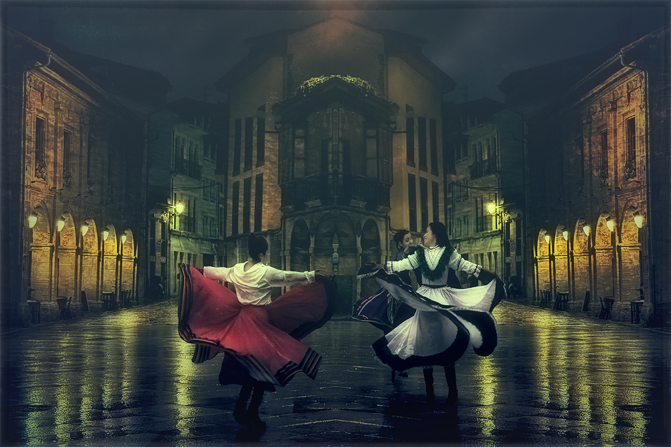
Hi Matt, when I was living in Sydney, I loved grabbing my camera and venturing into the streets to capture some street shots. I agree that it's difficult to get all the elements to work together.
With this composition, you've created a scene that immediately captures our attention-the lights in the doorway, the board, and the man perfectly positioned, all enhanced by the consistency of light throughout the scene. Everything is working well, as all the elements belong to the same scene and story. |
Feb 21st |
| 54 |
Feb 25 |
Comment |
Hi Peggy, once again, you have mastered the tonal colours in this composition. The leading lines guide us directly to the man, whose interesting pose as he looks at the bike helps create the story.
The use of ICM works beautifully in this composition, giving it a dreamy look and a painterly finish. I agree with the suggestions made by other members, such as the lack of texture in the road. It is a lovely scene! |
Feb 21st |
6 comments - 6 replies for Group 54
|
| 65 |
Feb 25 |
Reply |
Hi Diana, thanks you for your comment, I am glad that you like it. |
Feb 22nd |
| 65 |
Feb 25 |
Reply |
Hi Dick, I totally agree with this quote, the challenge is making the camera capture the shot we envision in our minds. That's where technique and skills come into play.
I think that removing the leaf helps focus all the attention on the flowers and soft colours, personally, I prefer the first version. |
Feb 22nd |
| 65 |
Feb 25 |
Comment |
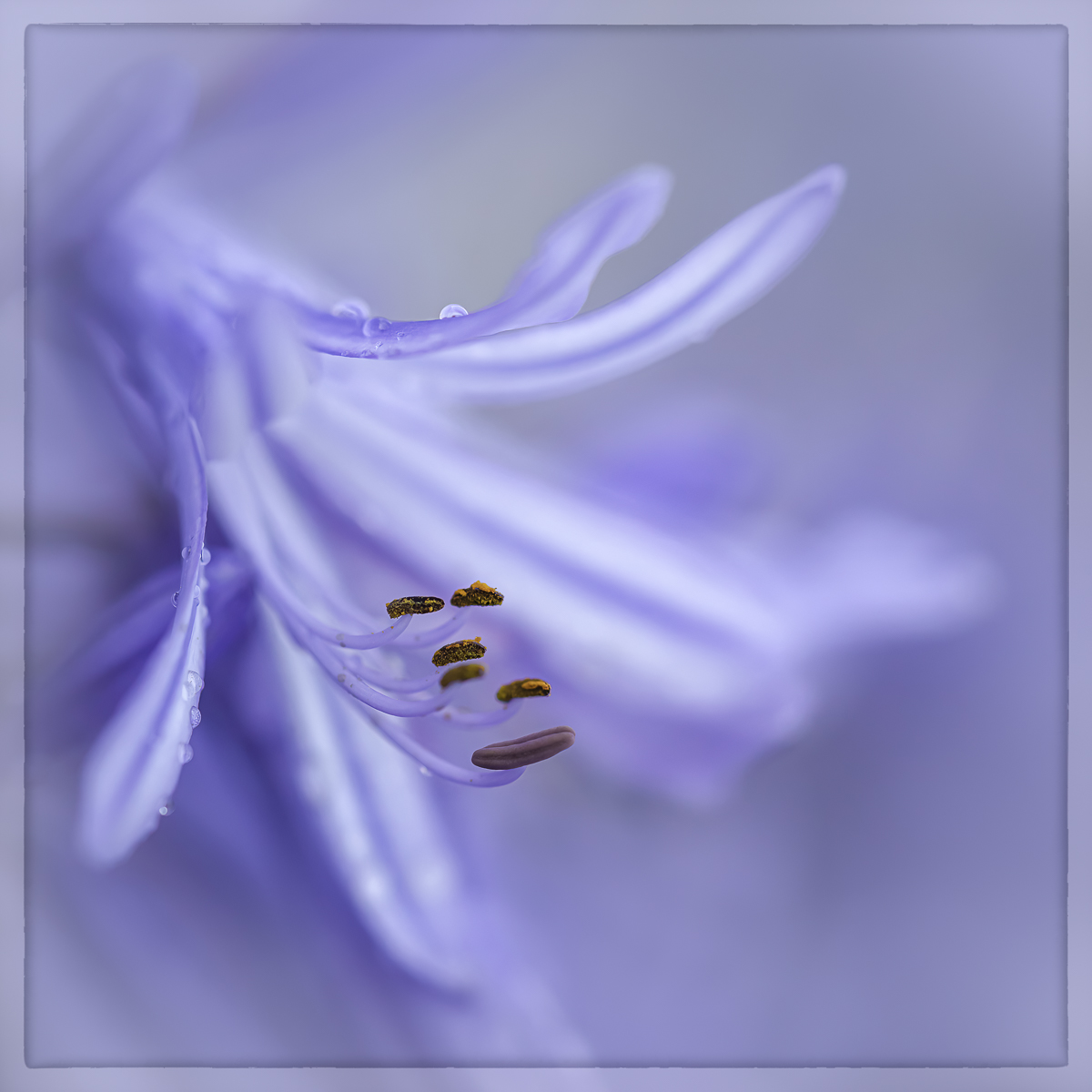
Hi Shirley, I really like the close-up of this yellow rose. The square crop suits the composition really well, and the drops of water add a special touch to the image. Beautifully done!
|
Feb 19th |
| 65 |
Feb 25 |
Reply |
Hi Dick, thank you for your comment! I agree, the yellow dandelion really enhances the image. |
Feb 19th |
| 65 |
Feb 25 |
Reply |
Hi Barbara, thank you for your kind comment! I'm glad you like it.
|
Feb 19th |
| 65 |
Feb 25 |
Reply |
Hi David, I'm glad you like the image! It was a frozen morning that offered great opportunities for some nice shots, so I took the camera and looked for flowers around the house. This one stood out due to its colour, which contrasts beautifully with the frozen background. |
Feb 19th |
| 65 |
Feb 25 |
Comment |
Hi David, you have created a beautiful minimalist image, isolating this little flower in a snowy landscape.
It would benefit from a bit more depth of field, but even so, it stands beautifully. You have chosen a nice composition. |
Feb 19th |
| 65 |
Feb 25 |
Comment |
Hi Amy, welcome to the group!
You have captured beautiful detail and colours in this calla lily, but giving the background almost half of the image creates a conflict in identifying the main subject.
I like David's suggestion, as it focuses more attention on the details of the flower. |
Feb 19th |
| 65 |
Feb 25 |
Comment |
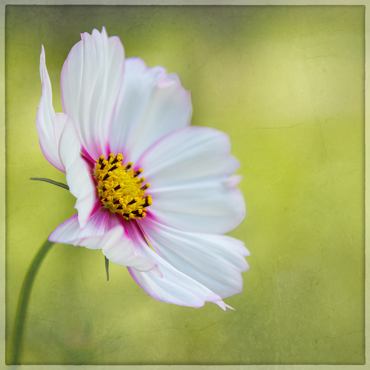
Hi Diana, beautiful image of this yellow gerbera, which you have captured with plenty of detail and sharpness. I like the contrast in colours between the flower and the background.
Even though I usually like the contrast between a flower in the foreground and a blurred one in the background, in this case, I find it a bit distracting due to its placement in the composition. I agree that eliminating it could benefit the image. |
Feb 19th |
| 65 |
Feb 25 |
Comment |
Hi Barbara, the amount of detail in this flower is amazing, and you have captured it beautifully. I like the composition and the slight curve of the stem.
I agree with the other comments about the background-blurring it could make the flower stand out even more, and perhaps a different tonality could complement the flower better. |
Feb 19th |
| 65 |
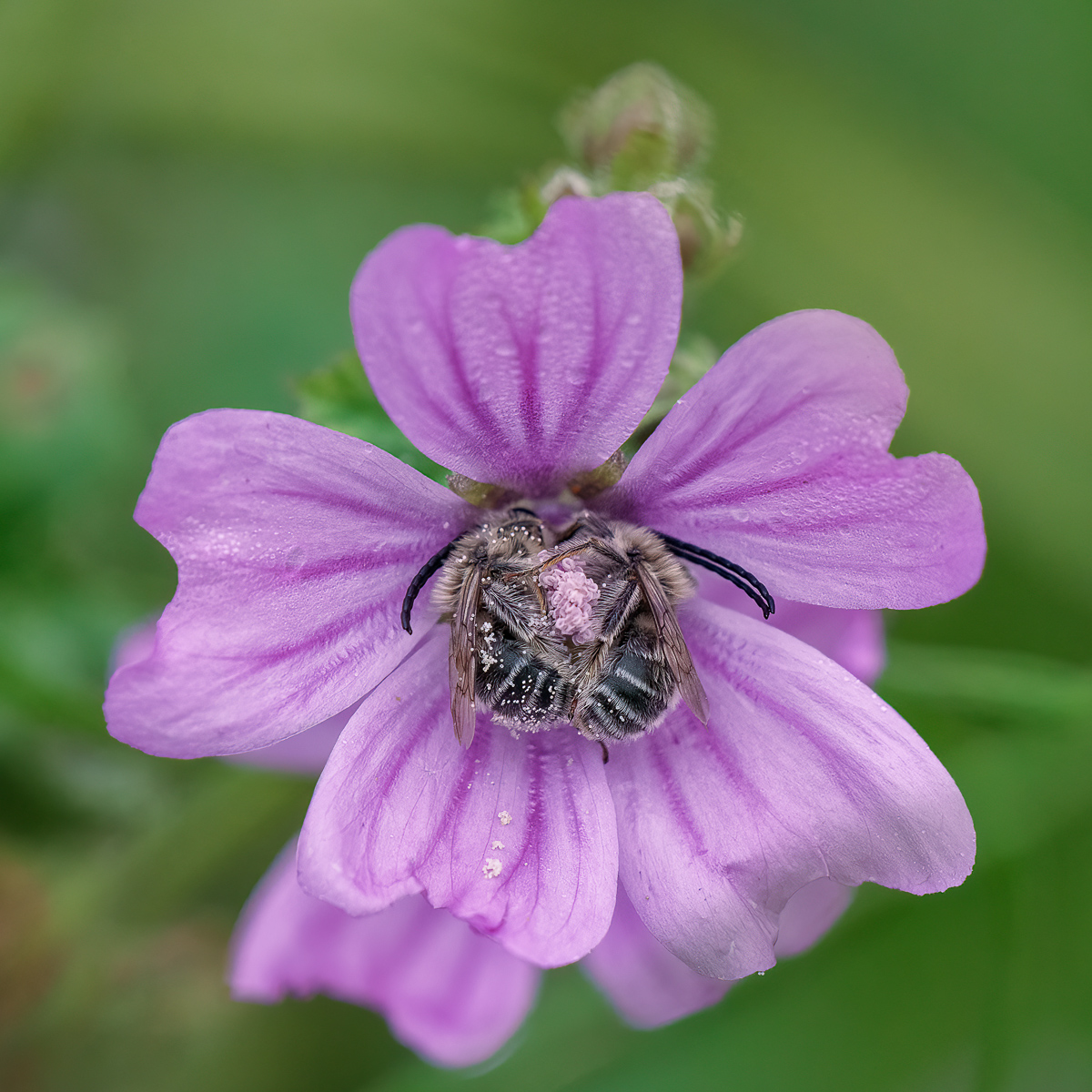
Feb 25 |
Comment |
Hi Dick, I like this technique-it makes the flower stand out while isolating it from its surroundings.
I also like the composition, with the main flower placed in the center while the other flower is partially hidden in the blur. The only thing that concerns me in this image is the light-coloured leaf in the background. I find it a bit distracting, and I wonder if a square crop could benefit the image.
|
Feb 19th |
6 comments - 5 replies for Group 65
|
| 72 |
Feb 25 |
Reply |
Hi Adrian, thank you for your comment and suggestion. I'll create another version of this image with a square crop that removes the top left, focusing more on the vegetation and the steps. |
Feb 22nd |
| 72 |
Feb 25 |
Comment |
Hi Isaac, this is a great image of the group of penguins, telling us about their environment and behaviour. The composition, showing the group of penguins creating visual contact with the viewer without any distractions, and the beautiful colours, is fantastic. |
Feb 19th |
| 72 |
Feb 25 |
Comment |
Hi Adrian, this is such a beautiful image! I like the crop you've done, and the composition with the fish and the water is very dynamic. The light colors in the bird make it stand out nicely in the image. |
Feb 19th |
| 72 |
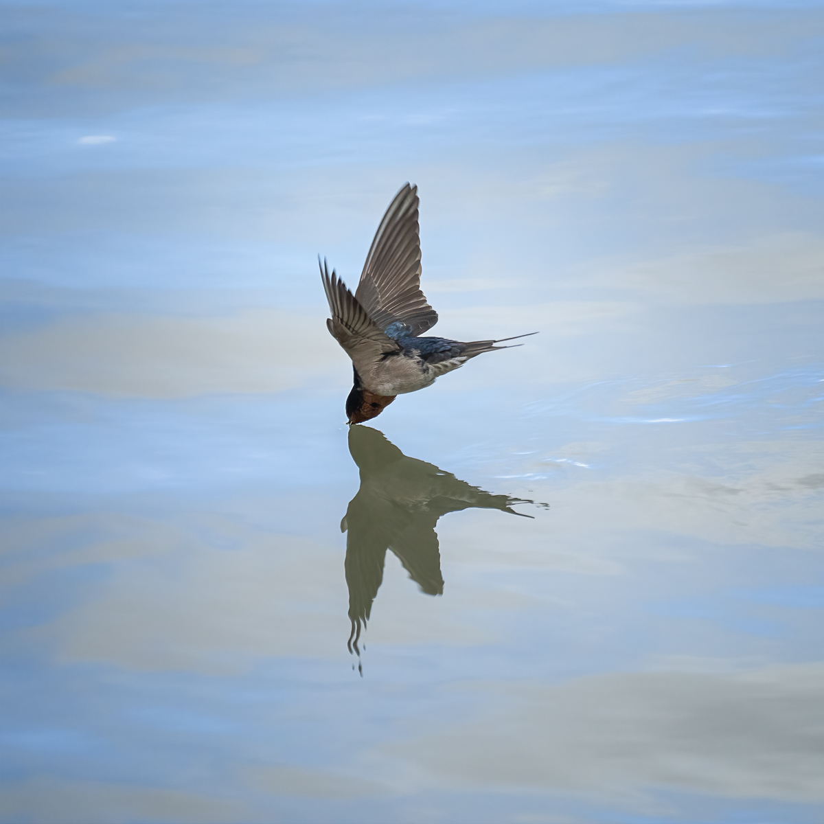
Feb 25 |
Comment |
Hi Maria, I really love avocets, and you've captured this one with a perfect reflection, a nice pose, and great action.
I also prefer the blue tonality on the water that Bruce suggested-it really makes the bird stand out. |
Feb 19th |
| 72 |
Feb 25 |
Comment |
Hi Richard, I like how you've captured the birds and their reflections, creating this beautiful image. I totally agree with the points that Bruce suggested-removing the branches on the right and concentrating the attention on the birds and their reflections would create a stronger image. Also, removing the spots would make the image even cleaner and more beautiful. |
Feb 19th |
| 72 |
Feb 25 |
Reply |
Hi Richard, I really enjoyed the morning walking through this snowy landscape, looking for images like this one. It's a nice change after having lived in Australia for many years. |
Feb 19th |
| 72 |
Feb 25 |
Reply |
Hi Bruce, thank you for your suggestion. I really like the image resulting from the crop. I was debating whether to include this or crop it as you suggested, and in the end, I decided to include it to create a strong diagonal line that adds tension to the rest of the image. |
Feb 19th |
| 72 |
Feb 25 |
Reply |
Hi Isaac, thank you for your comment. I agree that the steps in the snow could be considered distractions, but I included them in the shot because I like the story they tell. |
Feb 19th |
| 72 |
Feb 25 |
Comment |
Hi Bruce, I really like the group of elephants facing you, isolated from the background and showing plenty of detail in their bodies.
It's a well-composed image, telling a nice story. My only suggestion would be to crop a little from the top to create an even more powerful image. |
Feb 19th |
5 comments - 4 replies for Group 72
|
20 comments - 16 replies Total
|