|
| Group |
Round |
C/R |
Comment |
Date |
Image |
| 46 |
Sep 24 |
Comment |
Hi Marilyn, what a beautiful bird! You have portrayed this Eurasian Eagle Owl wonderfully, capturing its powerful gaze. The detail and lighting in the image are very well managed. My only suggestion would be to slightly reduce the sharpness in the owl's face, as I feels a little too strong to me.
|
Sep 17th |
| 46 |
Sep 24 |
Comment |
Hi Xiao, Great capture of this Cedar Waxwing such a beautiful bird! You managed to get the shot in the perfect moment, with the fruit right in its beak. The blurred background complements the scene beautifully, and the bird is sharp with plenty of detail.
|
Sep 17th |
| 46 |
Sep 24 |
Comment |
Hi Sylvia, congratulations on your invitation to exhibit a photograph in the PSA DDG.
I love the creative aspect of this image, the slower shutter speed creates a sense of movement, adding a dynamic effect, while the lonely bird remains in sharp detail. The colour and lighting work beautifully, creating a nice contrast throughout the scene.
|
Sep 17th |
| 46 |
Sep 24 |
Comment |
Hi Ted, you have capture a great moment of this great heron taking off. I really like Lisa's editing suggestion, it truly makes the image pop!
|
Sep 17th |
4 comments - 0 replies for Group 46
|
| 54 |
Sep 24 |
Reply |
Hi Kirsti, thank you for your comment, I really appreciate it. I also agree about the turtle and the size adjustments, and I love the idea of adding a sinister fin!
|
Sep 17th |
| 54 |
Sep 24 |
Reply |
Hi Brad, thank you for your comment and suggestion. I agree with you, the turtle could be removed without significantly altering the overall perception of the image.
|
Sep 17th |
| 54 |
Sep 24 |
Reply |
Hi Alan, thank you for your comments and suggestions. I really like the idea of creating a bit of suspense by just showing the fin. I hadn't thought of that before. I also agree about the size of the children, I might need to resize them to fit better within the image.
|
Sep 17th |
| 54 |
Sep 24 |
Reply |
Hi Melissa,
Thank you for visiting our group and taking the time to comment on the images-I really appreciate it. The nets were part of the original image; the children were playing with them, and I took the opportunity to capture some shots. I agree with you about the proportions, and I may need to resize the children to make them look more realistic.
|
Sep 17th |
| 54 |
Sep 24 |
Comment |
Hi Brad, I really like your idea of placing the Lilly in this natural environment and recreating the waterfall as a part of the flower. The concept works visually, as the flower both receives the water and acts like a funnel that expels it. My concern is with the blurred area in the middle, which creates a disconnect between the upper and the lower parts of the image.
My suggestion would be to recover some of the rock's texture in that area to make the blending more realistic. |
Sep 17th |
| 54 |
Sep 24 |
Comment |
Hi Bruce, Your image has double impact for me-visually and emotionally. Visually, all the elements come together seamlessly, like clockwork, working in perfect harmony. Emotionally, the story of the girl looking for her prince, willing to kiss the frog in hopes of turning it into a handsome prince, really resonates. The composition, colours, pose, lighting all work so well together that everything feels perfectly integrated into the image. |
Sep 17th |
| 54 |
Sep 24 |
Comment |
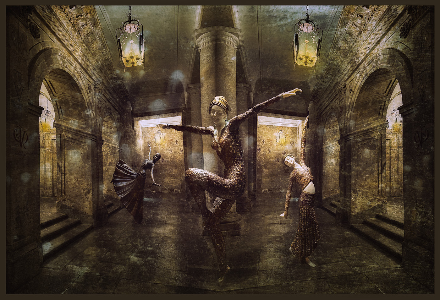
Hi Alan, the first thought that comes to mind when I look this image is a girl lost in a labyrinth of doors, entering and exiting from different ones, searching for the right one that opens to the outside world.
Maybe my interpretation is far from your original idea, but I suppose that we all get loss in our own labyrinths.
The composition and colours work really well, I might suggest elongating the distant girl slightly, as she appears a bit small and out of proportion. I also really like the patterns and textures on the doors.
|
Sep 16th |
| 54 |
Sep 24 |
Comment |
Hi Kirsti, I congratulate you on making all the element work so well in this image. The use of filters really complements and creates a look that makes the image stand out. I love the treatment of the ice surface- its shiny texture is clearly visible. The composition works wonderfully, with the motorbike entering in the frame and the angle conveying a sense of speed.The black and withe tones enhance the image, and the dark background helps to focus attention on the motorbike. The spectator might be a bit to bright, but its placement is perfect for balancing the scene. Well done!
|
Sep 16th |
| 54 |
Sep 24 |
Comment |
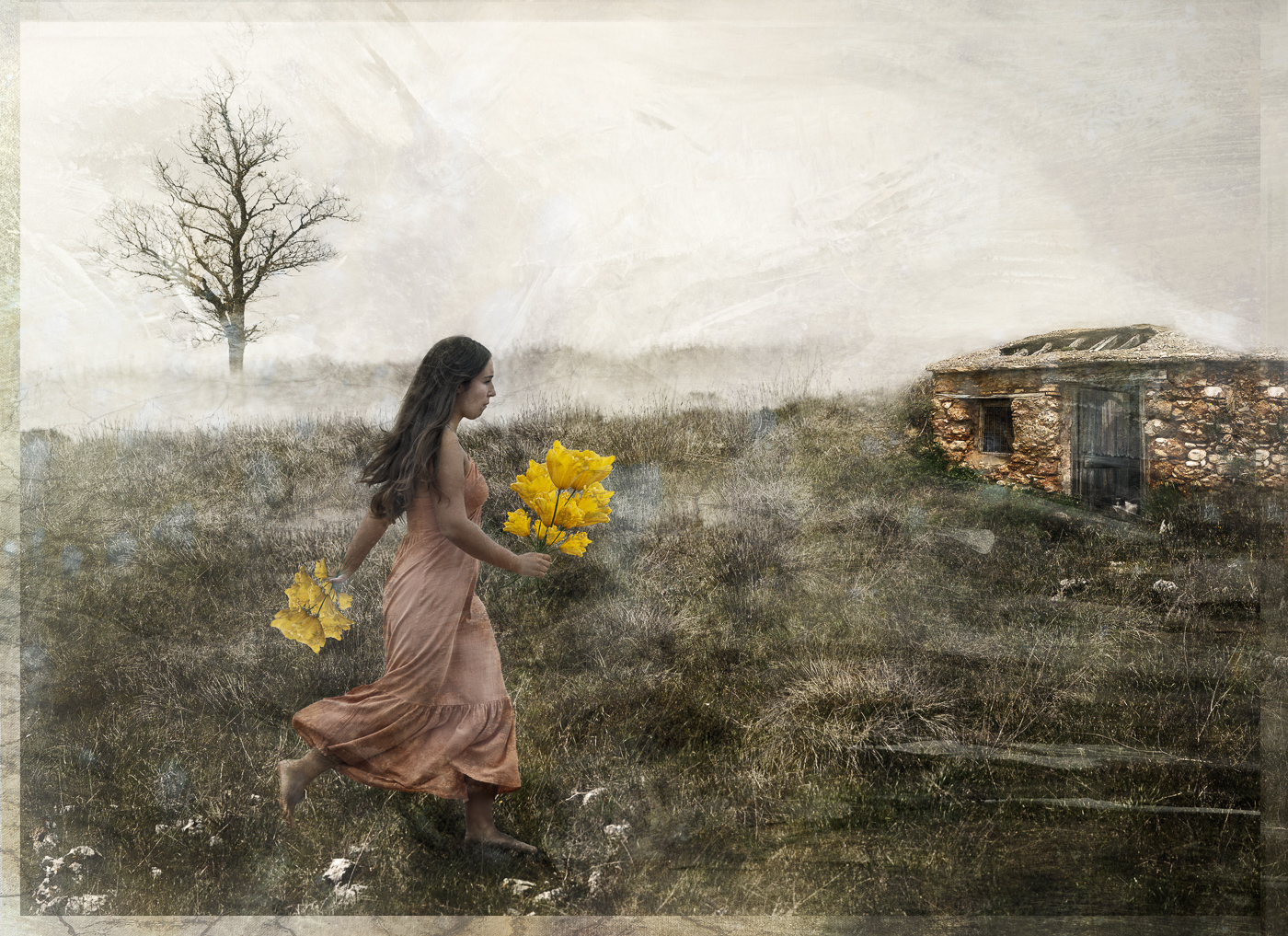
Hi Peggy, what a wonderful work that you have made to create this image! the swirl staircase creates the perfect effect, making the image mysterious and impactful for the viewer. The creation of the girl's figure is simply masterful. I love the detail in the hair and the way that the flower transforms into a dress full of texture and detail. The composition works really well, placing the human figure at the start of the stairs to create a compelling story. The colours and textures complement the image beautifully. Well done!
|
Sep 16th |
5 comments - 4 replies for Group 54
|
| 65 |
Sep 24 |
Reply |
Hi Dick, I also like the dark background, it complements better the flower.Thank you for your suggestion about the crop, I think you are right, it could help focus more attention on the flower.
|
Sep 16th |
| 65 |
Sep 24 |
Reply |
Hi David, I really like your rendition of the image. The dark background makes the thistle stand out even more and enhances the colours beautifully. Thank you for your suggestion and for taking the time to work with the image.
|
Sep 16th |
| 65 |
Sep 24 |
Comment |
Hi Shirley,
I like your interpretation of this Yarrow bloom. You showcase it in a unique way that makes the ordinary more interesting, with a touch of painterly finish. The colours and composition work really well in this image. I do wonder if slightly reducing the amount of texture applied to the flowers could help them stand out more, creating better separation from the textured background.
|
Sep 16th |
| 65 |
Sep 24 |
Comment |
Hi David, you have done a great job photo-staking this Dahlia, capturing all the detail in sharp focus. I like how the image turned out after removing the distracting elements in the background and applying the texture, which complements the flower nicely. The fantastic point of view creates an appealing look of the flower. Well done!
|
Sep 16th |
| 65 |
Sep 24 |
Comment |
Hi Esther, Butterflies always like Lantana flowers! I appreciate your patience and effort in capturing the butterfly on the flower. Unfortunately, the image is not sharp enough for such a tight crop that focuses solely on the flower. I agree with David that a wider crop, including more of the flowers and the butterfly, could help reduce the feeling of softness in the image. I encourage you to continue exploring compositions that better isolate the flower, and wait for the butterfly to land in the perfect spot to capture the full beauty of both |
Sep 16th |
| 65 |
Sep 24 |
Comment |
Hi Diana, Beautiful image of this pink peony! You did a good job capturing it in this soft light, which creates a delicate portrait of the flower. The addition of the soft pink texture in the background complements the peony so well, creating an overall delicate image. I find the crop a bit tight and I wonder if a little more room around the flower, specially on the right side, could benefit the composition.
|
Sep 16th |
| 65 |
Sep 24 |
Comment |
Hi Barbara, The composition,colour and level of detail in this image are outstanding, I love it!You have captured it bautifully, and the interplay of colours make the image stand out nicely. The addition of the detail in the y petals complement the image so well.
|
Sep 16th |
| 65 |
Sep 24 |
Comment |
Hi Dic, what a beautiful capture! This image tells a compelling visual story by showcasing three seasons. I really love how the flowers are emerging from the snow, the leaves introducing the warm tones of the autumn, and everything is framed by the texture of the snow. Well done!
|
Sep 16th |
6 comments - 2 replies for Group 65
|
| 72 |
Sep 24 |
Comment |
Hi Isaac, I agree that the green foreground in the original image draws too much attention due to its strong colour. I
really like your second version, which tones down the green and makes the fox stand out beautifully.Thanks for your comment and suggestion.
|
Sep 16th |
| 72 |
Sep 24 |
Reply |
Hi Bruce, thanks for your nice comment. I really appreciate it. |
Sep 16th |
| 72 |
Sep 24 |
Comment |
Hi Barbara, thanks for your explaining the green tags. I am not familiar with bear environments or behaviour, so that really helps me understand the context of the shot.
You've captured the bear in a great pose within its natural environment. The contrast between the bear and the grass makes it stand out beautifully. The detail and sharpness in the image are excellent.
|
Sep 16th |
| 72 |
Sep 24 |
Comment |
Hi Isaac, Great capture of the blue-footed Booby! The birds are well placed in the frame, and the level of detail and sharp focus is excellent.The blue colour of the feet really draws attention to them. I agree with Bruce that the background with its detailed and the contrasting colours, creates a strong focal point that divert attention from the birds. I would suggest desaturating the background slightly to reduce the colour contrast and them compare it with the current image to see if it makes the birds stand out more. |
Sep 16th |
| 72 |
Sep 24 |
Comment |
Hi Adrian, I'd love to have the opportunity to see this beautiful and fast bird in the future.
I really like your choice of crop, which frames the three birds in a triangular arrangement. The clear background effectively draws attention to the birds, which are sharply in focus. Well captured! |
Sep 16th |
| 72 |
Sep 24 |
Comment |
Hi Chris, You have captured this wolf beautifully. I appreciate the muted colours and the way the light highlights the wold, creating a clear contrast with the background. Your low point of view enhances the visual engagement with the wolf, even though it isn't looking directly at the camera. I think a square crop could improve the image by focusing more on the wolf's face and reducing some of the background.
|
Sep 16th |
| 72 |
Sep 24 |
Comment |
Hi Bruce, I really love the interaction between the mother and the pups in this image. The sense ofd maternal protection and the puppies' initial attempts at exploration are priceless.
The beautiful scenery, with its nicely blurred background and the soft touch of colour from the flowers in the foreground, complememts the scene perfectly. Well done!
|
Sep 16th |
6 comments - 1 reply for Group 72
|
21 comments - 7 replies Total
|