|
| Group |
Round |
C/R |
Comment |
Date |
Image |
| 46 |
Nov 23 |
Reply |
Hi Lisa, Thank you for your comment, I am happy to show you some of the birds that are in this country, most of them are common in other areas of the world but others are residents only in this vast country |
Nov 28th |
| 46 |
Nov 23 |
Comment |
Hi Sylvia, Many thanks for your comment, I really appreciate it. |
Nov 27th |
| 46 |
Nov 23 |
Reply |
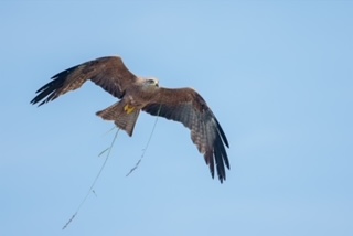
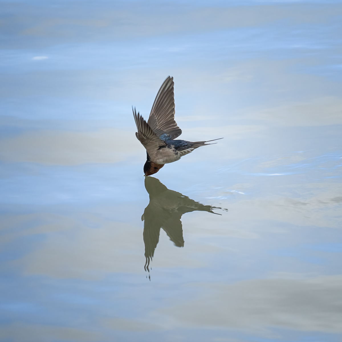
Hi Richard, Thanks for your comment, I am happy to show you some of the birds that inhabit here in Australia, as I always enjoy seeing other beautiful birds that are not found here.
Regarding flipping, I usually don't flip them because I like them the way that I have captured them, but in this case I found the bird more engaging flying left to right. |
Nov 16th |
| 46 |
Nov 23 |
Reply |
Hi Marilyn, I am glad that you like the image, thanks for your comment. |
Nov 16th |
| 46 |
Nov 23 |
Reply |
Hi Isaac, thanks for your thoughtful comment, I didn't know that flipping the image is not allowed in pure Nature competitions. I'll consider it for the future in case I enter. I am glad that you find this bird interesting as I think it really is. |
Nov 16th |
| 46 |
Nov 23 |
Reply |
Hi Tom, I am glad that you like this image, I agree with you, I prefer it when it's flying away. Thanks for your comment |
Nov 16th |
| 46 |
Nov 23 |
Reply |
Hi jack, I enjoyed capturing it while it was flying across in front of me, this birds are a little shy, and it is not easy to get close to them. Thanks for your comment. |
Nov 16th |
| 46 |
Nov 23 |
Comment |
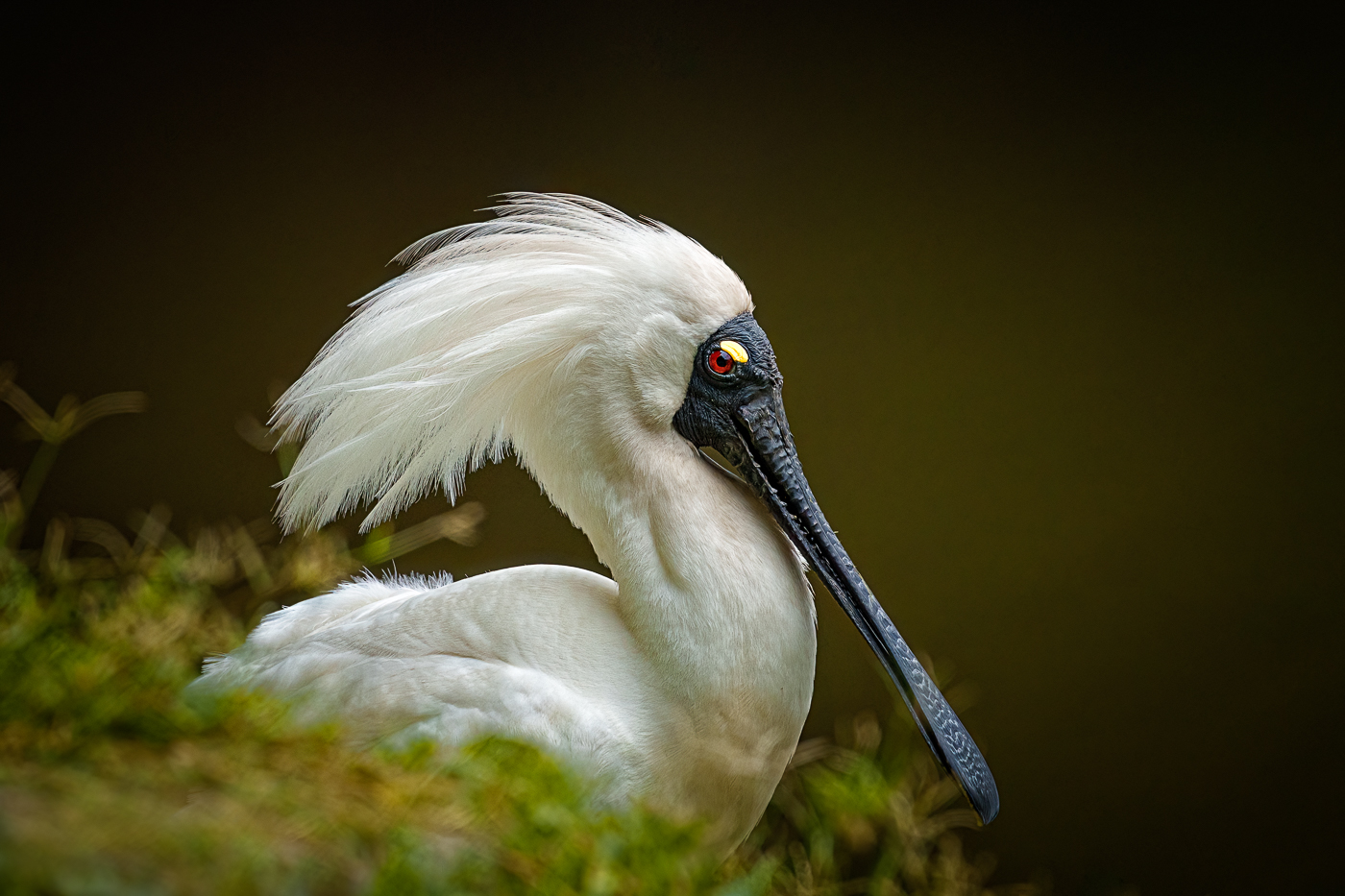
Hi Marilyn, Great image of this owl, the square crop really enhance the pose and the owl's face, I Like your high key version, although the low key is my favourite as I consider that the darken background helps to isolate and brings more importance to the owl itself. My only suggestion is about the amount of sharpness that you have applied, I can see some artifacts resulting from an excess of it. You might consider reducing it or brushing it only in the areas that really need it. |
Nov 16th |
| 46 |
Nov 23 |
Comment |
Hi Sylvia,
I love the way that the seagull is posing and looking towards you. You have managed the editing well, enhancing the sharpness and the detail of the bird, I also like the square crop and the composition, including part of the boat. Nice image. |
Nov 16th |
| 46 |
Nov 23 |
Comment |
Hi Jack, stunning capture of the hummingbird, you've caught it in an interesting pose that showcases its features and colours. the background colour and the flower complement the image so well. I agree that it is a wonderful idea to create two versions of the image, one for competition and the other with more freedom in editing. This could improve the image by removing undesirable branches or elements that distract for the main subject. |
Nov 16th |
| 46 |
Nov 23 |
Comment |
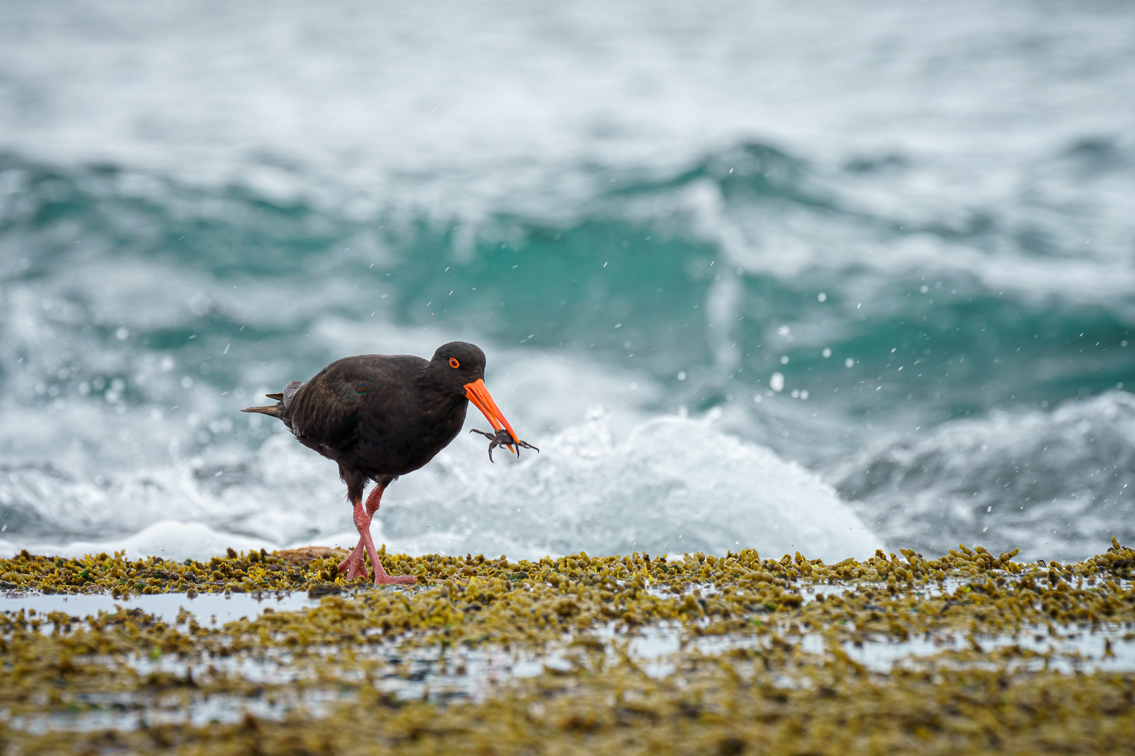
Hi Richard, Beautiful pic of this Downy, I don't believe we have them here in Australia as it is my first time seeing it.
I totally agree with Jack and his comment about the blurry branch. The bird is sharp, and having it in this pose adds a point of interest and action to the image. You are very lucky to have it in your backyard, and if it is a regular visitor to your garden, you should consider placing a nicer branch for it to perch. This would considerably improve your images. |
Nov 15th |
| 46 |
Nov 23 |
Comment |
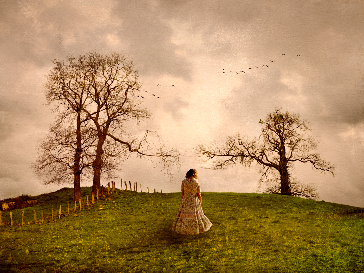
Hi Lisa, excellent capture of this flying eagle. The image is sharp and flipping has improve the overall result even more. My only suggestion is about the sky tonality,I find it a little dark and grey, perhaps you can play with the blue tones to achieve a more beautiful tonality. Great image. |
Nov 15th |
6 comments - 6 replies for Group 46
|
| 54 |
Nov 23 |
Reply |
Hi Aavo, thanks for your comment. I always appreciate it. |
Nov 18th |
| 54 |
Nov 23 |
Reply |
Hi Peggy, thanks for your lovely comment, I am pleased that you think so highly of it, enought to use it as halloween decoration on the wall. It was a lot of fun to hunting for the images and then recreating them in this image. |
Nov 18th |
| 54 |
Nov 23 |
Reply |
Hi Brad, thanks for your comment. I'm pleased that you enjoyed the image. Working on it was a good learning curve for me. |
Nov 18th |
| 54 |
Nov 23 |
Reply |
Hi kirsti, thanks for your comment, I am pleased to hear that you enjoyed the image. As you rightly pointed out, it could be interpreter either as a holiday celebration or as comercial critique. However, my intention was only to create a humorous image incorporating some of the street decorations. |
Nov 18th |
| 54 |
Nov 23 |
Reply |
Hi Alan, I completely resonate with your perspective. Halloween is not inherently part of my culture either; it has recently made its way to Spain, largely influenced by marketing and global commercialisation during this time of the year. However, having lived in Australia for over ten years, particularly in a neighborhood with many young families, it was inevitable not to be caught up in the halloween spirit this year.
I create this image purely for fun, taking advantage of the festive atmosphere that the decorations offered. I wholeheartedly agree with your point that creators often have emotional attachments to their creations, influencing their perspective.Thanks for your comment and suggestions |
Nov 17th |
| 54 |
Nov 23 |
Comment |
Hi Aavo, your image masterfully recreates the feel of an oil painting, with beautiful colours and textures.
Personally, I find it challenging to establish a connection between the bust, the surfer and the seascape. It seems unlikely that the surfer is contemplating the figure, given his intense focus on riding the waves.
I found the version with the pitcher more interesting, because it connects better the elements.
I particularly appreciate the transparency of the water in that version. |
Nov 17th |
| 54 |
Nov 23 |
Comment |
Hi Alan, your image is truly excellent, and your tone mapping technique is executed so well that it resembles an old stamp or photograph.
The composition. is also impressive, and the placement of your characters works seamlessly. The character outside of the room complements the scene in a fantastic way.
I understand Peggy's point about the ceiling and the attention it draws from the scene. I agree that a bit of darkening could help to reduce its prominence.
Overall, I really appreciate this image and the skilful technique required to bring it all together. |
Nov 17th |
| 54 |
Nov 23 |
Comment |
Hi kirsti, your husband makes the perfect model,and his expression beautifully mirrors the feelings you describe, turning him into a believable character as a sailor. Personally, I prefer the second version, I find that your husband, the sailor, is better appreciate in this rendition.
The inclusion of the seagull works well, and the opacity level is just right, creating the impression of a free soul living in the sailor's memories.
My only suggestion is to consider removing the shadow of the hat over the sailor's head, as it could be mistaken for a double wing of the bird. |
Nov 17th |
| 54 |
Nov 23 |
Comment |
Hi Aavo, I belive these boys have found an excellent spot to practice their skills!. I particulary like the angle of the stairs, specially for the skater at the top. His turn around the corner blends seamlessly into the scene.
I agree with the general opinion that the boy on the floor to be scaled, as he currently appears outsized in comparison to the others. Additionally, I notice that the boy in the blue shirt has a somewhat unnatural pose, while his placement is good, I would follow Alan's advice and consider removing the girl behind him.
Overall it is a great image that seems to capture reality quite well. |
Nov 17th |
| 54 |
Nov 23 |
Comment |
Hi Peggy what a dreamy image with such beautiful palette!
Thanks for sharing the detailed steps of your editing process.
ICM is a great technique to experiment with. It is not always easy to achieve good results, but as they say, practice makes perfect. I really appreciate the transparency touch in the girl and the soft colours. Even though I also like the Alan version, I prefer the colour one. |
Nov 17th |
5 comments - 5 replies for Group 54
|
| 65 |
Nov 23 |
Reply |
Hi Diana, thanks for your lovely comment and suggestion, I am glad that you enjoyed the image. |
Nov 19th |
| 65 |
Nov 23 |
Reply |
Hi Melanie, thanks for your lovely words, I am glad that you enjoyed the image. |
Nov 19th |
| 65 |
Nov 23 |
Reply |
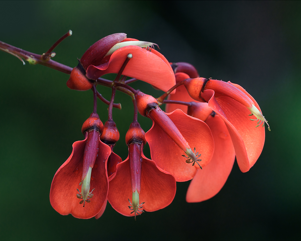
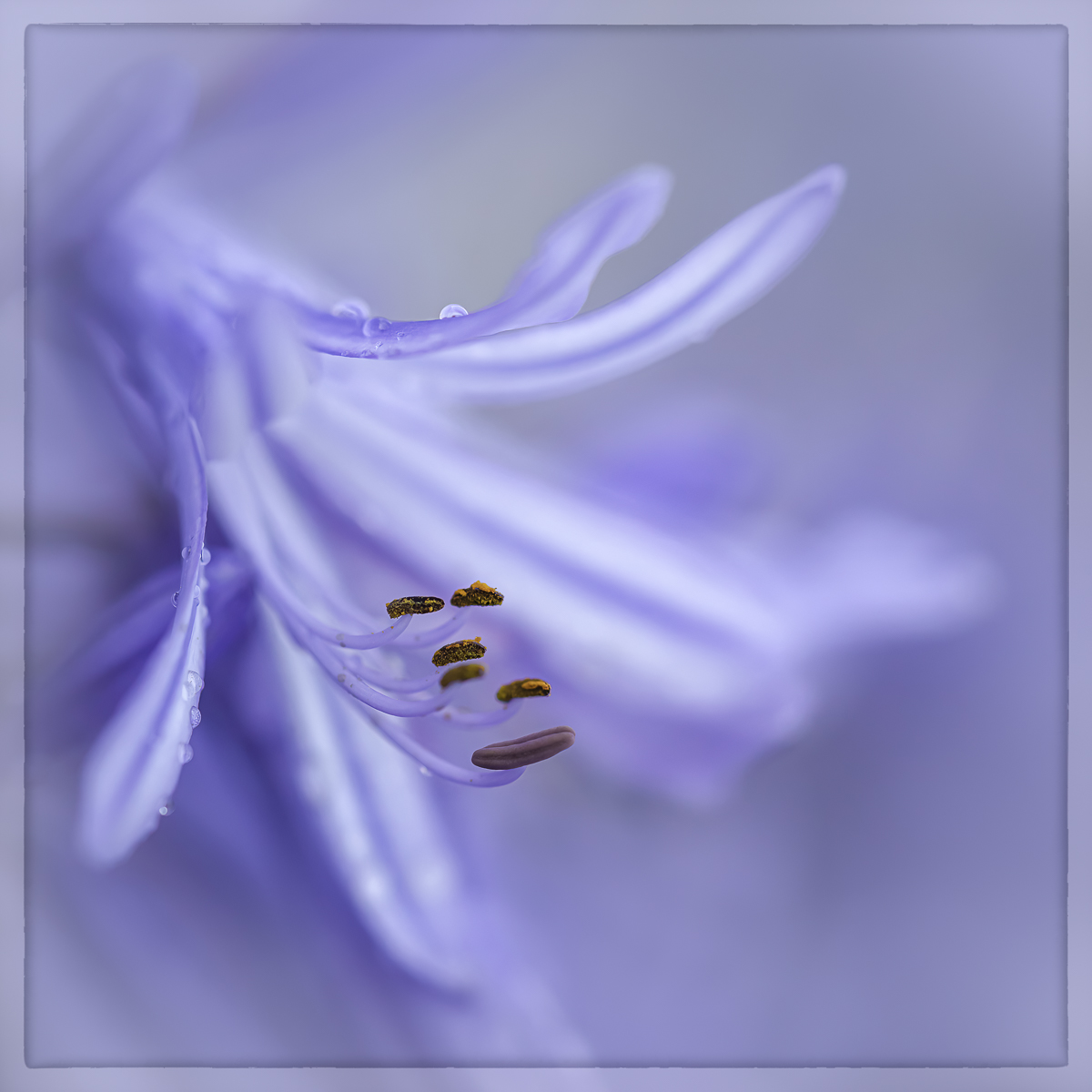
Hi Dick, thanks for your comment,I really appreciate it. I also agree that the bud creates a good balance with the lower area of the image.
|
Nov 19th |
| 65 |
Nov 23 |
Reply |
Hi Fran, Thanks for your comment and suggestions, I am glad that you like the image. I will consider putting back the water drops, as the general consensus is that they add interest to the flower. |
Nov 19th |
| 65 |
Nov 23 |
Comment |
Hi Melanie, I love photographing water lilies too, and I agree that their environmental placement can make it challenging to find the best point of view or composition. the dull light conditions also add a level of difficulty to the shot. While a different result might have been achieved by facing the flower, as you mentioned, it's not always feasible to find an alternative perspective. Despite these challenges, you did a great job with the crop, framing the flower beautifully and removing most distractions. The amount of detail captured in the flower is also commendable. |
Nov 19th |
| 65 |
Nov 23 |
Comment |
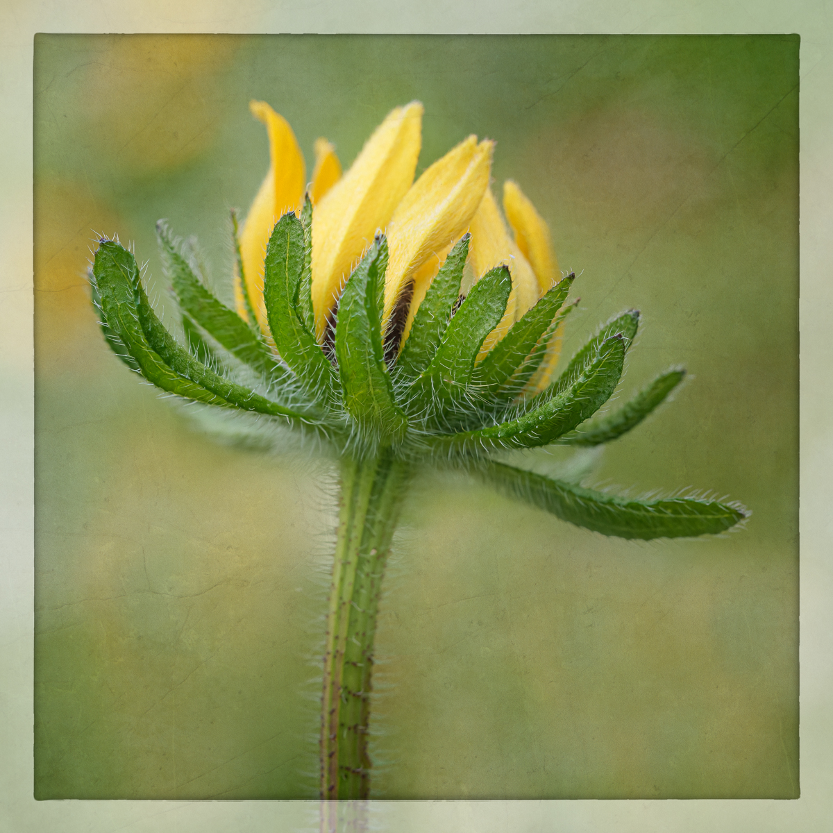
Hi Diana, Sunflowers are a fantastic subjects for photography, offering various creative approaches.
I particularly appreciate the stem's curve, guiding the eyes towards the center of the flower. The texture and different patterns in the petals add a rich detail to the image. I agree with Fran that a bit more of light in the center would reveal all the intricate details. Personaly, I prefer the yellow tone in the background, as it complements the flower and enhances the overall image. |
Nov 18th |
| 65 |
Nov 23 |
Comment |
Hi Fan, I also love taking photos of a dried flowers. I find it fascinating to capture the amount of detail and textures that merge during the drying process.
As you mentioned, it is amazing to see the variety of different versions of this rose. Since each one has its own beauty, I agree with the idea of creating a triptych to showcase the different colours.
Otherwise, your rose is full of character, displaying detailed textures in its petals and an interesting colour palette. |
Nov 18th |
| 65 |
Nov 23 |
Comment |
Hi Dick, this image is. outstanding due to the amount of detail and your final edition. I appreciate the placement of the flower and the rich colour, although I also like the original colour, which is a little softer. The light is well- managed and your stacking technique reveals all the details, resulting in a beautiful rendition of this cone flower.
My only suggestion is that perhaps the flower needs a little more of the space at the top of the frame. |
Nov 18th |
4 comments - 4 replies for Group 65
|
| 72 |
Nov 23 |
Reply |
Hi Barbara, thanks for your nice comment, I am glad that you like the image. |
Nov 27th |
| 72 |
Nov 23 |
Reply |
Hi Bruce, thanks for your comment, I also agree with all the suggestions about the cropping the number of flowers that should be included. I believe that making these changes could make the image stronger than the one I have presented. |
Nov 19th |
| 72 |
Nov 23 |
Reply |
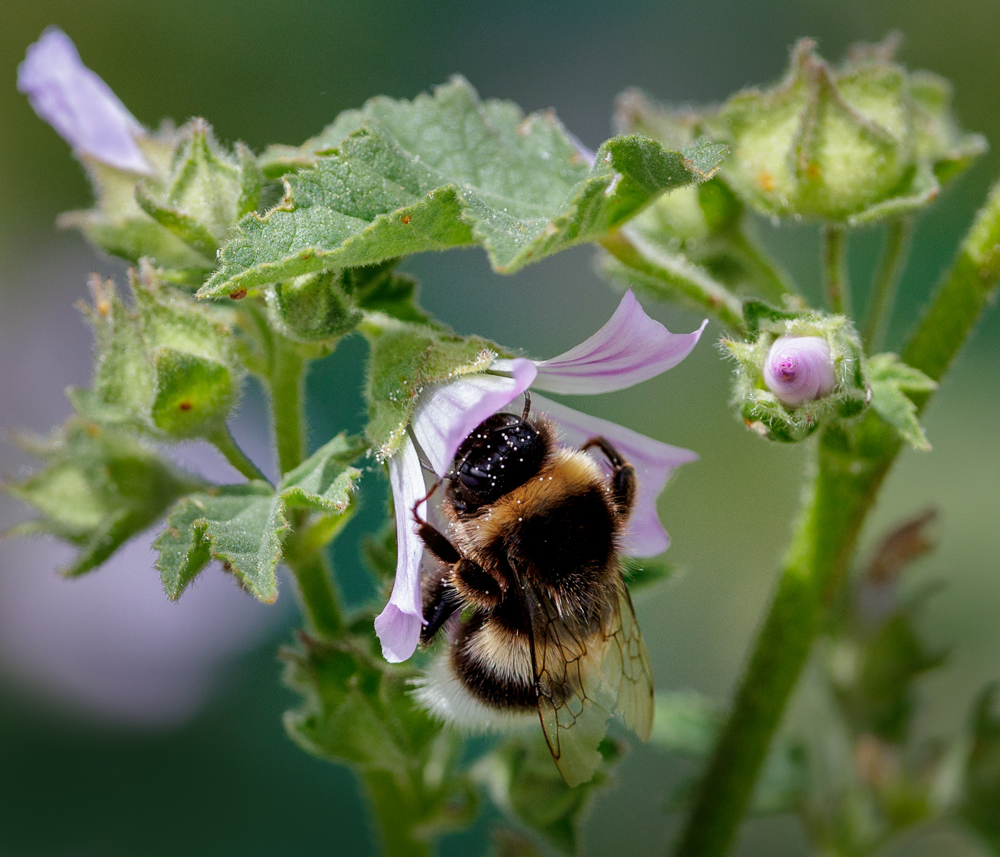
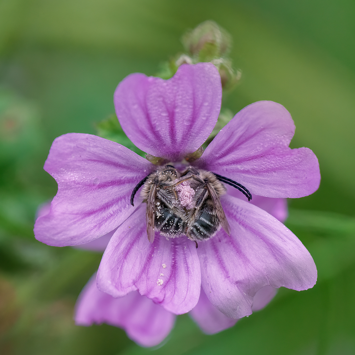
Hi Adrian, thanks for your comment and suggestions, I can now see that the other flowers are still too prominent in the image, competing with the main focus, which should be the bee. Adding some blur to the other flowers could help create enough separation and give more importance to the little daisy with the bee. |
Nov 19th |
| 72 |
Nov 23 |
Reply |
Hi Isaac, thanks for your thoughtful comment. I really appreciate your suggestion about the crop, and I agree that the three flowers works better in the image, making the bee more prominent. |
Nov 19th |
| 72 |
Nov 23 |
Comment |
Hi Isaac, thanks for sharing with us all your knowledge about these tigers and the cause of their white fur. You managed to capture an interesting moment of interaction between them and the water. Your editing and frame complements the image very well. It's a great capture. |
Nov 19th |
| 72 |
Nov 23 |
Comment |
Hi Adrian, you have capture this macaque in its environment showcasing some of its behaviour, which it is a definite plus for the image. The level of detail and sharpening is impressive, and your editing complements the image effectively, creating a good separation from the busy background. Adding a bit of light in the eyes brings the macaque to life even more. |
Nov 19th |
| 72 |
Nov 23 |
Comment |
Hi Barbara, the interesting behaviour of those group of bears is captivating. I agree with Adrian, being so close to this family must be quite an experience. Your image is clear and full of detail. I appreciate the lower point of view that immerses us in the scene and the fact that the bears has enough separation between them, allowing us to see all their heads.I also like the distribution in the frame, with two of then facing each other and the other two facing in the opposite direction. Your editing complements the image very well. |
Nov 19th |
| 72 |
Nov 23 |
Comment |
Hi Mary, you have capture a beautiful landscape image on a sunny day. While the light conditions may not have been the best for creating an atmospheric shot, you managed to capture a nice composition with those reflections in the water and an interesting sky. Your editing complements the image very well. |
Nov 19th |
| 72 |
Nov 23 |
Comment |
Hi Bruce, how amazing has to be to find the Hippopotamus in its natural habitat. Sometimes it is just a matter of luck to capture the perfect shot. In this case, I found your image highly interesting as it show us the hippopotamus's behaviour and the intricate details of its skin texture. The image is well-cropped, enhancing the focus on the details even more. |
Nov 19th |
5 comments - 4 replies for Group 72
|
20 comments - 19 replies Total
|