|
| Group |
Round |
C/R |
Comment |
Date |
Image |
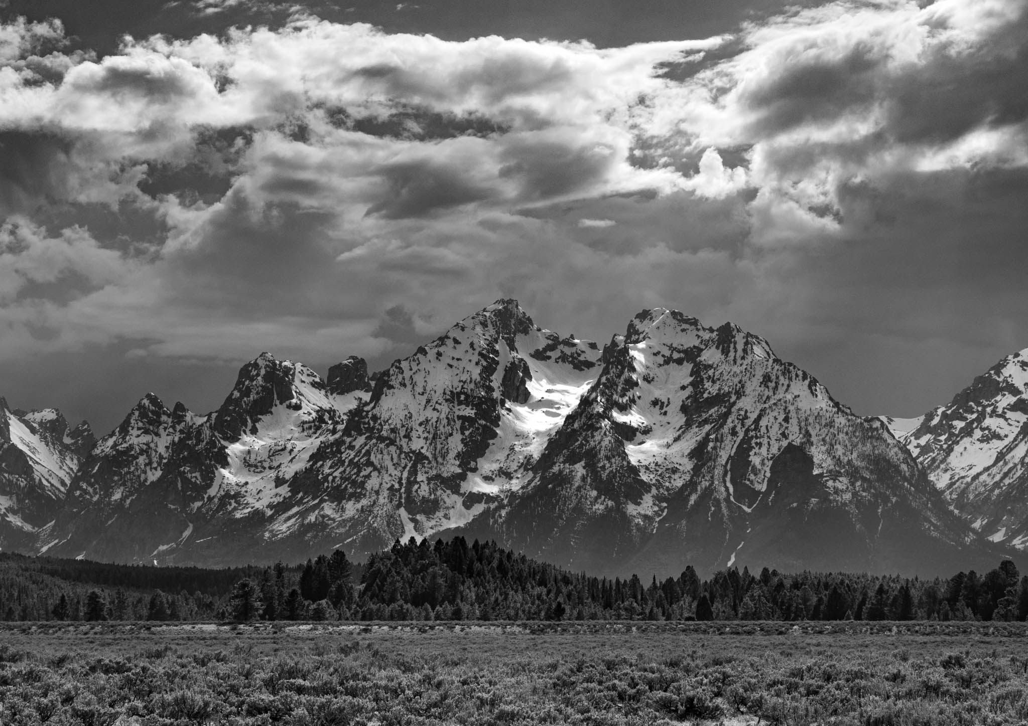
| 39 |
Jun 25 |
Comment |
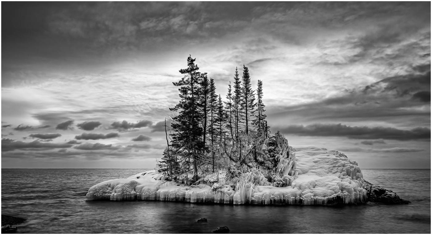
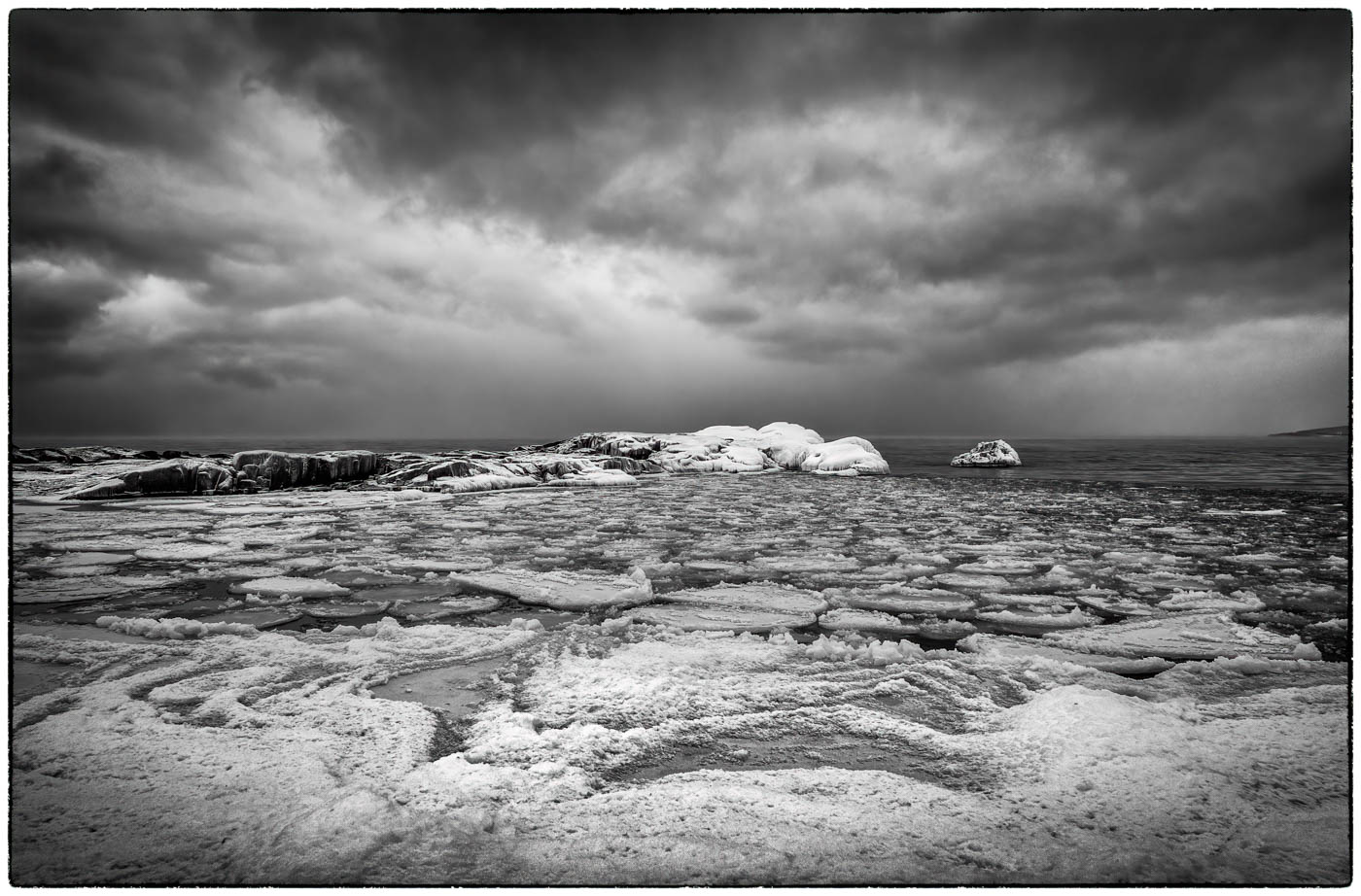
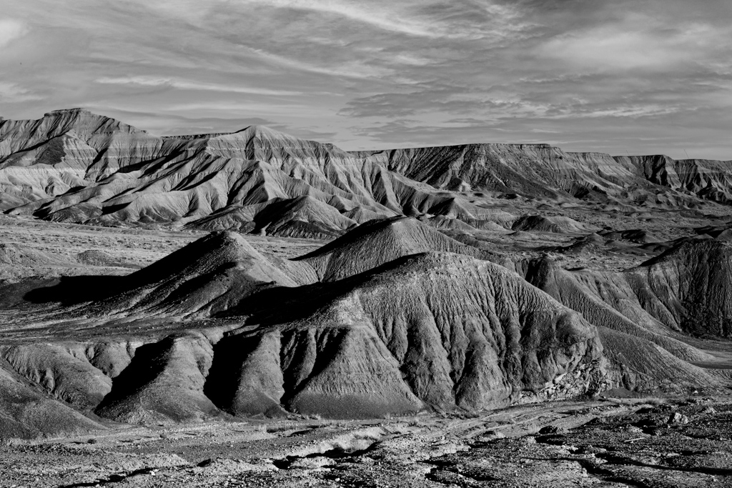
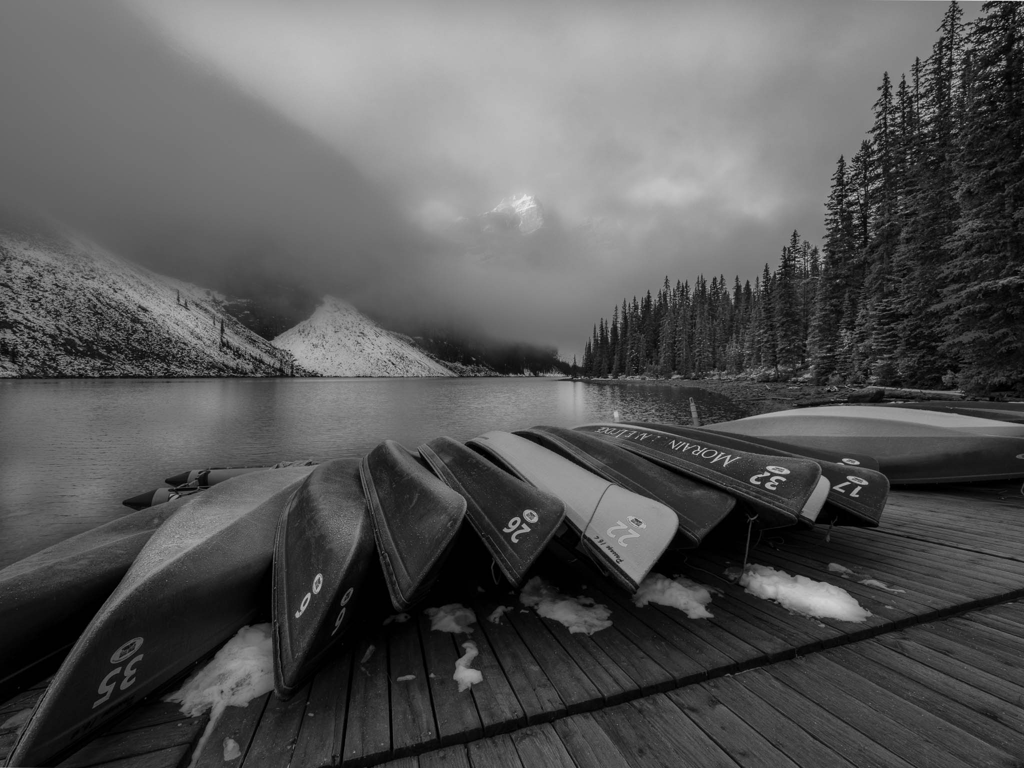
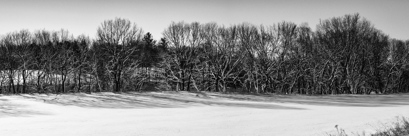
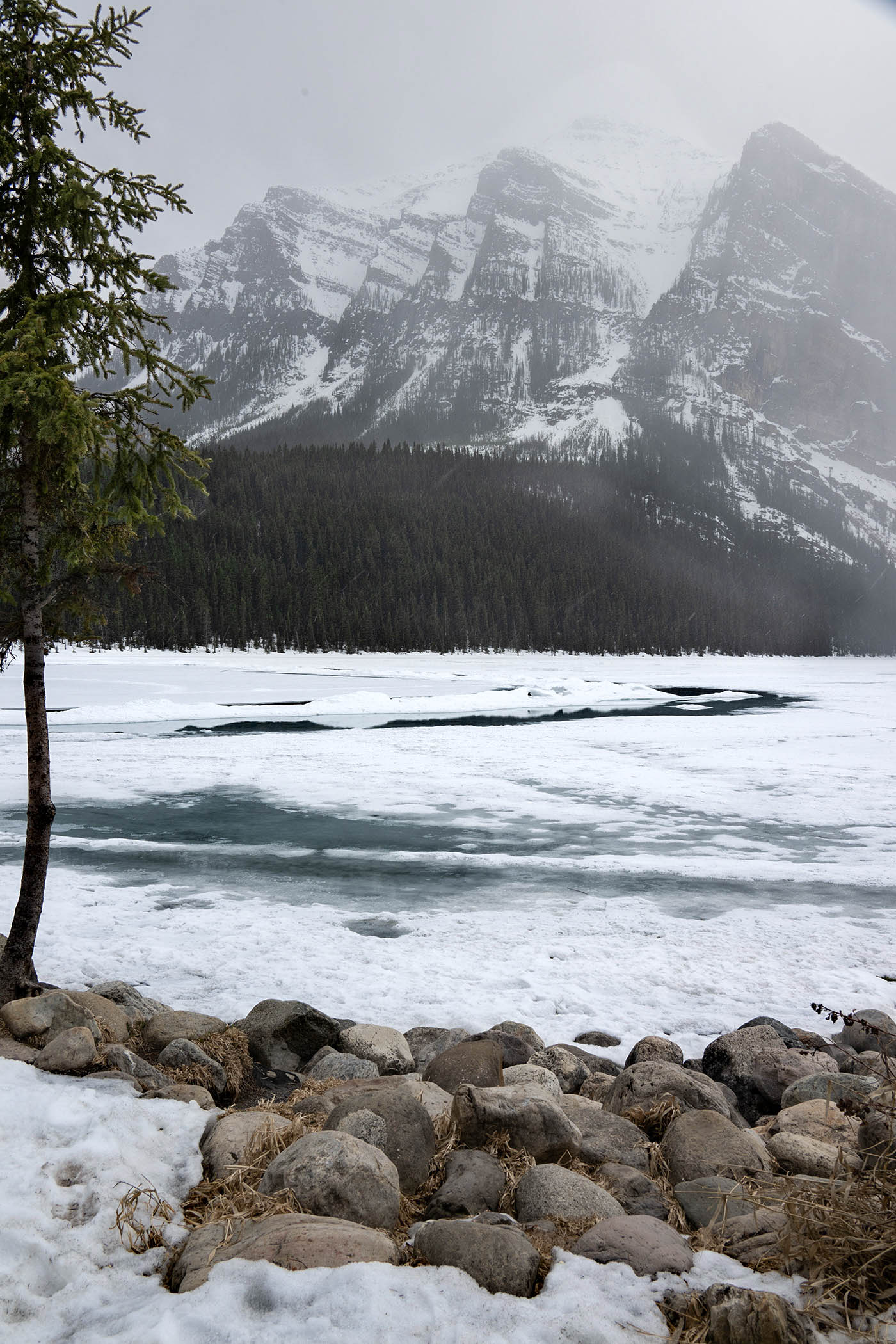
A great place to photograph, I have spent time there myself.
The conversion to B&W works for this subject as there is little color anyway. The focus is sharp from foreground to background. Using the rocks in the foreground works to balance the image and they work as a leading line into the image.
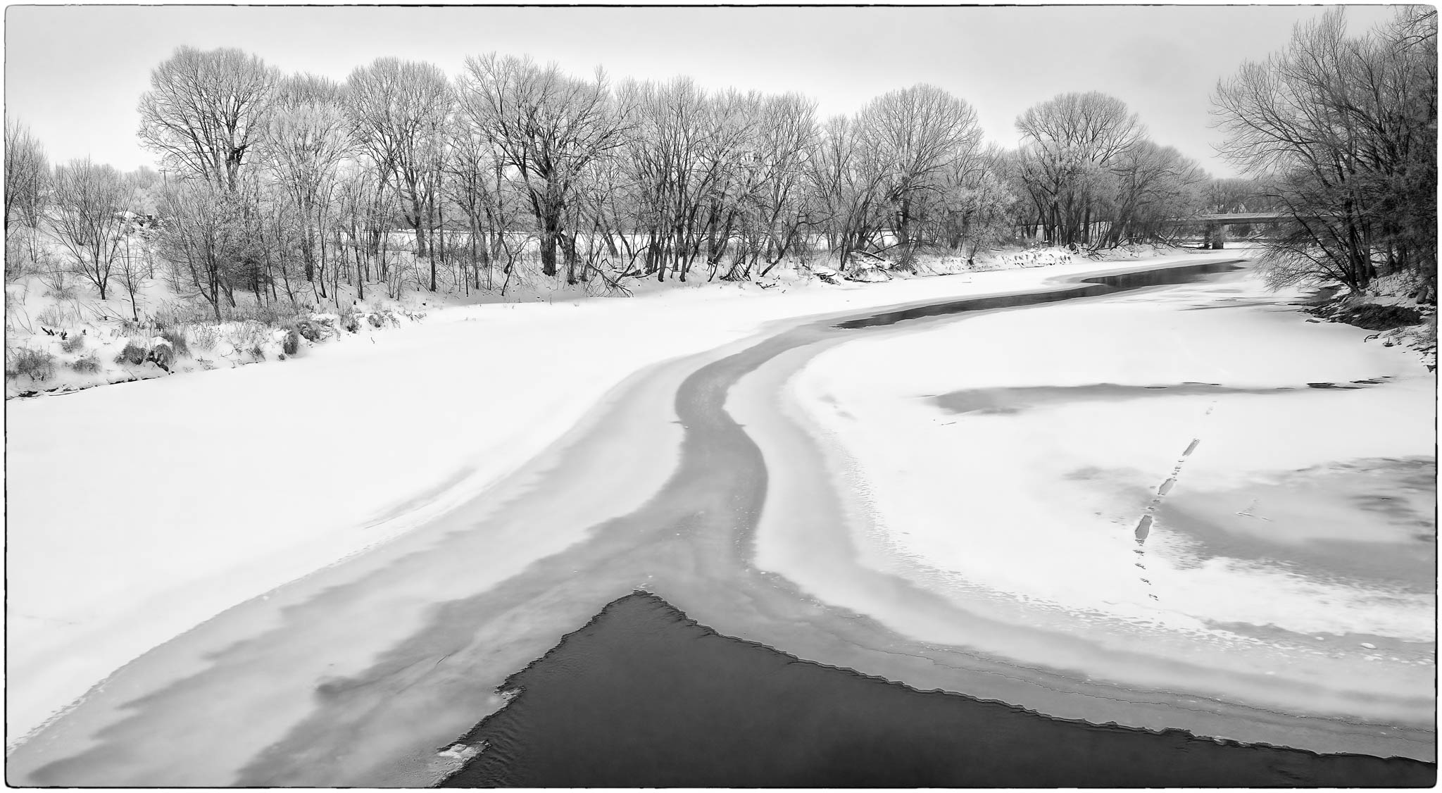
I think the subject lends more to a landscape format vs. vertical. The misty feel was captured, however, the added contrast has removed the mist. The contrast has also caused the snow to look harsh and dirty. It might work to selectivley add some contrast to the rocks and leave the rest as is. Might also select the trees in the background and lighten them some to bring out detail. I find it better to work selectively when making adjustment to an image rather than making overall adjustments. In this case, I would separate the rocks, tree on the left, snow, trees in the background, mountains and sky.
I used the color version, being a jpg it was limited, and made the selective changes I mentioned. BTW, I did not add any contrast. See what you think. |
Jun 9th |
 |
| 39 |
Jun 25 |
Comment |
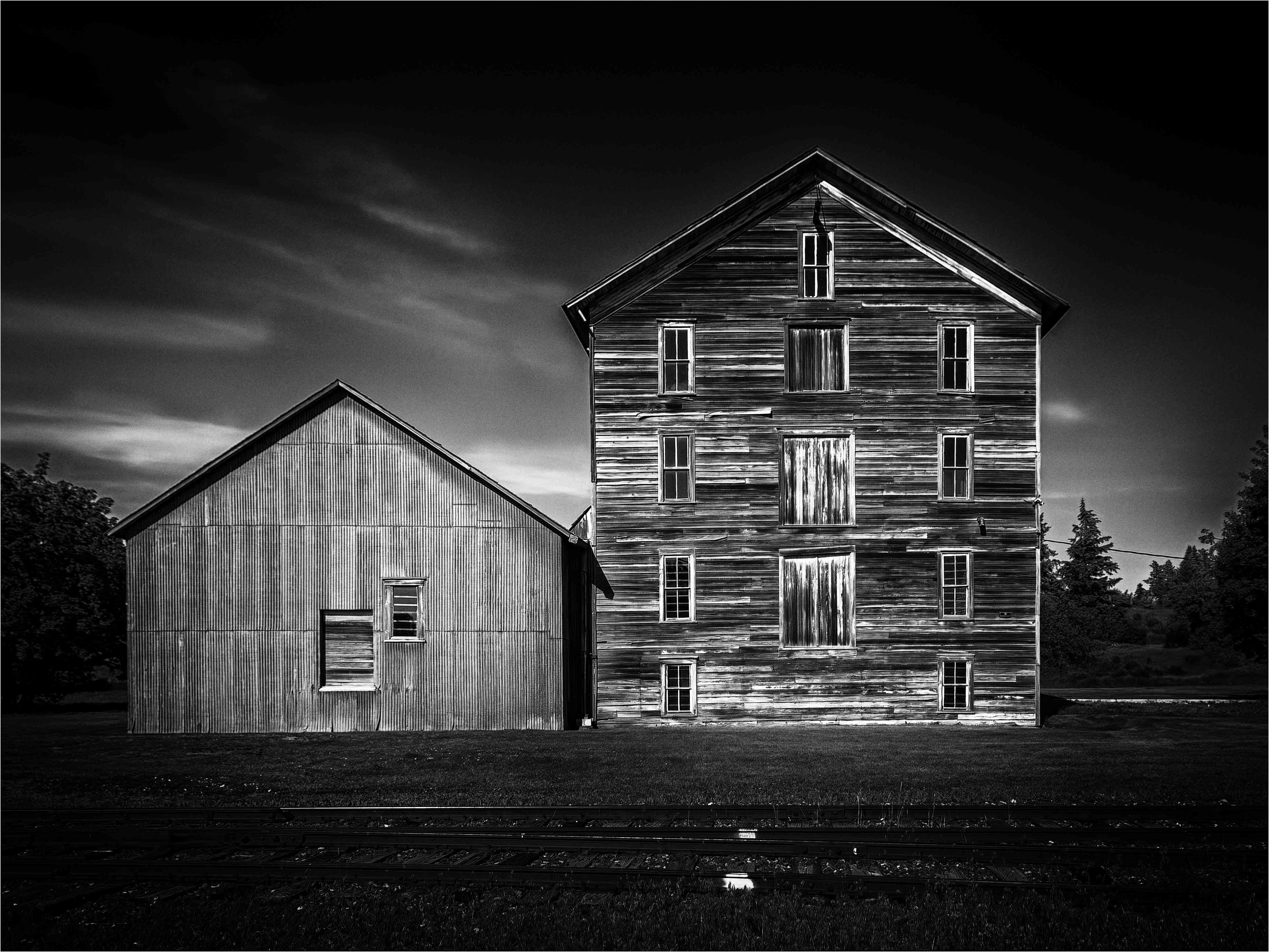
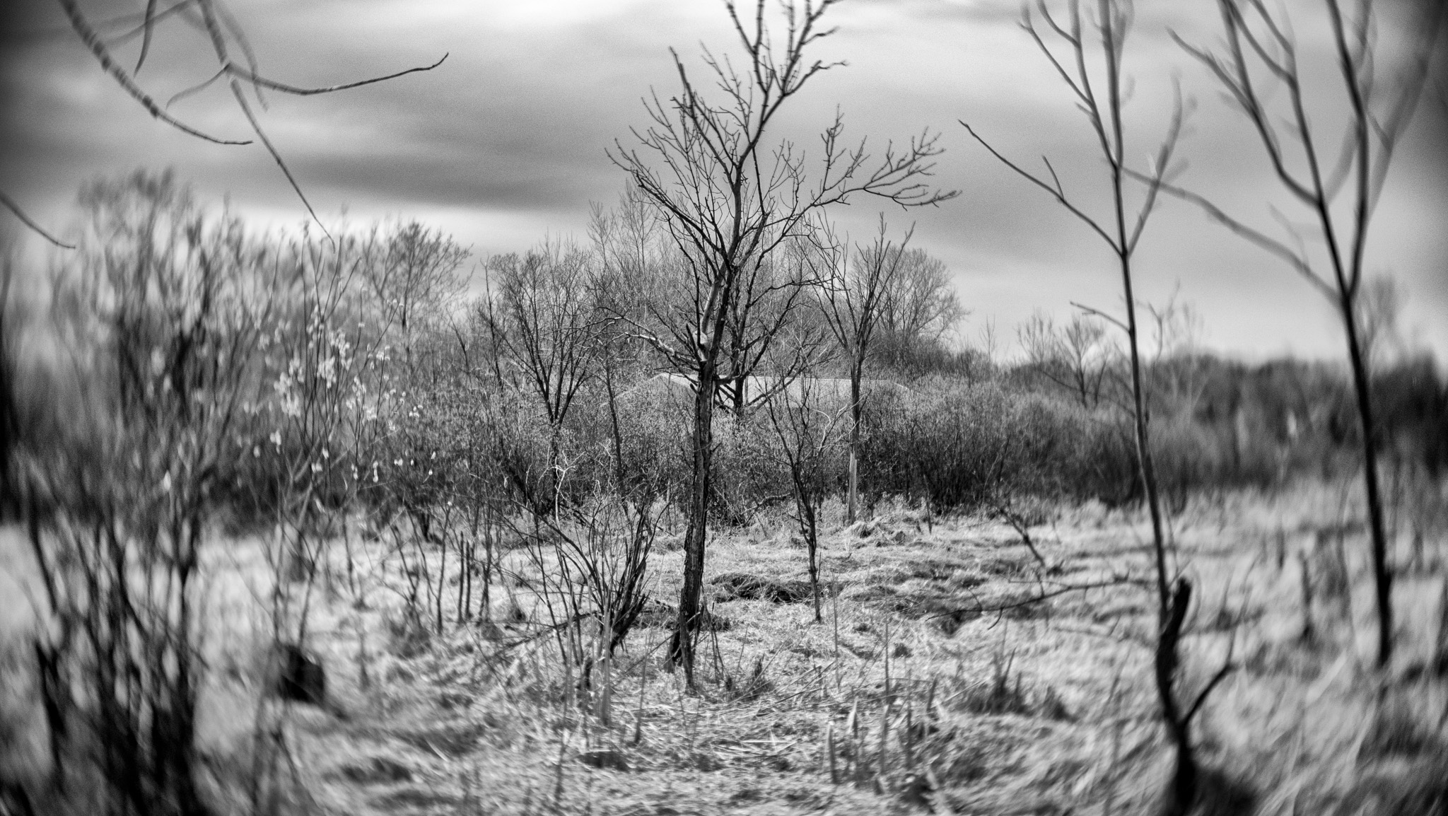
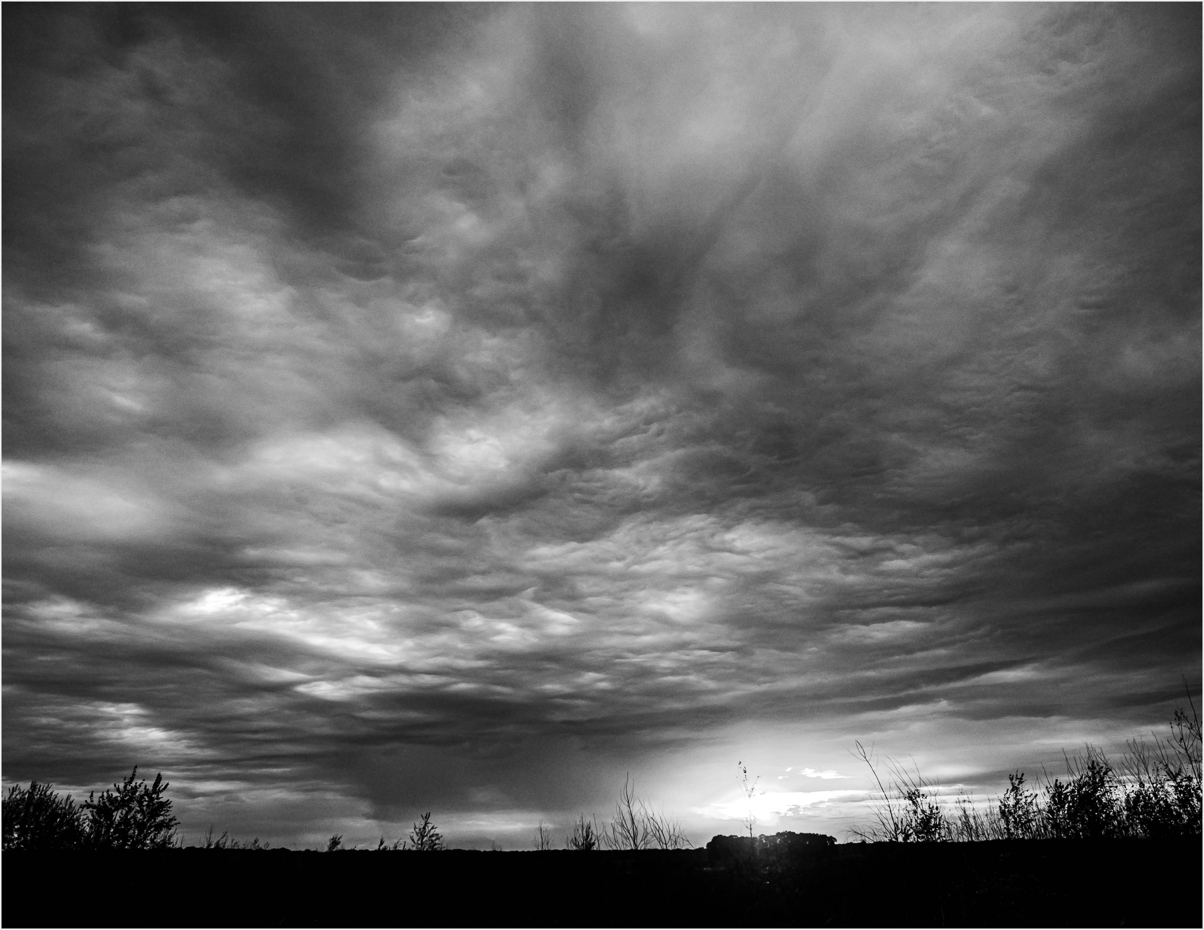
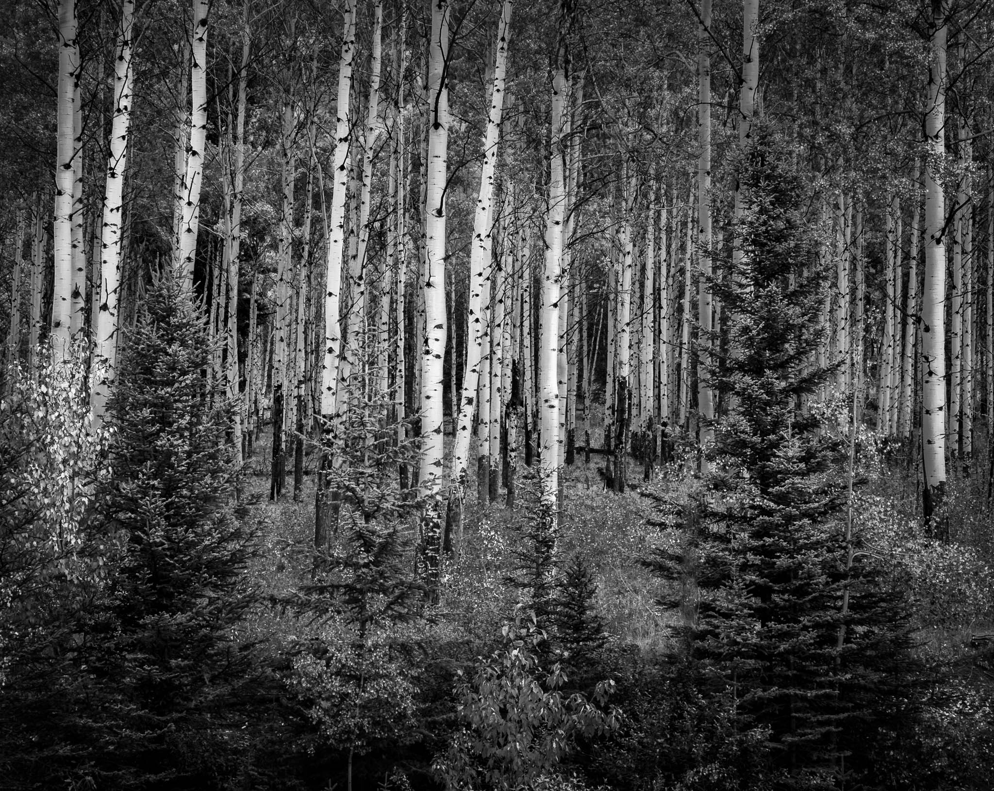
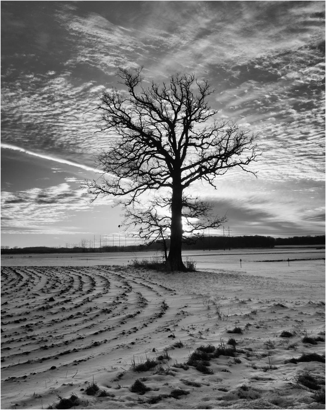
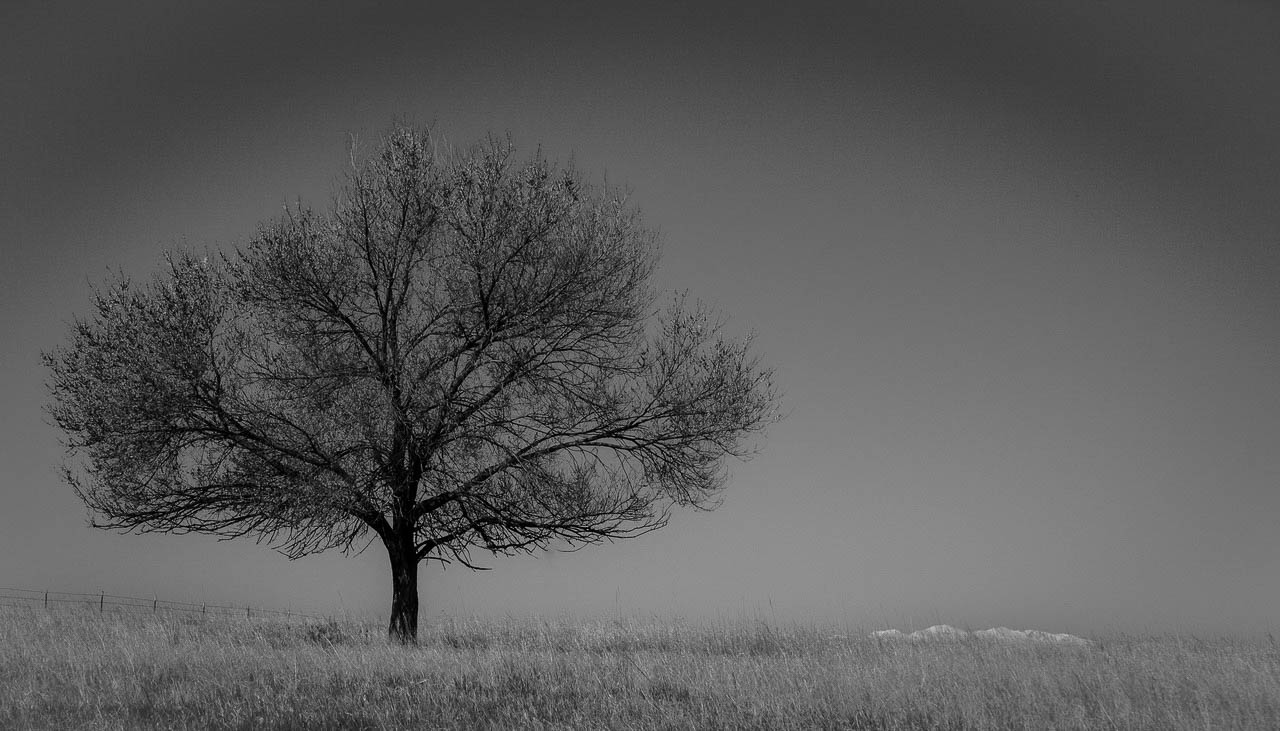
The title is "A tree near Ault".
The simplicity provides good interest. The mountains create a balance and cause the viewer to stay in the image longer. The tree is sharp and whos good detail. The fence works to balance the mountains and help lead the viewer.
Other than converting to B&W was there any other processing done? Overall it is a bit flat with little separation between foreground, tree and sky. There is also a dark curved area over the top of the image, wondering if that is intentional. I might tone that down. I would also suggest a thin boarder to help the image stand out more from the black blackground.
I made some adjustments to the foreground, tree and sky. seee what you think. |
Jun 9th |
 |
| 39 |
Jun 25 |
Reply |
Thanks Ella, good to hear from you. |
Jun 9th |
| 39 |
Jun 25 |
Comment |
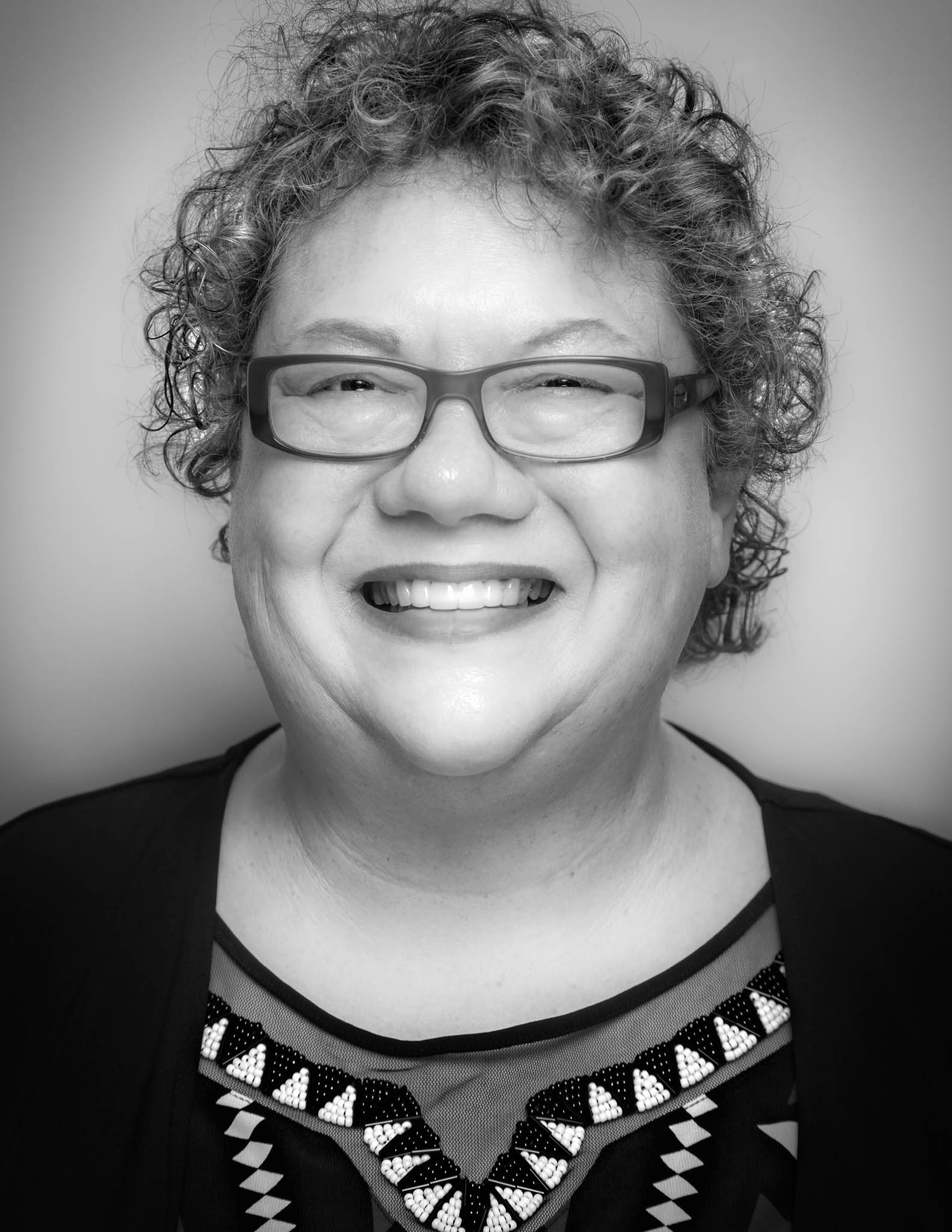
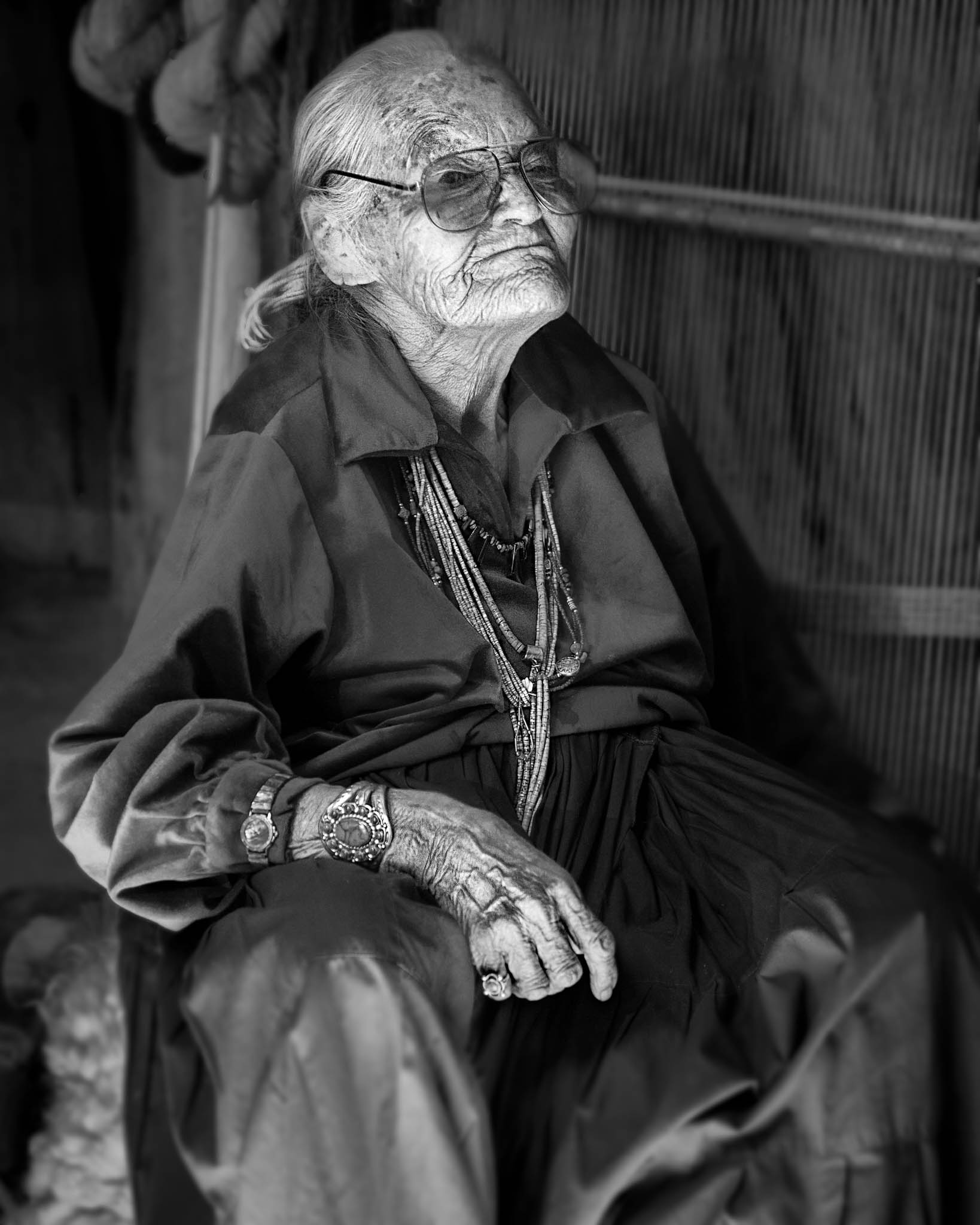
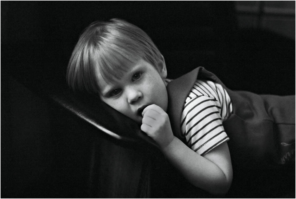
Good lighting and detail, and her pose, "The Pose", makes the image, and gives it interest. The white item provides some balance especially as the subject appears to be looking at it which ties the two together.
I think I prefer the color version of this image. The color tends to add more dimension to the image.
A white border would make it stand out more, as it is ite tends to blend with the background. |
Jun 5th |
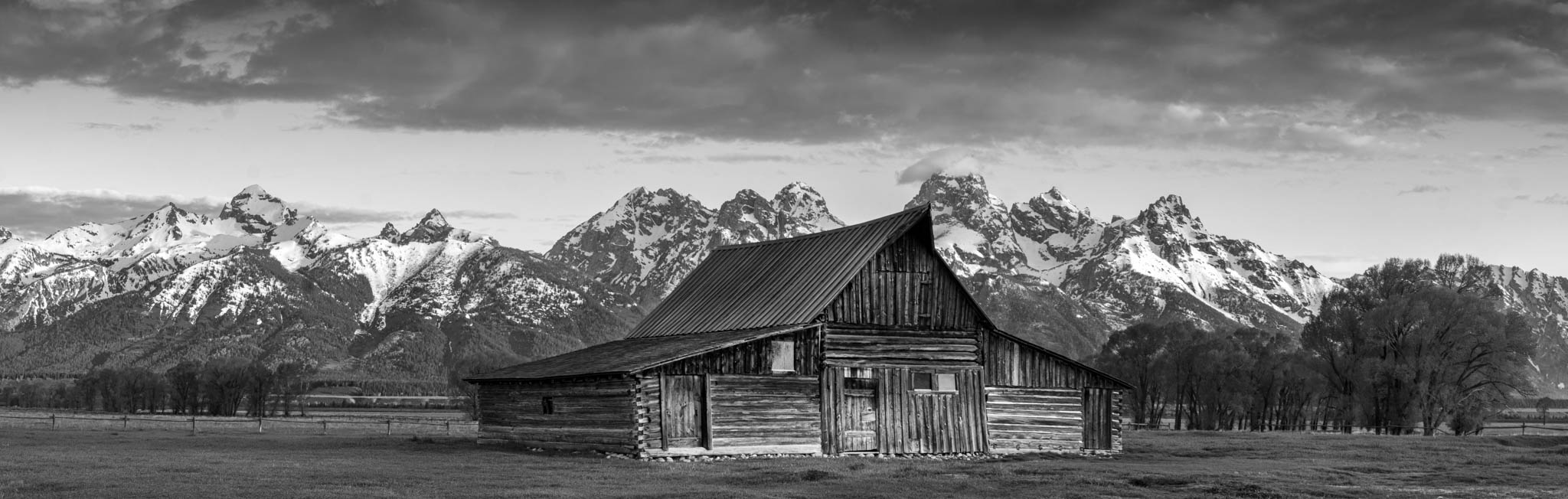
| 39 |
Jun 25 |
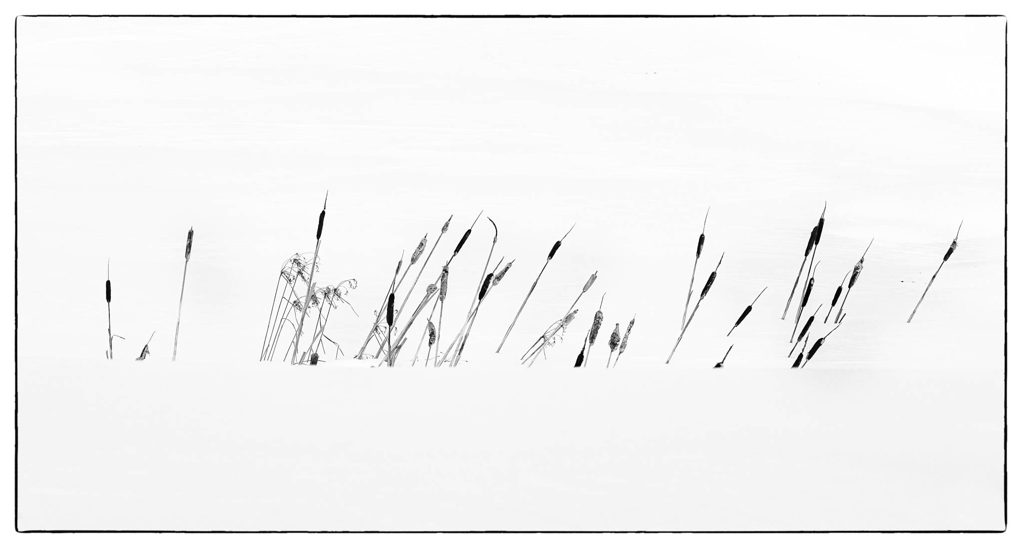
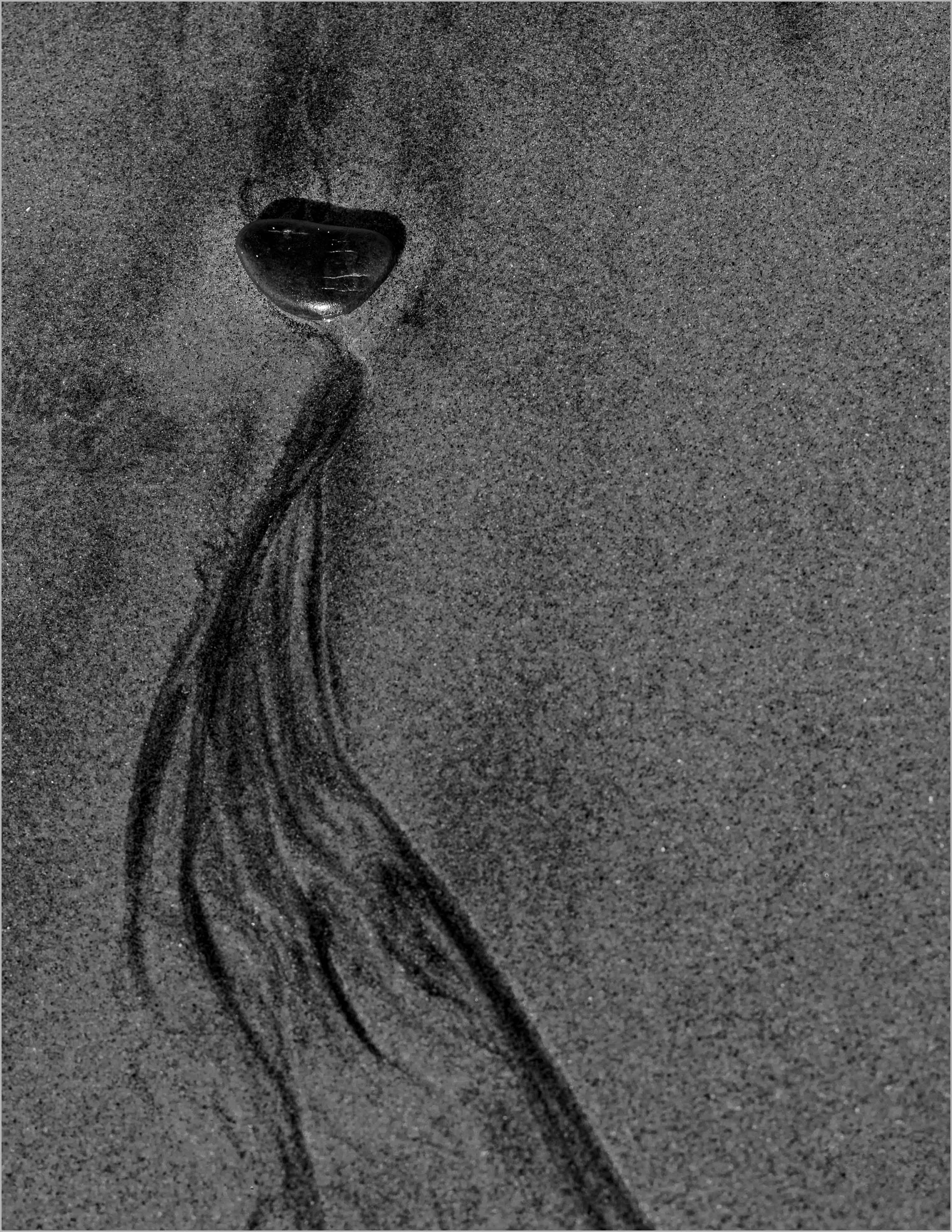
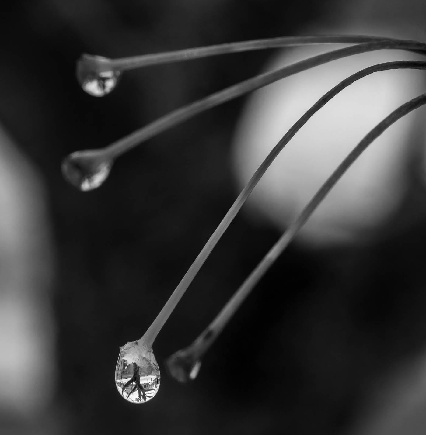
Comment |
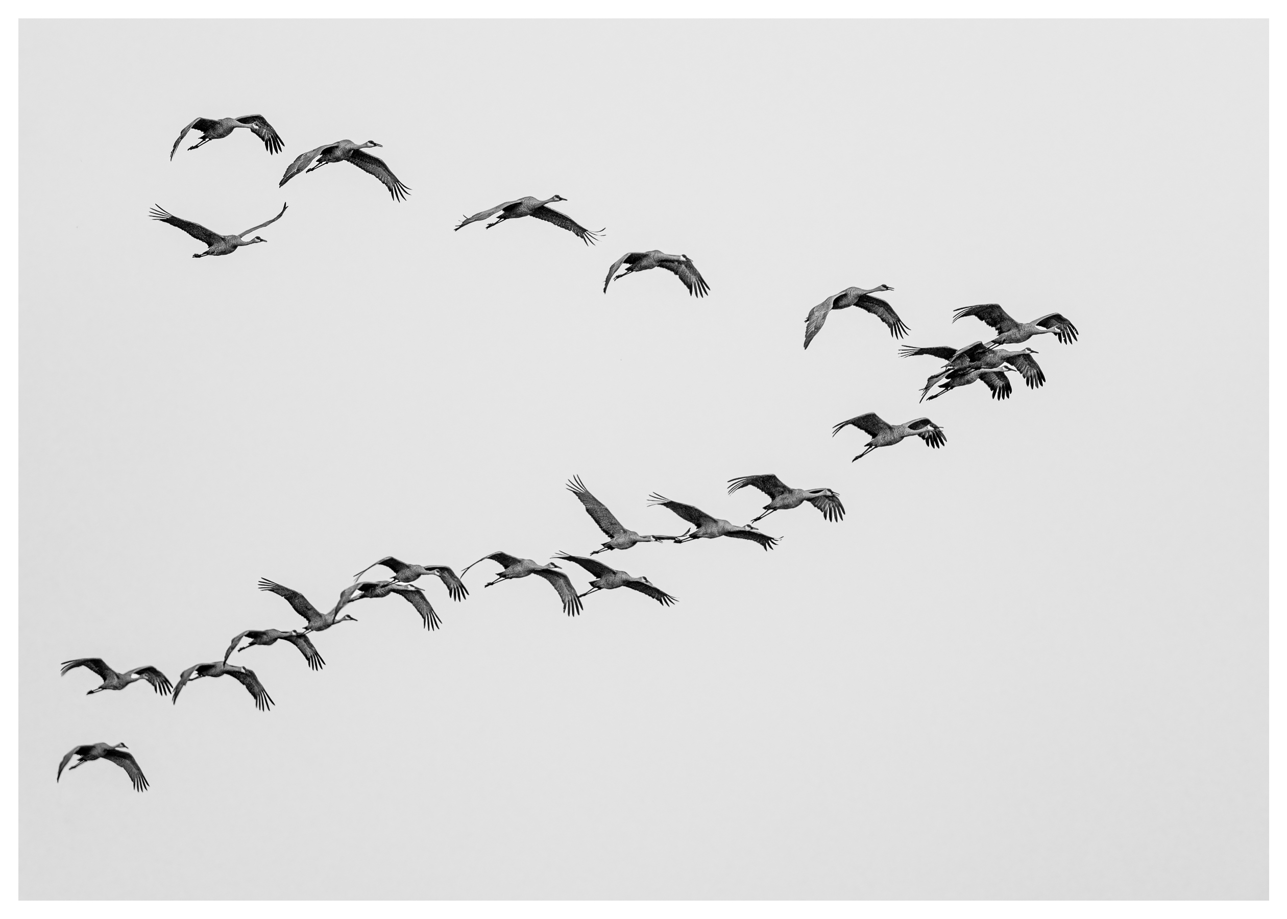
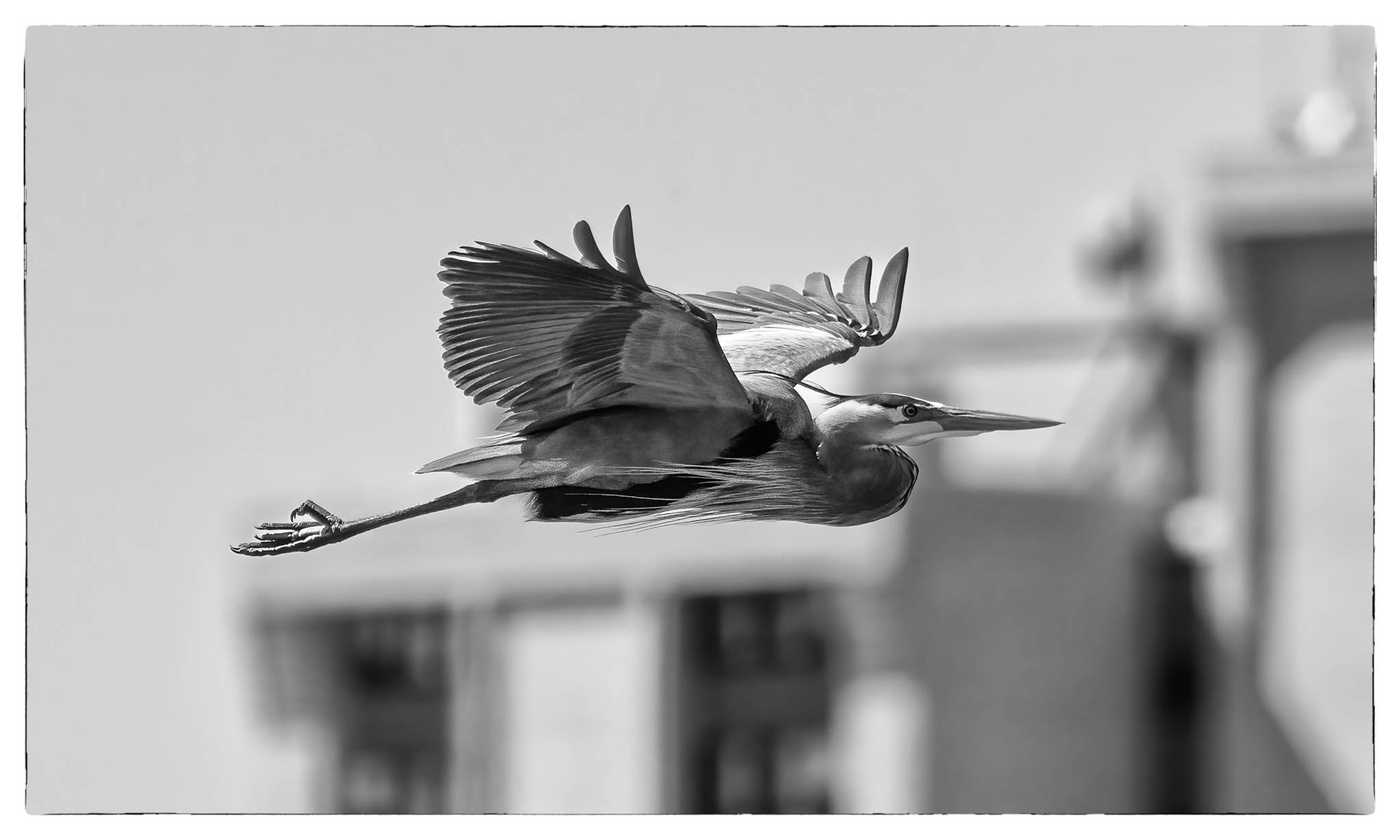
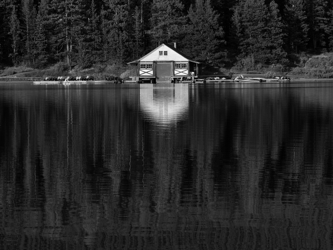
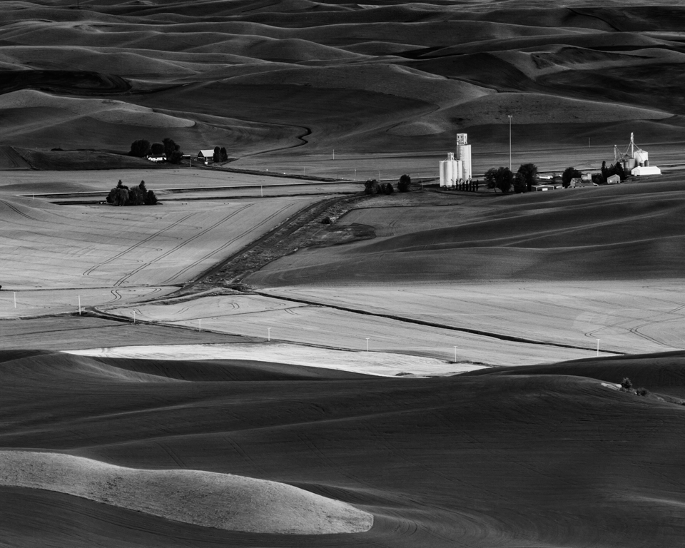
A very strong image with high impact and interest. Great tones, contrast and details in the reeds. The reflections are an added bonus. The bend in the reeds provides an easy relaxing feel. The B7W version is much stronger that the color. A wall hanger.
The size of the image should be 1200 - 1400 pixels on the long side then when clicked on itwill display larger for a better view. |
Jun 5th |
| 39 |
Jun 25 |
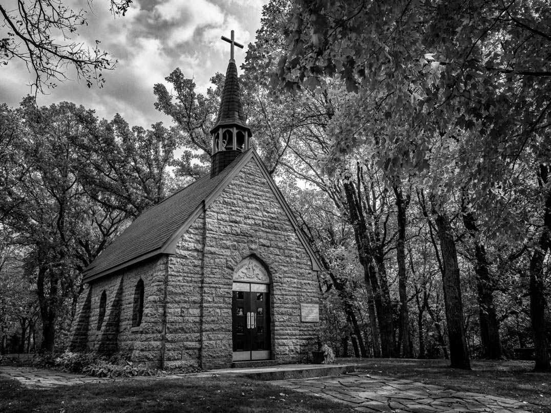
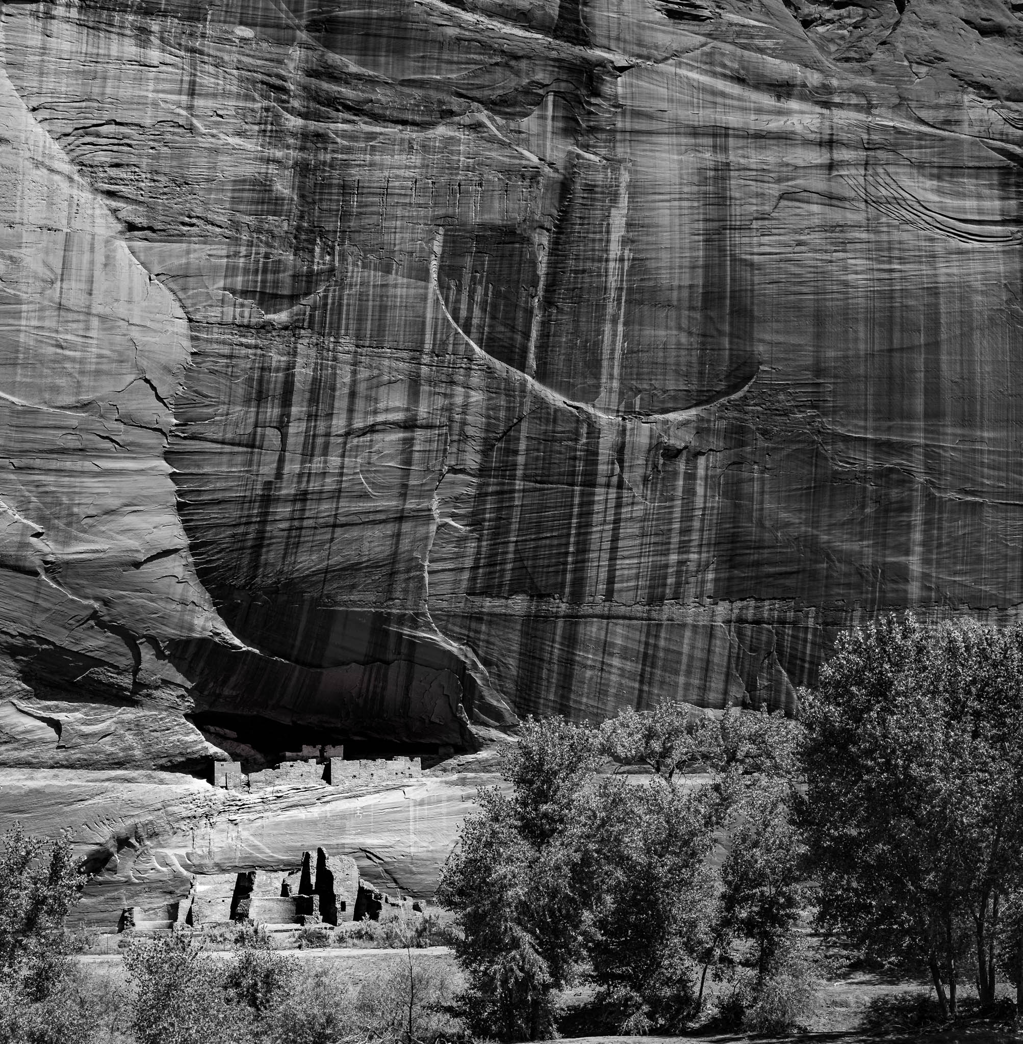
Comment |
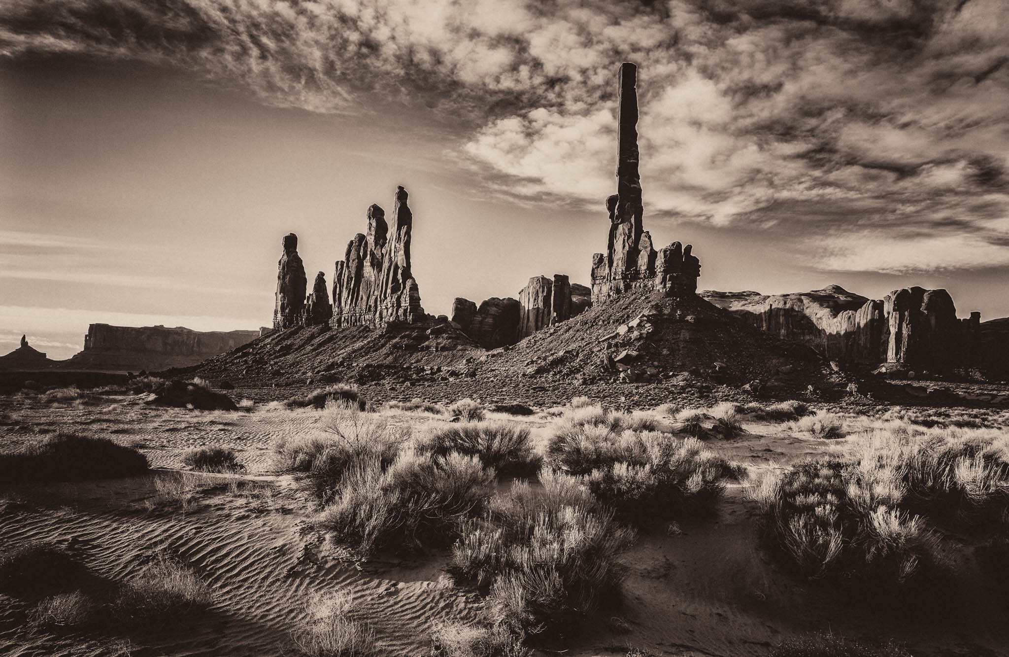
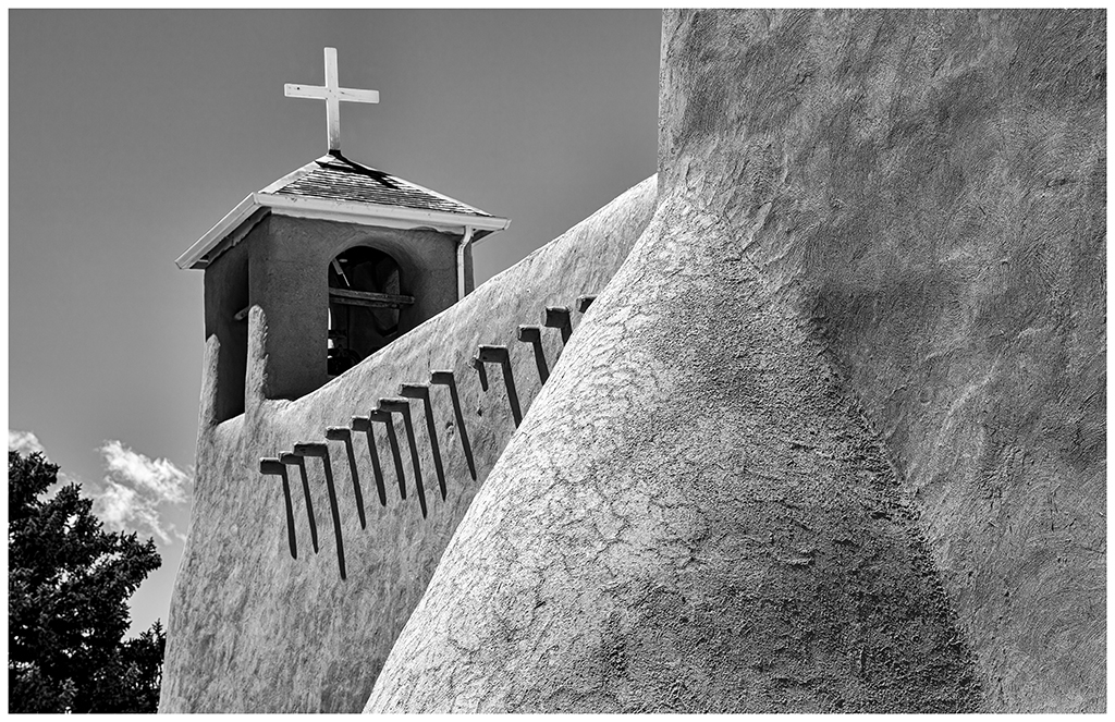
This image works well in B&W. It has great detail, so good work on the statue. The wavy lines tend to work as leading lines to the subject and lead the viewer in. The space between the church and statue is very good and the two work well together.
Because the bacground is black, I recommend adding a border to set the image off from the background.
The size of the image should be 1200 - 1400 pixels on the long side then when clicked on itwill display larger for a better view. |
Jun 5th |
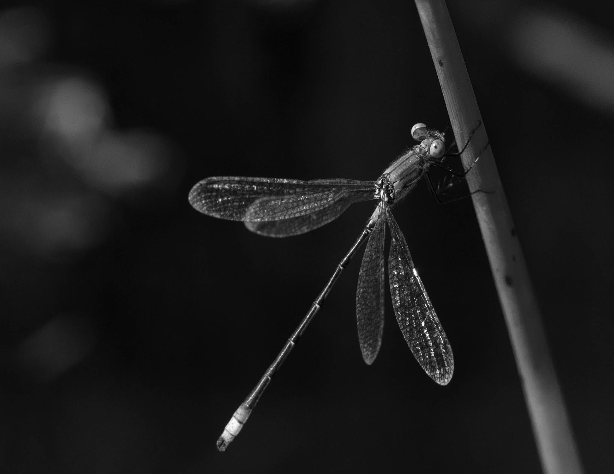
| 39 |
Jun 25 |
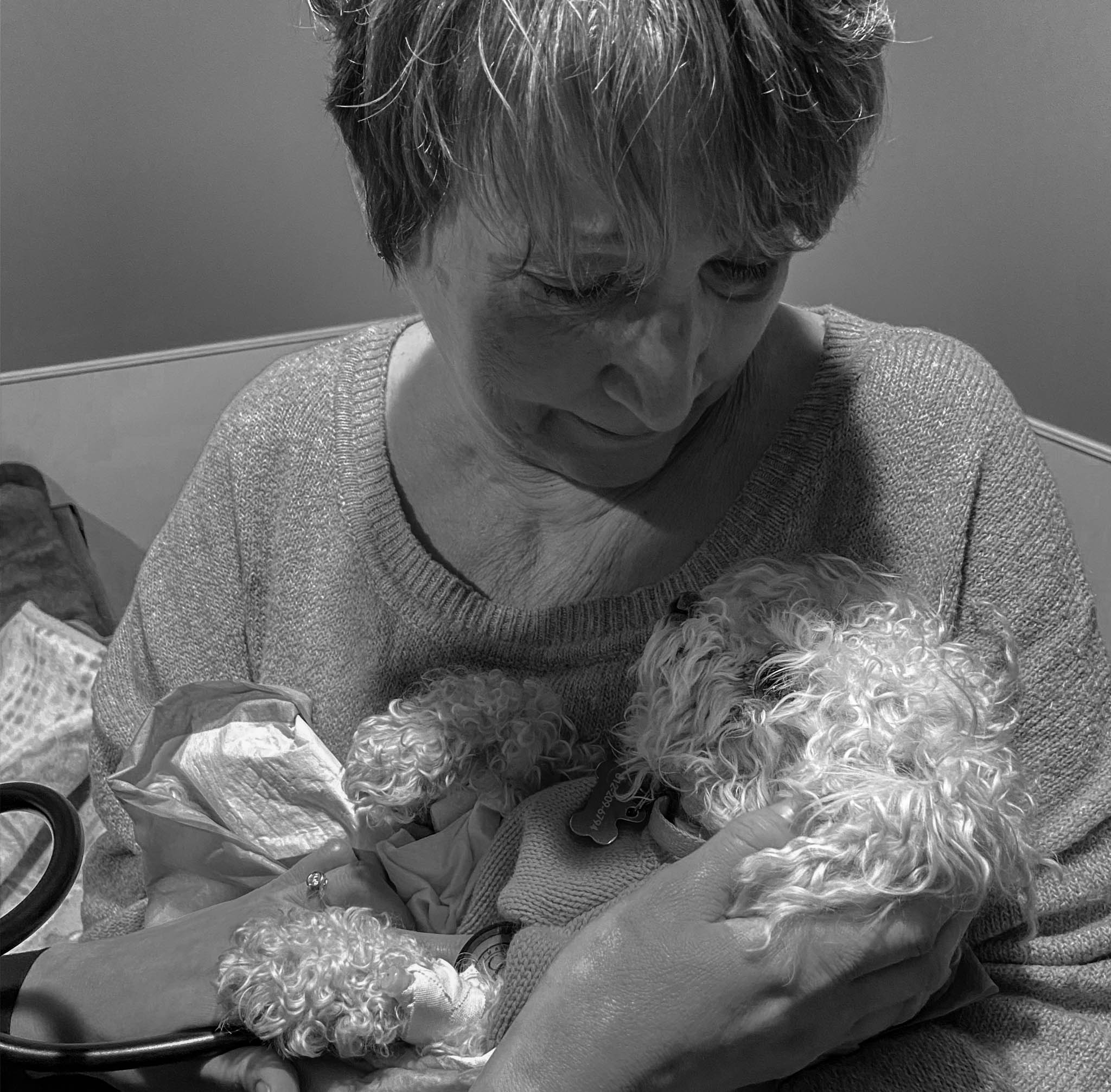
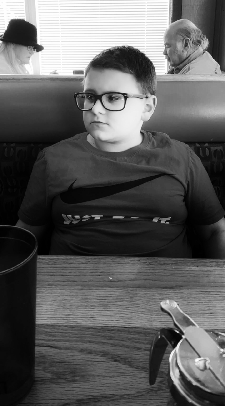
Comment |
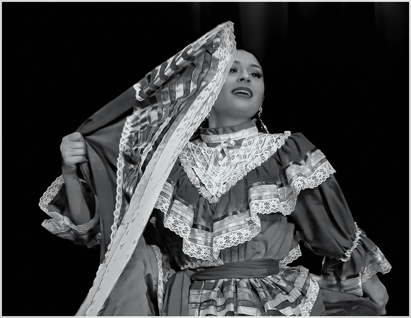
A great subject and it works very well in B&W. There is some blur in the arms and protion of dress she is holding giving it a feel of motion. Her expression and catch lights in the eyes provide interest.
I think a little more depth would work to get more in focus, especially the eyes. Was there any processing on her face, it appears soft? The whites are a bit too bright causing some loss of detail. I toned down the whites, see what you think.
|
Jun 5th |
 |
6 comments - 1 reply for Group 39
|
6 comments - 1 reply Total
|