|
| Group |
Round |
C/R |
Comment |
Date |
Image |
| 39 |
Apr 20 |
Comment |
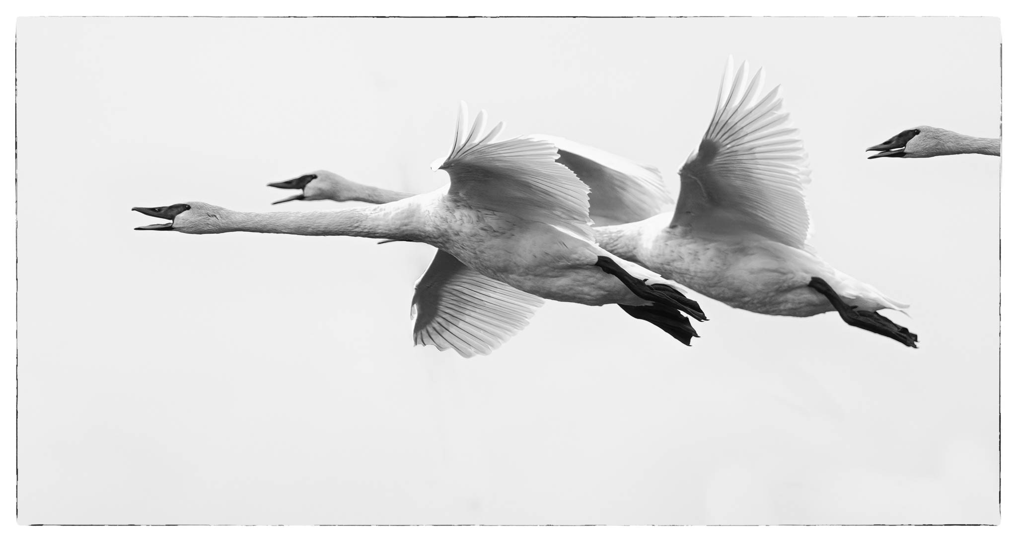
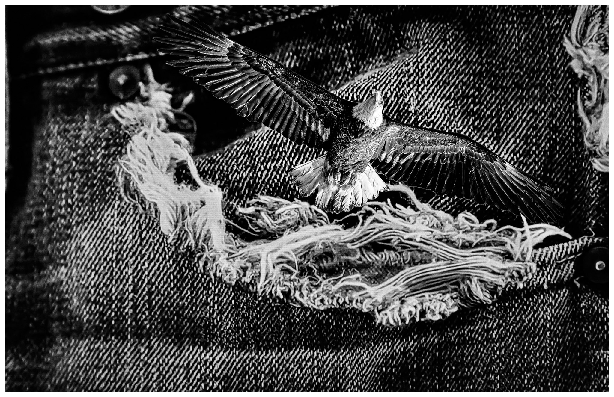
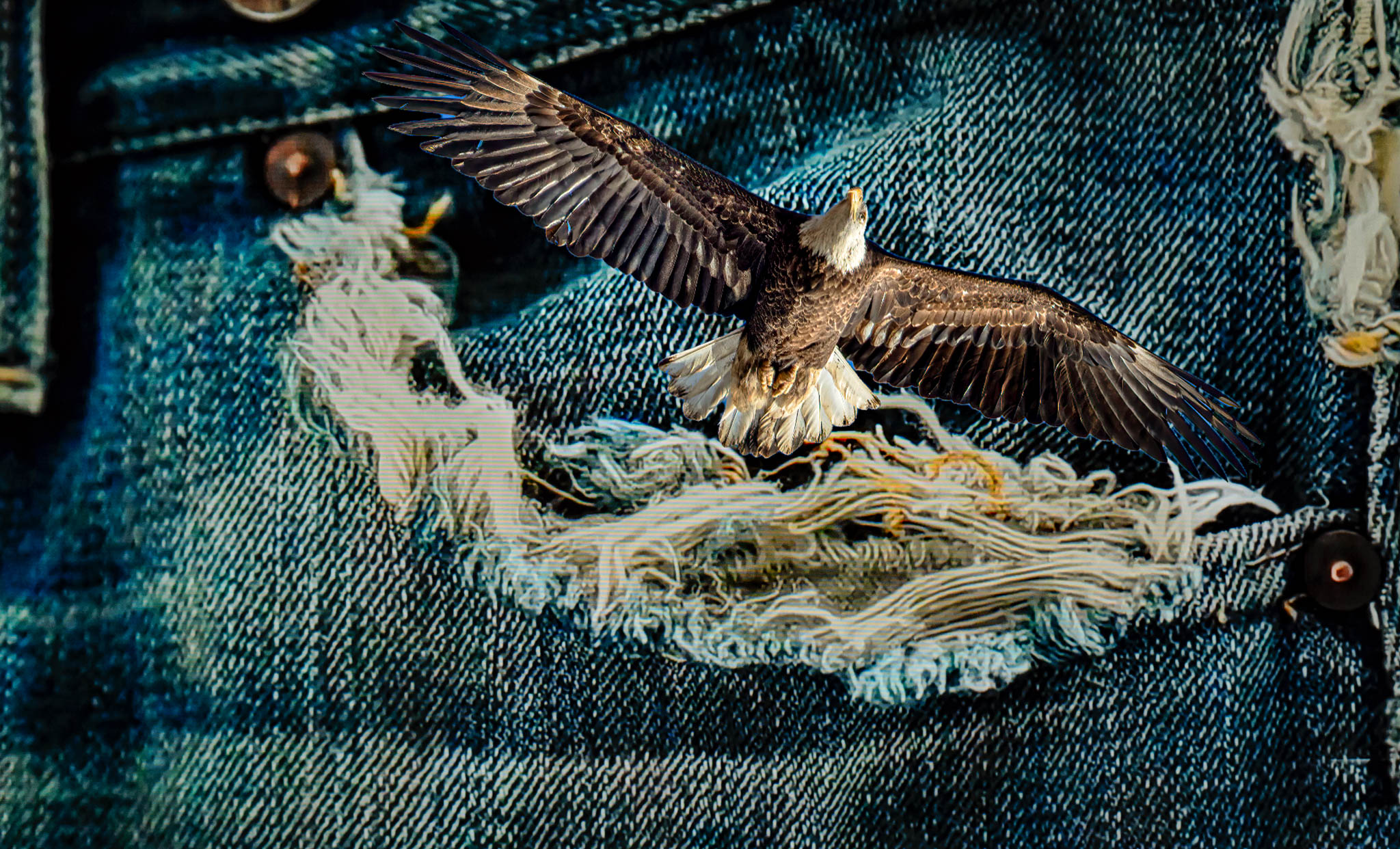
I like that tint Paul, it tends to help the crop issue also, for whatever reason. |
Apr 9th |
| 39 |
Apr 20 |
Comment |
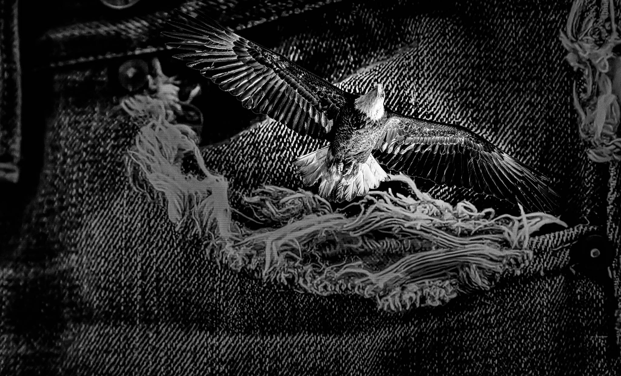
Paul, you are right, probably jumped in without much of a plan. Also correct about the cut out of the eagle, need to fine tune that. At least it got some communication going on. |
Apr 9th |
| 39 |
Apr 20 |
Comment |
I don't think I agree with the crop, I like the balance and tension from the wider crop. |
Apr 9th |
| 39 |
Apr 20 |
Comment |
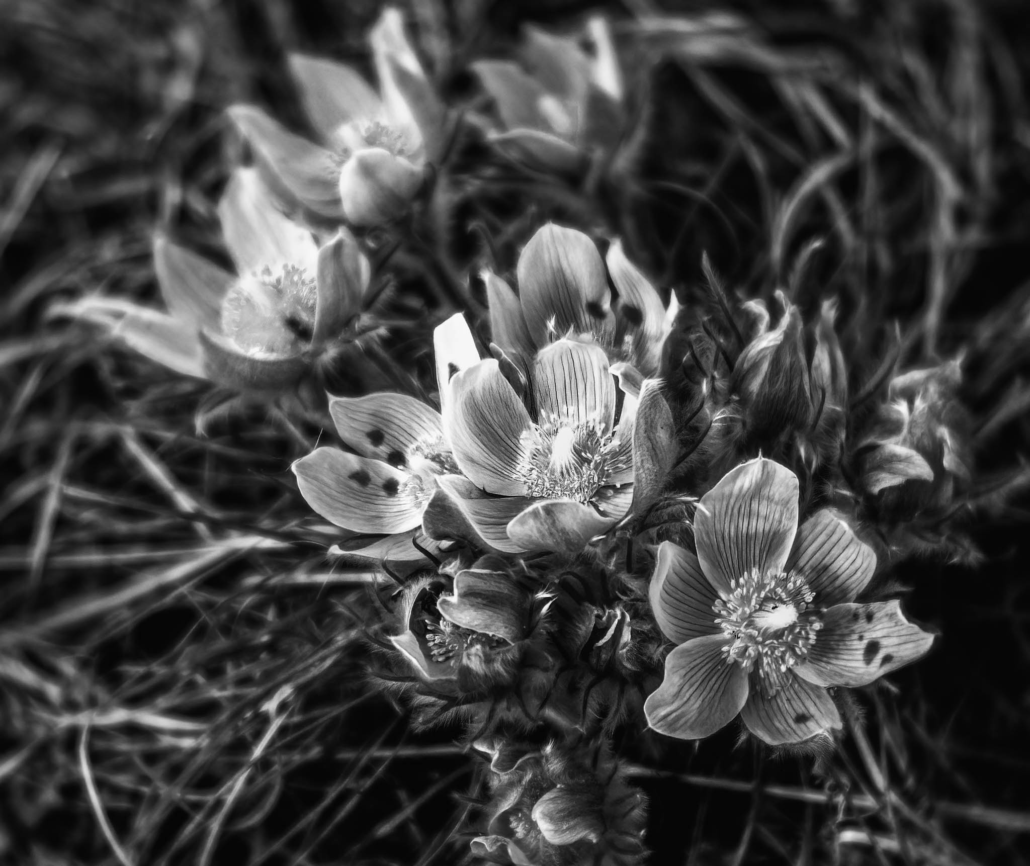
An interesting subject with lots of details. The technicals are good. I think the crop is a bit too tight especially on the left and the item near the top. I prefer the color version, it tends to be stronger for me. |
Apr 8th |
| 39 |
Apr 20 |
Reply |
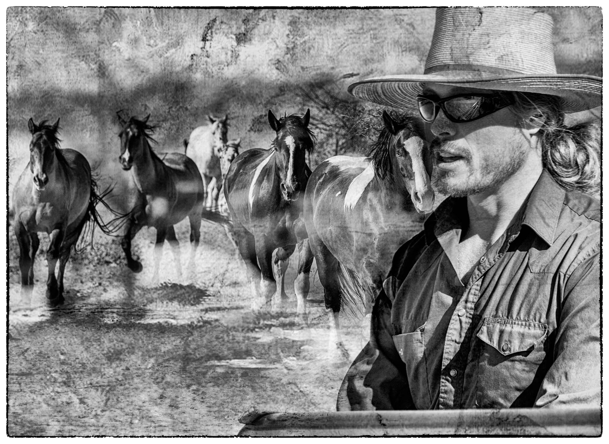
Totally understand, it is hard to show our feelings/mood to others. Bottom line, if it does what you want, what else matters. |
Apr 7th |
| 39 |
Apr 20 |
Reply |
Right, I am not sure what I was after, just trying something new for whatever.
|
Apr 7th |
| 39 |
Apr 20 |
Comment |
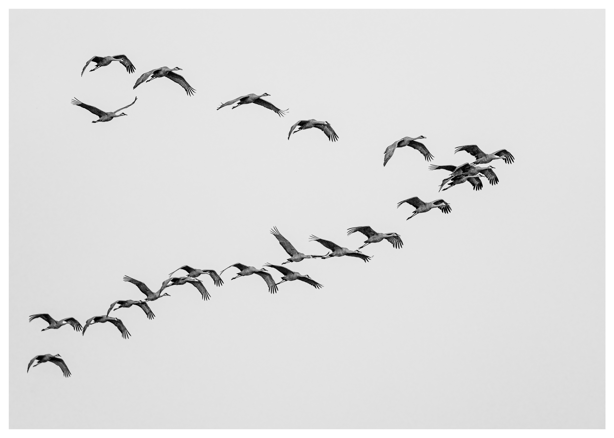
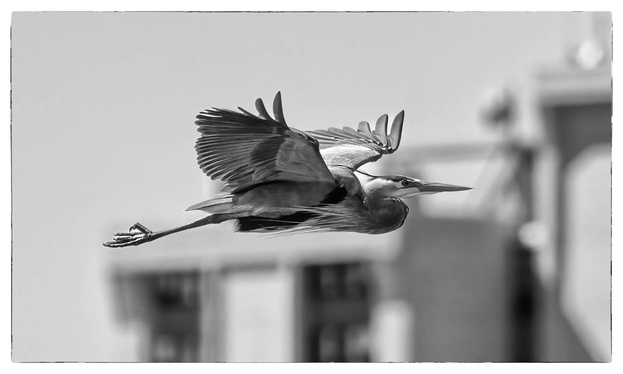
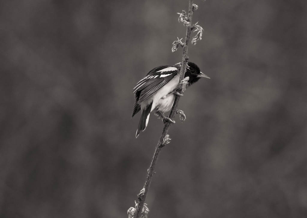
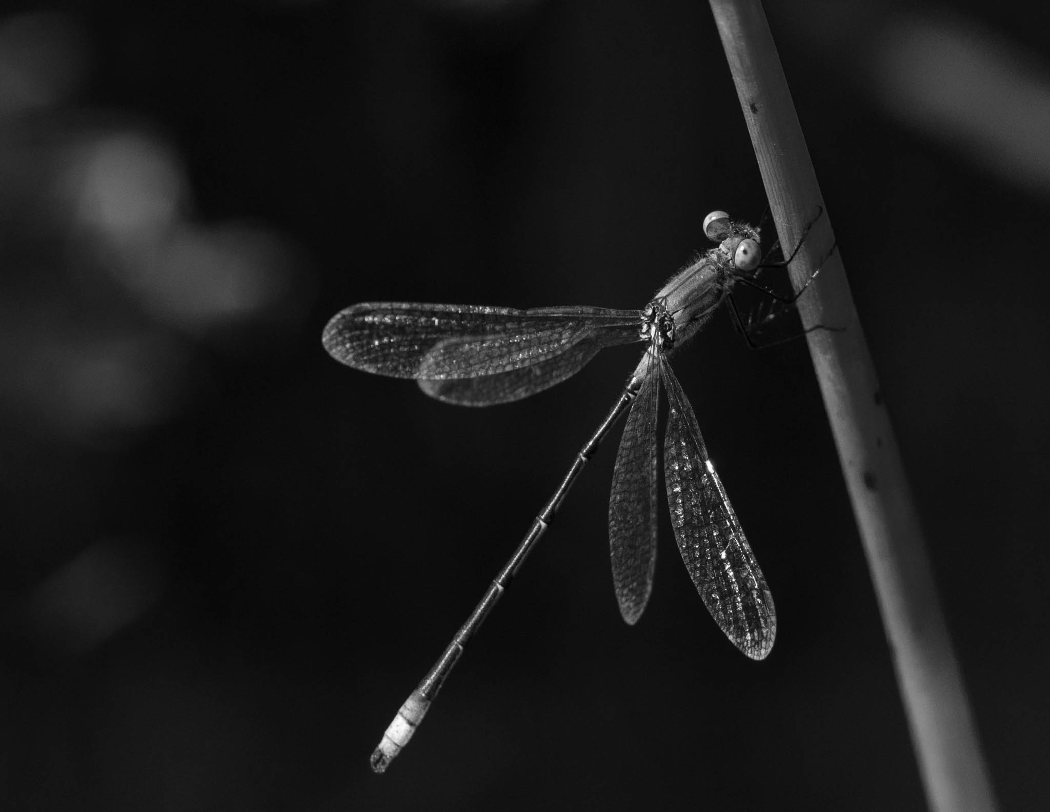
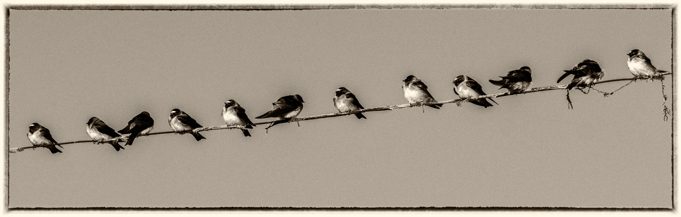
This image has very good impact and interest. I think it works great in b&w, it has good balance with the birds on each side and the one sitting on top of the pole. What is the background? it looks like a texture layer was added? Not sure what you mean by top down approach, were you above the birds shooting down towards the ground? Either way I think is a strong image and would consider hanging it. I have not suggestions for change. |
Apr 7th |
| 39 |
Apr 20 |
Comment |
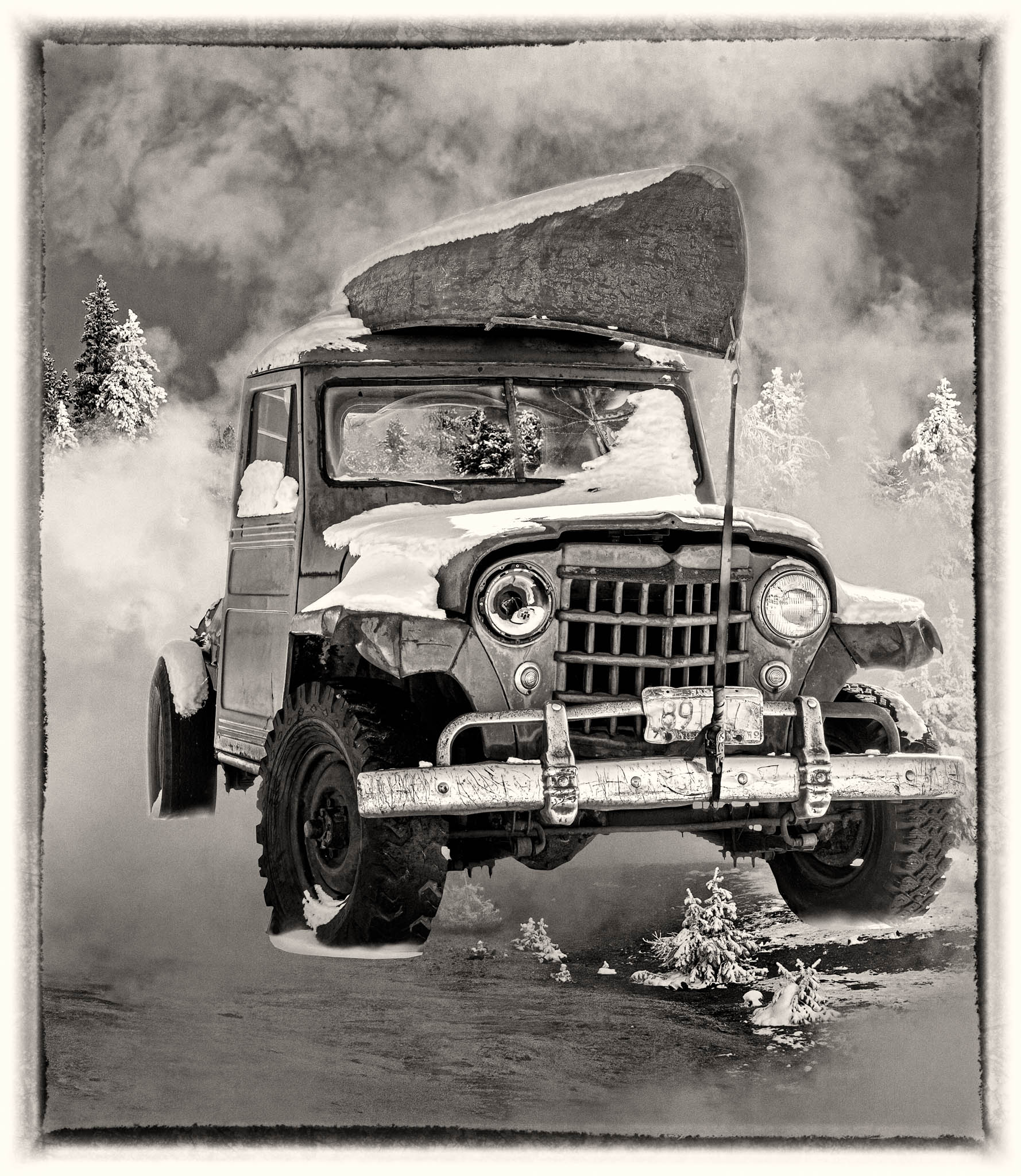
For me the sharpen is over done and makes it look too crispy and unnatural, maybe half of that would work. |
Apr 4th |
| 39 |
Apr 20 |
Comment |
Here is an adjusted image based on input from Larry. |
Apr 3rd |
 |
| 39 |
Apr 20 |
Reply |
The title is there, at least it shows on my screen. The Eagle shows much better in the color version, so I am attaching it here. I will try your suggestion. I too like it but not what made me choose the background, I tired a number of backgrounds and this one turned out to be the one I liked, I guess in art we don't have to know why. |
Apr 3rd |
 |
| 39 |
Apr 20 |
Comment |
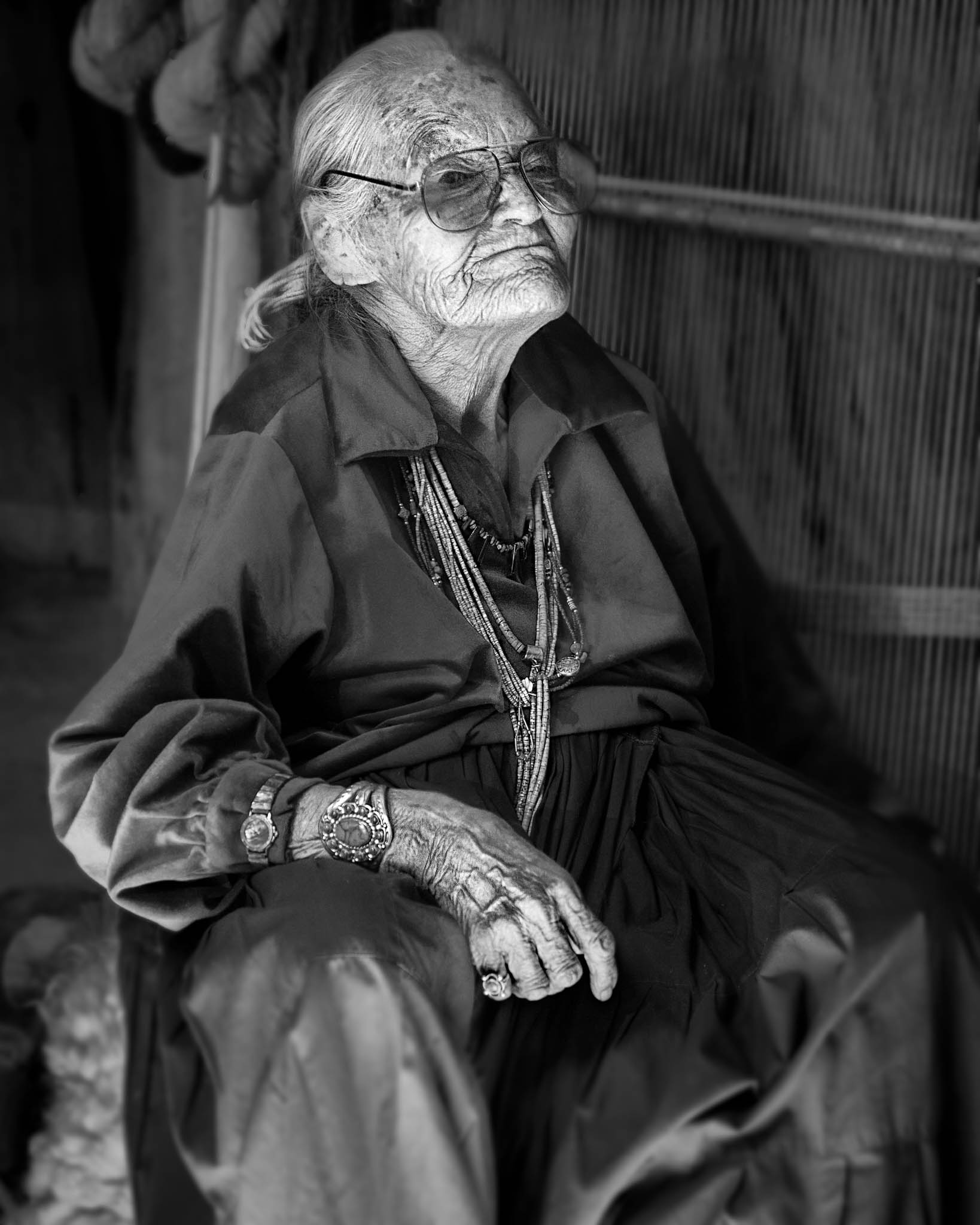
it works well in B&W and I like the composition, tone and DOF. My issue is I feel like I need my glasses...but I have them on. The blur in the water and sky is fine but in the rest of the image not too much. |
Apr 3rd |
| 39 |
Apr 20 |
Comment |
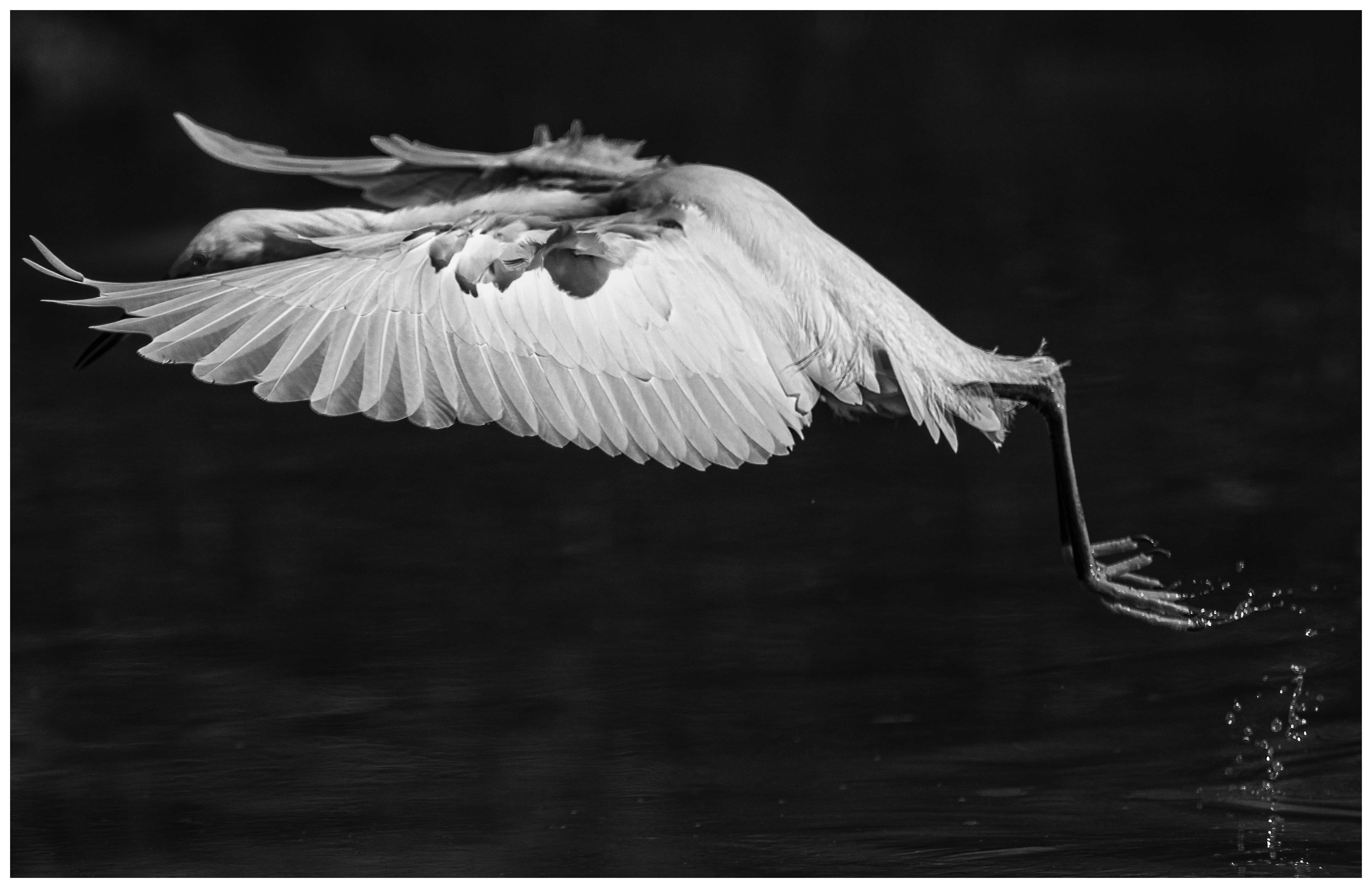
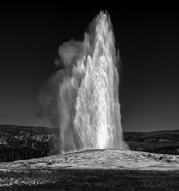
Good choice Larry, I think that puts the finishing touches to it. |
Apr 2nd |
| 39 |
Apr 20 |
Comment |
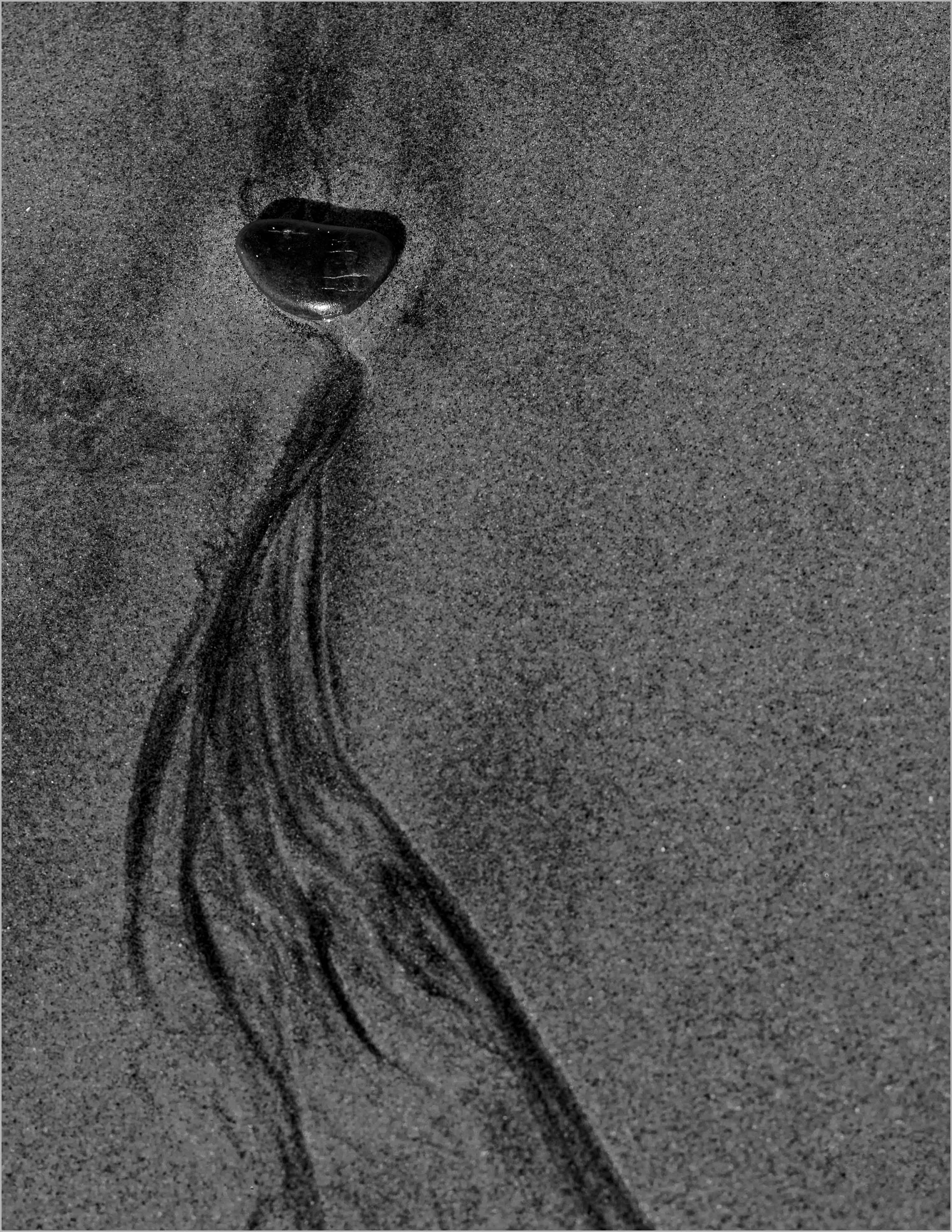
The definition in the water stands out more in the B&W. I can even see individual drops on the right side that I can see well in the color. Good contrast and lots of detail in the geyser. There is a lot to work with here and I think you can keep the aspect ration but bring in the sides and the bottom some to give the geyser more emphasis. I lowered the highlights, raised the whites and lowered the blacks then raised the texture and clarity. I think it brings out more detail in the geyser. See what you think. All done in Lightroom. |
Apr 1st |
 |
| 39 |
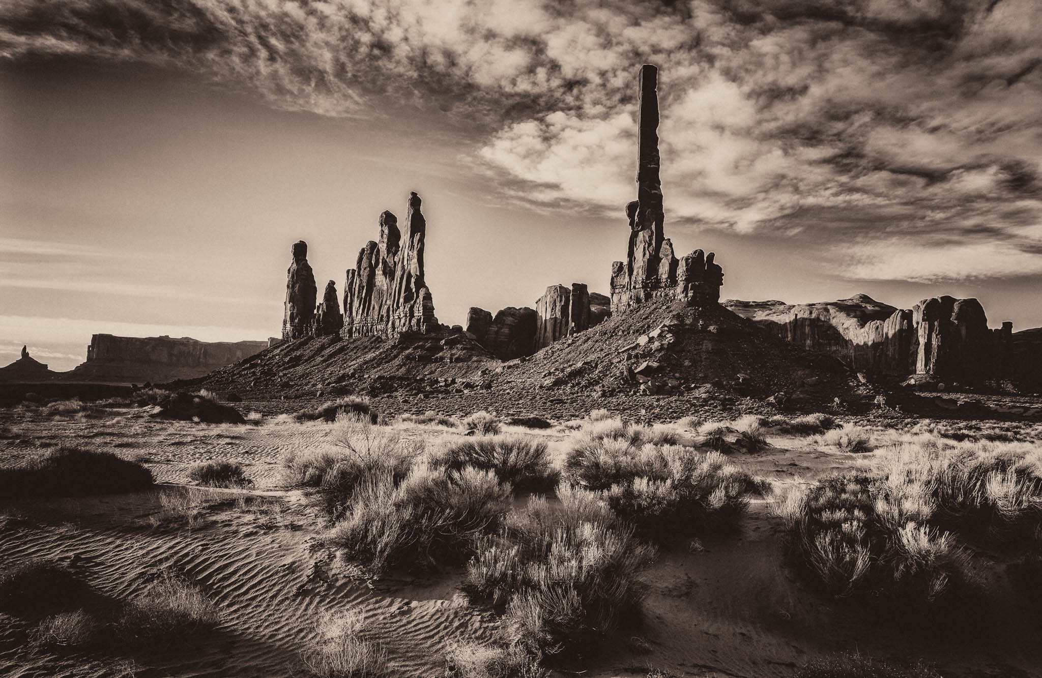
Apr 20 |
Comment |
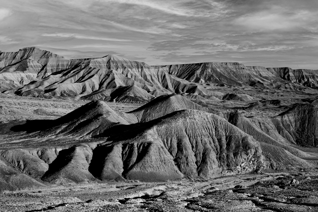
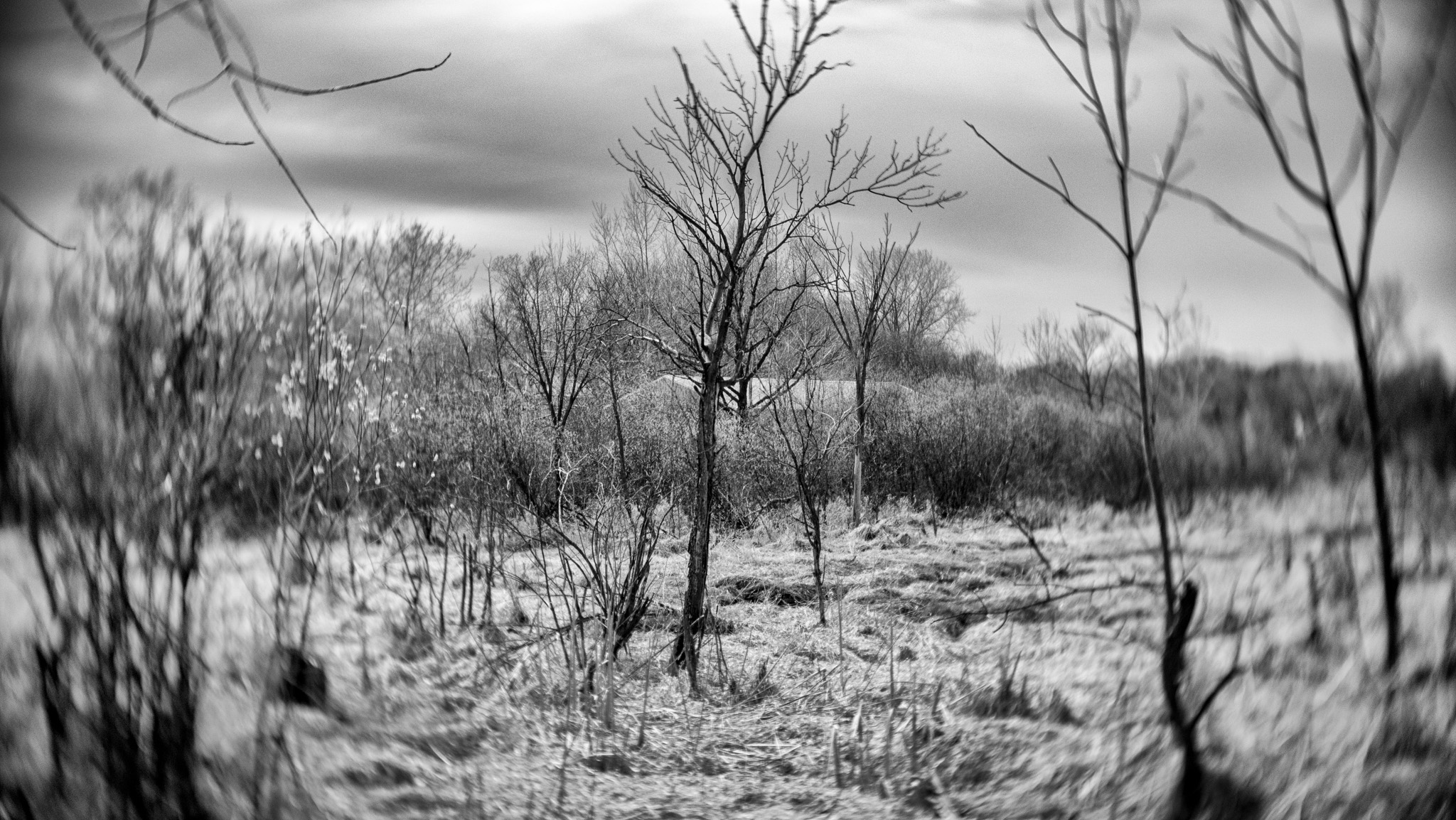
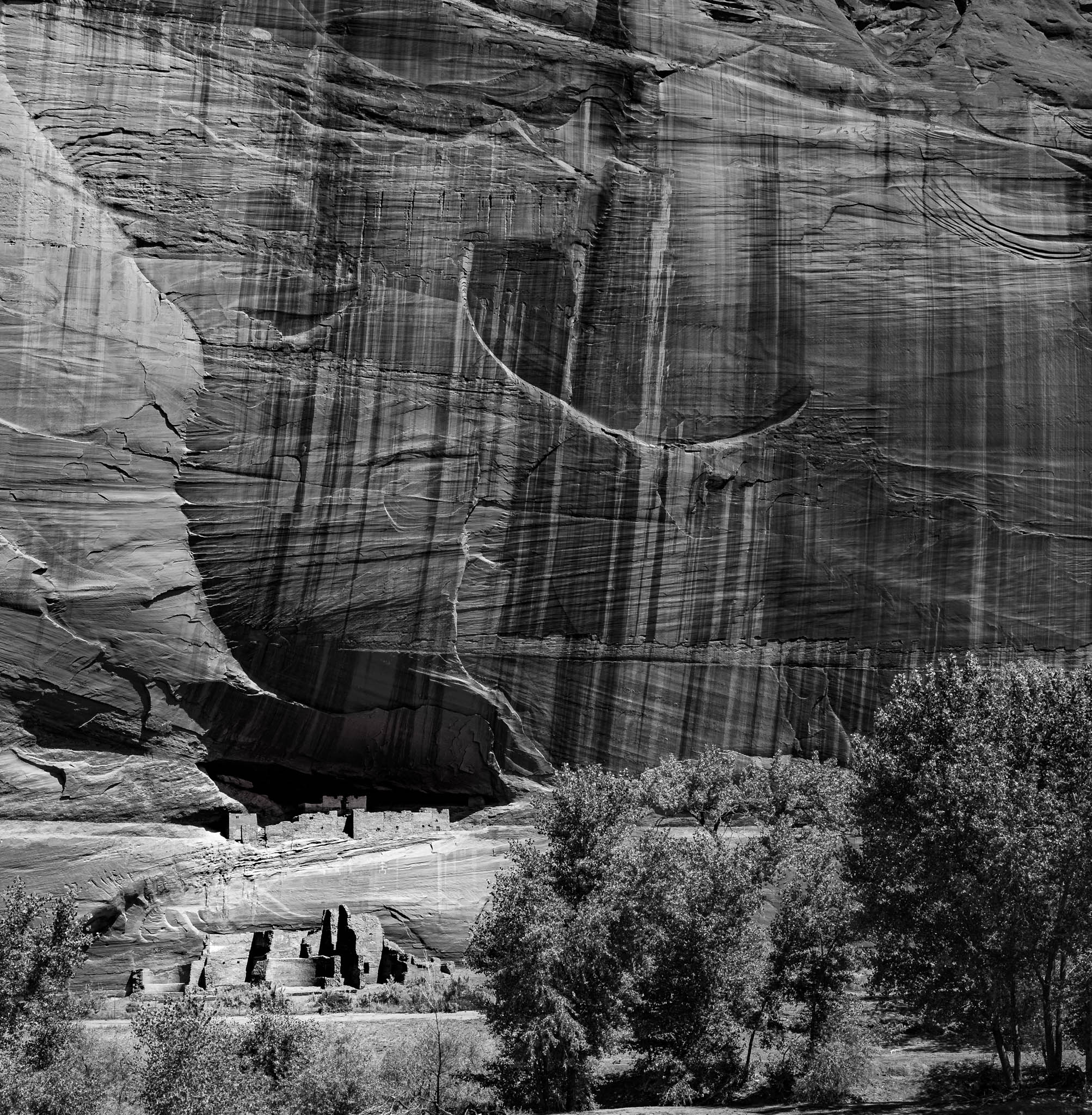
Looks like many of the places I have been in the south west. The road coming in and disappearing brings the viewer in and leads them to view the cliffs and clouds. The sign adds a little tension for me, maybe a little room between the sign and the road to eliminate the merge of the two. I would like to see more of a separation between the foreground, mid ground, background and sky. And maybe some adjustment to the road to make it stand out a bit more.
When clicking on these images they are too large and we need to scroll up down, left and right to see them. It would work better to size them 1024 or 2048 wide at most. |
Apr 1st |
| 39 |
Apr 20 |
Comment |
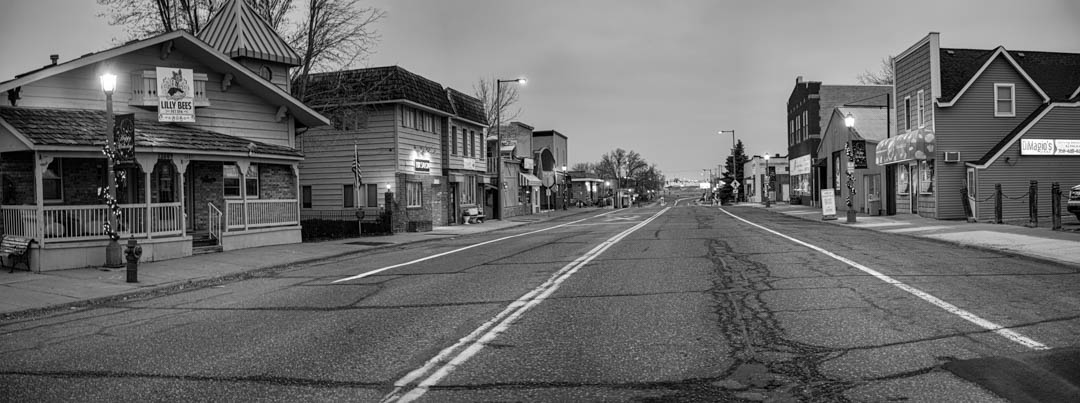
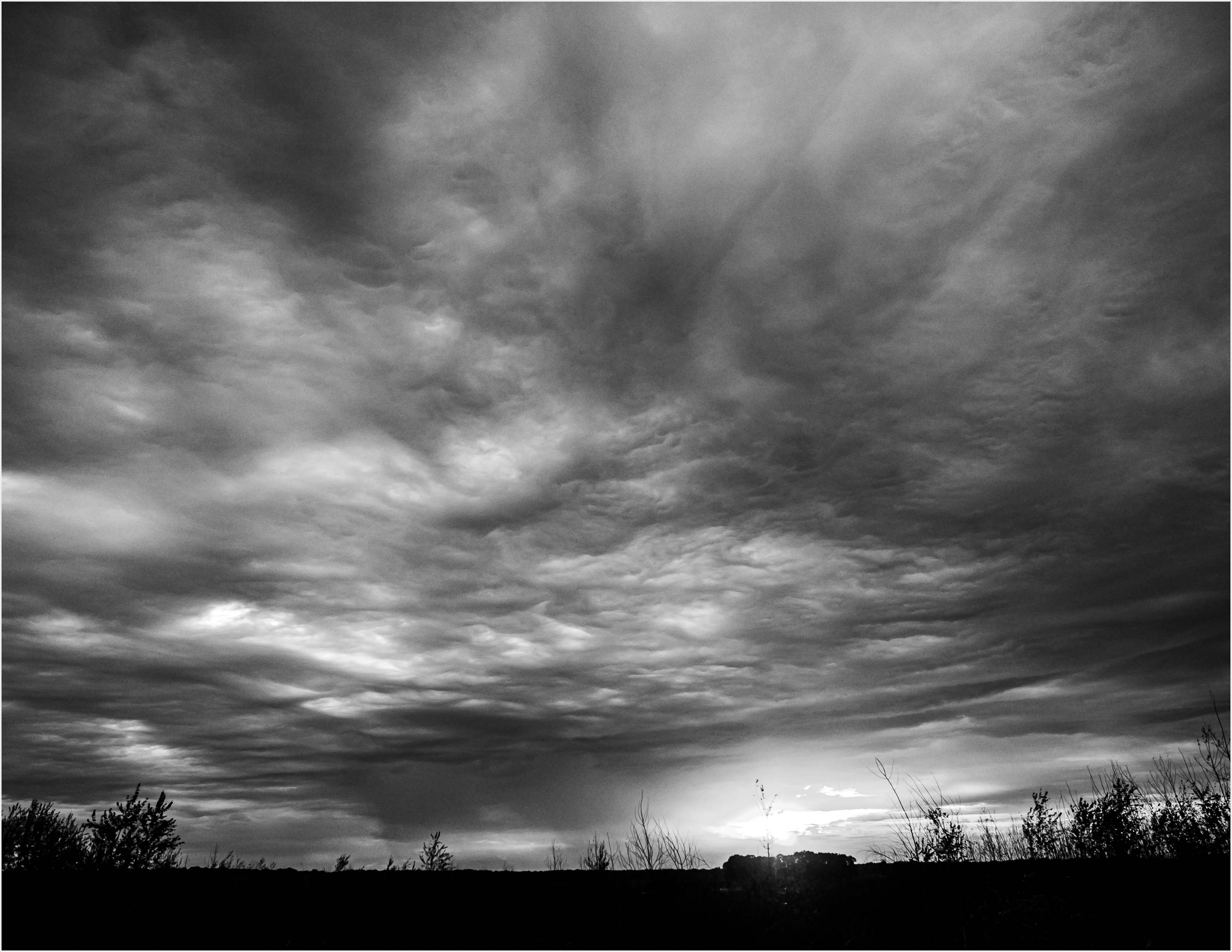
I like this image. The road leads the eye through the sharp foreground and to the hazy background with great wispy clouds and it feels like going from one world to another. It has a very welcoming feeling like a road I would like to follow.
I think parts of the road are a bit too bight and I would lighten and add a slight contrast to the clouds.
Very nice |
Apr 1st |
12 comments - 3 replies for Group 39
|
12 comments - 3 replies Total
|