|
| Group |
Round |
C/R |
Comment |
Date |
Image |
| 88 |
Jan 24 |
Comment |
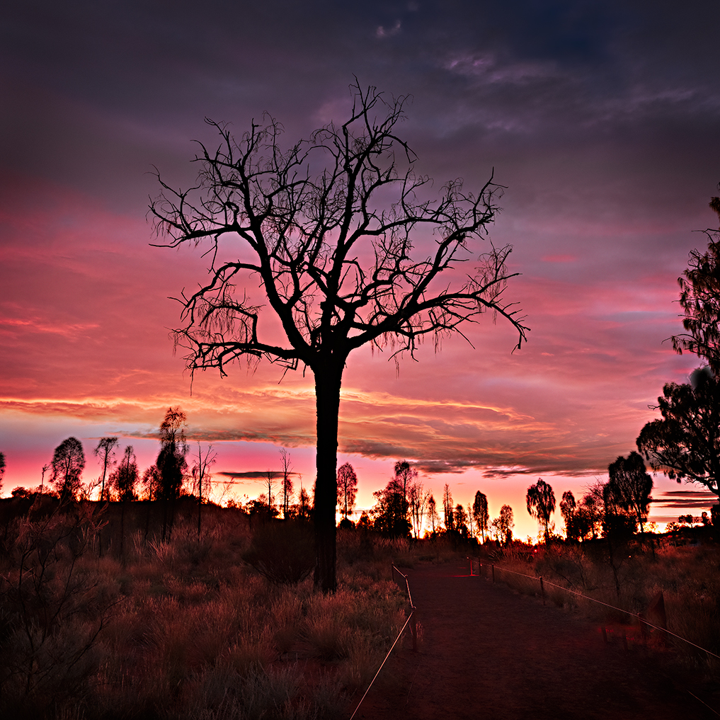
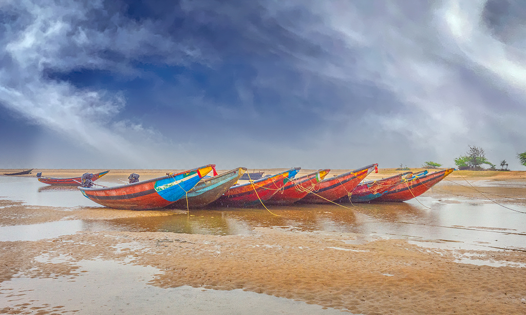
Hi Sanat. Your composition works well and you have managed to bring out great colour in the boats which instantly draws the viewer in. To my eye the blue in the sky was to dominant and I felt removing the motor bike and adding a vignette would help. I've attached my suggestions. |
Jan 11th |
 |
| 88 |
Jan 24 |
Comment |
Hi Trey. You nailed it. Lovely image, great colour and processing. |
Jan 11th |
| 88 |
Jan 24 |
Comment |
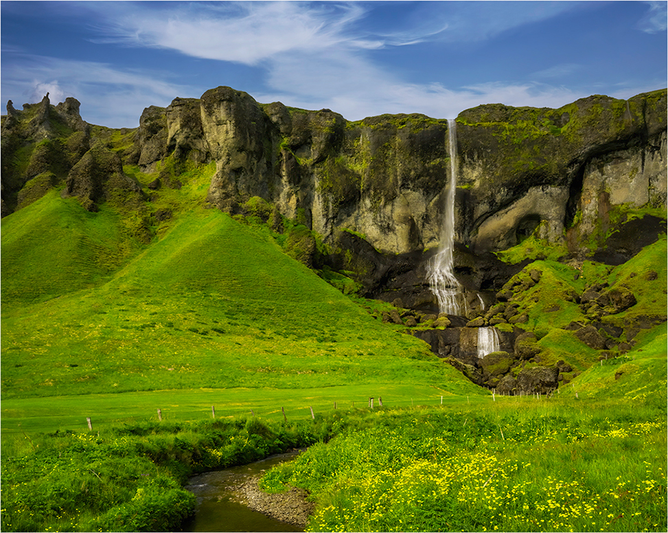
Hi Quang. This is a excellent photo and you have achieved what you set out to capture.The texture is excellent. I would suggest 2 edits that may add the overall appearance. in the foreground there are 2 distinct snow colours with the closest being the brightest. I would reduce that brightness to match the snow colour running behind it. It could be distracting. It could also be worth creating a vignette to hold the image together in the viewers eye. |
Jan 11th |
| 88 |
Jan 24 |
Comment |
Hi Charles. This is an excellent composition and you have brought it life very well and well done. Please excuse me for playing with your image. I learned a technique from Australia's preeminent photography and processing educator, Les Walkling, to sculpt an image to create form and dimension. Your image brought this back to mind, and I had to see If I could add dimension with this technique. I haven't spent much time nuancing each brush stroke with the dodging and burning method, but I think I achieved a reasonable sculpturing effect for a primary attempt. |
Jan 11th |
 |
| 88 |
Jan 24 |
Comment |
|
Jan 11th |
 |
| 88 |
Jan 24 |
Comment |
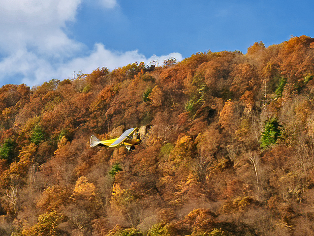
Hi Mark. Unfortunately in capturing the plane your shutter speed may have been too slow as the complete image appears to be blurry. Increasing the aperture may have given you a better depth of field for the Autumn trees in the background but this may have also been impacted by the slow shutter speed as well.
The following is just a personal preference but when I have movement across the image I make the movement left to right, provide there is nothing like wording etc in the background. Our normal direction when reading is left to right and that seems to be more comfortable for the viewer.
I have done this with the attached image and also used Topaz and Nik filters to improve the sharpness, contrast and punch the colour a bit. |
Jan 11th |
| 88 |
Jan 24 |
Reply |
Hi Charles. Thanks for your thoughts. I struggled with the blue as I found it did something to the balance or distracted me from the emotion I wanted to achieve. Once I removed it, the strength of the threat was higher, and the overall image then felt right for me. The same applied to the amount of detail and micro contrast; I also wrestled with that for some time. |
Jan 9th |
6 comments - 1 reply for Group 88
|
6 comments - 1 reply Total
|