|
| Group |
Round |
C/R |
Comment |
Date |
Image |
| 34 |
Sep 21 |
Comment |
Thanks, Jan and Fran for your thoughts. I agree about the ripple and flower colour. It was my first attempt with Flood2 and I didn't understand the colour requirement. I tried hard to change it in photoshop but this is as close as my knowledge allowed me alter it.
The first image I took of the Magnolia was without the black background and I used my R5 focus stacking to capture the full depth in focus. Unfortunately, the settings I chose that took me all the way back to the fence in the background also being in focus. I could have left those images out of the stack when I combined them in PS but didn't think it through. the resulting cutout was unacceptable. I then shot with the black ground and it worked a treat in cutting out. |
Sep 6th |
| 34 |
Sep 21 |
Comment |
Hi Steve. I was intrigued by your comment "and painted in the moon (brushes from ON1 ages ago)". Can you please enlighten me on this process? Thanks. Cheers Brian |
Sep 5th |
| 34 |
Sep 21 |
Comment |
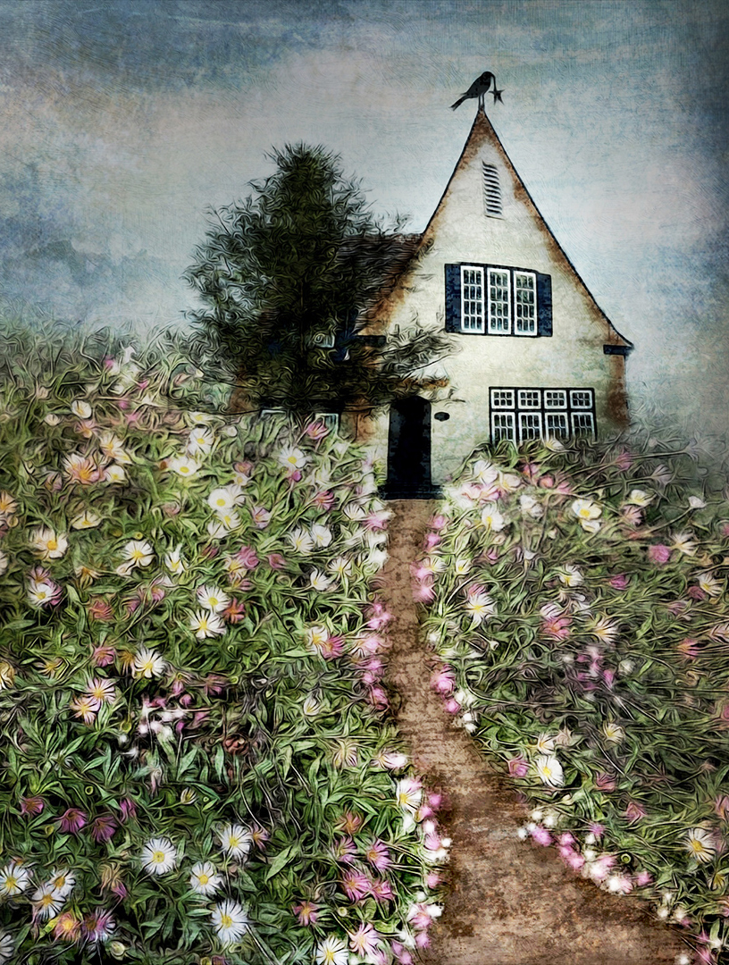
Nicely put together and the crow appeals. Looks like it's stealing the star decoration from the top of the house. The dark vignette on the left-hand side is very strong and perhaps distracting from the image. Hope you don't mind I had a play with working on a new crop and some of the tonality, looking to create a brighter leading line (path) to the door. The brightness in the flowers is also increased. As always it's a matter of how you feel about your image, and what you wanted to cahieve, this is just another approach. |
Sep 5th |
 |
| 34 |
Sep 21 |
Comment |
Lots of fun. Please excuse me but I had to join you in the sandpit and have some fun as well |
Sep 5th |
 |
| 34 |
Sep 21 |
Comment |
I agree with Alan, the boat and dock have a great feel. It would be so much stronger if the dog had similar treatment to the boat and blended seamlessly. |
Sep 4th |
| 34 |
Sep 21 |
Comment |
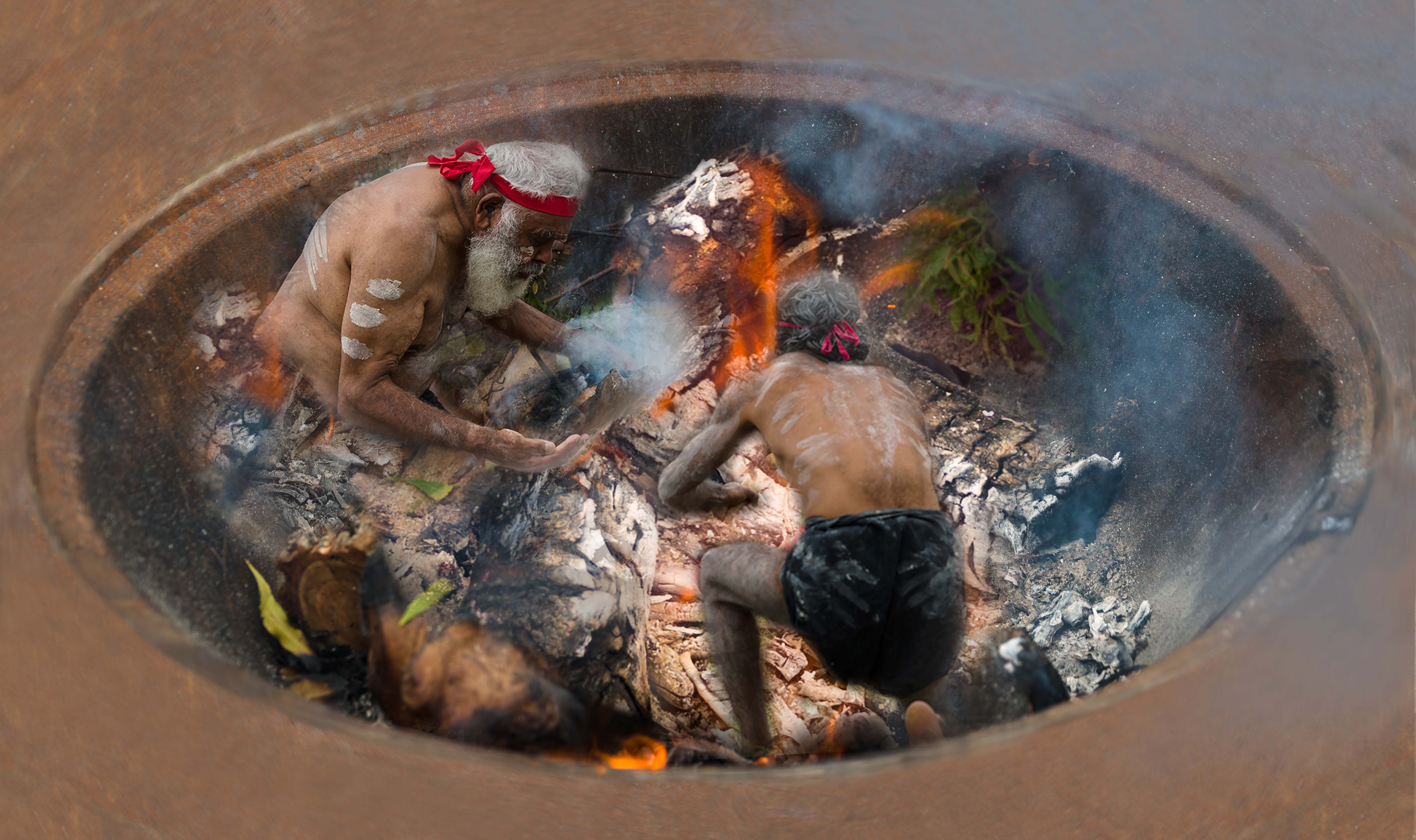
The roughened treatment on the Inca ruin is excellent |
Sep 4th |
| 34 |
Sep 21 |
Comment |
An enjoyable whimsical image. Thanks for sharing the tip on the "thin outline" addition it works well. Perhaps you could look at shifting the yogi towards the left of the shadow and yogi shadow more to the right so the combination of yogi and shadow still maintain a central feel. The light direction would then be in sync with the shadow that is on the bottom left-hand step |
Sep 4th |
| 34 |
Sep 21 |
Comment |
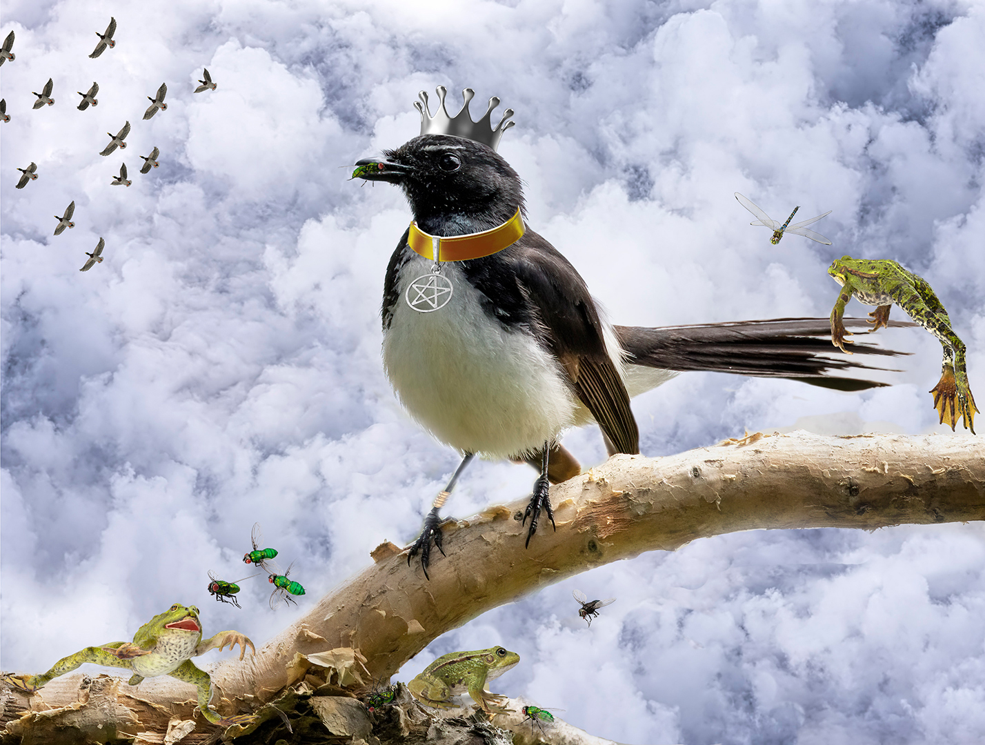
An image to make me smile. Being just a little picky the cut out around the top of the bird's head has a slightly green hue in some areas. Removing that would strengthen the blend. |
Sep 4th |
| 34 |
Sep 21 |
Comment |
You've created a very matching mood for these scary folk. Excellent depth and spooky background. The compositional elements are well crafted including the flip on the left hand Goth to keep our eye within the image. Very "realistic" |
Sep 4th |
9 comments - 0 replies for Group 34
|
9 comments - 0 replies Total
|