|
| Group |
Round |
C/R |
Comment |
Date |
Image |
| 40 |
Mar 25 |
Comment |
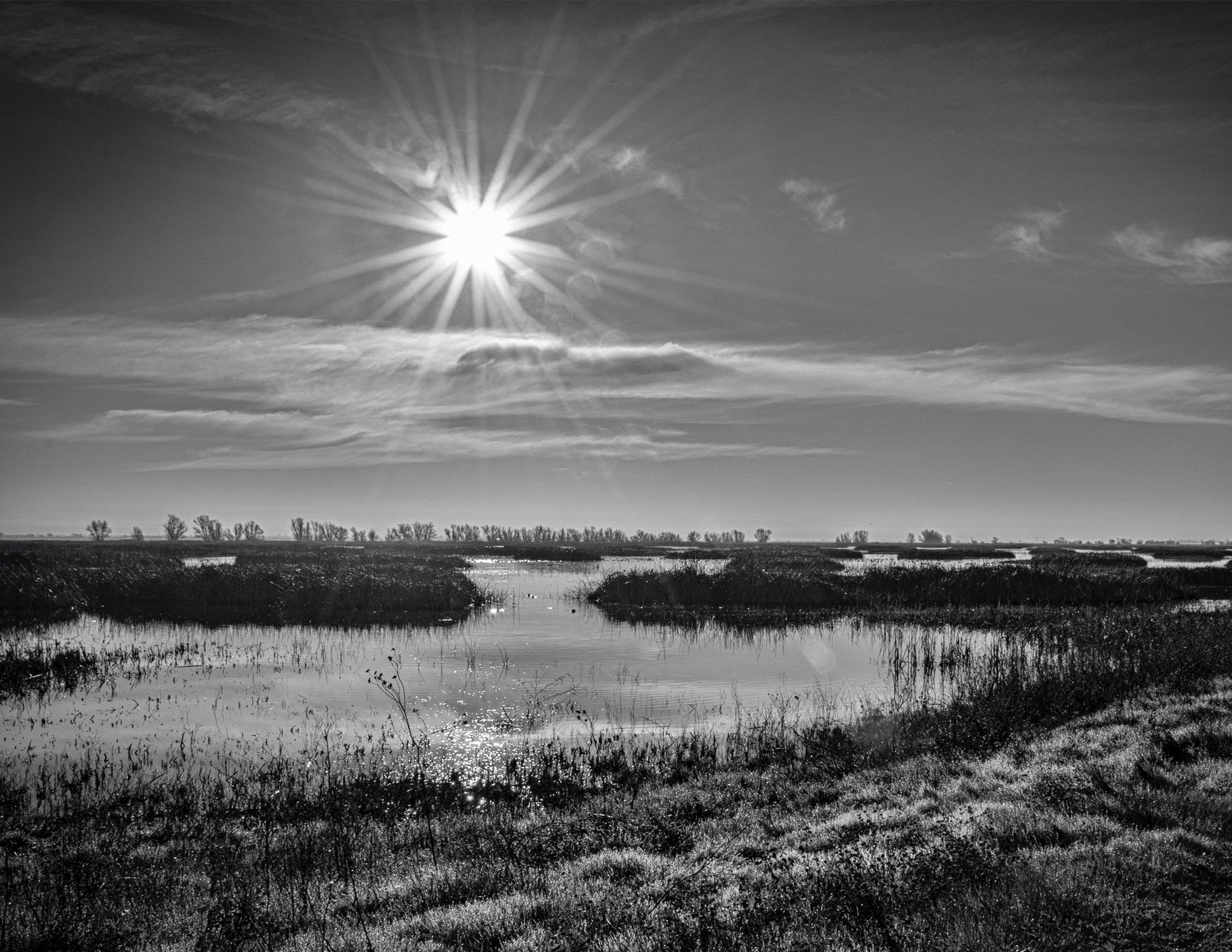
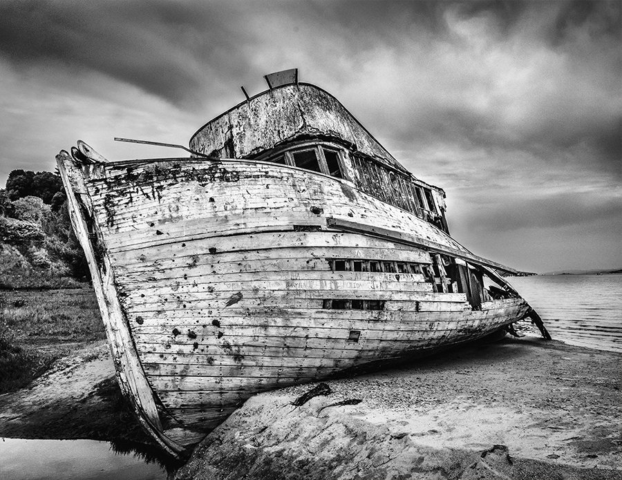
Hey Henry, interesting image. I cropped out the brush on the left and left in the right brush because it had two birds in it. Cropping the left brush took out some of the excess (in my opinion) sky, and gave more focus on the horses. It was shot from an interesting angle, and the sky is very nice. As always, exposure and composition, and sharpness is right on. I do see how the vast sky does scream, "North Dakota". I loved North and South Dakota. |
Mar 19th |
| 40 |
Mar 25 |
Comment |
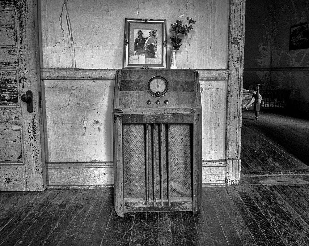
Hey Janice. Nice image. I took Henry's suggestion and cropped your image. I also saw some distractions that I removed. I follow some photographers who never edit their images. They call themselves "purist". When I look at an image and say, "what is that white spot on the subjects face?", it just, to me, becomes a distraction. So, I hope I have not offended anyone for cleaning up, and adding a little deNoise to your image. I think after the crop, I was up in the air about which I liked better. I left your subject off-center, as it seemed to co-exist with the background better (in my opinion). So these are all just my opinion and If I am trying to make a point, or show an image in a certain way, I don't always make changes. Your image is very good, and I enjoyed it and think you captured the subject at a great pose. |
Mar 19th |
 |
| 40 |
Mar 25 |
Comment |
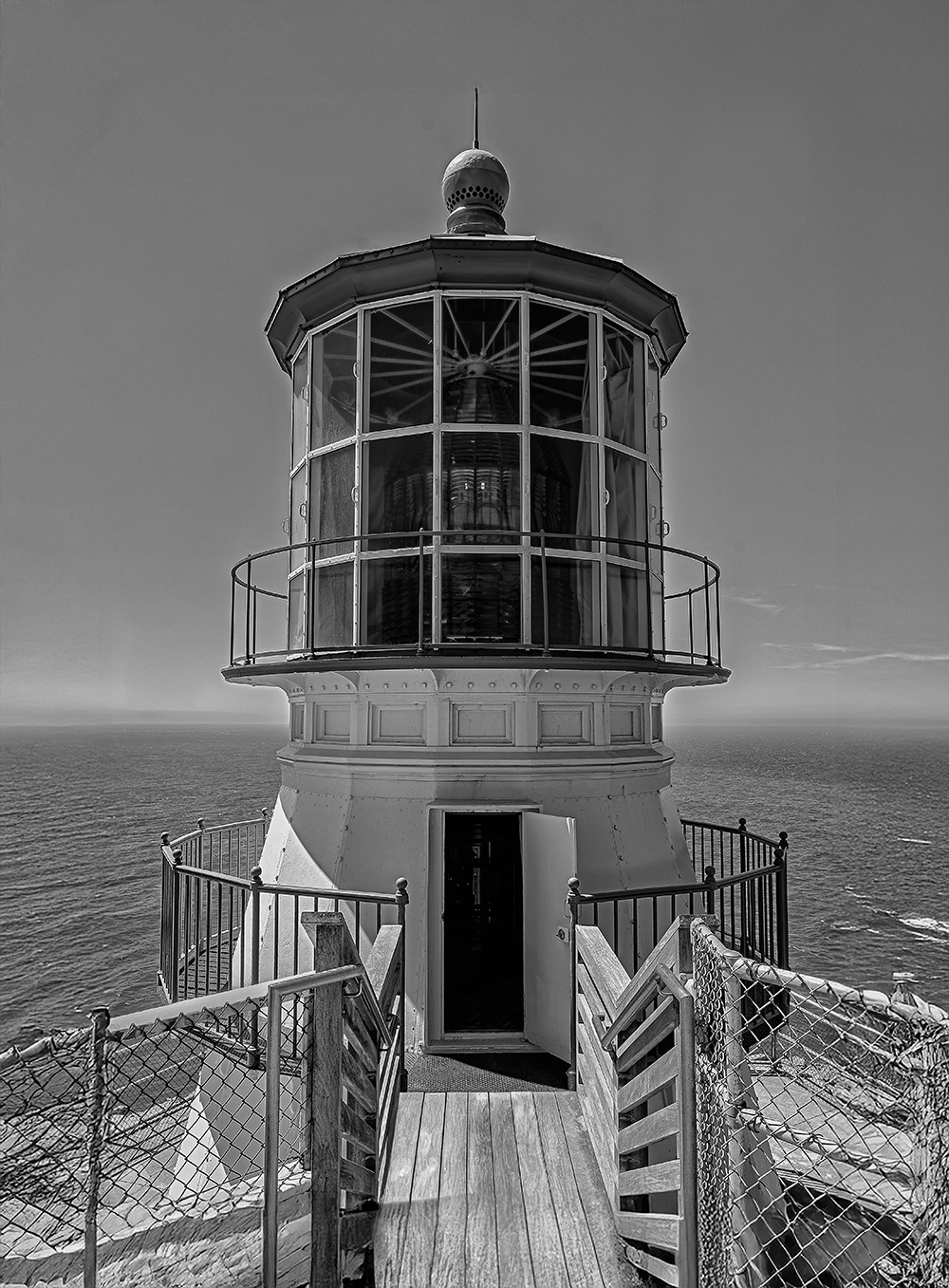
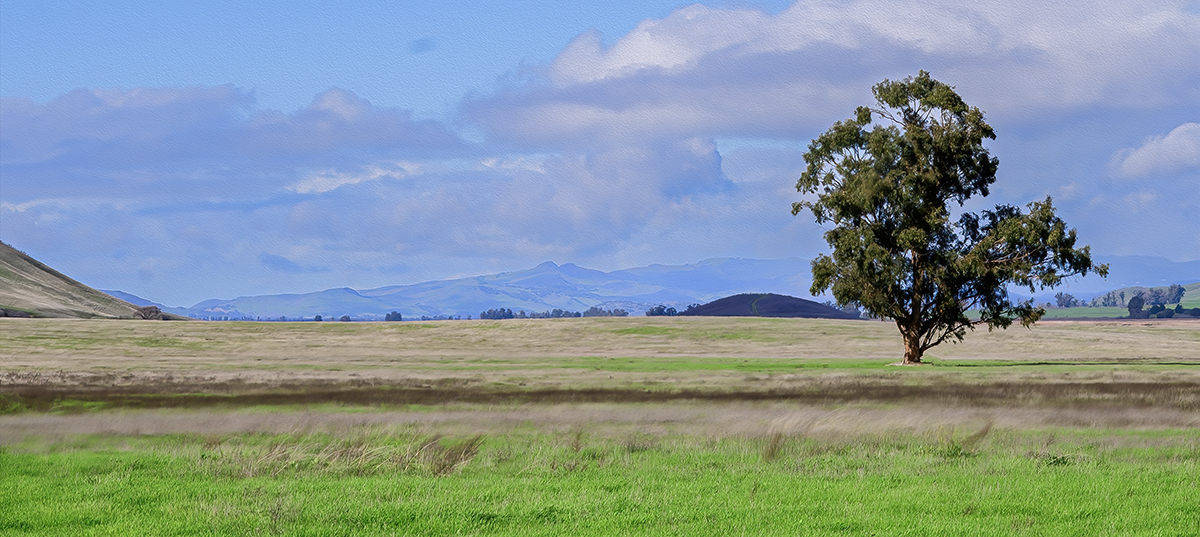
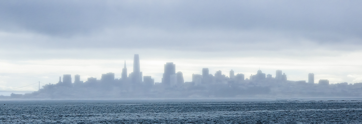
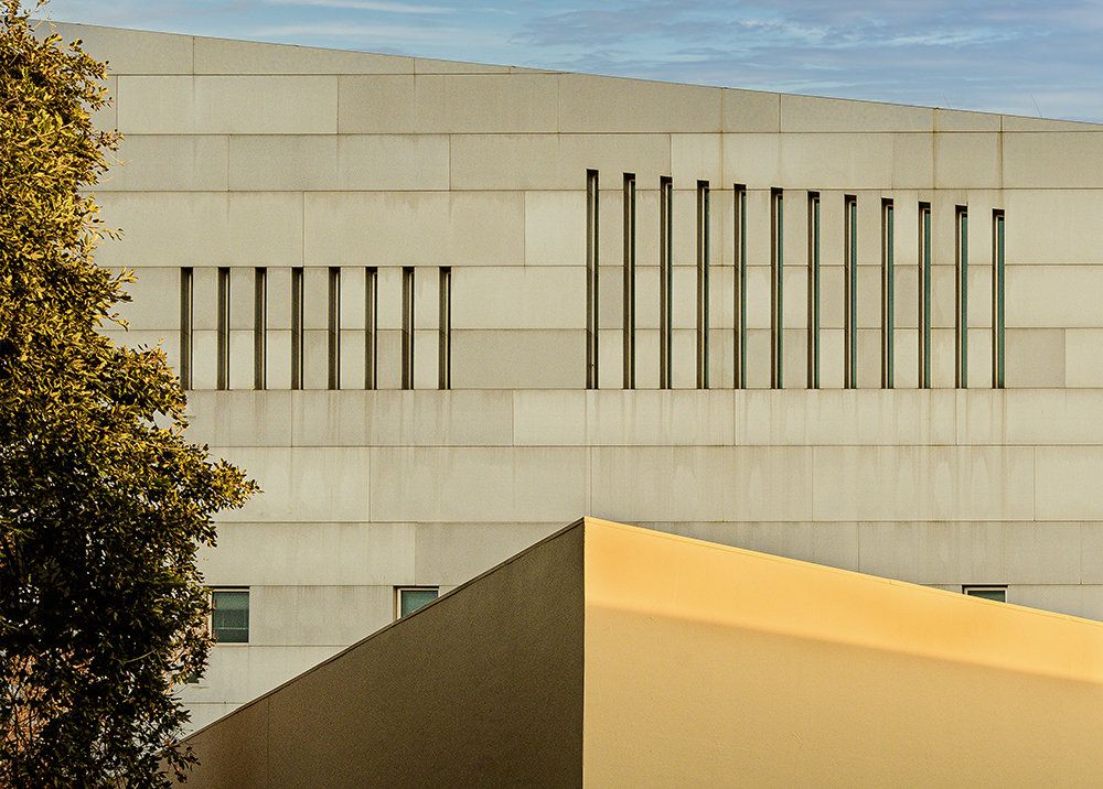
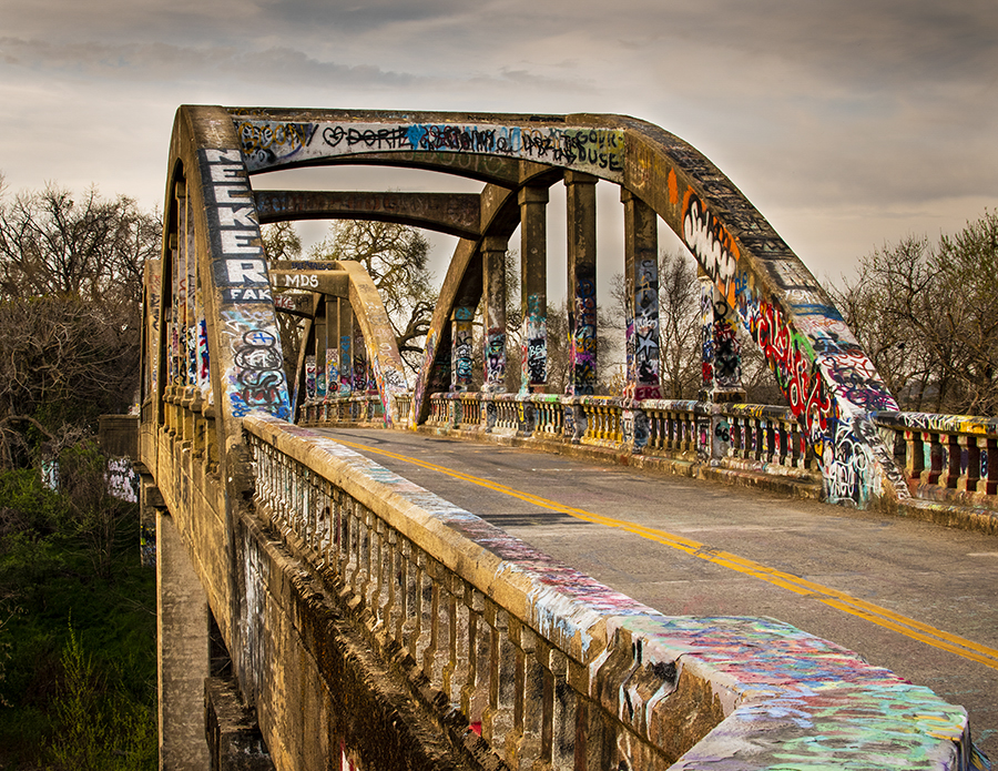
Hey Julie and Henry, thank you for your comments. I know Rick Sammon says in his 50 sammonisms that Dead center is Deadly, but I just wanted the blue and gold background sky to have sort of an equal gradient, but I do try to avoid breaking rules. I should have posted the original because there was a lot of sky. Henry, On top of the bank building was a sort of greenhouse that I found out was called the penthouse. Maybe the Bank President lived there. Who knows. I do love the post editing, but you can not always fix everything. |
Mar 18th |
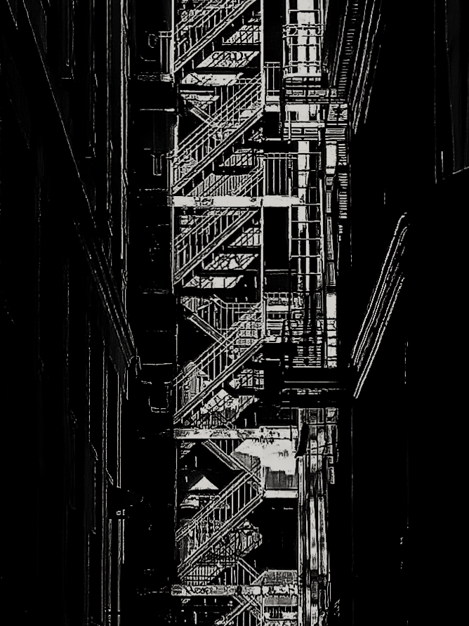
| 40 |
Mar 25 |
Comment |
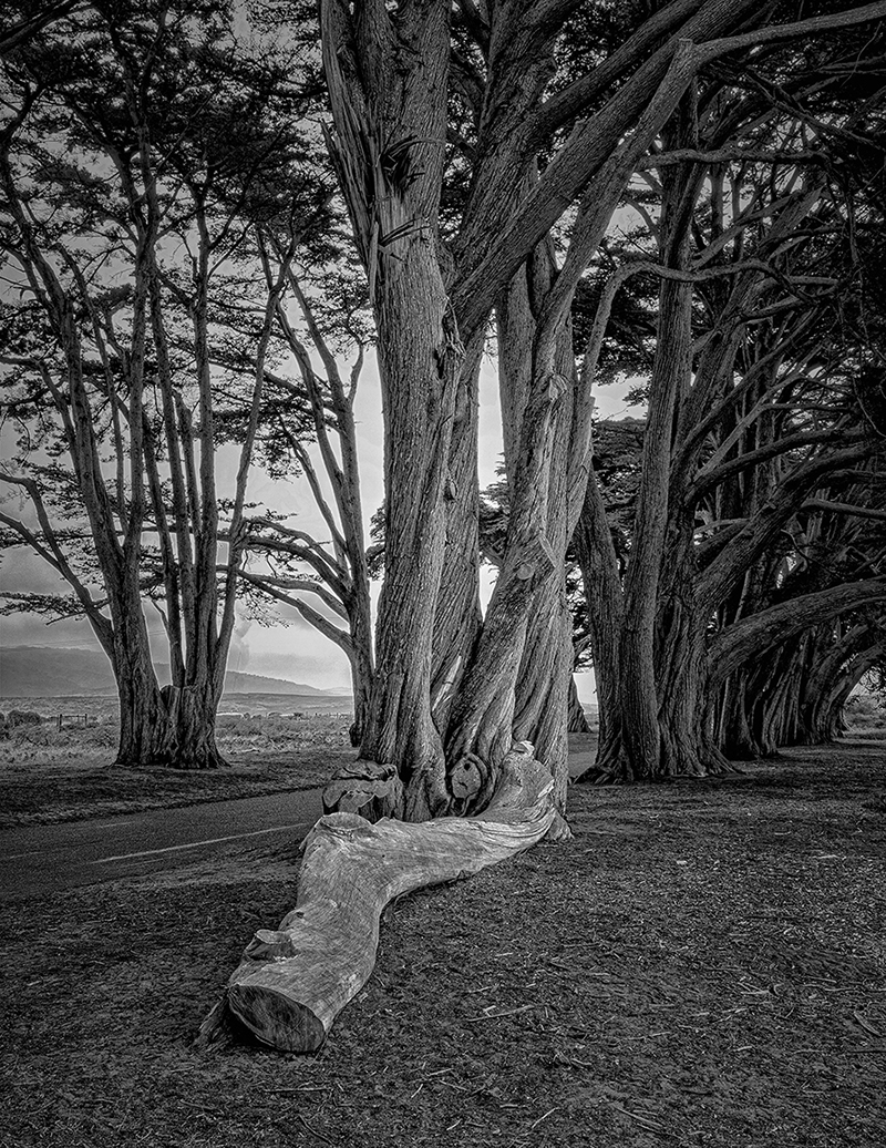
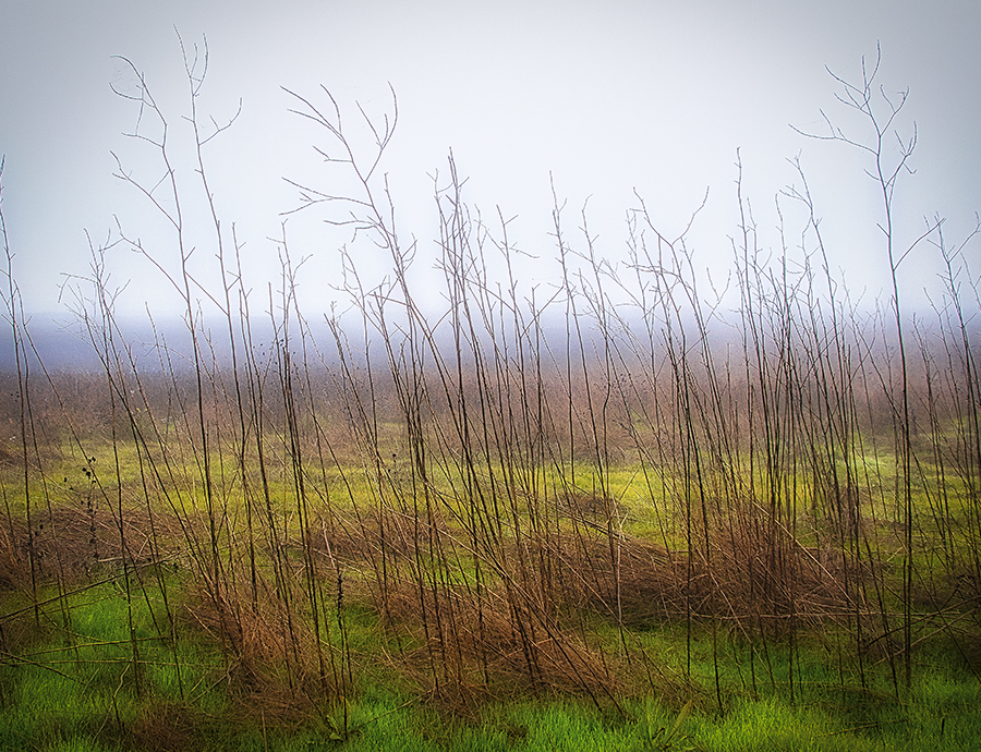
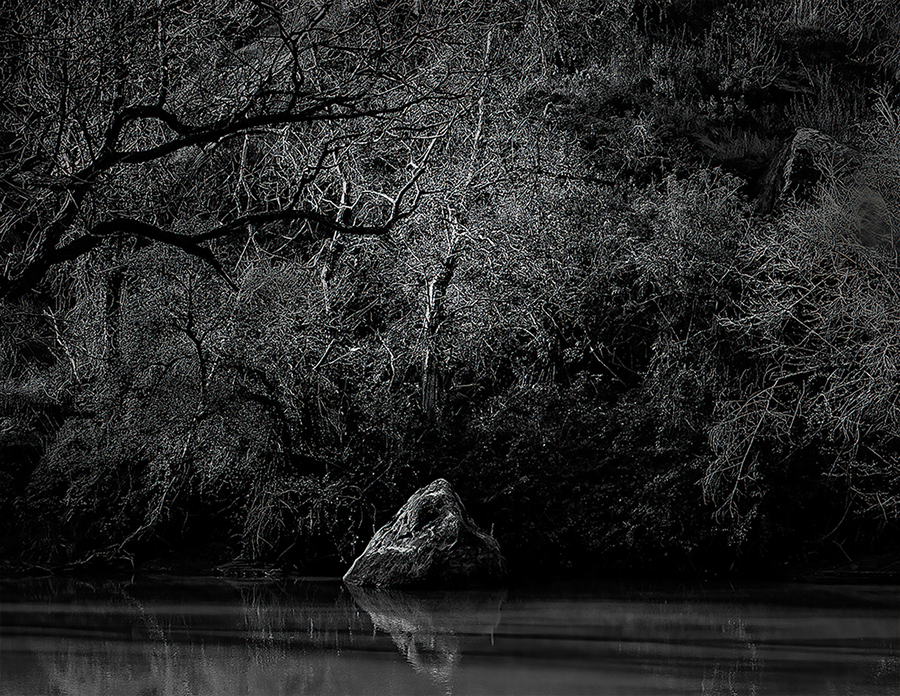
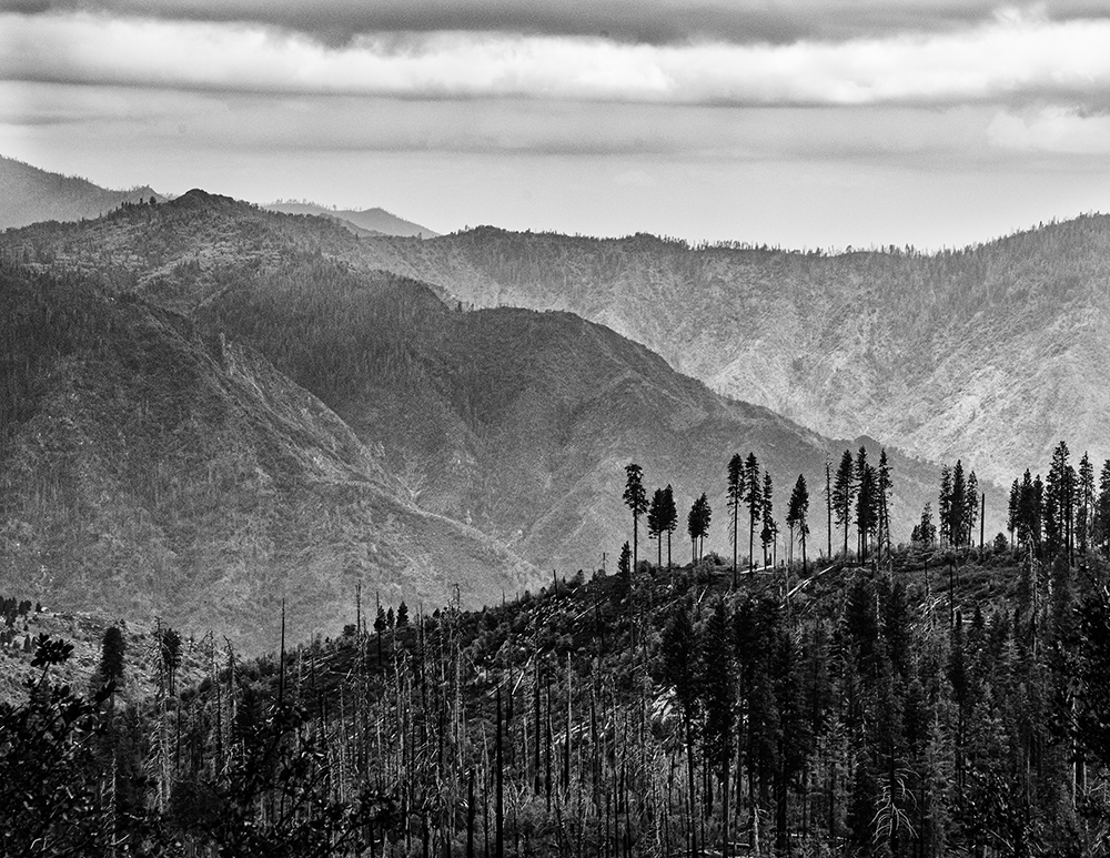
Hey Ling ling, I liked your image. There was no snow when I was in Yellowstone. I am not sure what feeling you were trying to evoke. I cropped a little off the top and bottom and warmed up the temperature and added some texture and clarity. I added some contrast. The blue cast in your image makes me feel cold. the temperature shift made the trees look, in my opinion look more lonely. What ever feeling you were trying to show, I hope I have given you some ideas of how to make an image feel different ways. You are very good at this type of photography. |
Mar 7th |
 |
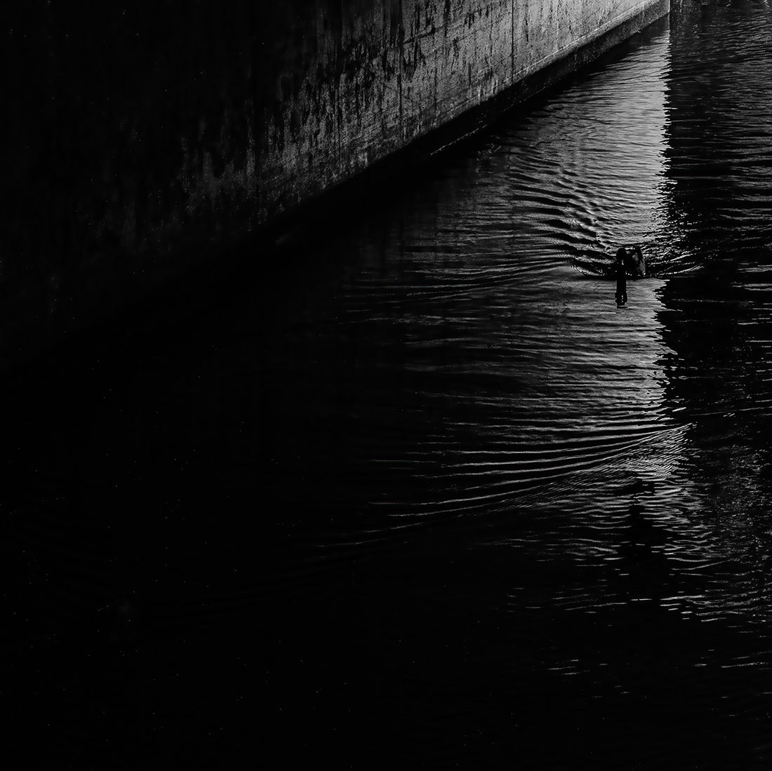
| 40 |
Mar 25 |
Comment |
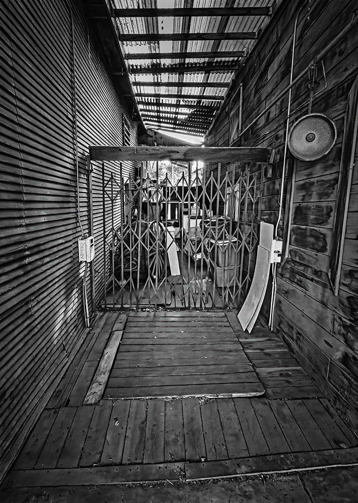
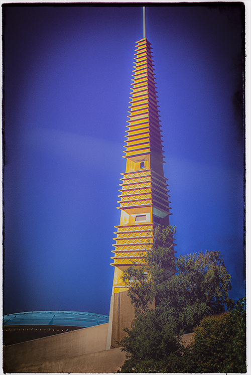
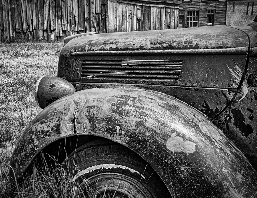
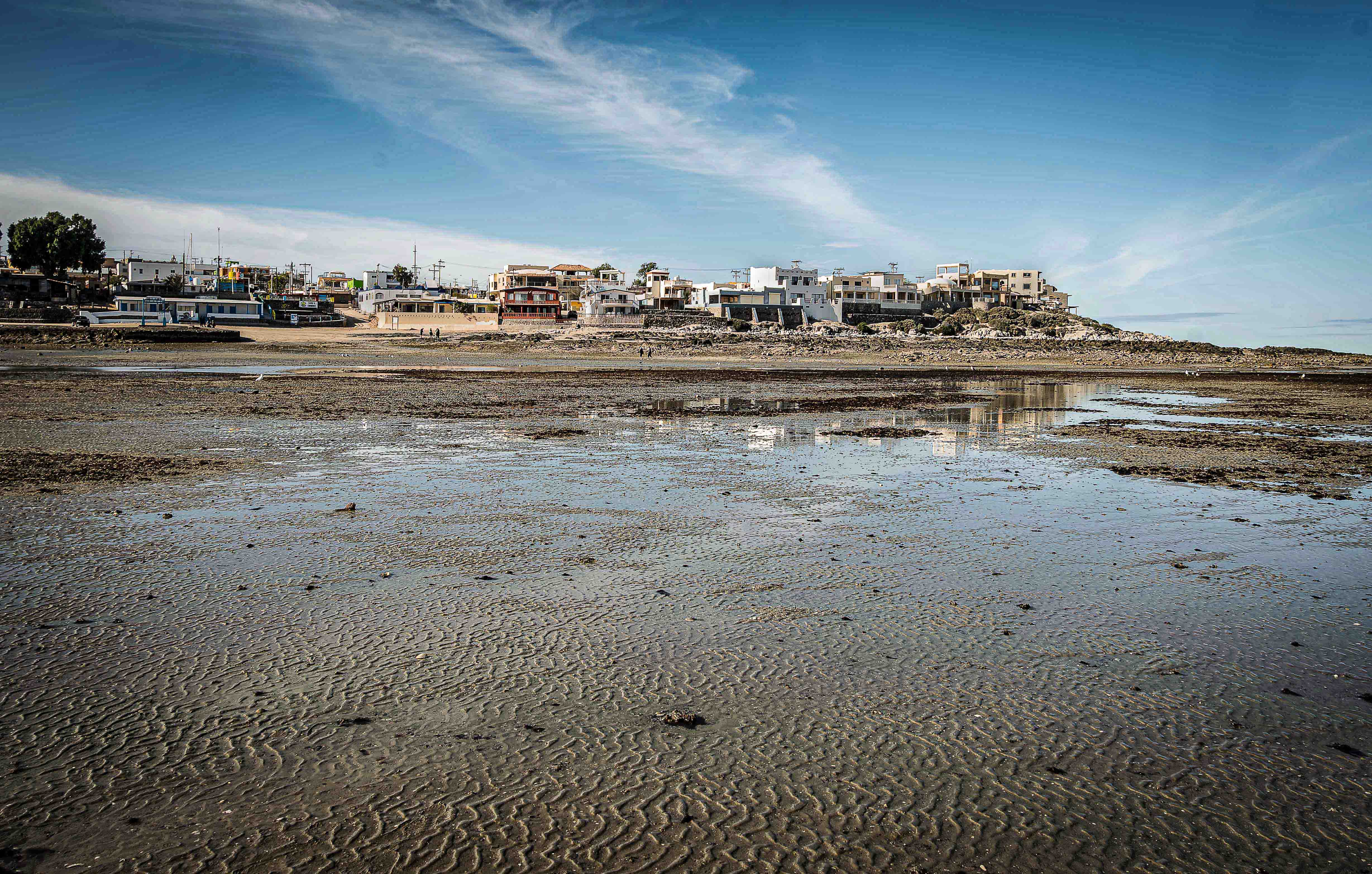
Hey Julie, this is a really cool image. I like the background, or lack of background. It's just a really cool image. the only thing I did was apply some Denise from Topaz. It made a difference by. bringing out some of the texture. Nice Job. |
Mar 7th |
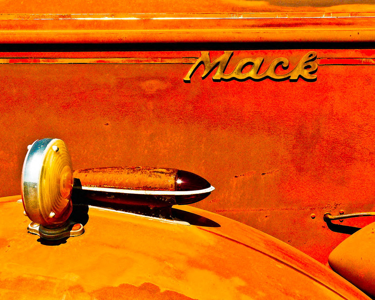
| 40 |
Mar 25 |
Comment |
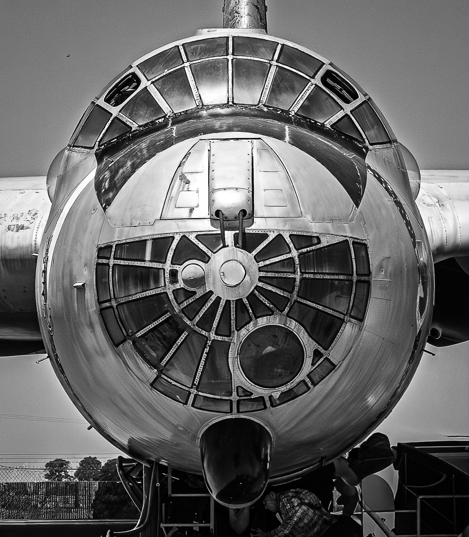
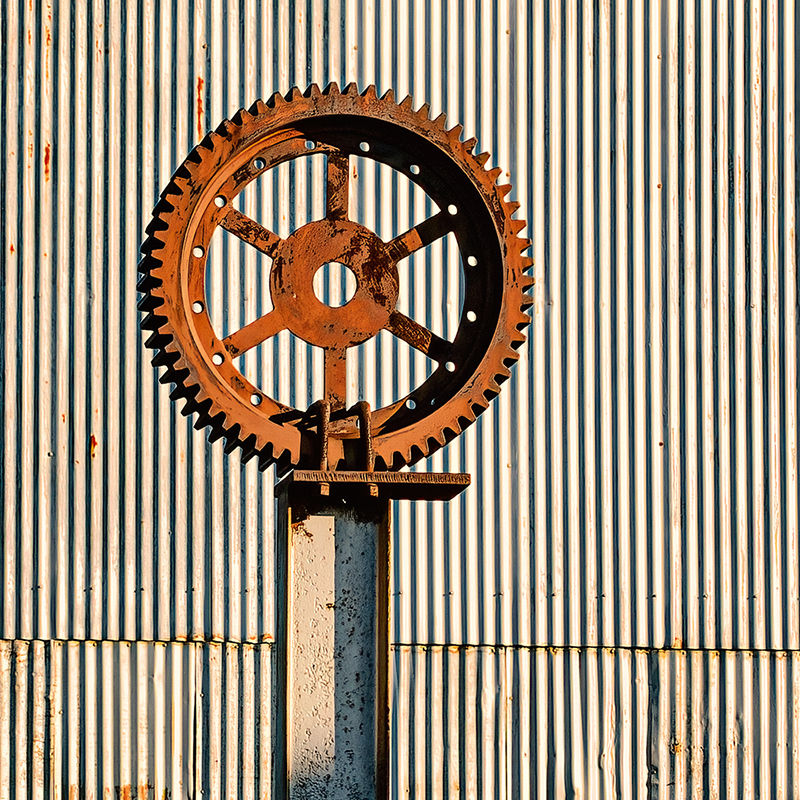
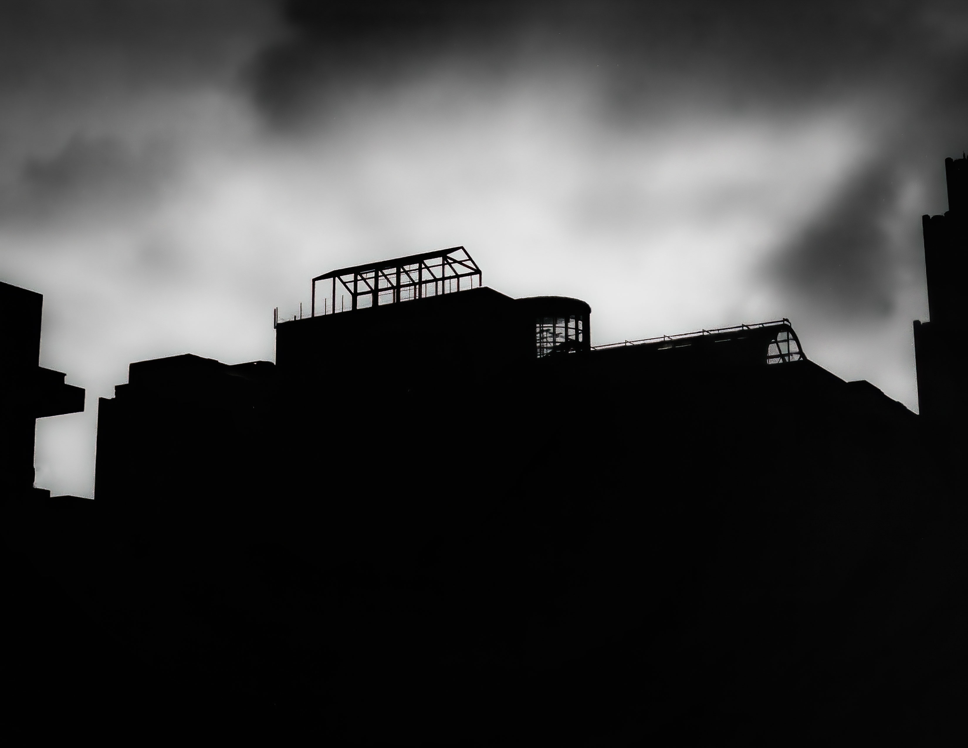
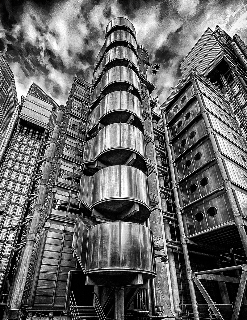
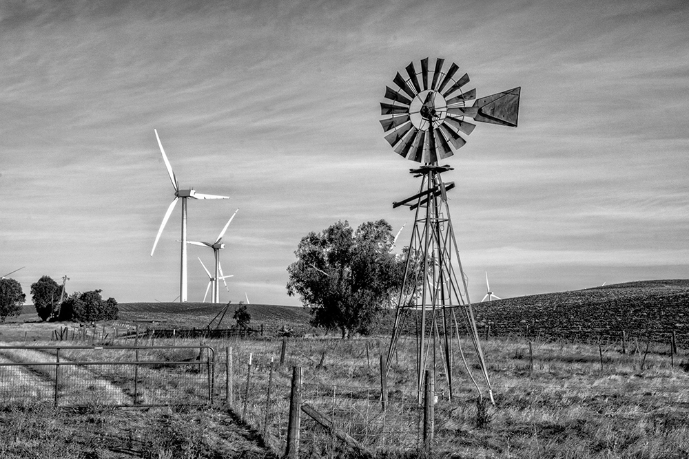
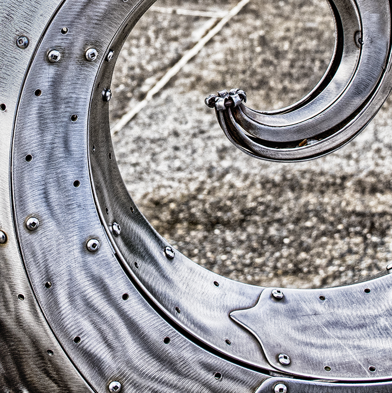
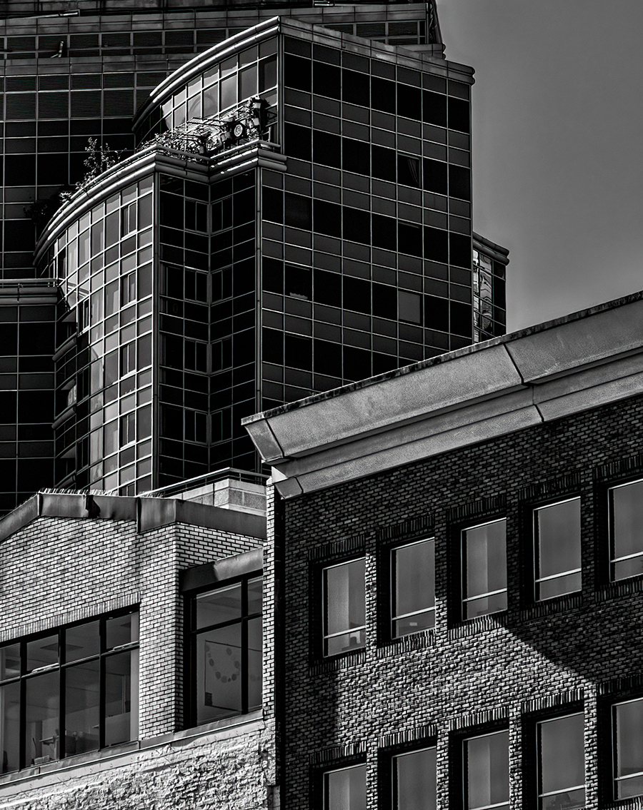
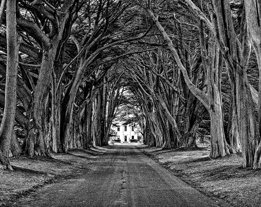
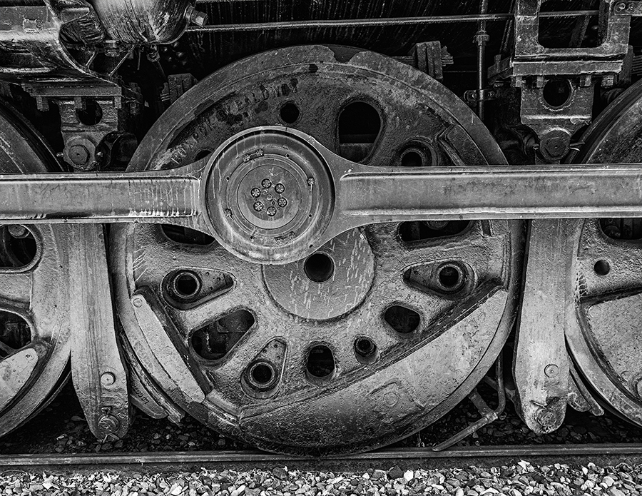
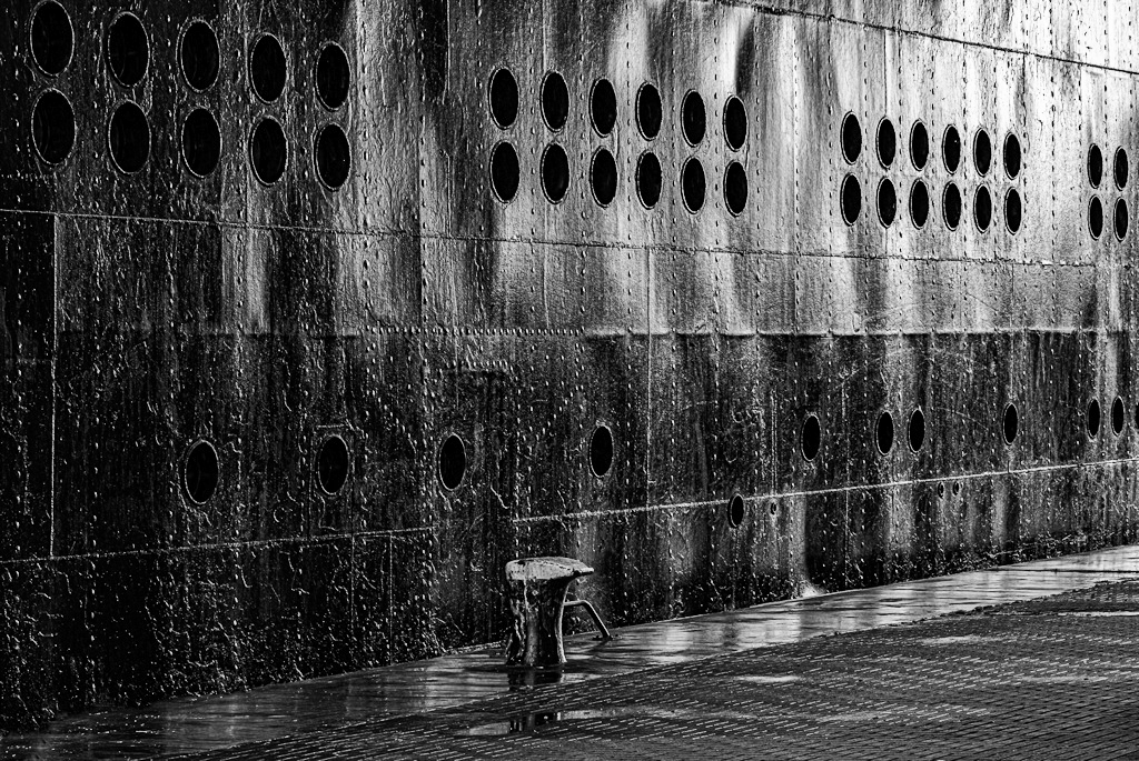
Hey Andrew, This month, group 40 is doing my favorite kind of photography. I really like the tone and texture of your shot and it looks monochrome but it's not. I did one in Silver Efex Pro but I like your's better. It has more subtle texture. But my rivets are too much. This is my favorite image of your's so far. |
Mar 7th |
 |
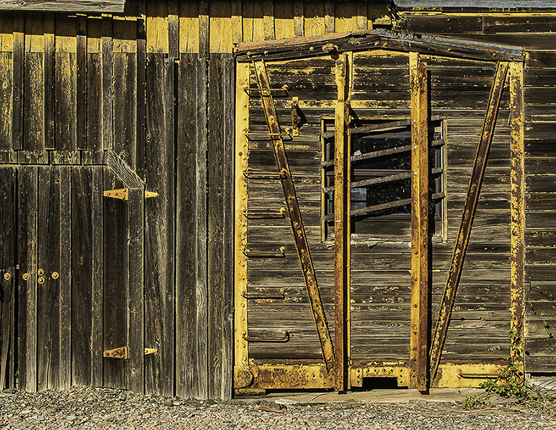
| 40 |
Mar 25 |
Comment |
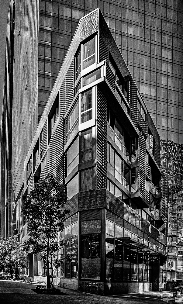
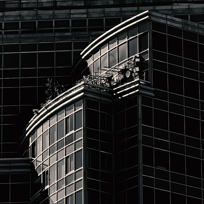
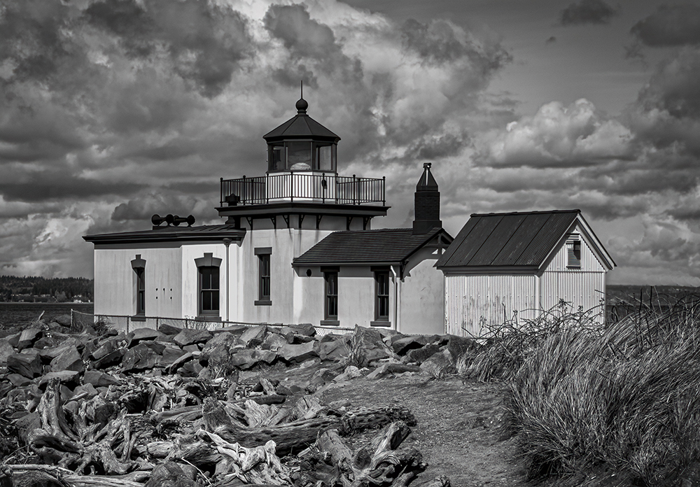
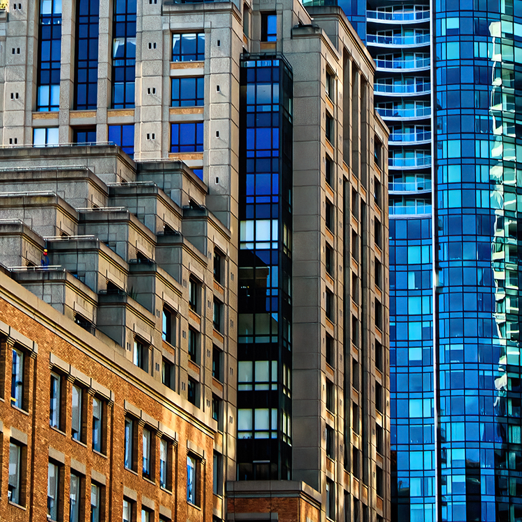
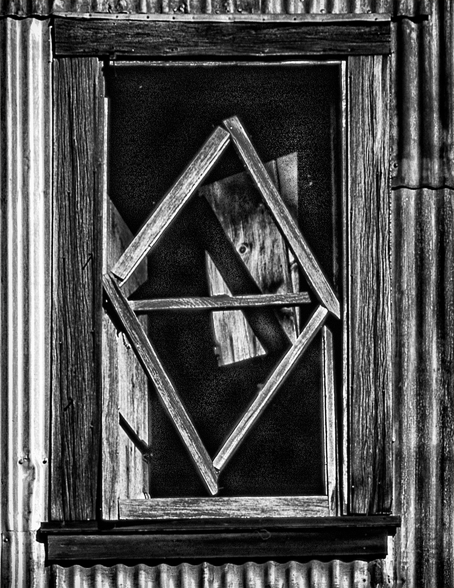
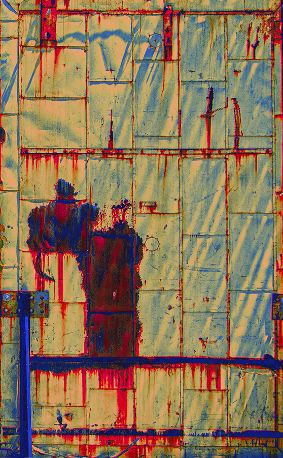
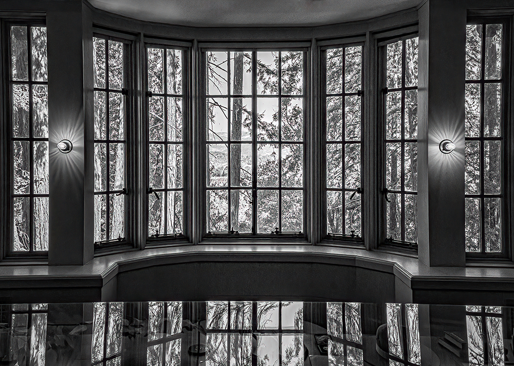
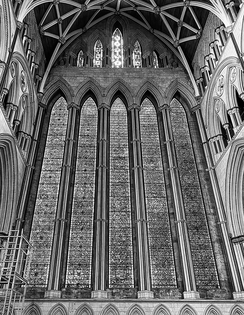
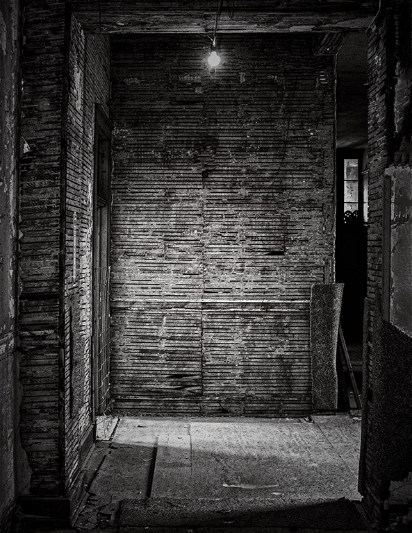
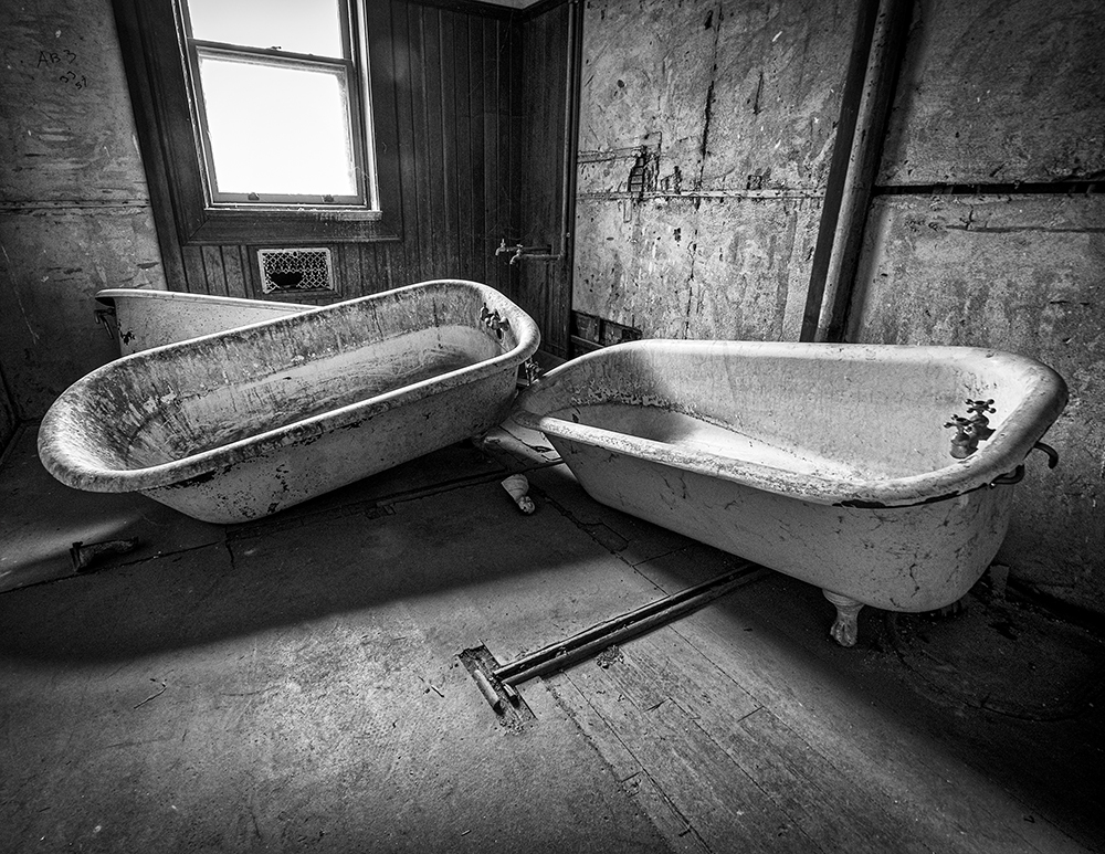
Hey Catherine, Wow, you know I love Buildings and I love Abstract, so, I love your image. I think it is, in my opinion what you do best. I would not change a thing about your image except maybe the white balance. I warmed up the temperature and added a little texture and clarity. I love your image. Don't be afraid to crank those sliders and... you can always go back. Good Show. |
Mar 6th |
 |
7 comments - 0 replies for Group 40
|
7 comments - 0 replies Total
|