|
| Group |
Round |
C/R |
Comment |
Date |
Image |
| 40 |
Jan 23 |
Comment |
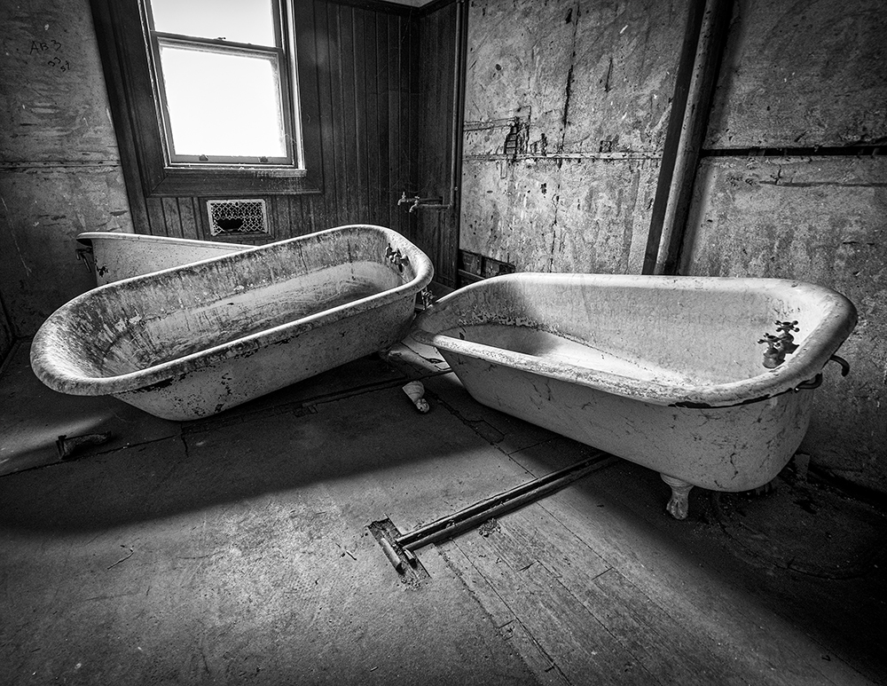
Hey Catherine, Nice wildlife shot. Looks like you got some advice from Photographers with more wildlife experience than me. I agree with a need for a crop, and I would have liked the background to be a little more soft. I am an expert at making images with a little "tilt". Nice job on your wildlife journey. |
Jan 24th |
| 40 |
Jan 23 |
Comment |
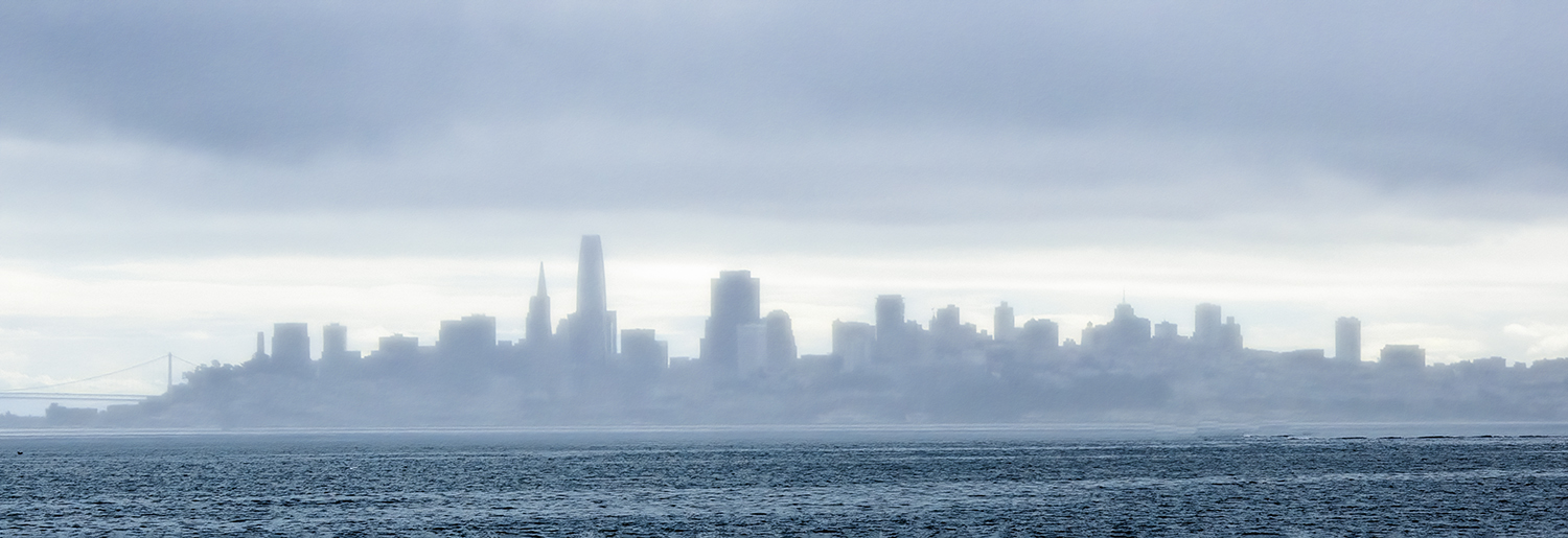
Hey Lin, Well, it looks like a "Pile-on" we all like your image. That is a difficult skyline to tackle. Good Job! |
Jan 24th |
| 40 |
Jan 23 |
Comment |
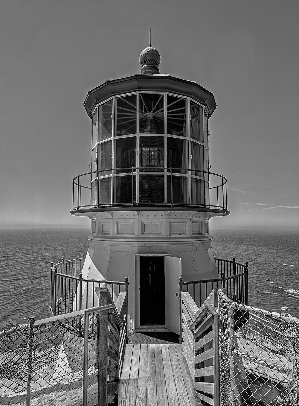
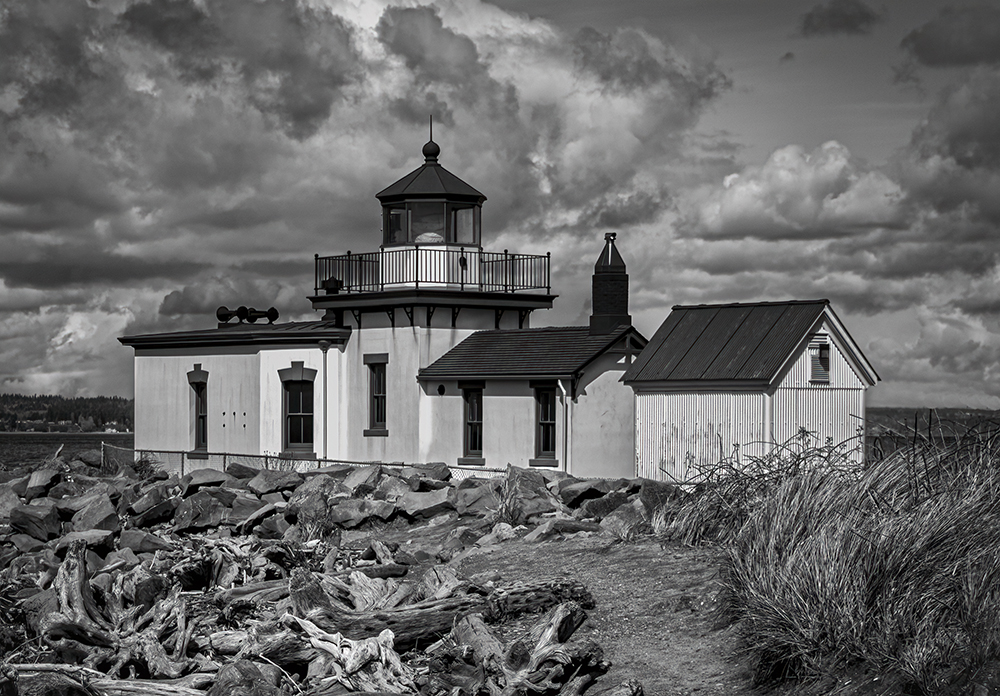
Hey Andrew. I love lighthouses and I love this one. I cropped the right a little to make the image more centered. I also turned down the highlights and brought out some of the clouds. That was just an opinion, your post-editing was spot-on. I could feel the wind blowing. |
Jan 24th |
| 40 |
Jan 23 |
Reply |
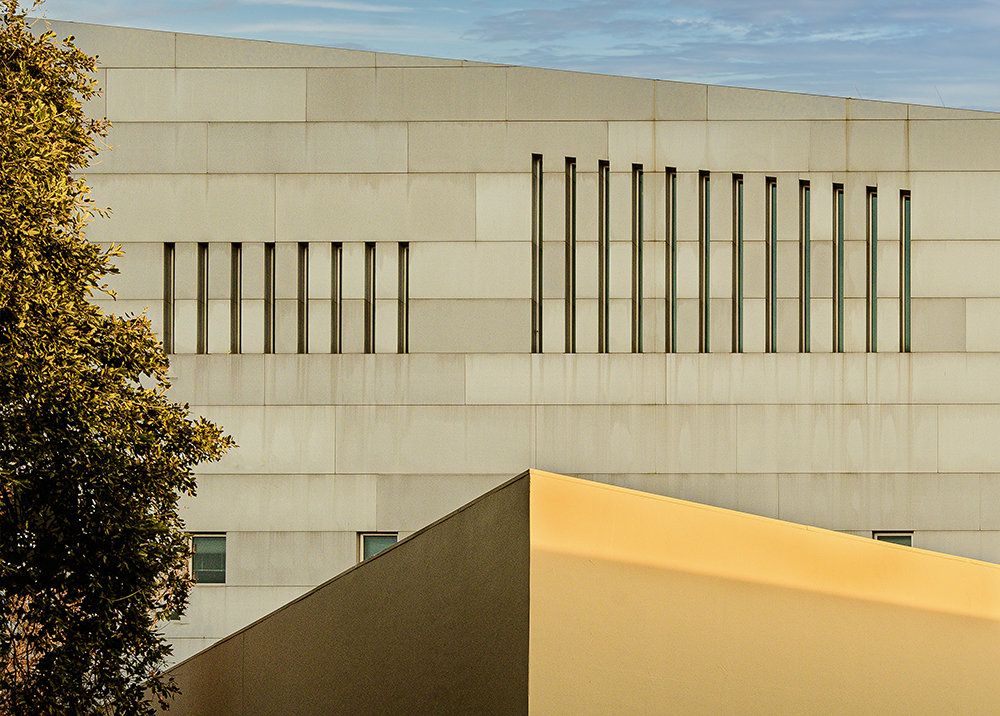
Thank you Jamie. When I work on a shot like this, I want to invite your eye to explore here and there and then go over to the right and then come back to the left and see the detail in all the trim on the buildings. Thank you, this comment is exactly what I wanted for Christmas and my Birthday (sorry, I got carried away). |
Jan 20th |
| 40 |
Jan 23 |
Reply |
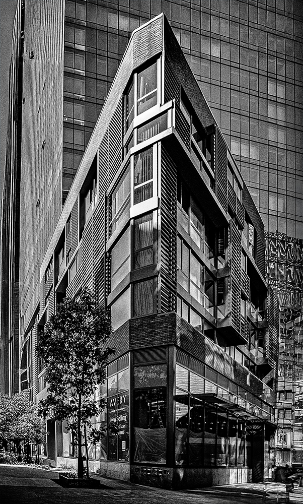
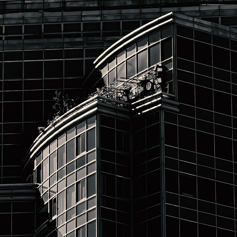
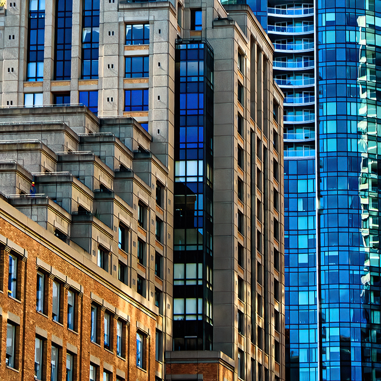
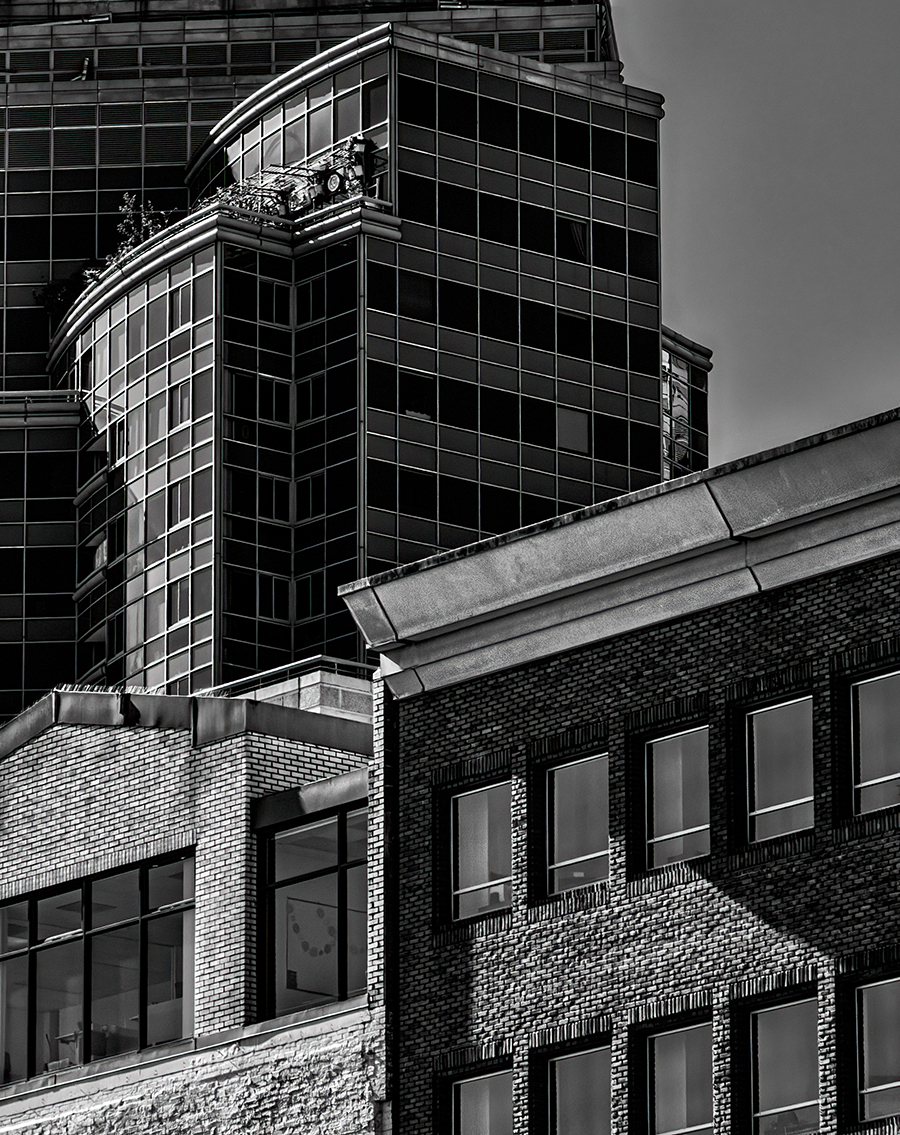
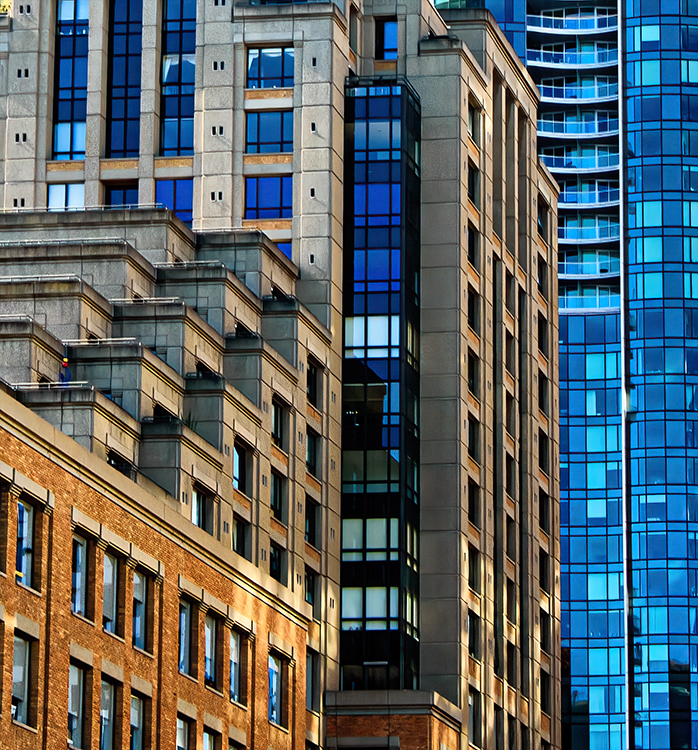
Hey Henry, thanks for the nice comment. I was a big fan of Herb Caen, and used to read his column in the newspaper. This (Architectural Photography) is the direction I am heading in after putting it off for many years. You should check out a guy based in Los Angeles named Richard Greene. His abstract stuff is my main inspiration. You will see my other stuff in this posting, but my new ventures will be in this direction (except when I go to Alaska in May. Not many skyscrapers there). This image was captured on a very sunny morning in the financial district. |
Jan 15th |
| 40 |
Jan 23 |
Comment |
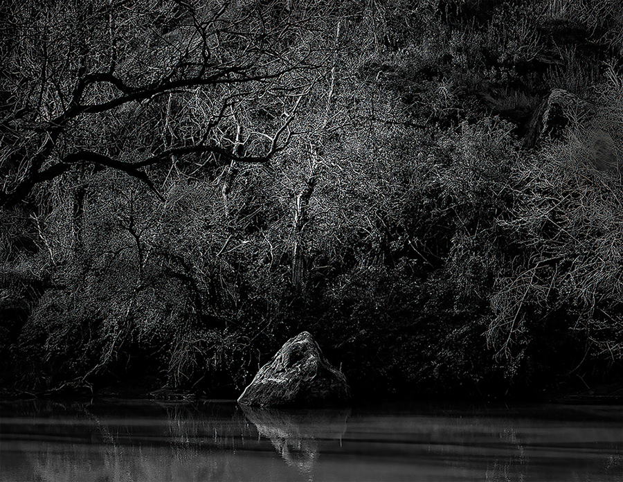
Hey Julie, I don't shoot wildlife (mainly because I don't have any long lenses), but everything I have seen and read about bird photography says the bird needs to be sharp (especially the eyes) and it looks like you nailed that. What makes this image something like I would see in a magazine, is that it shows action, and beauty, along with what looks like the sun coming through the wings. It also has a blurred background, and nothing really distracting. I give it an A+. I would not worry about the horizon cutting through the bird. You could always blur the background a little more, but this a really well-done image that is worthy of being published. Look at the water particles in the air by the feet. Nice! |
Jan 9th |
| 40 |
Jan 23 |
Reply |
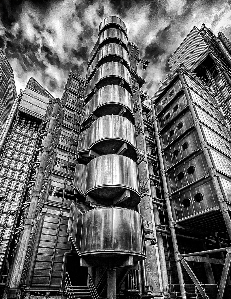
Thank you Julie. I grappled with wether to crop out the right building reflection for a long time. I really wanted as many different colors as possible in the shot. The main question is, when the reflection pulls your eye to the right, can it come back. I decided not to crop the top becuase there was too much going on with the ledges which I think make the shot more interesting. I have posted a version cropped on the right. I would love to hear how the group feels about the crop. I just want to settle it in my mind. I can print it either way. I am so glad you brought this up. It was bothering me. Thanks Julie. |
Jan 8th |
 |
| 40 |
Jan 23 |
Comment |
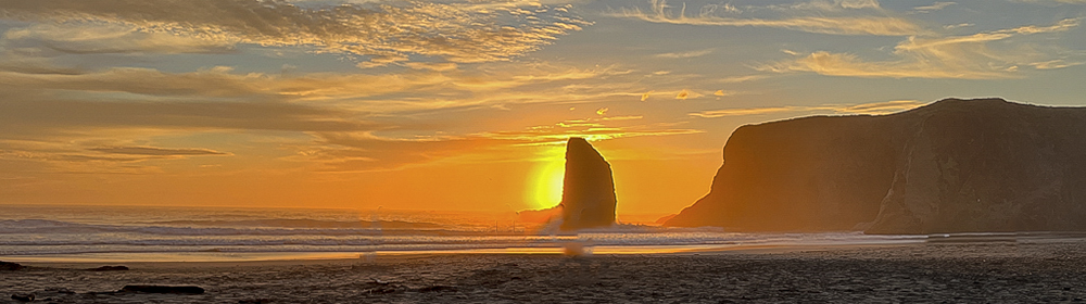
Hey Jamie, I love the Oregon Coast and I love your take on one of the most photographed beaches on the west coast. The cool thing about our group submissions is that you can tell us what you had in mind when you made the image and most of us will respect that ( and I do). There are two versions of this image. The one you took, which I agree adds another dimension to the subject (by adding an interesting grouping of onlookers), and the one that I could not resist. This wide angle shoot just screams to be even wider. Your shot is really more interesting, and I am glad you told us what you were going for (I try to do that with my stuff). Your are a really talented photographer and I hope you did not mind my take on this. |
Jan 6th |
 |
| 40 |
Jan 23 |
Comment |
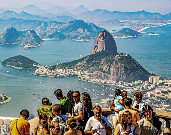
Hey Henry, This image brings back a lot of memories. I have never been to Rio, but I had a Nikon D100 and like film, I never want to go back. My images always had a color film feel and that is what I am getting here. I hope you don't mind, I went in and got rid of the blue cast. I tried it in black and white and it did not work for me. I cropped some of the left to make the crowd feel more centered. I also adjusted texture, clarity, and Dehaze. I sharpened and took out some of the noise. I turned down some of the sun baking the crowd. I still think it looks like color film, and did you know you can buy plug-ins to make your images look like different color films. What is this world coming to. I had a lot of fun looking at this image. Thanks Henry. The cool thing about this image is that everytime you look at it, you will remember Rio. |
Jan 6th |
 |
6 comments - 3 replies for Group 40
|
| 74 |
Jan 23 |
Comment |
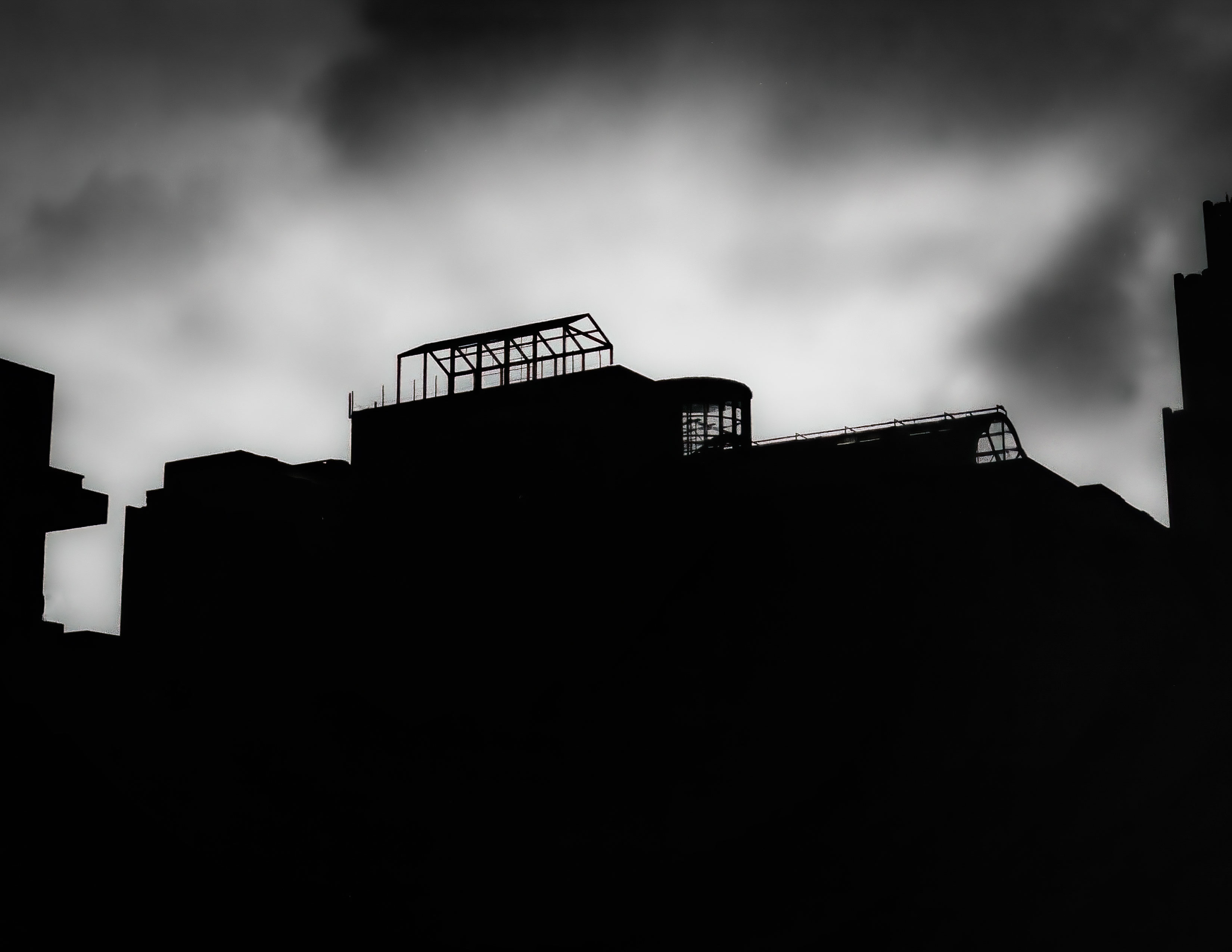
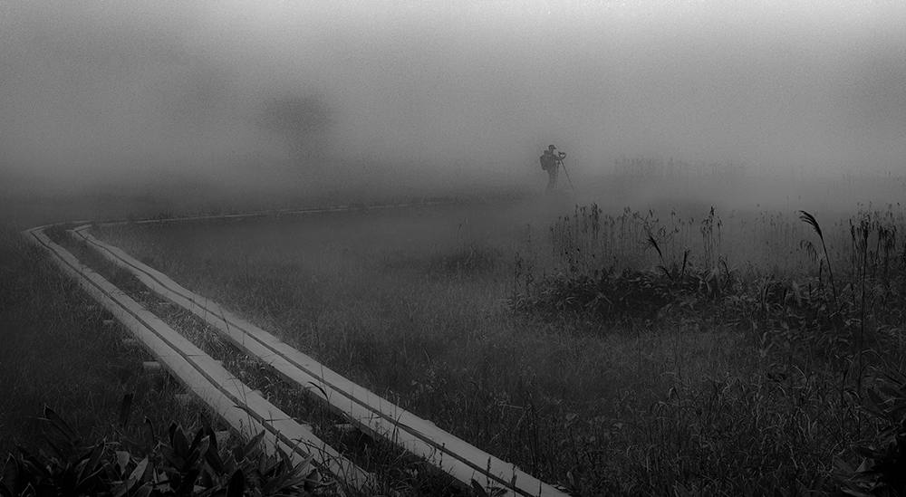
Hey Haru, Interesting shot. Good Composition, and I love the planks leading to the photographer. I could not get past the fog looking so noisy. Oddly enough, I reduced the Clarity (my favorite Slider) and it looked to me more like fog. You captured a great story here. |
Jan 24th |
 |
| 74 |
Jan 23 |
Comment |
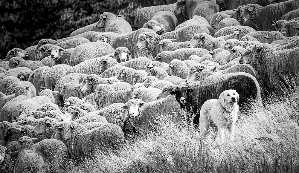
Hey Lisa, Nice image. I like the story being told. I know some of us have strong opinions about using different sliders and such in Photoshop or Lightroom, but I could not resist cloning out a white object just to the right of the dog's head. I know this sounds picky, but when i looked at the dog, my eye went to the object on the right. I also used Topaz DeNoise AI to sharpen things. I like the crop that Haru did, and by no means (I can only speak for myself) did I feel anythig was needed for your post-edit. Again, your image really captured the story being told here. |
Jan 24th |
 |
| 74 |
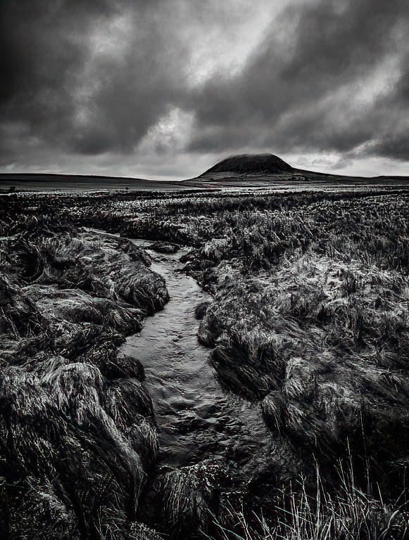
Jan 23 |
Comment |
Hey Arne, I like your image, I can feel the cold. The open lot at the bottom left does seem to draw me over there and I sort of get trapped. I like the clouds and the water, and it is a good candidate for Black and White. The road gives good composition, and I tried cropping some of the left out, but you lose the hill on the left and the church. I wonder if the buildings on the right hill should be burned a little. Overall, it is a nice introduction to this charming city of Bergen. |
Jan 24th |
| 74 |
Jan 23 |
Comment |
Hey Arne, Thanks for the comment. Ansel Adams is my favorite photographer of all time. I think in the future I will try to be more selective with my clarity. Thanks again. |
Jan 8th |
| 74 |
Jan 23 |
Reply |
Hey Haru, Nice, I like what you did. Thanks for the help, as always. |
Jan 7th |
| 74 |
Jan 23 |
Comment |
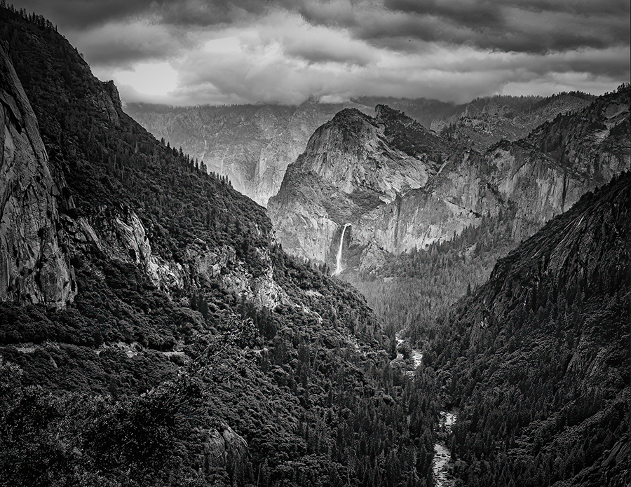
Hey Tevor, I really like your image. You really made me imagine the storm, and how it must have felt to be out there. I like the mist on the top of the hill, and I think you have captured all three ranges of tone with your editing. I don't use Lightroom, but Adobe Camera Raw is the same thing (pretty much). As I have said many times before, my 2 favorite sliders are the Texture, and Clarity. I hope you don't mind, I took your shot and punched up the Clarity, but left everything else alone. I felt it was a little soft in places, and I really wanted to see more detail in the area in front of the hill that appears to be some water. I used Topaz DeNoise AI and took out some of the soft areas. It is very subtle and you may feel it, rather than really see it. I appreciate that you did not use a Vignette (I know I will be unpopular for saying that), but I don't think you have to hold anything in. I was wondering how you converted to Mono, as there seems to be at least 4 ways to do that in Adobe Camera Raw, and a couple in Photoshop. Thanks Tevor, I am going to go warm up by the fire. |
Jan 3rd |
 |
5 comments - 1 reply for Group 74
|
11 comments - 4 replies Total
|