|
| Group |
Round |
C/R |
Comment |
Date |
Image |
| 40 |
Dec 22 |
Comment |
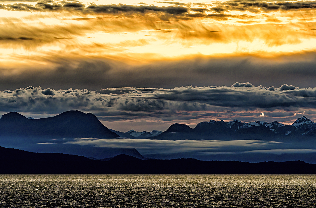
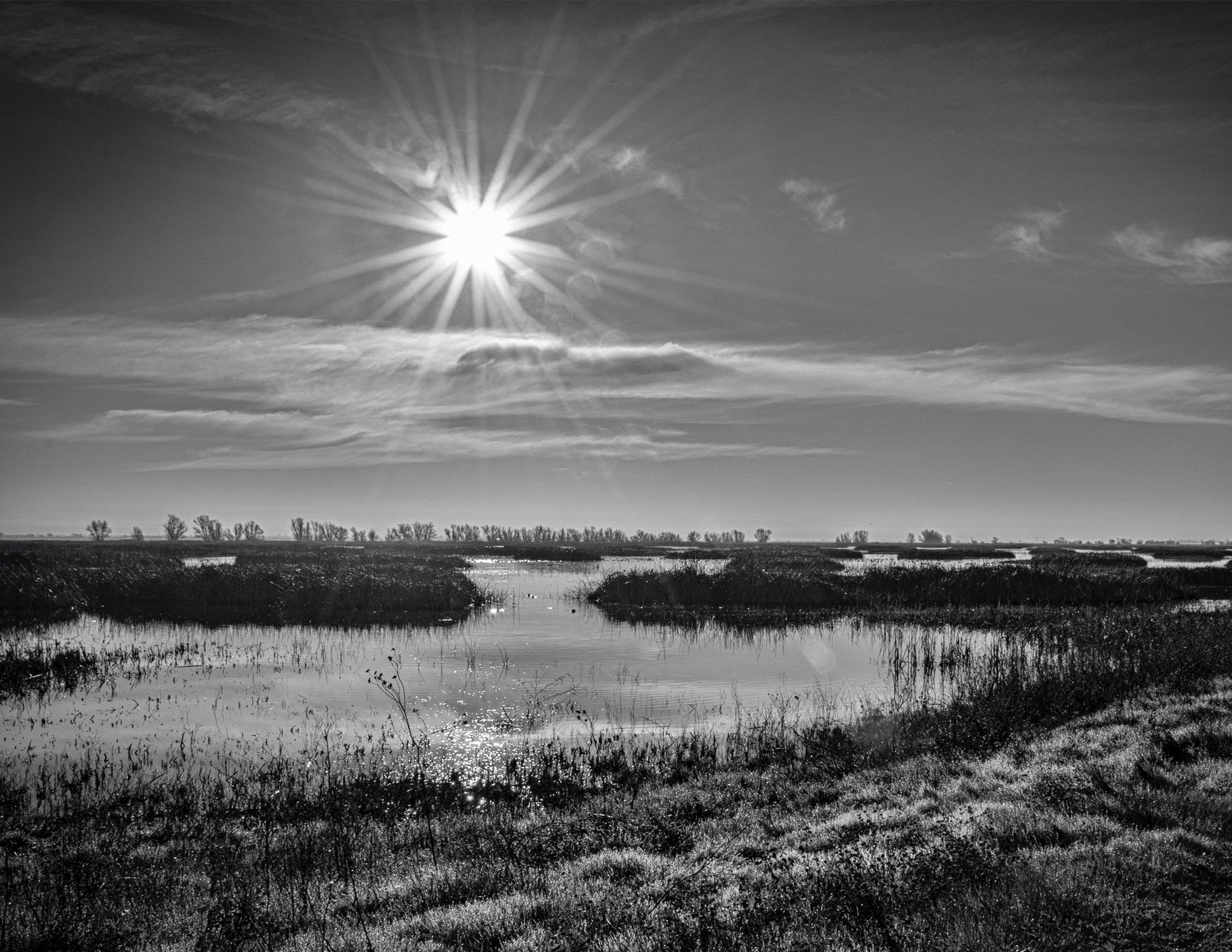
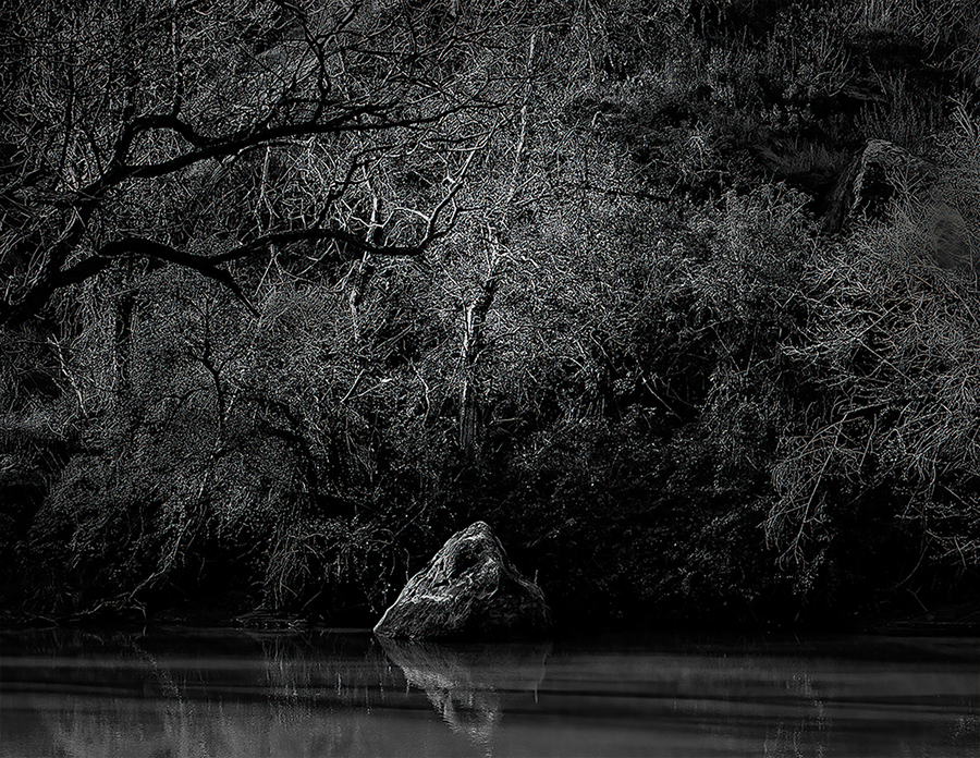
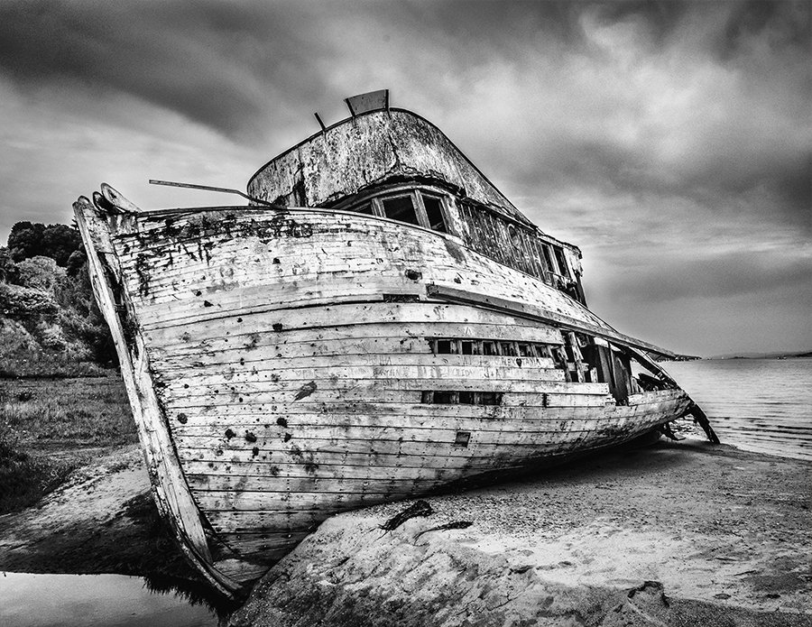
Hey Lin, Nice shot. I tried some of the things that Andrew and Catherine talked about. I also added Texture and Clarity from Adobe Camera Raw. Clarity always makes water look... Wet. I cropped and then added some Topaz DeNoise AI filter and took out some of the lower water that had a sort of texure to it. So, I would have tried F/16 at a higher ISO and taken care of noise with Topaz. I don't see any distortion, but some lenses don't like extreme f stops. Nice shot either way. This wold make a nice tourism shot for Texas. Enjoy the Holidays. |
Dec 23rd |
 |
| 40 |
Dec 22 |
Comment |
Hey Andrew, Thanks for the comment. I always forget to get lower or higher. At my age I might need someone around to help me up.
Katherine, thank you for your comment. You and I see this the same way. Your photographic eye seems to be evolving as you experiment with new types of images. No turning back now. |
Dec 23rd |
| 40 |
Dec 22 |
Comment |
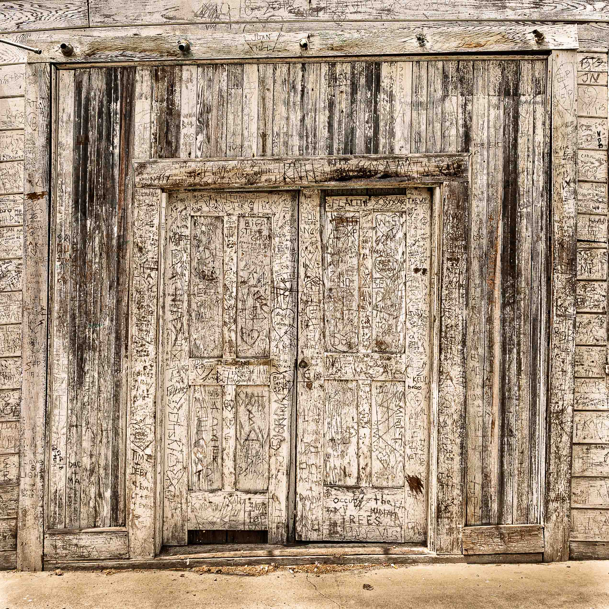
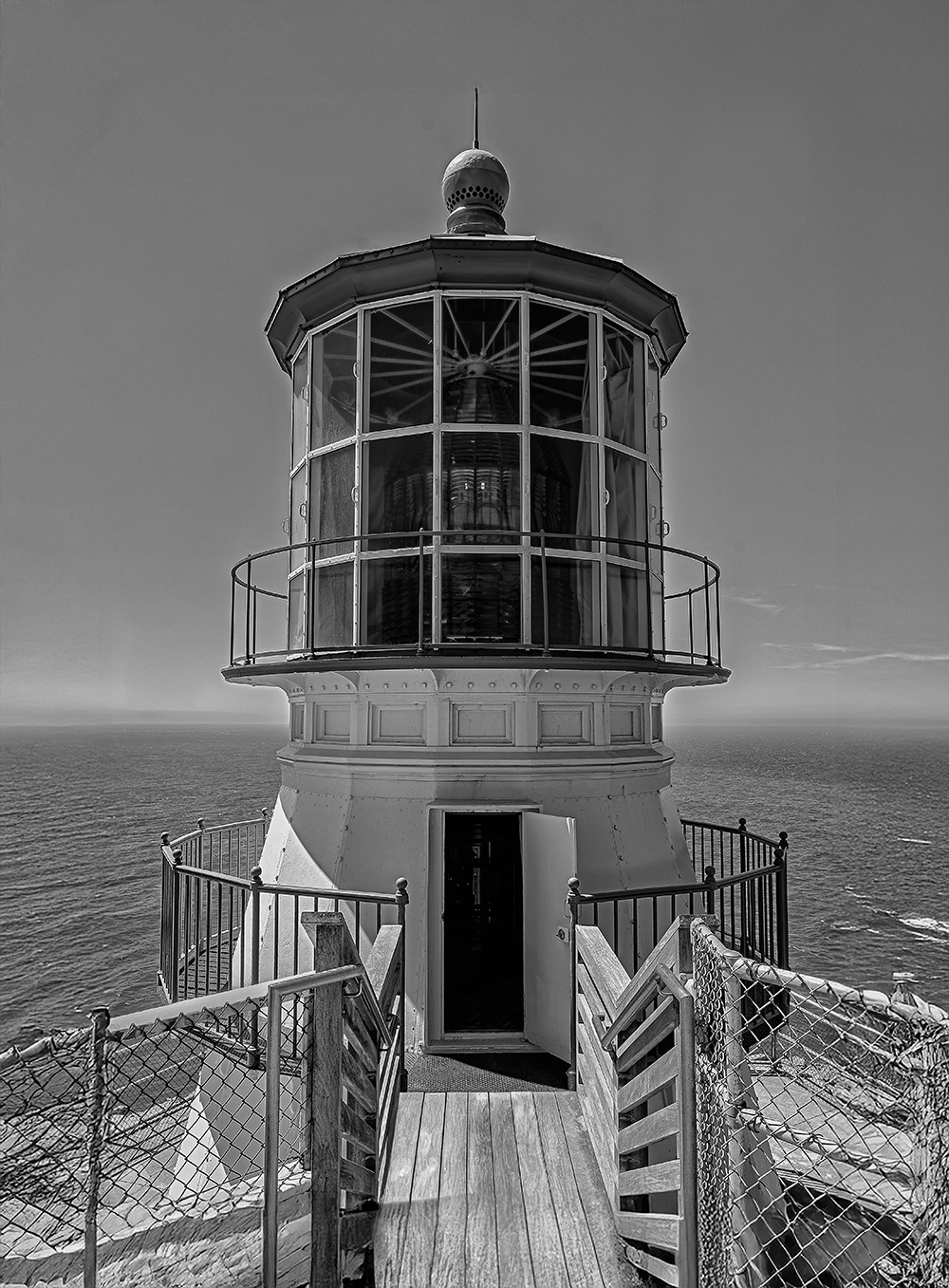
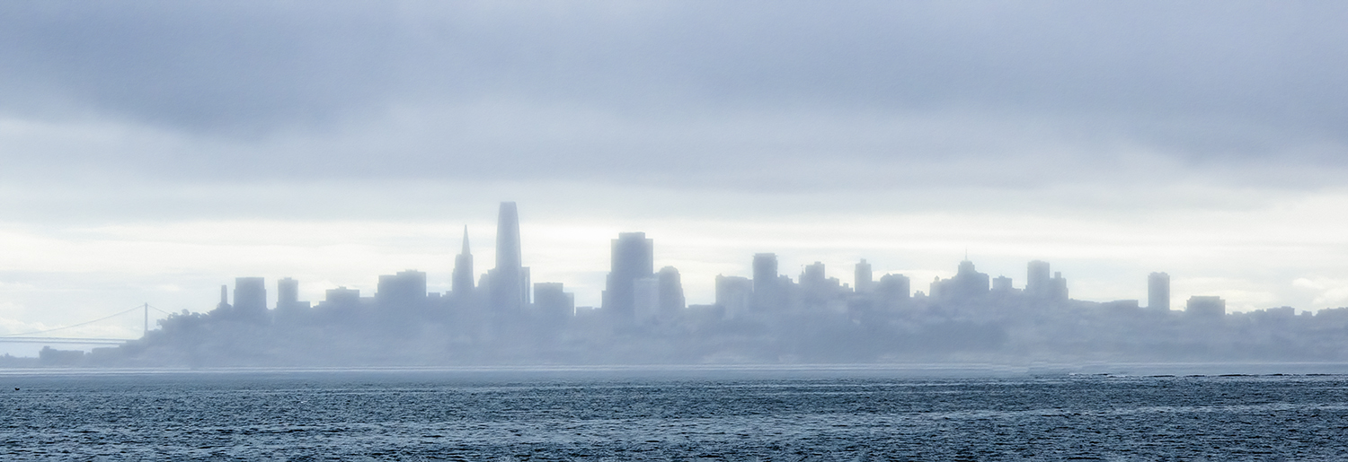
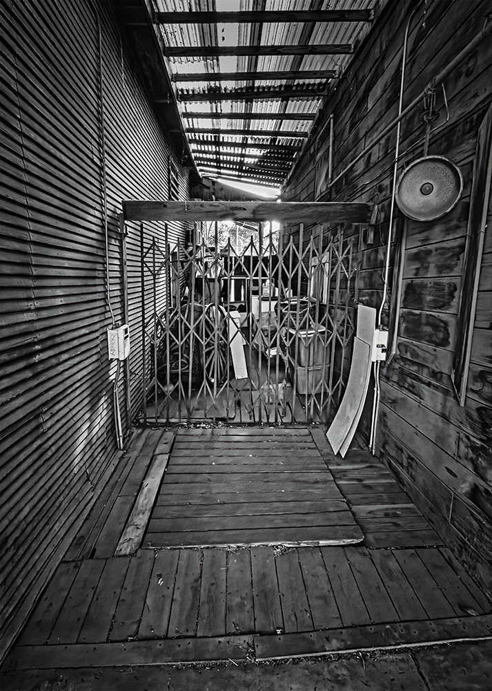
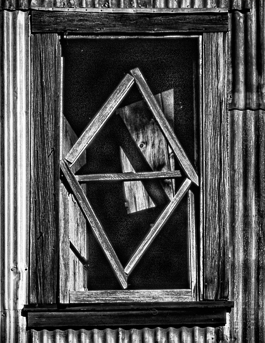
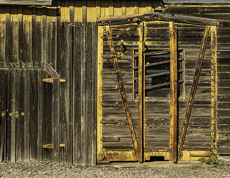
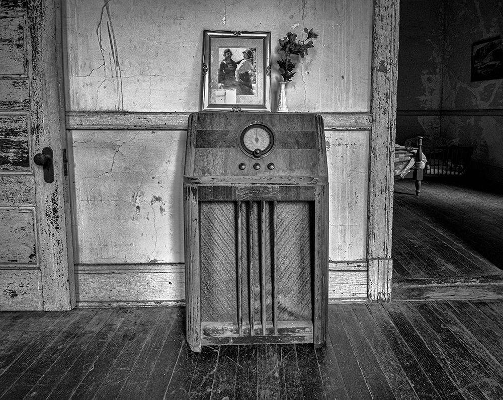
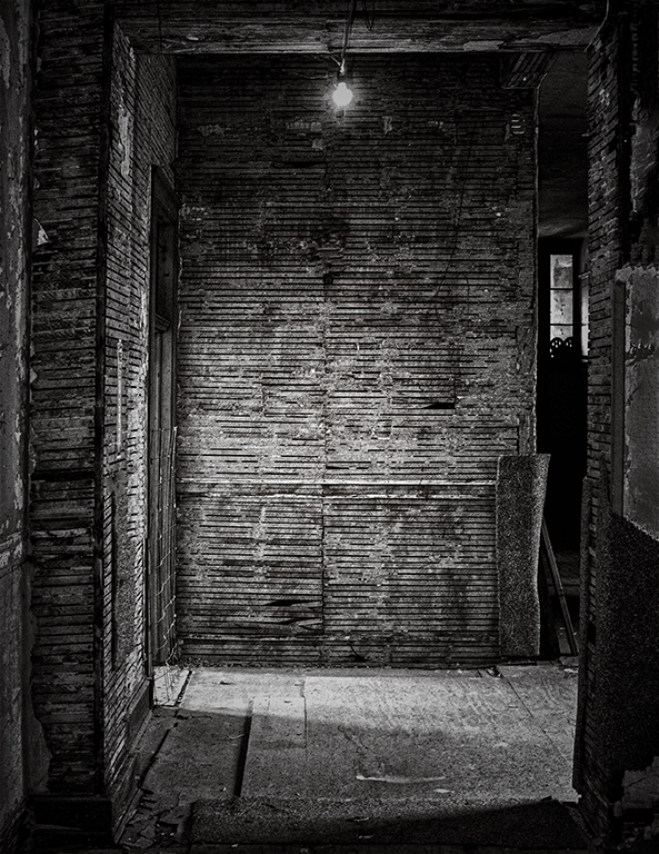
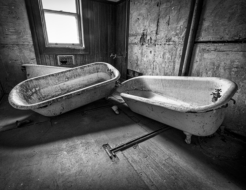
Hey Henry, thanks for asking about my health. I am doing fine. I can see where you are coming from with your comment. I am a firm believer in images having a subject. There are shots like a skyline, or an Architechual Interior where the subject is that it is a skyline or an interior shot. Locke is a town full of interesting buildings with equally interesting alleys. Julie lightened things up to see all the detail, and I tried to perserve the tones of the wood walls and floor as close to how they were. To me, this shot works when you can see the different tones, and the several directions that the floor takes. If I had a show of my Locke Images, It would make more sense. I am trying to jump off the bandwagon of making everything dark and adding a vignette. My orriginal hesitation of posting this image was that I thought it was boring and did not have a central theme, but then I realized the theme was... Junk, and the clearer the junk is, the more you can understand what people consider worth keeping. I tried cropping up to the gate and it still looked boring. I have a large image of the front of a building in Locke when you walk down the entry hall of my house, but this will not be printed or hung. It's good to get opinions from membes of Group 40, as I trust you all with my images. |
Dec 16th |
| 40 |
Dec 22 |
Reply |
Hey Jamie, Thanks for your comments. My college photography professor said I did chaos better than anyone he had met. I don't think I have done any of my shots in this town in color. thanks again. |
Dec 7th |
| 40 |
Dec 22 |
Comment |
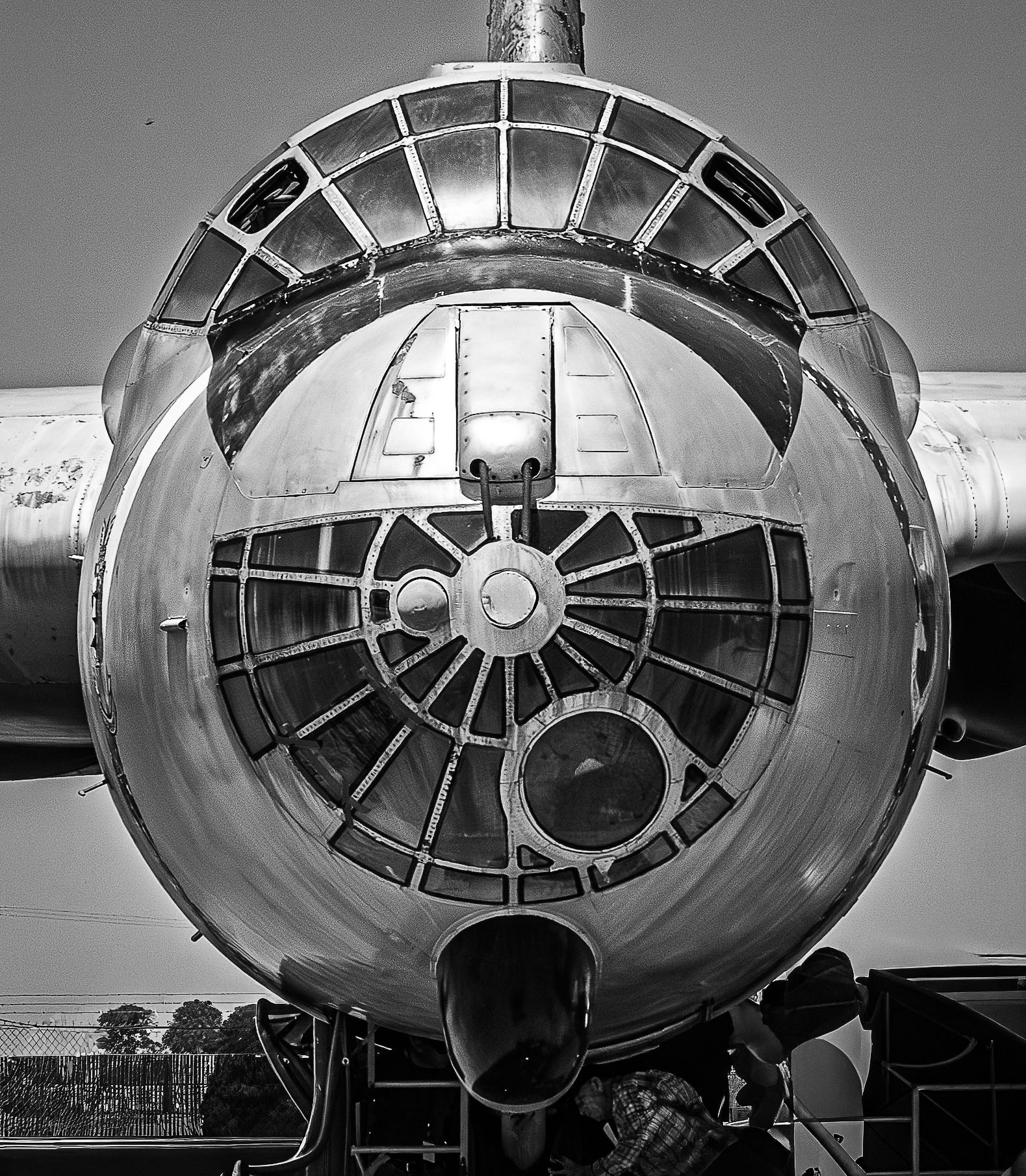
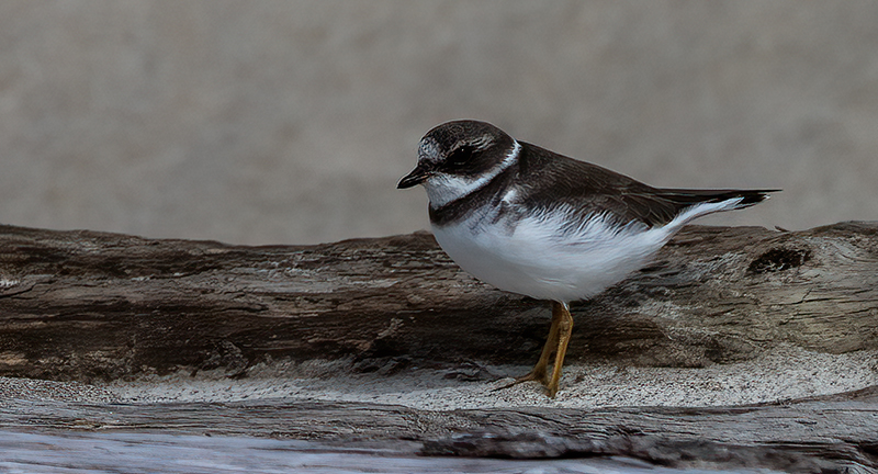
Hey Jamie, Nice shot. I don't have a lens to atempt bird photography. The image seemed a little soft so I put it into Topaz DeNoise AI. I see this used a lot in wildlife photography. Take a close look I think you will like. Nice Shot Jamie. |
Dec 3rd |
 |
| 40 |
Dec 22 |
Comment |
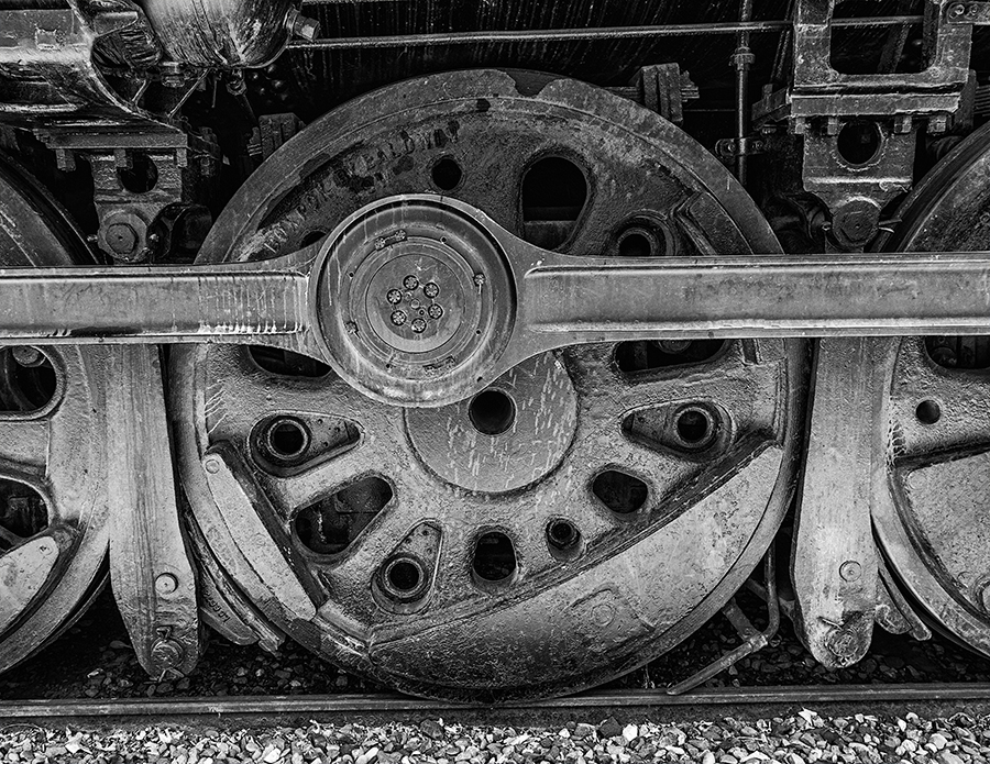
Hey Andrew, Nice image. I went in and using the new mask tool in Adobe Camera Raw, made the smoke coming out of the smokestack darker. I like that you had the shovel in the image to show a sense of action (to come). I would have loved to see this engineer in action with that shovel and that pile of coal. As always, your exposure is right on, and the image is sharp. Don' t you hate it when clouds take a holiday? |
Dec 2nd |
| 40 |
Dec 22 |
Comment |
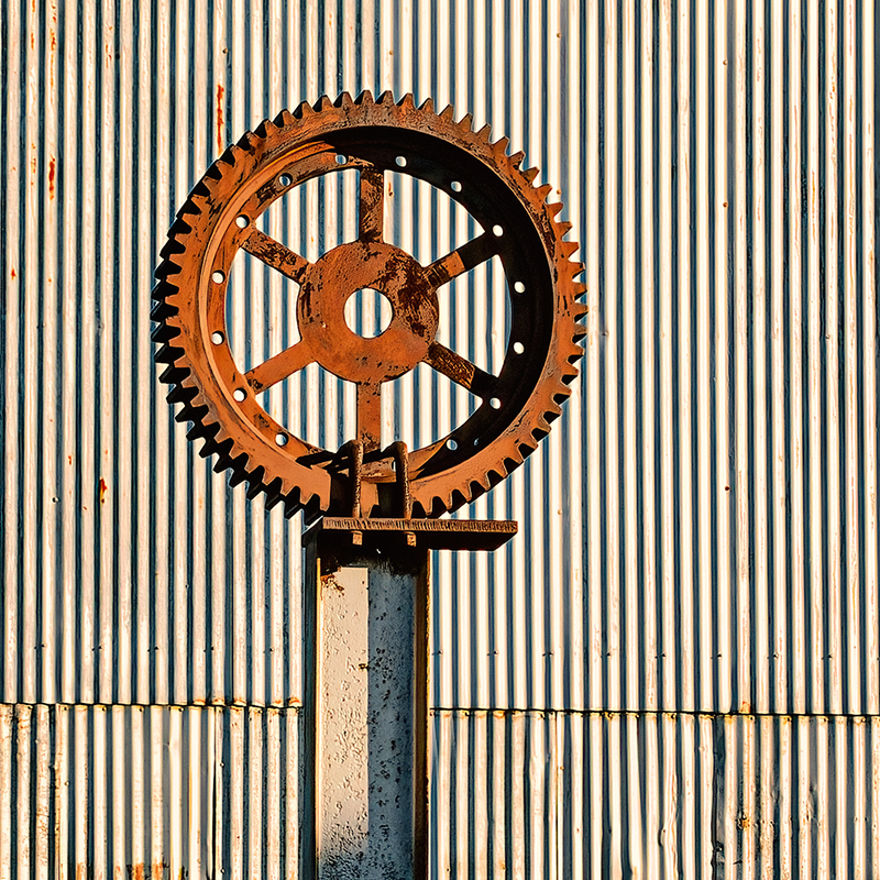
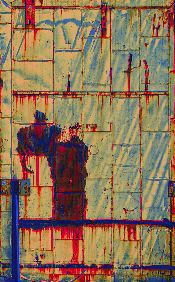
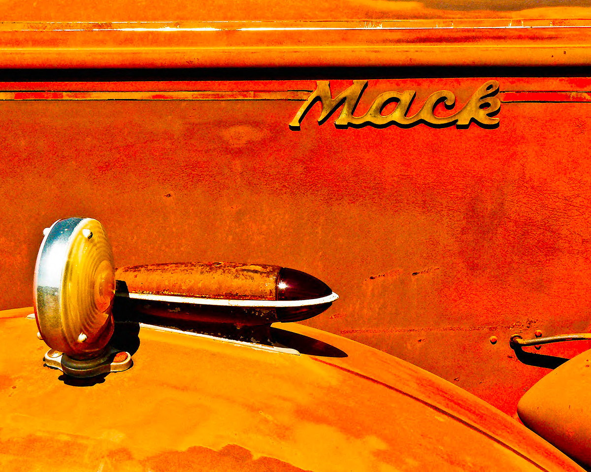
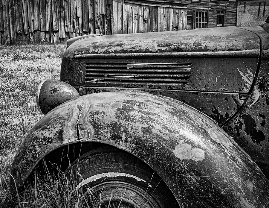
Hey Julie, Thanks for taking a look at my image. I agree that a square crop would work well here. I left the metal plate at the bottom of the image to give the shot a beginning. I wanted a foreground, middle ground and background. This image is all about textures, so I like what you did with the sliders. I usually overdo the contrast, but in this case, the wood was sort of bleeched (in real life), so I tried to show that. I am really glad that you gave me your take, as I am trying to improve the tonal contrast in my images. Again, I appreciate your help with my journey. This is the kind of feedback I really need. |
Dec 2nd |
| 40 |
Dec 22 |
Comment |
Hey Julie, interesting image. I just worked on a shot of a tree I took in a valley just north of here and it looked like a man's face with ugly teeth. I liked your original, but maybe your submission looks more like mountains. As for paper, I started photography in a darkroom printing black and white photos. There was not a lot of choice. Now days, I use paper from a company called Moab. I have tried other brands but I like their papers the best. I purchased a sample pack and used up a lot of ink testing papers(my printer has nine cartridges). Moab has a metalic paper that I like for metalic things, like old trains, or old trucks. I had one image of an old truck actually printed on Metal. I did not like it as much as my friends and family, but I think it was sort of a novelty. I shoot my cityscapes on glossy paper and my black and white stuff on a sort of mat/pebble paper. Printing is an art form all to itself. There are so many considerations like, Mats for a border, and type of frame, and type of glass. I paid $100 for a 16x20 piece of museum glass. Sometimes a great print behind cheap glass, hung in the wrong place spells disaster. Sorry there are so many variables for printing an image. Find a glossy paper you like for things that need to be glossy, and a mat or semi mat paper for everything else, and when you get that special image that needs a special Japanese paper or a metal paper, Look at paper companies like Moab. Sorry to ramble but this is day 4 of my Covid quarantine. |
Dec 1st |
7 comments - 1 reply for Group 40
|
| 74 |
Dec 22 |
Comment |
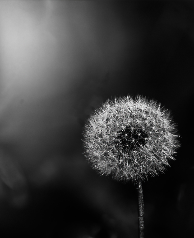
Hey Haru. Nice image. I liked the black and white better than the original. I liked the original placement of the dandelion, more off-center. I used Topaz DeNoise AI just to see the difference. Either way works for me. Nice lighting. |
Dec 8th |
 |
| 74 |
Dec 22 |
Comment |
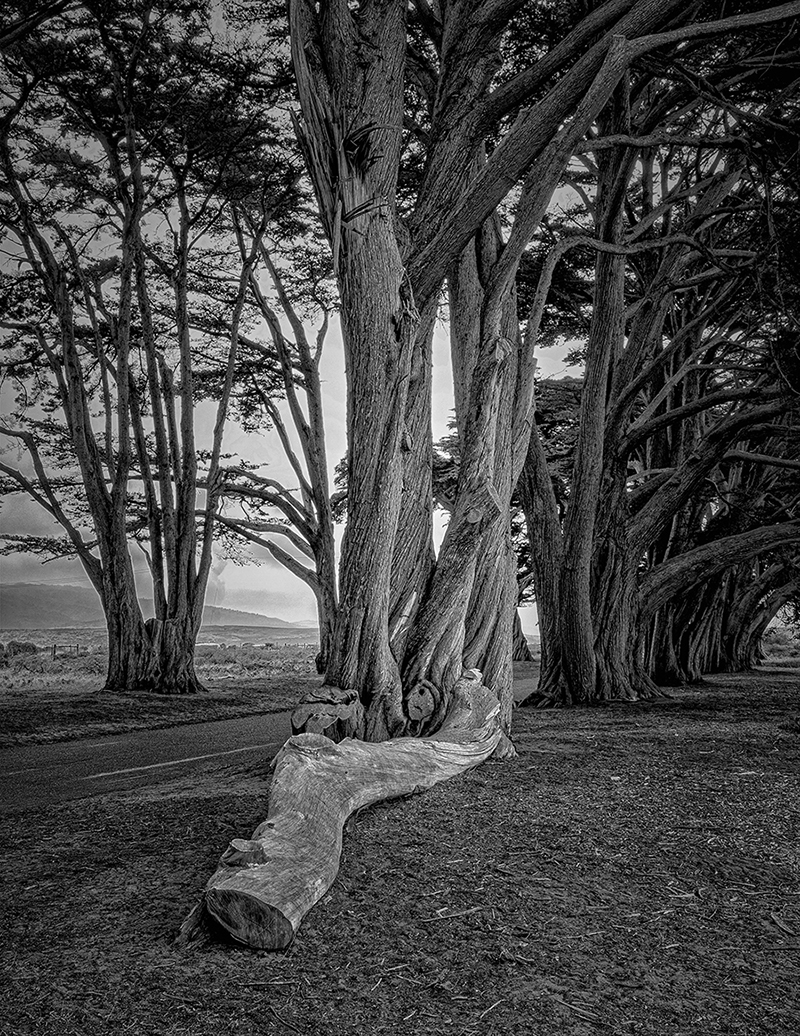
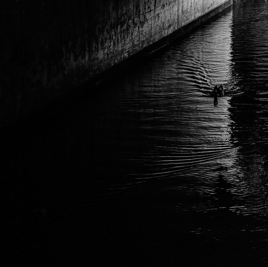
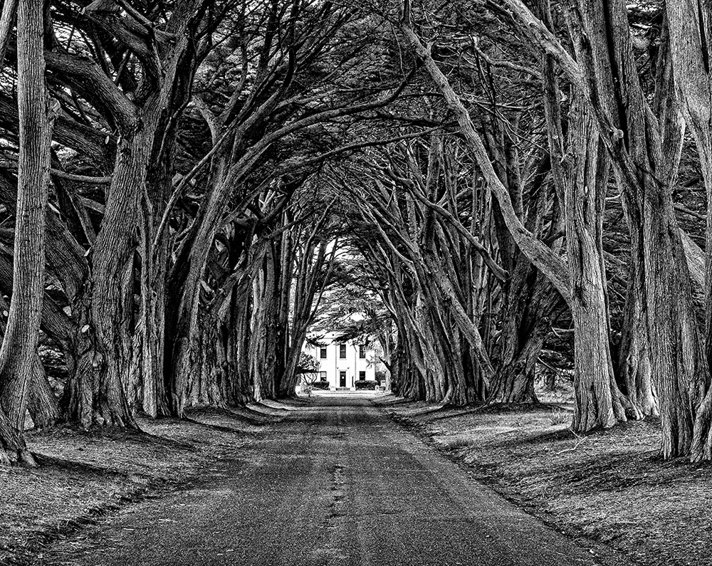
Hey Haru, thank you for your comments. I have several takes on this shot and one has the vignetting. There have been some Professional Photographers who have shot this grove facing the other way. At the end of the grove facing the other way is a road with some rolling hills and Drakes bay, but they are hard to see. I guess it all depends on what the photographer thinks the subject is. Personally I think the subject is the trees, so I wanted to show a lot of the canopy. If the building was the subject, I would have gotten closer. I like your cropping idea and, as always I look forward to your comments on my images. Thank you for helping me out on this. |
Dec 7th |
| 74 |
Dec 22 |
Reply |
I agree with your thoughts. Not sure if I agree with the crop idea, I like having the road lead into the image. I tried a version in Topaz DeNoise AI wth the road with less noise. It made the road look like a paved road, and I kind of wanted it to look like Dirt. In real life, the road was smoother, but it just looked fake. The station was built in 1939 so the road was probably paved later, or re-paved. It just looked too new for the setting. To me, photography can be a time-machine. I was trying to capture this grove as it may have looked maybe in the 60's. So we have, foreground, middle ground, and background. Sorry to ramble. |
Dec 3rd |
| 74 |
Dec 22 |
Reply |
Wow, I don't know what to say. Your research is thorough. Weston probably got tired of people saying his peppers looked like bodybuilders or two people kissing. That's it. I am off taking pictures of fruits and vegetables for life. |
Dec 3rd |
| 74 |
Dec 22 |
Comment |
It's funny, I always thought Edward's peppers sort of looked erotic (sorry if I offend anyone). Sorry I said brothers, they were, as you said, father and son. Brett's stuff did have a darker tone. |
Dec 3rd |
| 74 |
Dec 22 |
Comment |
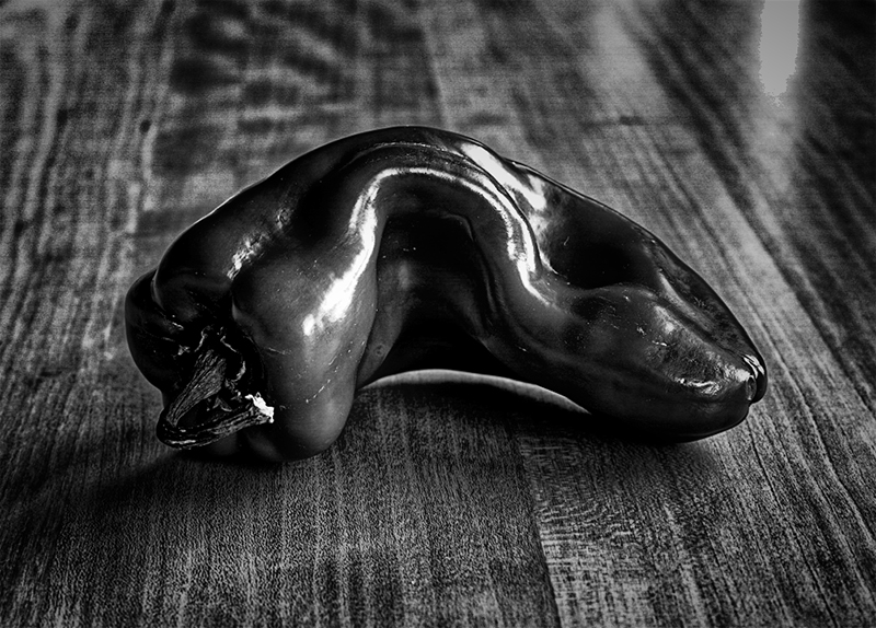
Hey Dick, I love Edward, and his brother Brett's photography. I recently saw some of Bretts original prints in a gallery in Carmel California. I love the Pepper shots from Edward and yours is a great tribute to that. I decided to give equal weight to the table in my version. I also opened your original in DXO color efex and applied some tonal contrast. Then I put it in DXO silver efex and applied my favorite filter #5. My take is a lot darker and I could have taken out the table, but it is a great table and I love textures. I have seen a printed large version of Edward Weston's Peppers and I thouht I would meet you in the middle. I hope you don't mind. Your shot looks more like a real pepper. Nice job. |
Dec 3rd |
 |
4 comments - 2 replies for Group 74
|
11 comments - 3 replies Total
|