|
| Group |
Round |
C/R |
Comment |
Date |
Image |
| 40 |
Aug 22 |
Comment |
Hey Julie, What a great shot. I love this. What an opportunity you had for some great photography. So the question is, what color were the birds. I put your shot in DXO Color Efex Pro and applied a bleach filter which made the birds white without making the image black and white. It is more than likely a White Balance issue and that can be tricky without clipping. Maybe black and white might be a choice. How about going into Adobe camera raw or lightroom and in the color mixer taking everything out except some orange and yellow. Either way, I like you edit. Nice job. |
Aug 12th |
 |
| 40 |
Aug 22 |
Comment |
Hey Andrew, I love the tones in this shot. I agree with Julie that dead center may not be the first choice. I did some cropping and I punched up the sliders in ACR (I think I may have gone too far but I wanted to give some options). In this case I feel the crop taking the bird off center also took care of some dead space. I would love to have a lens that would let me shoot at 841mm. Very well done! |
Aug 12th |
 |
| 40 |
Aug 22 |
Comment |
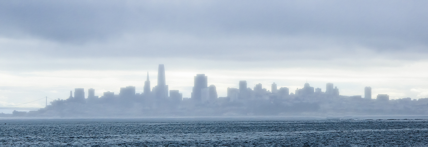
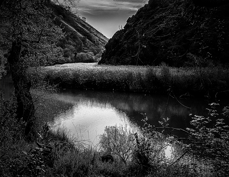
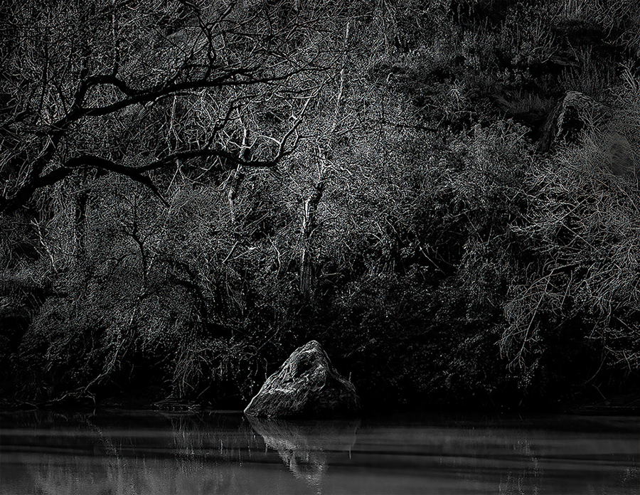
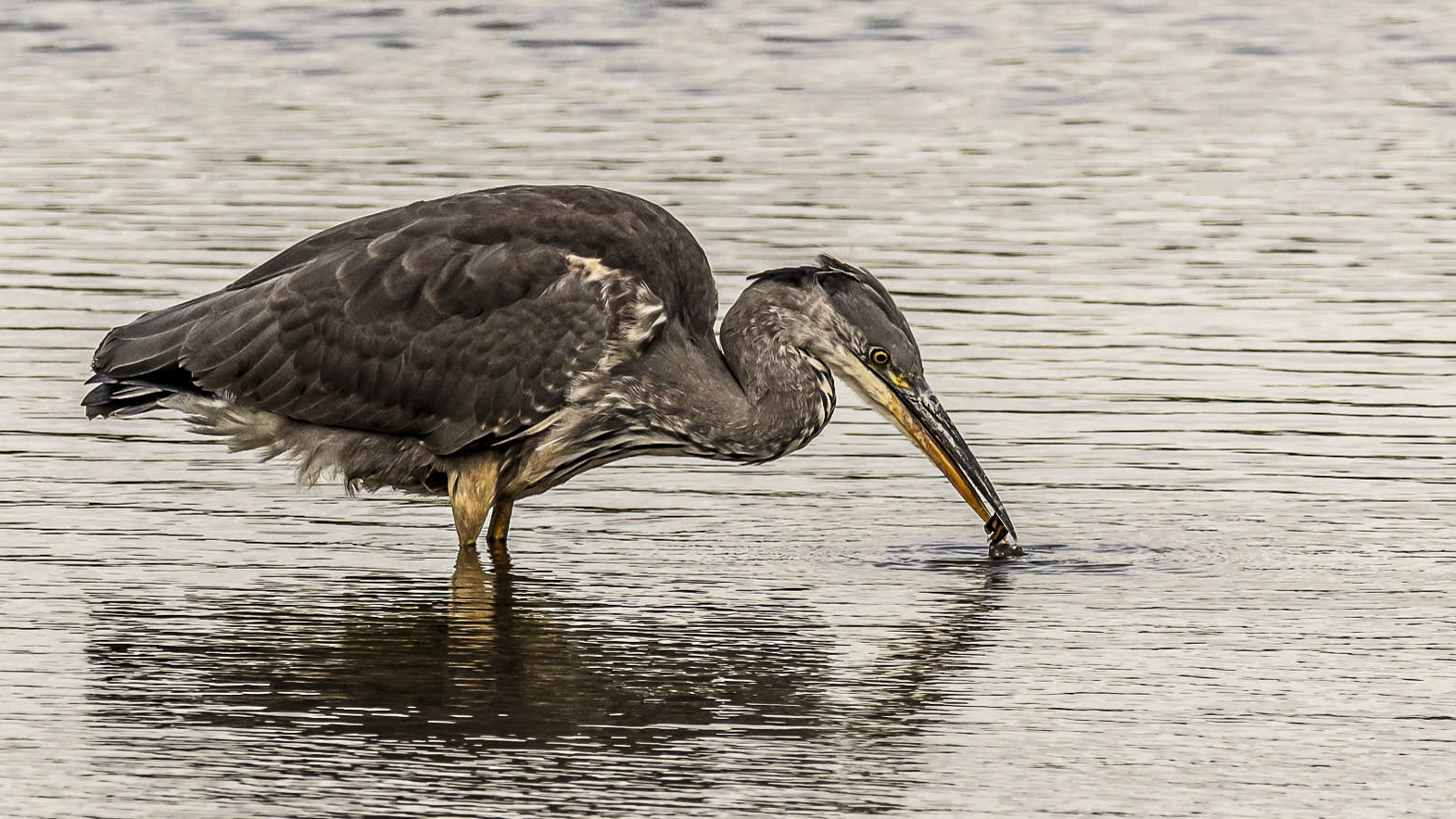
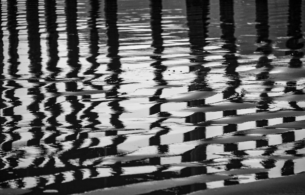
Hey Jamie, Nice shot. I love reflections. I don't know if this will make sense but, the water just did not look wet enough. I love the clarity slider in Adobe Camera Raw. You have to be careful in certain uses but, generally it works good. I also kicked up the contrast and texture and punched up the highlights. I have been told not to be afraid to be bold in your use of contrast and other sliders and it was one of the best pieces of advise I have been given. Since it is on the boarder of being an abstract fine art photo, you are in control. You can even break some rules. Nice shot that makes me want to go to San Francisco and walk along the waterfront. |
Aug 11th |
 |
| 40 |
Aug 22 |
Comment |
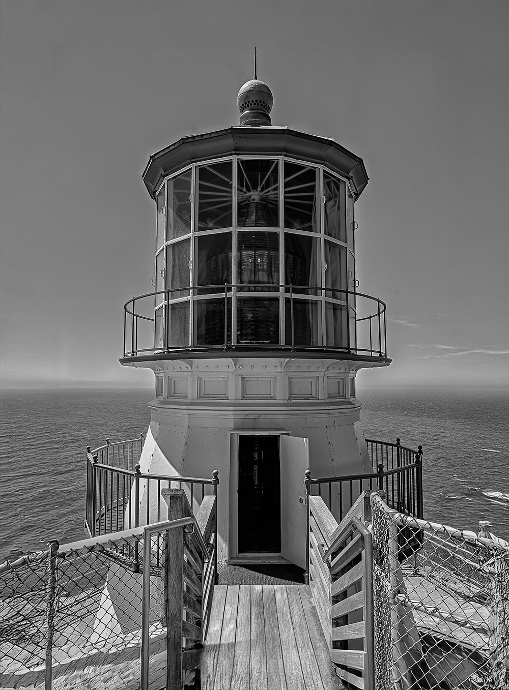
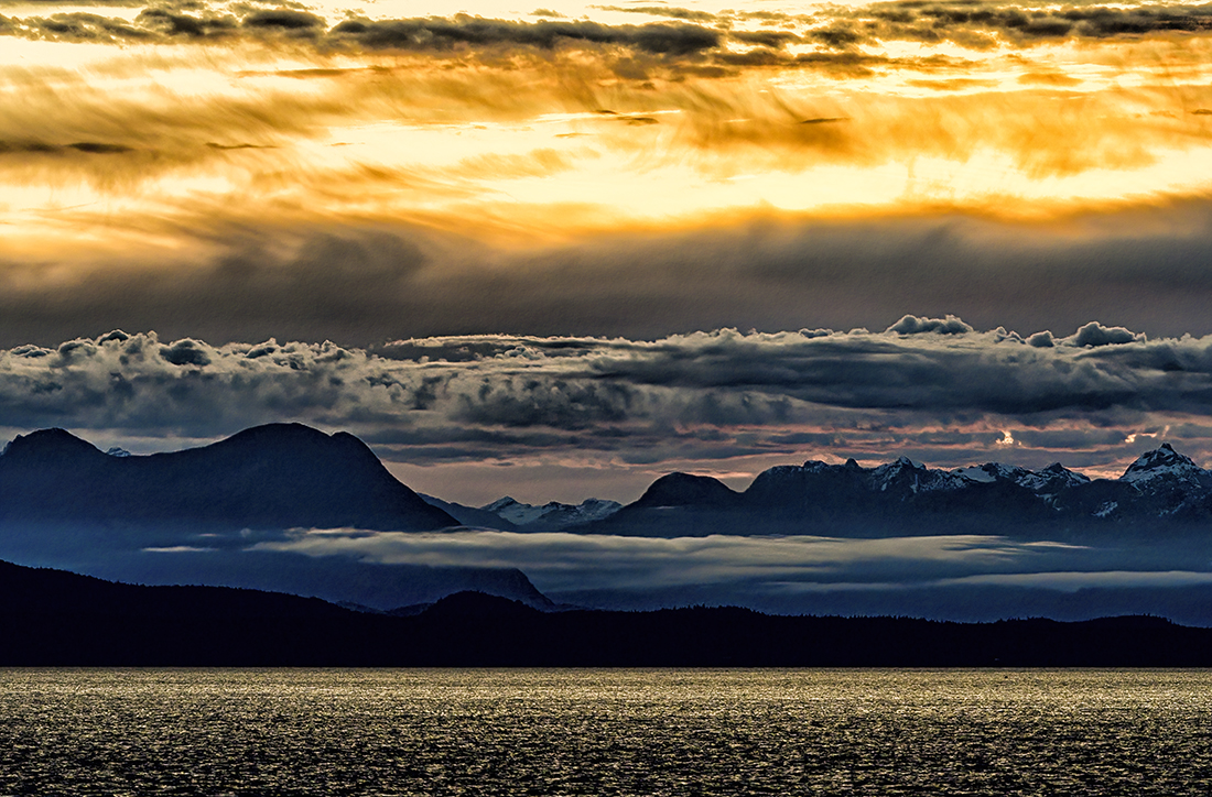
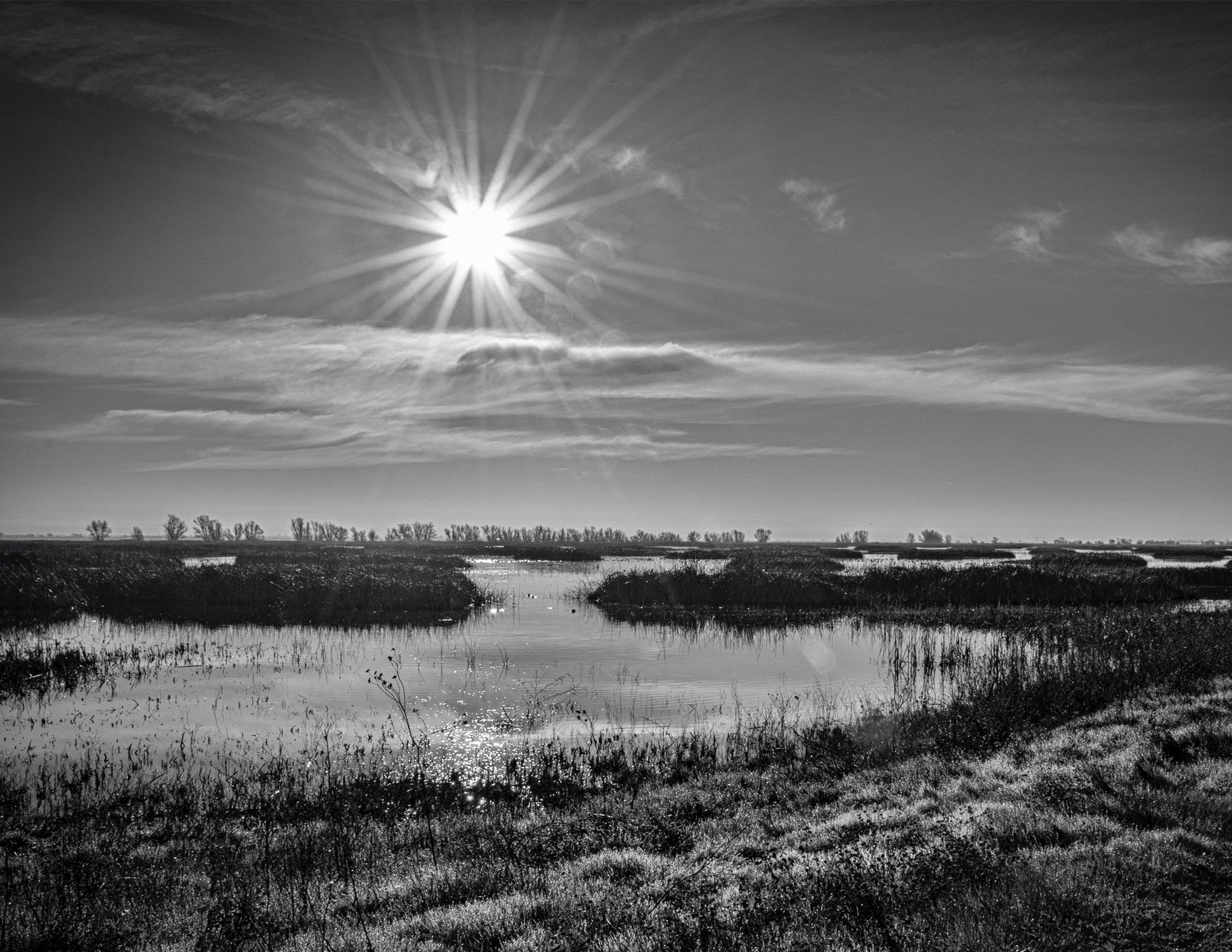
Wow Catherine, that is way too cool. That is Magic. Was this taken at some sort of Rocket launching area? Wow. |
Aug 8th |
4 comments - 0 replies for Group 40
|
| 74 |
Aug 22 |
Comment |
Haru,
Sorry, my question probably could have been worded differently. |
Aug 12th |
| 74 |
Aug 22 |
Comment |
Hey Haru, I liked your edit better than the original. the original seemed like the lighting was artificial and did not fit the subject. I feel when I look at your edit that the statue is in a very dark cave with light leaking in from the top left. Would you put this edit into the travel photography category, or just art? Just curious. As always, I love your stuff. |
Aug 8th |
| 74 |
Aug 22 |
Comment |
|
Aug 8th |
| 74 |
Aug 22 |
Comment |
Hey Jeff...Mission Accomplished. Nice job. |
Aug 8th |
| 74 |
Aug 22 |
Comment |
Hey Tevor, Nice shot. I kind of agree with Haru about the subject being in the middle. but why have dead space on the left. There is plenty to see on the right of the image, so I am okay with the original (the real original). It is okay in my opinion to have two subjects in this image. The depth of field is very good and everything seems sharp and exposure looks good. The subject's face was handled very nicely. I sort of like the color original better because the colors gives a nice contrast to the operator. |
Aug 8th |
5 comments - 0 replies for Group 74
|
9 comments - 0 replies Total
|