|
| Group |
Round |
C/R |
Comment |
Date |
Image |
| 40 |
May 22 |
Comment |
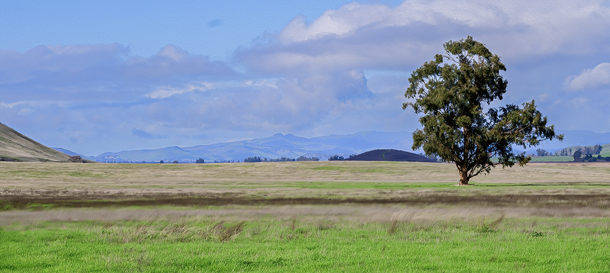
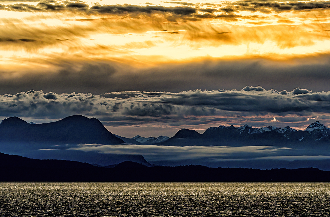
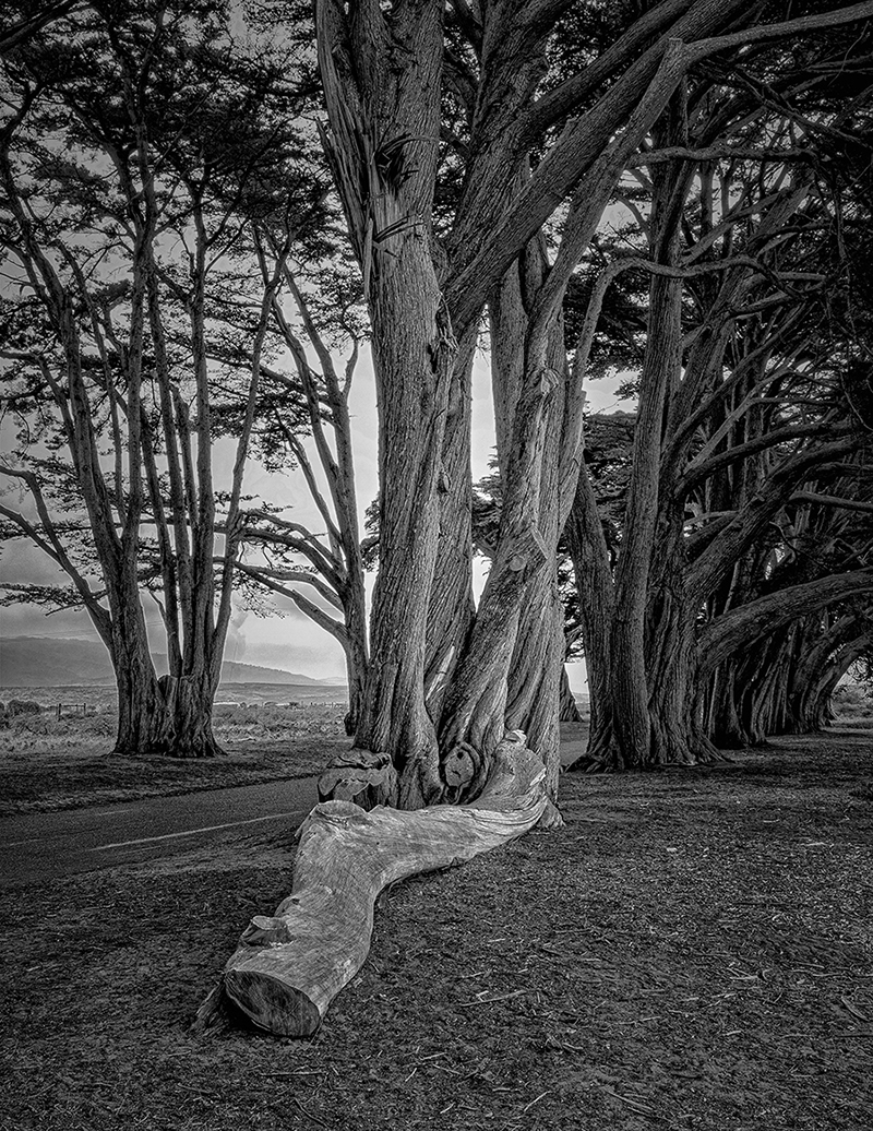
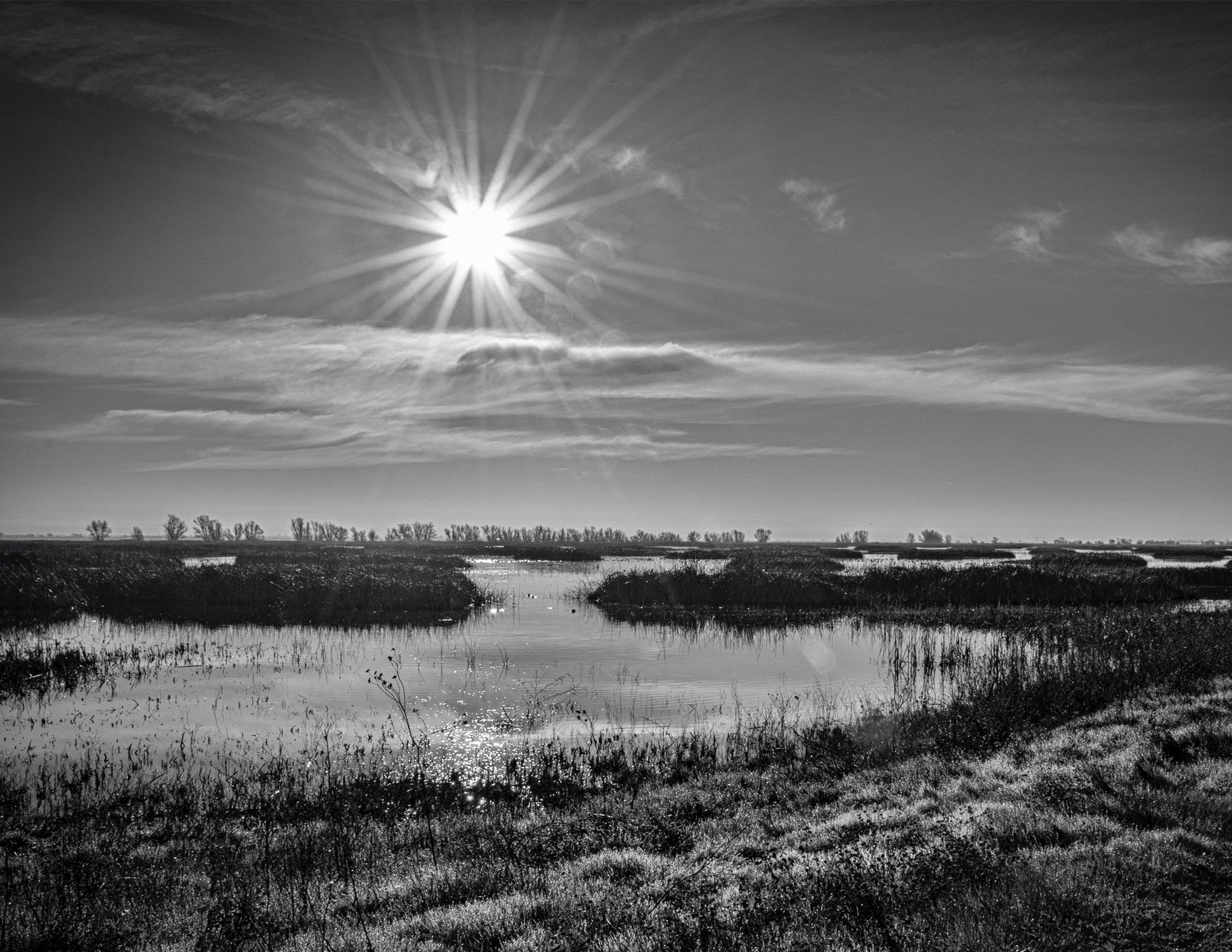
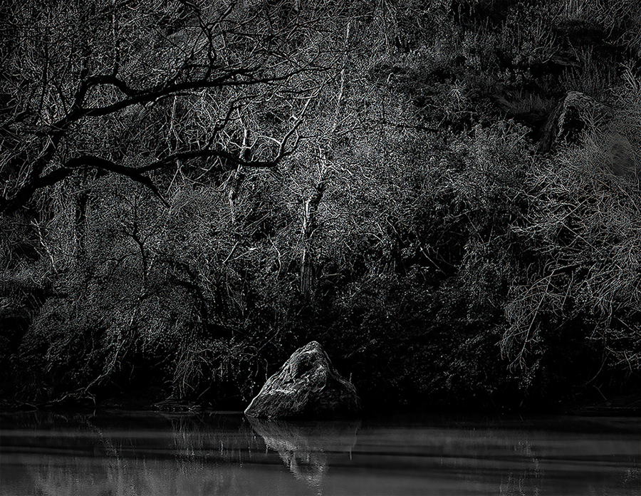
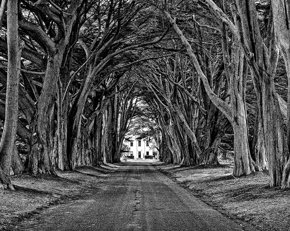
Hey Julie and Andrew. Thank you for your comments. It looks like I mistook over saturated colors for a "mystic mood". After consideration I agreed, so I backed off on the green and cropped so that the horizon is not in the center of the image. I also cloned out some of the twigs that were coming out of nowhere. I now have a new checklist from a class I took to make sure I don't miss this stuff again. Your comments made me go back and re-educate myself on what to look for before posting an image. In a matter of a couple of a week, I feel like I have improved and I hope I will not make these types of misjudgments again. Thanks. |
May 16th |
 |
| 40 |
May 22 |
Comment |
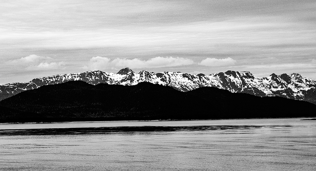
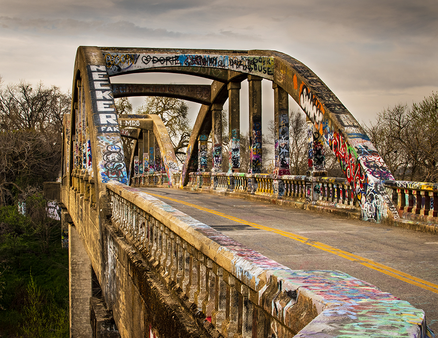
Hey Andrew, good point about the need for cloning out the stems on the sides. I think I forget to take that one last look before I pronouce an image ready for flight. |
May 6th |
| 40 |
May 22 |
Comment |
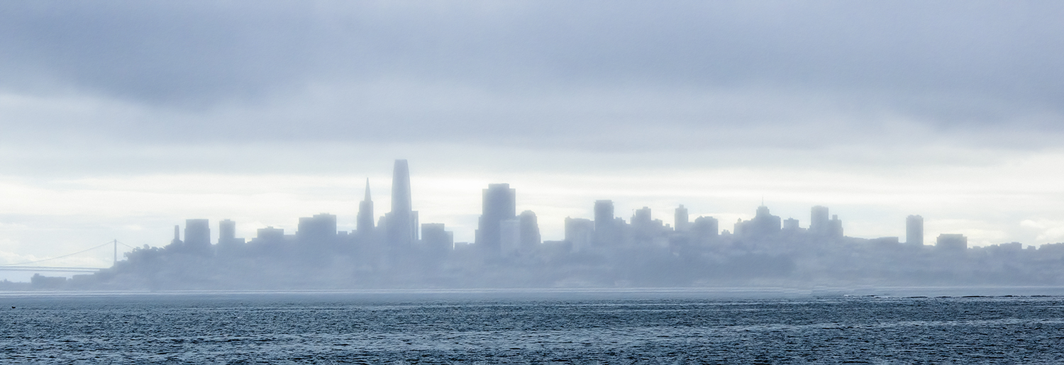
Hey Jamie, this is one of my favorite places. I was there shooting travel pictures for AAA. Your are right, the original did not capture, as far as I remember, the Pink color of the dunes. I like the color shot better. The sand in the B&W looks like a lot of noise. It's a great shot. Too bad there are no foot prints (just kidding). I really like your composition and it makes me want to go back and shoot some more. By the way the Dunes had snow on them when I was there. If you have a chance to go back, do it after a storm. Thanks for sharing. |
May 6th |
| 40 |
May 22 |
Comment |
Hey Catherine. Yes it worked. You are beoming a real bird photographer. Good DOF. I am a huge vignette fan but in this case, you did fine. Thanks. |
May 3rd |
| 40 |
May 22 |
Comment |
Hey Andrew, What a fun shot. I like what you did and I am glad you did not try to darken it up and put a vignette in. I like lance's suggestion that you see the line more prominent. Again, what a fun shot. Thanks |
May 3rd |
| 40 |
May 22 |
Comment |
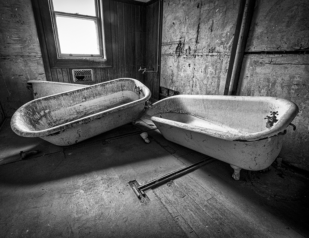
hey Julie, I really like your image. I sort of liked the color version best, so i opened it in PS and cropped just a little off the left and did all my editing and my back and white version looked almost the same as yours except I added som texture and clarity and the jugs were a little more shiny. Then I added a vignette and I ended up liking your black and white version the best. That is a keeper that I would have framed somewhere in my house. Nice job. |
May 1st |
6 comments - 0 replies for Group 40
|
| 74 |
May 22 |
Comment |
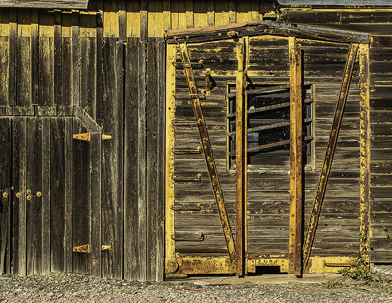
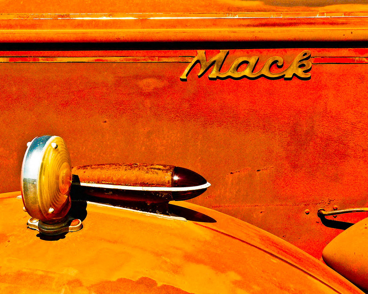
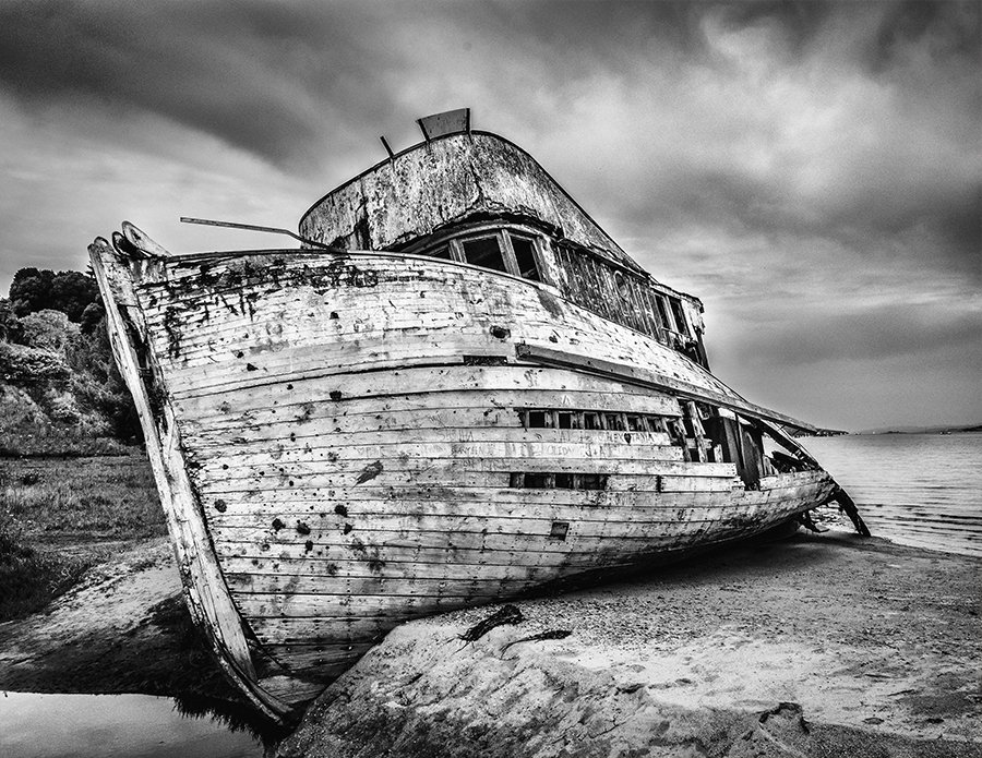
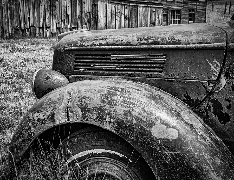
Hey Jeff. I liked your shot. I like the transformation to black and white. I like that the paint is dull and oxidized, and I like the rust, and the weeds growing up in the bumper. For me, cars are either best when shinny and perfect, or old and rusty and sitting in a bed of weeds. I am a texture lover, and I like what Dick did, so I tried it myself. I did a real bad clone job on the grill and my Silver Efex treatment added some shine back which I did not like. I did like that I was able to bring out some of the stuff near the hood. Overall I would like to have the feeling that this was amoung other old cars, so I woud not have shot as tight, even though I am known for shooting too tight. I have gotten better with everyone's help. So, everybody contributed. |
May 9th |
 |
| 74 |
May 22 |
Comment |
Hey Dick, as a former newspaper journalist and photojournalist, this was the mood I was trying to convey. I appreciate your comments... you made my day! |
May 5th |
| 74 |
May 22 |
Comment |
Haru, I love your work. If I was still shooting film, I would only shoot black and white. Your color stuff is just so well done, Maybe giving me a choice is the issue. In a show, you would probably not show two versions of an image. So, your black and white stuff is great, I just really like your color versions. Either way, your stuff always gets a WOW!! |
May 3rd |
| 74 |
May 22 |
Comment |
Thank you Tracy, I will play around with it. Thanks |
May 3rd |
| 74 |
May 22 |
Comment |
Hey Tevor, Nice Contrast, good action, and nice facial expression. These can be hard to capture, but it looks like you got it right on. Makes me want to try jet ski's again. Thanks. Definitely Better in B&W. |
May 3rd |
| 74 |
May 22 |
Comment |
Hey Dick, I like your treatment of the original image Making it B&W really works for me. I liked Haru's first suggesting also, I like having something to sort of focus on. Your b&w submission was cropped very nice and the exposure seems right on. Nice. |
May 3rd |
| 74 |
May 22 |
Comment |
Hey Arne, you really nailed it. The tone and mood is perfect. Your perspective made me feel what it must have been like. Very Nice! |
May 3rd |
| 74 |
May 22 |
Comment |
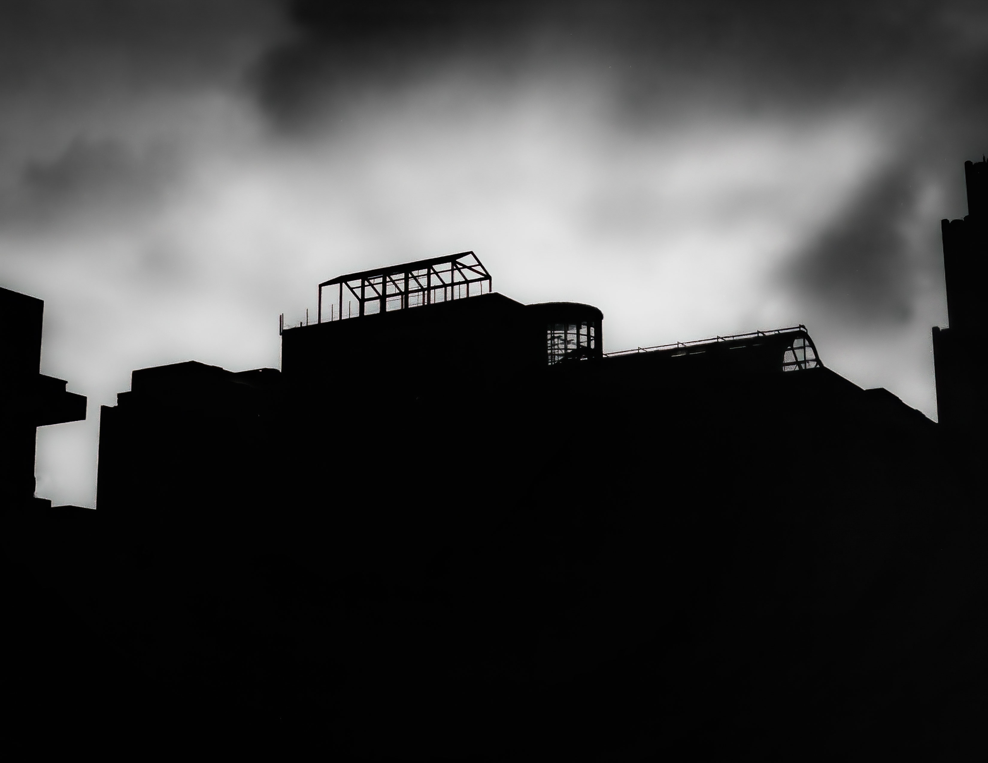
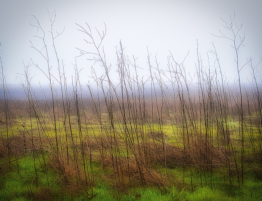
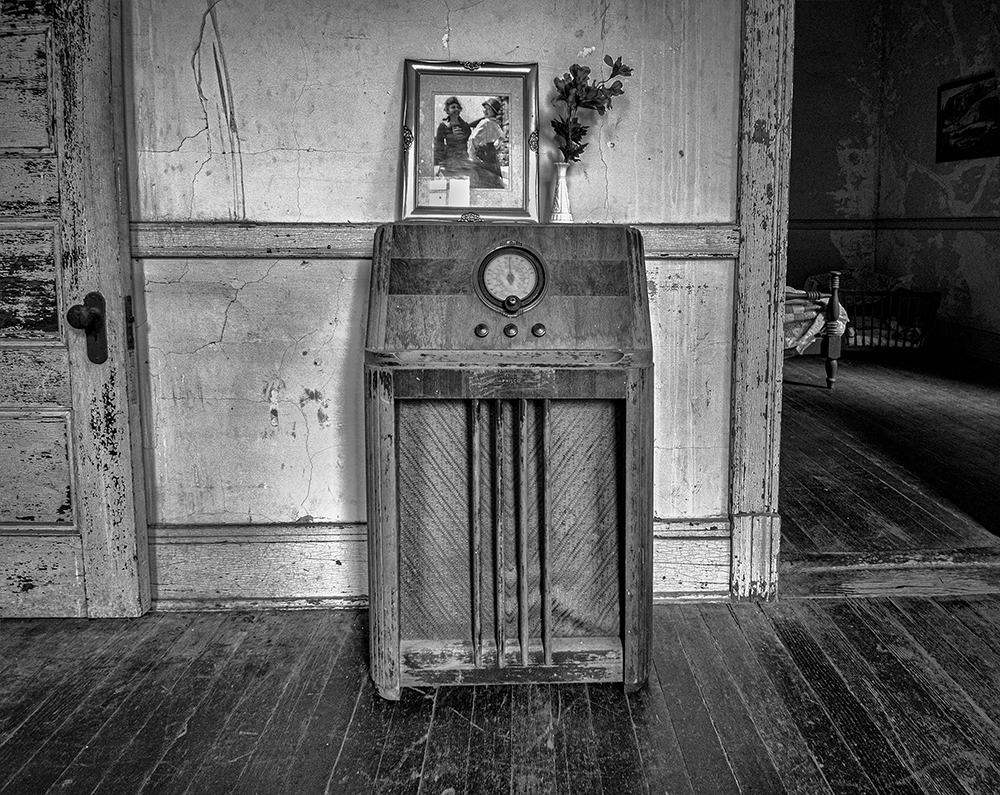
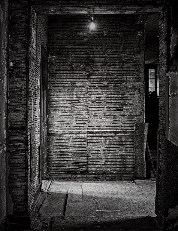
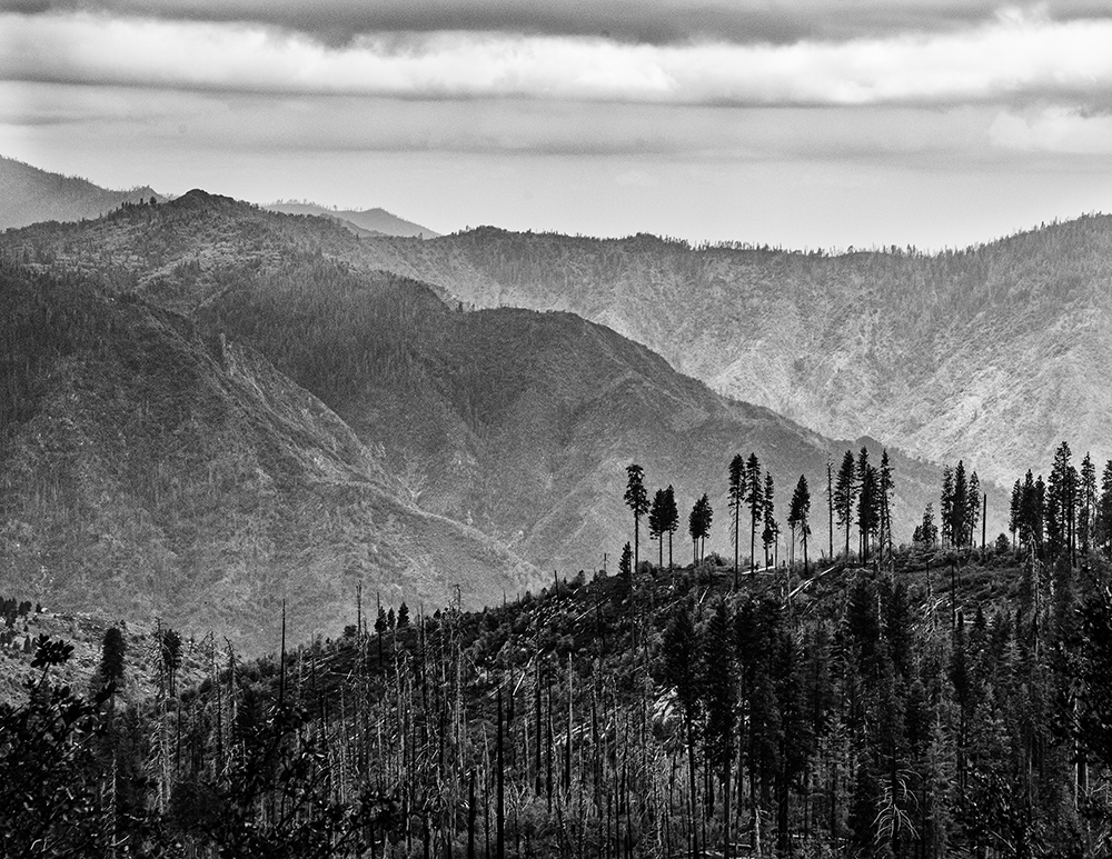
Hey Tracy, your image is very interesting. When I take a picture, I normally have a mood and tone that I am trying to set. Sometimes when I post an image, I totally disagree with some of the comments and "redo's" that are in the comments. I understand where you are coming from. This month I tried to set a mood for an old building that is being restored, and one that had a very dark past. So, what the comments made me do is to step back and take another look at the image. Maybe I make it a little darker, or more vignette, or crop different, but If I have a mood I am trying to set, I try not to lose sight of it. Photography is so subjective that everyone can be right, or wrong, but this is always a learning experience for me. On your image, I understand the mood you were trying to set, but I really liked what Haru did, and His image seemed sharper. I was distracted by the tops of the plants being out of focus, as well as the leaf at the bottom. I do think they look like tentacles, and I understand if you shot this at a higher F stop, you may have needed a tripod, or a higher ISO. I really think these groups are to make us better photographers, and I have learned so much by comments that I have disagreed with. Keep shooting. Thanks Tracy. |
May 3rd |
| 74 |
May 22 |
Comment |
Hey Haru, I feel the depth. I think I like the color version better even though I prefer b&w overall as a rule. It feels like it needs more contrast, or texture. Just my opinion. I don't know what to do about the sky. Thank's for sharing. |
May 2nd |
| 74 |
May 22 |
Comment |
Hey Haru. Thank you for your suggestion. I will work on it, but maybe not as dark. You make good points. thanks again. |
May 2nd |
10 comments - 0 replies for Group 74
|
| 96 |
May 22 |
Comment |
Hey Haru, you are not going to believe this, but I like your black and white take on this better than the color. I like the increase in detail and there are fewer distractions. As always, I get good ideas from you images. |
May 17th |
| 96 |
May 22 |
Comment |
Haru, I like the image. I like the shutter speed and wish it were slower. How about a monopod? I get the feeling everything is thawing out. The trees help with that feeling without so much coverage. Great detail. Thanks |
May 3rd |
2 comments - 0 replies for Group 96
|
18 comments - 0 replies Total
|